URBAN ITINERARY: CINEMATIC SPACE
Seeking to trace the Urban Interior as a point of origin and departure for Cinema
04. 10. 21
Drawing on reflective practice to coherently synthesise my design project documentation and its communication…
This week we are to continue developing, enhancing and synthesising our presentation documents and overall design communication narrative. Following from the incredibly beneficial Co-Design Workshop we had last week, we are to utilise and put into fruition the comments and feedback generated from our collaborative conversations with industry designers. The insights drawn from our projects and the varying ways in which we can strengthen both the design narrative and its communication. They were able to help us develop and build on our design proposition, but most importantly helped us to continue shaping our documentation so that it is the most cohesive and expressive that it can be. The feedback from this session I will be able to continue developing and refining this week in order to further prepare for the upcoming final formative presentation. For this presentation we have a parameter of 12 pages maximum that our documentation must conform too, so I need to ensure the layout and content present on each page is relevant, purposeful and expressive of our design intervention and its conceptual frameworks.
Firstly I started by reviewing over the notes and feedback comments made from my Co-Design session. All the comments made were incredibly influential for helping to further develop and enhance my design presentation. The array of advice stemmed into many different design components, particularly in relation to presentation and ways of further improving its clarity, detail and communicative methods for a viewer to best understand my design. Shown below are further insights gained from my collaborative session in which will help me to build on and refine my design presentation documents.

The main consideration I need to redevelop is the overall structured order and layout of my documents. Each image should progress onto the next in a cohesive way that is clearly understandable. The designer suggested to imagine presenting your document in a way that someone will see it for the first time without any previous knowledge into the project or brief. By particularly focusing and emphasising the design journey, the process of how I established my final outcome. Another key consideration is to introduce the spatial parameters and site in which I am working into clearly, what its current use and architectural layout is and what changes my design intends to make. She suggested setting up the structure of the space before introducing my design. This will help to articulate how my design will alter and transform the exisiting space of Imperial and Fort Lane.
06. 10. 21
For todays studio session I had a one on one conversation with my tutor to discuss how the Co-Design Workshop and how my design project is progressing in response to my conceptual and contextual frameworks. During this session I was able to show her my current design document presentation to get her input and feedback on how it reads and communicates my ideas. Firstly we went over the comments and feedback generated from the workshop, so I could her her thoughts and opinions on it. We discussed the importance of being selective with my process work, as it is such a crucial part of representing my design journey, however with limited final pages I need to only showcase the key elements. By focusing on and isolating particular models, drawings or photographs, it will enable the viewer to build a connection of understanding for how it shaped or manifested within my design outcome. Making visual relationships and connections between various drawings. Whats the key? Whats the pivotal moment? So they can understand what comes after that point in time. We also both came to the conclusion that the order needed to be rejigged. This would allow for a clearer progressive design journey through the various components of my design. Currently my presentation has process work and renders spread throughout, however by shifting the process work to the beginning to build and establish the narrative, then I can start moving through the various perspectives and detailed drawings of my design.
Along with this in order to enhance the visual aesthetics and communication within my documents, she suggested playing around with contrasts between my foregrounds and backgrounds. Whether this be through experimenting with the opacity of the exisiting buildings, or instead by bringing in a subtle colour shift. By introducing a subtle light pink, or blue, any colour into my line drawing, this would help my design stand out and pop off the page. Even though I want to maintain this built visual language and black and white aesthetic throughout my final documentation imagery, by experimenting around with the images for readability purposes it will create a visual relief. In coherence with this we also talked about introducing colour onto the edge faces of my pavilion design, this new element would both help to make my drawings more visible but also make it visually pop and stand out in the laneway.
In terms of the order sequence for my documents, I need to think really carefully about how I am walking the viewer through my designed space and how I order these various viewpoints so that it becomes a journey. Instead the pavilion becomes the end point of the narrative for what it is I have created. The first viewpoint should be the entrance threshold coming in from Queen Street, the doorway into this space, followed by the thoroughfare laneway along the side of the dance studio. Then am I able to progress into the dance studio space, highlight its details and then head out into the pavilion to engage with the threshold into Fort Lane.
All the combination of feedback generated from both my Co-Design Workshop and one on one tutor discussion will enable me to develop and refine my presentation document and the various ways in which I am showcasing my proposed design. How can I best showcase my project narrative and design intentions in a captivating, expressive and evocative way relative to the conceptual frameworks embedded within my work? In order to establish this I need to reflect back over my design documents and make the according adjustments where necessary, as well as new additions that will help to clarify my design representation.
MATERIALITY AND DETAIL.
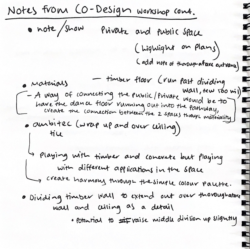
Firstly as part of my Co-Design workshop, we had an incredibly valuable discussion surrounding materiality. As heading into this workshop I was a little unsure as to which surface treatments I would decide to incorporate but I was able to get her expert opinion and advice on this. Shown below is the materiality considerations in which we discussed upon.
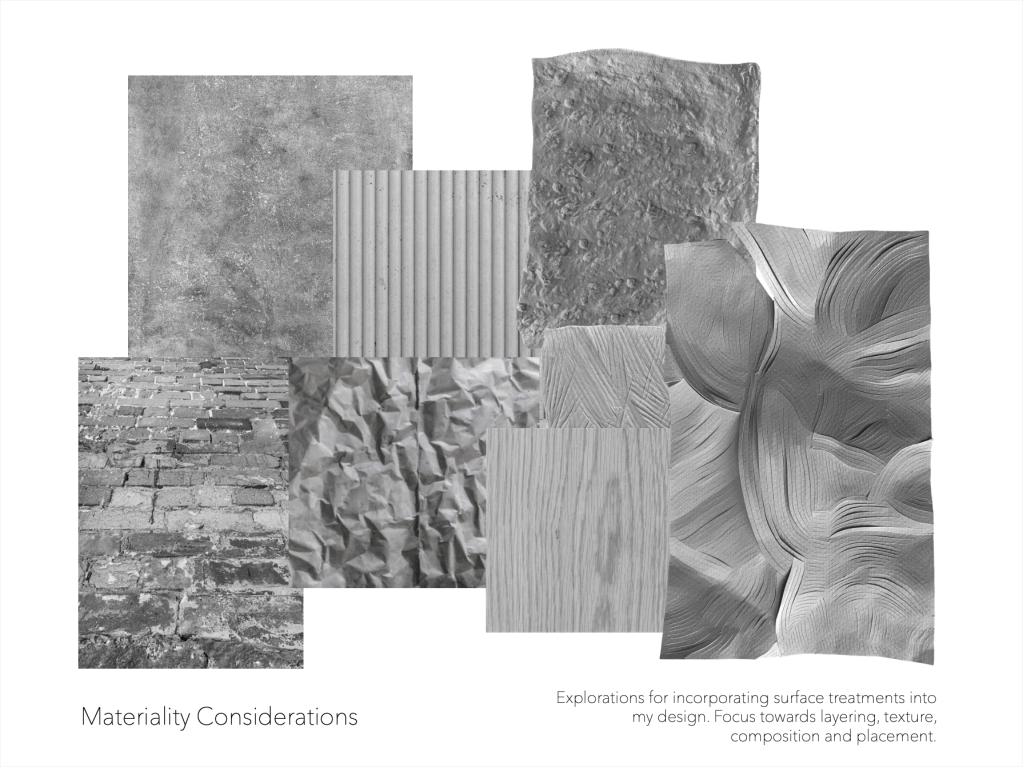
Within my design, she expressed how materials could play a vital role in connecting the public and private spaces with the potential to extend these surfaces across each intersection. Creating a connection between the two spaces through materiality. Where the placement of materials connect and harmonise together between the spaces, used both within my dance studio, Imperial Lane and on the pavilion structure. I explained to her the array of surface treatments I was considering and she suggested the key is to keep it simple and to not overcomplicate it. She stated how majority of times we feel this emphasise to utilise a whole tone of varied materials on all different surfaces and features. Yet she recommended using just timber and concrete but playing around with different applications in the space. To create harmony through this simplistic, understated colour palette. Along with this she also introduced me to the material Ambitec tile that she encouraged could be wrapped up the walls and along the ceiling, a surface that would create the type of aesthetic and spatial atmosphere I am wishing to establish in my design. Using these new insights, I started gathering and selecting the materialities of timbers and concrete that I wish to incorporate into my design.
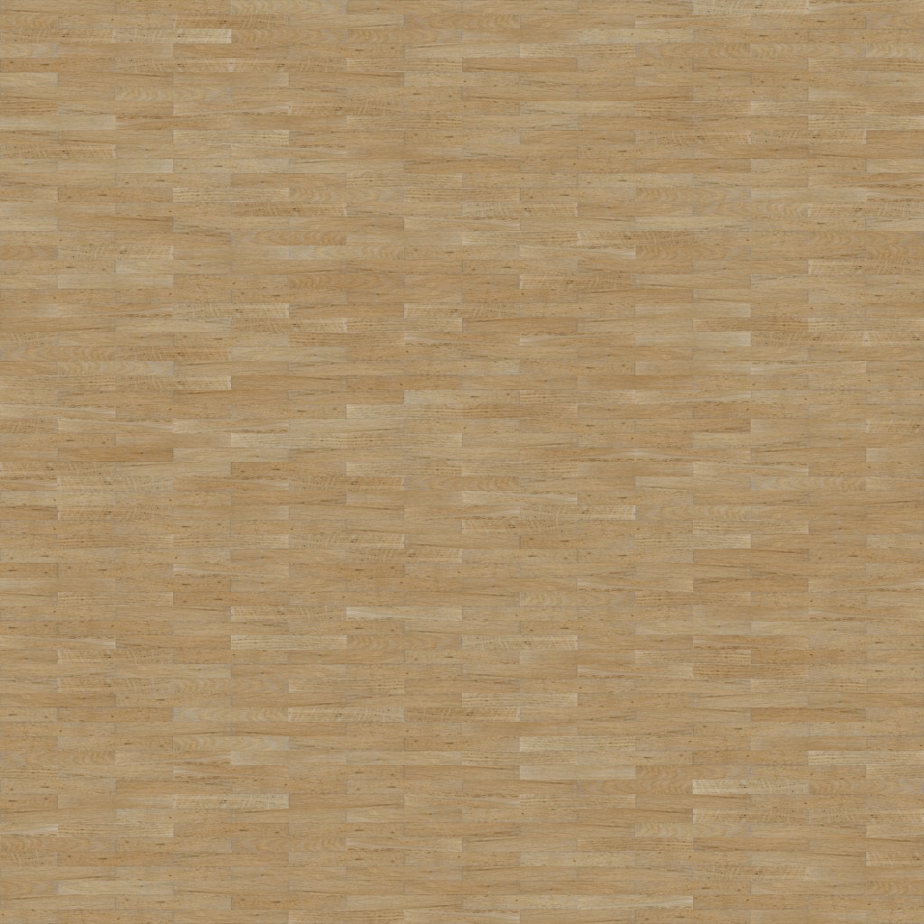
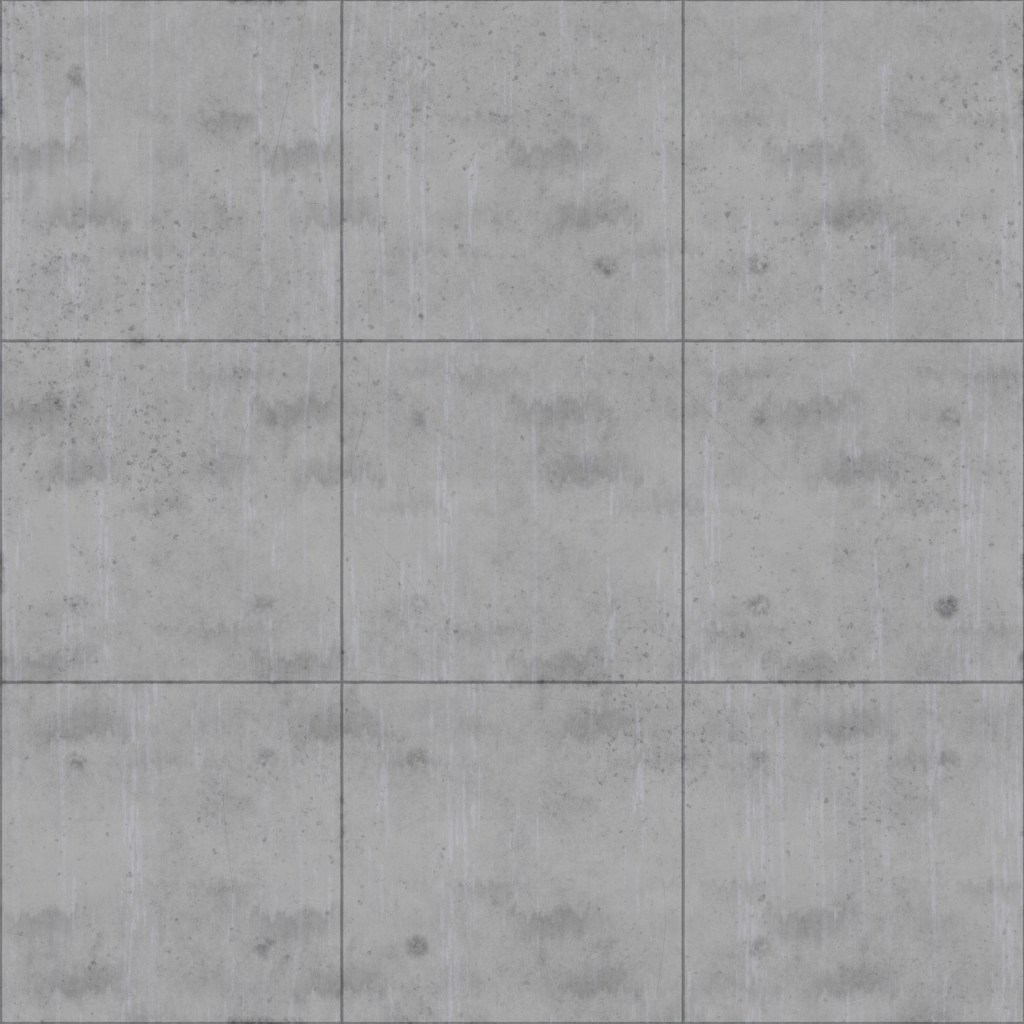
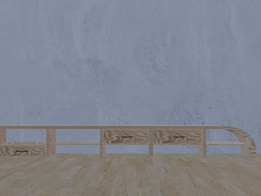
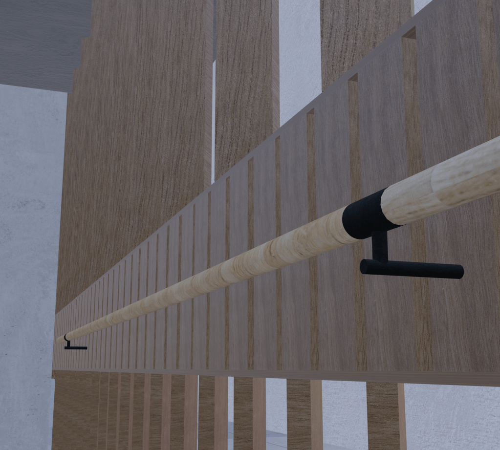
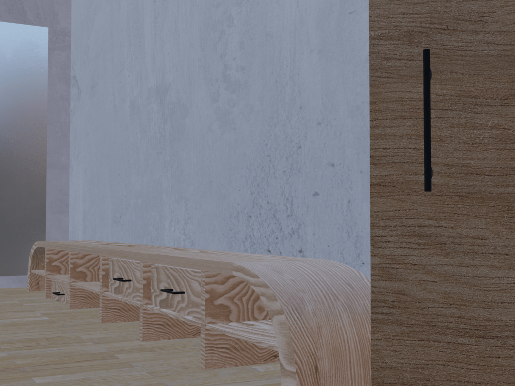
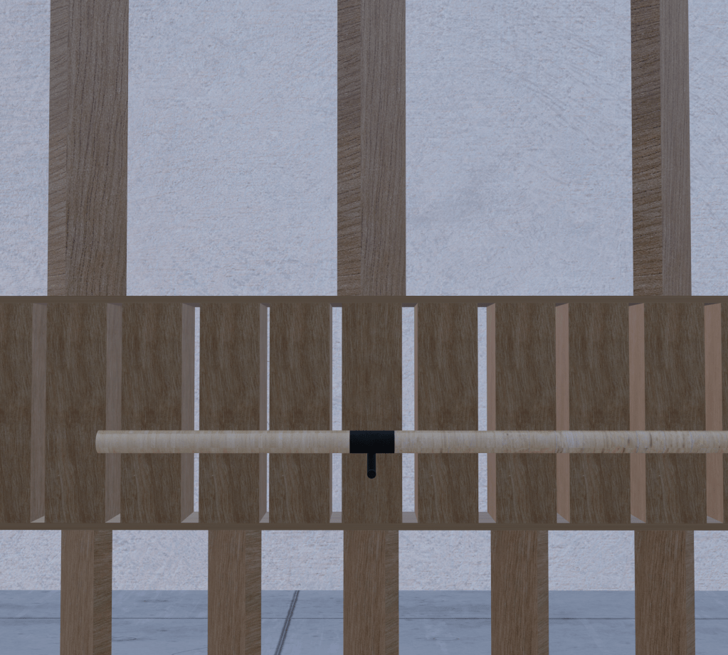
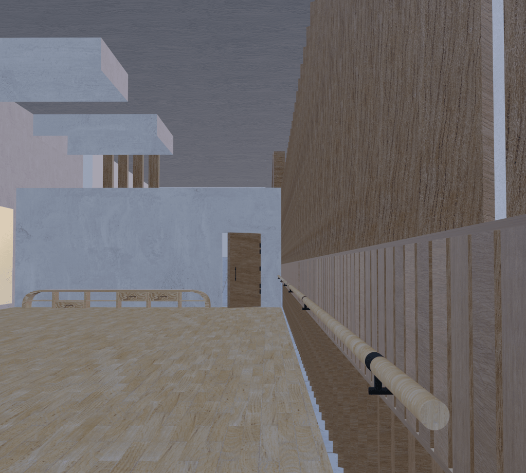
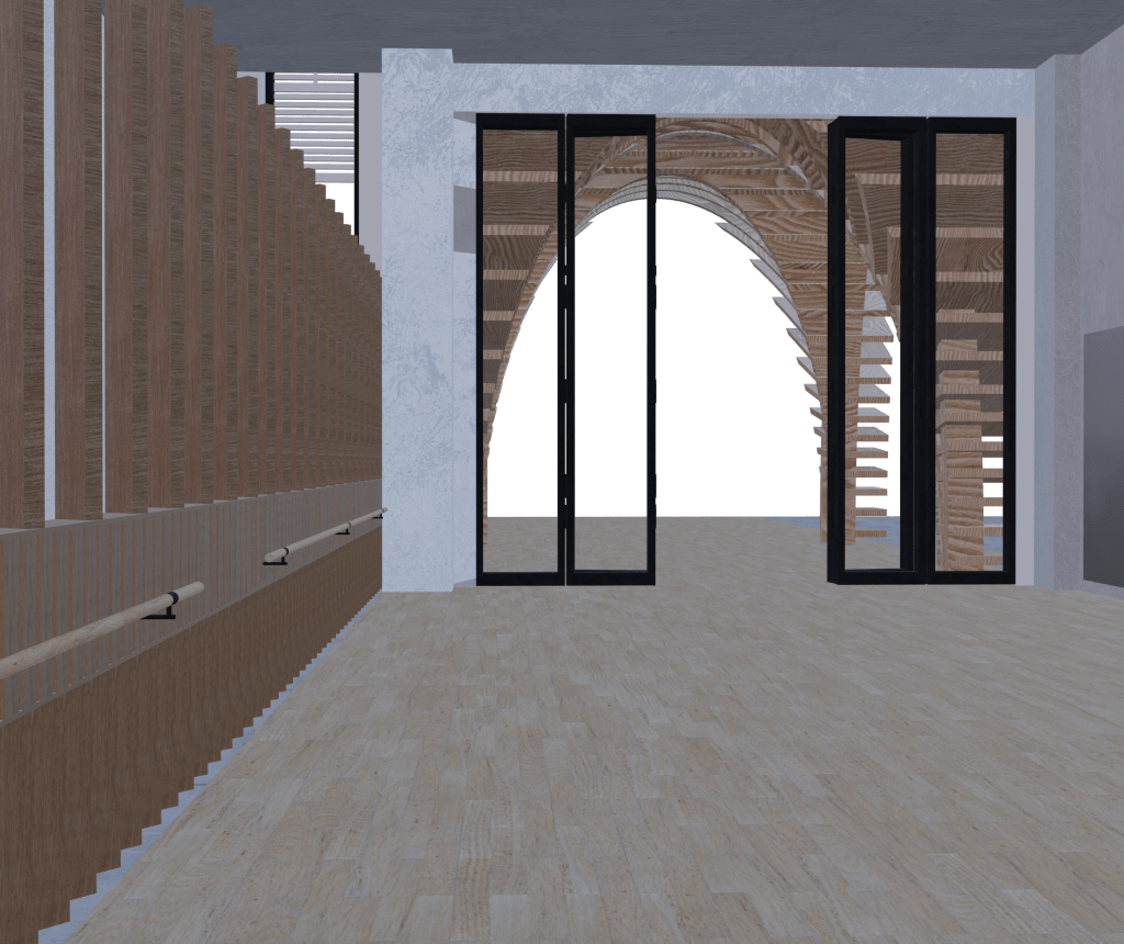
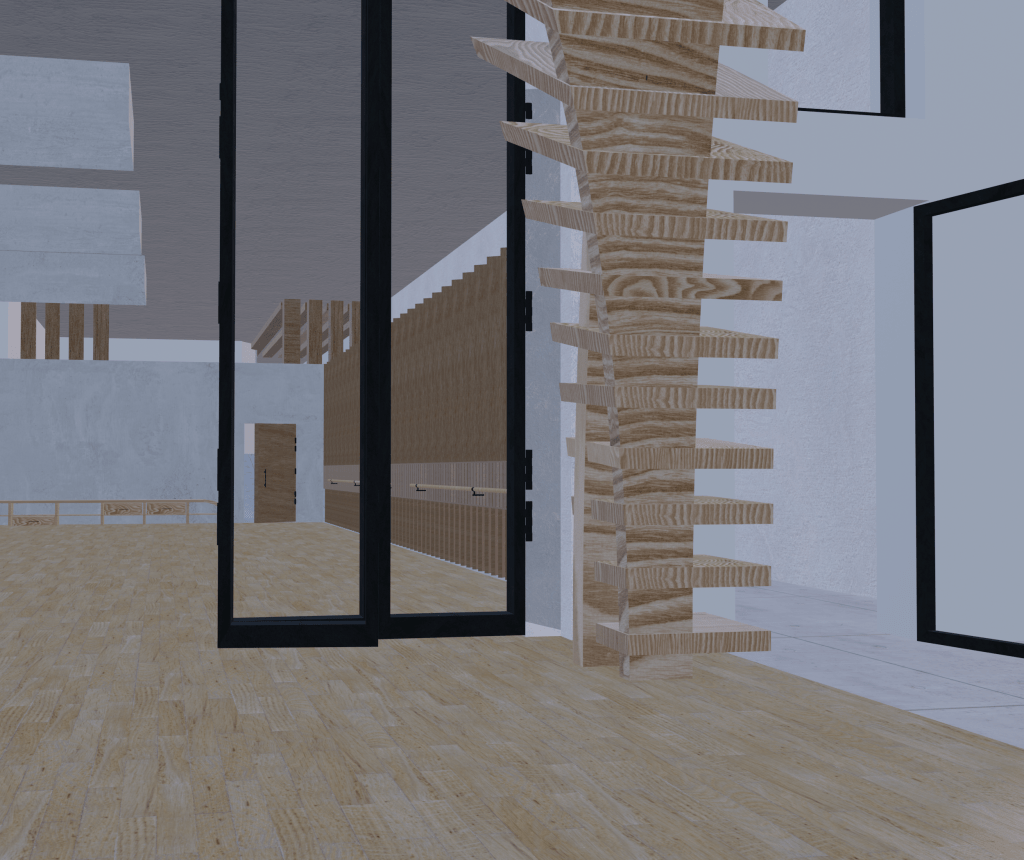
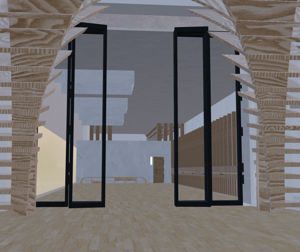
The main materialities that I am implementing into my proposed design each would uphold their own aesthetic and function within the interior space and pavilion. A simplistic, minimal palette that plays with the application of timber, concrete and plaster within the space. For the flooring, I wanted to maintain a connection to the exisiting building and its environment by utilising an exposed concrete tile for the thoroughfare and rest of Imperial Lane flooring. I material that is practical, durable and appropriate in its application but will also coherently work in relation to the overall design, its aesthetic, and functionalities of being a public, transitory space composed of movement. In consideration of this the fixtures and fittings such as the door handles and window, door frames will have a black steel finish. In terms of the dance studio flooring, a hardwood is essential. A sprung, solid hardwood that optimises safety, performance and durability as dancers interact with the floor more closely than any other part of the studio or performance space. A shock absorbing surface is essential to avoid injuries, as is the right level of friction and “feedback” so they can perform at their best. By incorporating a hardwood flooring it will provide optimum shock absorption, surface deflection and slip resistance. For the aesthetics of the space, a light, natural beech floorboards will create clean lines for my minimalist material concept.
Junckers. (n.d). Sprung Dance Flooring. Retrieved from https://www.junckers.com/sports-flooring/sports/dance
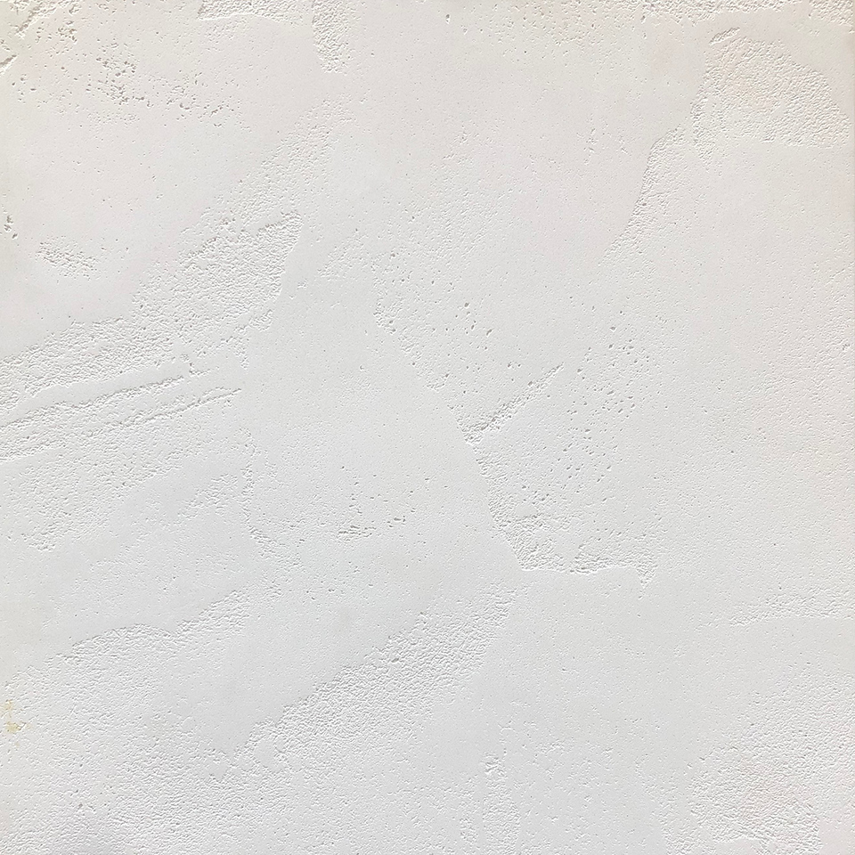
For the walls and ceilings we discussed the use of Ambitec tile, a textured, plaster surface finish. This suave polished, plaster finish is a specialist surface finish suitable for use on all absorbent and prepared indoor surfaces such as the existing brick and concrete walls. With the Suave specialist finish the design choices do not end with the colour, or the grade of polish. The overall look of the Suave finish is effected by the level of texture chosen across the surface finish. From rugged to delicate and anything in between, the choice of texture quantity and character can be varied and custom to desired outcome. By choosing a soft, light and subtly textured plaster finish it will help to entirely brighten up the internal space to provide a much more delicate finish.
Ambitec. (n.d). Suave Polished Plaster. Retrieved from https://ambitec.smugmug.com/Finishes/Suave-Colour-Swatches
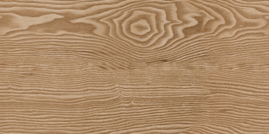
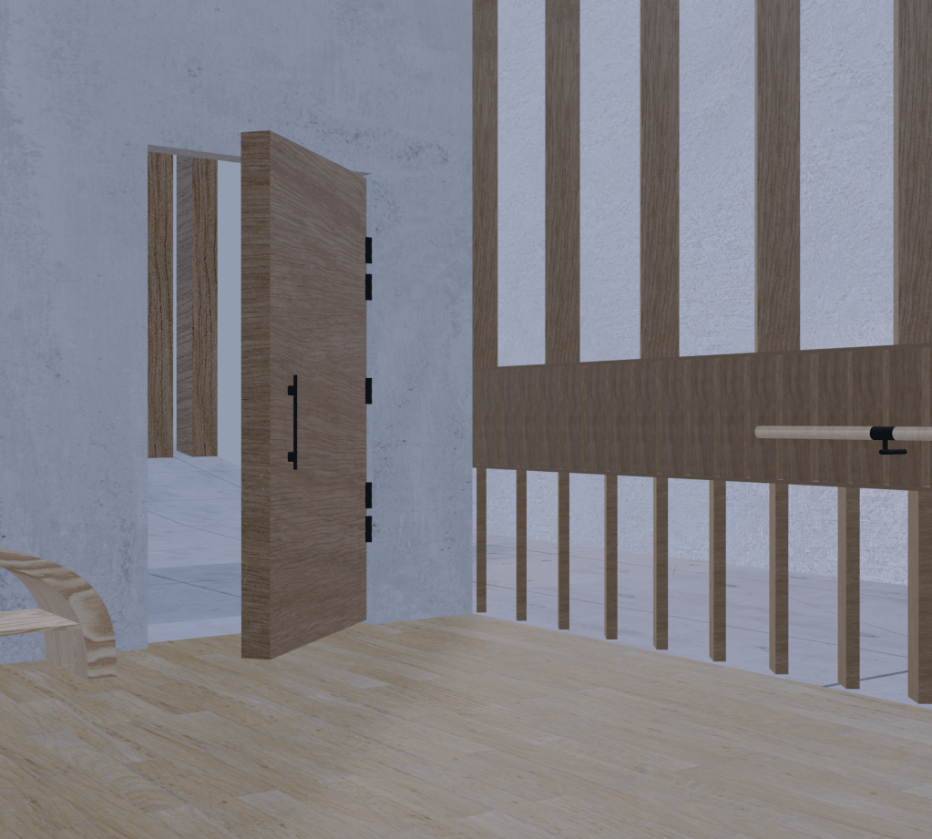
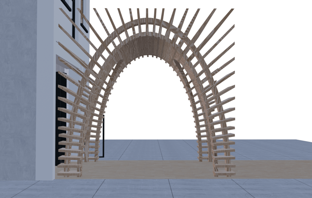
The internal timber partitioned wall features will be constructed out of oak timber as this will provide the warmth, natural aesthetic I am wishing to enhance into the space. It will directly contrast against the textured plaster walls and concrete flooring to bring in a glimpse of natural colour. However for the external pavilion structure it will be constructed out of CDX plywood that can withstand the durability of an outdoor environment. It is a construction grade option that is sturdy, practical and can be easily worked, the layers can be made from veneers, high-density hardwood, or light hardwood. Along with this, the curved form embedded within my pavilion design will be able to be established as it can be worked with moderate ease with both hand and machine tool, its superb stability, good strength properties, and easy workability makes it a viable option. Featured below is the overall materials palette of my proposed design intervention.
Materials Palette
consistent of oak and beech timbers and hardwood flooring, exposed concrete floor tiles, black steel and ambitec plaster finishes.


Once I had fully established and clarified the materialities that I wish to incorporate into my design intervention and their exact surface placement in the space, was I able to further develop and enhance these details within my perspectival renders. By adding materials to my renders it immediately transformed not only the visual attributes and appearance of the space, but gave it a greater sense of depth and detail. Through utilising my constructed digital rendered model of my design, I started capturing selective perspectives showcasing key viewpoints and elements of the progression throughout the space. Imagining what it would be like to inhabit and occupy. It communicated a clearer journey through my proposed spaces, and articulated key moments of my design narrative with more expression and definition.
Materiality rendered perspectival views of my design intervention into Imperial Lane and Fort Lane.

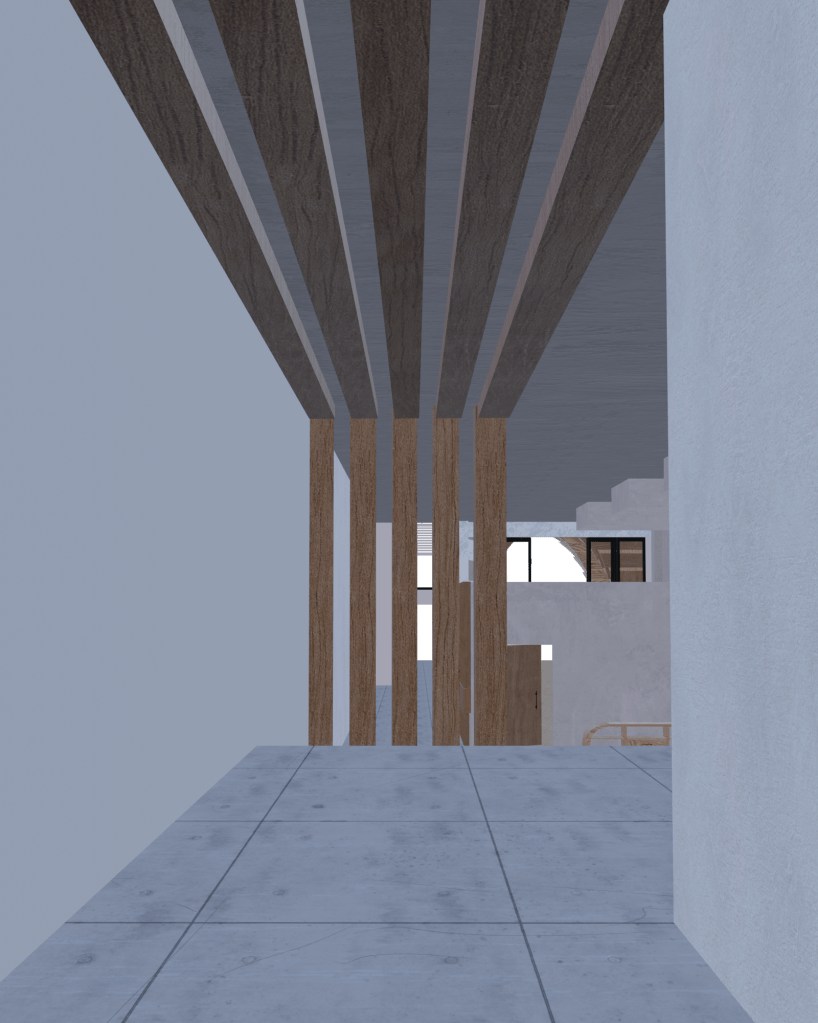
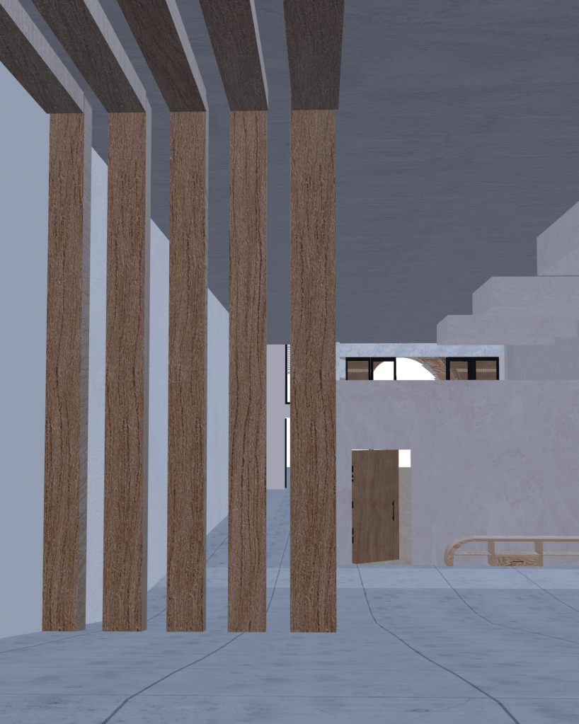
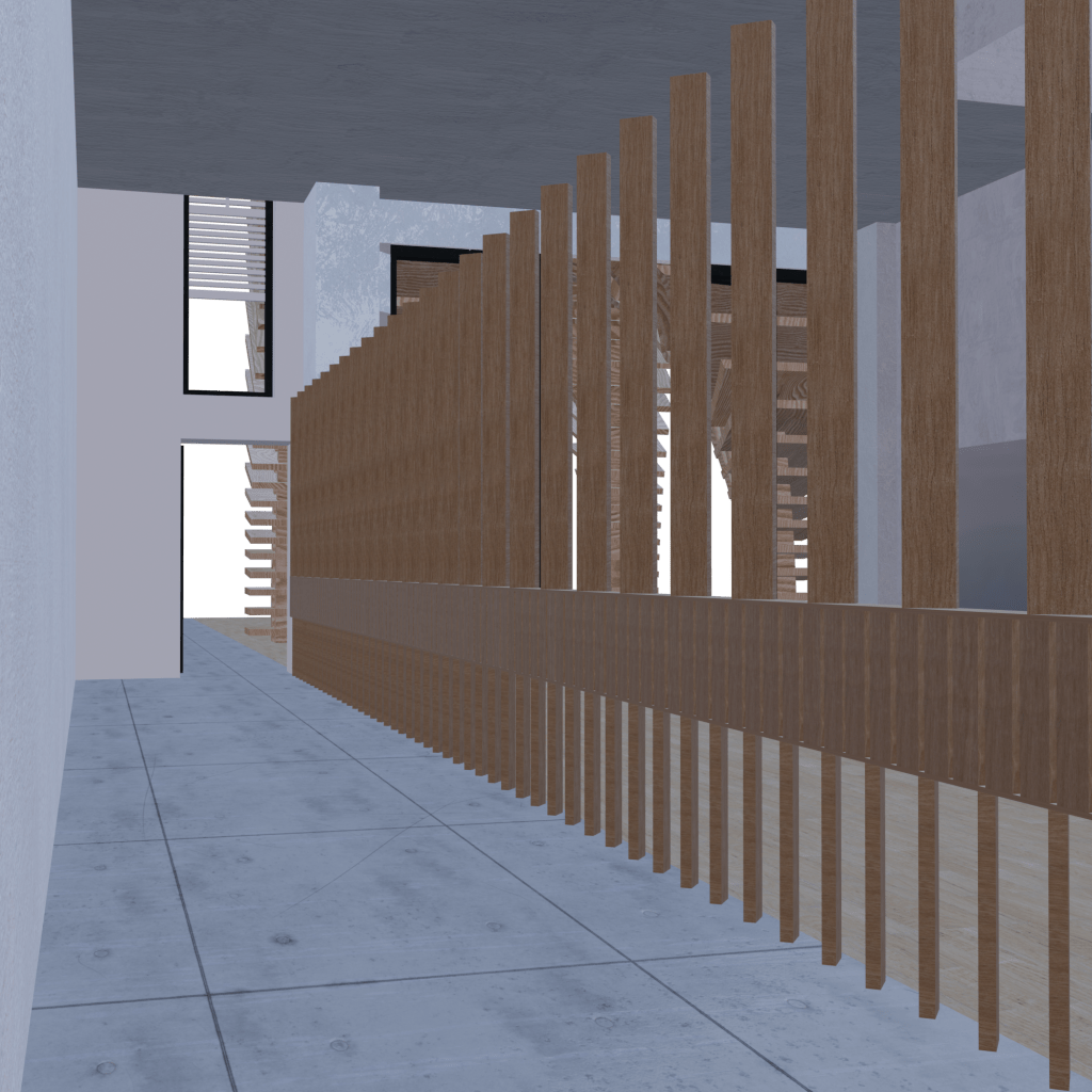
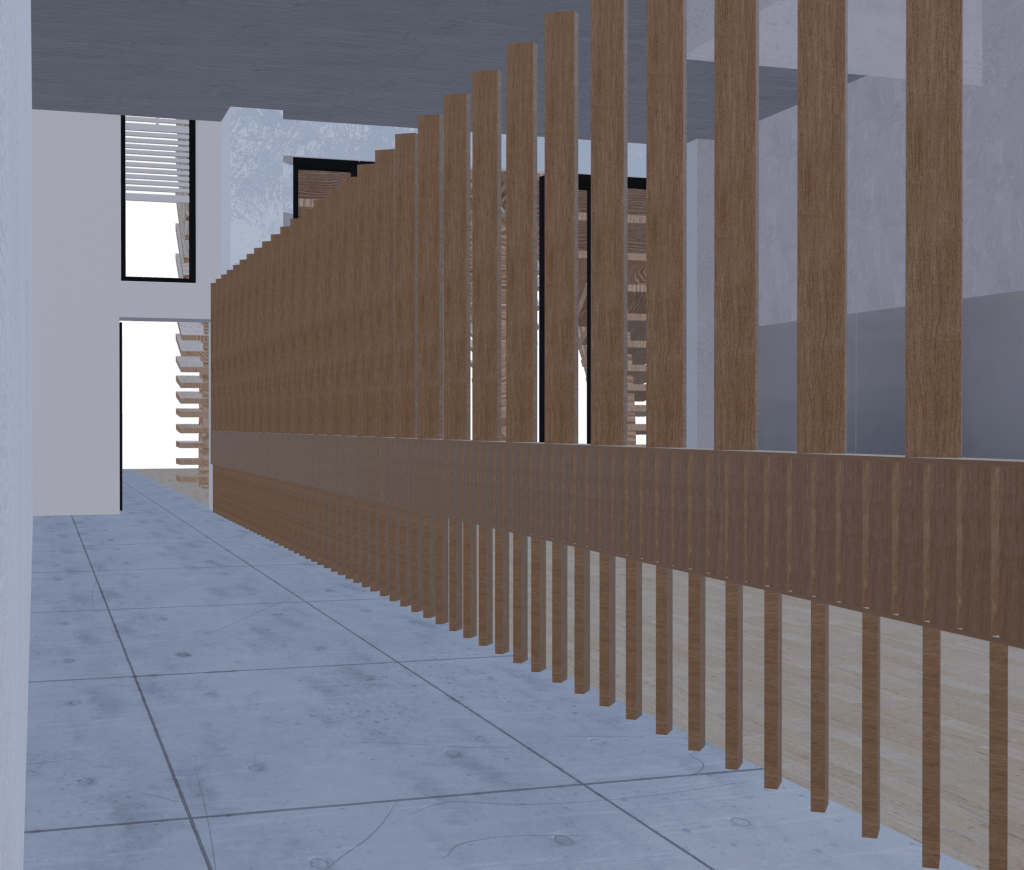
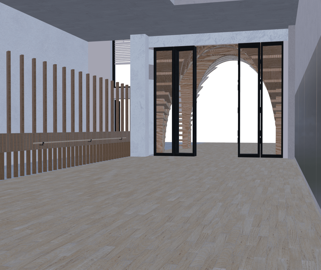
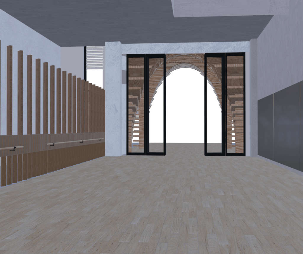
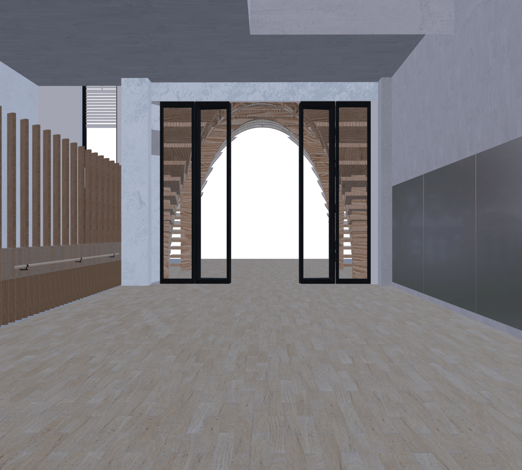

Inclusive to my perspective renders will also be my digital line drawings, expressive of highlighting these rhythmic horizontal and vertical forms within my design. This use of line drawing and mark making to connect back to the mediation between space, architecture, and the body.
The Introduction of Colour…
A key reflection made from both the workshop and my one on one tutor session was to enhance the visual aesthetics and communication of my documents by playing around with contrasts through colour. By introducing a subtle colour shift to my design intervention elements will help it pop off the page, stand out and therefore create a better sense of readability and understandability for the viewer. In coherence with this we also talked about introducing colour onto the edge faces of my pavilion design, this new element would both help to make my drawings more visible but also make it visually pop and stand out in the laneway. Even though I want to maintain this built visual language and black and white aesthetic throughout my final documentation imagery, by experimenting around with the images for readability purposes it will create a visual relief. I started experimenting with my line drawings by instigating colour into each documentation to help it contrast directly against my black and white images.
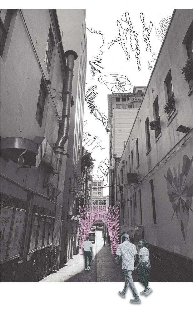
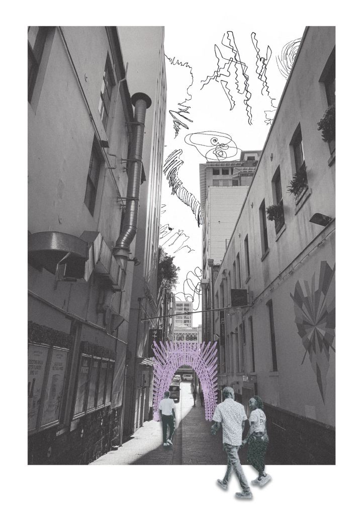
Initially the colour I contemplated about introducing was a baby pink, as this colour to me holds a direct influence and connection to what is deemed a dance studio space. Pink also upholds a strong visual cue that is striking against my exisiting imagery, however when I began collating and sequencing these new coloured images with my perspective renders, I felt the visual connection and coherency was partly absent. The natural, underlying colour hues embedded within my perspective renders showcase this incredibly subtle, yet captivating lilac, thistle purple undertones. This encouraged me to experiment with purple shades to explore their contrasts against my imagery. Once I established on the accurate shade and altered my line drawings, it started to build a strong visual coherency between all my documentation. I knew instantly a new visual language had been developed, one that I never thought I would employ into this project, however it has helped to enhance it even further. Along with adding colour to my specific line drawings, I also reflected back over each document to see where this contrast needed to be further strengthened for better readability purposes. By sharpening the lines and increasing various line weights where necessary, this helped to build the contrast between my backgrounds and foregrounds.
Another key reflection made from both sessions was on redeveloping the ordering and sequence of my overall presentation documents. Each image needs to progress onto the next in a cohesive way that is clearly understandable. By particularly focusing and emphasising the design journey, the process of how I established my final outcome. Drawing on these spatial leads to explore this connection between public and private space through my materiality, the pavilion structure and image arrangement. Shown below is my new presentation order that progresses through my design narrative in a much more clear and organised layout.
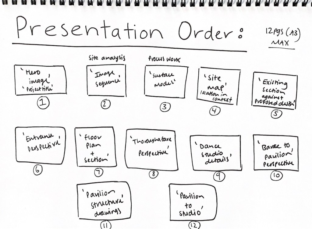
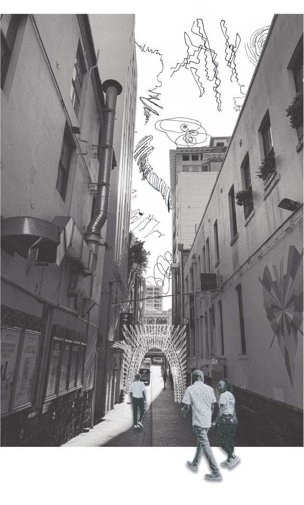
The main adjustments were in bringing all my site analysis and process documentation to the beginning of the presentation, including an additional introduction to the existing Imperial Lane layout, and reconfiguring the design journey of how one walks through my designed space. Instead the pavilion becomes the end point of the narrative for what it is I have created. The first viewpoint becomes the entrance threshold coming in from Queen Street, the doorway into this space, followed by the thoroughfare laneway along the side of the dance studio. Then it progress into the dance studio space, highlight its various details, to then head out into the pavilion to engage with the threshold into Fort Lane. The inhabitant crossing between the thresholds of public and private space to reconsider what is deemed public and what is deemed private anymore.
‘A PROGRESSIVE DESIGN JOURNEY’
As the progressive design journey is a crucial part of our design documentation, I need to further capture why I decided to do a dance studio and how I came to the specific designed elements and their forms. Reflecting over my workshop presentation it wasn’t visually represented or obviously shown in my documents, so by highlighting the key process driven material that led to how and why I landed on a dance studio is an important priority in my work. Firstly the alteration of the layout will help convey this, however I need to selectively collate my process material. Both these drawings, model and photographic image sequence were utterly significant at sparking this idea of performance, body, movement in motion, and the means it upholds within a spatial design context, both as part of the process, design intervention, and inhabitation of space.
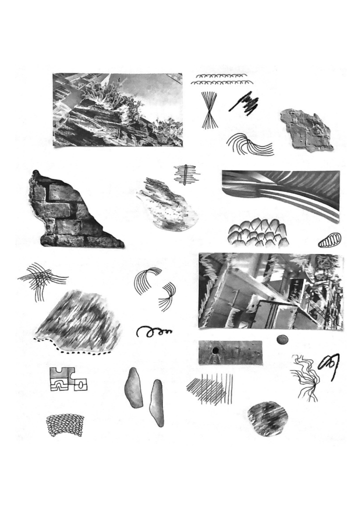
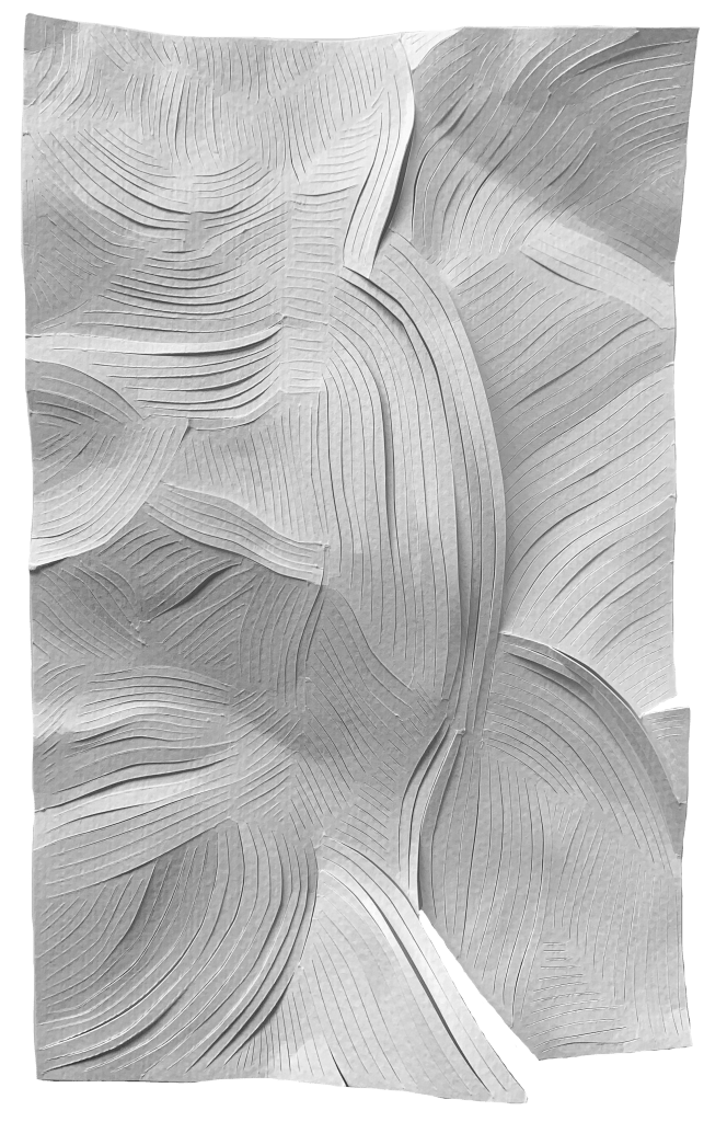
By focusing on and isolating particular models, drawings or photographs, it will enable the viewer to build a connection of understanding for how it shaped or manifested within my dance studio and pavilion design. Making visual relationships and connections between various drawings. My presentation had process work and renders spread throughout, however by shifting the process work to the beginning to build and establish the narrative, and ultimately how it influenced my design outcome. These line drawings and particular paper model established the not only the aesthetic and detailed features within my intervention, but they formulated this connection between public and private, what it means to uncover a veil or reveal parts of something, perhaps even unexpected through line and form. The simplicity of the line formed this dialogue between body and movement focusing on direction, action, gesture and spontaneity. Both of these explorative evaluations where pivotal to the development of my conceptual frameworks and overall design.
Existing vs Proposed.
Another key development is to introduce the spatial parameters and site in which I am working into clearly, what its current use and architectural layout is and what changes my design intends to make for my design intervention. In order to do this I created a new documentation comparing the existing section plan of Imperial Lane against my proposed design to showcase the changes that would be endured and the additions that would be made. For this page I also wanted to add more depth and interest by experimenting with various background imagery.
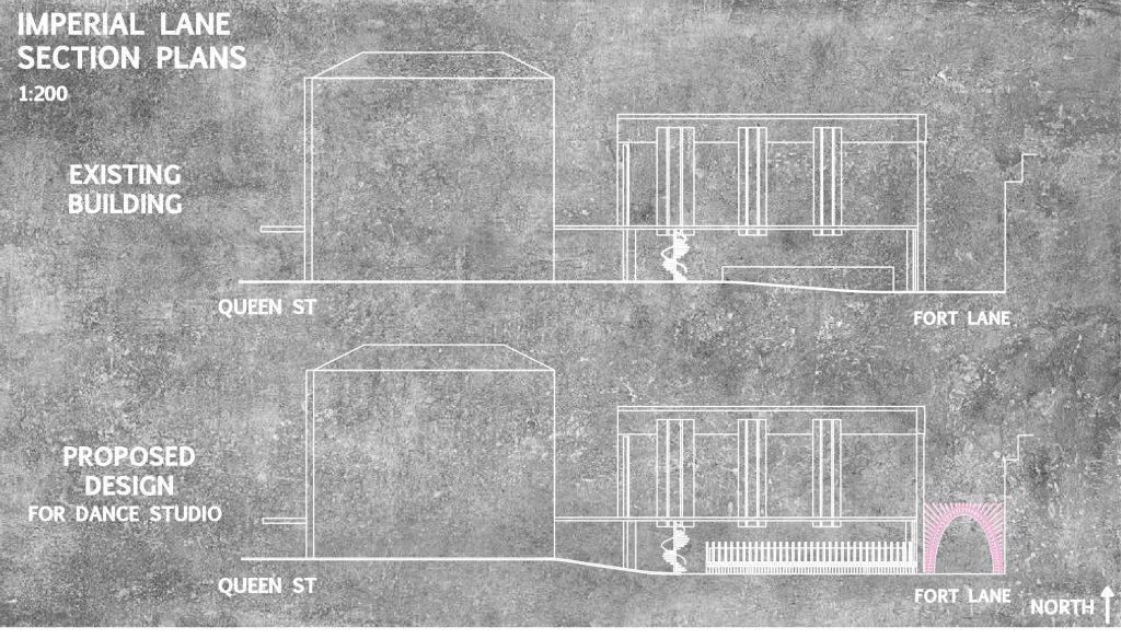
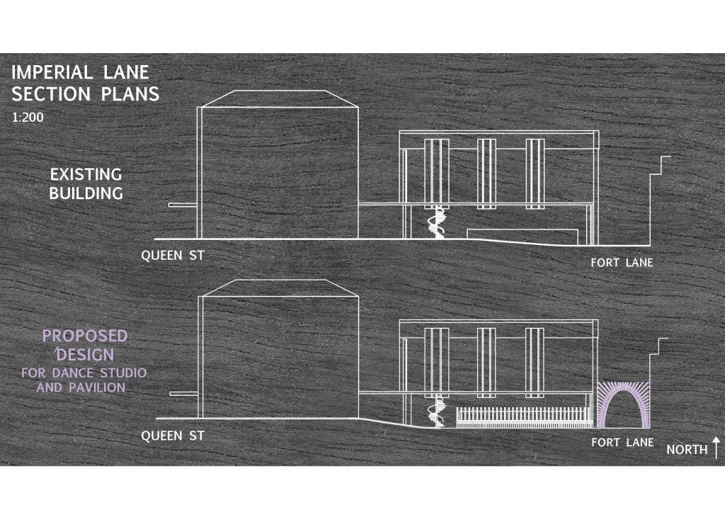
Both of these documents connect back to the materialities of concrete and timber that are highly relevant and incorporated into my design. However again reflecting back over the importance of establishing strong contrasts to allow my design to stand out and not let the foregrounds and backgrounds merge, I set on a more simplistic yet striking visual composition that is easily readable. Particularly as for the concrete background my line drawings began to lose their distinctiveness which is incredibly important.
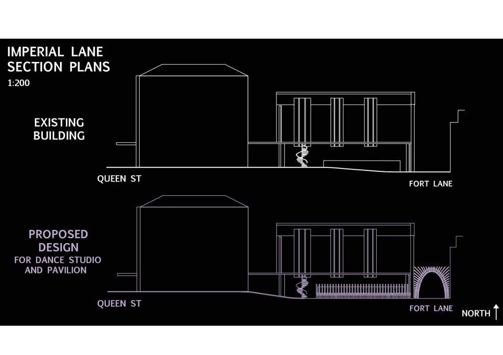
By setting up the structure of the space before introducing my design, this will help to articulate how my design will alter and transform the exisiting space of Imperial and Fort Lane. I choose to utilise a section plan as it allows the viewer the ability to see the key new additions of my design, the partitioned wall and pavilion structure. As well as this it can clearly articulate the structural alterations to the existing raked floor level in order to make the studio space functional, whilst maintaining the light tunnels and spiral staircase for upper level access.
