Project Design + Investigation and Experimentation
COLOUR COMPLEX
Week One | Colour Mapping – Design Workshop 1
25. 02. 20
Today in class we were introduced to a new design project and its exploration site. For this specific project, our analysis and conceptual design thinking is to be centered around colour, its purpose and its direct impact on not only people but in a spatial environment. We are to explore and examine various approaches to the use of colour in spatial design representation through fabrication and the art of making. Through this design intervention we will “critically interrogate the relationship between spatial practices and colour: colour as integral to materials, applied to materials, embedded into materials and colour as immaterial.“ The question of: How can colour be used as a tool to highlight, articulate, orientate, integrate or contrast spatial practices relative to a particular context? will be an extremely interesting study to analyse further into, exploring beneficial knowledge that can will be employed within our own design practices.
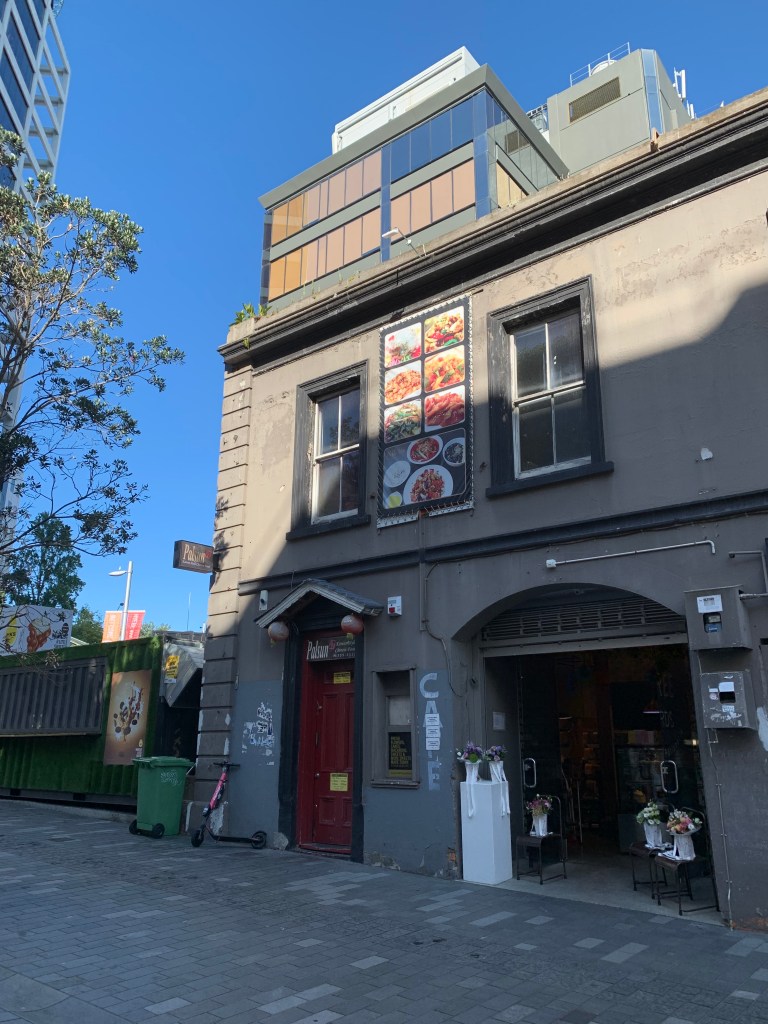
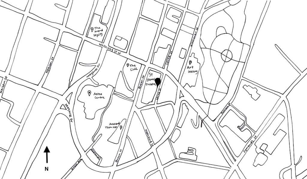
In order to strengthen and fully develop our understanding towards the perception and experience of colour and space, the main site for our design will be the passage way of the St James Theatre foyer space, located on Queen Street in Auckland’s CBD. The foyer served as a holding space for theatre goers as well as a thoroughfare for people between Lorne St and Queen St. The theatre itself was a place that housed people in an ‘imagined space’, a space that showcased cinema and art performances such as operas, musicals, ballet and events. As described “through the frame of the proscenium arch, from the viewing lines of seating hierarchy, one could be entranced by voice or movement, at varying levels of intimacy, by a performer on stage.” The foyer was this contrasting space that composed of a crossing between people exterior to the theatre experience and those captured by the imagined within the theatres interior.
The site is now derelict, a historic space waiting to be transformed, returning to a new beginning. We must consider how do we reinstall the imagined possibility? How can we use ‘colour’ to repurpose this place? As part of this redevelopment, we have been asked to propose a design intervention in the foyer space of the St James Theatre through exploration into colour, surface and pattern which speaks to the social, cultural and material conditions of the site. Our choices of colour material surface will either reflect to the sites past, present or create a speculative future.
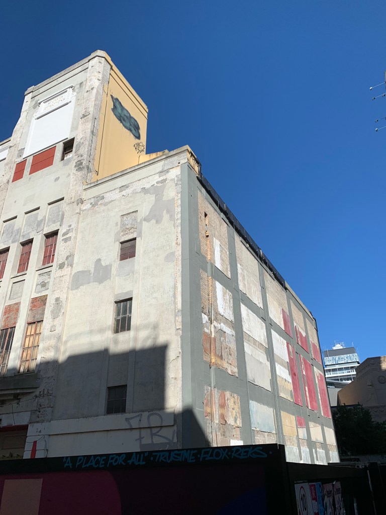
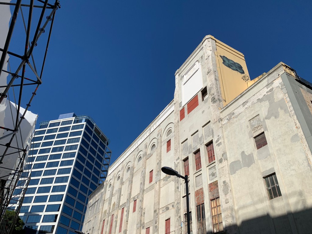
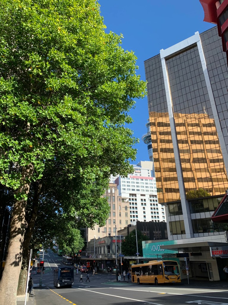
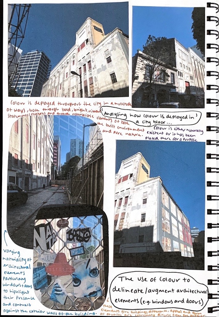
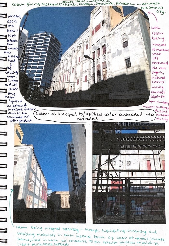
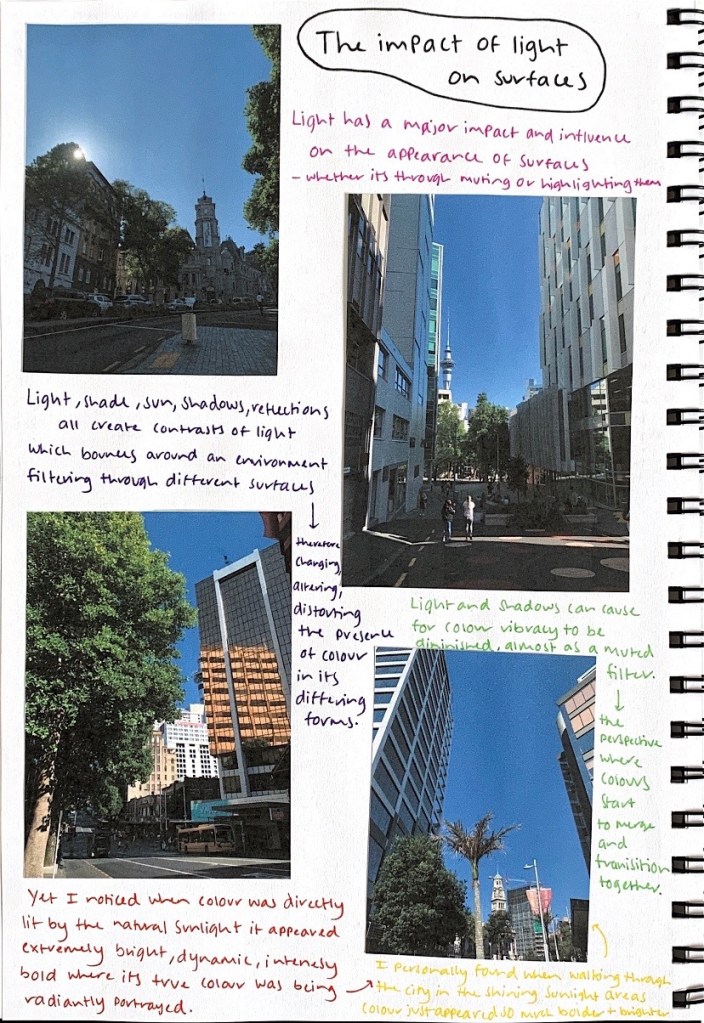
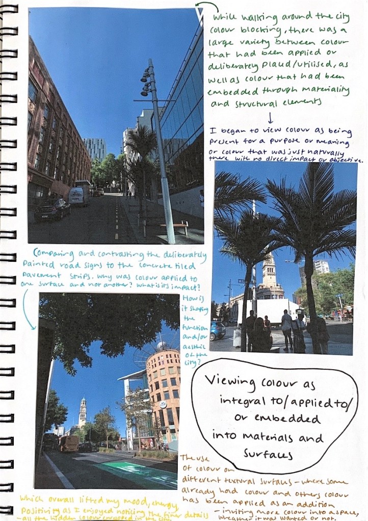
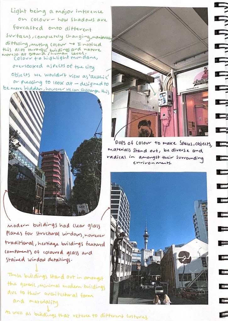
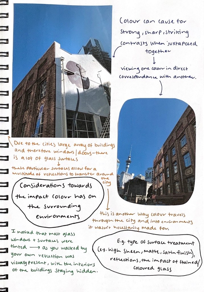
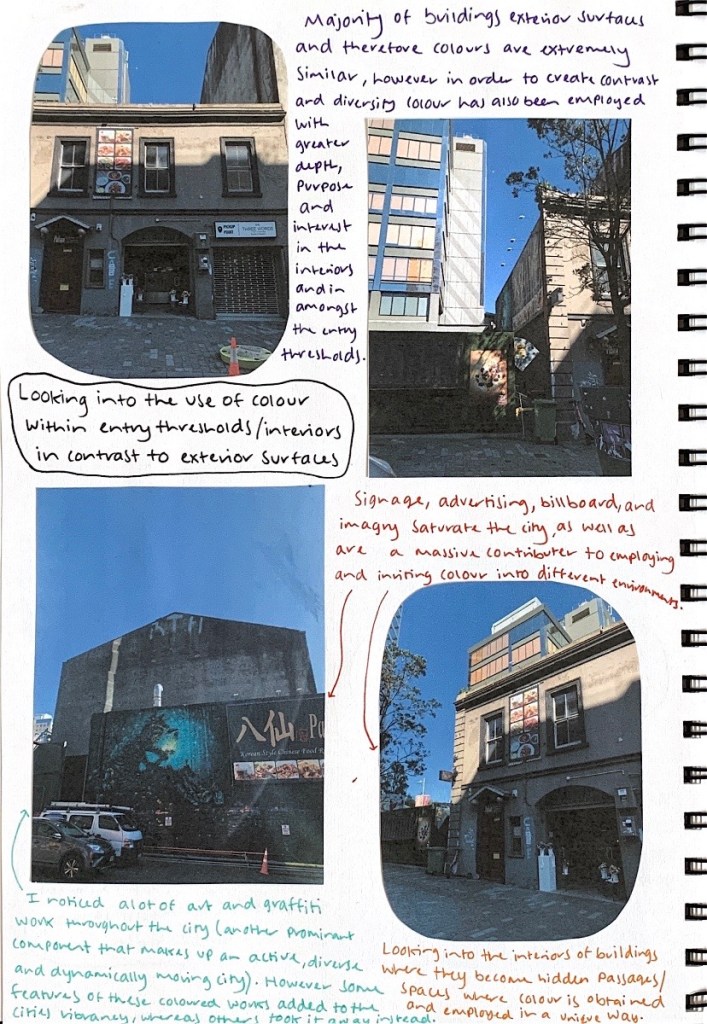
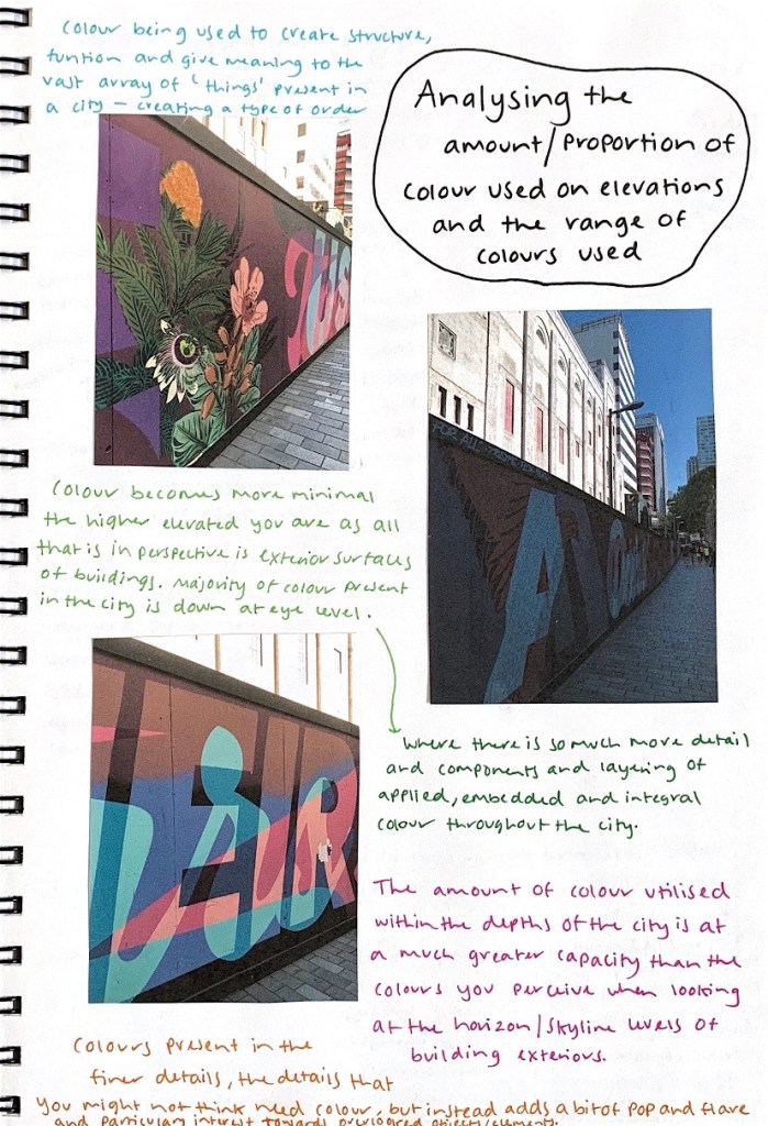
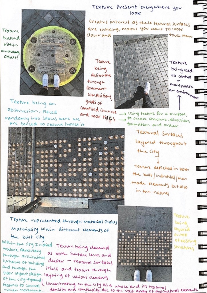
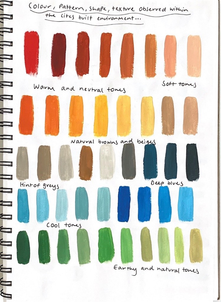
As part of a colour mapping exercise focused on the exploration of colour within the built environment, we went on a walk from the studio space down to the St James Theatre. While walking down to the site we were asked to document our observations of colour through sketches, drawings, photographs and note taking methods. Below are a series of photographs that I captured on our walk that highlight the different colours and textures used within the city.
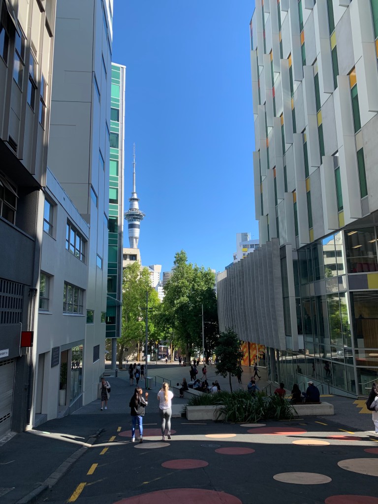

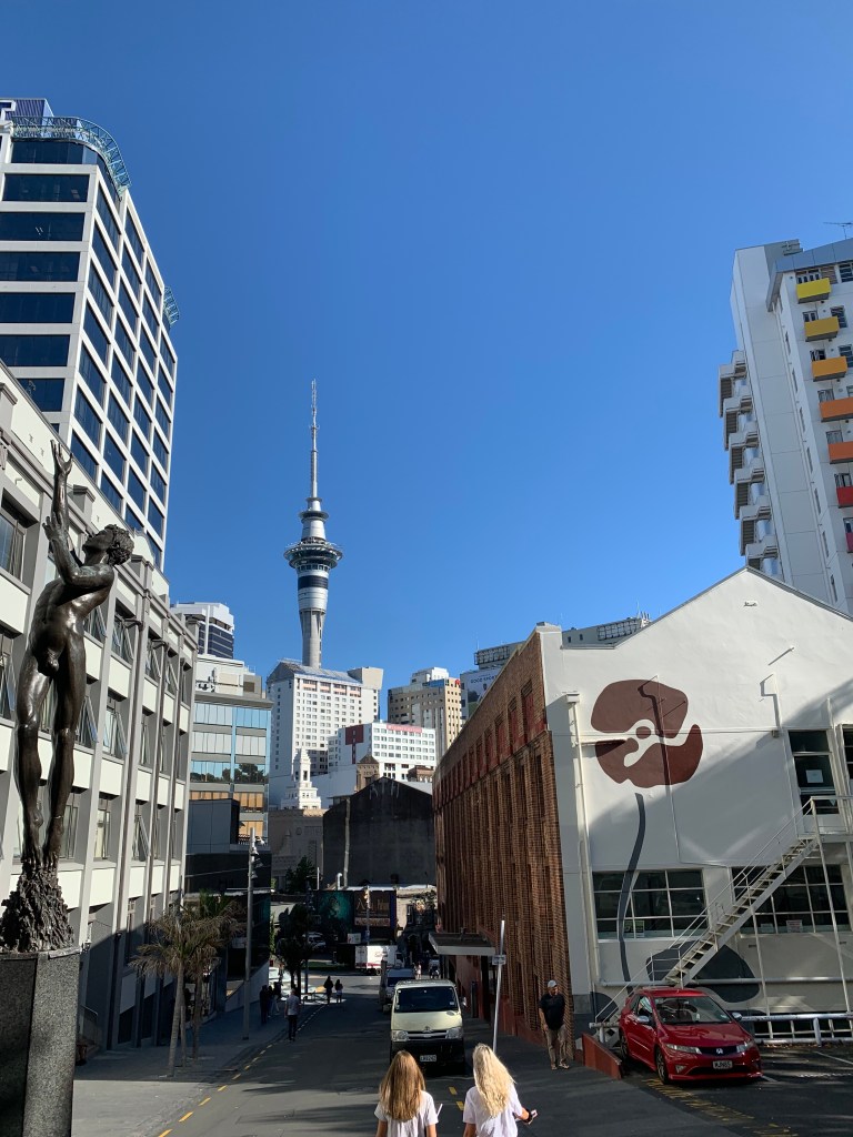
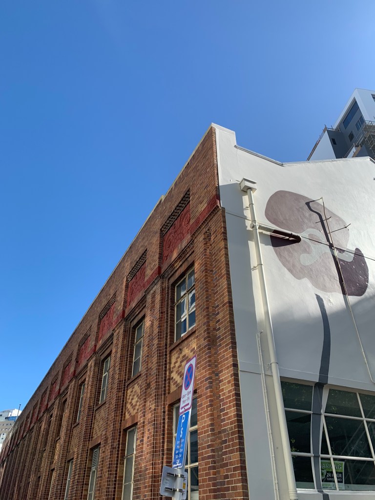
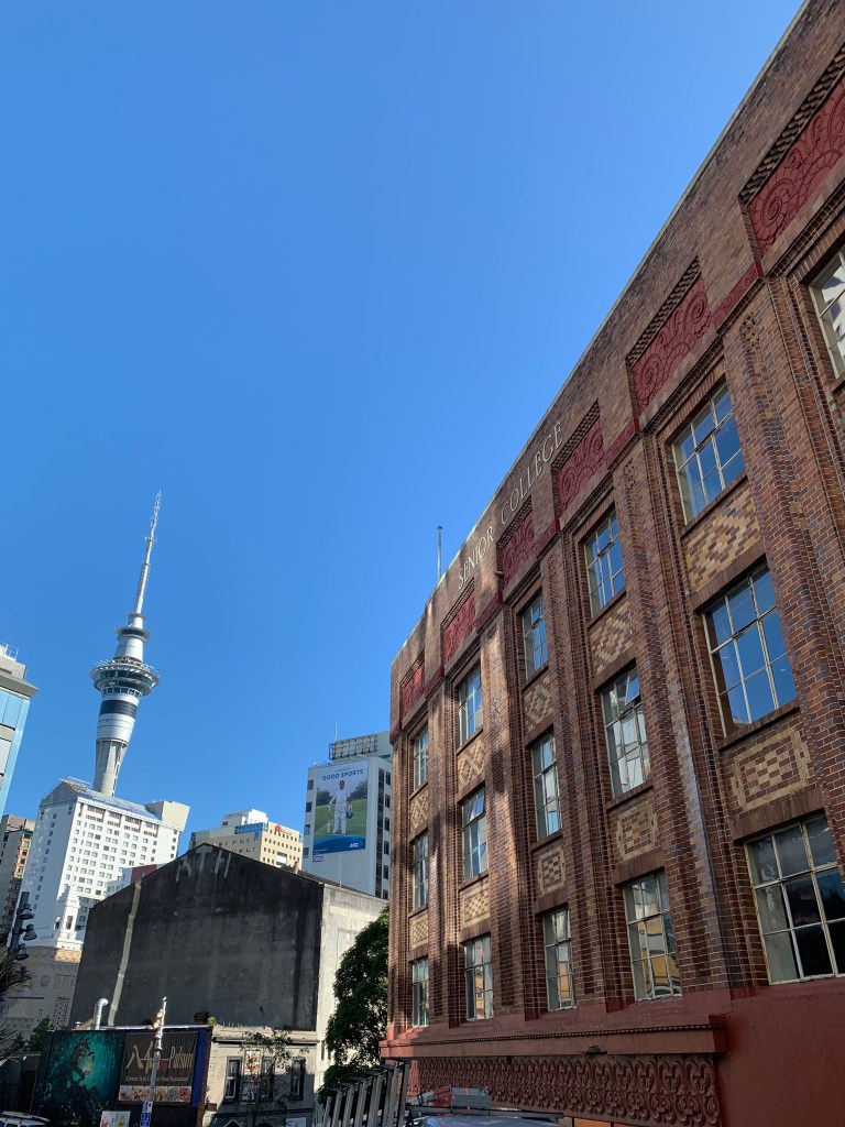

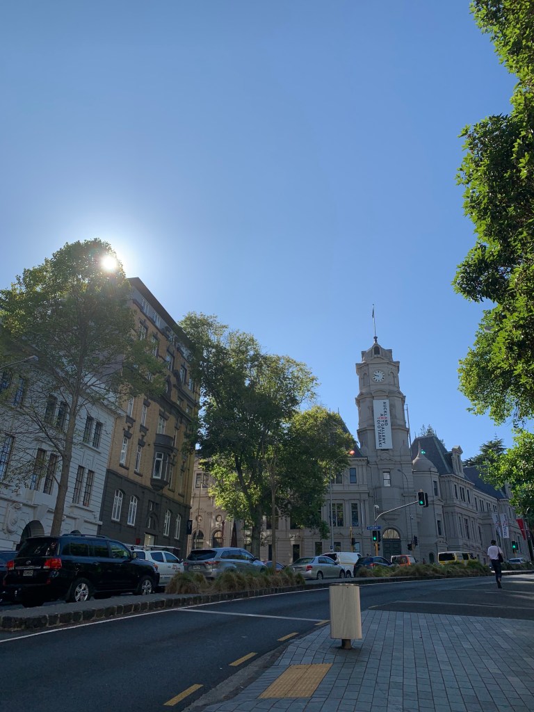
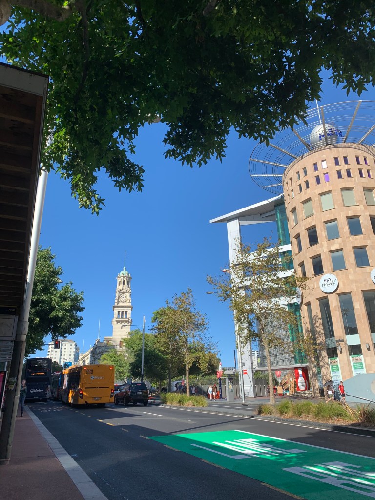
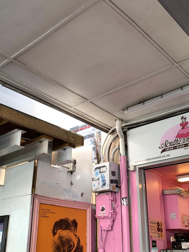
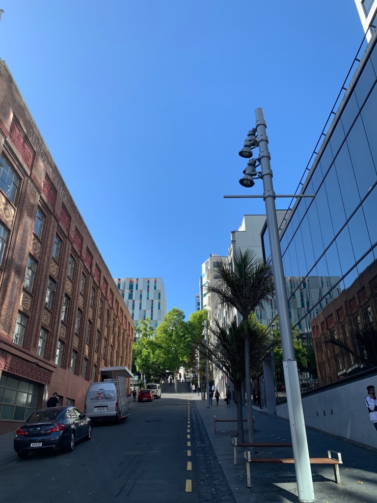

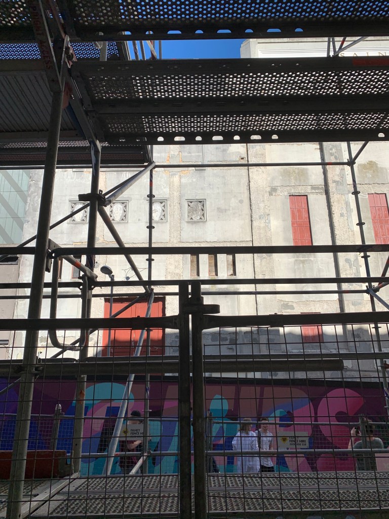
Following along from our walk in the city, I reflected back on key observations that I noticed in relation to how colour is deployed, utilised and employed within the city and the direct impacts it has on materiality, surface treatments and its overall surrounding environments.
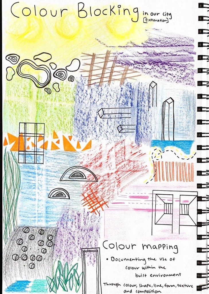
I also created coloured sketches, drawings and textural rubbings from my observed surroundings whilst on our walk in the city.
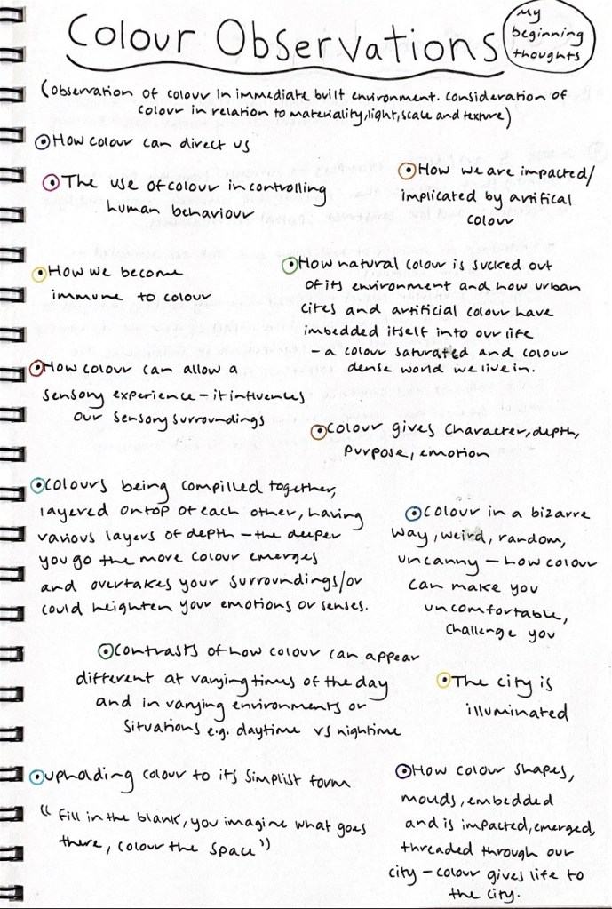
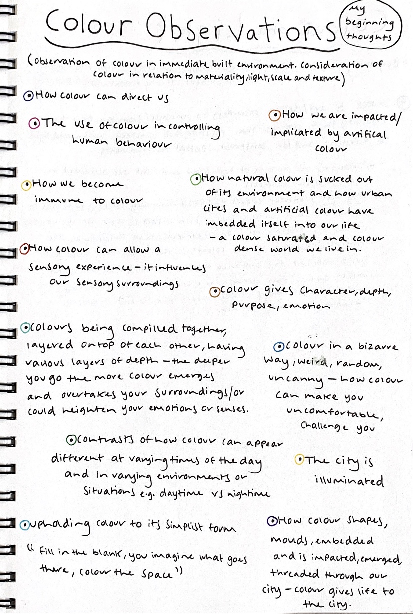
During our walk I also had multiple collaborative discussions with others surrounding their perceptions of colour, not only in a visual, aesthetic sense but in a more meaningful and purposeful way. Beginning to consider questions of how does colour impact us, what is the purpose of colour and what are some ways that colour can be utilised, transformed or even manipulated within a space? I found it particularly interesting how we all had such unique, yet distinctive observations, interpretations and ideas towards colour and its meaning. Below are some of my beginning thoughts around the concept of colour and its affects.
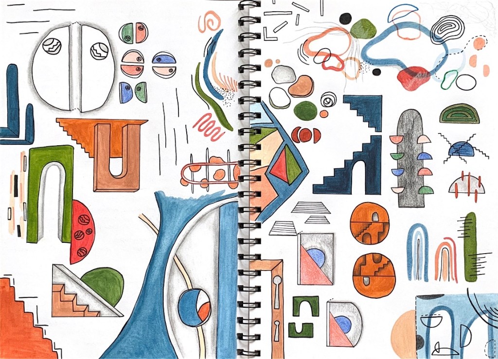
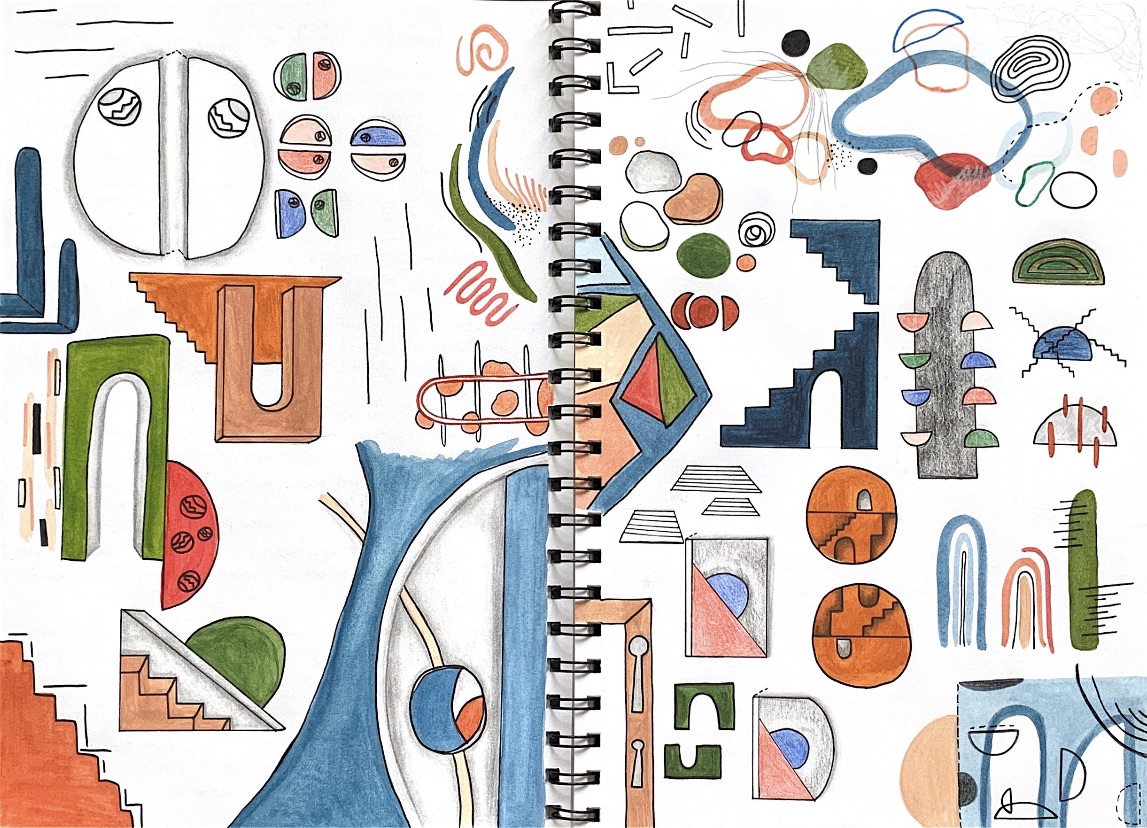
After walking through the city and colour mapping the various patterns, shapes, colours and textures I noticed, I began to generate colour schemes, exploring the array of colours present within the cites built environment. I wanted to establish an overall colour palette that references to a vast range of colours, in order for me to start grouping together selective colours that could be employed within my design.

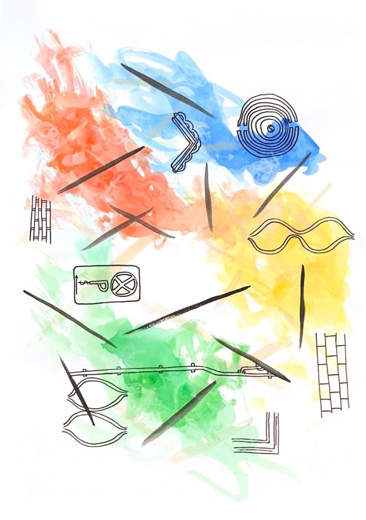
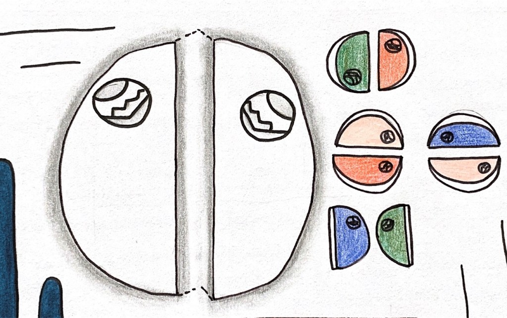
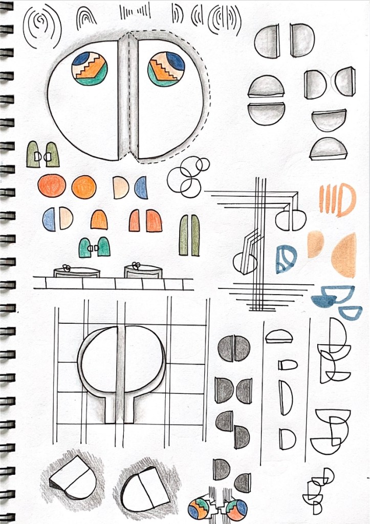
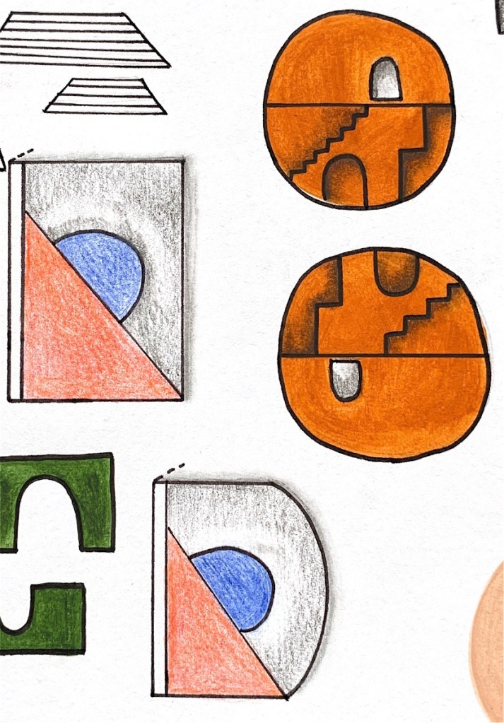
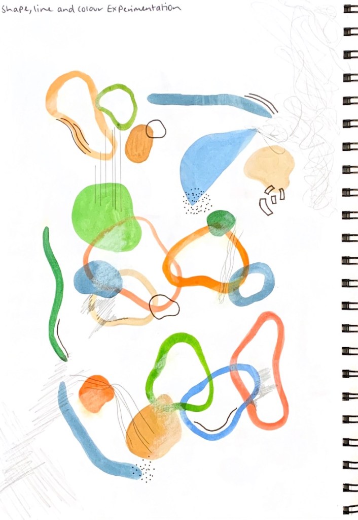
I also started to play around with shapes, line and patterns, based off observations from my colour mapping notes and sketches, by using different colours and creative mediums to experiment with layering, juxtaposition and contrast.


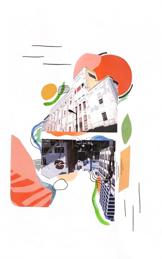
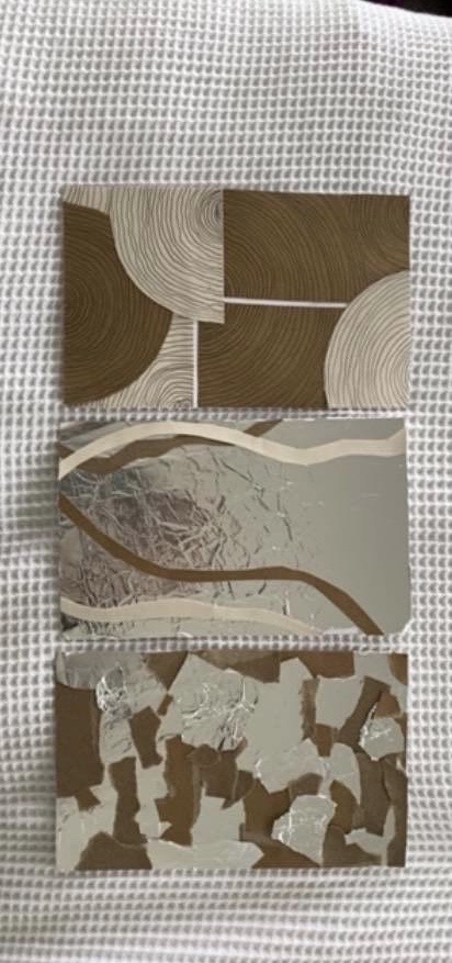
Developing from the colour mapping exercise and our observational findings of how colour is deployed in a city block, we begin constructing a collage/assemblage based around these findings. Before creating my finalised collage, I wanted to experiment and practice playing around with colour, shape, composition and layering within a means of assemblage. I decided to test out two different medium approaches, with one collage being constructed from magazine cut outs and the other incorporating water colour. Below are the practice collages I made exploring these aesthetic and medium components and how I could utilise them within my collage.

Following from these various experiments, I began to sketch out some planning layout designs for my finalised colour collage, combining together different elements of colour, shape, line and pattern.

For my final colour collage I incorporated together and experimented with a range of colours, shapes, line and pattern. Applying my observations of colour within the built city environment, my collage consists of bold, contrasting colours such as vibrant warm tones of red, mustard yellow and pink as well as deep blues and sage greens. My collage composition focuses around a mirrored layout where I have used photographs taken of the St James Theatre and cityscape from our class walk in the city. Surrounding the images I have juxtaposed solid coloured shapes against black ink line patterns in order to frame and merge together both building photographs. In my collage I wanted to capture the variety of colours and patterns I observed within the city, yet taking more of a playful approach that emphasises and enhances their presence.
Design Workshop 2
27. 02. 20
Today in class we began the workshop by having collaborative group discussions about our colour collages. In my table group we each reflected on our collages and how we have collaged colour in relation to the walk in the city, as well as how we have sequenced, juxtaposed, layered our sequence of colours. Getting to share and talk about our work with others was extremely beneficial as we could see and understand new approaches, methods and perspectives to how we all view colour in the built environment.
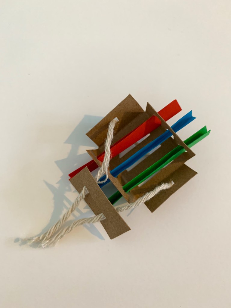
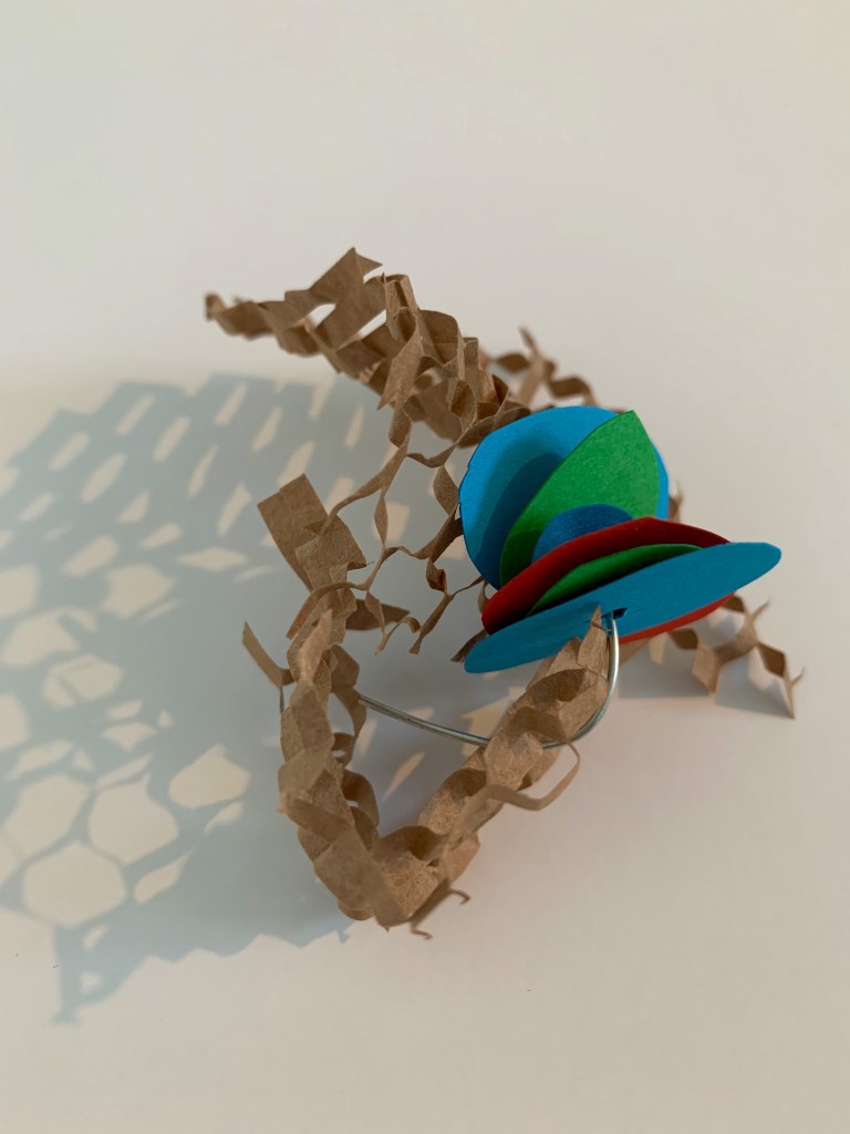
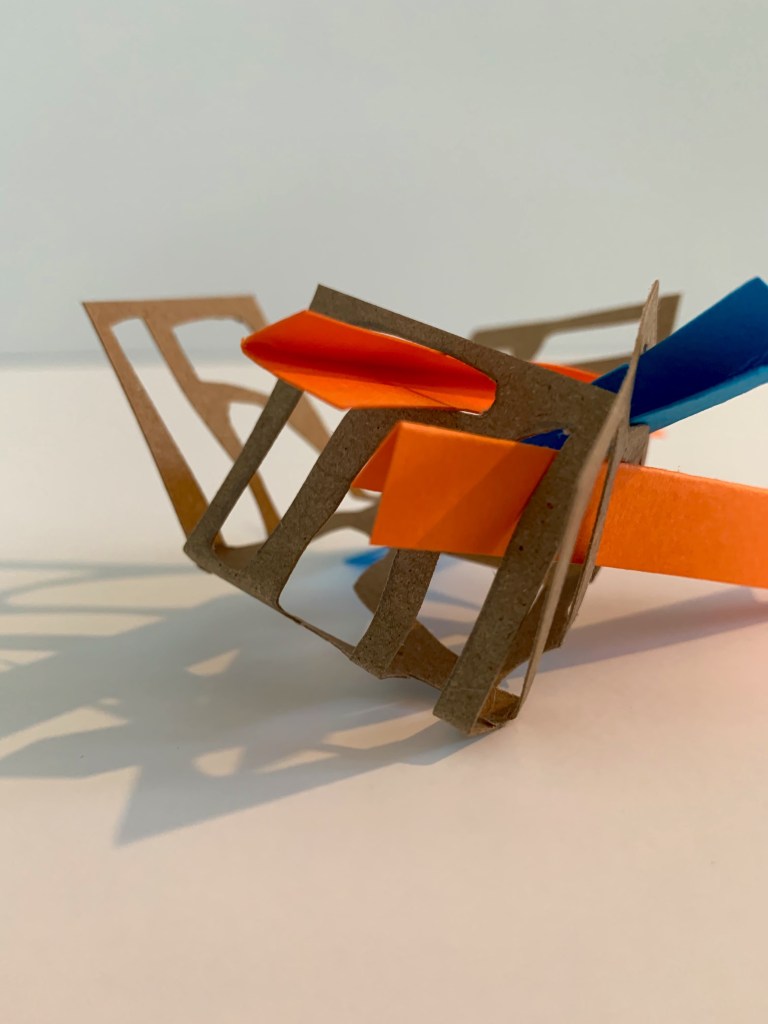
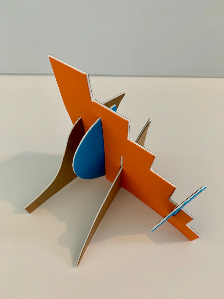
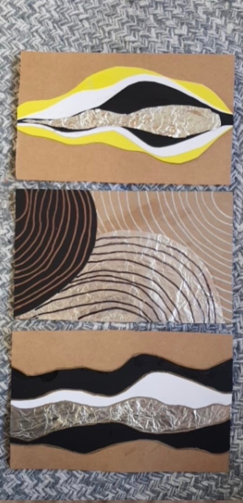
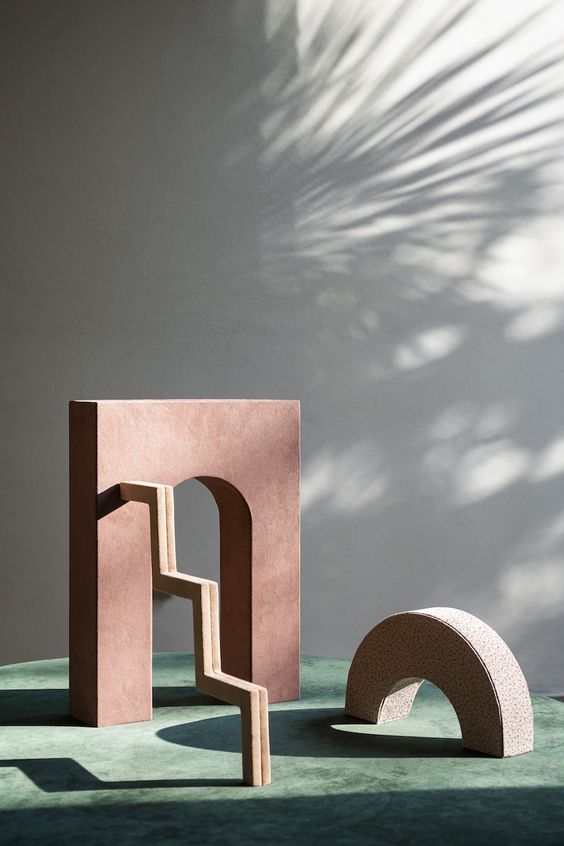
In this design workshop we were focussing on the production of 3D collage models, starting to consider what aspects of our 2D collages could be developed into 3D forms and spatial qualities/atmospheres. We were asked to produce 3 intersecting colour models within a spatial volume of 100mm x 100mm x 300mm. The first model I produced intersects volumes and light, considering how one volume connects to another.
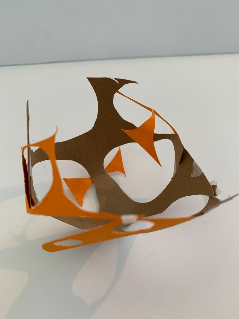
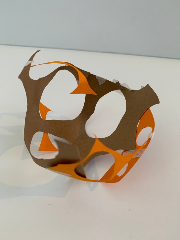
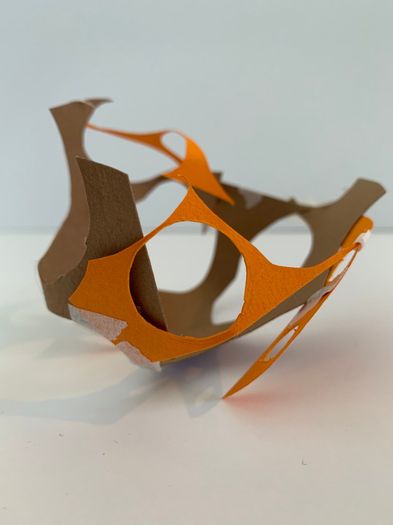
The second model I produced explores surface textures and shadow, considering what affect does texture and shadow have on colour within my model.

The third model I produced connects my first two models, considering how to modify them in order to achieve the desired connection and transition between.
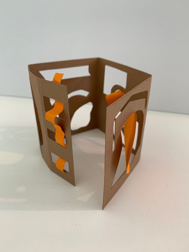
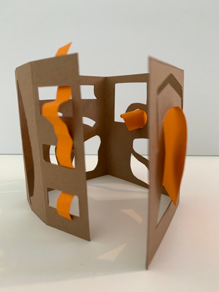
Below are photographs of all my models placed together.
While creating these models inspired by my colour collage, I utilised some similar bold, striking colours that were present within my collage, colours I had observed earlier in the week when walking to St James Theatre, just more dominant to enhance its presence and contrast. This experimental approach and notion of colour I could consider adopting within my future design intervention into the St James foyer space.
Week Two (Group Seminars + Colour Complex) – Design Workshop 3
03. 03. 20
This week in class we were asked to develop and create a colour research seminar in small groups of 5-6 people that would be presented to the class the following week. My groups seminar topic was Colour + Light, where we were to explore and analysis the topic through visual and written research. Our group was given a selection of artist models and informative questions to research into for our presentation. We each decided to select and focus on our chosen question, with mine being ‘Choose 5 art/design precedents to analyse (from the past to the present) that explore the relationship between colour and light to represent and/or construct spatial environment.’ By comparing and contrasting artists from different time periods it will help us gain a better understanding of the potential for colour to augment/alter different environments at different scales in different places.
For my specific research question on Colour + Light surrounding different artist model examples, I developed analysis pages summarising my gathered research and findings. This research I will implement and use in our groups seminar presentation. Featured below are some of the main resources I used for my research investigation into Colour + Light.
Phillips, R. Master Artists and Their Relationship with Colour. Retrieved from https://www.healing-power-of-art.org/master-artists-and-their-relationship-with-color/
Head for Art. (2016). How Artists use Colour. Retrieved from http://headforart.com/2016/12/16/how-artists-use-colour/
ITMO.NEWS. (2017). The History of Light in Art. Retrieved from https://news.itmo.ru/en/news/7179/
Woodward, W. (2016). Light and Colour in Art. Retrieved from https://library.si.edu/event/light-and-color-art
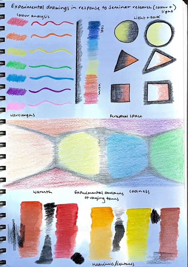
I also produced some experimental sketches in response to our groups collective Seminar Research, forming explorations of colour and light through tone, hue and shades being directly applied to a surface, as well as colour analysis.
In the following weeks Design Workshop 5 all groups presented their Seminar Presentations to the class. Below is the link to my groups final seminar presentation on Colour + Light: https://docs.google.com/presentation/d/1JfD6YPlGRt8kgytA2yi8H9_iPbagPXAMWt0FJRfsGm4/edit#slide=id.g80edc831de_2_49
Design Workshop 4
05. 03. 20
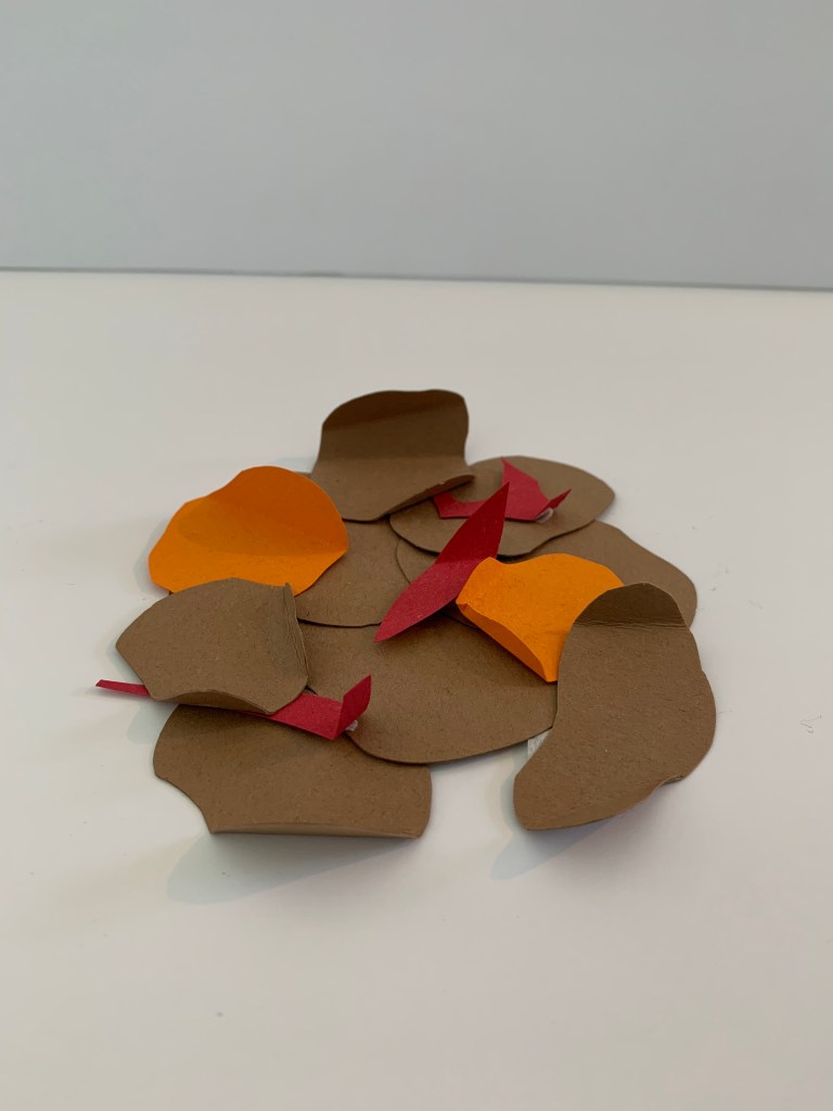
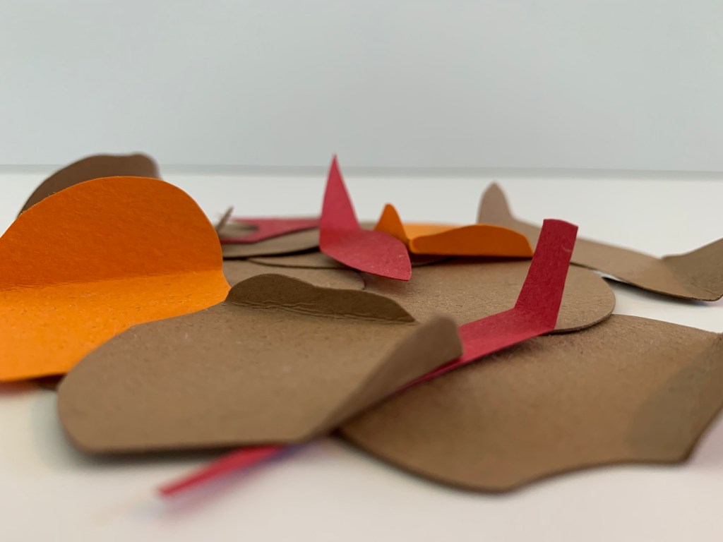
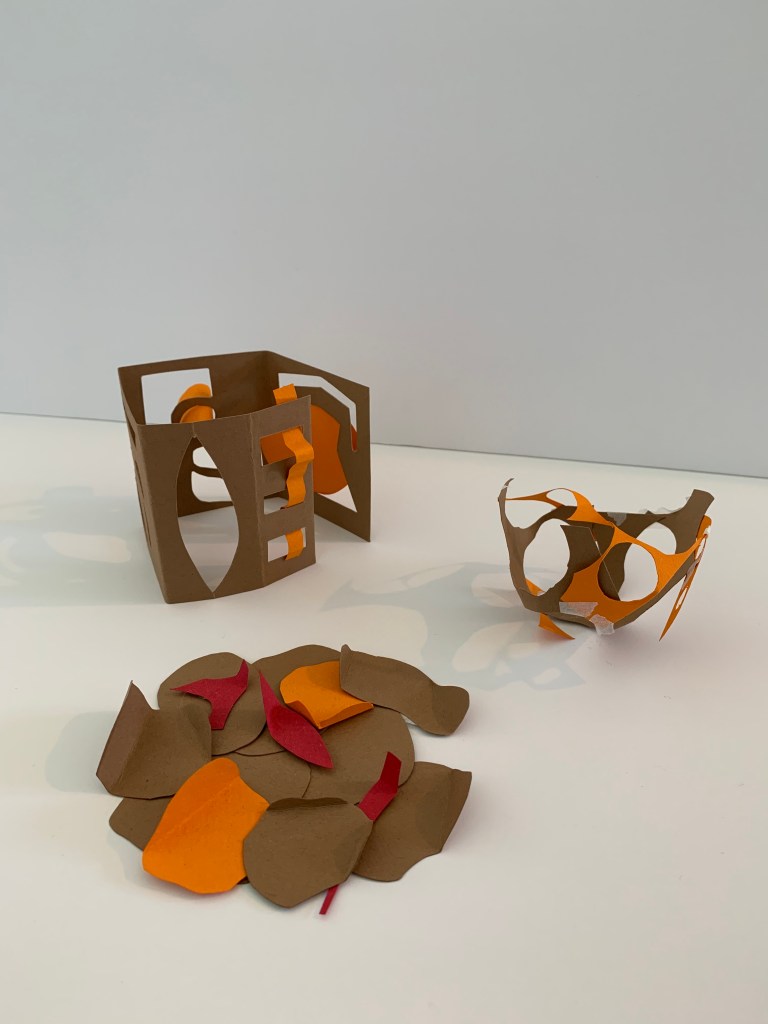
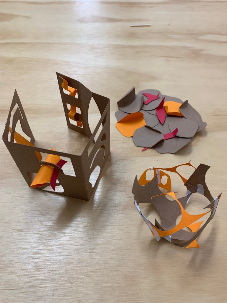
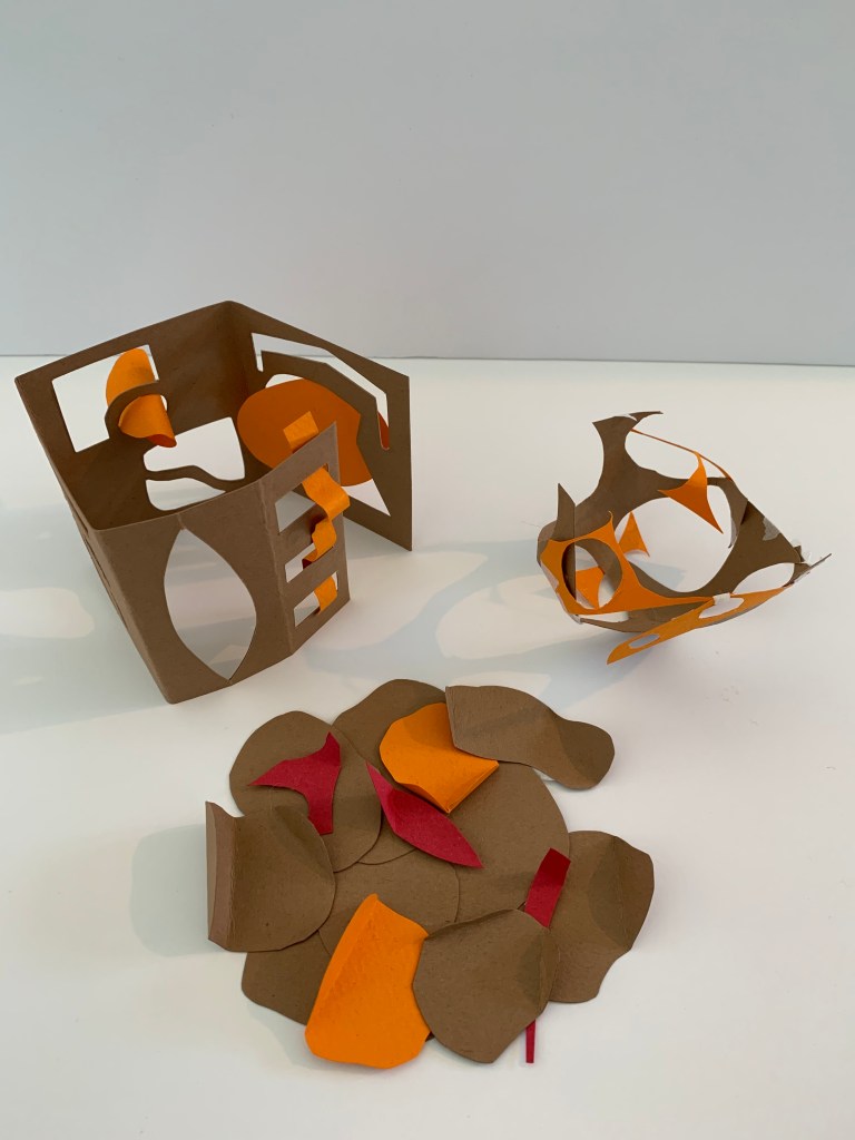
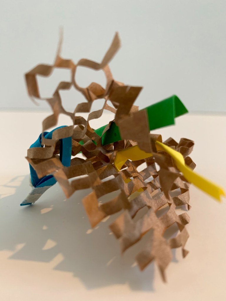
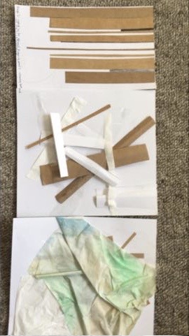
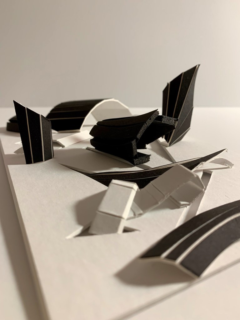
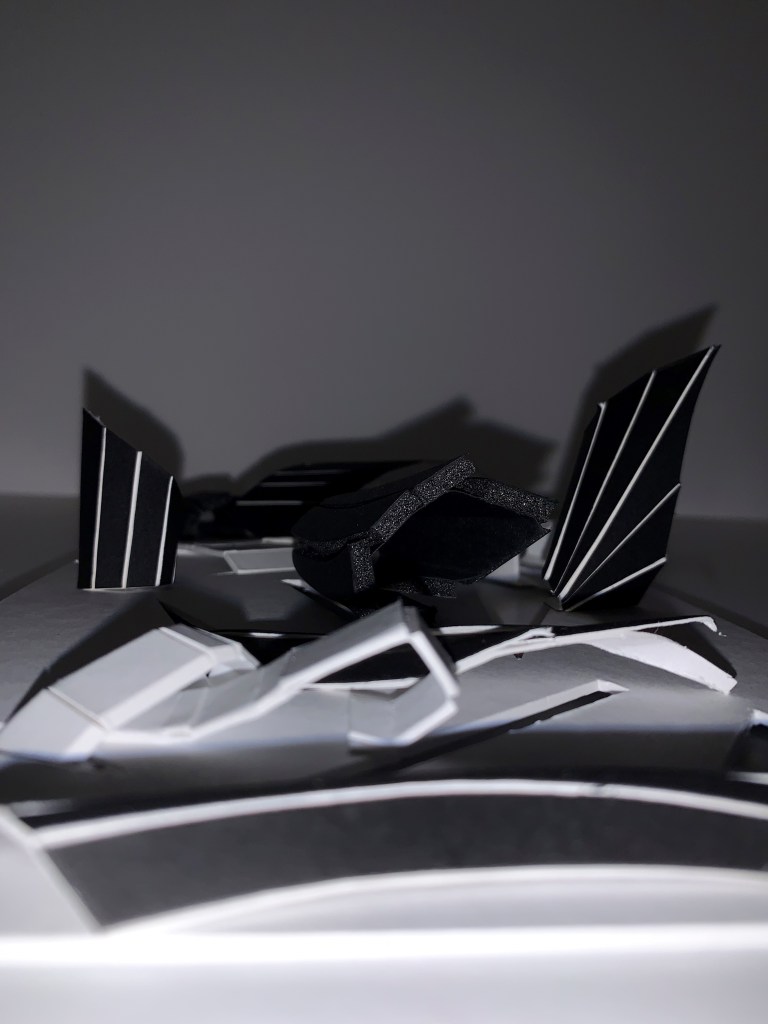
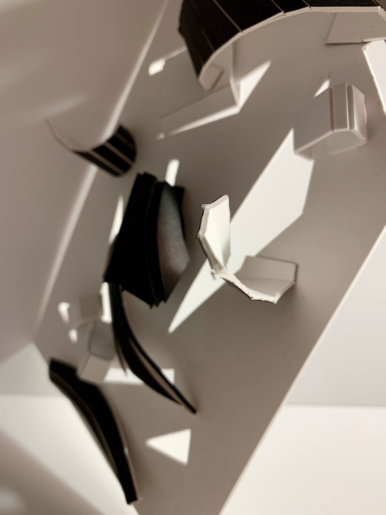
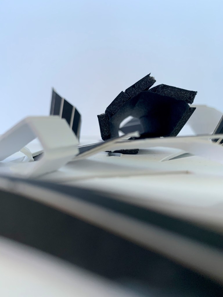
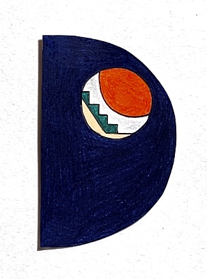
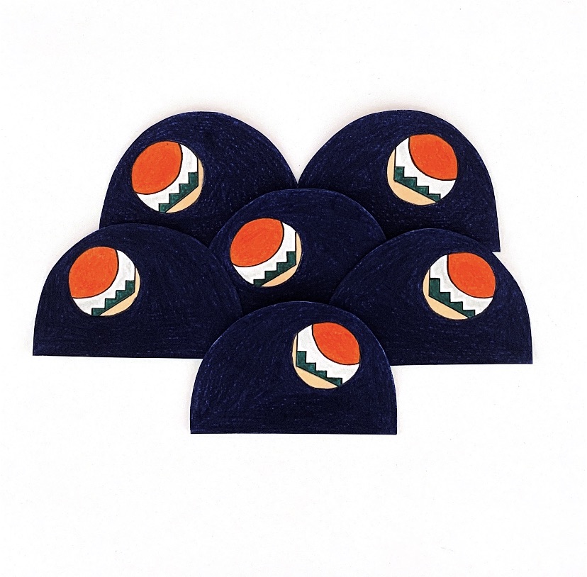
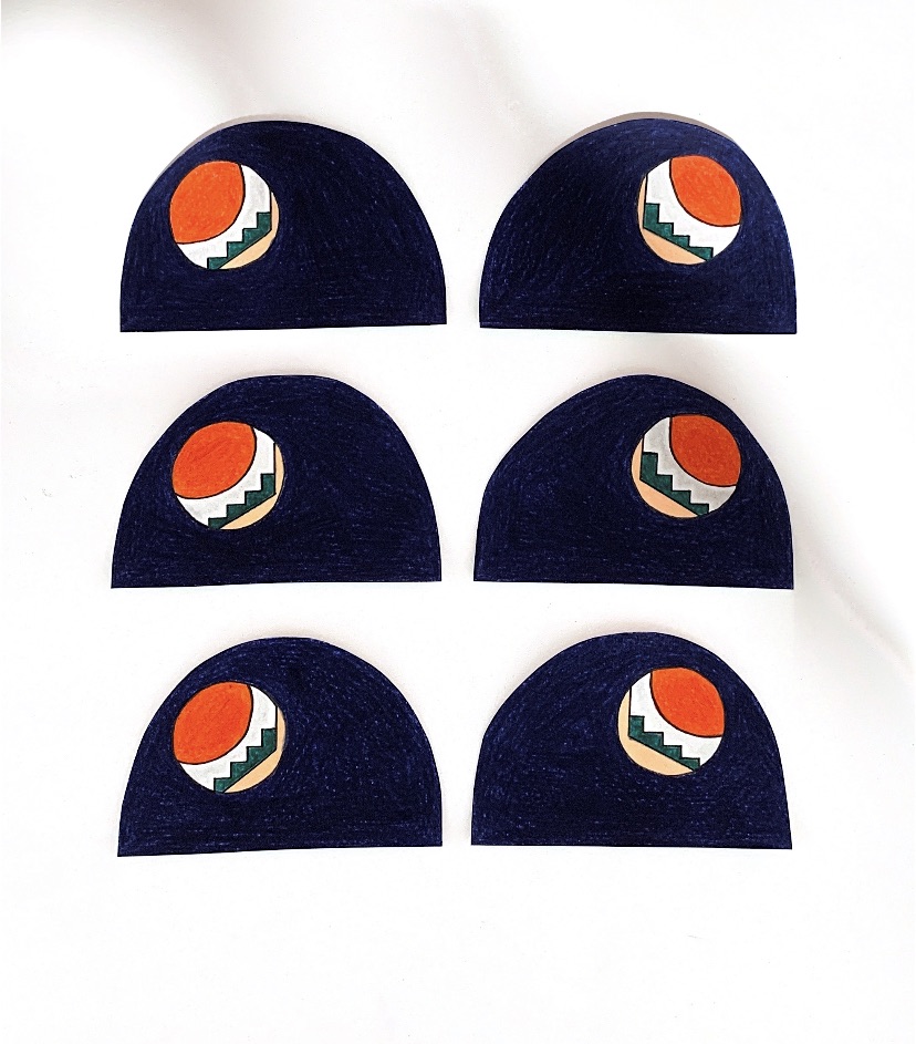
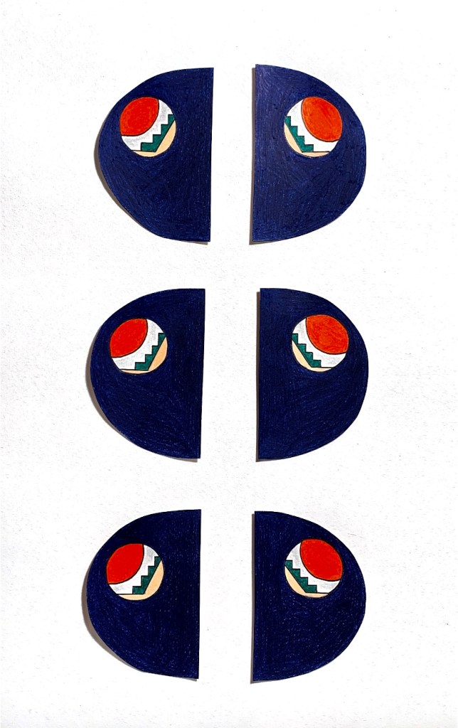
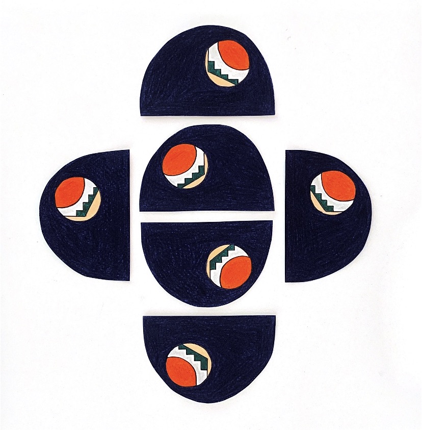
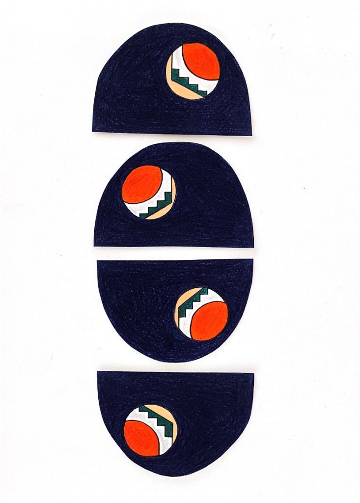
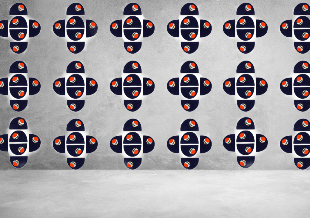
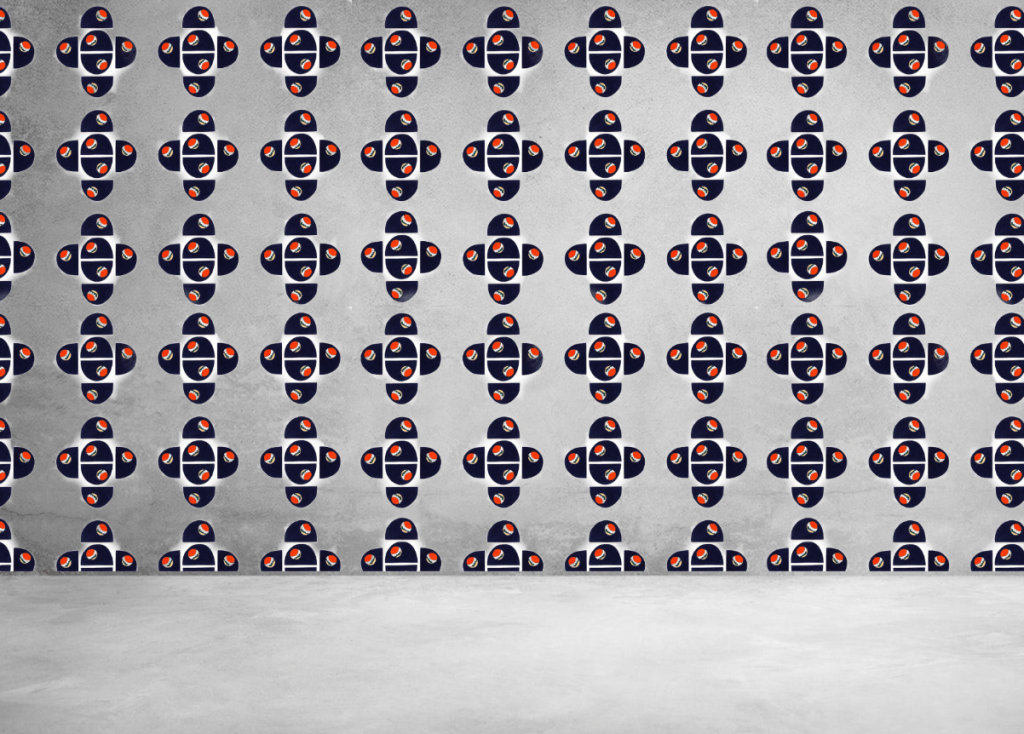
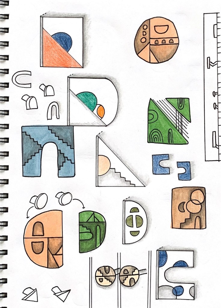
As part of developing visual research for our seminar presentation, today’s workshop was centered around ‘Colour Complex’, an iterative model making exercise that seeks to produce a series of design iterations that connect aspects of our theoretical and practical research. The colour complex method allows us to produce x 25 small models that represent and communicate ideas surrounding our topic ‘Colour + Light’, investigating the interaction of colours, analysing an aspect of our seminar research or modelling a significant detail. I began by starting the complex with these three models which will allow me to construct and fill in the remaining spaces.
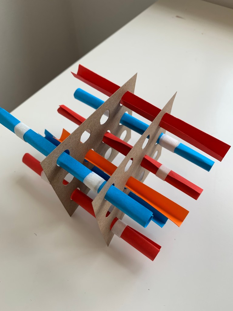


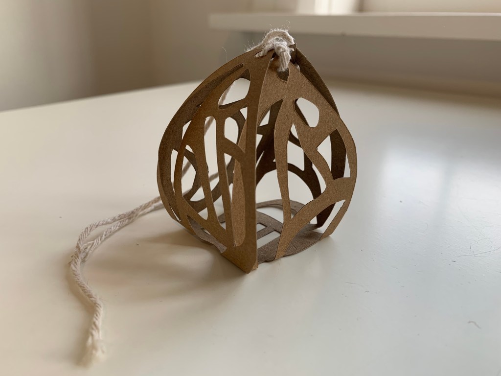

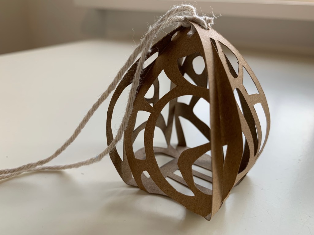


During the model making workshop I completed over half my iterative models, so in order to complete the complex I went home and finished all x 25 models.
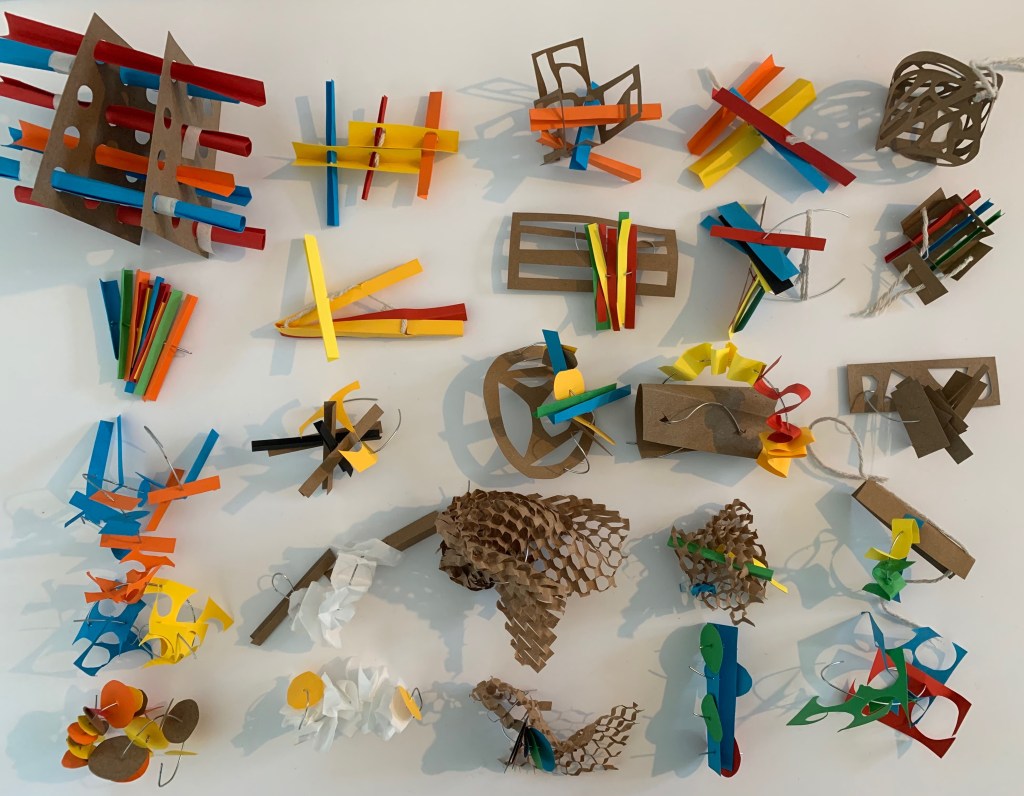
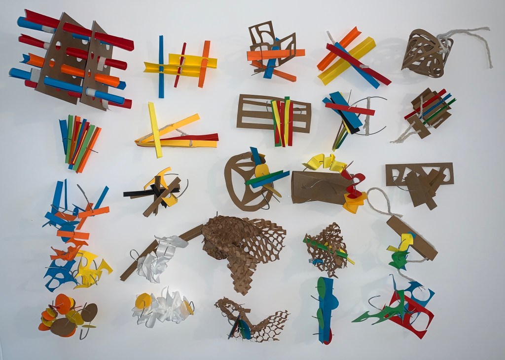
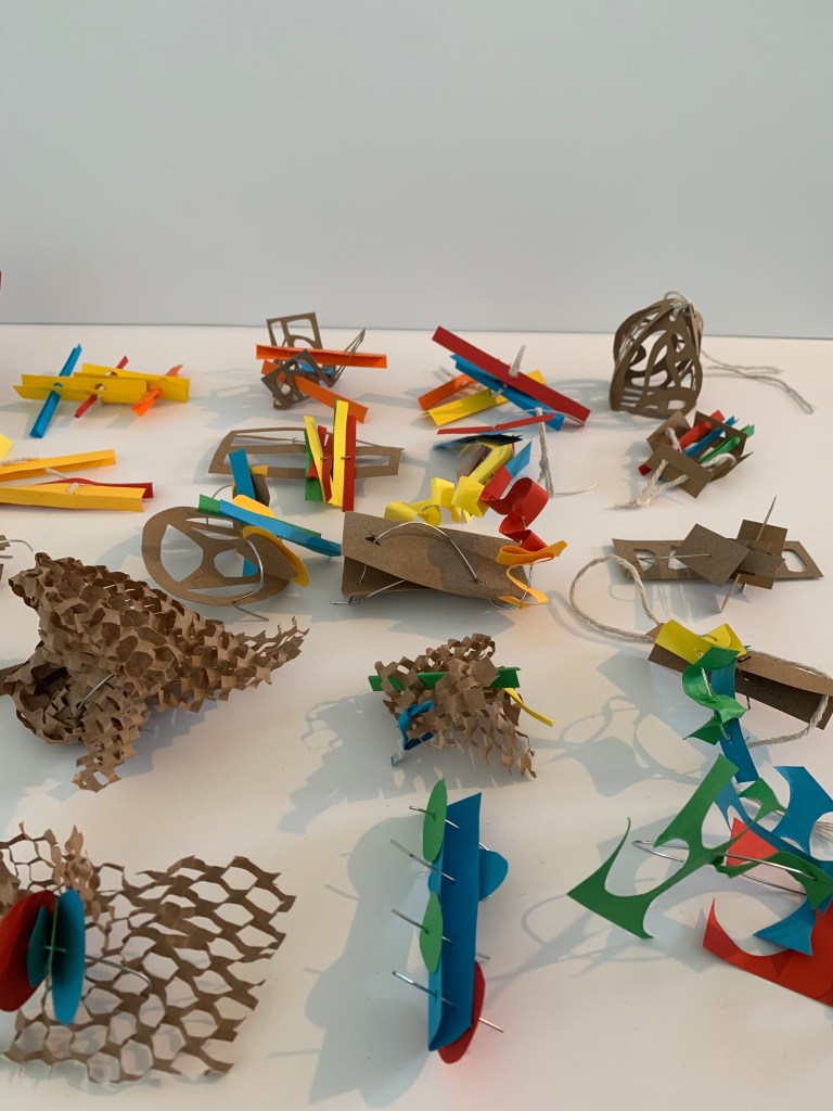
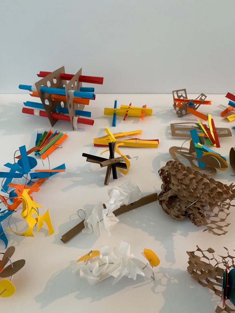
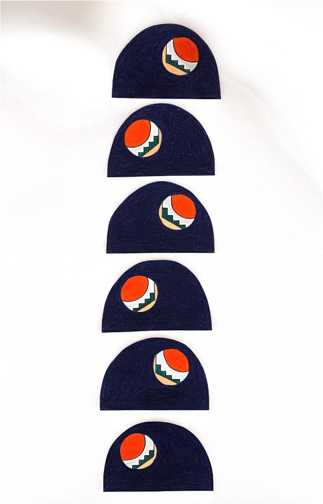
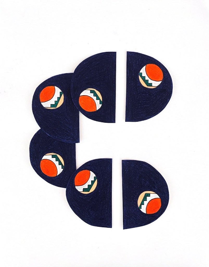
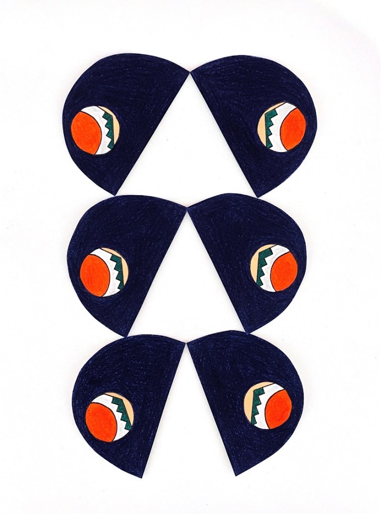
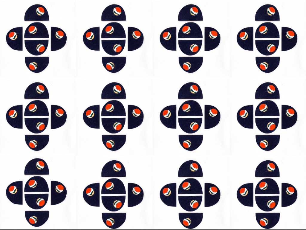
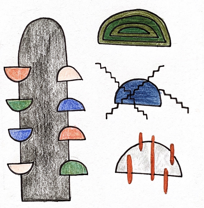
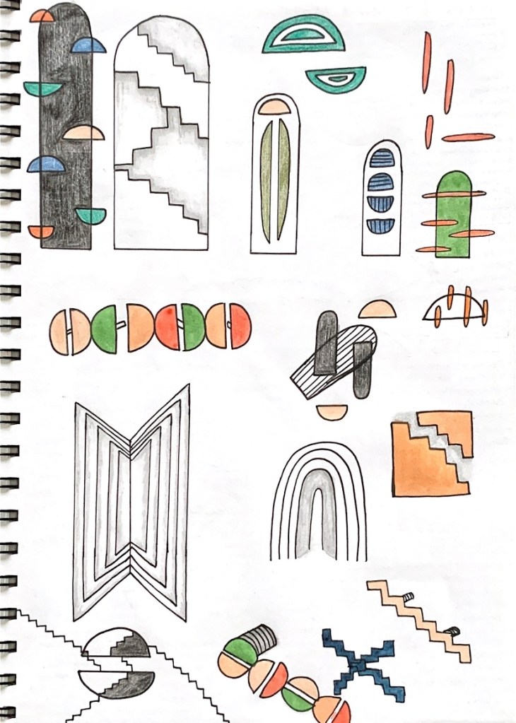
For my overall Colour Complex models I began by exploring light, shadow and contrast and how colour could be applied, embedded or entwined in between different surface materials. I worked to establish a range of models that experimented with this idea by continuously changing, developing, combining and manipulating aspects from each model to formulate new model ideations. I utilised different shapes, cut outs, layers and materials to play with light and colour and how each element impacts each other. The material and creative exploration I undertook during the Colour Complex workshop will be an extremely valuable archive to draw upon while progressing through my future design ideas and concepts.
Using all the research I gathered for my seminar question, I was able to experiment with light and colour in a multitude of ways, connecting to various artist models and their personalised applications and practices that emphasise light and colour. Each artist model I studied had their own unique approach to incorporating light and colour within their works, which through my Colour Complex models I was able to explore these different approaches. Particularly I wanted to play around with the idea of harmonising and intertwining light and colour together, as well as use energised, vibrant colours that juxtapose and contrast against each other to create shadow and depth. Featured below are some of my Colour Complex models that experiment with light and colour in diverse ways.

Week Three (Site Analysis) – Design Workshop 6
12. 03. 20
Today in class we began the workshop with a context talk surrounding site analysis and some important tips and insight into site documentation and how to compile a sequence of drawings that communicate our key findings. Some of these tips were to pace it out, sketch lots (focusing on key elements and areas of interest), scale, use a range of mediums and layering for exploration, and finally measure things with your body as its much easier to remember when its in relation to you. Constructing a productive, in depth site analysis of the St James Theatre will allow us to understand the space, its characteristics and conditions as well as patterns of behaviour and experiences that circulate it.
For this weeks workshop we were lucky enough to be shown around the St James Theatre by a man from ST James Buildings, the developers for the restoration project. While walking around the site I was really interested in the history behind it, and how the different spaces operated back when the theatre was functioning in its original condition. During the site tour and while we were walking around the theatre, I wrote down many of the main points talked about in relation to past use, materiality and its current operations.

St James Theatre History
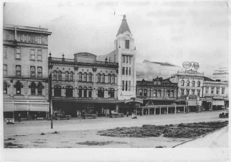
Opened in July 1928, the St James Theatre is a heritage stage theatre and cinema located on Queen Street in Auckland, New Zealand. The architect of this building was Henry Eli White, whom also designed many other famous theatres in Australia and New Zealand including the State Theatre in Sydney and the St James Theatre in Wellington, in which it was deemed he used the same plans for. He designed the St James Theatre for its owners Sir Benjamin Fuller and his brother John Fuller. Originally it was built as a replacement for the older Fuller’s Opera House and was designed for live performance of vaudeville acts, musical and comic entertainment. The St James was quickly adapted to the newly popular ‘talking pictures’, however with the addition of a film projector 18 months after opening. The St James has accommodated live performance and/or film during different periods of its lifetime.
1930s or very early 1940s 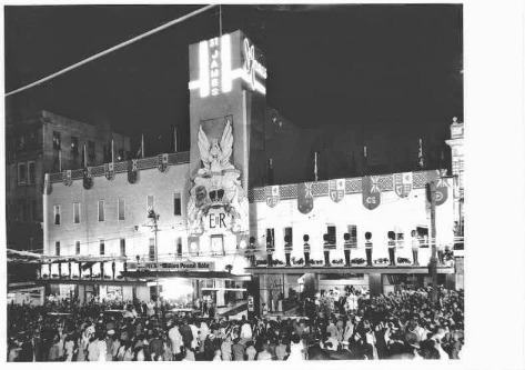
1953 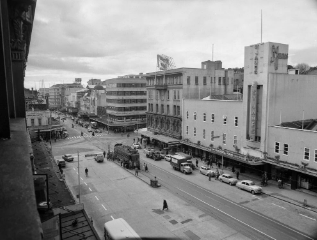
1956-1957 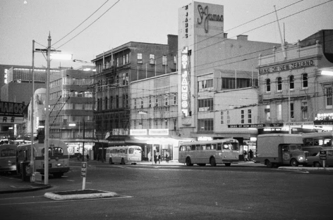
1970s 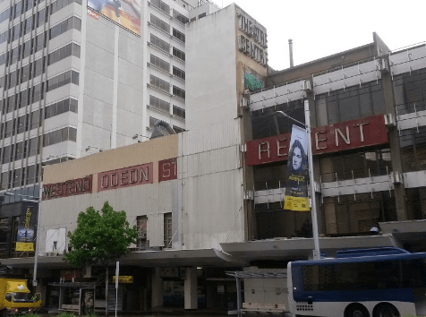
2014 
2020
St James Theatre constructed of three levels with each containing its own lobby, to establish and make for no interaction between the different classes of people whom attended the theatre. The theatre seats 2000 people, with the layers of seating being designed for each level to not be able to see any other levels while watching a show/performance. The ‘gods’ seating was deemed the worst seats in the theatre, being right at the back up at the very top level. The ‘gods’ lobby was also used as a nightclub called The Grand Circle for the last 15 years it was open.
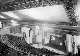
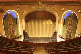

The theatres overall style is an honest reflection of the architecture and designs used in theatres in the 1920’s, however the St James has undergone several major modifications since its construction. A year after it was finished, cinema projectors were added due to the popularity of cinema. In 1953, the buildings facade and vestibule underwent renovation for the visit of Queen Elizabeth II, covering the exterior in sheets of metal in an attempt to give the building a more modern look. However its Spanish-Renaissance style interior is well preserved. The main auditorium has three tiers of seating plus boxes, elaborate lighting and ornate plasterwork decoration; items of heritage value include statuettes, the terrazzo flooring and the grand marble staircase. Sadly in 2007, a fire damaged the theatre and it has not been open to the public since then.
In terms of restoring the theatre, in 2010 there was a proposal for St James to be restored as part of a new Convention Centre. However in 2014, the theatre was purchased by Relianz Holdings who confirmed plans to restore it and build the St James Suites apartments on the adjacent site by as early as 2018, but by July 2019 repairs were at a standstill after a bank withdrew $90 million worth of funding for the apartment complex. Their plan is restore the theatre back to the style used in the original 1928 design, choosing a time period so that the theatre isn’t mixed with old and modern styles.
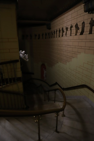
From our site visit some of the notes I made with regards to restoration aspects within the theatre were: Walls have been plaster rendered to look like brick, the statues were initially bronze and have been painted to look like marble, with each restoration colours have gotten darker in order to hid the dirty appearance lighter colours portrayed, the theatre has been painted with cold, dark colours yet originally had warmer tones (they plan to bring this back), the whole building is mostly brick yet has been plastered to look ‘pretty’ – an illusion decorated with intricate patterning, currently the building has temporary lighting as an electrical fire made power unsafe to use and all archives are stored up on the gods level. The theatre is essentially two tall buildings with a suspended roof between and cast iron poles holding it up, however the building is receiving Seismic upgrading. This means the theatre is being put on large roller skate like bearings where it bounces during earthquakes taking force and pressure off the building. This solution means that less restoration will need to be done on the structural walls but the building will need a new foundation. In order to restore the site back into an operational theatre, plans are reliant on the neighbouring development. The space will be used for concerts, graduation ceremonies and small shows due to the small backstage area.

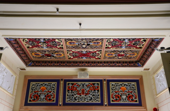


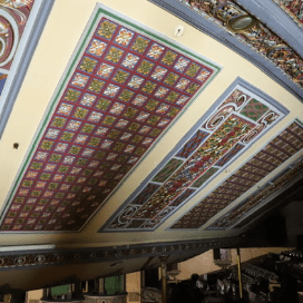
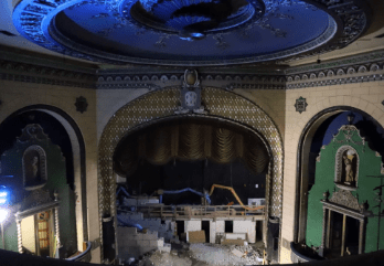
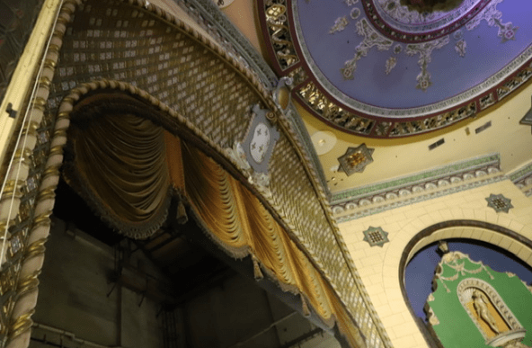
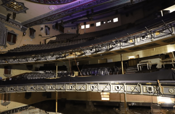
Whilst observing the site I noticed its bold, vibrant colour palette consisting of deep blues, reds and yellows. Majority of colour present in the theatre was through the walls and ceilings which were decorated with busy yet intricate patterning. Lighting within the theatre was quite minimal, as I observed multiple areas within the site that lacked natural lighting. A lot of spaces in the theatre are dark and inclosed so aspects of artificial lighting will need to be included. In the foyer space there are doorways at either end allowing for sunlight to stream through that specific area.
Getting to visit the St James Theatre and get toured throughout the entirety of the interiors seeing, observing and analysing its original details, features and structural layout is extremely beneficial to developing our understanding of the site as well as helping us to visual potential design ideas and concepts for our intervention. From visiting and walking around the site, I now have a much better perception of scale within the space and its overall layout. After our site visit and seeing the space, I still really like the idea of the site being a passageway or walkway connecting between Queen Street and Lorne Street.
Site Analysis
I began my site analysis by mapping out the location and orientation of the St James Theatre within Auckland city’s built environment, the pathways, routes that intertwine, interact, merge and connect within the city, in order to develop a greater understanding of its contextual position and connection to its external surroundings. I also decided to highlight out some other key buildings that uphold a similar function and purpose to the St James Theatre such as other performing arts theatres like The Civic and Aotea Centre. The array of these kinds of buildings present within the city environment showcases just how influential and meaningful they are towards creating and establishing a major part of the city’s urban atmosphere.
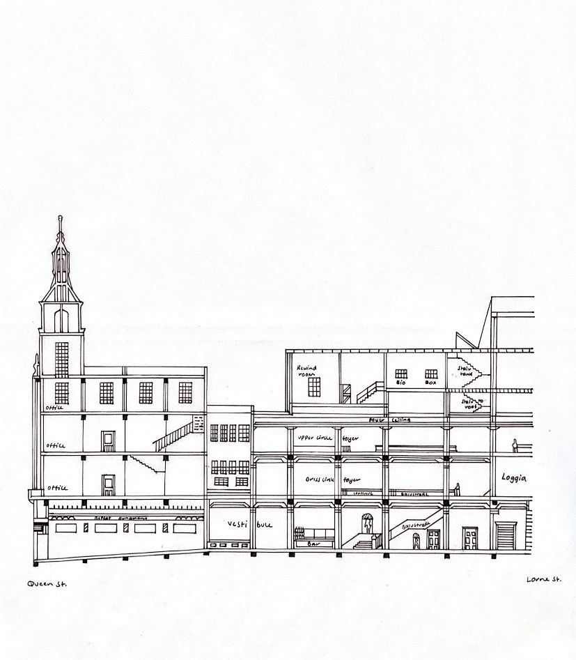
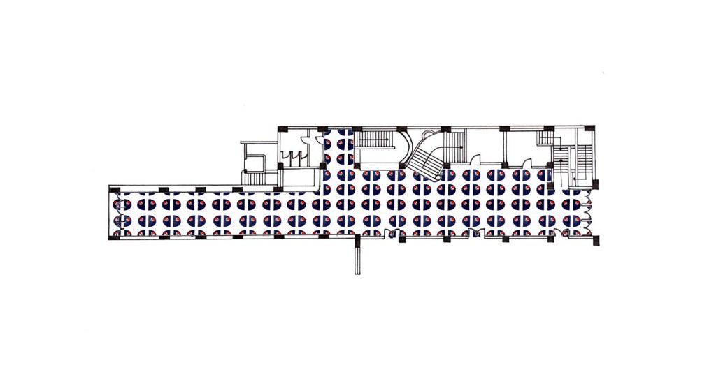
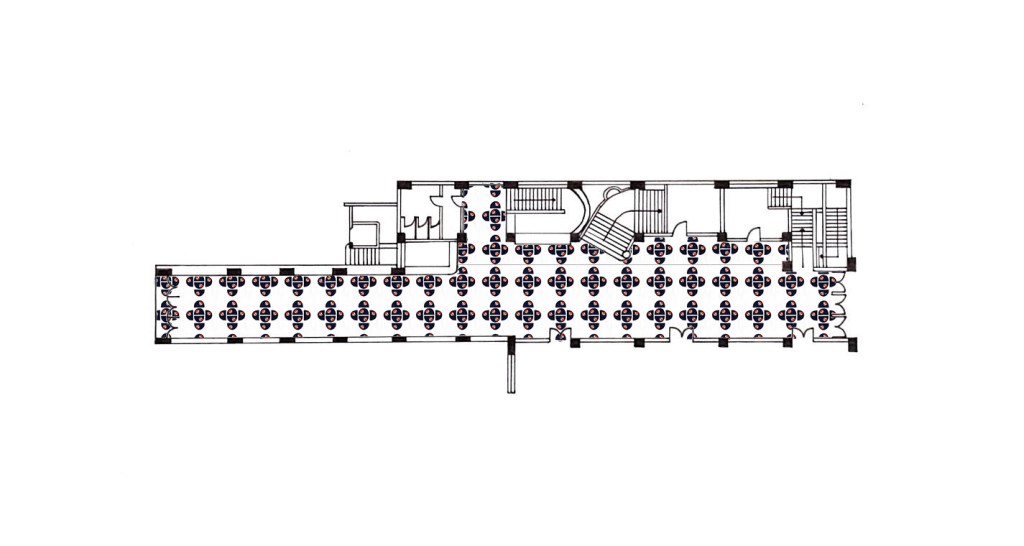
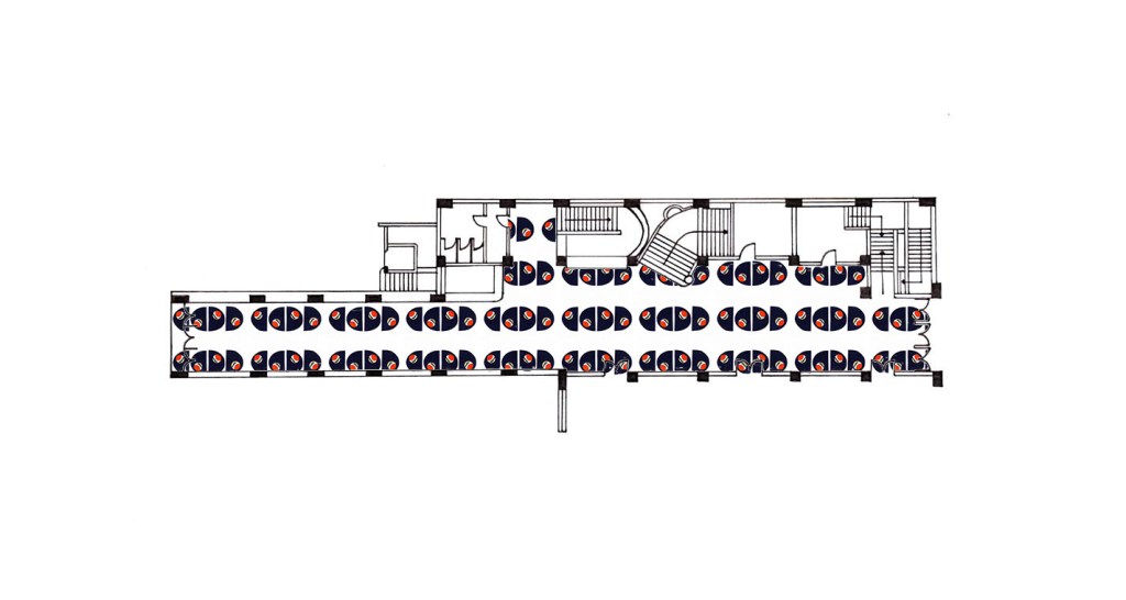
I then proceeded to create a site floor plan and section documentation of the St James Theatre foyer.
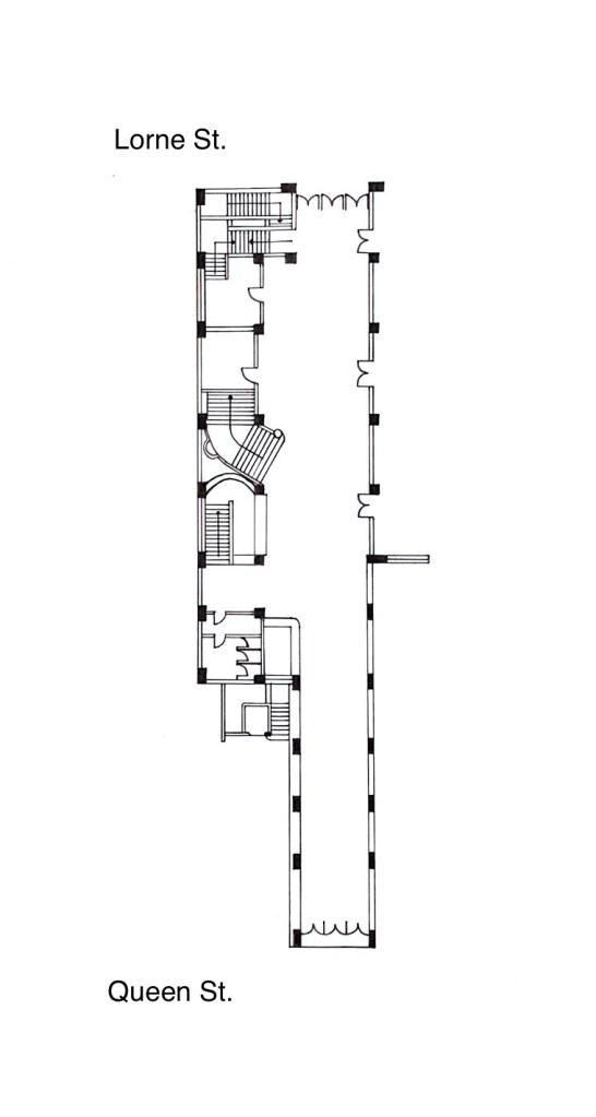
Featured below are a series of floor plans depicting various observational studies done on the St James Theatre foyer space, applied colour, natural light and circulation of people movement.

This site floor plan explores the application of colour used within the St James Theatre foyer space. From our site visit I observed a multitude of bold, vibrant colours, all which highlighted the incredibly intricate and detailed ceilings and doorways. There was a range of warm and cool tones present within the space such as deep blues, bright reds and pale creamy yellows, overall making for a very busy, colour dense space.
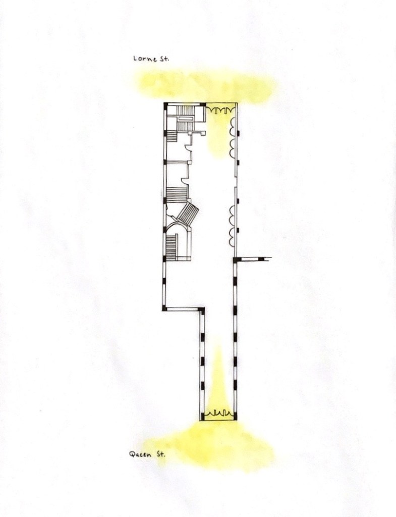
This site floor plan explores where natural light enters into and transfers within the St James Theatre foyer space. During our site visit we were only able to access a section of the space however I understand that there are entrances from Queen Street and Lorne Street, both being the main access points where natural light enters. Due to the natural light sources being present at either end of the site, this means that minimal light reaches the centre of the space. When considering my future design, I will aim to utilise the natural light as well as assess ways in which I can employ additional light into the site.
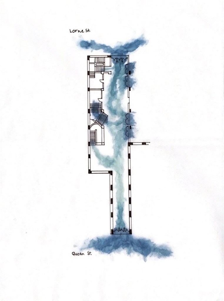
This site floor plan explores the circulation of people movement within the St James Theatre foyer space. This observational study is extremely important as in order to design a comprehensive and functional space, it is imperative to analyse how people will use/inhabit the site. As I am considering utilising the foyer space as a walkway/passageway access between Queen Street and Lorne Street, I need to understand how people will move through it. After visiting the site, I imagine foot traffic would be most busy around the transitional areas such as stairwells and doorways, with regular traffic floating throughout the entirety of the space. I will be taking these observations into account when designing the space in order for foot traffic to flow throughout.
With regards to our programming of the space, we are able to choose to design in a particular area of the site or use the entire designated space. We will need to justify our decisions based on our intervention, programming of space and related atmospheric conditions.
Week Four (Artist Model) – Design Workshop 7
17. 03. 20
So far throughout this creative, design process we have investigated a broad range of topics related to colour and its relationship to spatial practice, however the next step is to take our newfound knowledge and use it to analyse in detail a work by a creative. The creative in which we chose, their concepts/theories about colour will inform the design of our intervention within the St James foyer space.
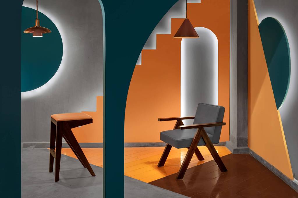
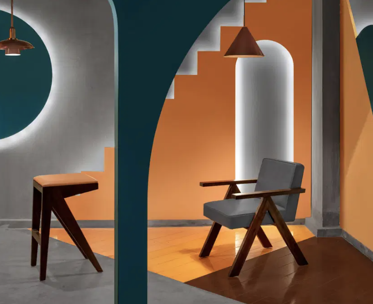
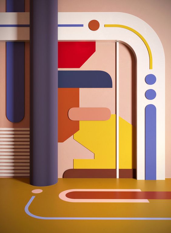
My chosen artist model that will influence my design is Renesa Architecture Design Interiors Studio based in New Delhi, India. I was drawn to their overall design aesthetic, their ability to implement texture and pattern within a space, as well as their bold, compelling utilisation of colour, shape and materiality.
Find out when and where they produced their work – With the company starting in January 2006, Renesa is an award winning creative consultancy firm dealing in Architectural + Interior design consulting across India. They are based in New Delhi and their design studio and project plan office, comprising of a number of associate architects and several architectural assistants, is lead by Mr. Sanjay Arora – a highly experienced and qualified licensed architect, along with his son Mr. Sanchit Arora, the studio Head Architect at Renesa.
Identify the key conceptual ideas that underpin their work – Within all of Renesa’s creative works the conceptual ideas underpinned within their work is showcased through their unique utilisation of colour, pattern, shape and materiality. Each design upholds their own compelling personality that draws the attention of a passer-by and transports them into a dynamic, spatially constructed environment. All of Renesa’s aesthetic choices are deliberate, where each aspect of the space has been comprehensively formulated, in order to create a spatial experience that provokes meaning, interest and curiosity.
Identify their critical position on colour in relation to their work (i.e. how is colour applied, in what proportions, what particular theories about colour inform the making of the work, how does colour change dependent upon the environment in which the work is viewed?) – For all of Renesa’s works, colour is purposefully utilised as a fundamental component that enhances all aspects within their design. They employ a wide variety of colour in their works, ranging from applied bold, vibrant colours to more simplistic, natural colours present within different surfaces and materials. Within majority of their works, particularly the ones in which I have researched, their chosen colour palette is very minimal and usually restricted to a few key colours. This creates a space where each colour harmoniously compliments each other and adds to the overall design and spatial experience, as well as each colour has the power and strength to be impactful when on its own. Colour is enhanced through detail, where it has been applied, incorporated and intertwined within materiality structures, emphasising both the structure and the colour itself.
What type of surface treatments are used in the work? Do they use matte, satin, or gloss paints or material finishes or all of them together? Why might they do this and what is the effect of doing this? – Within each of Renesa’s creative works they employ a variety of surface treatments and materiality finishes, all which compliment and harmonise with their compositional layout and colour choices. Majority of the flooring surfaces in their designs are constructed of exposed concrete or a detailed tile finish. For their wall surfaces this widely varies and is dependant on the overall structural layout as well as the kind of spatial experience they are wishing to create. They utilise a combination of materiality and surface finishes such as exposed concrete, painted plaster, wallpaper, tile, wood and brick (only a selection). Renesa uses many different finishes ranging from matte surfaces to more glossy, shiny surfaces. Their design decisions to utilise and integrate a diverse collection of materials and surface finishes into their works allows for the creation of a compelling space that upholds depth and meaning, intriguing the viewer at the hues of the interior that follows inside.
What scale are the artworks you have researched? How does scale impact on how the work is experienced and how colour and materiality are perceived? – All of Renesa’s creative works in which I have researched are the designs of entire spaces ranging from a restaurant to a showroom and retail interior. As all the works are interior spaces and uphold a large scale effect, this means that the visitor has an entirely immersive experience, where the design has full impactful presence. One of the main reasons I was drawn to Renesa’s works was due to their compelling use of scale, in order to emphasise and enhance each aspect of colour and materiality utilised within their design. By having larger scale works, Renesa is able to develop and create an impactful space where the perception of colour and materiality is dynamic, bold and striking, commanding the viewers attention.
Analysing Studio Renesa’s Design Projects
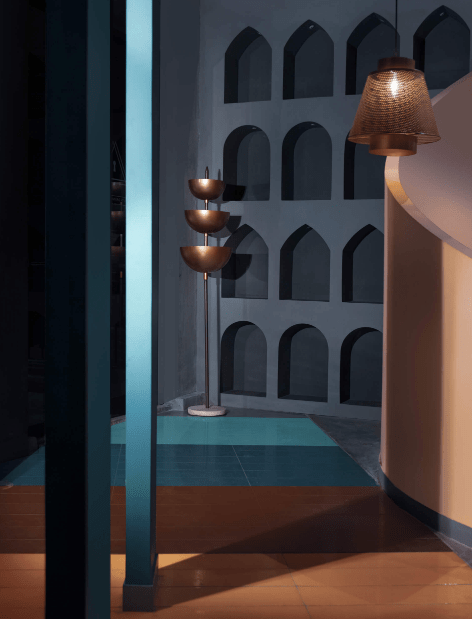
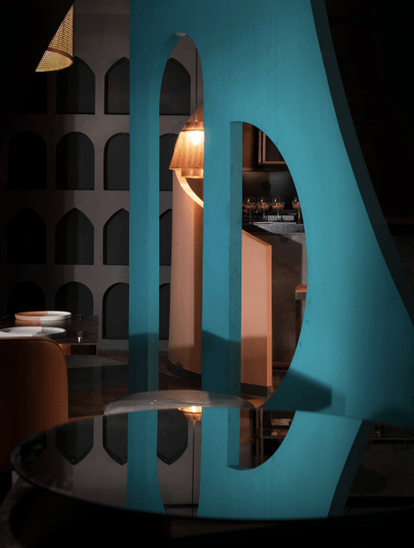
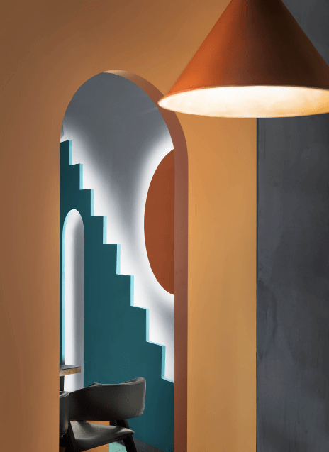
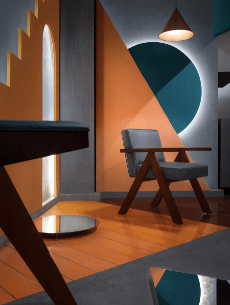
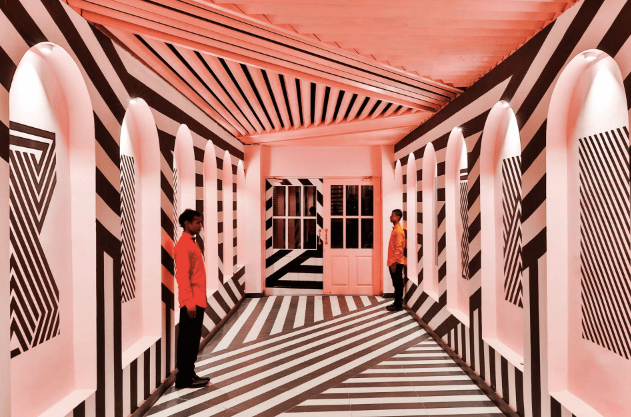
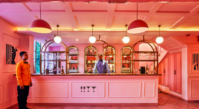
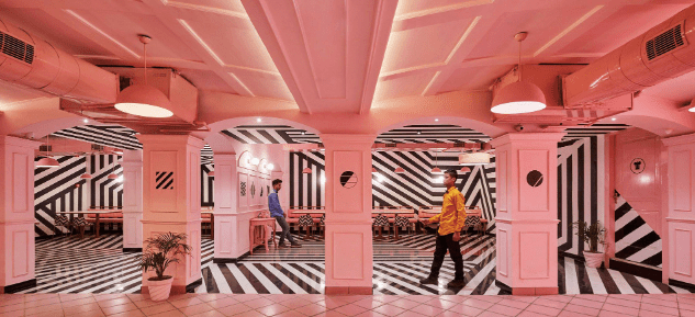
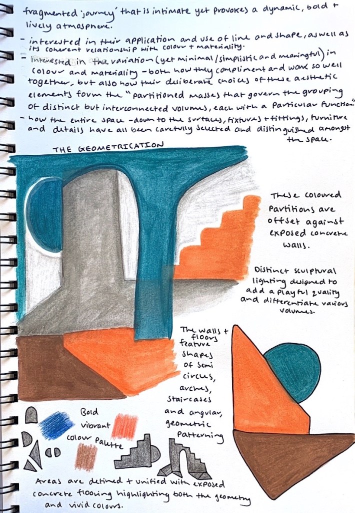
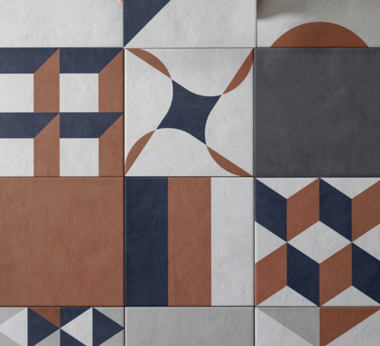
The Geometrication – Hospitality Space

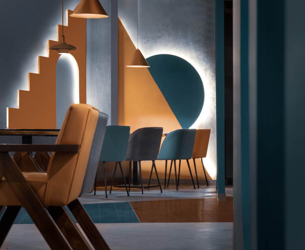
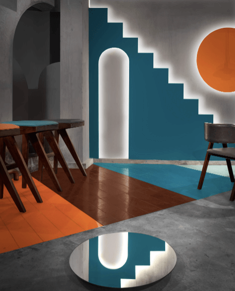
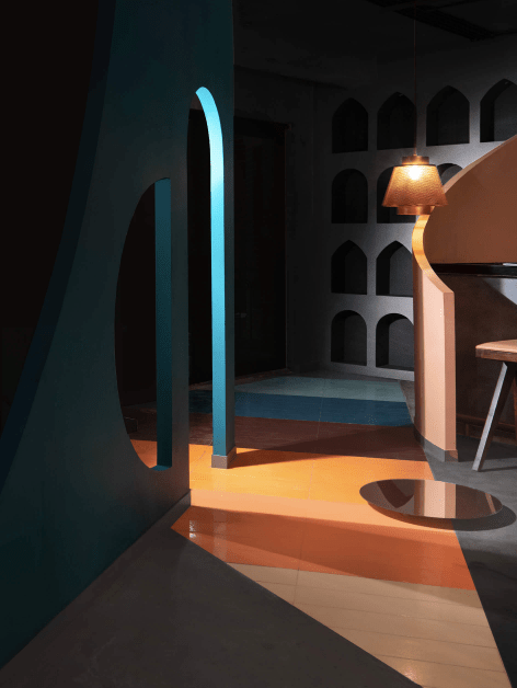

Purpose – Taking cues from the original deconstructive architecture, Renesa’s aim was to create a variable spatial experience filled with volumetric galleries and partitioned masses. They have created a space where the visitor is transported to an uncertain realm characterised by successive geometric shapes on different scales and colours.
Colour Palette – A clear, vivid colour palette of warm shades of rusts, orange, brown, grey and deep teal blue.
Materiality + Surfaces – Exposed concrete floors and walls, tile, mirror, copper metal, painted plaster, wood, glass.
The Pink Zebra – Retail Space

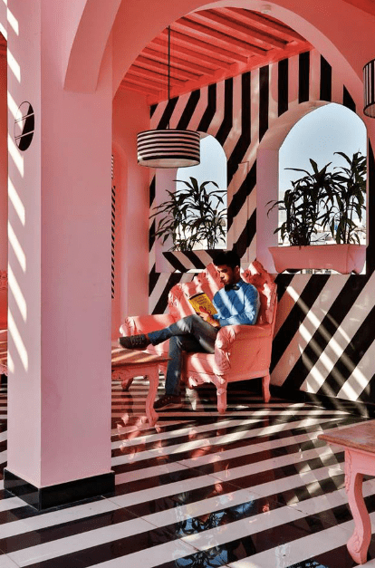
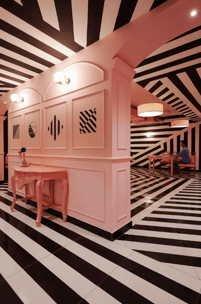
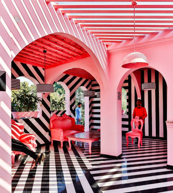
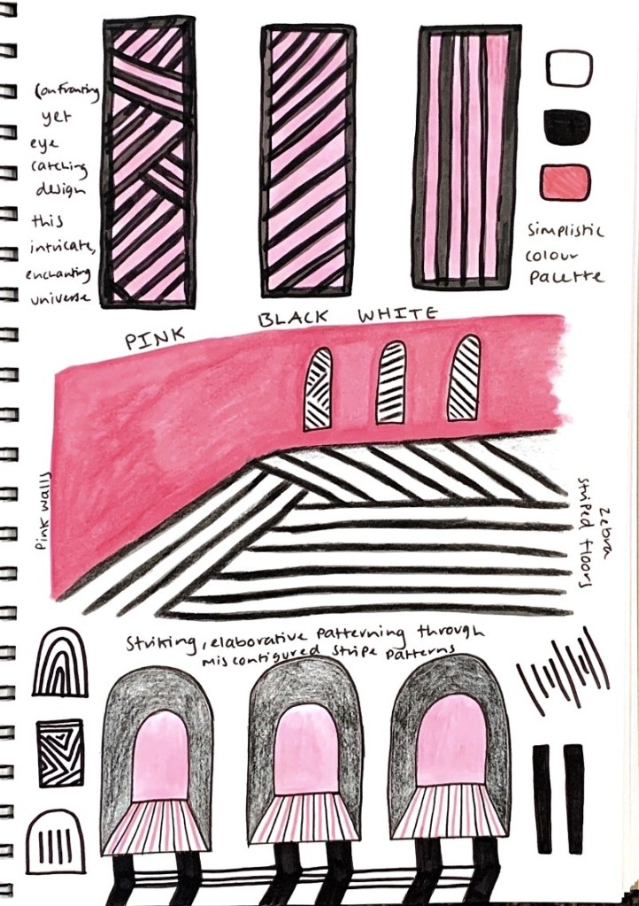
Purpose – To create a distinct aesthetic architectural style that connects to the city people and poses its stand through a very bold and fierce narrative. Its unique facade design creates an everlasting effect on the passerby and invites them into a magical, expertly crafted world whose spaces are framed to treat the eyes.
Colour Palette – A simplistic yet bold and striking colour palette that commands attention, composed of only pink, black and white.
Materiality + Surfaces – Painted plaster, wallpaper, tile, metal, marble, glass.
The TerraMater – Retail Interiors Space
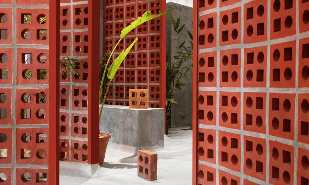
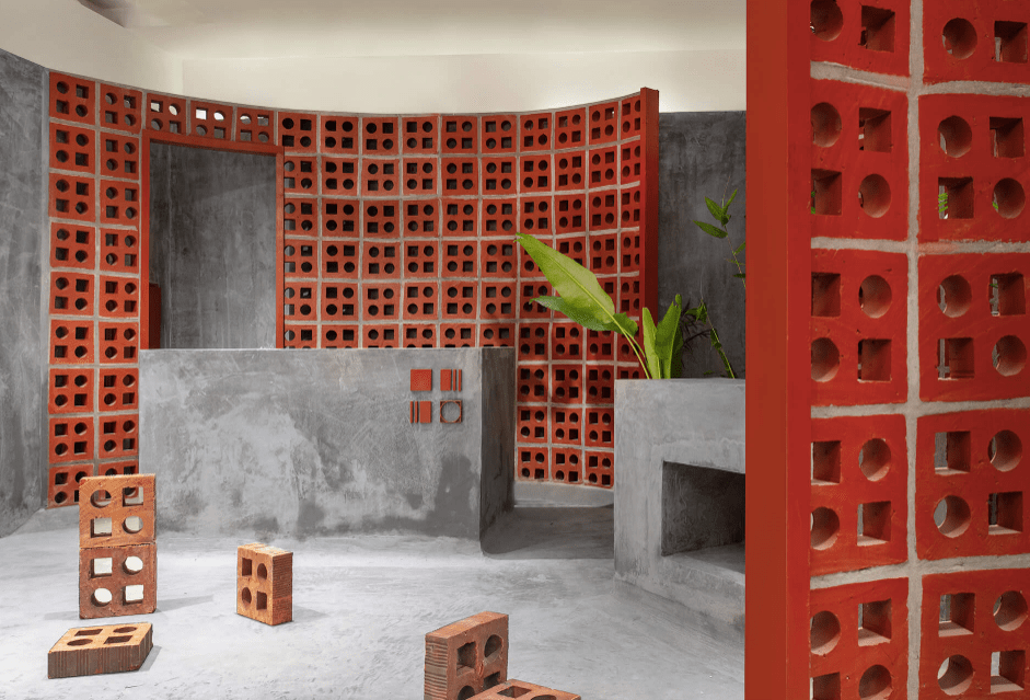

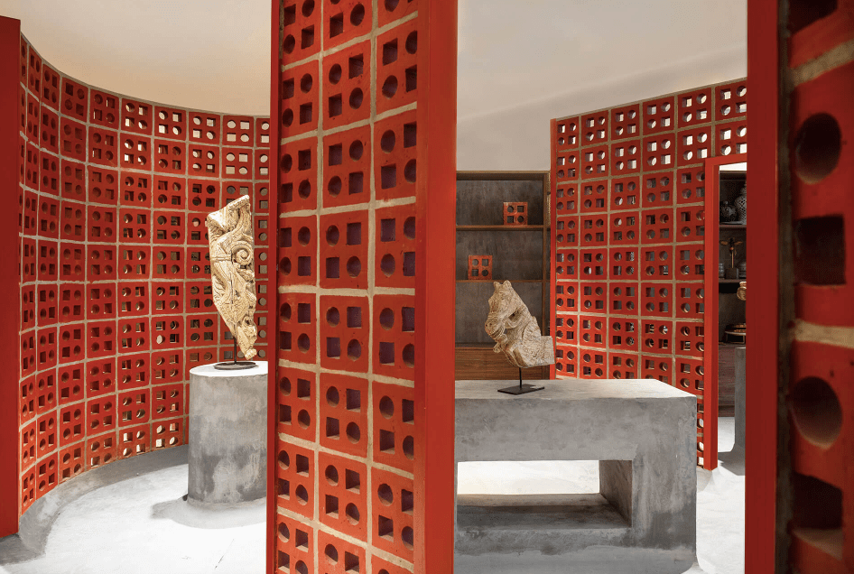
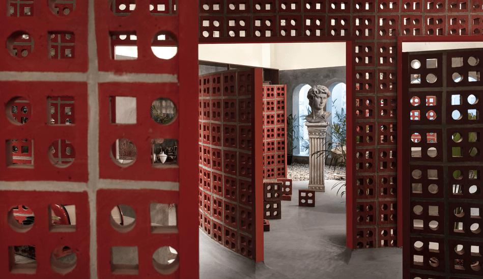


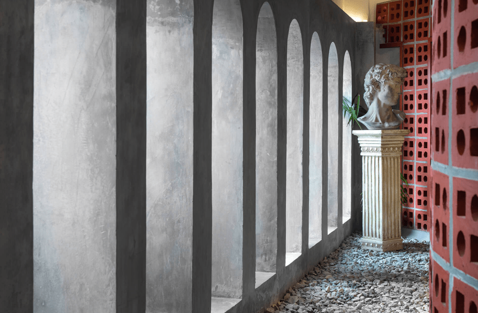
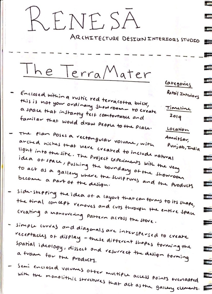
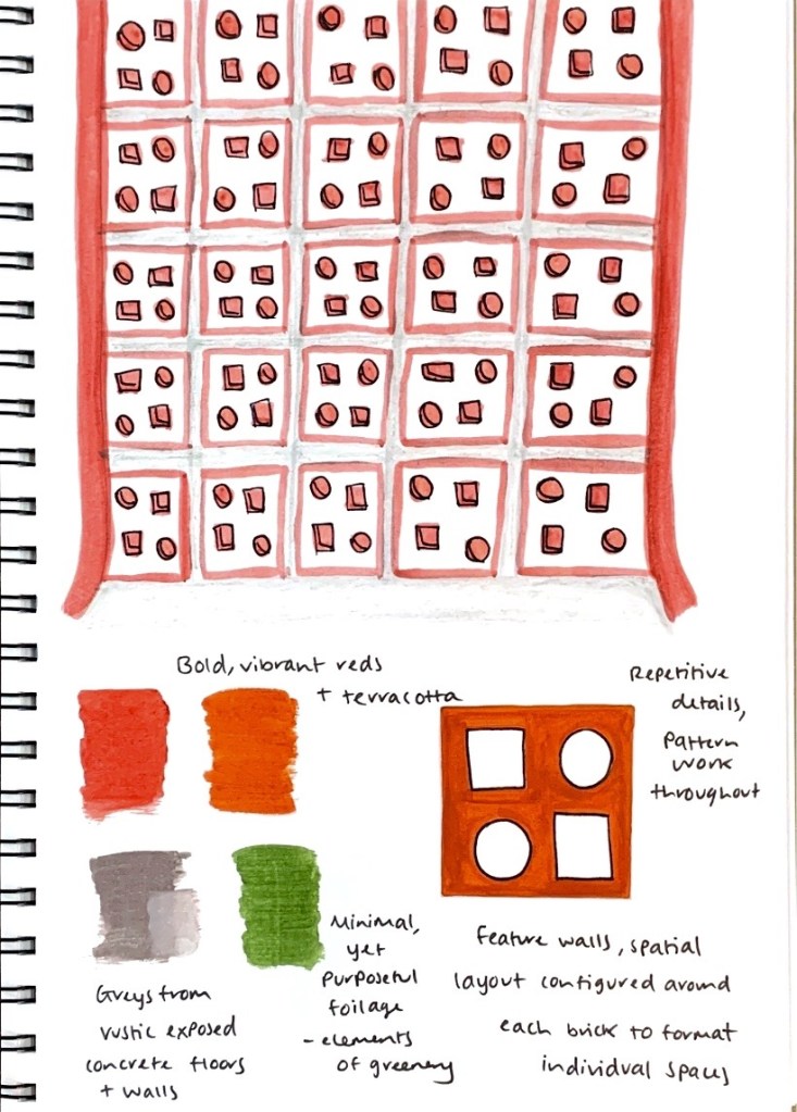
Purpose – The design poses a rectangular volume with arched niches, experimenting with the idea of space, pushing the boundary of the showroom to act as a gallery where the sculptures and products become apart of the design. Their use of different shapes through simple curves and diagonals dissect and resurrect the design, forming a frame for the products.
Colour Palette – Minimal yet compelling through the use of warm and cool tones such as terracotta reds, green and various shades of grey.
Materiality + Surfaces – Patterned terracotta brick, exposed concrete floors and walls, foliage elements, marble, stone.
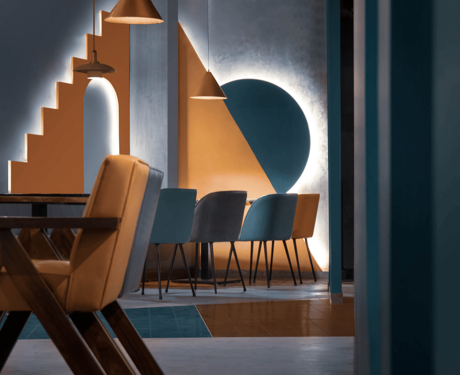
After researching and analysing various creative works by Renesa Architecture Design Interiors Studio, the work I selected to be my main, influential source and inspiration for my own design intervention is ‘The Geometrication’. I was drawn too and chose this particular work because of its use of layered, geometric patterning and how it has been incorporated within multiple aspects of the space (and in differing ways). How a highlighted feature throughout the design is its simplistic, yet striking shapes are that contrasted and juxtaposed against each other. I was fascinated by their creation of multiple pockets of space, where they take the visitor on a fragmented journey that is intimate yet provokes a dynamic, bold and lively atmosphere. Their deliberate choices towards each aesthetic element has led to a design where the relationship between colour and materiality is coherent, a concept I wish to explore and develop further.
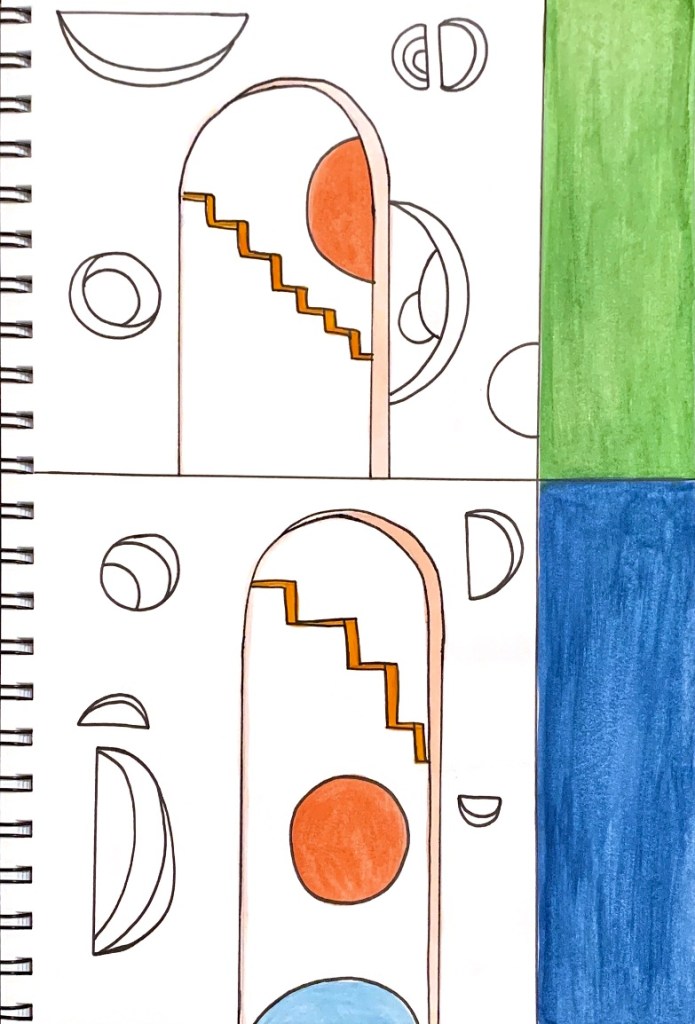
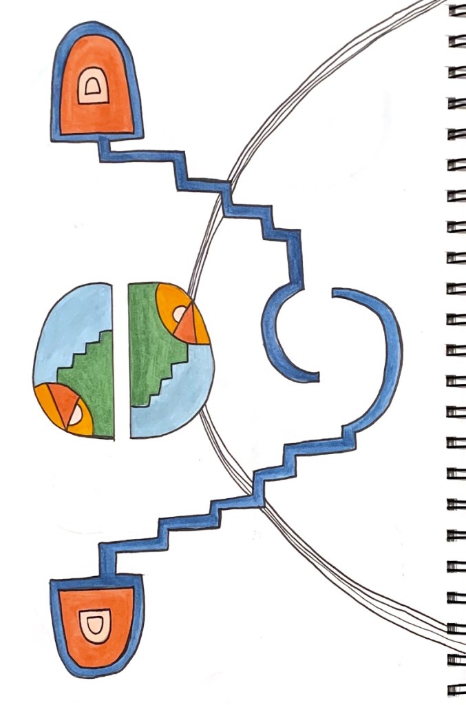
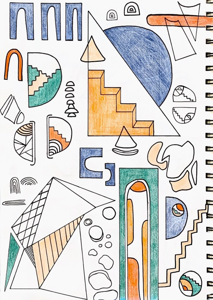
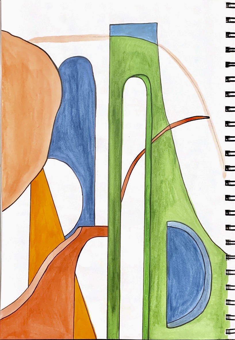
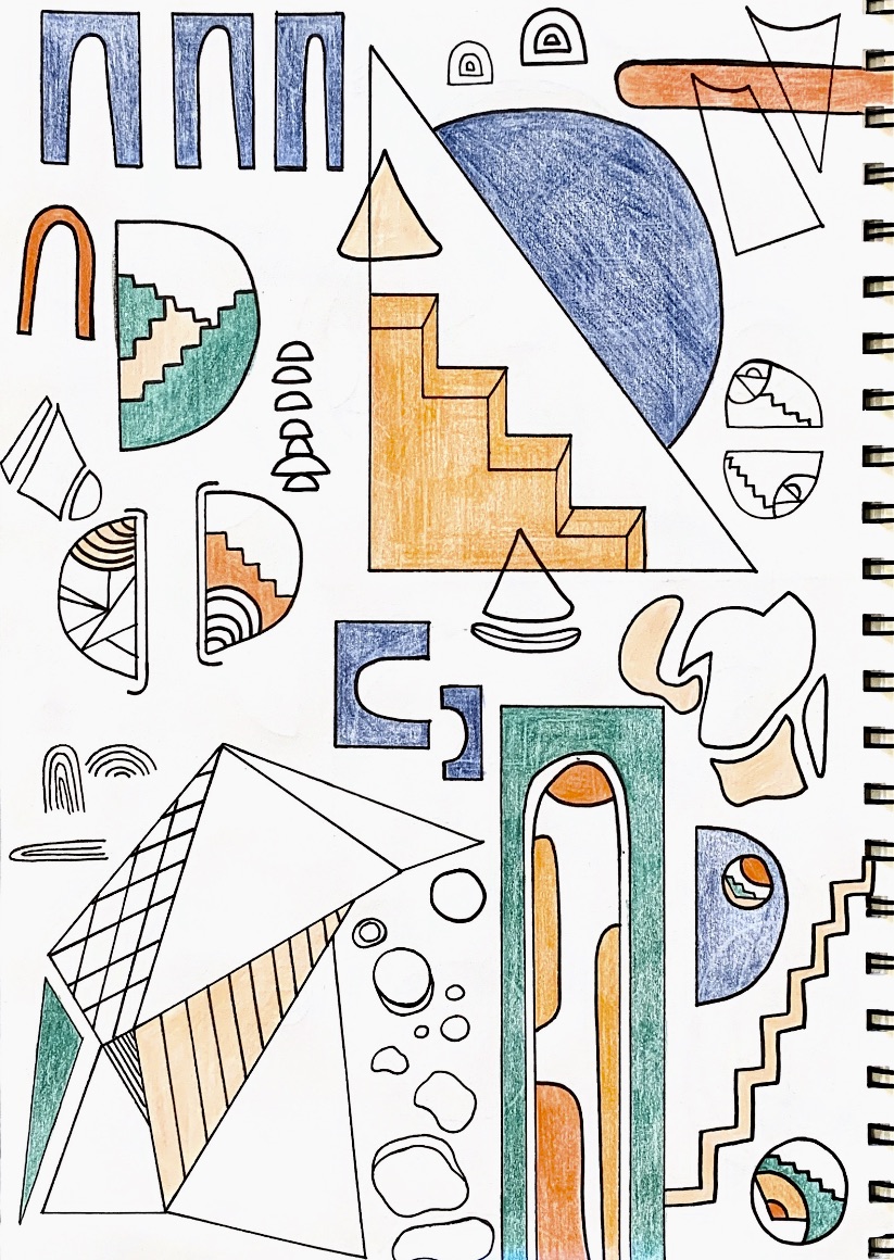
Based off and influenced by my chosen artist model work ‘The Geometrication’, I created a series of inspired drawings.

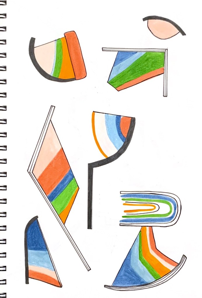


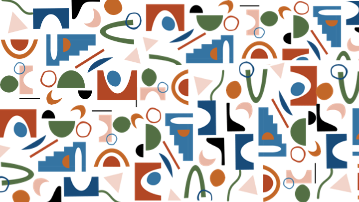
Each drawing highlights the array of geometric shapes and lines present within my artist model’s work. I wanted to explore both the juxtaposition and the cohesion between the shapes and their specific colours. I decided to play around with layering, connection, pattern and bold, blocked shapes in contrast to more shapely outlines. All drawings sequence very similar colour palettes containing both warm and cool tones. The selected colours I chose to use are the warm rusts, and oranges as well as deep blues present within ‘The Geometrication’ space. I also decided to include tones of green and pink in order to establish an intriguing colour palette, one that will provoke interest as well as be complementary within my design intervention and the existing foyer space.
Design Workshop 8
19. 03. 20
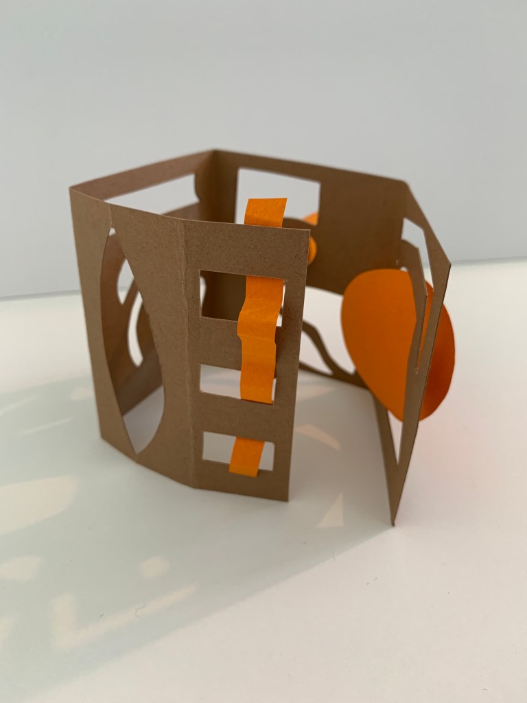
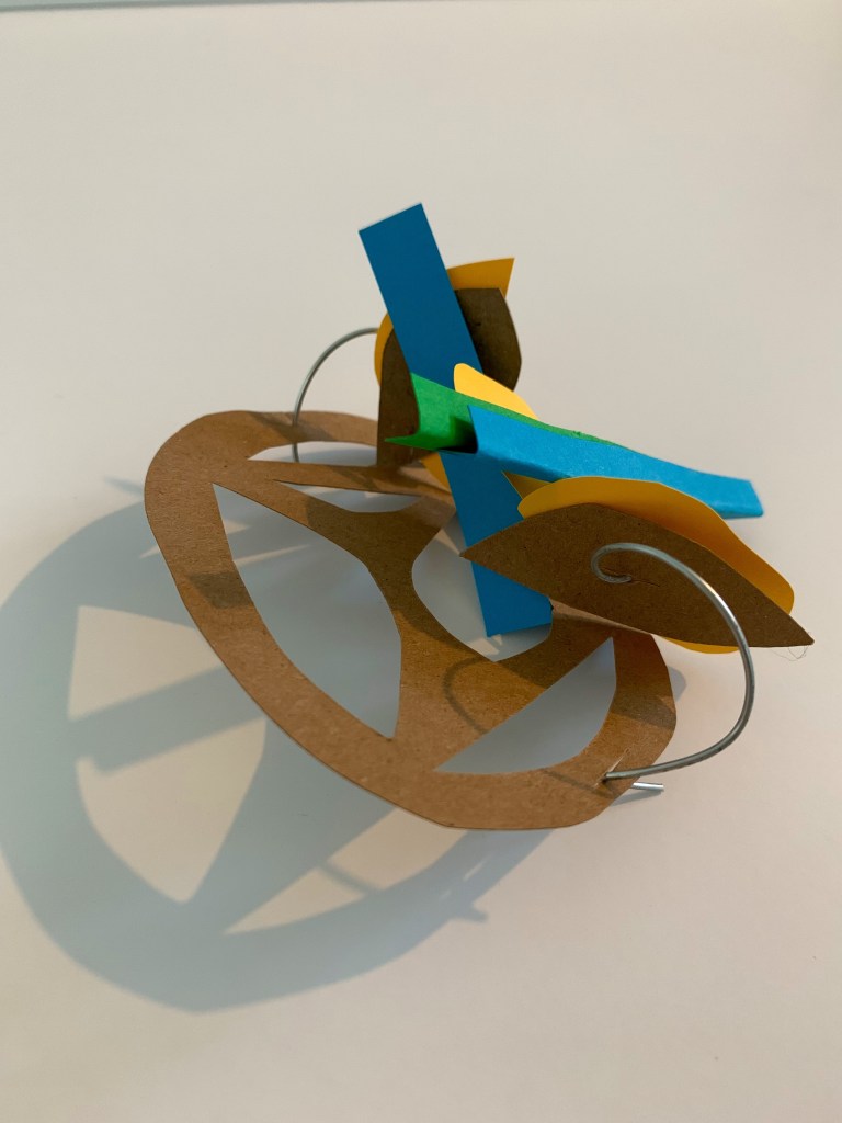
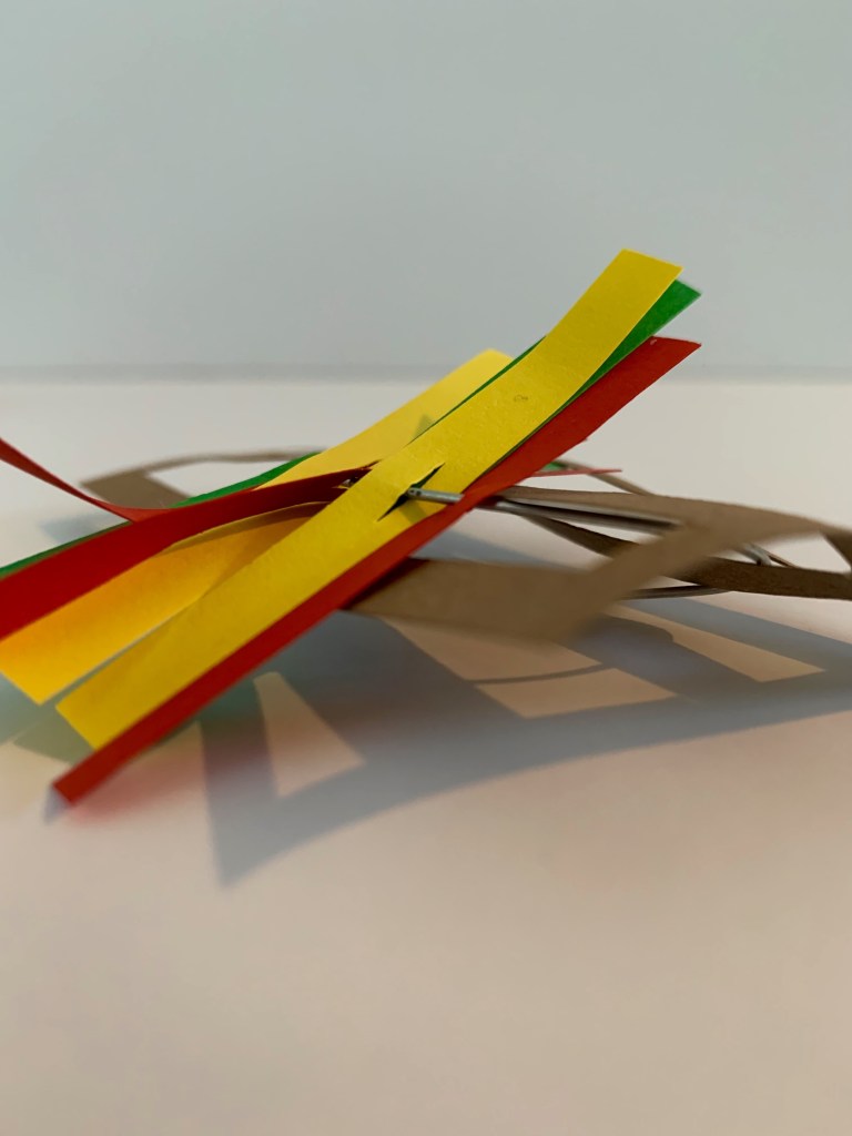
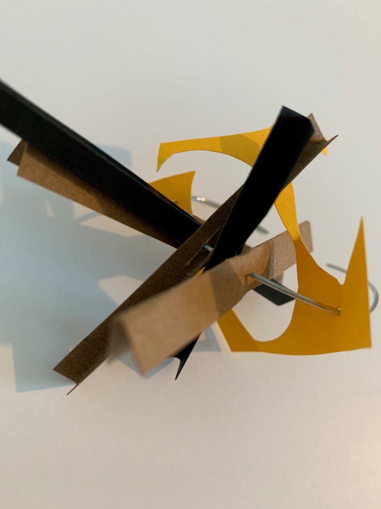
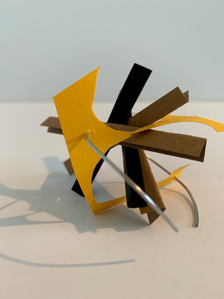
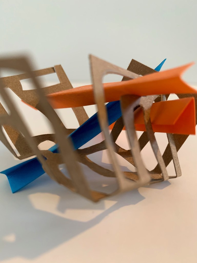
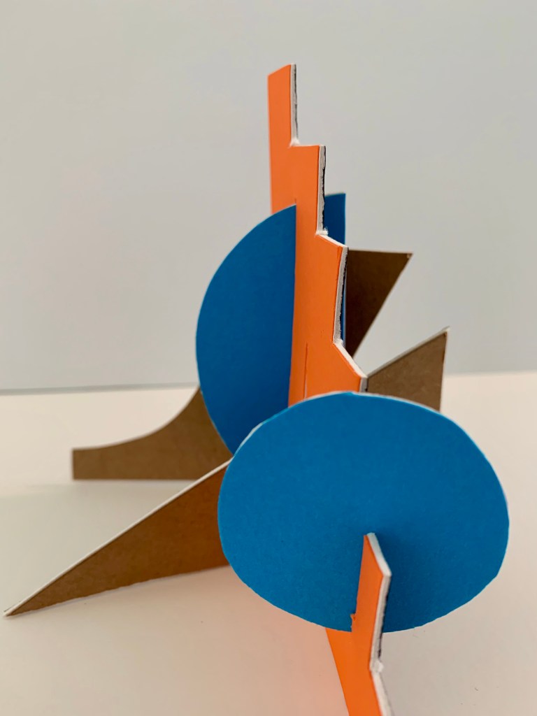
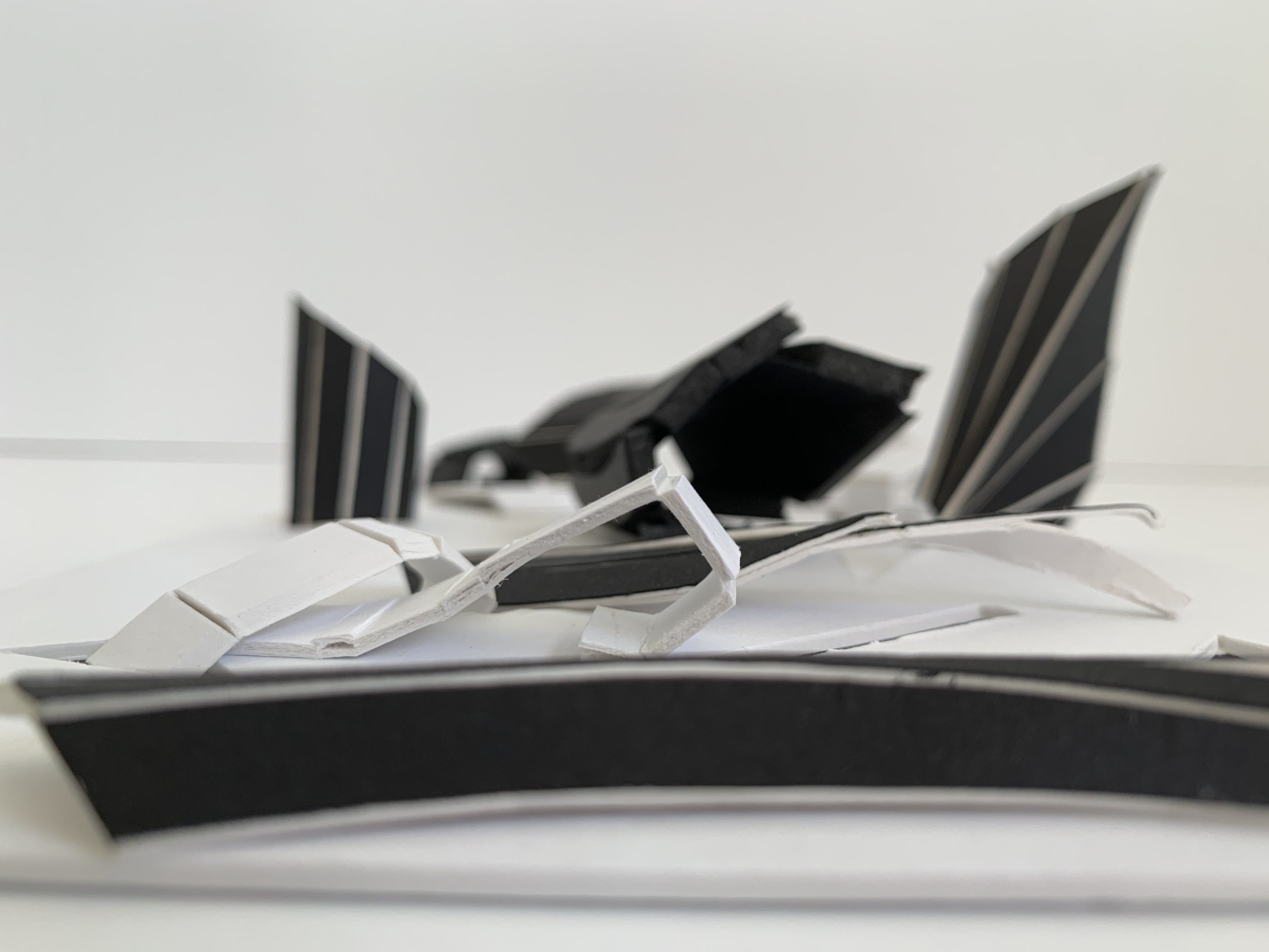
Utilising all of the research and artist model analysis we conducted throughout the week, this design workshop explores our artist model through a practice of making. For this exercise we have been asked to make a series of models that analyse aspects of our chosen artist model, focusing on materiality by using materials that reflect our analysis of the creatives work. This may be that you use the type of materials the artist models use or something that resembles what they use. Featured below are my three intersecting colour models.
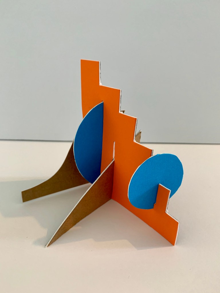
For my first model I decided to play around with the main, dominant colours, various shapes and volumes present within Renesa’s work. Exploring how these distinctive forms and volumes could overlap, layer and interconnect with each other.
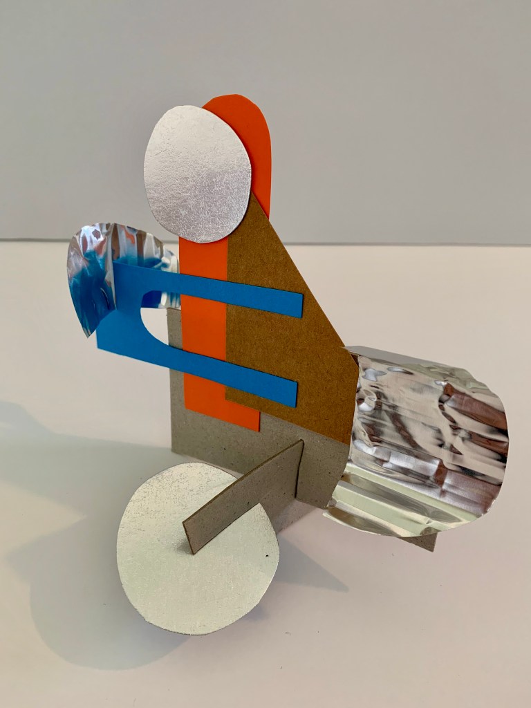
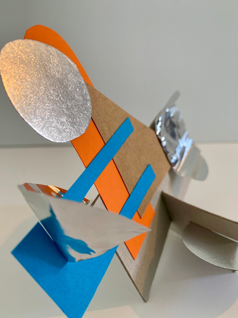
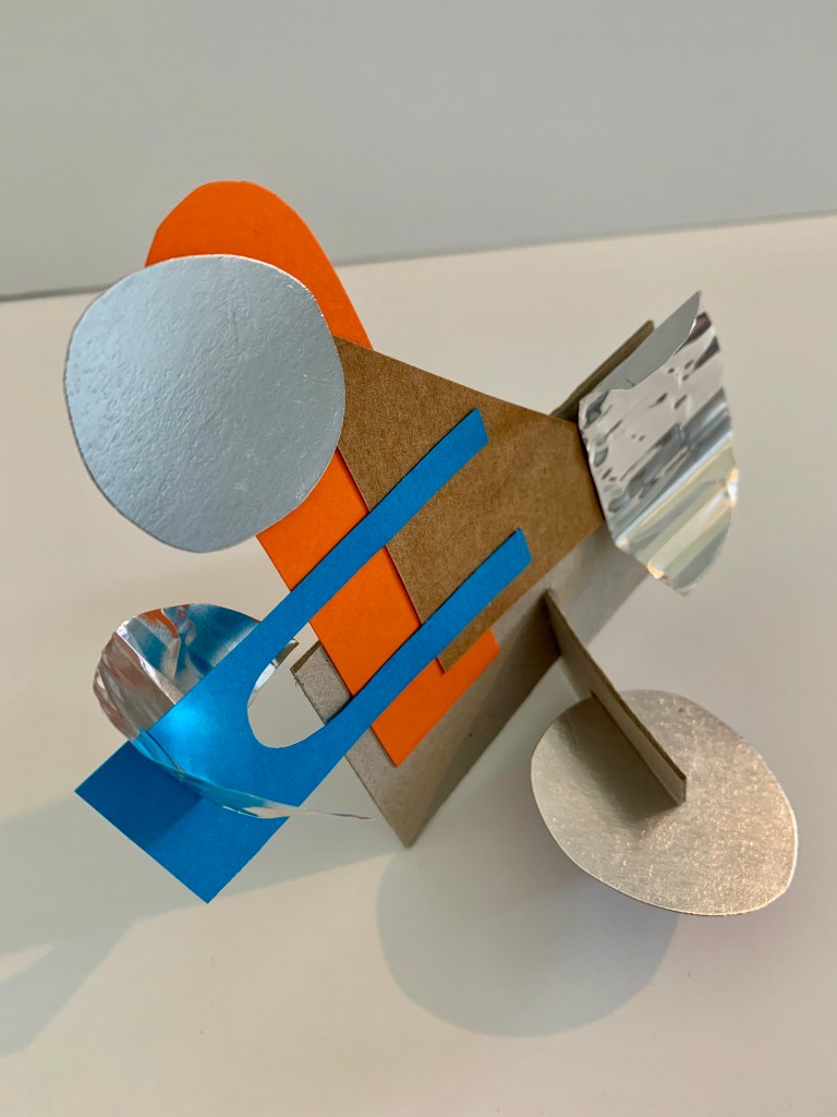
For my second model I decided to play around with the differing surface textures and materials present within Renesa’s work. Experimenting with how colour is impacted by the inclusion of these textural surfaces and what light or shadow qualities they produce.
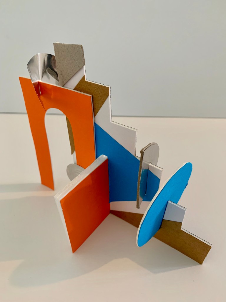
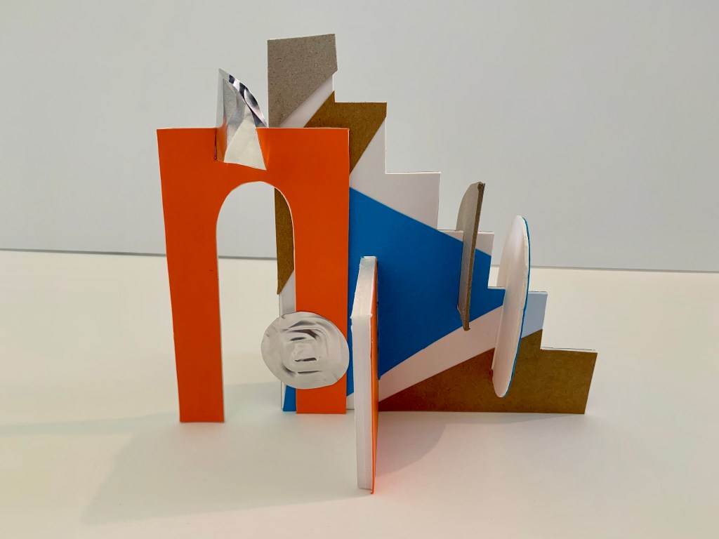
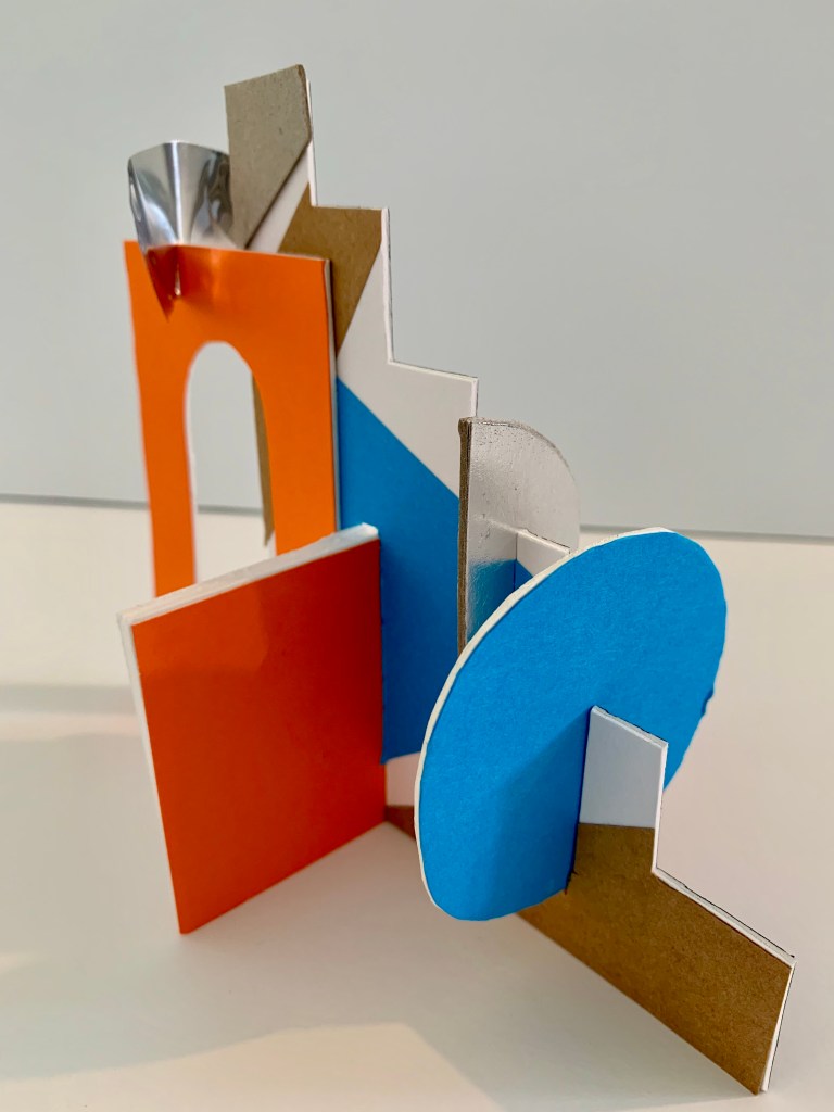
For my third model I explored the connection between both my first and second model, considering how I can incorporated, combine and even juxtapose the differing elements showcased within each individual model. Playing around with colour, shape, volume and surface textures.
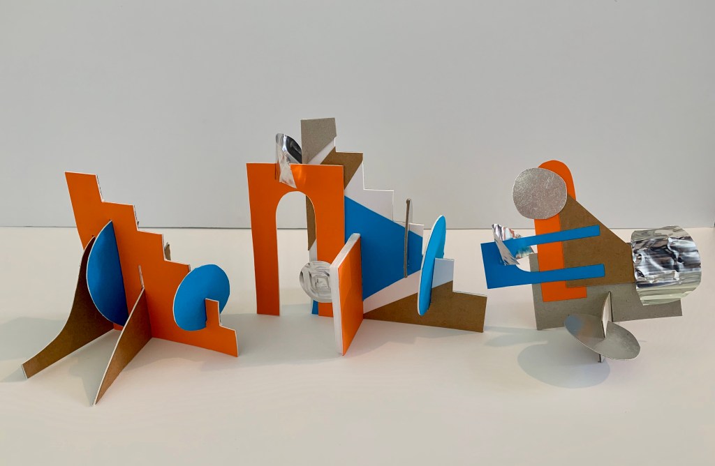
Throughout the creation of all three models I stuck with the same prominent colours present within my artist models work, in order to establish its direct influence and connection. Each model explores different aspects such as colour, light, shadow, surface textures and shapely volumes. Getting to experiment and play around with the key aesthetic features present within my artist models work, allows me to consider which of these features I wish to further explore and possibly implement within my own design intervention, in order to start building on potential creative and aesthetic components.
Week Five (Slow Surface 1) – Design Workshop 9
28. 04. 20
Starting from this week we transitioned into online learning, where all workshops and classes are to be taken directly at home. For this weeks studio workshops it is centered around observation and experimentation in relation to ‘Slow Surface’ and surface analysis. This phase of studio experimentation will consider the temporality of surfaces, surface affects, movement of people, and other environmental forces. This study of surface allows us to start considering the interrelationship between surface design, large scale atmospheric qualities and user experience. The method of slowing down as designers allows us to observe and analyse the complex of material and sensorial affects taking place in everyday situations.
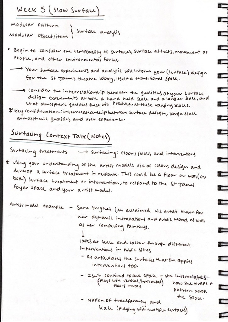
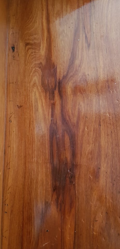
The first experiment exploring Slow Surface focuses around observing a surface in our immediate environment (our home). We were asked to take note of the patterns of movement that may occur along this surface, identifying the materiality, patterning and other atmospheric qualities of our chosen observed surface. The surface I chose to analyse was the glass plane on our bathroom window. Featured below are photographs of my chosen surface, taken at various times in the day (both in the morning and in the afternoon), as I wanted to compare and contrast the different light qualities present throughout the day and how it would impact the appearance of the surface.
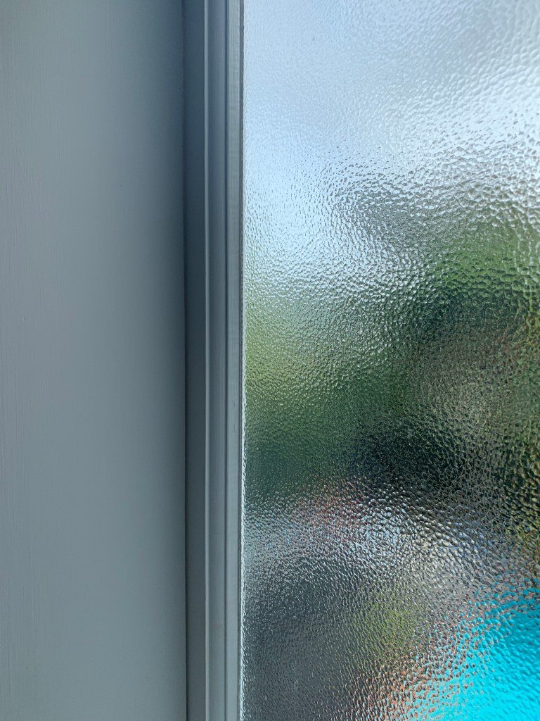
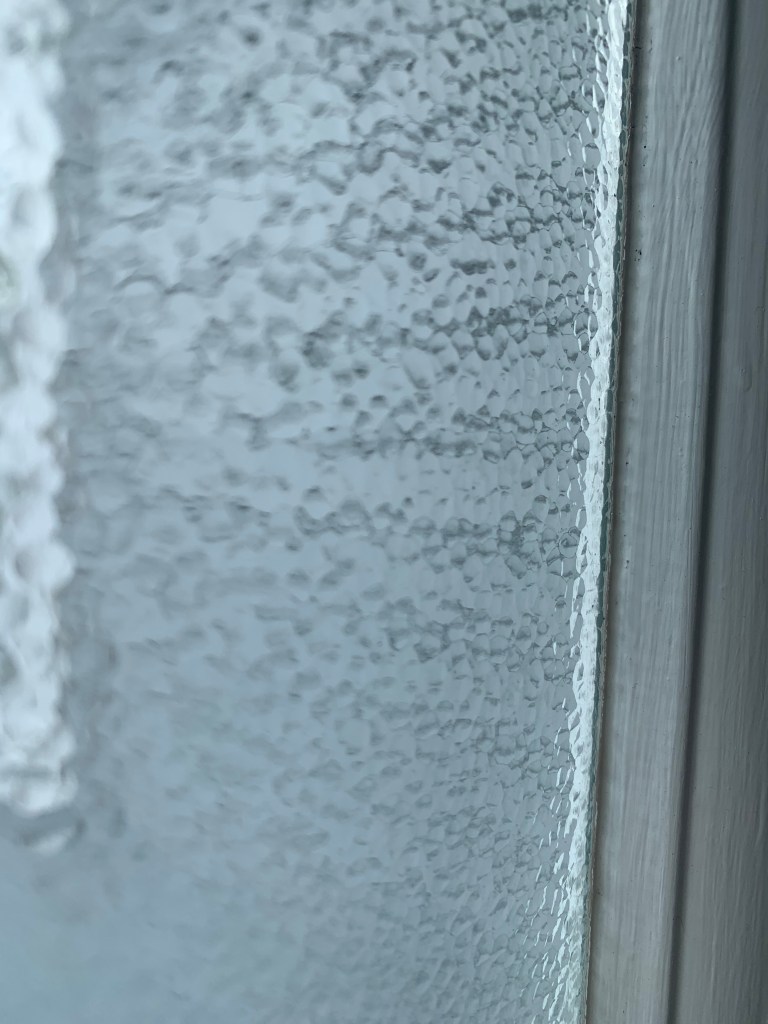
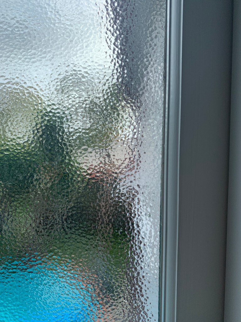
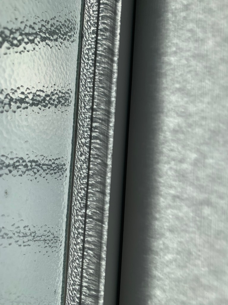
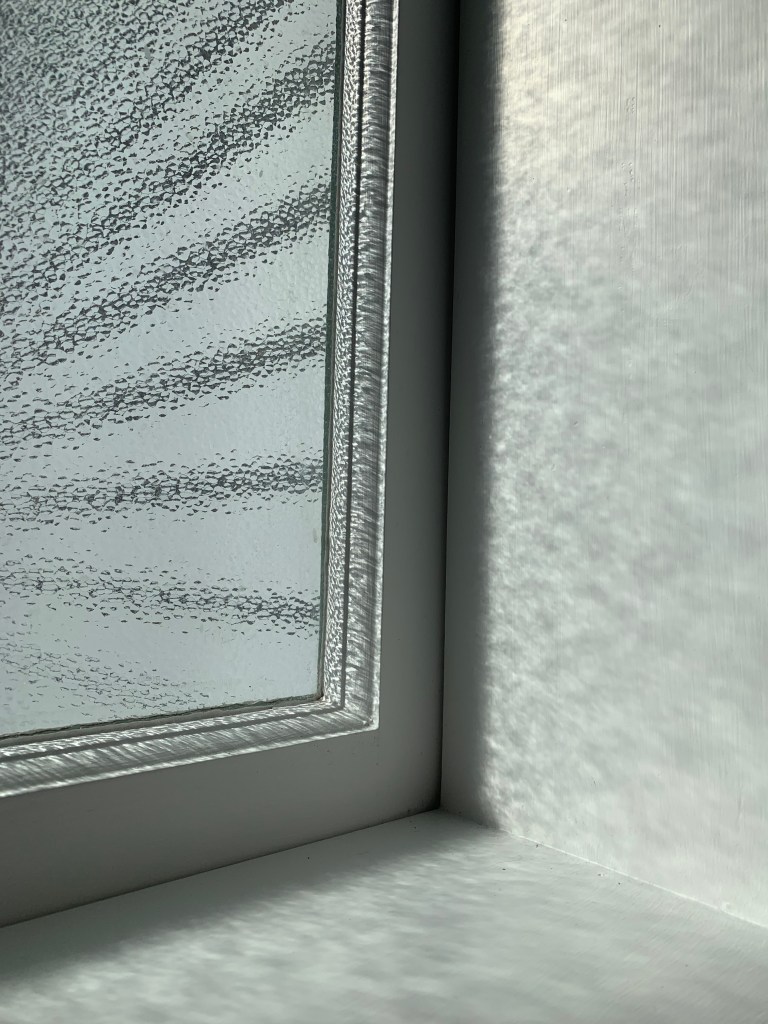

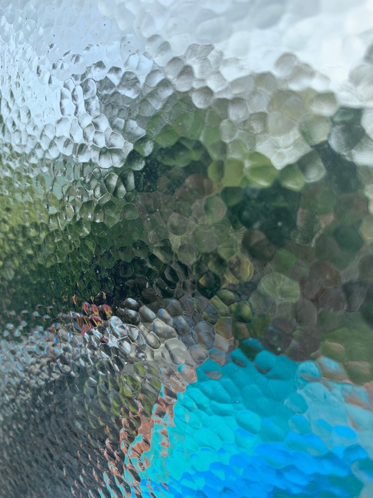
For my chosen surface analysis, I jotted down notes on my direct observations, particularly focusing on its materiality, patterning and atmospheric qualities.
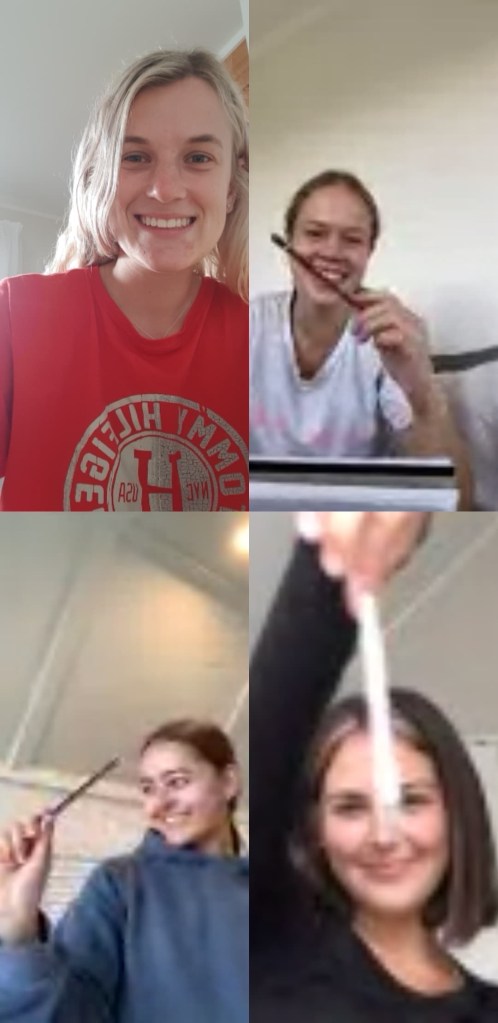
Directly following along from our individual surface analysis, we then progressed into a group activity where we were to discuss our surface observations, in order to collaboratively construct a composite surface drawing.
Zara 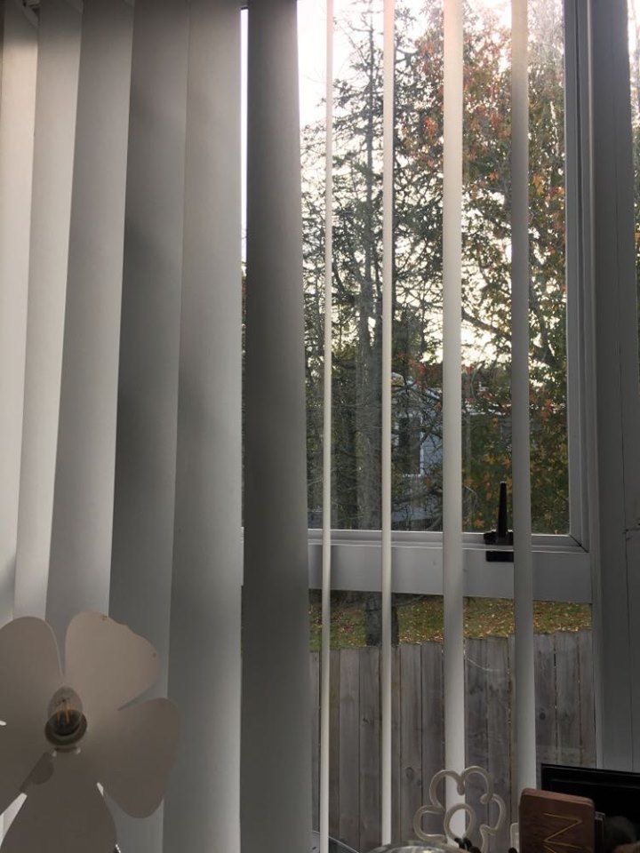
Amy 
Renee
As a group we each discussed our selected surface, unpacking and sharing our observations. We then collaboratively planned a design for a composite surface drawing that combines a collection of all four of our surface images. We considered and talked about different shapes, colours, layers and patterns that we could utilise in our collage surface drawing.

All the colours incorporated within our surface drawing were directly referenced to our surface images. They have been selected from the reflected blue and green colours present in the window, as well as the varying brown/rusty tones reflected off the water in the wood. The use of these colours generated the overall aesthetic for our surface drawing. We decided to implement solid colour blocks in conjunction with specks of our images, as referral to the specks of light reflecting on the surfaces. We employed a range of angular shapes and lines such as triangles, squares, horizontals and verticals in order to capture the geometric patterning in our images. For the geometric shaping utilised within our drawing, the ideas came from the geometric shaping of the windows, curtain panels and linear grains in the wood. All these elements combined together to create our collage.

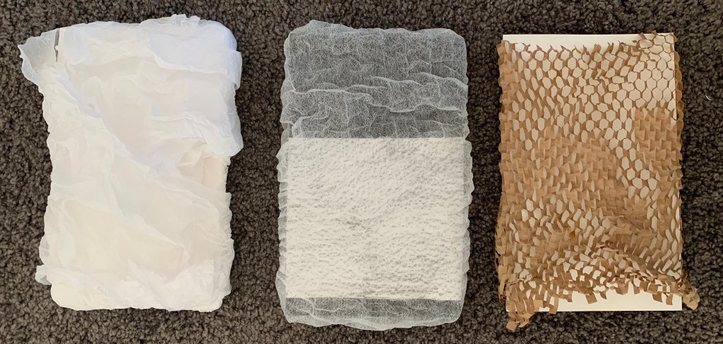
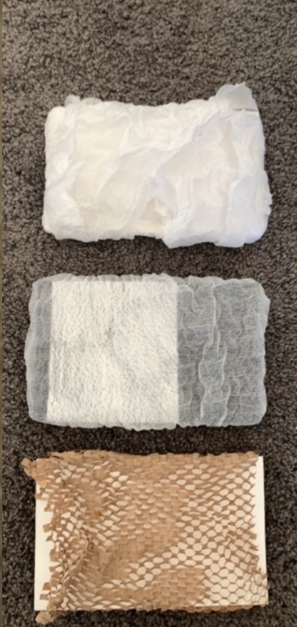
The second part of this Slow Surface experiment focuses on making. We are to draw on our observations of the ‘Slow Surface’ from experiment one in order to produce a series of quick surface designs considering materiality, assembly and detail. All of my surface designs were influenced and driven by the images I captured of my selective surface (glass window).
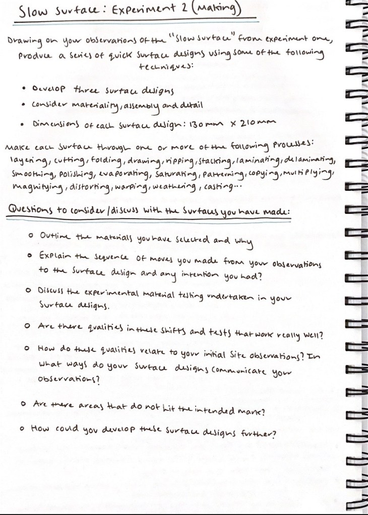
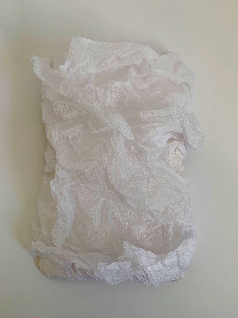
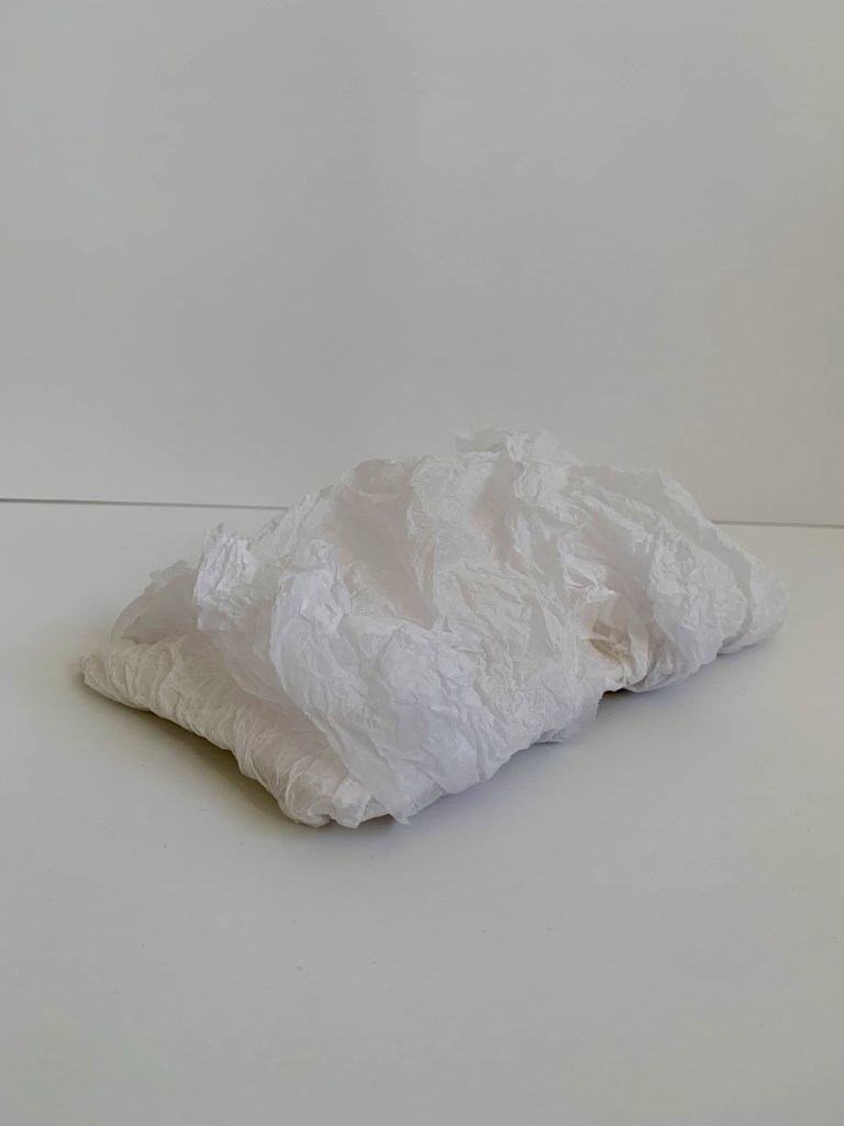
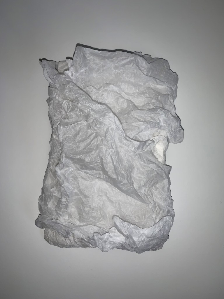
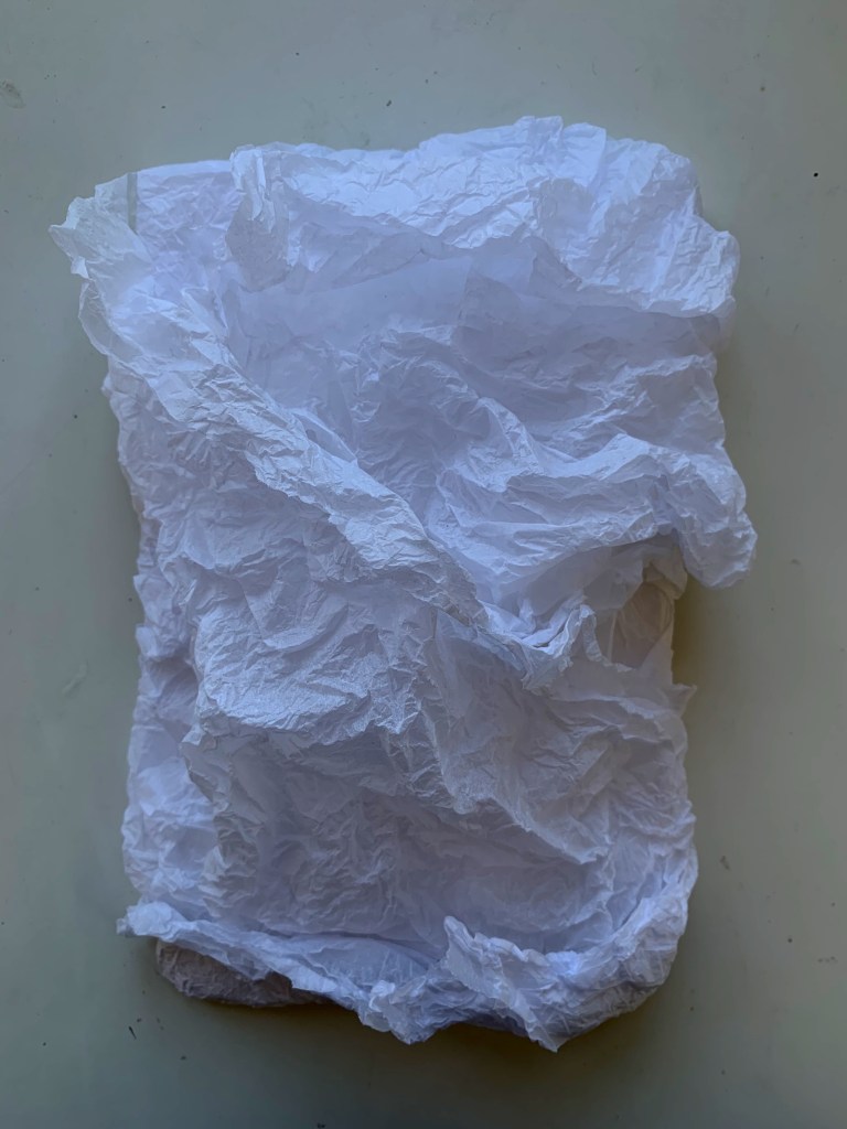
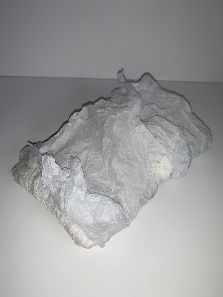
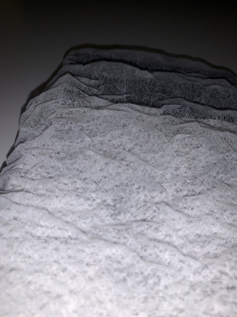
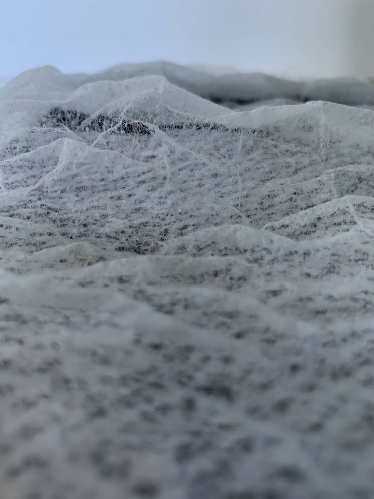
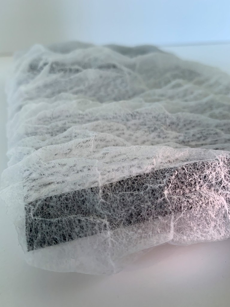
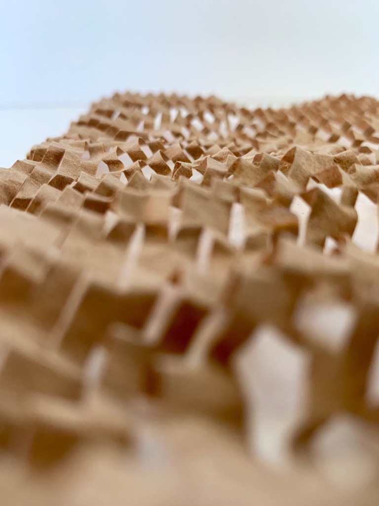
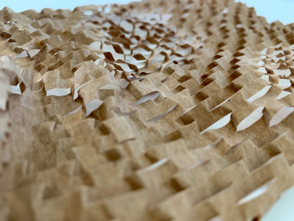
The first surface design I created explores texture through light and shadow. When observing the glass surface used within the window I was particularly drawn to its textural detail and intricate pattern. The glass had repeated, in grooved indentations throughout its entire surface which was a key aspect I observed and wanted to experiment implementing into a surface design. Using its intricate texture and the details that can be emphasised with contrasts of light and shadow, I created a surface design that exaggerates these features, experimenting with surface texture in a more three dimensional form. I used multiple sheets of weathered and crumpled tissue paper, folding and manipulating it in order to build up layered texture.
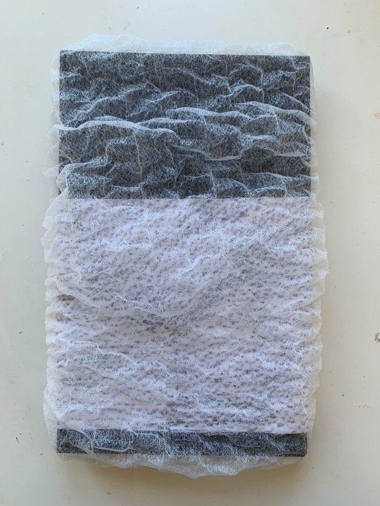
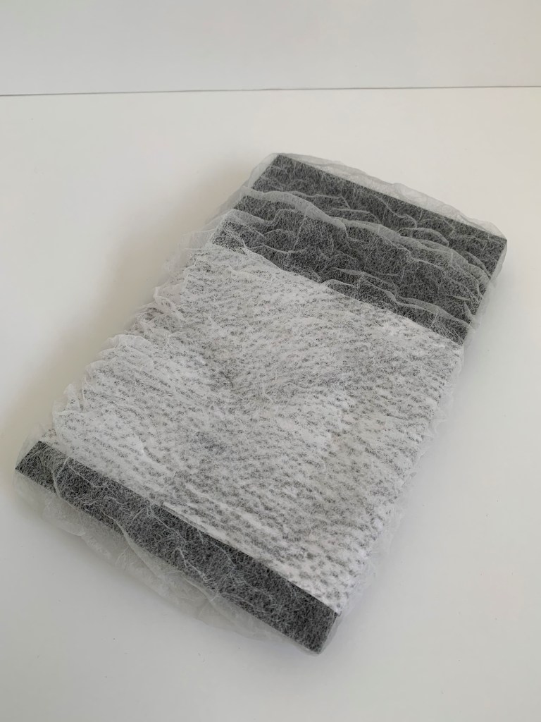
The second surface design I created explores light and texture. When analysing the surface, the texture qualities it possessed caused for the exterior background to blur into deformed and disfigured shapes. As well as this when light filtered through the window it highlighted along each independent, circular grove picking up on the fine details and textured pattern. These observations heavily influenced this surface design, as I have utilised a combination of rub drawing and mesh material to create a textural surface that upholds the similar patterning and atmospheric qualities of my chosen surface.
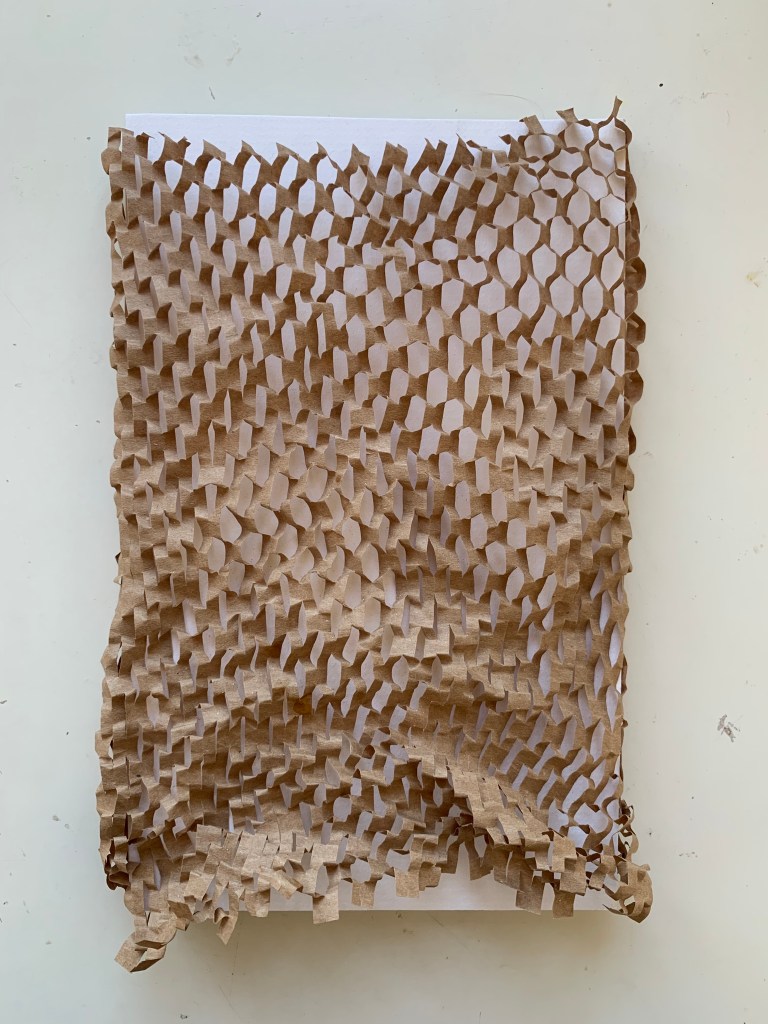
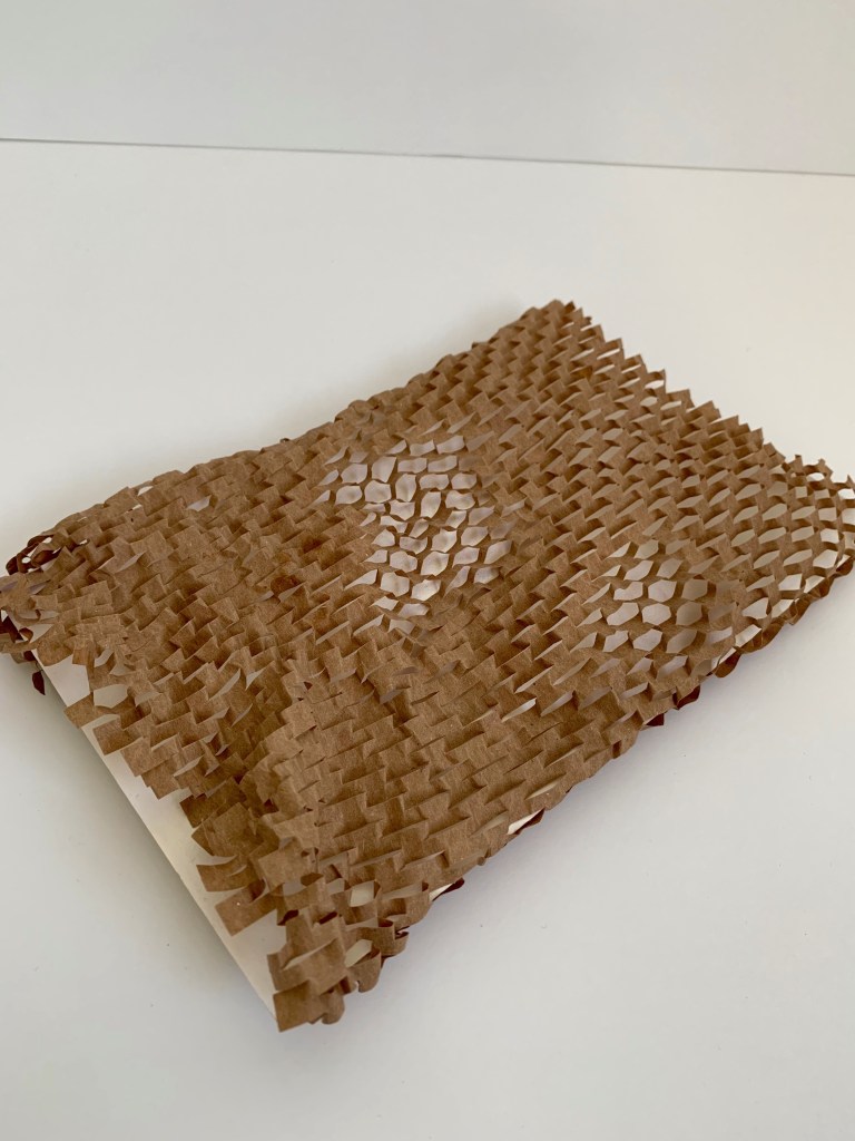
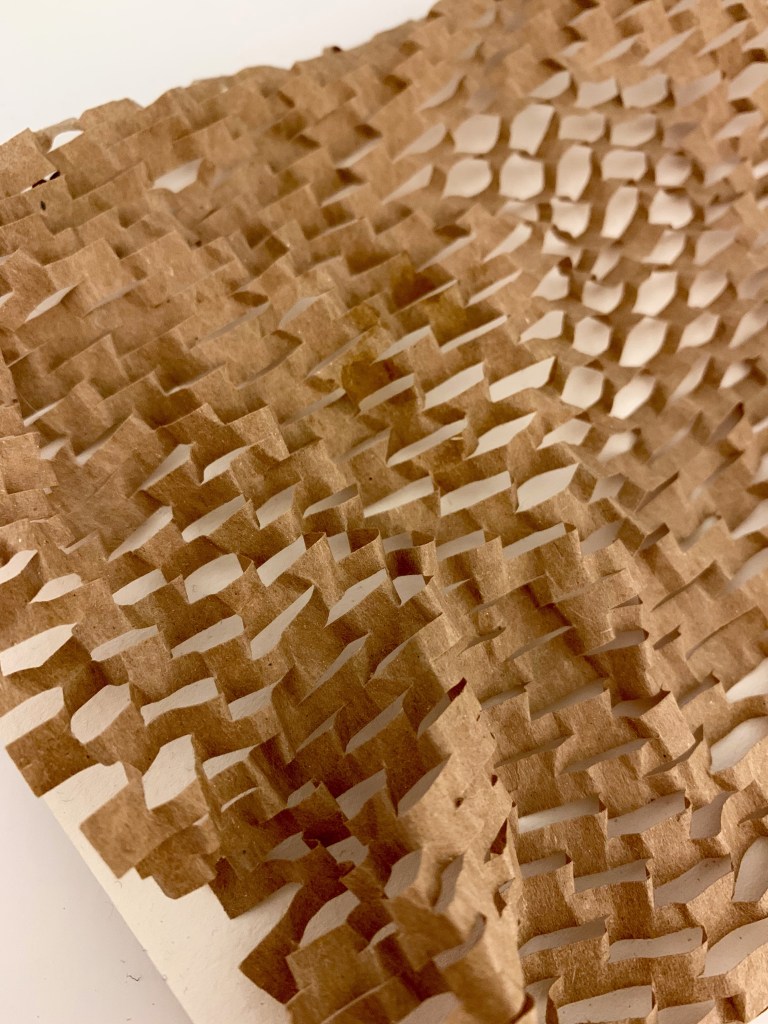
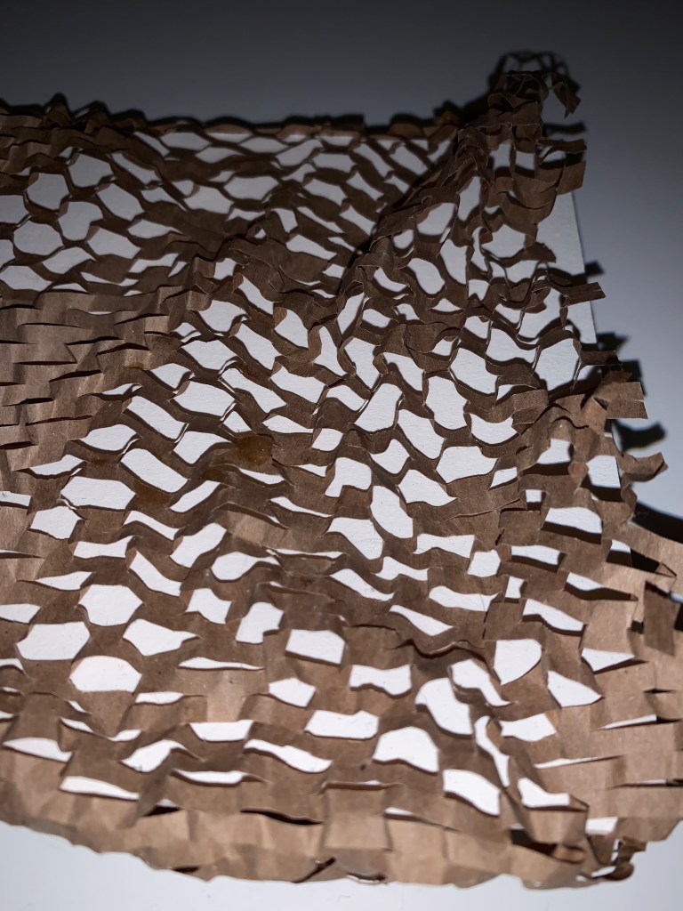
The third surface design I created explores shape and texture. When observing the glass surface its texture was an in grooved, indented circular pattern that repeated throughout the entirety of the window. The rounded shapes present in the glass I decided to draw inspiration from for this surface design. By emphasising the pattern and developing it into a reversed format, this allowed me to experiment with its textural qualities even further. I utilised an intricate cut out, netted pattern and moulded it to create varying tonal shapes and indents.
My group and I all had a collaborative sharing session on the surfaces we each made. We discussed material choices and how we proceeded to make our surfaces, as well as what aspects of our analysed surface we were inspired by or influenced our design. While sharing our surfaces it was really interesting to see how we each interpreted our surfaces and the various techniques we employed within our experimental surface designs.
Some of the surface qualities I was able to create reflect and relate to my initial surface observation. However further development of these experimental surface designs could be to start considering the implementation of colour and what impacts it would have on texture and vice versa. Beginning to play with the idea of a creating a ‘textural surface’, yet with the inclusions of purposeful colour, shape and pattern. Having strategic placement of all these aspects and how it could be included within the St James Theatre foyer space.
Design Workshop 10
30. 04. 20
As a continuation into exploring and unpacking our chosen artist model, we began by revising our analysis of one of their creative works. My chosen artist model is Renesa Architecture Design Interiors Studio and the specific work of theirs I am observing and researching into is ‘The Geometrication’.


From our artists models work, we are to observe and analyse any surface affects, movement patterns, and colour compositions active in their work. Looking into the spatial and temporal qualities at play within their work, and what details or hidden aspects of the work are revealed when you look closely and slowly. Below are my direct observations to their work ‘The Geometrication’.

Utilising our observational analysis of our chosen artist model, we are to develop and produce a second series of surface designs based on the temporality, movement, materiality and atmospheric affects of the creative work we have studied.
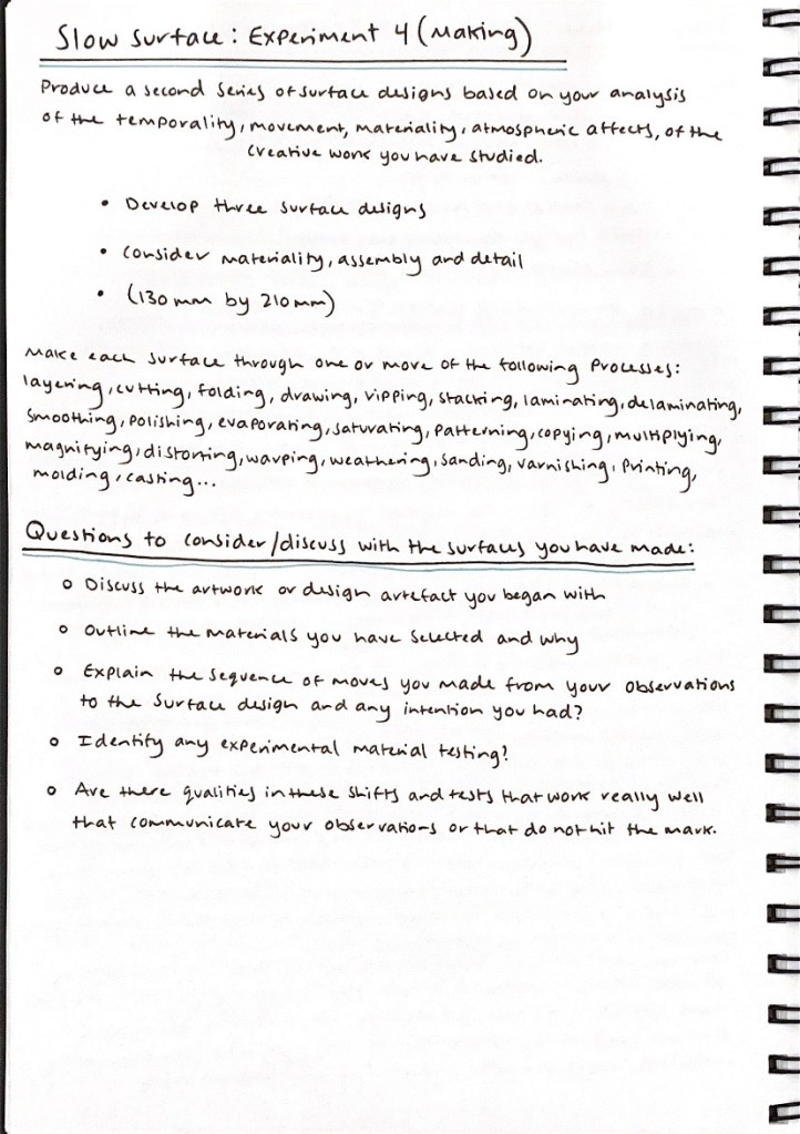
Before constructing my second series of surface designs, I drew up some planning experimental sketches of various surface design ideas that are influenced by my chosen creatives work ‘The Geometrication’. For my first surface I sketched and planned out my ideation and the creative components I wanted to focus on in my design.
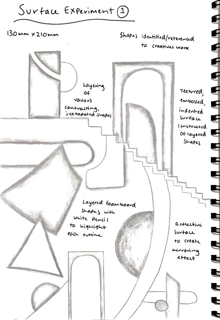
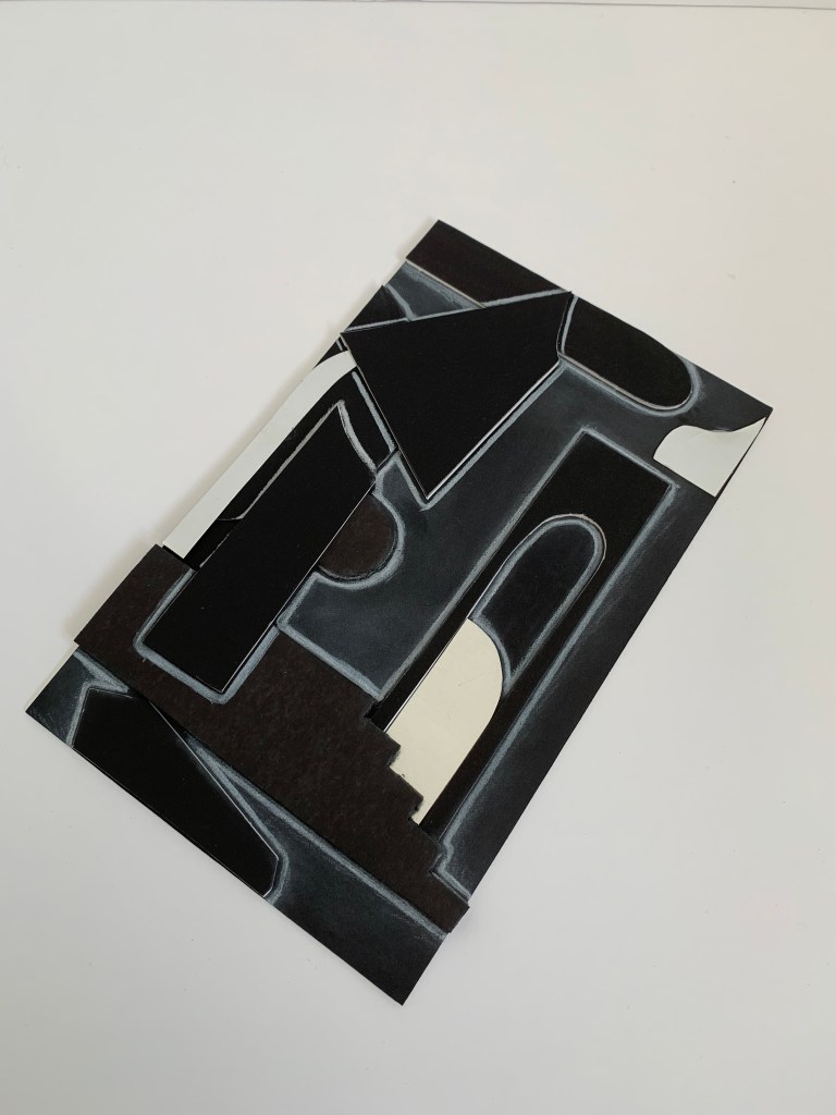
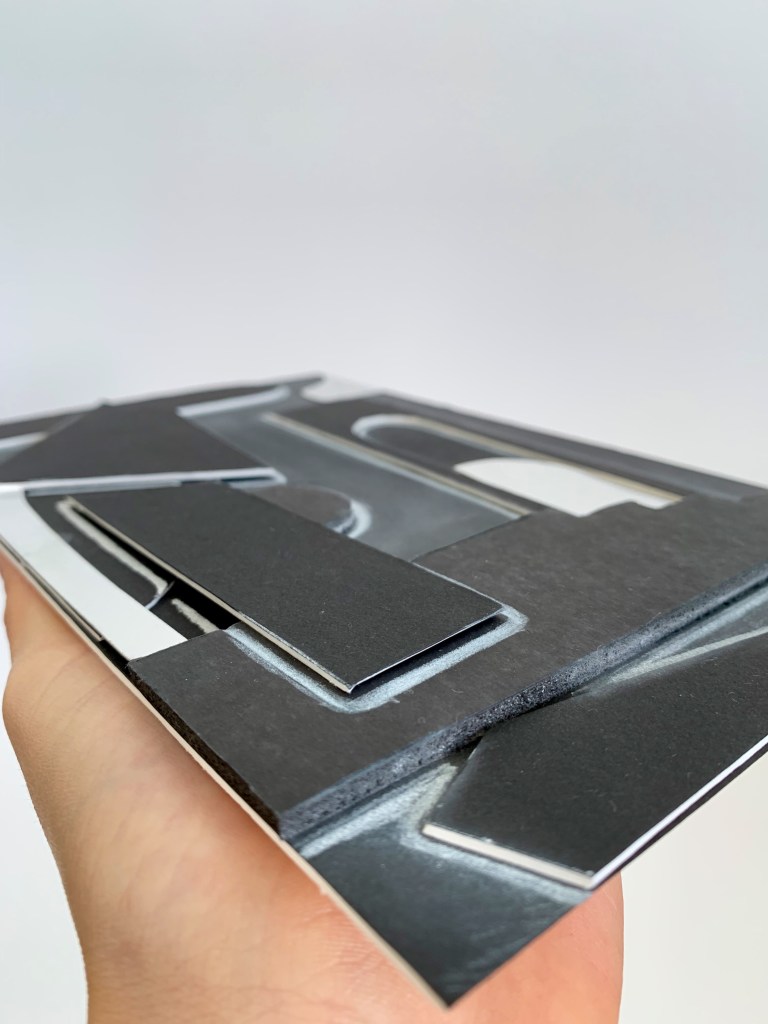
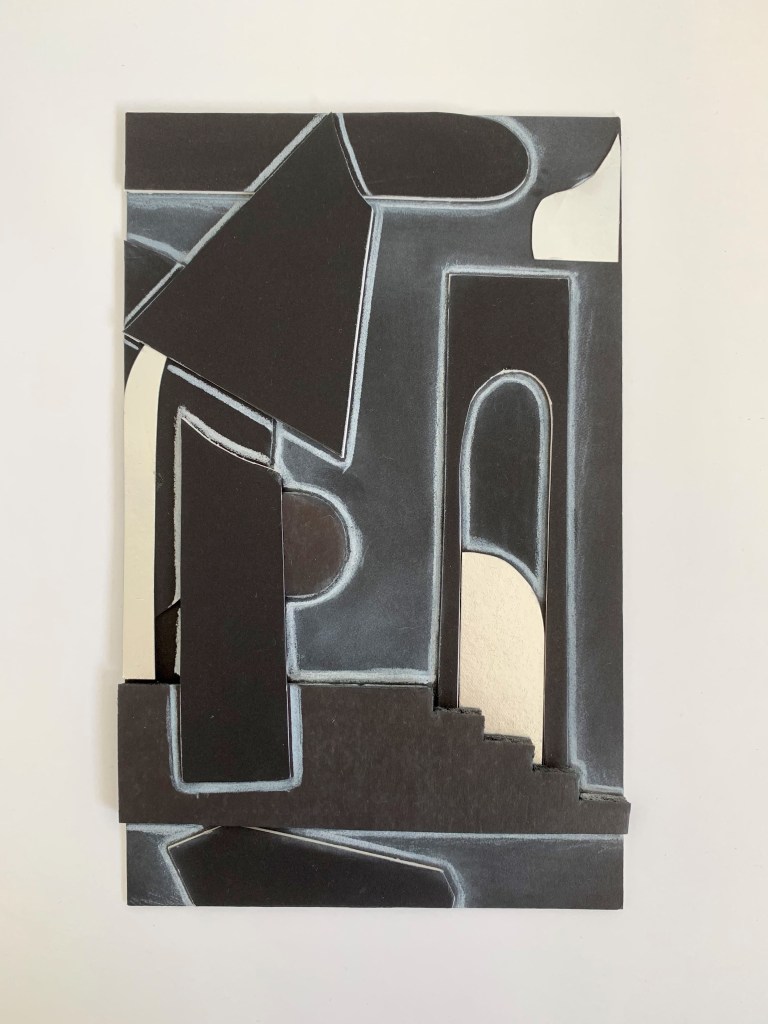
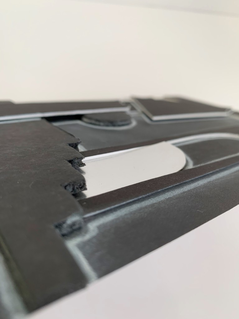
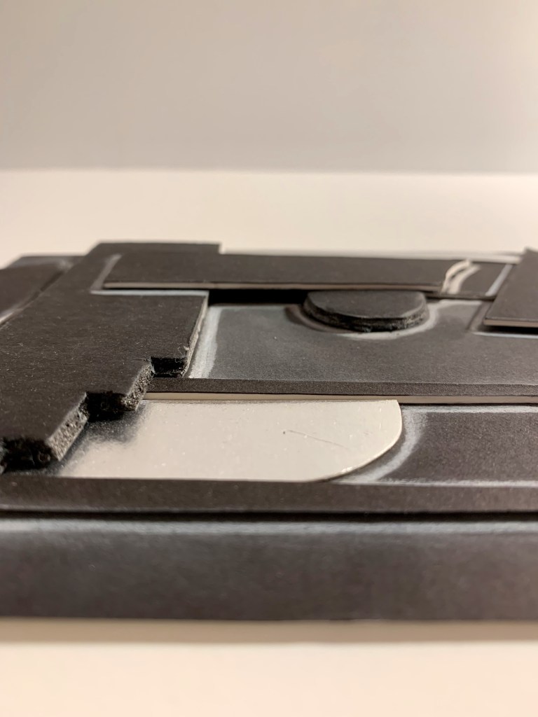
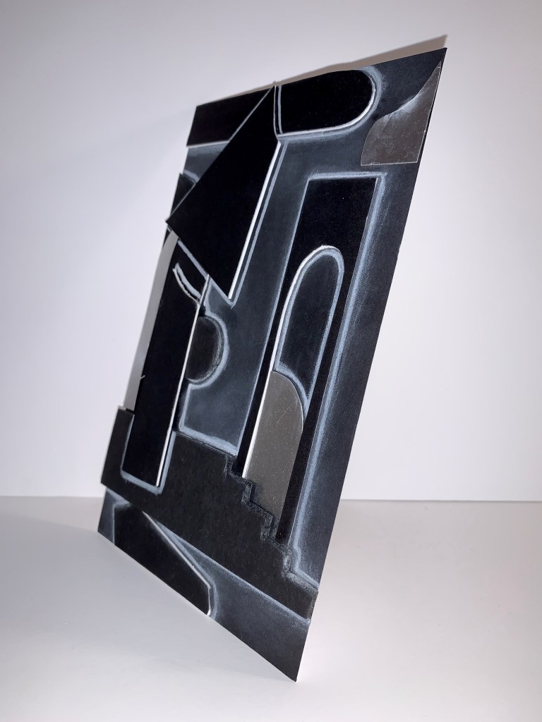
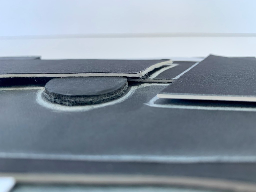
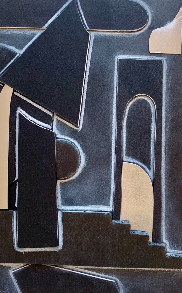
My first surface focused on the layering arrangement of various contrasting and juxtaposed shapes. Identifying and referencing to shapes from Renesa’s work, I have created a textured, embossed and indented surface constructed of a multitude of shapes. The surface is constructed by using, cutting and layering black foam board and reflective surface, as well as outlining and highlighting the shapes with white pencil.
For my second surface I sketched and planned out my ideation and the creative components I wanted to focus on in my design.
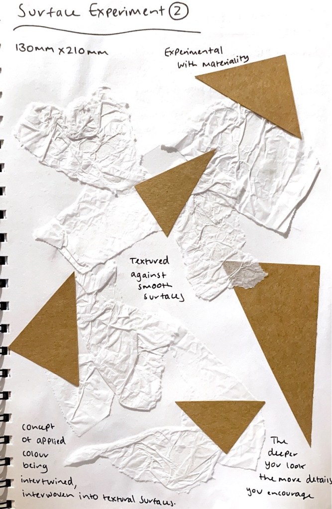
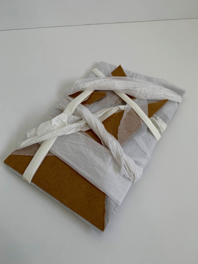


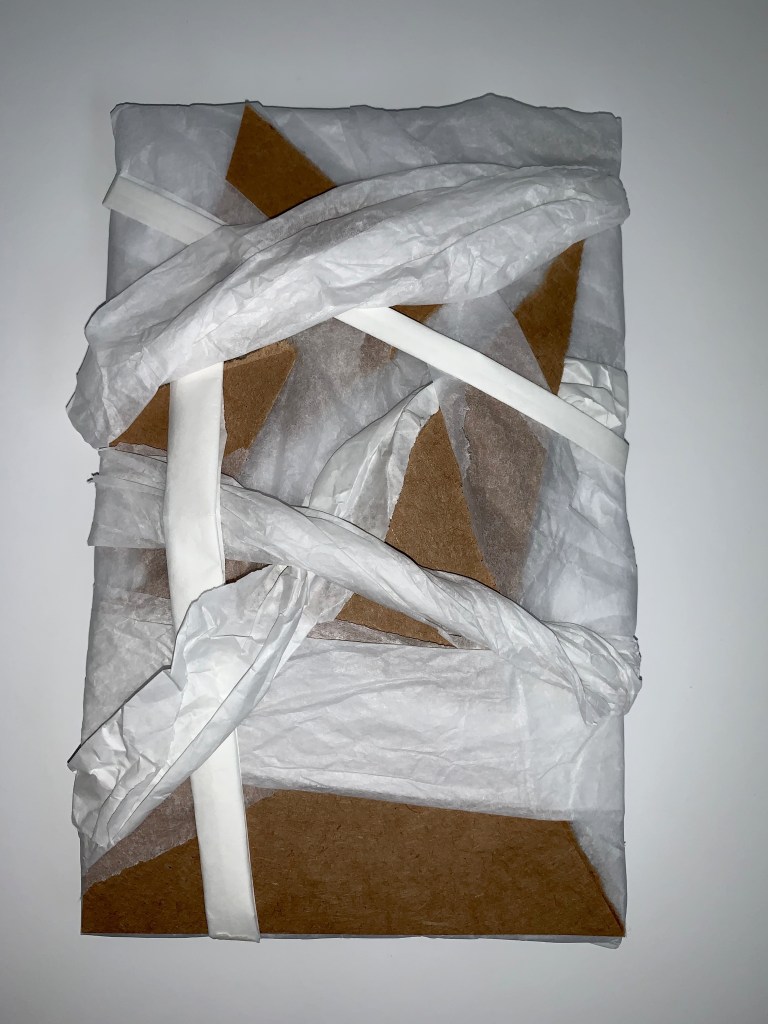
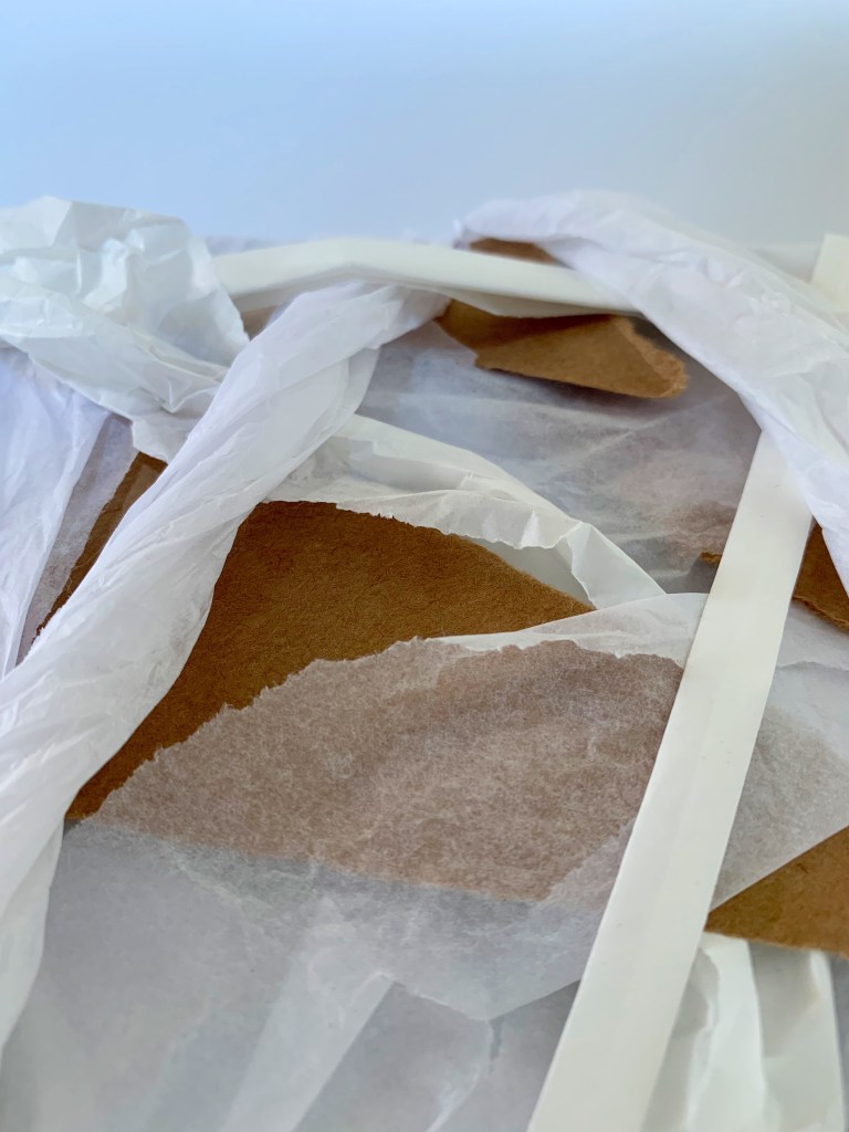
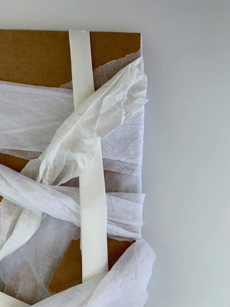
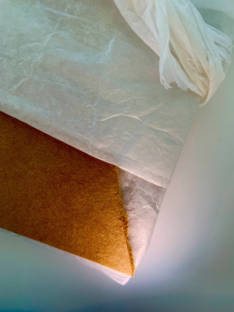
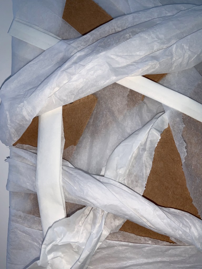
My second surface focused on experimenting with materiality and the contrasting qualities possessed within a textured and smooth surface. Within Renesa’s work they utilise a range of surface materials either upholding texture or not, so I wanted to play around and expand on their use of intertwining applied colour within and into textural surfaces. The surface is constructed by using white paper, tissue and card, where each material has been manipulated, folded, cut and interwoven together.
For my third surface I sketched and planned out my ideation and the creative components I wanted to focus on in my design.
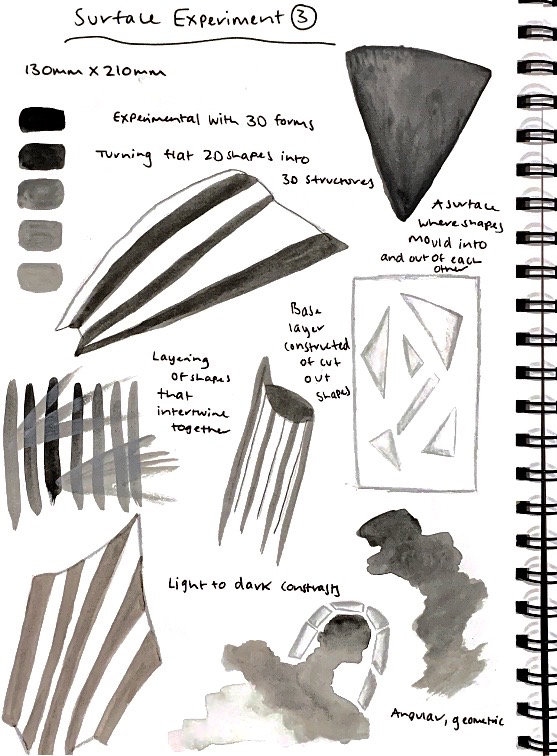
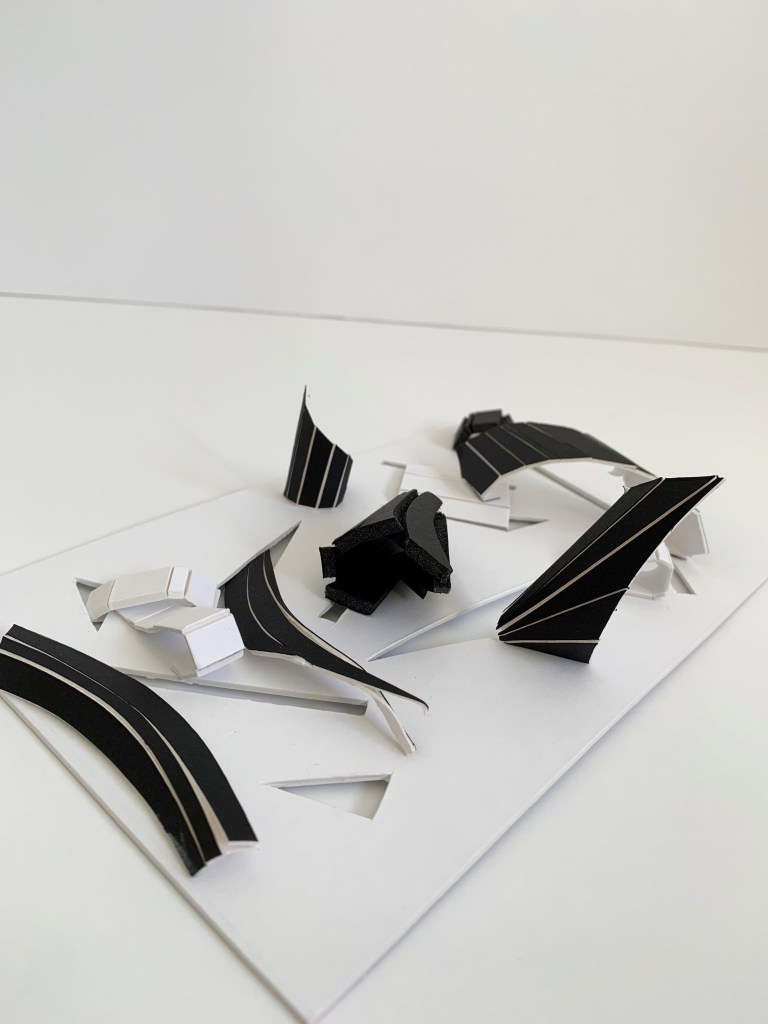
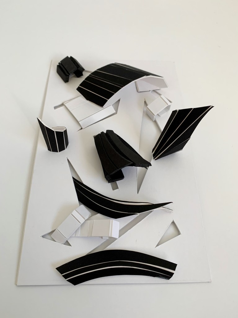
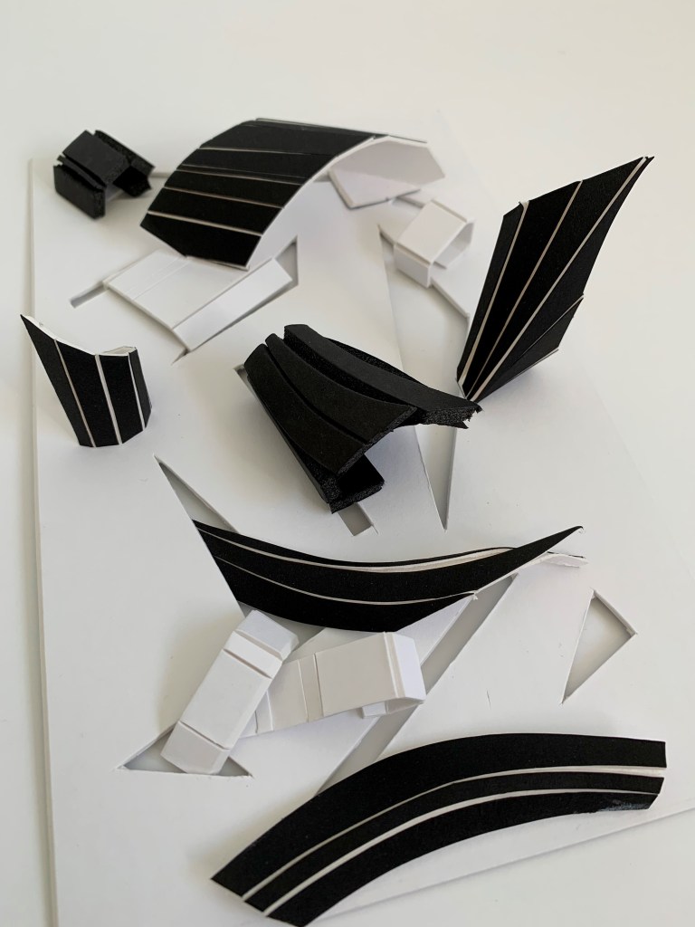
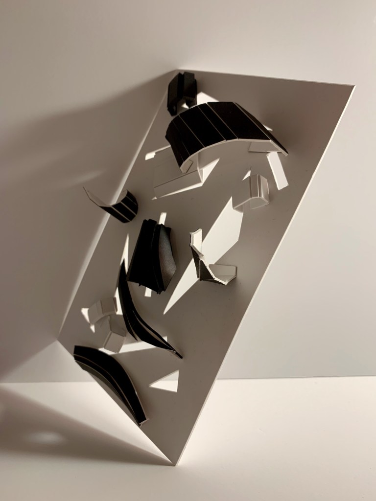
My third surface focused on experimentation with 3D forms by turning flat 2D shapes into 3D structures. Highlighting the depth of angular, geometric shapes present in Renesa’s work, I wanted to play around with the ideas of creating a surface where these shapes mould into and out of each other, unfolding and unraveling, a layering of shapely forms. This surface also explores stark contrasts through light, dark and shadow. The surface is constructed by using a base layer composed of various cut outs, where patterned foam board shapes have been folded and threaded throughout the surface.
My group and I all had another collaborative sharing session to show each other our three new surface designs. It was really interesting to see how we each were influenced by our chosen artist models and how we employed aspects of their creative work into our designs. We all used similar techniques of folding, cutting, layering and drawing yet in such contrasting ways, making our overall surface outcomes all so uniquely different.
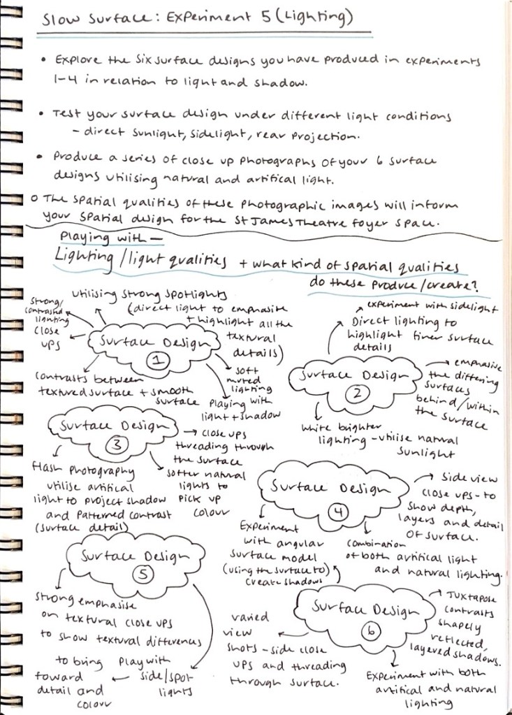
Exploring all the six surface designs I have produced within the Slow Surface experimentation exercises, we were asked to test our surface designs under different lighting conditions. Playing around with light and shadow, we are to produce a series of close up photographs of our six surface designs utilising natural and artificial light. I decided to write down and plan out some idea explorations surrounding various lighting choices that I could explore in my photographs.
Below are the photographs I took of each experimental surface design under different lighting conditions.


For my first surface design I wanted to utilise strong spotlights and direct light sources to emphasise and highlight all the textural details present within the surface. Playing with light and shadow by employing soft, muted lighting in comparison to strong, contrasted lighting in order to closely juxtapose the textured surface against the smooth surface.


For my second surface design I wanted to experiment with direct lighting in order to highlight finer surface details and emphasise the differing surfaces imbedded within the design itself. Playing around with both bright white lighting and natural sunlight sources to see the varying impacts each has on the surface material.


For my third surface design I wanted to experiment with flash photography and employ artificial lighting in order to project shadow and patterned contrasts of the intricate surface details. I also explored a softer more subdued lighting approach to pick up the natural colours of the surface. Some photographs demonstrate close ups where I played around with different angles, threading through the surface.


For my fourth surface design I wanted to explore a combination of both artificial lighting and natural lighting, as well as experiment with various perspective angles. Playing around with angular viewpoints using the surface itself to create shadows, also employing side view close ups to show depth, layers and details of the surface design.

For my fifth surface design I wanted to create a strong emphasise on textural close ups in order to show the textural differences embedded within the surface design. Playing around with both side lights and direct spotlights to bring forward detail and colour.

For my sixth surface design I wanted to experiment with both artificial and natural lighting in order to juxtapose and contrast the shapely reflections and layered shadows present within the surface. I also utilised a variety of viewpoints such as side close ups, angular perspectives and threading into the surface.
Getting to experiment and play around to differential lighting techniques and angled viewpoints was really interesting as it allowed me to discover new perspectives and creative aspects within each surface design. Understanding how you are able to discover and establish new surfaces through photography and lighting choices. It was intriguing to explore which surfaces and materials would contrast harsh shadows in comparison to soft shadows and the types of shapes and patterns they would generate. It was fascinating to see how lighting could enhance, emphasise and highlight specific elements within each surface design. As a progression from this exercise, some of the spatial qualities possessed within these photographic images will help to inform the development of my spatial design for the St James Theatre foyer space. I was particularly drawn to how texture and detail was enhanced through purposeful lighting and the compelling qualities of surface depth in which they acquired. I was also interested in how lighting accentuated the shapes and lines present within each surface and how they transitioned into patterned contrasts and detailed shadows.
Week Six (Slow Surface 2) – Design Workshop 11
05. 05. 20
This week involves shifting the scale from the small surface designs we produced last week, and to develop these surface designs in relation to the St James Theatre foyer space. We are to consider the interrelationship between the qualities of our surface design experiments, at a hand held scale, and the atmospheric qualities these will produce at a larger scale – as a lived sensorial experience.
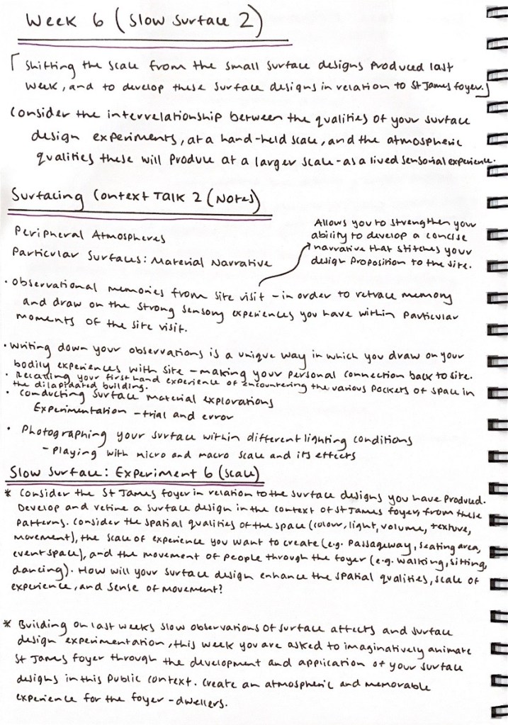
We are to consider the St James foyer in relation to the surface designs we have produced, developing and refining a surface design in the context of the St James foyer, from these patterns. Consider the spatial qualities of the space (colour, light, volume, texture, movement), the scale of experience you want to create (e.g. passageway, seating area, event space), and the movement of people through the foyer (e.g. walking, sitting, dancing). How will my surface design enhance the spatial qualities, scale of experience, and sense of movement?
Building on last weeks slow observations of surface affects and surface design experimentation, this week we are to imaginatively animate St James foyer through the development and application of our surface designs in this public context. Create an atmospheric and memorable experience for the foyer – dwellers.
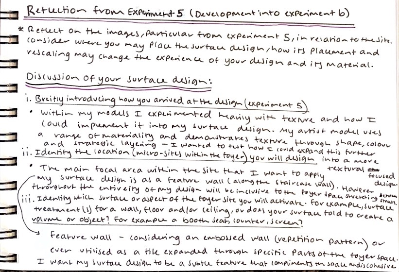
For the beginning of this design workshop, we were asked to reflect on the images, particular from experiment 4 and 5, in relation to the site. Consider where you may want to place your surface design, how its placement and rescaling may change the experience of your design and its material. For our group discussions I wrote down a summarised reflection of my experimental surface designs, as well as some of my initial ideas and thoughts towards where and how I may implement my surface into the foyer space.
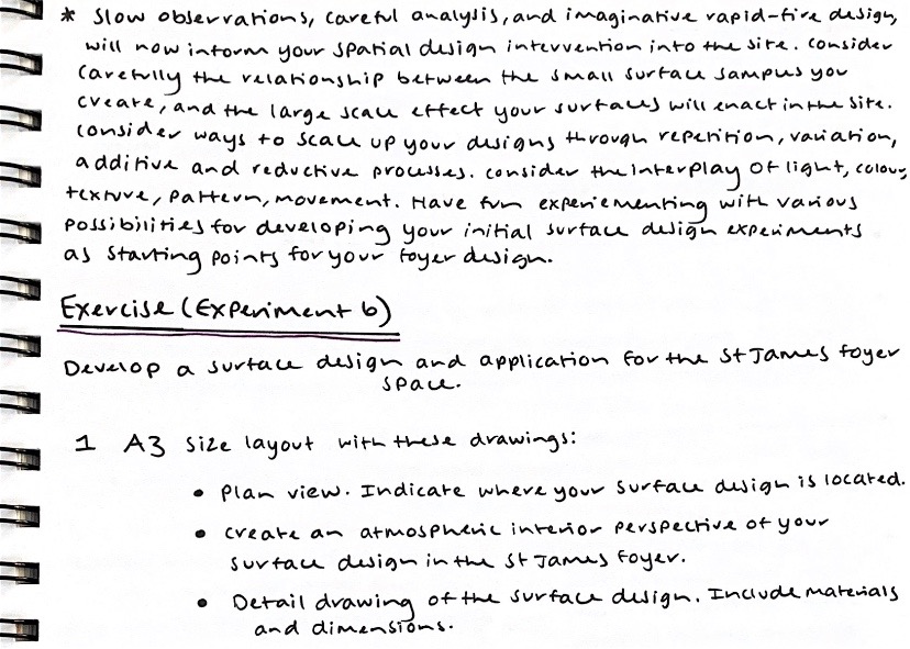
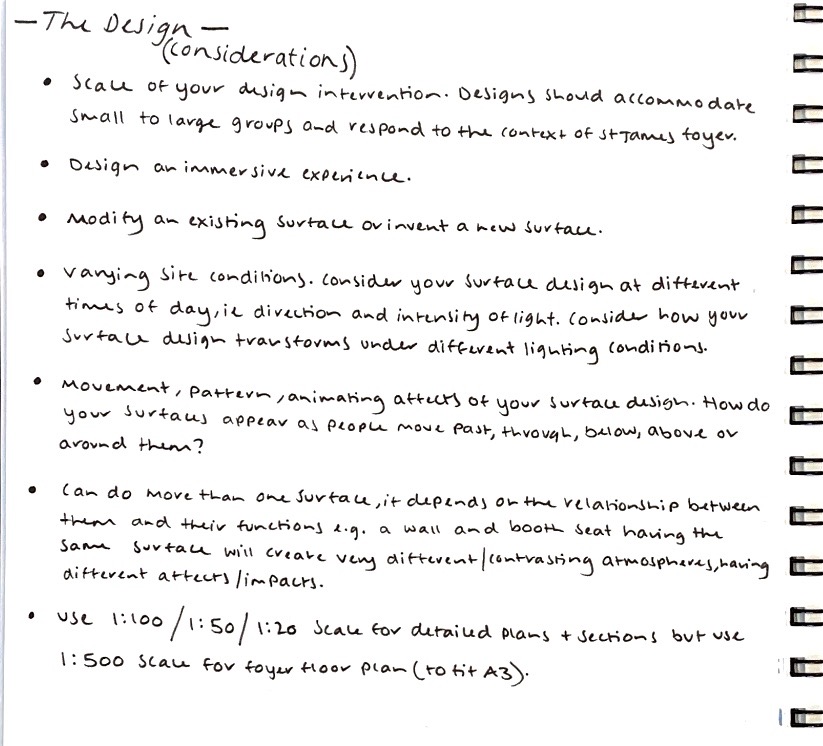
As a continuation development from our previous experimental surface designs, we are to develop a surface design and application for the St James foyer space, showing this through site plans, atmospheric interior perspectives and detailed drawings of the design. Written below are some of the main things to consider when developing the design.
As a continuation into my surface exploration, as a reflection from our previous Slow Surface design ideation exercises I was particularly drawn to one of my surface designs and how its implementation of shape (along with the future addition of colour) could enhance the St James foyer space. With regards to developing my surface design I was drawn to the variation in shapes and colour volumes showcased within Studio Renesa’s work as well as my own artist model inspired drawings. All these design explorations I am going to utilise to influence and draw inspiration on for my surface design. The image on the left captures my artist models work ‘The Geometrication’ and the surfaces present throughout their design. The image in the middle is one of my favourite slow surface experimentations focused particularly on the layering arrangement of various contrasting and juxtaposed shapes. Finally the image on the right is one of my artist model inspired drawings in which I wish to draw on the various geometric shapes composed together, exploring how I can incorporate them within my surface design.
In order to begin to correlate and establish some key ideas for surface treatments, designs and potential locations of placement, I decided to formulate a mind map brainstorm jotting down an array of possible surface ideas I could implement within my design intervention and the kind of impact it would have within the space. Taking into account how colour, shape, pattern, materiality and texture would be influential or inclusive within these surface treatments. What role would they play within my design? How would the location, size, scale of my surface design impact the inhabitants experience within the space? What kind of relationship do I want them to establish between not only the surface treatments but the overall space itself? Beginning to consider the kind of immersive experience I wish for people to encounter and feel, the spatial qualities in which I am exploring.
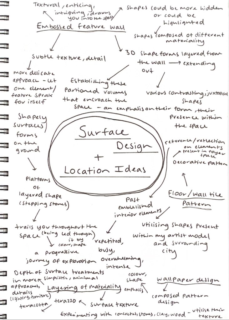
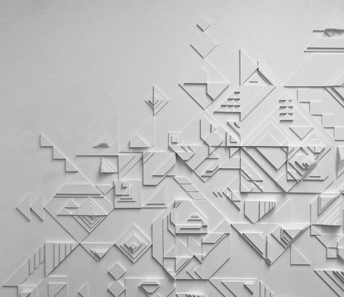
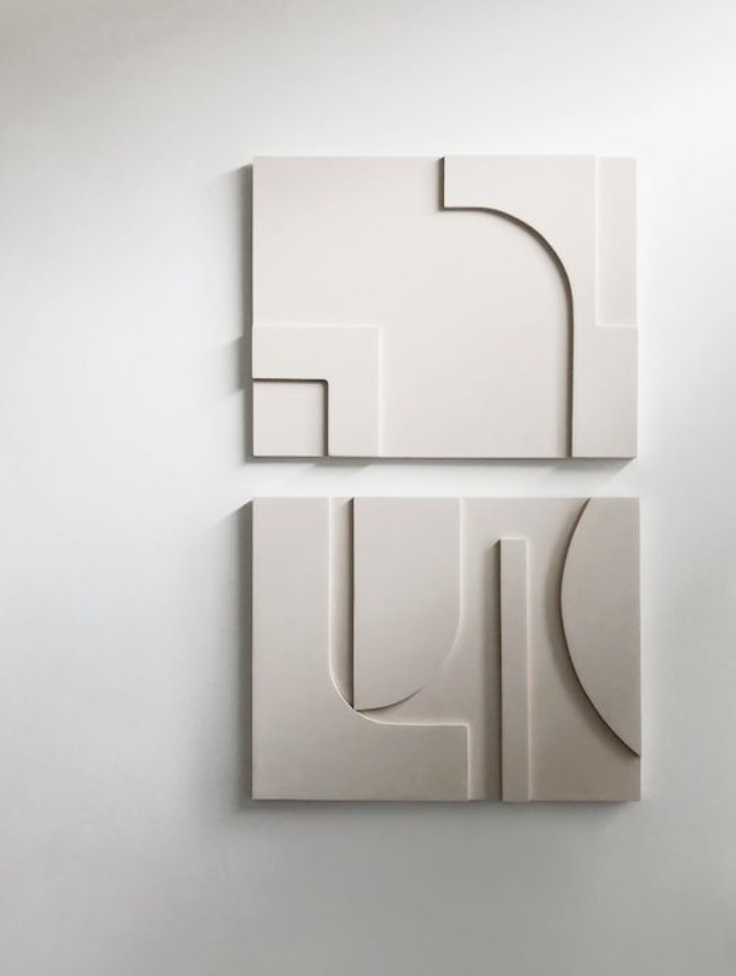
My initial idea exploration surrounded utilising the surface treatment of an embossed wall, a textural wall composed of various layered shapes and geometric forms. Where different shape forms are established through a detailed, three dimensional wall pattern. Considering how I could create these partitioned, textural volumes that would almost encroach within the space, how this kind of treatment would emphasise their form, their presence within the space. Featured below are some design inspiration images of the different ways in which I could potentially employ this kind of surface treatment.


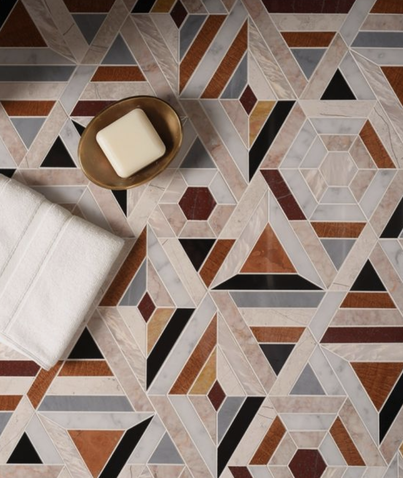
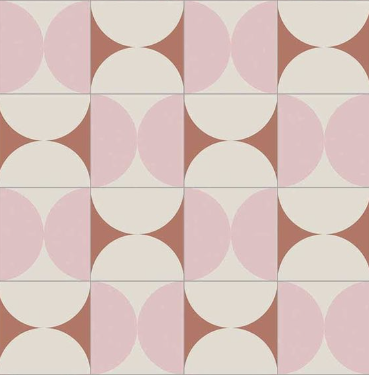
Another surface treatment approach I considered implementing within the space was the utilisation of a statement floor tile. A tile that consists of an intricate and detailed pattern that would extend throughout the entirety of the foyer space, in order to create a continuous flow throughout the space and generate maximum impact. For the experimentation of developing a surface design and application for the St James foyer space I decided to continue exploring how this tile design could be implemented within the space. Featured below are some inspiration images of different patterns and design ideations of how to construct a bold, statement tile, along with the ways in which I could potentially employ this kind of surface treatment and the materiality I could use.

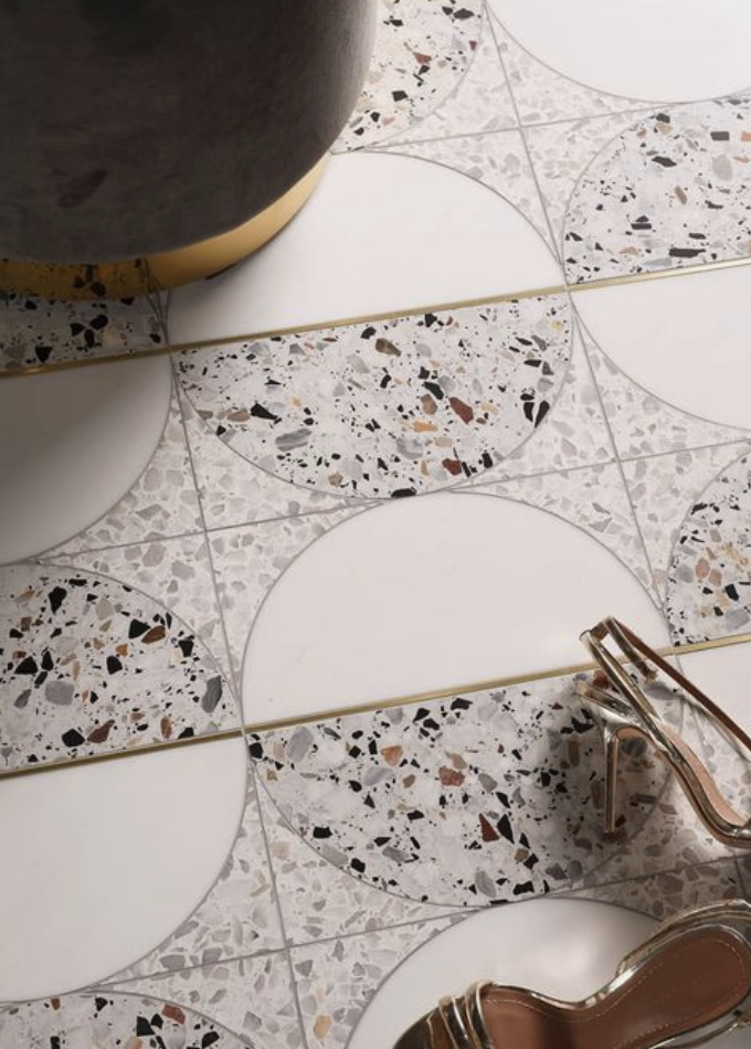

I was particularly drawn to creating a repeated tile pattern composed of one dominant shape that can be arranged, changed, manipulated and developed into multiple design ideations. Playing around with the adaption of shape and how it could be utilised in a variety of ways in order to establish a prominent, enhancing pattern design that will encapsulate the viewer.
Beginning my pattern design, I started by exploring and sketching out an array of shapes and geometric forms influenced by both my artist model’s work and shapes I observed through my own design explorations, as well as the external environments of our surrounding city. Experimenting with colour, shapes, pattern and how I could combine, layer, merge, juxtapose these aspects together to formulate a desired shape and pattern for further testing.
After accumulating, combining and experimenting with a variety of shapes and patterns, I eventually configured my favourite, key geometric elements to create one cohesive shape design that could be utilised and developed in a multitude of ways – allowing for great depth of exploration within different surface designs for a floor tile treatment. The materiality I would consider for this kind of surface treatment would be to utilise either a ceramic or cement tile as both are suitable for many applications and would be extremely durable to withstand the dense movement of people throughout the space.
Using my shape design, I started experimental testing of differential pattern ideas by laying out the shape in various compositions imagining how these designs would emulate in a repeated tile design.

After establishing multiple compositional layouts, I selected my favourite three patterns to continue testing in a larger, repeated scale, as well as transfer my tile design within the foyer site plan in order to start connecting how this kind of surface treatment would impact, view and be perceived within the space. Featured below are the patterns I am going to explore implementing within the foyer space.
I decided to generate an overall repeated tile layout of each individual pattern, establishing further development of pattern, allowing me to imagine the size and scale of this floor tile design and how it would be received at maximum scale across the whole site.


From these established tile designs I embedded each one within the St James Site floor plan in order to give these designs context, and allow me to consider how they will actually respond and resonate within the space, the particular type of impact they will have on my design intervention, the people progressing through the space and most importantly the St James Theatre foyer space itself.
I also decided to experiment with how this kind of intricate and repetitive pattern would read as a wallpaper or wall feature, comparing one specific pattern at different scales and the intensity each would have within the space.
As part of our informal presentation to show others what we have been working on and the different surface treatments we are exploring and experimenting with, I constructed an A3 drawing composing of the influential and progressive elements that allowed me to formulate through an exploration of ideas.

Week Seven (Informal Presentations + Threshold Moment) – Design Workshop 12
This week began with informal presentations, where in groups of four we each took a maximum of 10 minutes to present our A3 drawings and explain our design ideas to each other. Below are an outline of some of the questions that we drew on as part of our group discussion:
Identify the location of your design on the site – The implementation of a surface treatment consisting of an intricately repeated floor tile pattern to be applied throughout the entirety of the foyer space.
Explain why you chose a specific place – I selected to apply this surface treatment to the floor of the site as this location will allow for maximum impact and establish a continuity to flow within the space as the people move through it. By choosing a flooring surface I was able to connect the two ends of the site, Queen Street and Lorne Street leading people through the space.
Briefly introduce how you arrived at the design – From the beginning I knew I wanted to play around and experiment with shape, colour and pattern as these components I am heavily intrigued by and are influential within both my artist models work and my own design exploration interests. I started by composing various geometric shapes and forms in order to generate one cohesive design that could be further experimented at a larger, repeated scale. Once I established the design the rest was just trial and error of different compositional layouts and potential tile patterns.
Discuss the aspects of the artist models work you have drawn on – I have particularly drawn on Studio Renesa’s use of layered geometric shapes and colours as these aspects are a critical component within their designs. Their unique utilisation of shape inspired me to create my own design implementing similar shapely forms and colour palettes.
The moves you made in developing the design – I experimented a lot with shape, colour, pattern and composition in order to develop a variety of surface designs, trialing with both pattern variation and pattern repetition. I also tested these designs at various sizes and scales.
The shifts you made when shifting the scale of your design from hand-held to room-scale – I knew that by experimenting with a floor tile pattern that it would extend throughout the entirety of the foyer space, leading people through it. From the beginning I imagined the individual tile size to be roughly 600 x 600mm but when extended throughout the space the scaled impact would be much greater.
Identify which surface or aspect of the foyer site that you have activated – The entirety of the foyer space would be activated as the surface treatment of a floor tile design would cover the full floor length.
Materials you have chosen – The materiality I would use for this kind of surface treatment would be a ceramic or cement tile as both are suitable for many applications and would be extremely durable to withstand the dense movement of people throughout the space. Either of these tile materials would allow for the applied pattern and details to be showcased.
The feedback from my presentation was overall really positive as my group loved the contrasts in colours (the application of both warm and cool tones) and how I have highlighted them through the use of geometric shape and patterning. Throughout my presentation I also showed them my artist model work and where I have chosen to draw inspiration from for my design intervention. They were fascinated by the backing lights highlighting the distinct volumes and shapes within the work, as well as how they uphold detailed emphasis on their selection in fixtures and fittings, how they add to the spaces overall atmospheric conditions.
Overall these Slow Surface exercises were a great way of further exploring, developing and applying a variation of surface treatments and how important it is to perceptively think through each aspect within the design considering its detail, pattern, colour, materiality, size, scale, placement as all these elements coherently work together to establish impact on both the space and its inhabitants. From these experiments I will continue to further develop, extend and progress my design ideas and other possible surface treatments in which I could employ within the space. These explorations have allowed me to start to question what exactly do I want the space to look like? What components, features, aspects to I wish to emulate within my design intervention? How will I implement colour, shape, pattern, texture within my design so that it has meaning, purpose, conceptual backing and most importantly has impact on both the space and the people moving through it?
In this weeks exercise we are looking to activate the entrance threshold by designing the door handle detail. The experience of a spatial narrative begins with the turn or push of the door handle or some other device or detail that initiates the entrance into another environment. This designed detail should in some way reflect how our chosen artist model uses colour and/or material. Essential aspects to consider when designing this threshold moment is the relationship it establishes with the exterior site conditions and the interior of the St James Theatre foyer space.
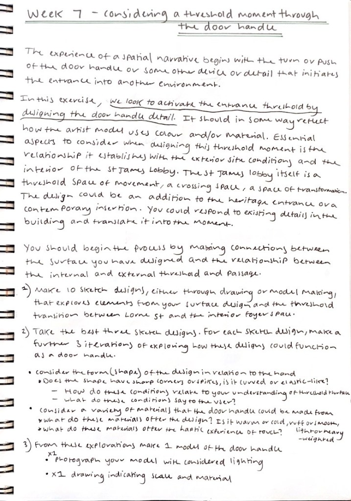
We should begin the design process by making connections between the surface we have designed and the relationship between the internal and external threshold and passage. I began by creating a variety of sketch designs that are inspired by and explore elements from my surface design, artist model exploration and the idea of a threshold moment. Referencing between the internal and external environments and how I could capture and extend the variety of colours, shapes and patterns present within the outer city into the foyer space throughout my design. Developing a profound connection between the two spaces where the dynamic atmosphere continues inside. To grab the attention of the passerby so that they are intrigued, curious and interested in what might lie within the interiors, the space that lies inside. To develop the design I experimented with colour, shape, texture, layering, size, scale and pattern.
I then selected three sketches to further explore different door handle iteration designs.
My first set of designs inspired by sketch one explore the connection between the interior foyer space and the exterior city environment. How these two spaces can interconnect where the door handle allows for the passerby to get a glimpse into the space that may lie inside. These designs highlight the juxtaposition of shapes present both in the foyer space and in the city, by using colour, layering, texture and detail to emphasise and enhance their placement, leading people into the space.
My second set of designs inspired by sketch two explore the dominance and authority of shape and how by contrasting, layering, merging, combining different shapes to establish patterns and detail can influence ones perception and experience in a spatial environment. Playing around with how to develop a radical, bold statement piece, almost as if it appears decorative, a feature of work within itself.
My third set of designs inspired by sketch three explore the idea of direction and movement both that would occur within the internal foyer space and in the external city space. Experimenting with how colour, shape and pattern can direct, control, influence ones movement within a particular environment.
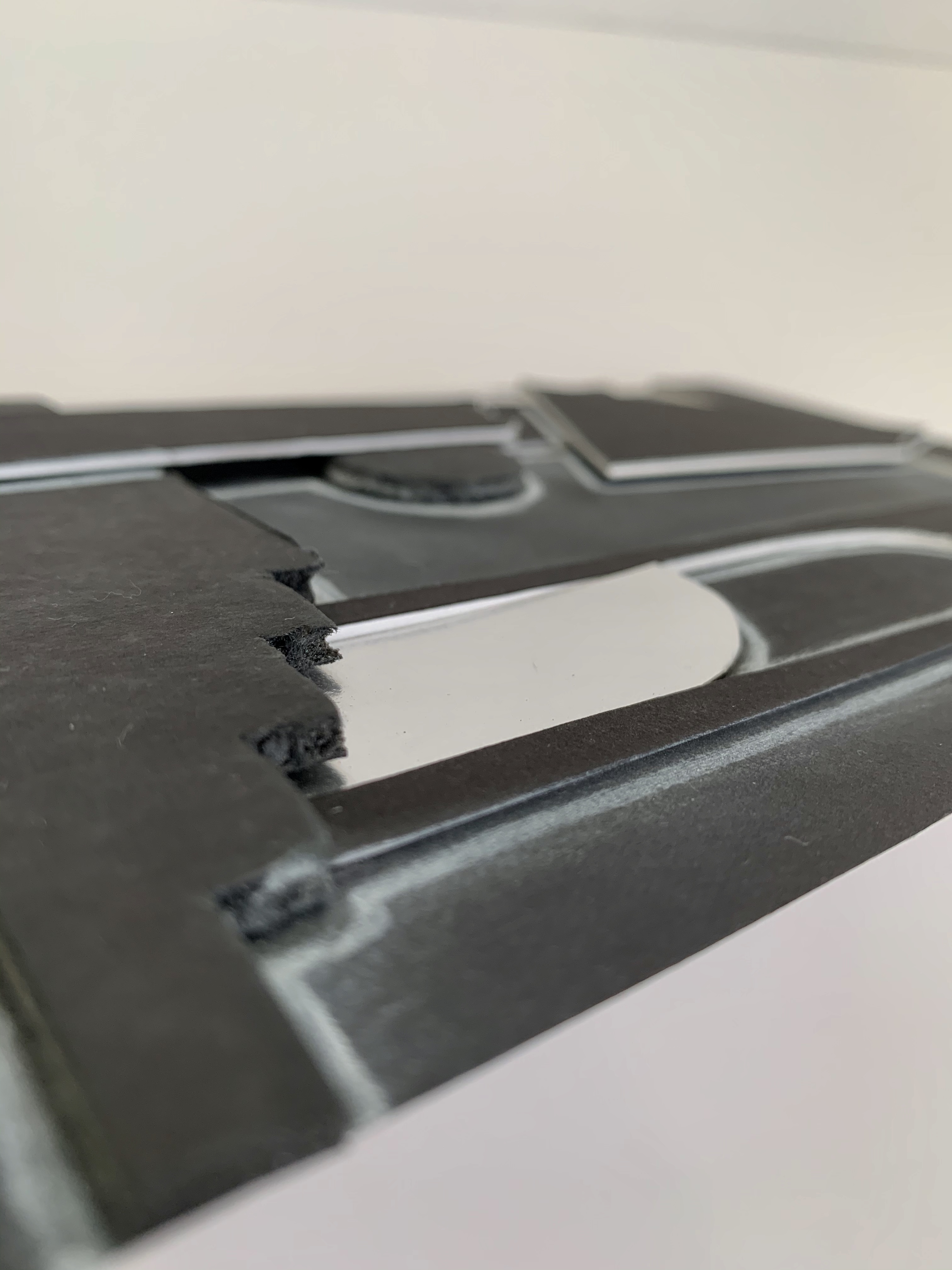
Featured below is my chosen door handle design as I felt this particular design best showcased the type of impact I was wanting it to have, both with regards to the internal and external environments. This design, down to its finer details combines all influential aspects and ideas that I wish to establish right at the entrance and exit point of the space, the threshold transition.
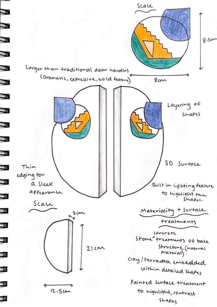
This design explores the connection between the interior foyer space and the exterior city environment, and how these two spaces can interconnect where the door handle allows for the passerby to get a glimpse into the space that may lie inside. I wanted my door handle design to be a statement, one that is bold and striking with detail, a feature of work within itself. Enhancing the juxtaposition of shapes seen both in the foyer space and in the external city, by using vibrant colours, layering, texture of materiality and detail to emphasise their presence, leading people into the space.
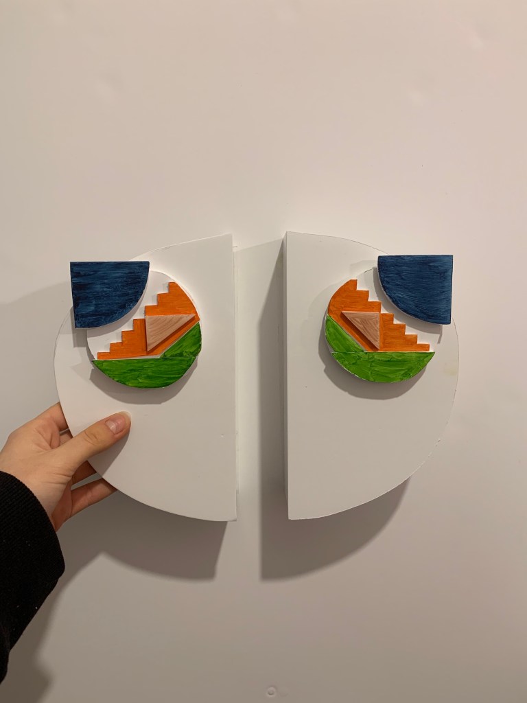
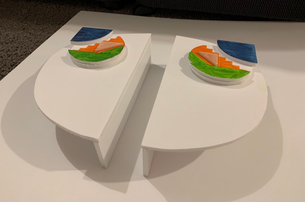
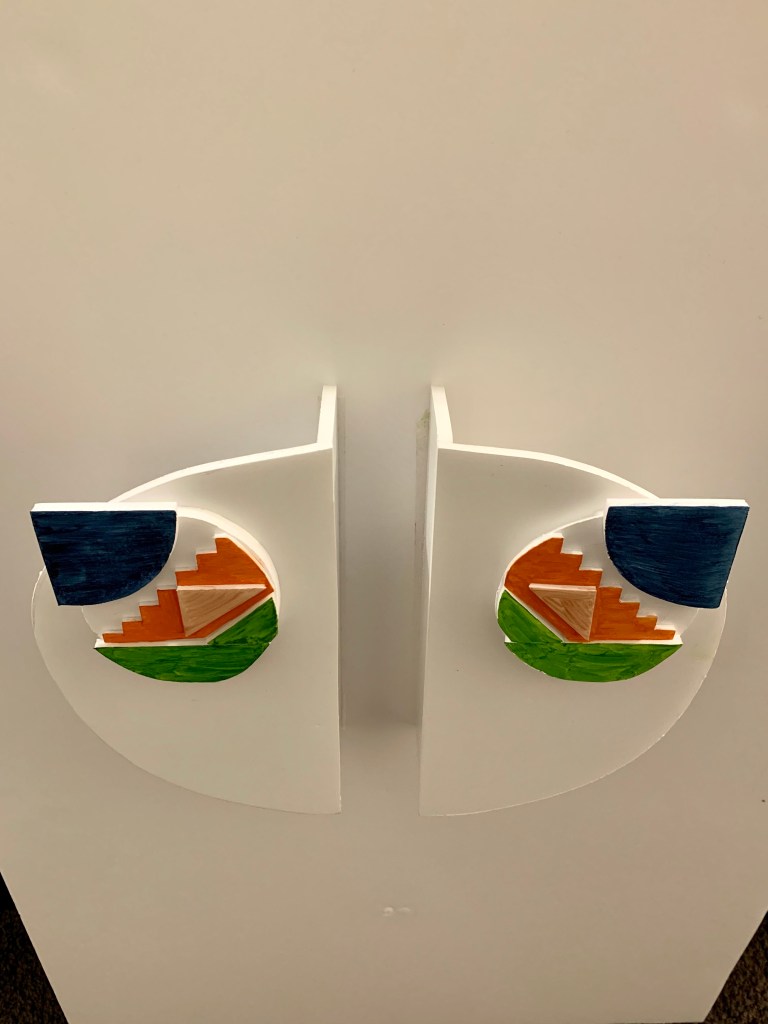
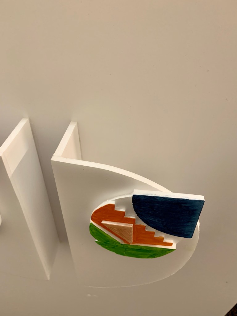
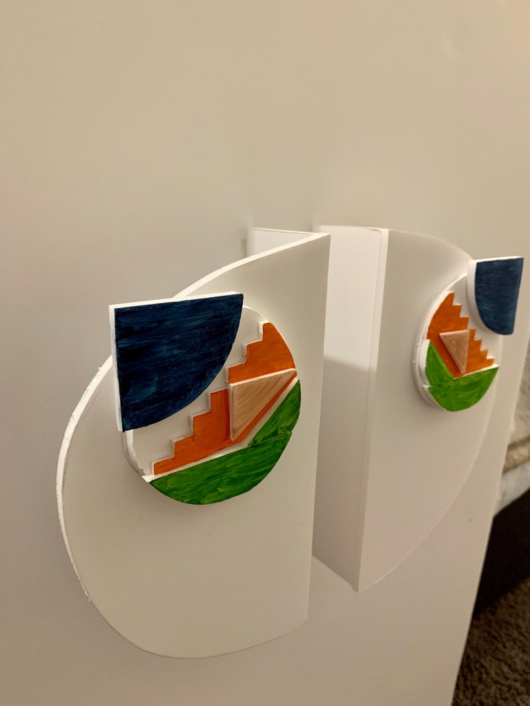
For the final design I chose to utilise two half circles, both which extend out from the wall to create the appearance of a whole circle. Each half features a detailed composition of layered, geometric shapes, each built from differential colours and materials, particularly ones reflective within the foyer space. The base and half circles are constructed of an exposed concrete finish, with the coloured shapes highlighting both painted surfaces and textured materiality, in order to make it all cohesive to the materials used in the internal space. The size of the door handles extend slightly larger than the average door handle in order to heighten its presence, impact and truely capture the attention of people proceeding past. This design is bold, vibrant and detailed, yet minimal and sleek at the same time where each curve, line and angle is purposeful and dominant.
Week Eight (Mind Mapping + Starting the Design Intervention) – Design Workshop 13
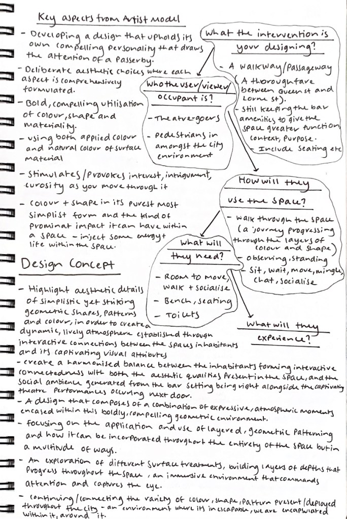
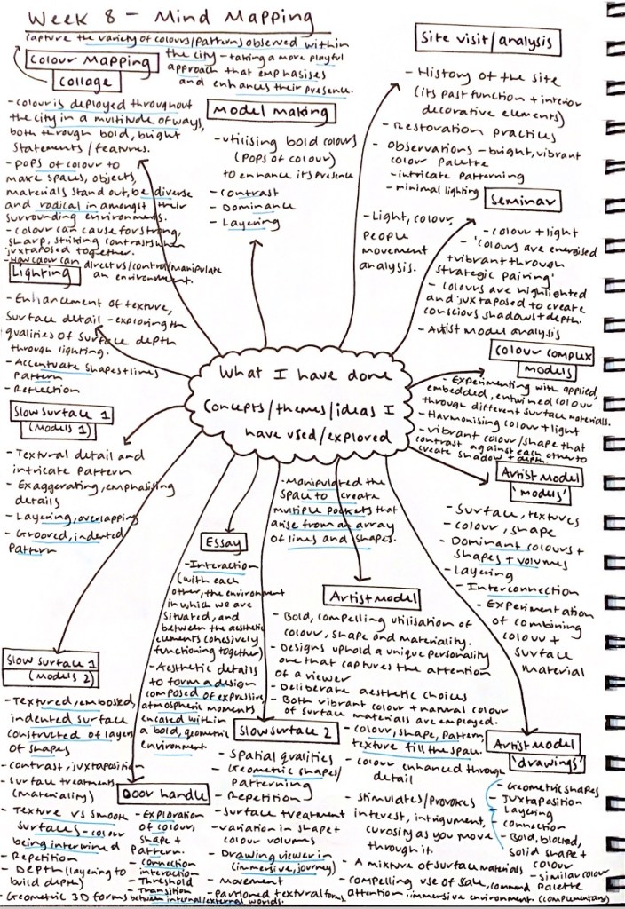
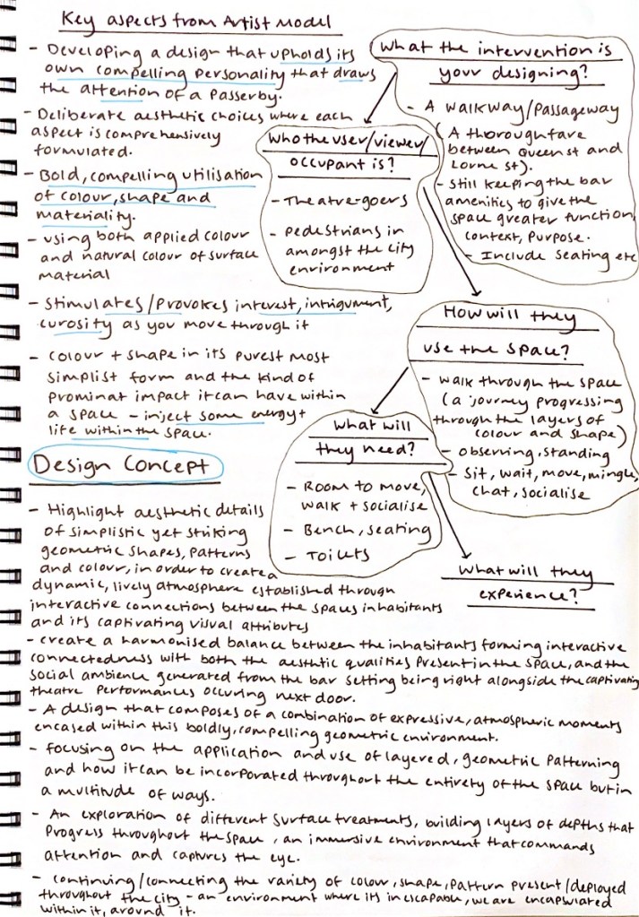
As part of our design workshop, we were asked to brainstorm and map out what we have done, in order to help us consolidate our work so far to date, capturing the ideas and work that resonates with us. In our mind maps we are to identify What can be used going forward? What the intervention is your designing? Who the user/viewer/ occupant is? How will they use the space? What will they need? What will they experience? By mind mapping out all these crucial components to the creation of our overall design it will be extremely beneficial in gathering, understanding and clarifying our thoughts and creative direction.
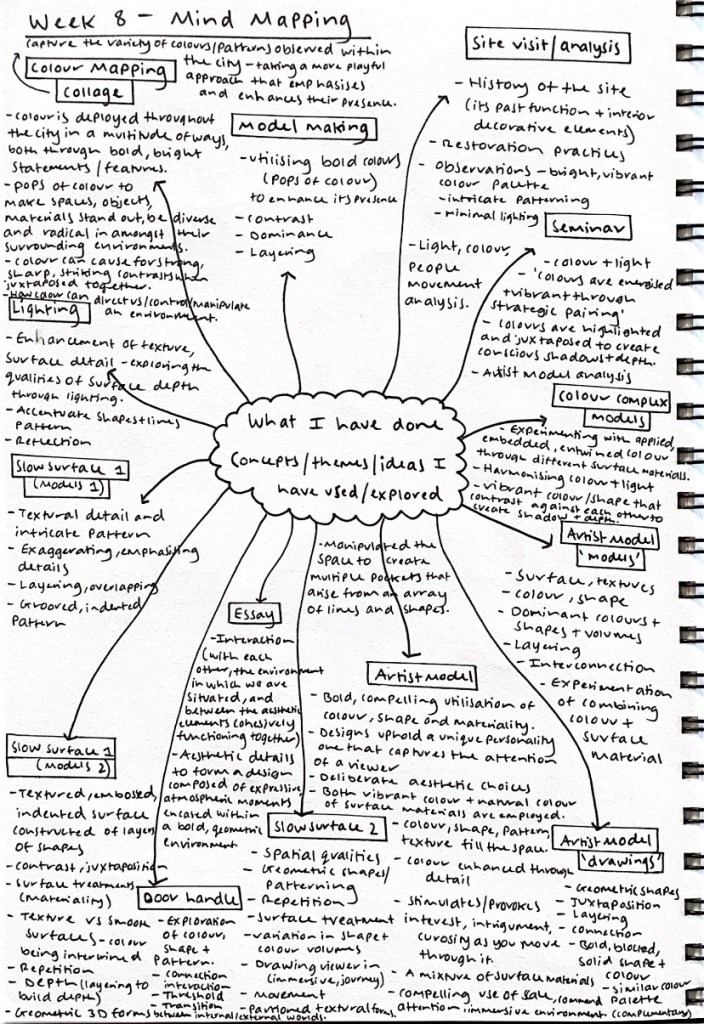
I started to mind map everything I have done over the last eight weeks as part of this design development process. Below each jotted exercise and activity I wrote down the key elements, concepts, ideas and discoveries made within each creative experiment. I noticed that there were a lot of reoccurring themes and connecting ideas between the different explorational activities, all of which I wish to utilise and continue progressing with in my design moving forwards.
I decided to brainstorm and map out what exactly my design intervention will entail, its main components and overall function and purpose. I also wrote down key influential aspects from my artist model and their work, as well as beginning to establish my conceptual ideas, thinking about what exactly is conceptually driving my design intervention, the experience I am wanting to create and how will my creative approach reflect this.
Design Workshop 14
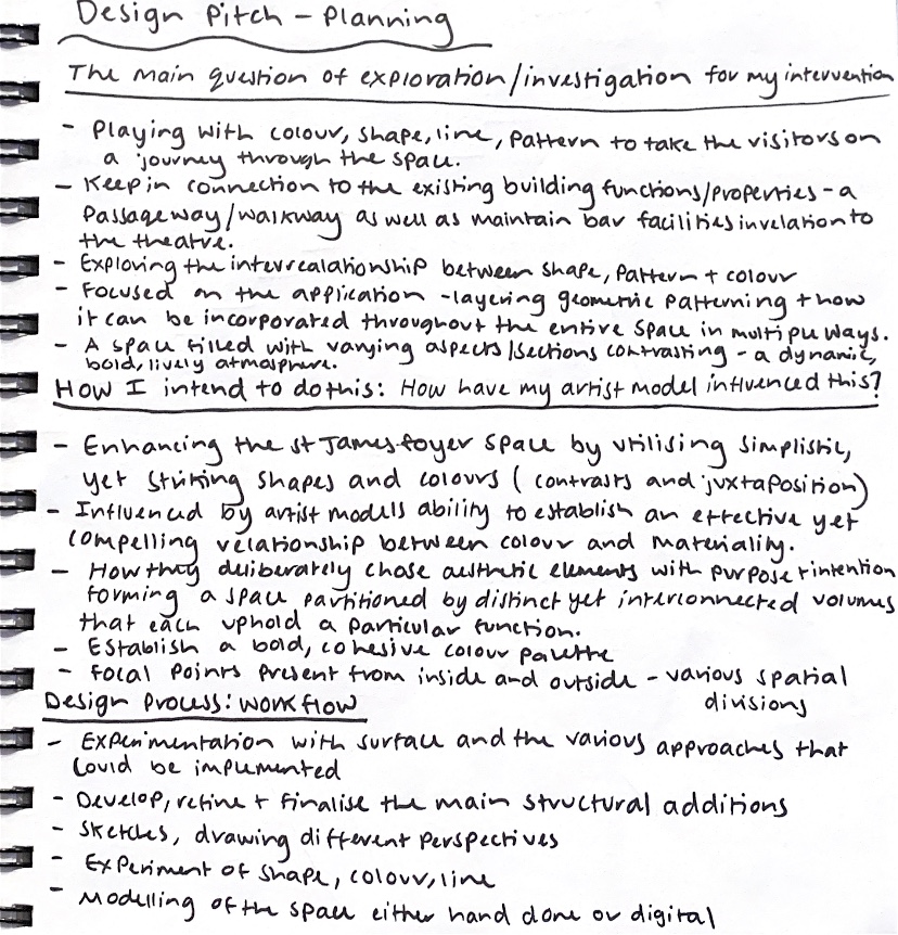
As part of beginning to establish our overall design direction and investigation purpose, we are to write up a design pitch discussing three key components, firstly the main question of our design exploration and our current ideas, how we intend to do this along with the influence of our artist model, and finally our plan for future design workflow.
My Design Pitch (First rewrite)
My desired design intervention will explore the interrelationship between characterised geometric shapes, pattern and colour, and how each element coherently functions within the space. I wish to enhance the St James foyer space by utilising simplistic, yet striking shapes and colours that contrast and juxtapose against each other, creating a dynamic, bold and lively atmosphere. Focusing on the application and use of layered, geometric patterning and how it can be incorporated throughout the entirety of the space but in a multitude of ways.
The artist model and work that I have chosen is Renesa Architecture Design Interiors Studio work The Geometrication. I was particularly drawn towards their application and use of shape and line, as well as their ability to establish an effective yet compelling relationship between colour and materiality. Their deliberate choices with regards to various aesthetic elements, form a space that is partitioned by distinct, yet interconnected volumes that each uphold a particular function. I was intrigued by their notion of developing a space that ‘takes the visitor on a fragmented journey, in order to create a kind of variable experience’.
For the continuation into developing my overall design intervention, I will continue to experiment with surface and the various approaches I could implement within the space (my main considerations are a a textural, embossed feature wall composed of a repeated, geometric patterning or a statement tile that is distorted and juxtaposed). I will also begin to develop, refine and finalise the main structural additions (relevant to my design intervention e.g. feature walls) that I wish to employ into the foyer space. For my workflow I am currently really enjoying playing around with colour, shape and pattern, experimenting with the differing ways in which I can emphasise and implement these forms into my design. I wish to utilise digital and hand drawn perspectives to showcase the detail of my surface and design intervention.
In order to further develop and explore within our design process and workflow, we are beginning self directed task work, directly influent to our own specific design intervention. For our self directed task, we are to start designing and developing our intervention. Some approaches to start programming the space and developing our design is to grab the plan of the foyer space and:
- Sketch the possible ways the foyer space could be used, programme the space.
- Explore sequencing of space – drawing on your newly developed understanding of threshold, and transition to consider how you could move people through space?
- What surfaces will they encounter at the various stages?
- How will they interact within the space?
Week Nine (Design Development)
Beginning this week and our own self directed work with regards to continuing to develop our designs, I decided to go back and reflect on all my progressive work and creative explorations gathered over the last eight weeks. Highlighting and establishing what aspects along this design process I wish to utilise, focus on and explore further in order to generate my final design intervention.
I went back over and reflected on the various creative explorations, activities and design exercises that I had completed throughout this design process in order to help clarify my thoughts with regards to exactly what I want my design to be, where I want it to go next and to develop into. By doing this it was extremely beneficial particularly towards drawing out the key elements I wish to focus on, establishing my creative drive and direction for my intervention.
Featured below are the main components, aspects, explorations and creative findings I am wishing to draw from, develop further and carry throughout my design intervention into the St James Foyer space.


Throughout this design process I have been particularly drawn to colour, shape and pattern and how I can utilise these features by purposefully implementing them within my design intervention. How these designs can transform into layered, volumetric forms that wrap around the entirety of the St James foyer space. Where the inhabitant becomes apart of the design, the pattern, the colour, the shape. Where they are enveloped by these forms, an eye catching and compelling experience of being in an environment encased with bold detail.
By reviewing and beginning to combine all these cohesive and progressive discoveries from the last eight weeks, along with mind mapping out and highlighting key aspects from each creative exploration and exercise I felt greater clarity towards the kind of intervention I wish to make, how it will aesthetically appear, its impact and the overall experience it will create.
Using my previous findings, artist explorations and key mind mapping conceptual ideas I am able to define and resolve my design intervention, the features will it have, how people will interact within the space and what surfaces will they encounter at various stages of the space. I started to experiment with different ways in which I could narrate the space, considering how might one move through it, what do they experience, feel, think whilst in the space.
I played around with sketching the possible ways in which the foyer space could be used and what features and details I wanted it to include, programming the space on my site floor plan layout.
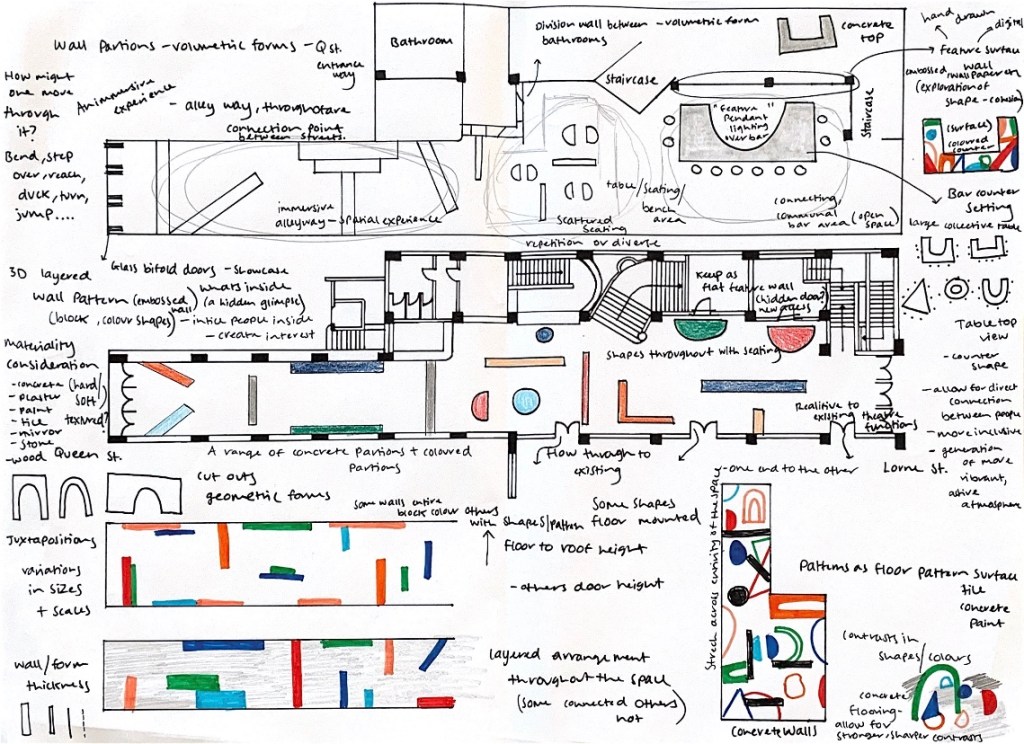
Firstly I noted down all the key aspects I wished for the space to obtain, referencing back to my mind maps exploring what the intervention is, who the occupant will be, how they will use the space and what they will need. By clarifying these features I then began programming the space, experimenting with multiple different compositions and layouts within the site in order to figure out which specific one would best suit the space and my overall design intentions. Playing around with the arrangement of different volumetric partitions, seating, counters and how they would all work and function together.
In order to fully establish and finalise my design intervention layout and composition, it is extremely important that I generate my selective colour palette, as this is a fundamental aspect that my design focuses on and will therefore have a major influence on the overall design intervention and its impact.
Right from the beginning of this design process I was heavily interested in the concept of colour and how I would employ it within my design intervention. From our first walk in the city, observing the surrounding built environment, I noted down and created an array of colour schemes stemmed from my attentive observations, picking up on the various colours whether obvious or more intricately hidden.
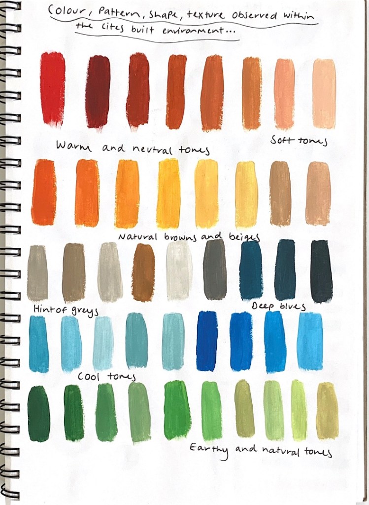
Based from these colour observations I began playing around with various colour combinations in order to create a cohesive and harmonious colour palette that was definite yet unique, showcasing the array of colours present within the city environment, whether they are obvious to the eye or are more hidden within the finer details.
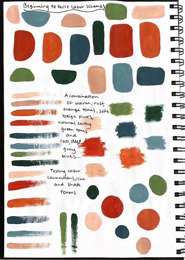
From these continued explorations and colour analysis I created a colour palette composed of these featured colours that I will notably manifest within my design intervention.

I developed this particular colour palette as I wanted to utilise colours that would provoke a response, colours that would capture the attention passerby, colours that draw you into the space, where you are intrigued to discover what lies inside. These colours are all bright, bold, striking and expressive, all design and atmospheric qualities that I wish for my design intervention to possess, that I wish for people to feel and understand whilst in the space. This colour palette captures the diverse range of colours present within the modern, city built environment.
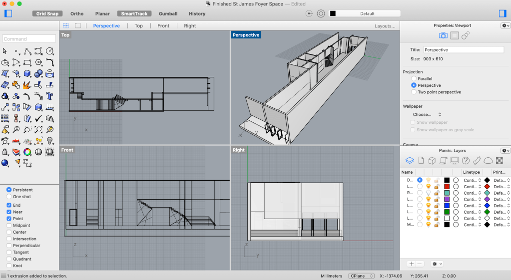
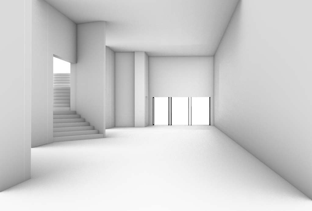
This week I also began the development of my Digital Rhino model that will portray the perspective views of my overall design intervention in the St James Theatre foyer. I decided to create a digital model of the space as I believe it will best articulate and showcase my design intervention and the kind of impact I am wanting it to have. It will also help me gather a better understanding of perspective, as by having a three dimensional representation of the space to work with, I will be able to better see and understand how my design could be implemented into the space and through what specific aspects.
Featured below are progressive images of the beginning stages where I am creating my base model, the exisiting St James foyer site in which my design will be working with.

Week Ten (Design Development)
As I am beginning to establish and clarify my design intervention and its focal features, I generated a Pinterest collage of further inspiration along with my artist model, for how I could utilise colour, shape and pattern into my design in a variety of ways.
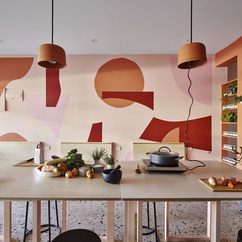
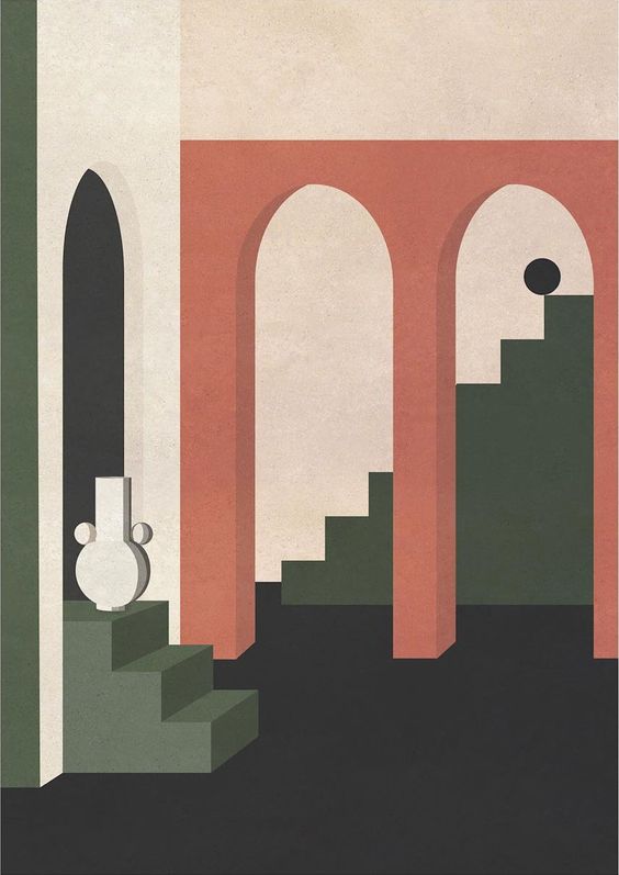
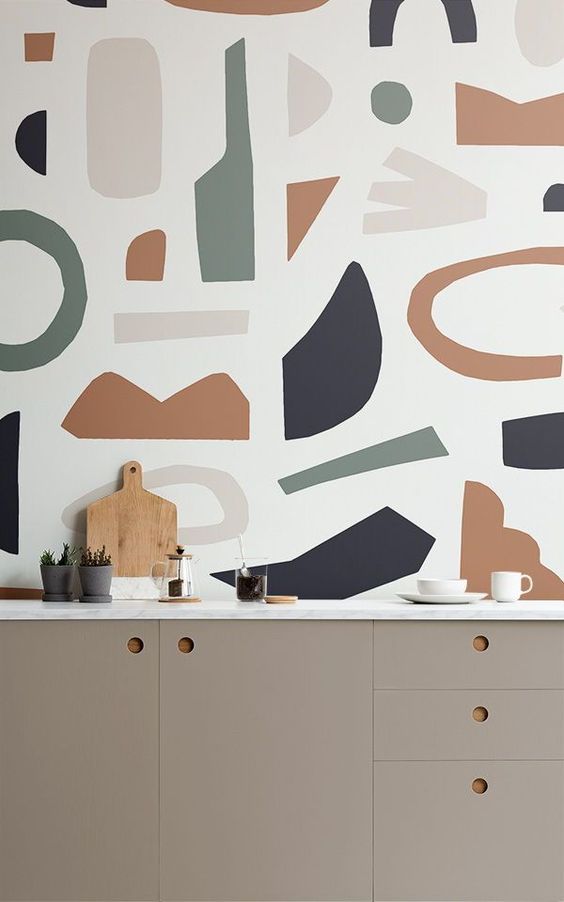
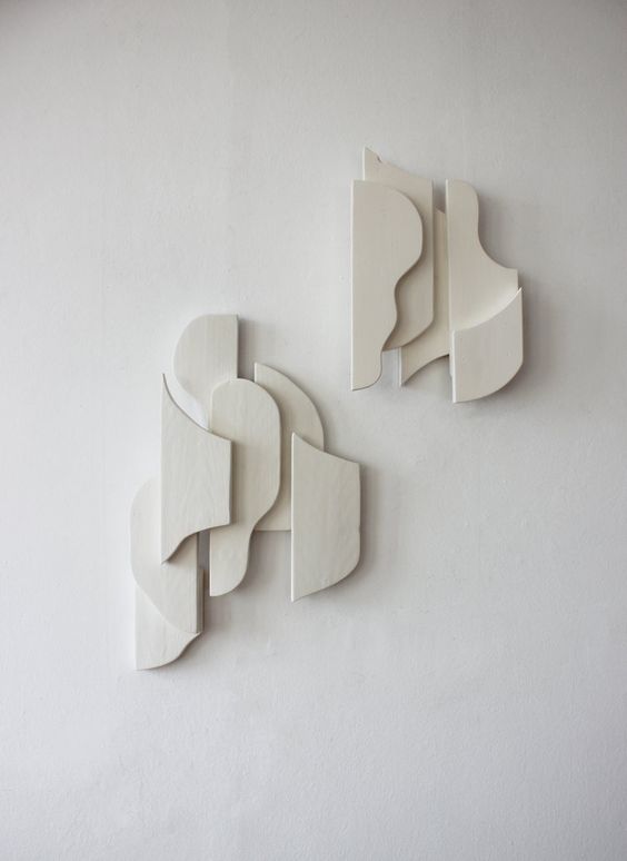
I was drawn to these images as they utilise shape, colour and pattern in such a captivating way, extending the form of each element and how it can be used with a more compelling approach. Layering, juxtaposing, contrasting, forming, interconnecting and cutting shapes to create designs that generate interest and entice one into the space. I wish to incorporate and employ this kind of approach to these spatial, atmospheric and aesthetic qualities and elements.
The newly found inspiration I gathered from these designs and images influenced my decision to develop and create a new surface design for my intervention, one that is more dynamic, expressive and striking, one that showcases and reflects the overall atmosphere of the space I am wanting to establish. Referencing back to my previous design iterations, exploration sketches and influential artist model drawings.


Using these exploration drawings and sketches I began establishing my digital patterns for a new surface design that would be incorporated within my design intervention.


I then proceeded to further develop these designs by creating a larger, more elaborate and detailed surface design that I would implement into my design intervention as a focal feature.

After I created this pattern I also wanted to test out other design iterations and experiments of how it would look repeated and at different scales.

Once I had established my new surface design I began sketching out the various ways in which it could be implemented into my design intervention, how it can be showcased and with what particular approach. Considering if I want it to be manifested as a surface design or even convert aspects into a three dimensional form. Considering size and scale and if it will be one focal aspect or included within multiple locations of the space as a repetitive design element.
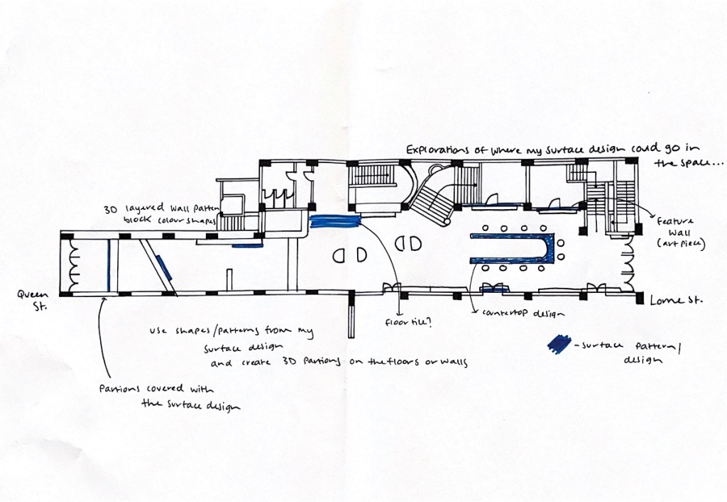
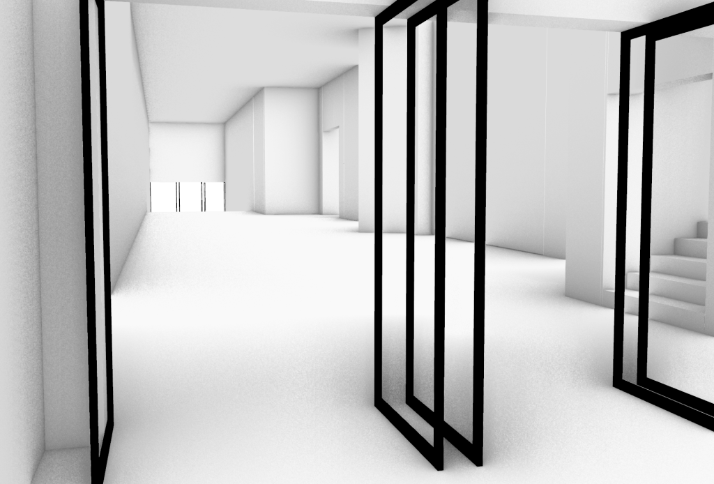
After constructing these exploration sketches of surface design placement, I decided for my design intervention to implement my surface design as both three dimensional geometric partitions to be included along the corridor down by the Queen Street entrance but to also utilise it as a statement feature wall along the staircase wall in the centre of the space.
Week Eleven (Design Development)
From all the further design developments I made last week I began to gather, establish and clarify the key components and aspects that I wish to manifest within my design intervention into the St James foyer space. Sketching out my finalised intervention design layout of the differential elements that will be incorporated, inclusive of volumetric coloured partitions, seating areas, benches and an open, communal bar space as the centre point within the design, a multi functional space that also acts as a thoroughfare between Queen Street and Lorne Street.
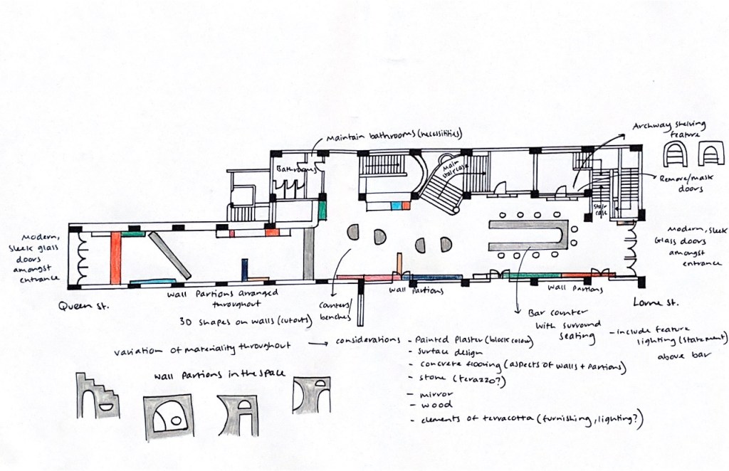
Once I had established my final design intervention after multiple design iterations and explorations, I began to construct my detailed site plan drawings of my intervention within the space. As part of my series of site drawings I wanted to include sectional elevations of the entry/exit accesses into the space, from both Queen Street and Lorne Street as these transitional thresholds are a major part of generating the spaces atmosphere along with captivating interest, enticement in the passerby and their first impressions amongst entry. These thresholds are also the connecting elements between the space and the external city environment, a moment where these environments interconnect.
Featured below are my Site Elevation Drawings for both Queen Street and Lorne Street.
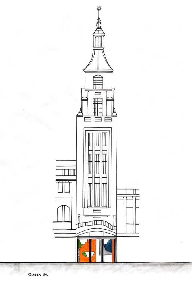
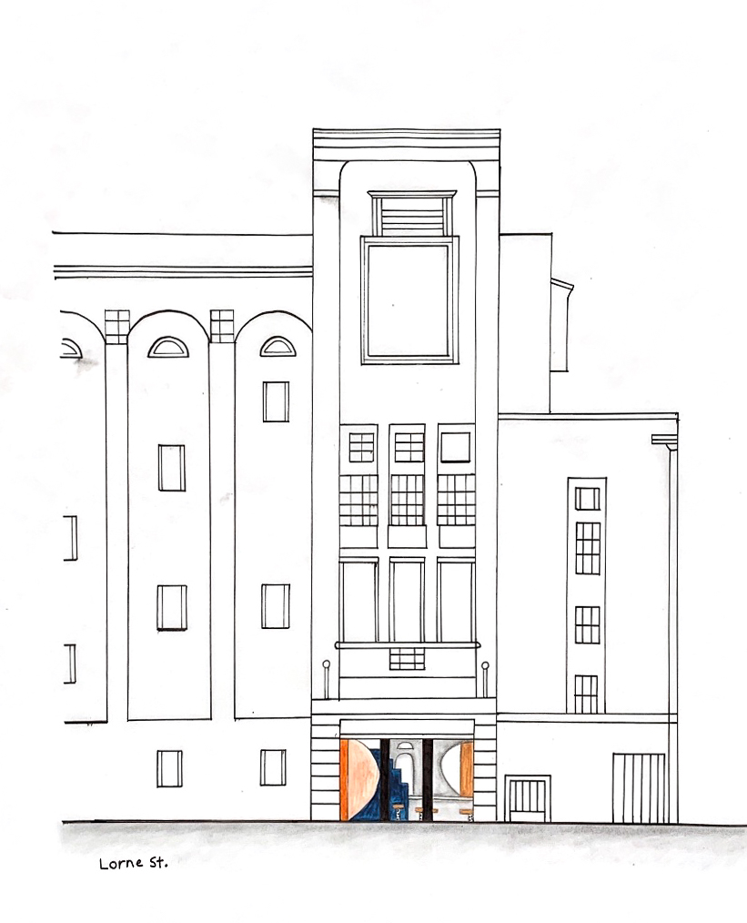
This week I also continued developing my Rhino model of my design intervention. By having my design layout finalised it made the entire digital process a lot more productive as I knew exactly how I wanted the space to look and what elements needed to be incorporated and where.
As a progressive continuation from my base model of the St James Theatre foyer space, I started to build the various structural elements of my design and orientate them within the space. By doing this it really brought the space to life where I could begin to see how it would actually look and function in a more realistic setting. I also started to play around with embedding my surface designs into the space as feature walls.
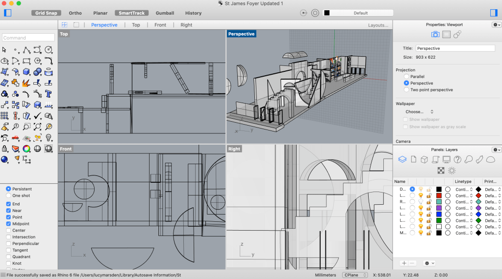

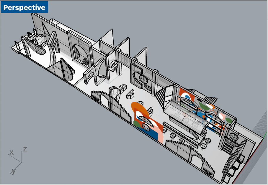
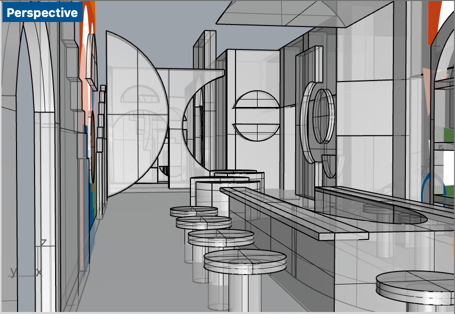
For my design intervention and throughout this entire creative process, I have been wanting to incorporate a range of materiality into the space. My main material considerations have been towards utilising a darker toned polished concrete flooring to stretch throughout the entirety of the space, as well as to be used as selective partition walls, geometric forms and the main bar counter. I chose to use concrete for my flooring choice as its such a versatile material that is extremely durable and easily maintainable, meaning it will be able to withstand all the traffic movement that would occur within the space. I also chose a darker shade of concrete as this will better contrast and juxtapose against the coloured shapes within my design.
For my other coloured partitions and walls present within my design intervention, as well as some of the main existing walls, I would utilise a simple, lightly textured plaster finish, one that highlights the bold, striking colours that would be painted on top. I also wanted to employ aspects of wood into my design, in order to enhance the overall space and make it more inviting, provoking feelings of warmth and comfort particularly when in the communal bar setting. I integrated wood features into a couple geometric wall mounted partitions, the bar stools as well as the archway feature that sits directly above the bar countertop. In order to further enhance the space I really wanted to try utilise the incorporation of a statement terrazzo stone as I believe it would add a whole another depth and layer to my entire design intervention. Using a material that would pick up on the various bold colours and tones present in the space tying it all together. I would subtly yet purposefully include the terrazzo stone into the base of the bar stools and as the free standing bench counters present in the centre of the space.
As part of the more decorative furnishings within my design intervention I am wanting to include statement pendant lighting above the bar counter, in which I am considering utilising the materiality of a terracotta clay. I chose to integrate terracotta into this specific stylistic aspect of my design as it will add extra warmth into the space, as well as cohesively combine and complement with both my bold surface designs and my exisiting colour palette.
Featured below is my cohesive materials palette featuring the array of materiality and textures I will be implementing within my design intervention.
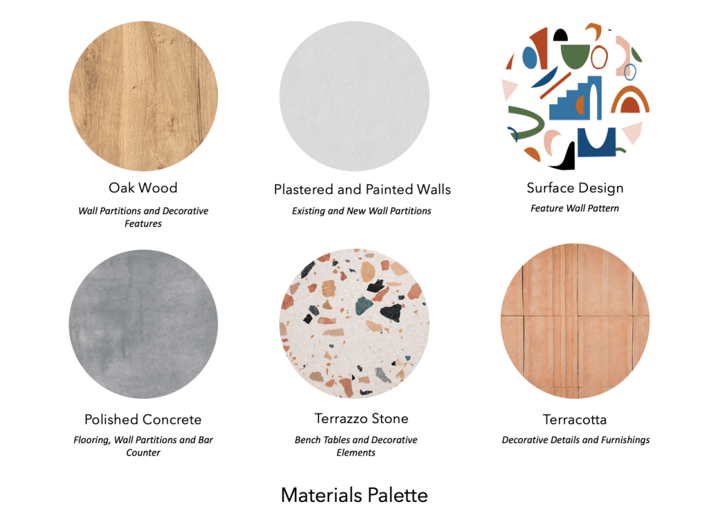
Week Twelve (Final Developments + Presentation Preparation)
As part of the final developments for my design intervention and this creative process, I focused on completing my digital Rhino model of my entire intervention space in the existing St James foyer. Once I had built all the structural and featured elements of my design, I then began to include my selective materials by rendering the different materiality onto each aspect of the space.
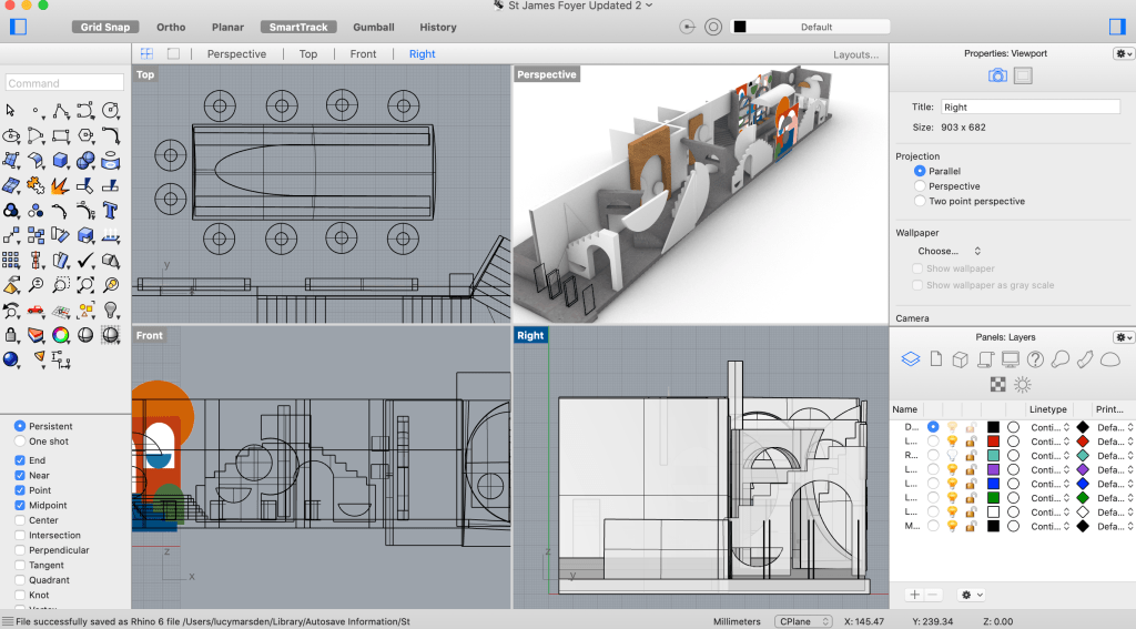
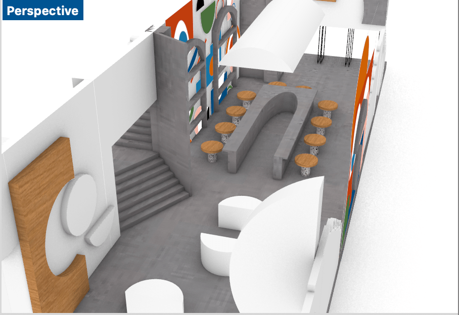
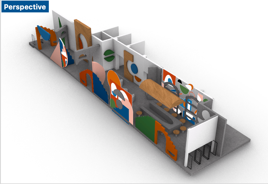
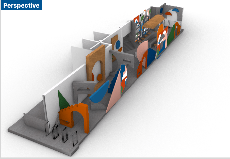
Once I had rendered all the various materials and colours into my digital model it completely transformed the appearance of the space, bringing my design to life exactly how I had imagined it. I then proceeded to capture an array of interior perspectives of the space, experimenting and playing around with different angles in order to capture the various aspects of my design intervention.
Featured below are some of my experimental interior perspectives of my design intervention.
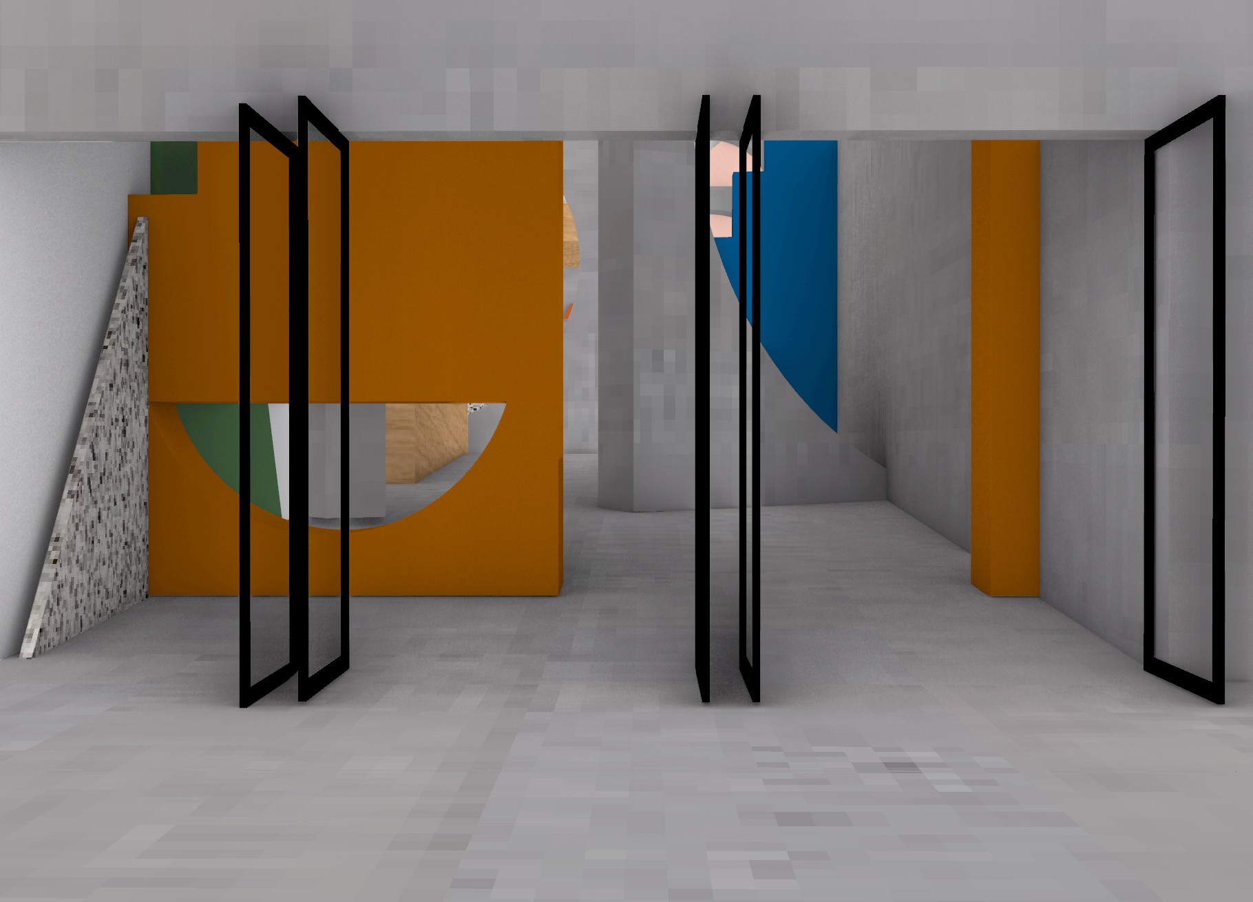
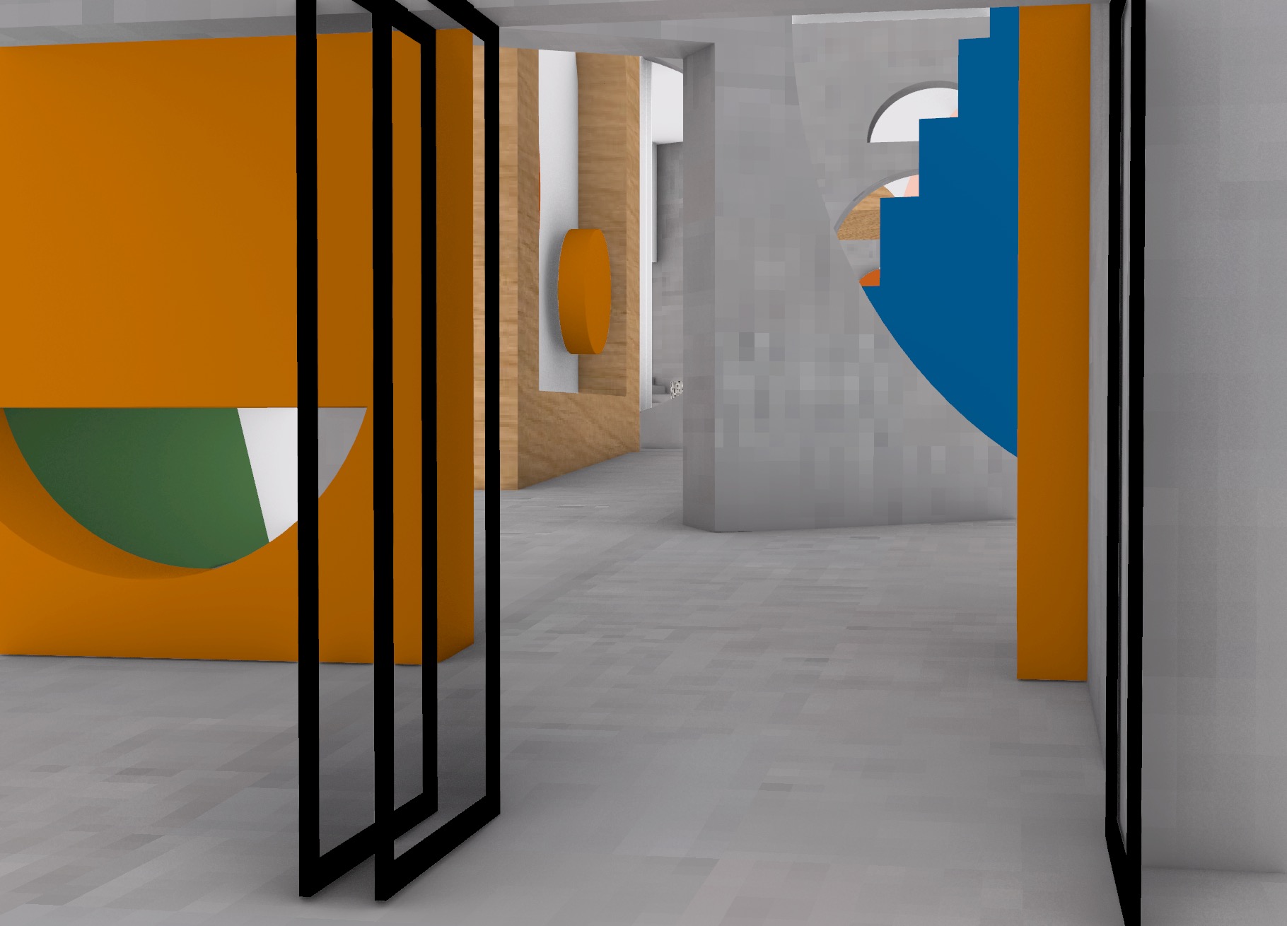
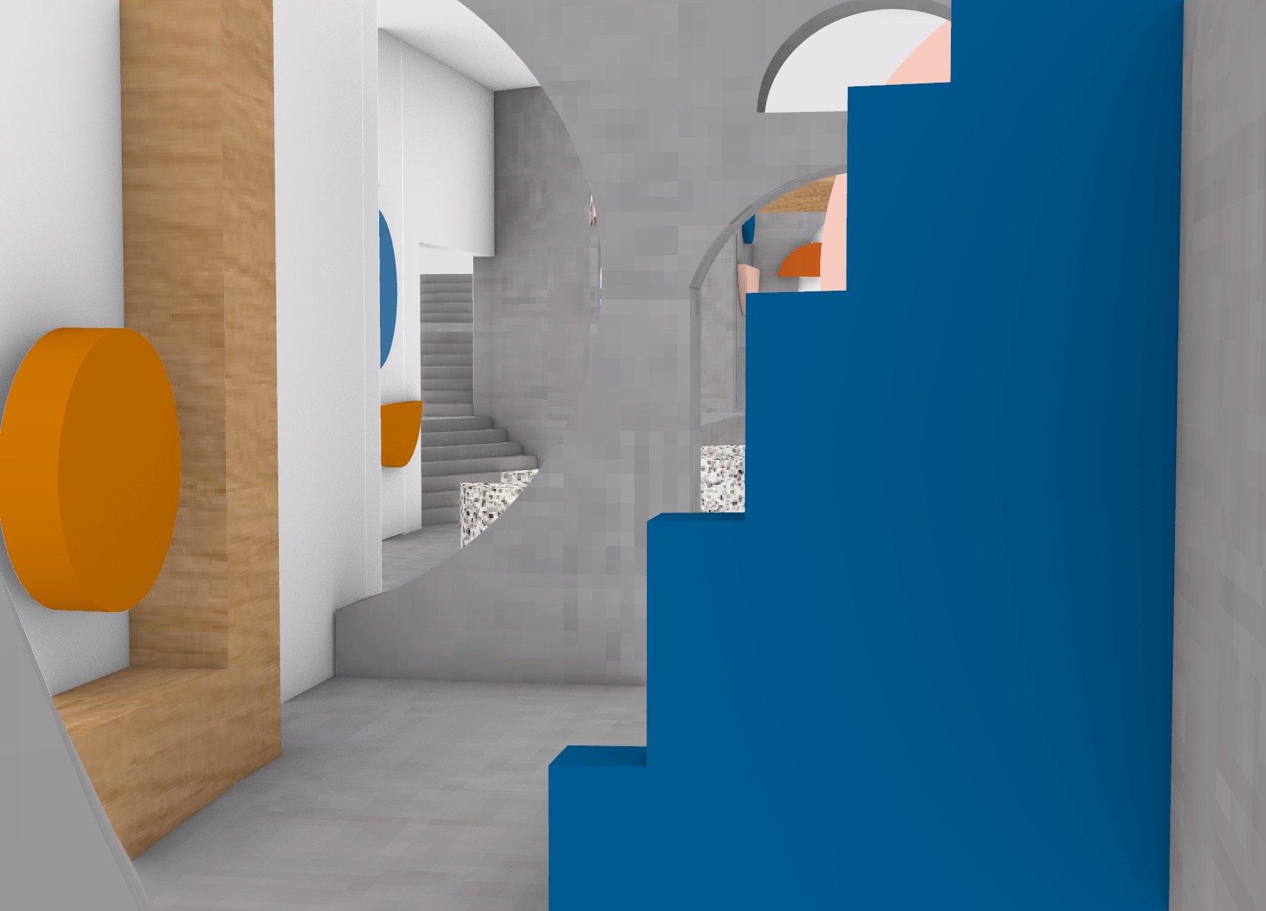

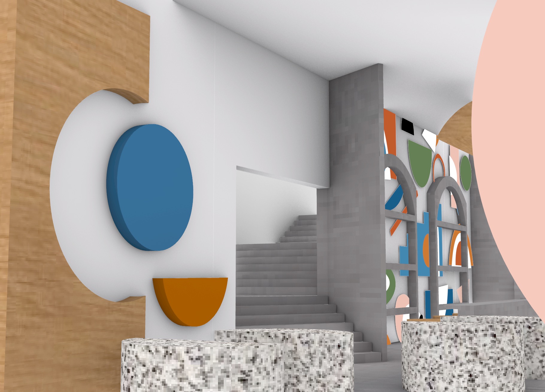
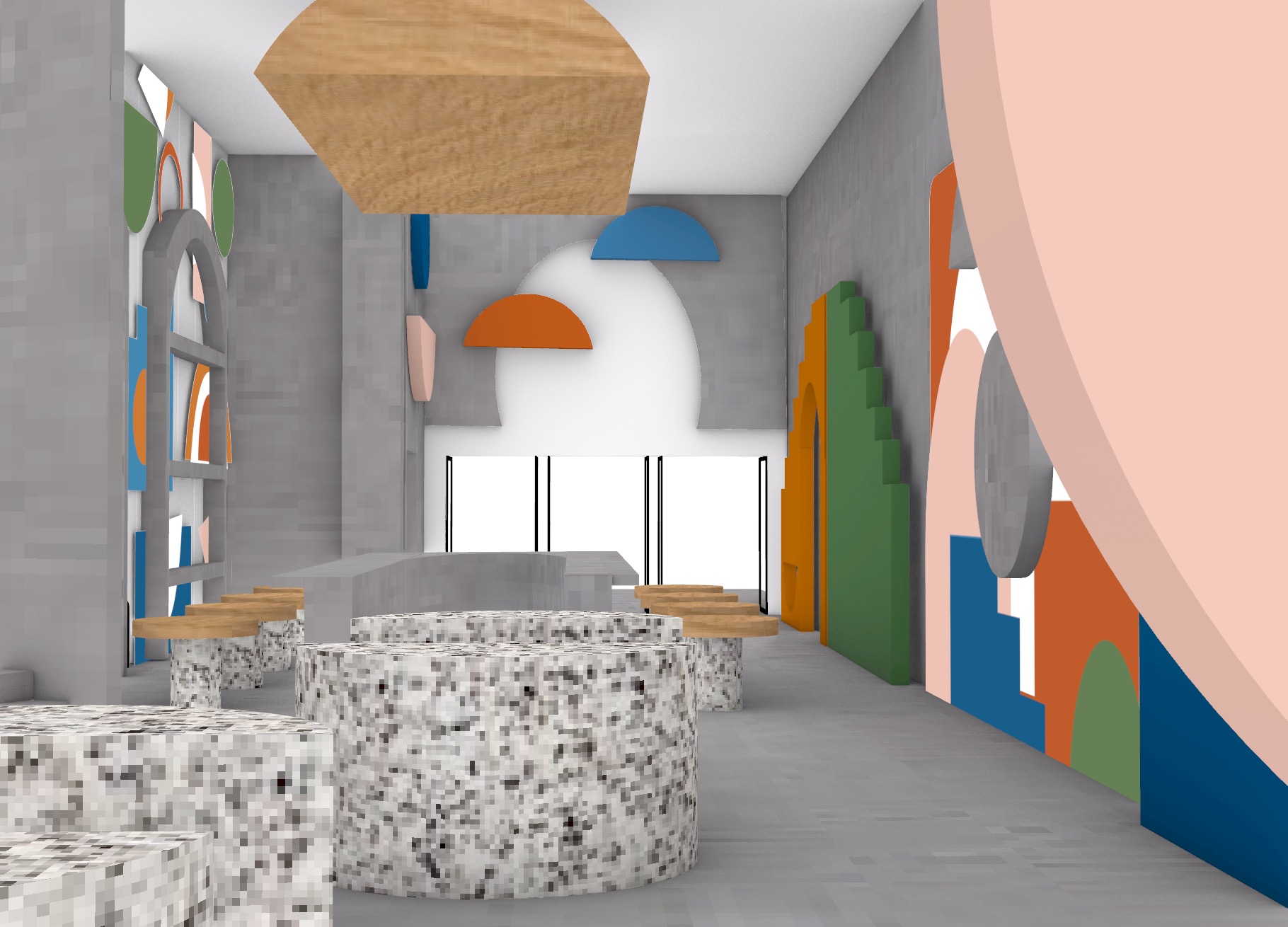
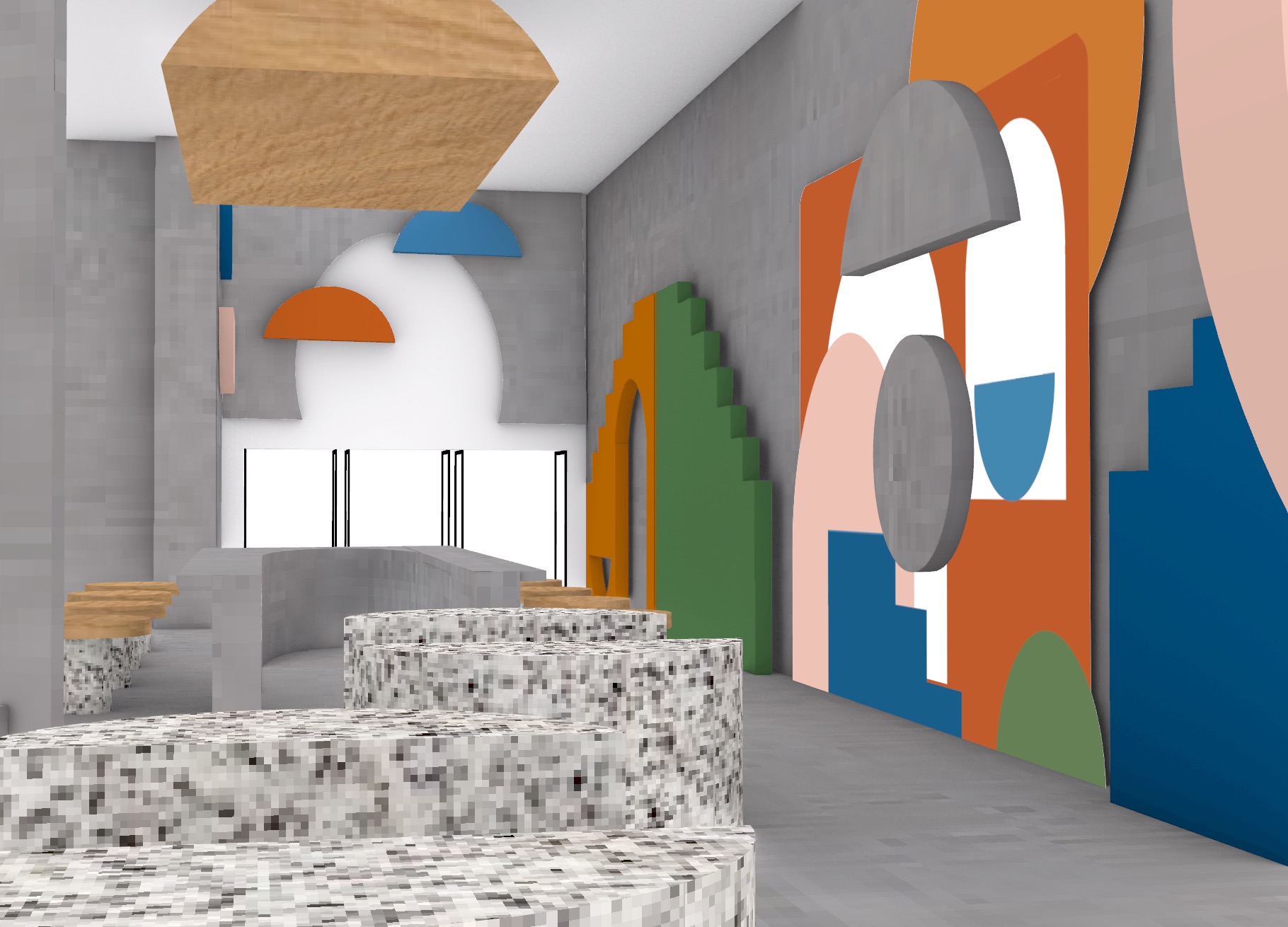
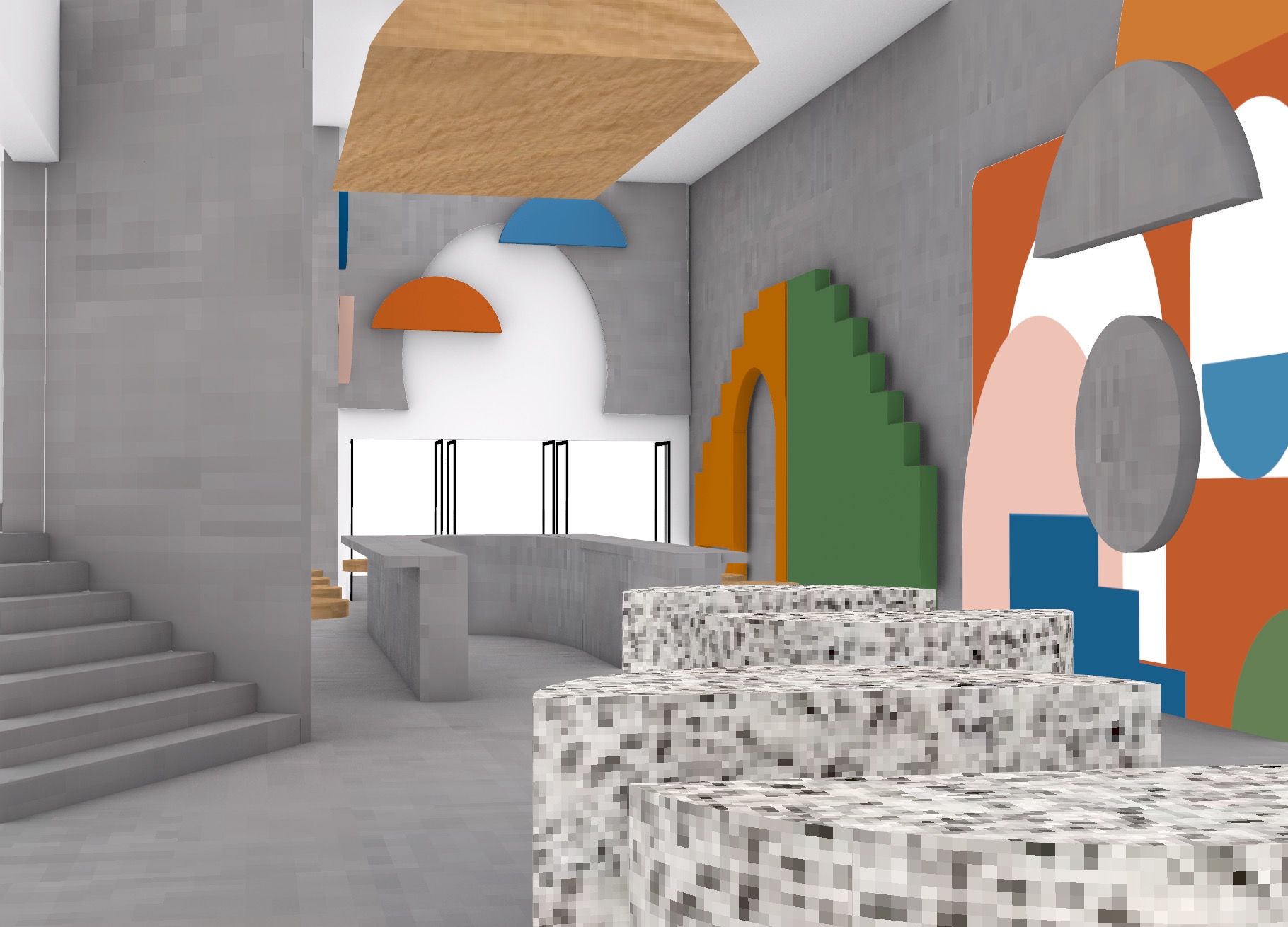
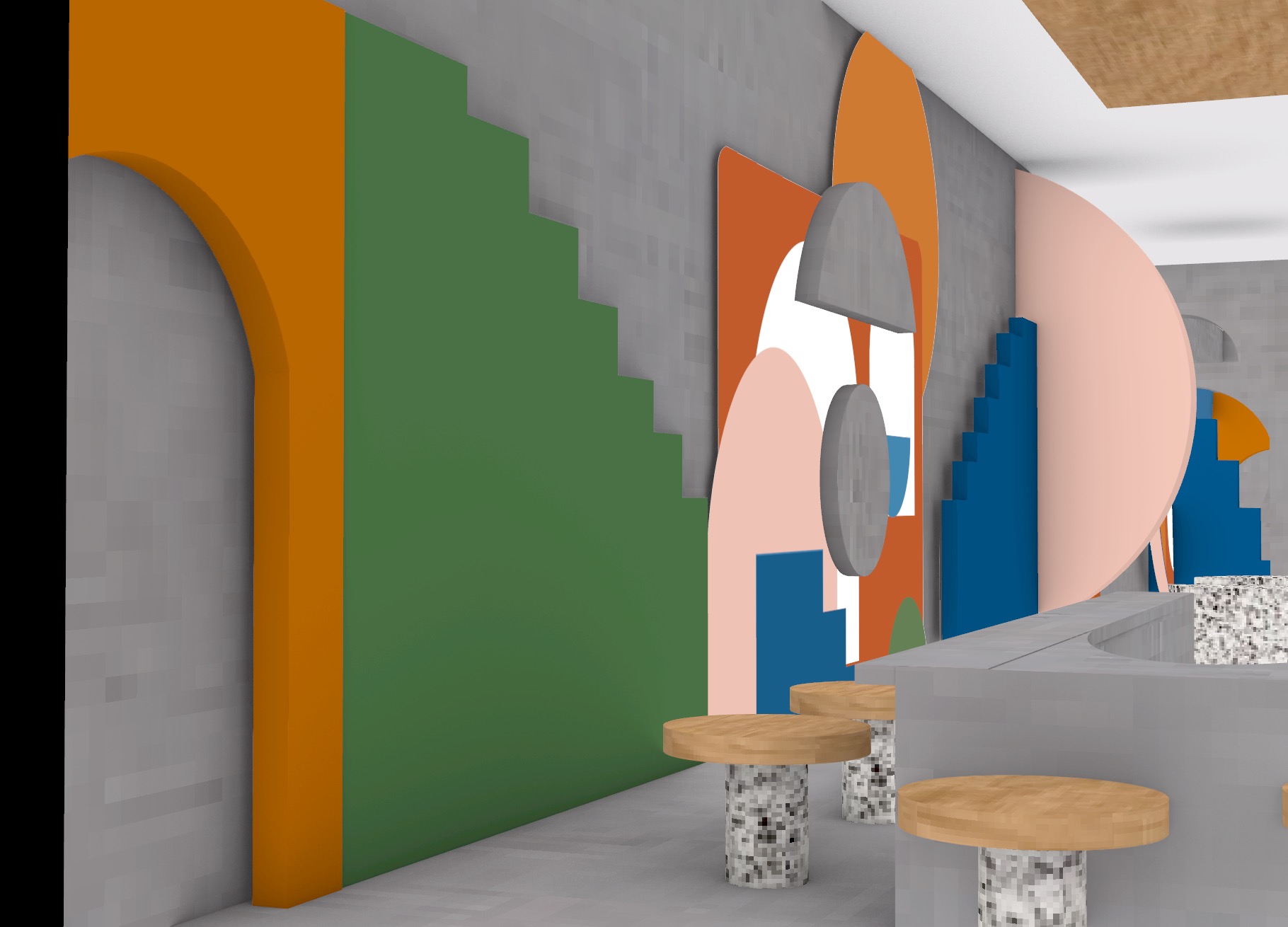
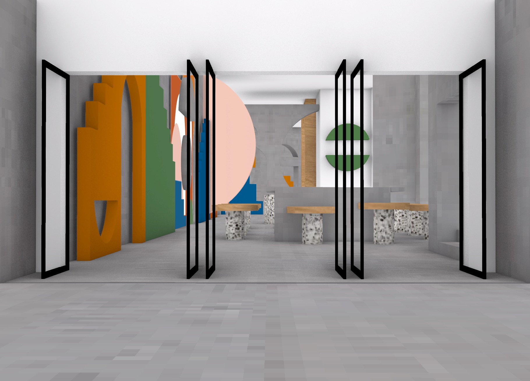
Featured below are my selective interior perspectives that I believe best showcase and capture my design intervention within the St James Theatre foyer space.
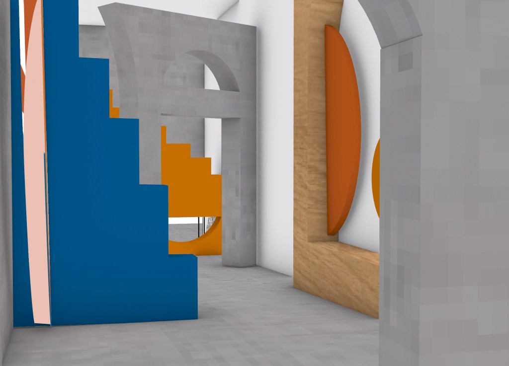
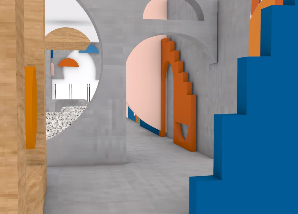

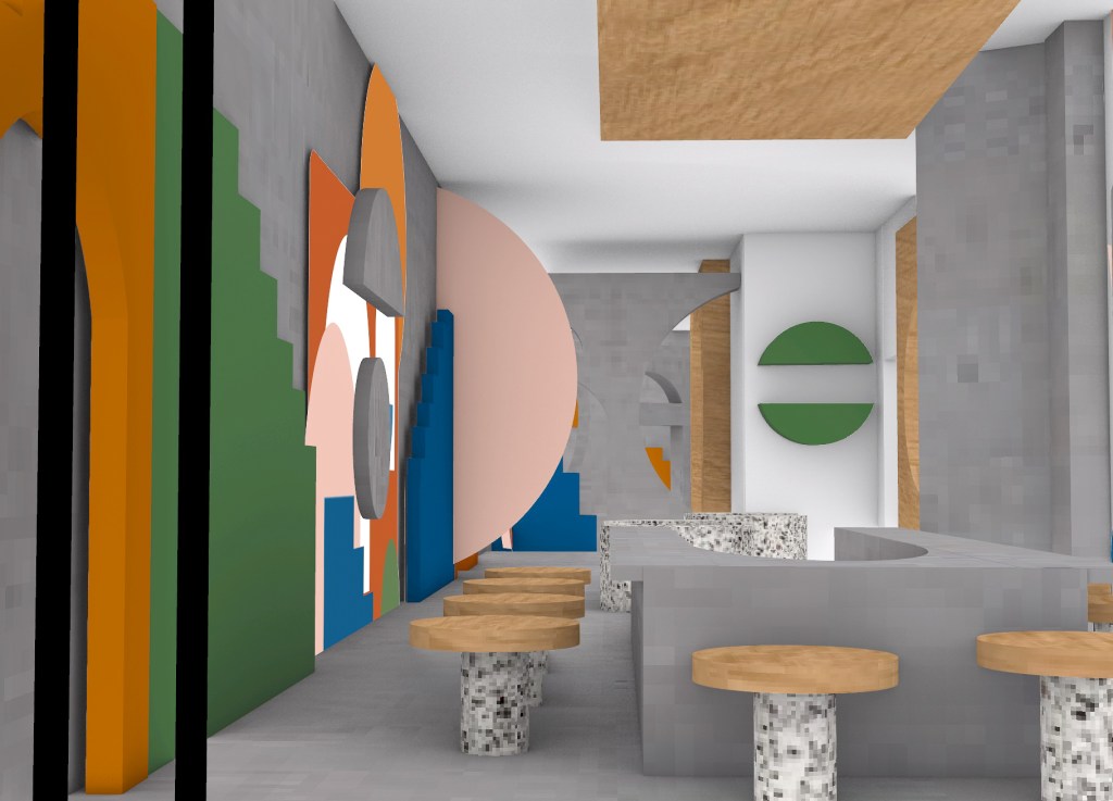
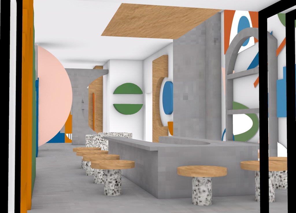
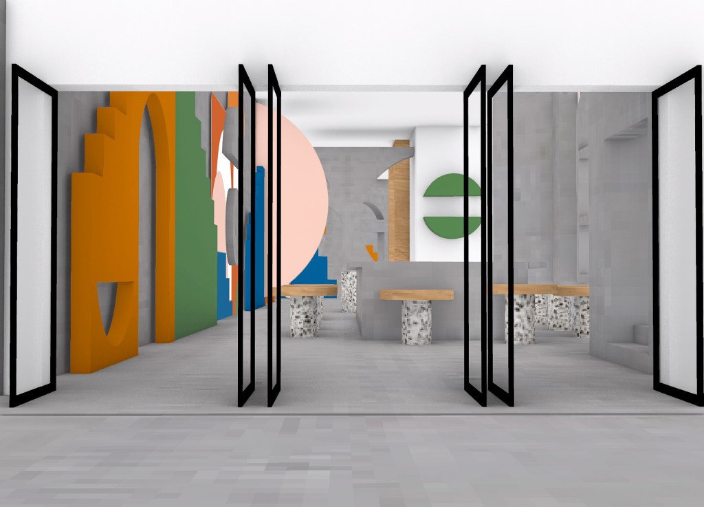
Once I had finalised my interior perspective views, I wanted to focus on developing and finishing my other site drawings, my floor and section plans of my design intervention. Both these site plans I wanted to keep fairly minimalistic as I wanted the full focus and attention to be on my design and its incorporation into the exisiting space. However in my section plan I did decide to include external buildings as I wanted to connect the St James Theatre in relation to its contextual orientation, by it being located in amongst a built, city environment.
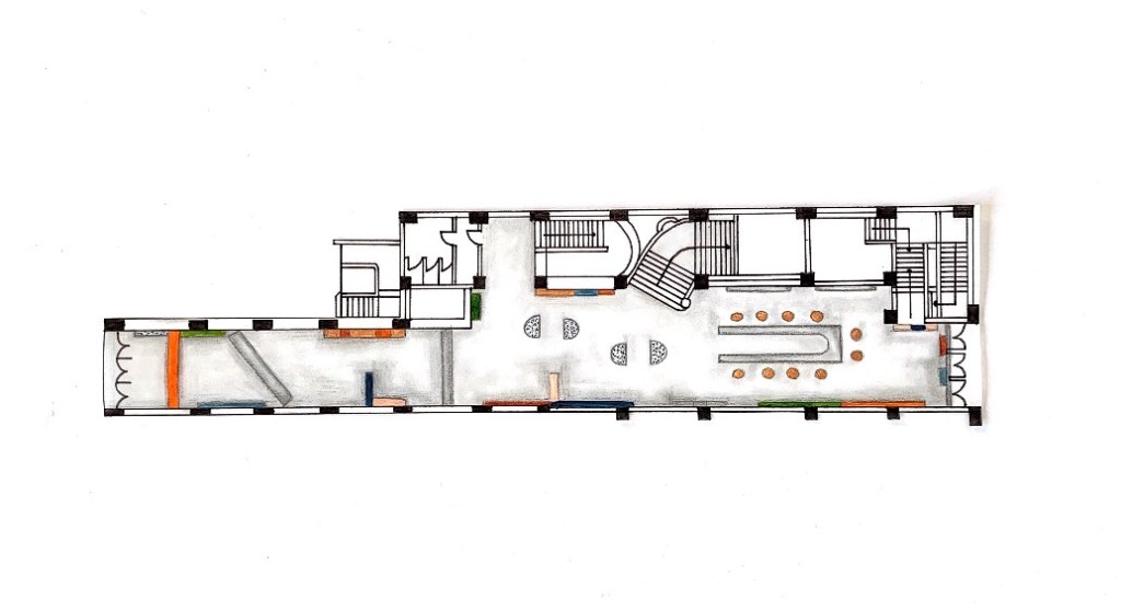
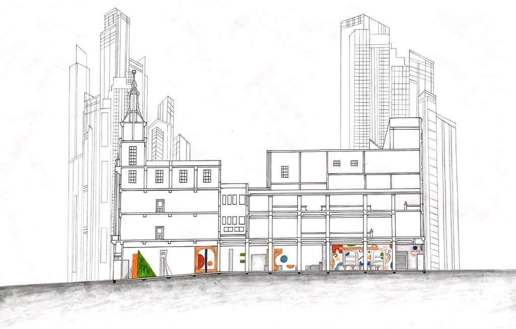
As part of my final presentation preparation, I decided to write down a list of all the different elements of my design intervention and the entire design process that I wish to include, or will consider and review for inclusion into my final presentation. Beginning to formulate my various creative explorations for my presentation.
For my final presentation I want to utilise a layout and overall design aesthetic that is cohesive and flows throughout all my progressive work in order to portray it in the best and most sensible way. It is important that all my images can be easily read, not cluttered and are in a comprehensive, structured order for the viewer to understand my design concept and intervention.
Week Thirteen (Assignment Completion + Hand In)
Featured below are my Final Presentation Slides showcasing my Design Intervention in the St James Theatre foyer space. My design intervention is titled ‘Dimensional Hues’.
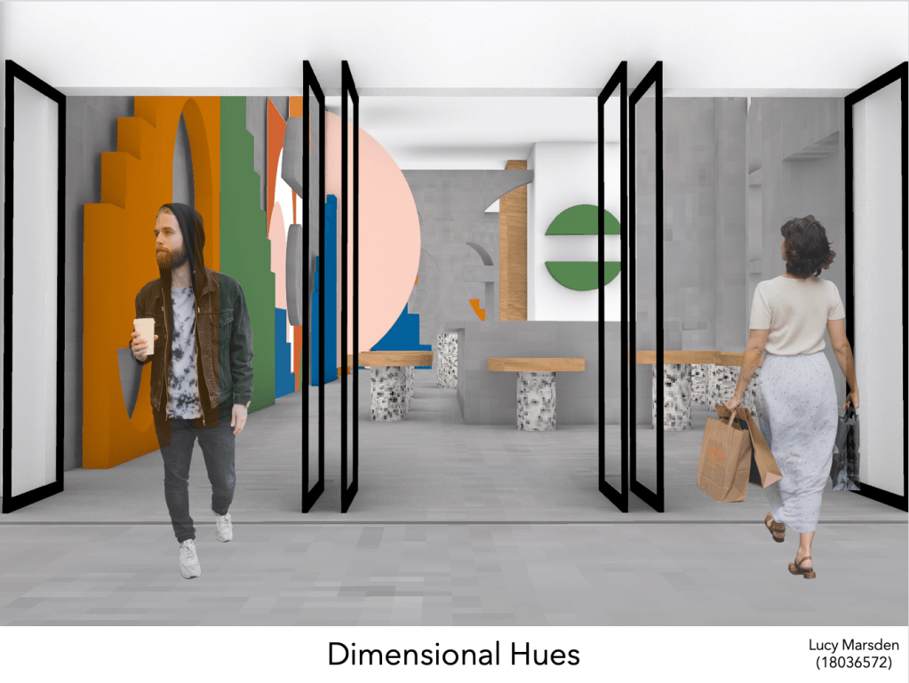
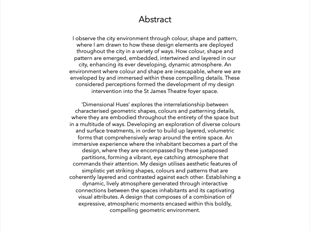
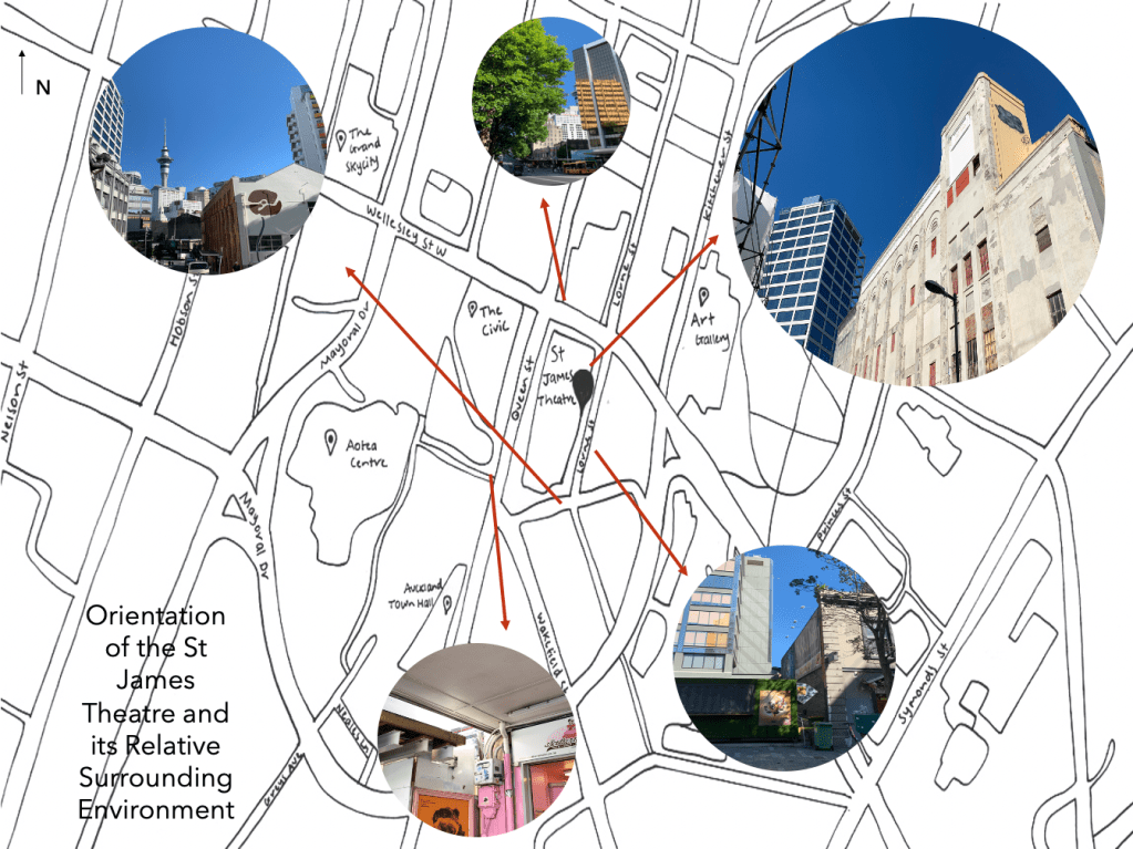
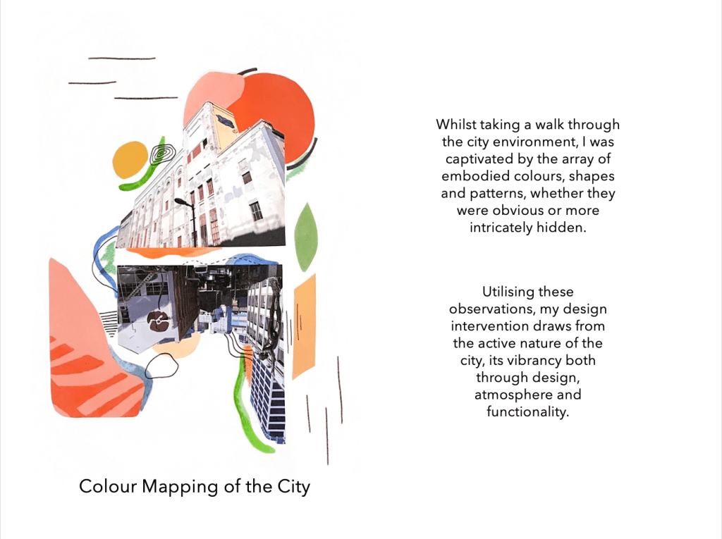
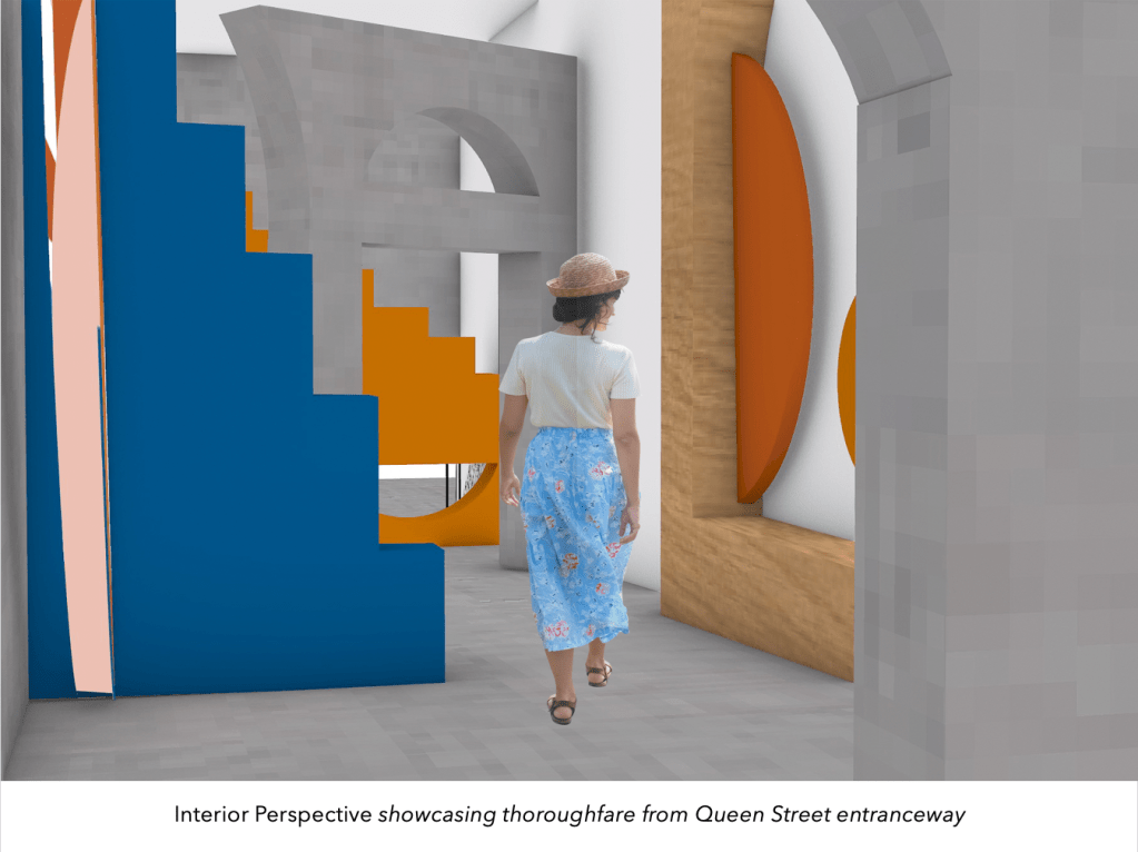
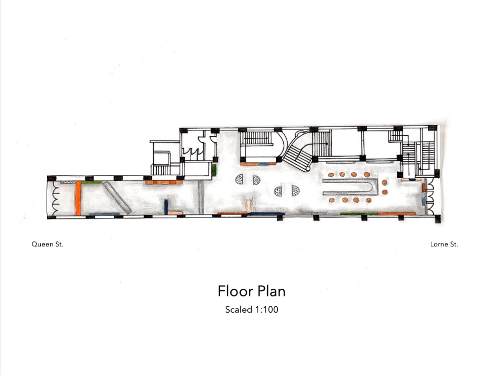

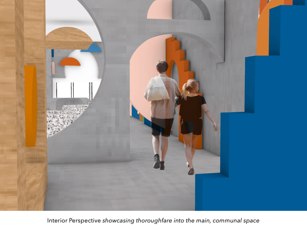
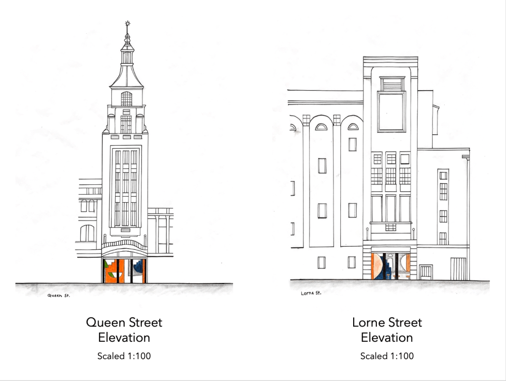
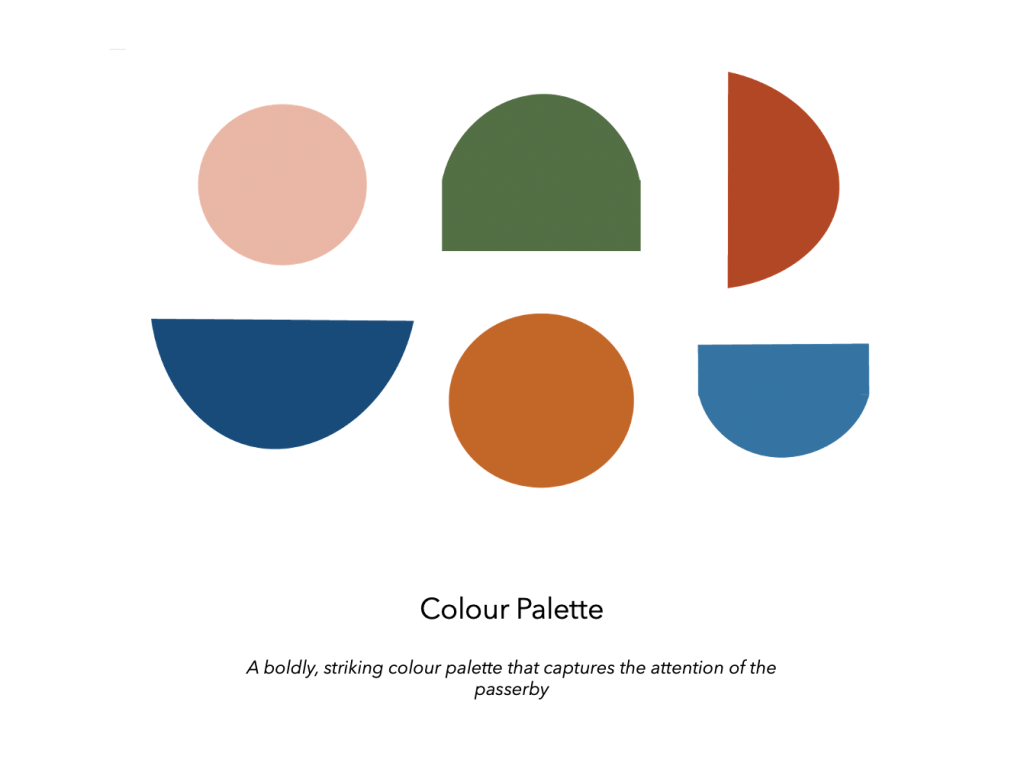
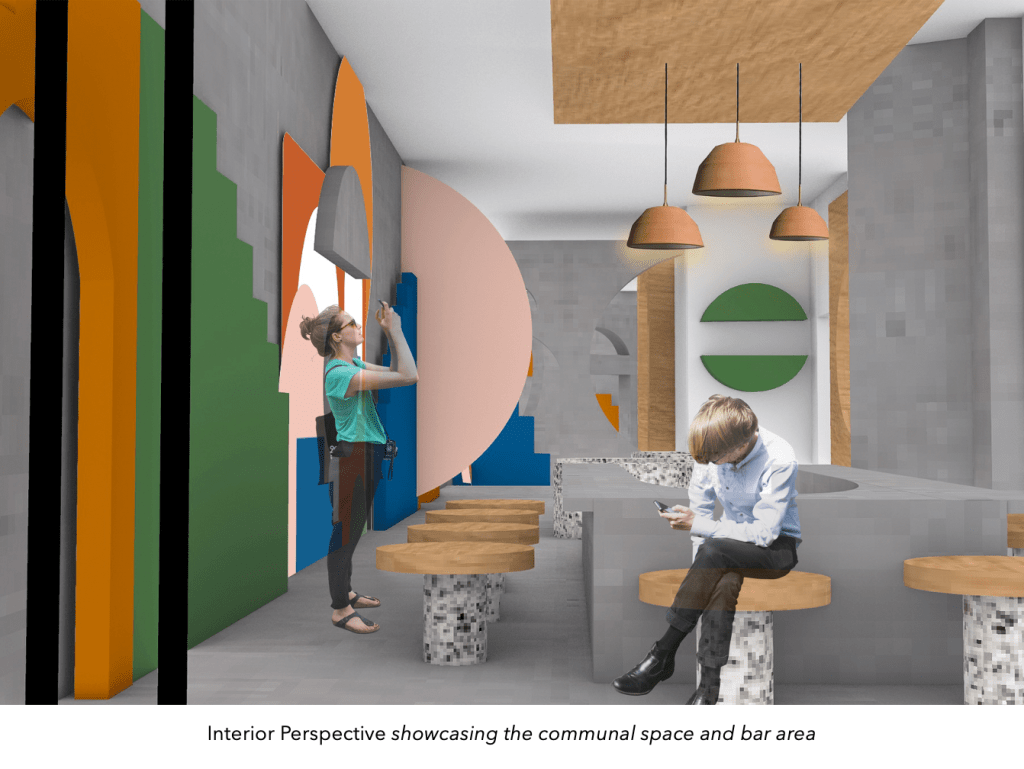
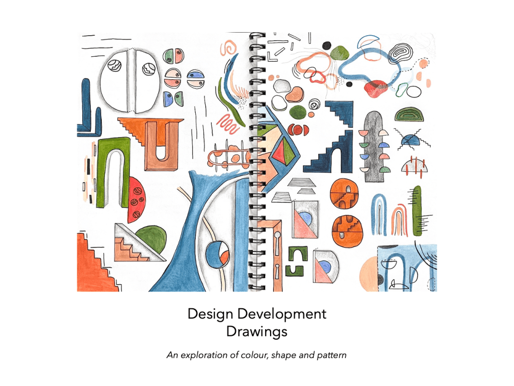
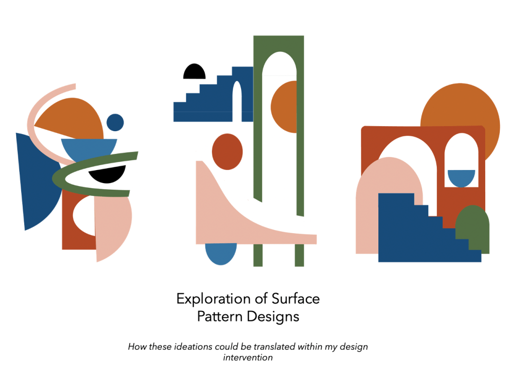
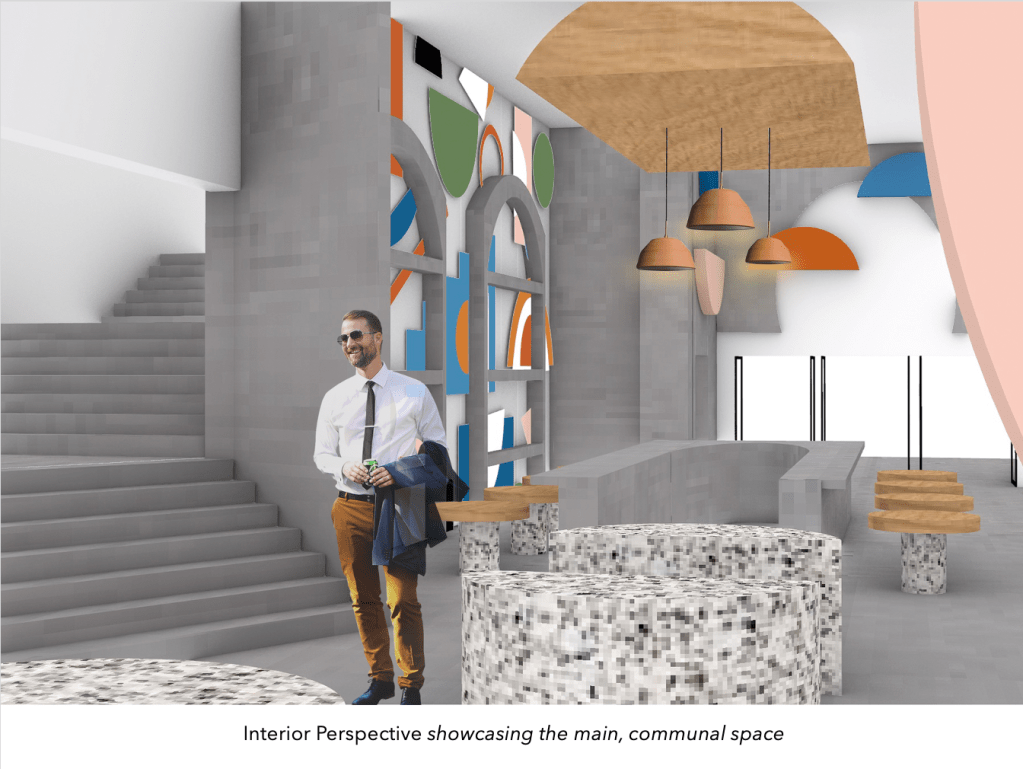

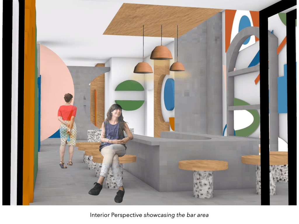
Featured below is both my written and audio recording of my Design Pitch.
Final Design Pitch
I observe the city environment through colour, shape and pattern, where I am drawn to how these design elements are deployed throughout the city in a variety of ways. How colour, shape and pattern are emerged, embedded, intertwined and layered in our city, enhancing its ever developing, dynamic atmosphere. An environment where colour and shape are inescapable, where we are enveloped by and immersed within these compelling details. These considered perceptions formed the development of my design intervention into the St James Theatre foyer space.
‘Dimensional Hues’ explores the interrelationship between characterised geometric shapes, colours and patterning details, where they are embodied throughout the entirety of the space but in a multitude of ways. Developing an exploration of diverse colours and surface treatments, in order to build up layered, volumetric forms that comprehensively wrap around the entire space. An immersive experience where the inhabitant becomes a part of the design, where they are encompassed by these juxtaposed partitions, forming a vibrant, eye catching atmosphere that commands their attention. My design utilises aesthetic features of simplistic yet striking shapes, colours and patterns that are coherently layered and contrasted against each other. Establishing a dynamic, lively atmosphere generated through interactive connections between the spaces inhabitants and its captivating visual attributes. A design that composes of a combination of expressive, atmospheric moments encased within this boldly, compelling geometric environment.
The artist model and work that I chose to help inform and further develop my project was Renesa Architecture Design Interiors Studio work ‘The Geometrication’. I was particularly drawn towards their application and utilisation of colour and shape, as well as their ability to establish an effective relationship between colour and materiality. Their design decisions to integrate a diverse collection of materials and surface finishes into their work, allowed for the creation of a compelling space that upholds greater depth, intriguing the viewer at the hues of the interior that follows inside. I was intrigued by their notion of developing a space that ‘takes the visitor on a fragmented journey, in order to create a kind of immersive, variable experience’. All of their creative designs have their own unique personality that draws the attention of a passer-by and transports them into a dynamic, spatially constructed environment. Their unique usage of these design and spatial qualities helped to stimulate not only my own interests in the utilisation of these elements, but also my comprehensive explorations into colour and shape in this new profound way. Where I am considering how these aesthetic details can be implemented within a spatial environment in order to create a distinctive design.
Audio Recording of my Design Pitch
As a reflection on this entire creative process and Colour Complex design intervention, I found this project really interesting and beneficial towards highlighting the importance of design iteration and explorative design practices. How through making, creating and crafting you can develop and generate new discoveries in amongst this process. This assignment has allowed me to be freely creative, experimental and radical with my design choices and the decisions I chose to make throughout this entire project, where the possibilities were open and endless to whatever I imagined or perceived the space to be. Despite the circumstances and change in studio methods and teaching style, I have still throughly enjoyed this entire creative process and the progressions, developments and explorations I made throughout my design intervention. I was able to work through each comprehensive exercise in order to build up my design iterations that ultimately progressed into my finalised design intervention ‘Dimensional Hues’ within the St James Theatre foyer space.
