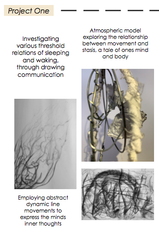
Project One: SLEEP/WAKE
Design Workshop 1
25. 02. 19
Today in class we were introduced to the conceptual idea of sleeping and waking, which is the transition between the sleep and wake state. This design project will ultimately lead into exploring, researching and discovering the beauty between the two states through individual interpretation and personal experiences. Throughout this assessment I will be documenting my design processes and ideas as well as reflecting on the outcomes of my creative practices.
Blind/Visual Drawings :
In class we were given two A3 sheets of paper and asked to fold them both in half horizontally to create four sections. Two out of the four sections we were asked to draw with our eyes closed (blind drawing) and the other two with our eyes open (visual drawing). The following drawings are the outcomes of my blind and visual drawings I produced in studio, spending eight minutes on each drawing. These drawings represent my initial ideas surrounding the sleep and wake states and some of their thresholds.
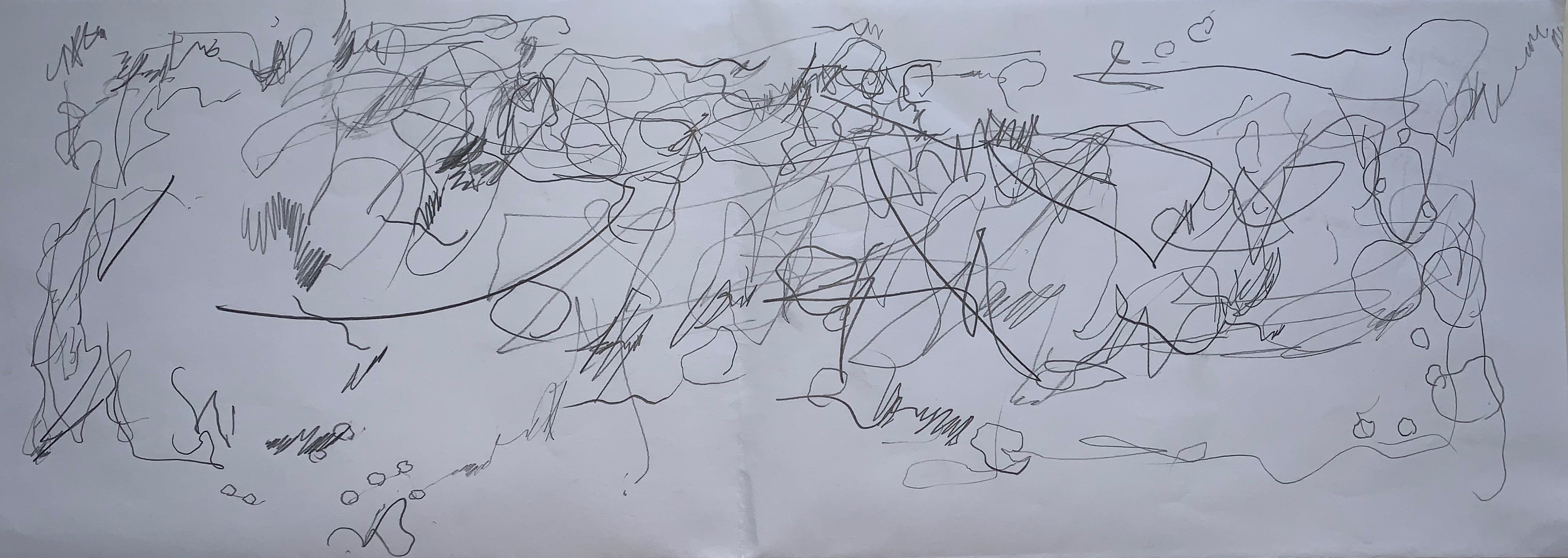
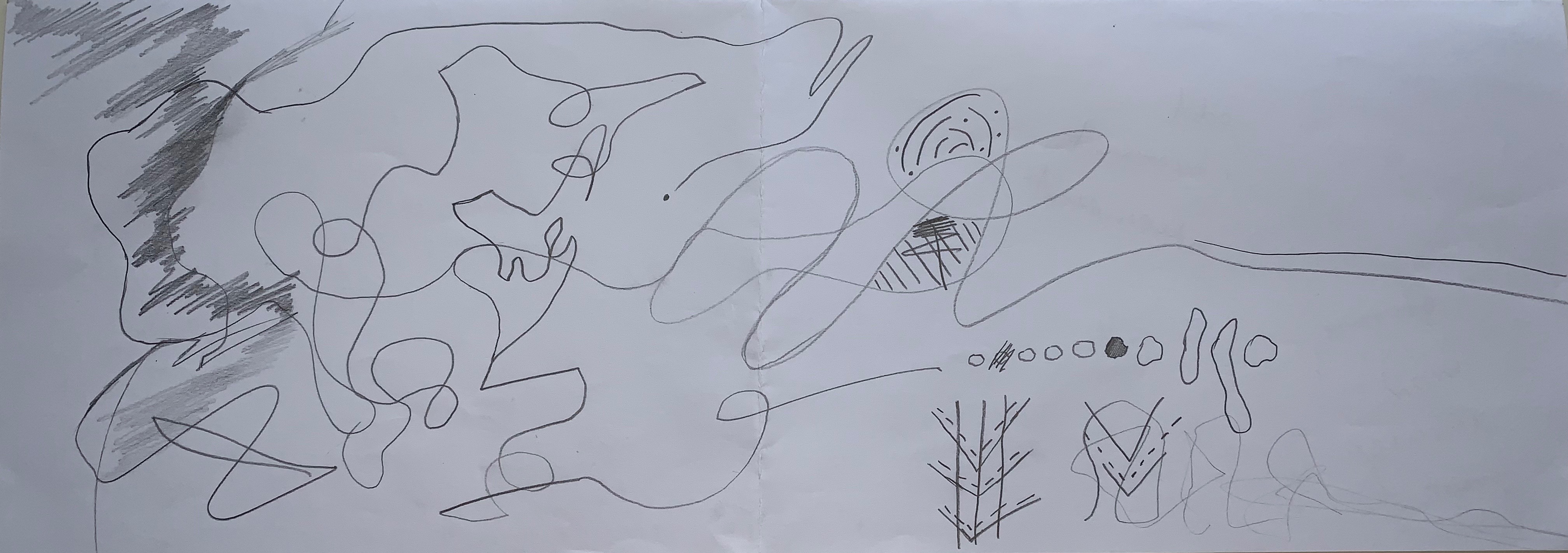
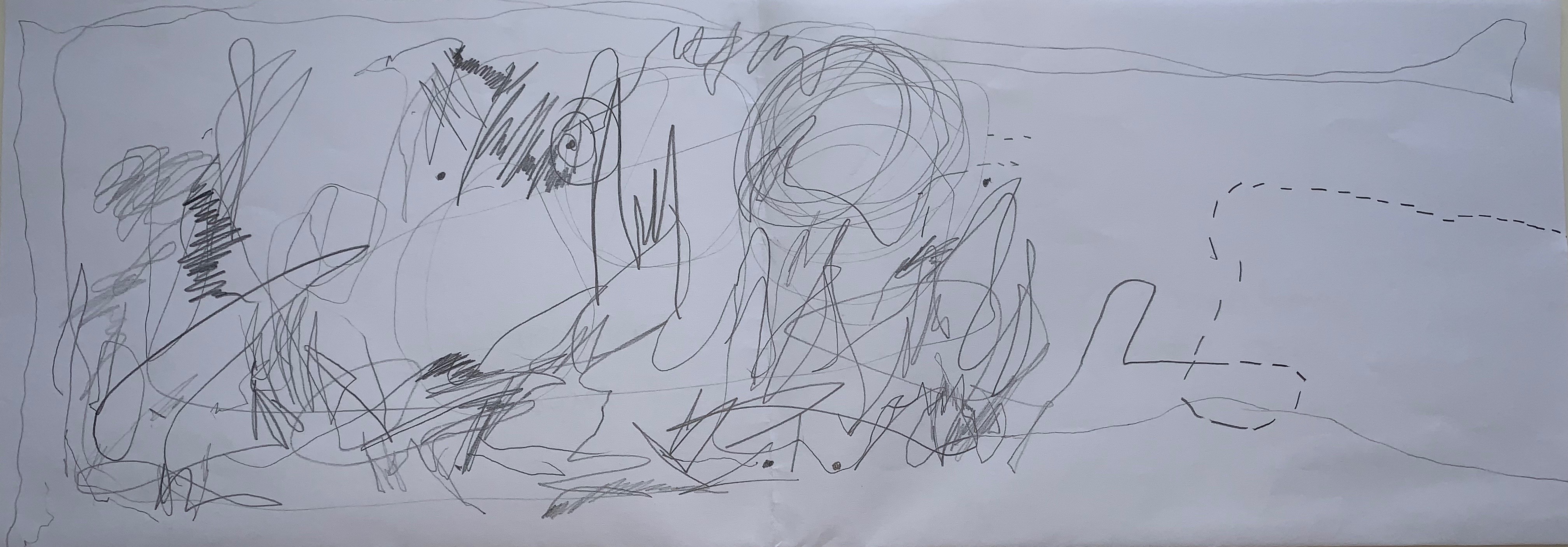
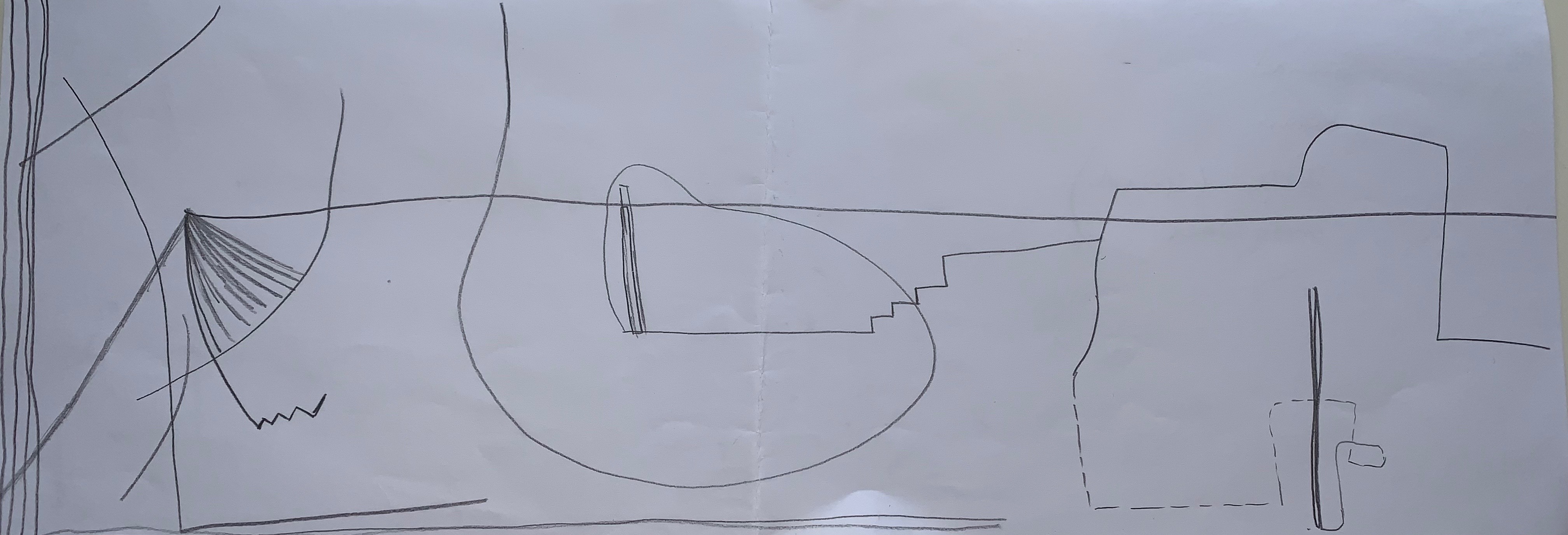
I found this task really interesting and telling, as I quickly realised while comparing my blind and visual drawings how they both portray such different qualities in outcomes and how having your eyes open or closed can impact this. I noticed that in my blind drawings my marking making is messy and hectic with a much heavier hand containing higher contrasts between light and dark tones, as well as having a more varied quality of line use. However my visual drawings are toned back and simplistic with much more empty space, as well as the lines appearing more controlled and direct compared to my blind drawings. This really highlighted to me how I feel much more comfortable to let my mind unconsciously taken over my hand and let the sketches freely travel on the paper without over thinking about every mark I made when my eyes were open.
Research :
26. 02. 19
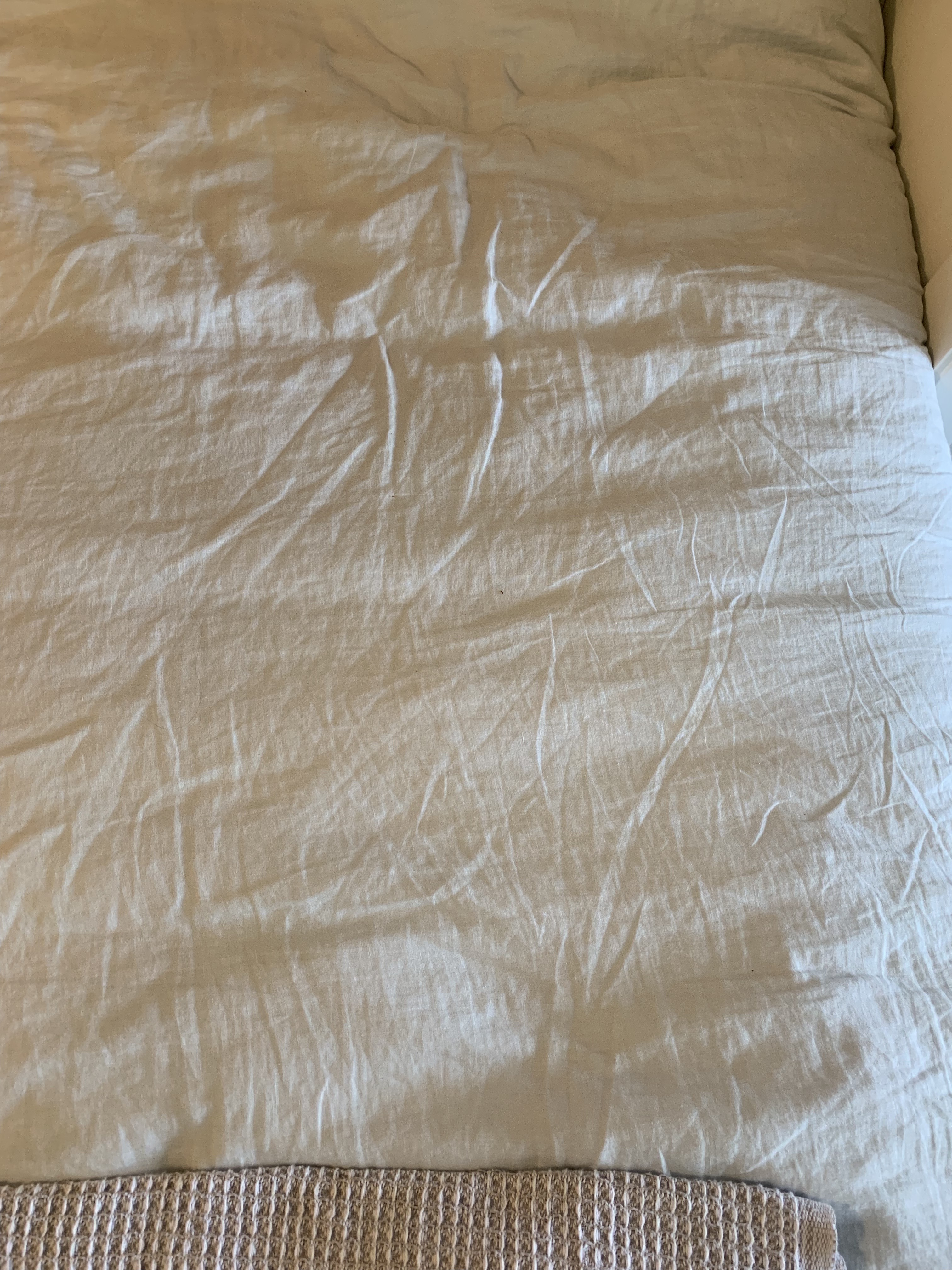
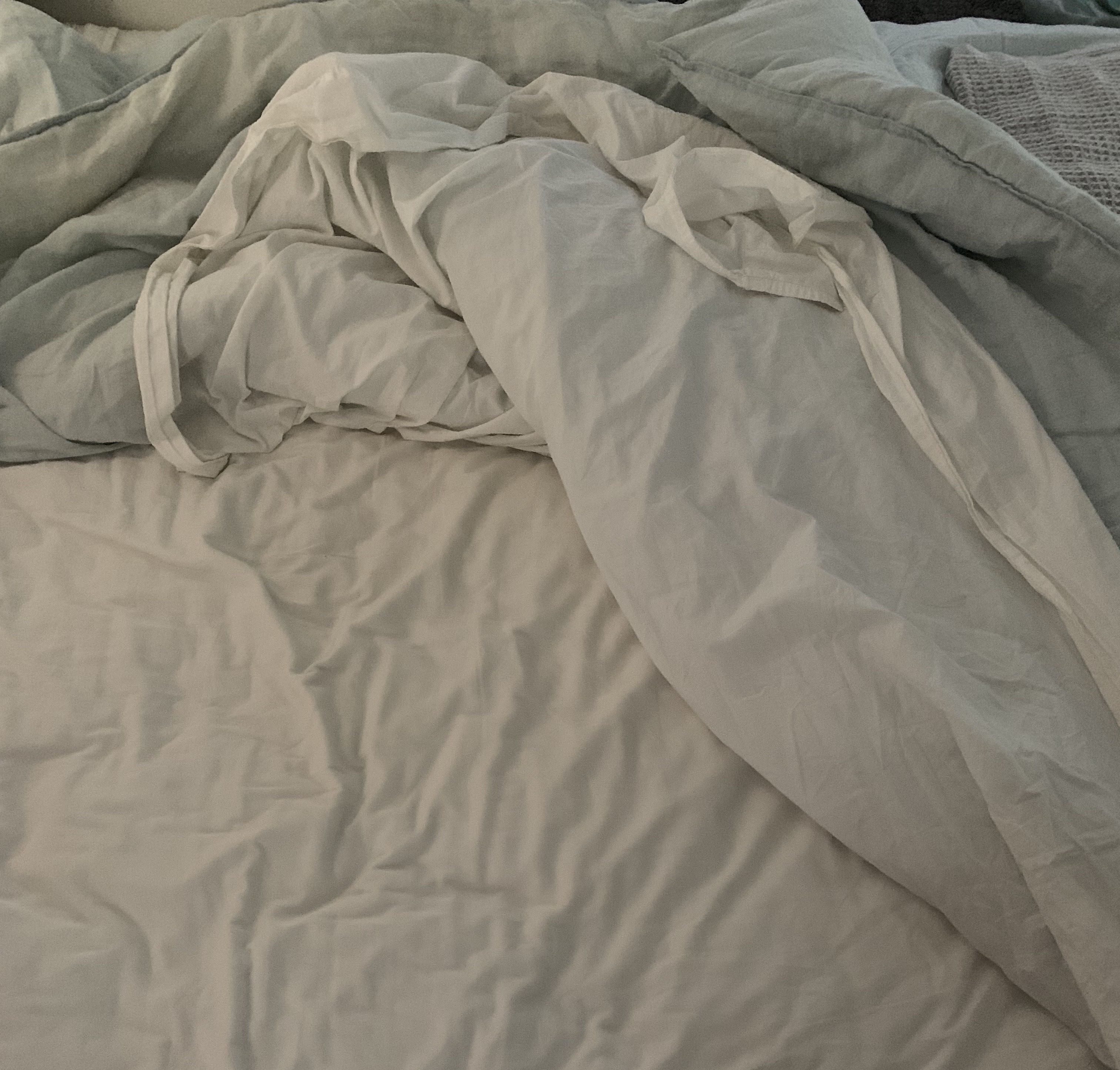
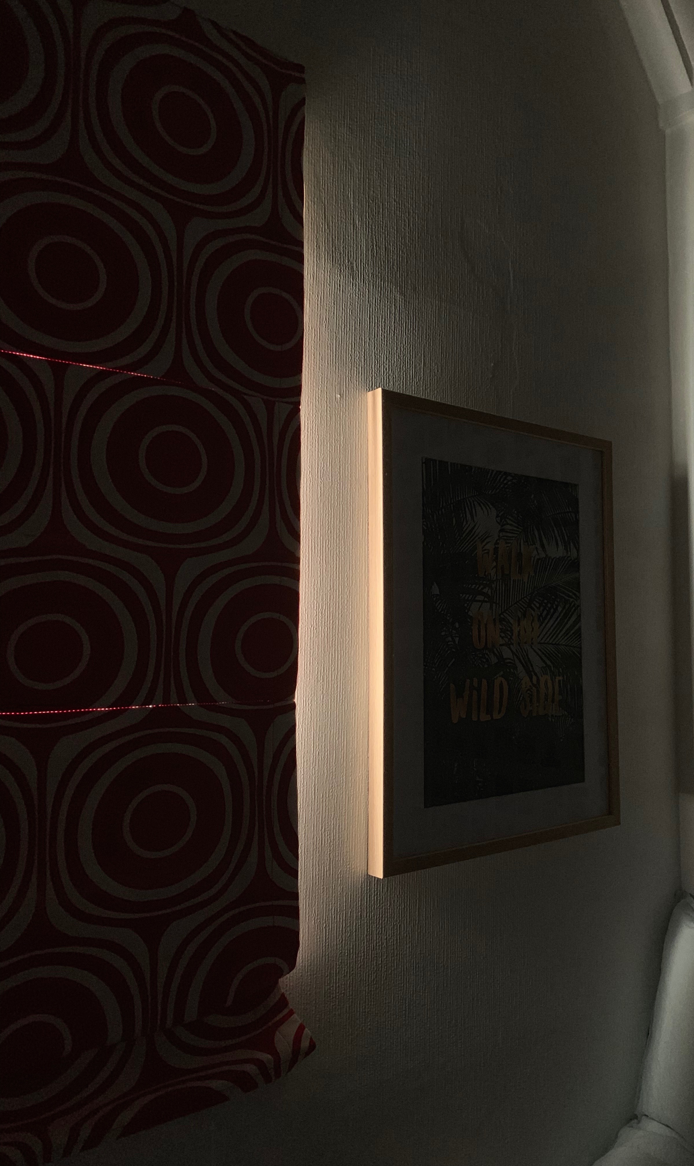
After the first studio session, the following morning I wanted to research and document the personal, intimate space of my bed by capturing my bedding the moment after I had just woken up. By doing this I wanted to explore the movement, lines and tone of my bedding straight after my mind and body had broken out of the sleep/wake state. I also captured the strip of morning light peering through my blinds, as this beam of light always casts a reflection on my walls and into my bedroom, beginning the stages of me waking up each morning. By reflecting on these photos I wanted to incorporate aspects of light/dark and movement/stasis of my own experiences with sleeping and waking and the space where I transfer in and out of each state. In particular when making my drawing and therefore models I wanted to focus on the nature of each line especially the natural direction and shadow of each crinkle/crease in the sheets and bedding.
Design Workshop 2
27. 02. 19
Today in class we started to brainstorm and discuss ideas for our A2 drawing and the threshold relationships we would like to explore further. There are four threshold relationships that I am particularly interested in and which should enable me to document my own personal impressions of sleep/wake through sketch drawings. Based on my initial blind and visual drawings, I think that with these thresholds there is further exploration to be had with my unconscious mind being uncovered when I draw blindly and let my gestural movements take over. These relationships included :
- Light/Dark
- Weight/Weightless
- Dream/Certainty
- Movement/Stasis
In order to begin creating my A2 drawing I used my initial four blind and visual drawings to reflect on the differing outcomes of each sketch and come up with some key descriptive terms that represent the two ways I draw. I then wrote my own interpretation of the meanings of 10 selective terms in the way that best describes my drawings and drawing style.
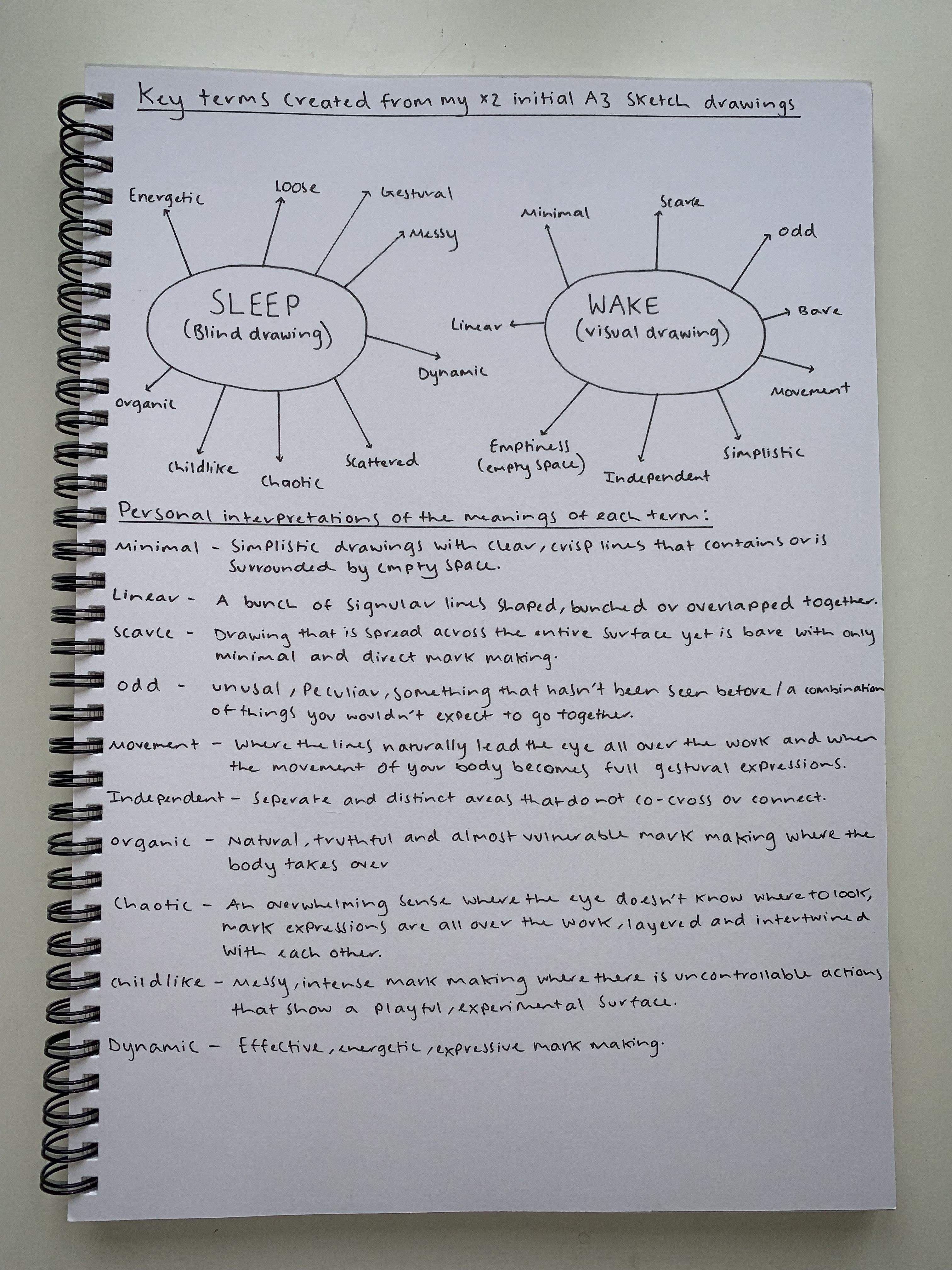
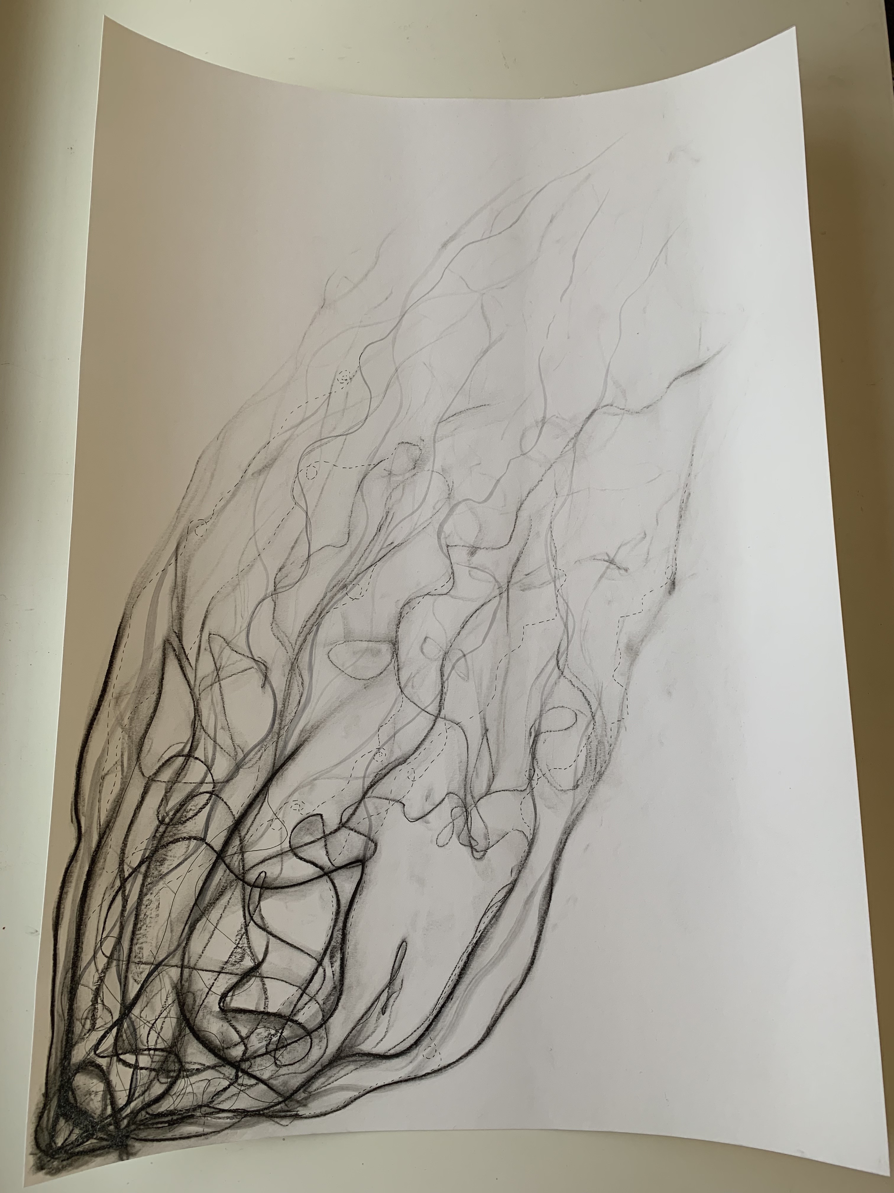
My initial A3 drawing I created mainly blind as I wanted to fully embrace allowing my mind to let go and my body to take over, without having direct control over where the lines travel and how the final outcome will look. The materials I used to create this draft was charcoal, a smudging tool, white pencils, black ink ballpoint pens and pencils in a range of gradients and thicknesses. With this work I wanted to explore the nature of line and how gradual layering of line with varied thickness and tones can create a detailed all over composition that is linking to my unconscious mind.
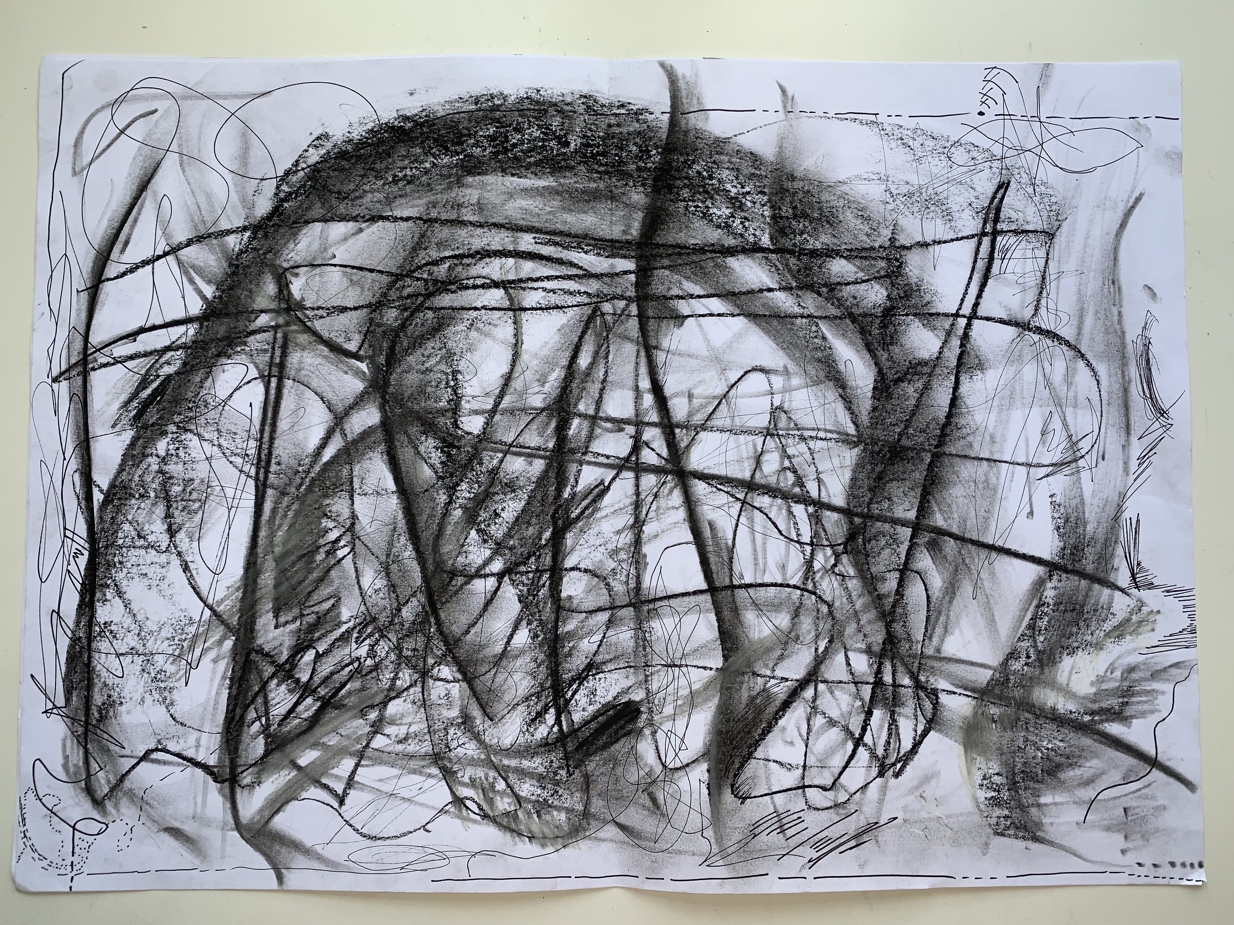
After I completed my first draft A3 drawing I decided to explore the contrasts and depths of line by creating two smudging drawings made up of the natural, organic linear forms created in my first A3 draft.
1st Smudge Drawing 
2nd Smudge Drawing
Following my first A3 draft and two smudge drawings, I decided to extend the outcomes of all three drawings to create a larger A2 drawing combining both experimental elements to play deeper on the thresholds of light/dark and movement/stasis.
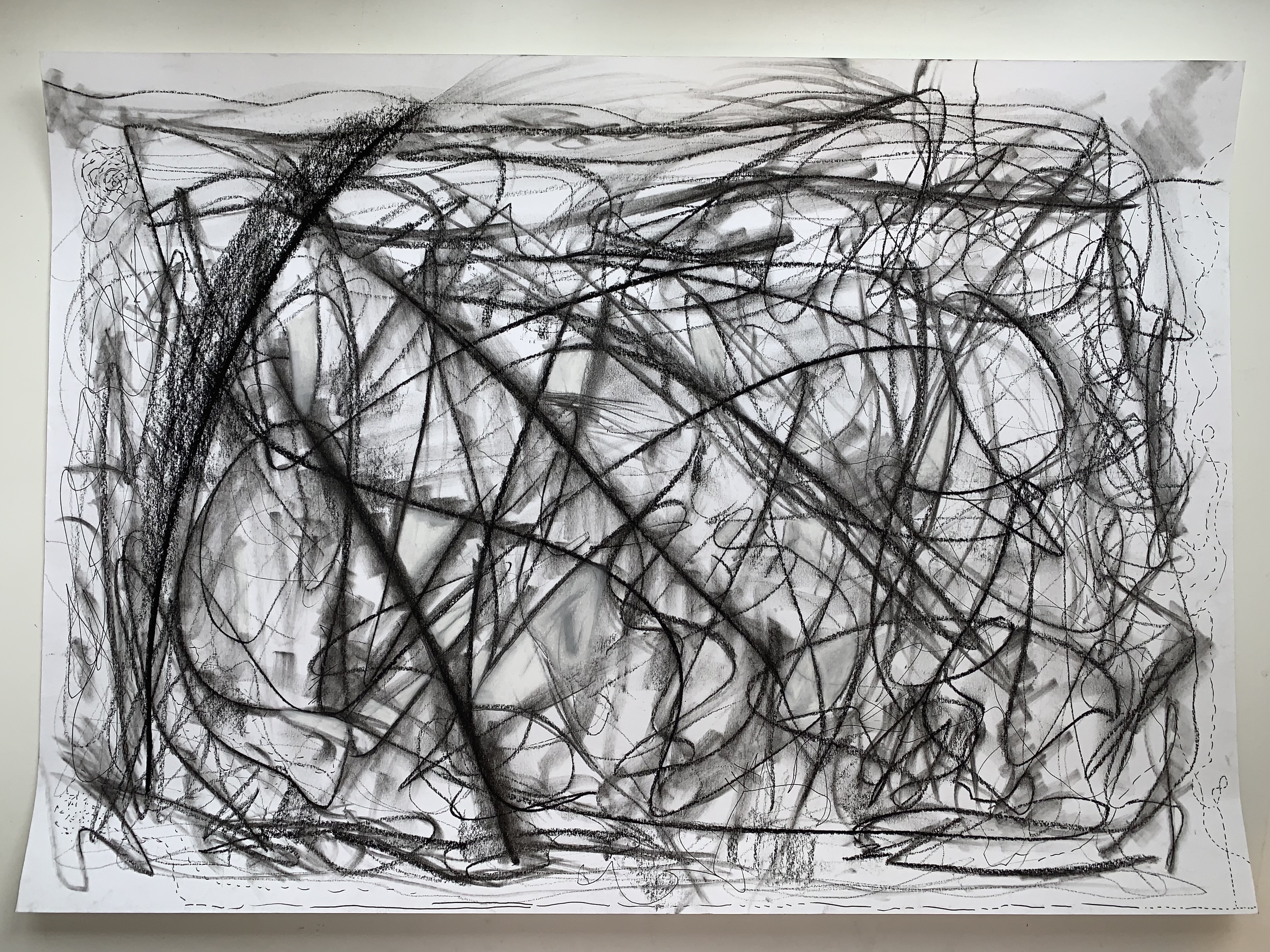
Following all my previous drawings, still using the same materials, I decided to extend my exploration of the sleep/wake states even further by maintaining my chaotic, messy sketches that behold the truth to my unconscious mind when I am progressing to the sleep state, while bringing in simplistic and minimalist elements. My final A2 drawing I extended my ideas surrounding movement and wanted each line to create its own direction. The lines begin clustered and tightly compacted together, dissolving to where the lines becomes faintly visible, creating this infinite space beyond the drawing where you imagining it continuing off the paper.
Design Workshop 3
04. 03. 19
Today in class we were all asked to bring in a box of gathered, found and collected random materials in order to create a range of small models. The materials we had to bring in needed to relate or connect to our A2 drawings in some way. This task wanted us to explore our A2 drawings and bring them to life in a 3D sense. The materials I choose to bring in were :
- Wire (with a range of thicknesses)
- Cotton balls
- Cotton buds
- Match sticks
- Foil
- Tissue paper
- String
- Paper bags
- Cloth
- Cake pop sticks
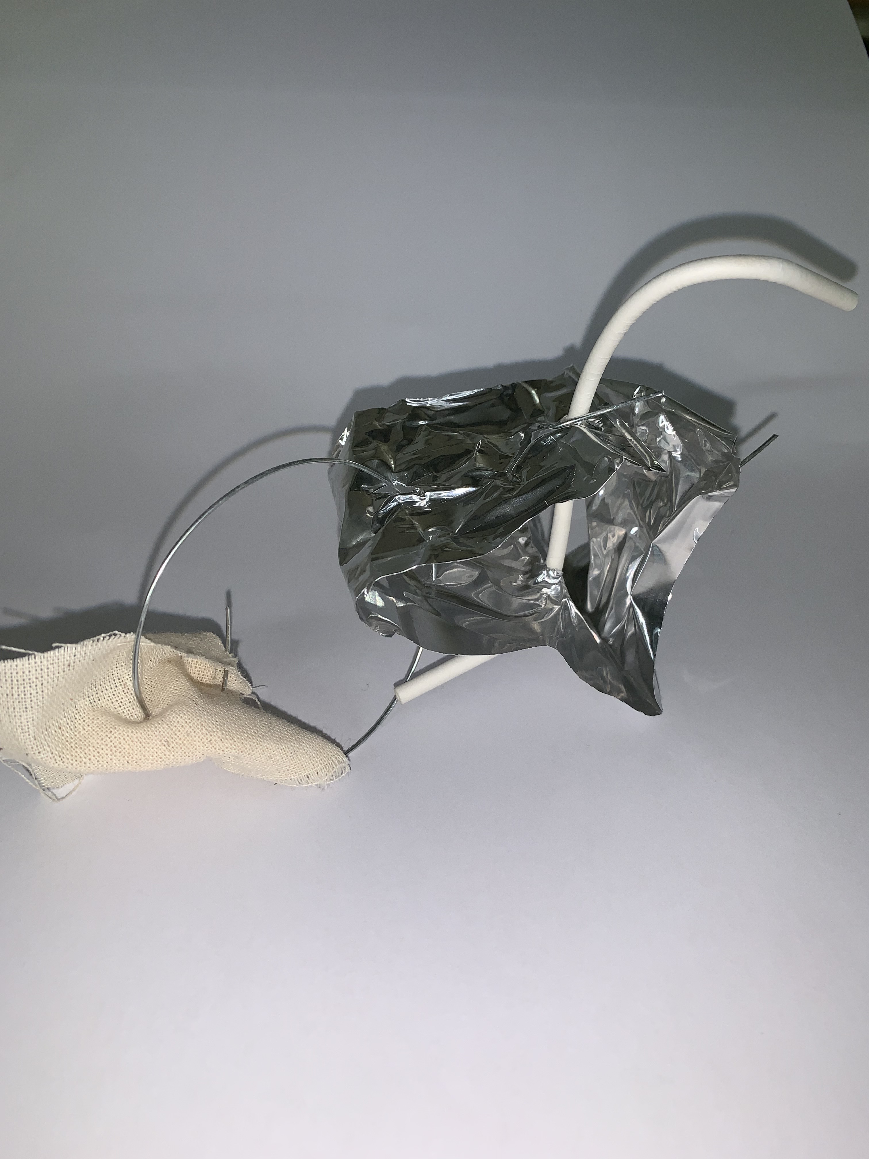
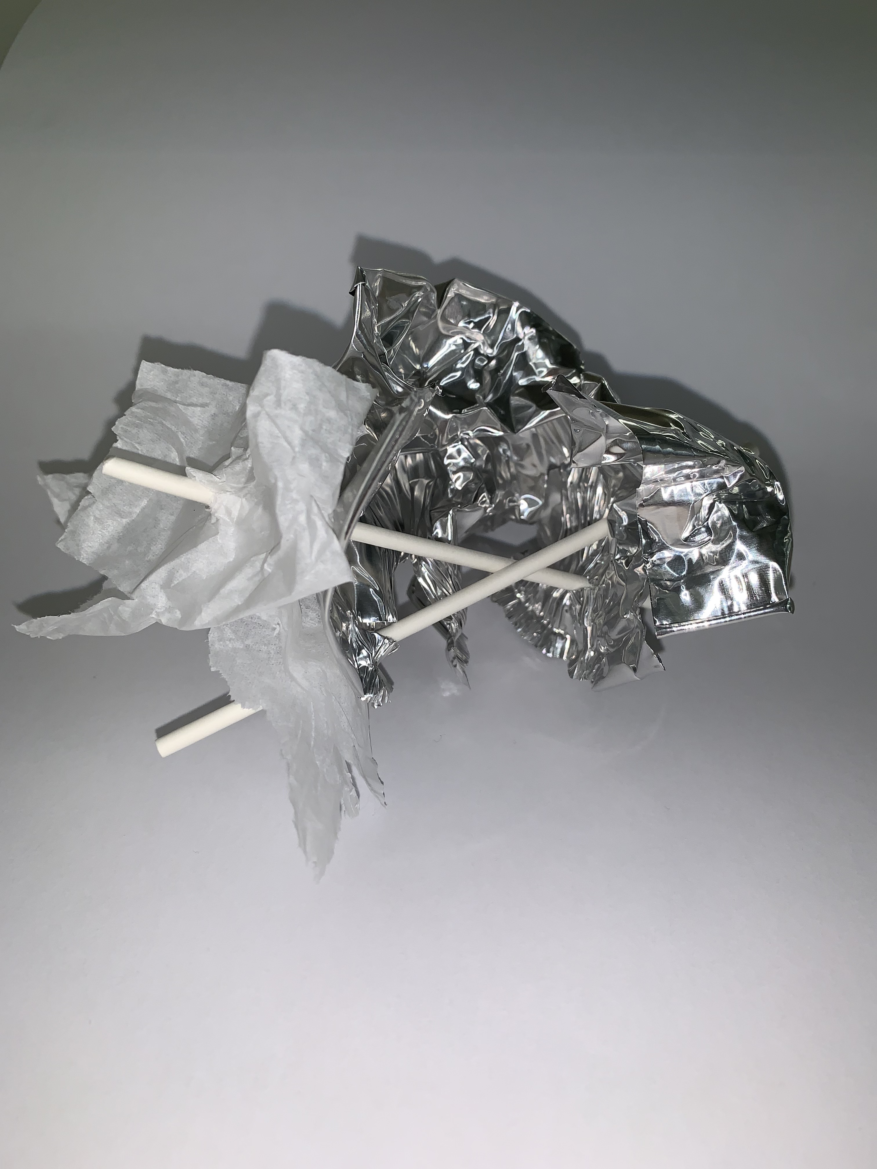
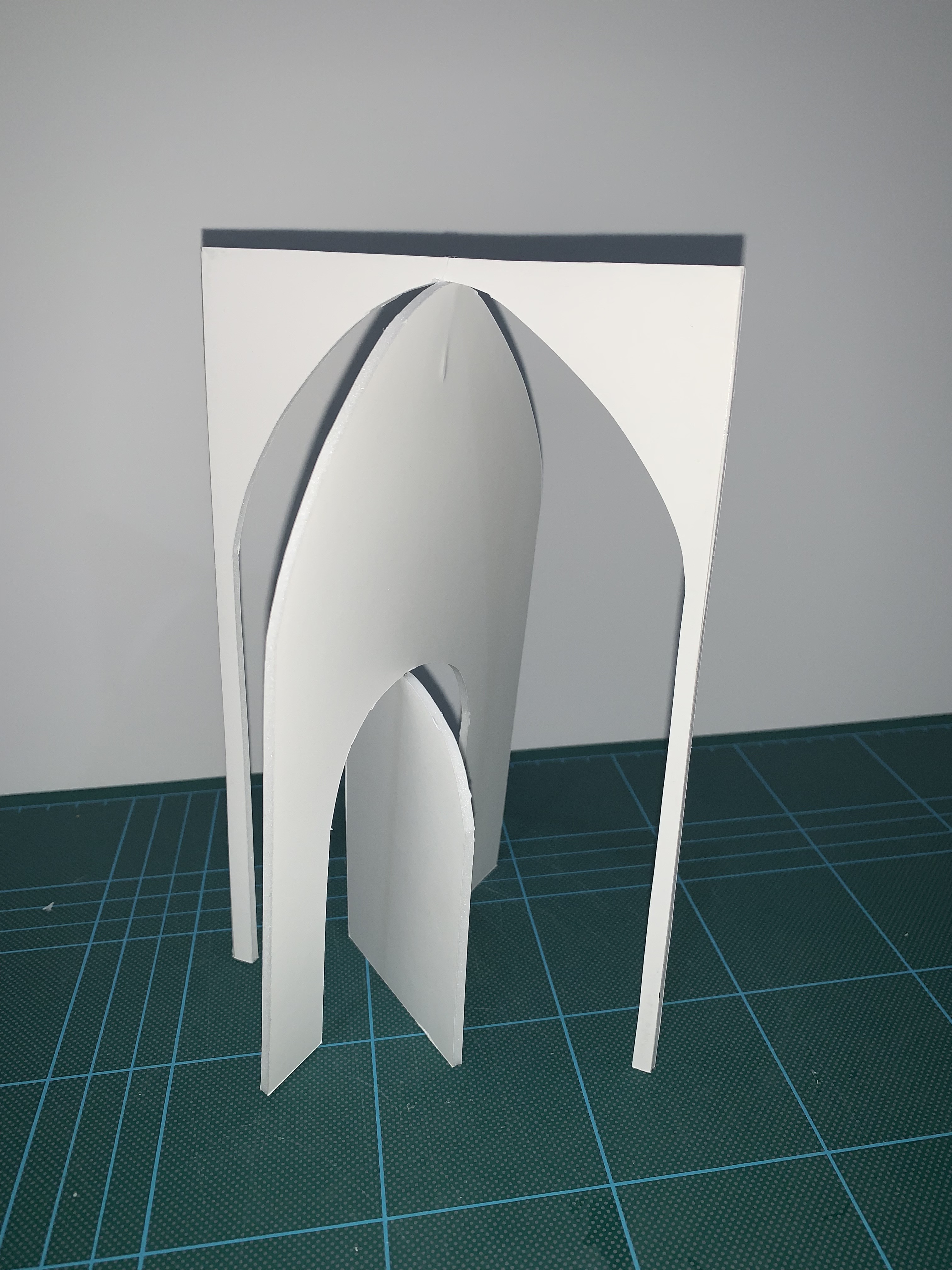
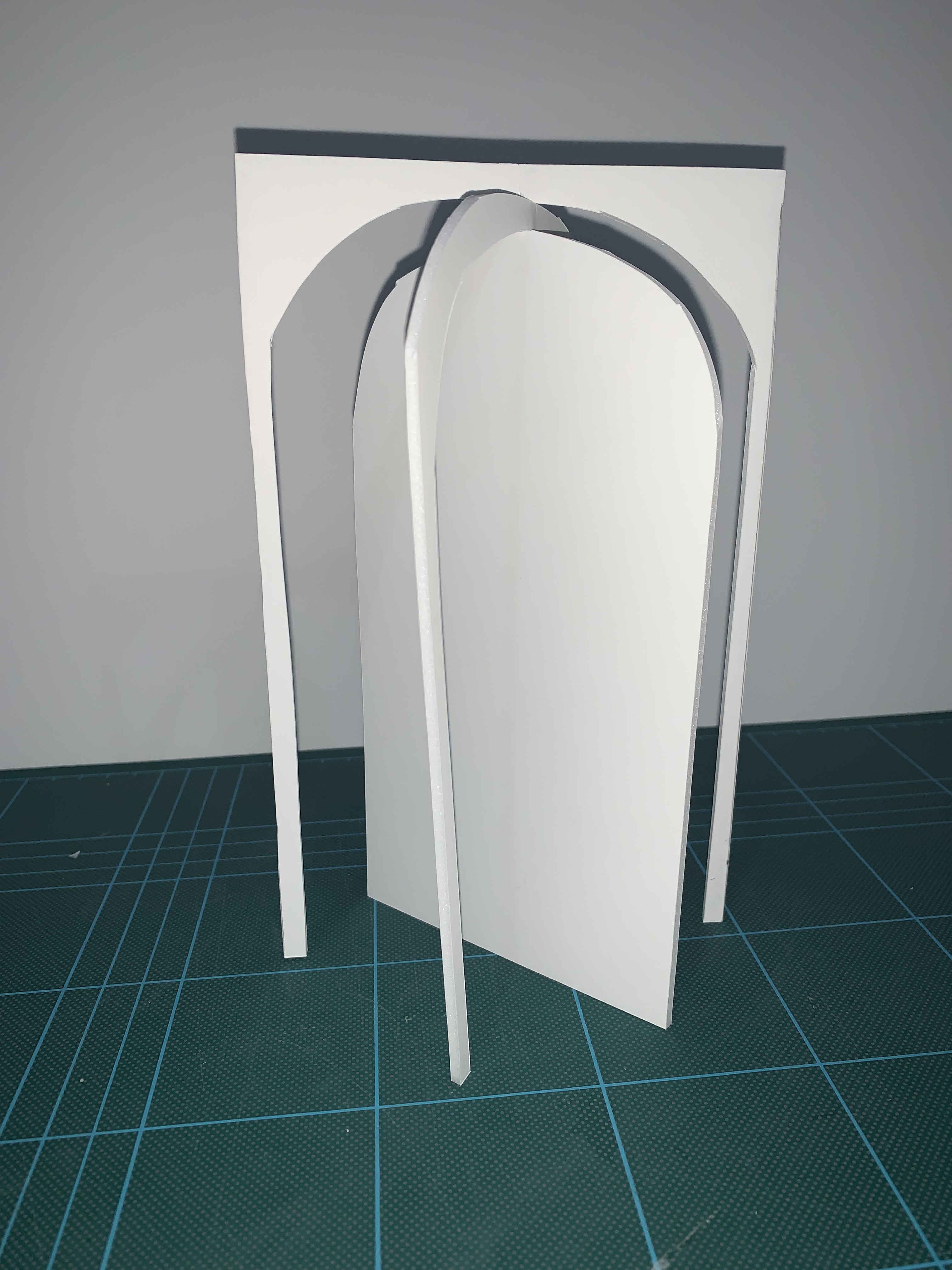
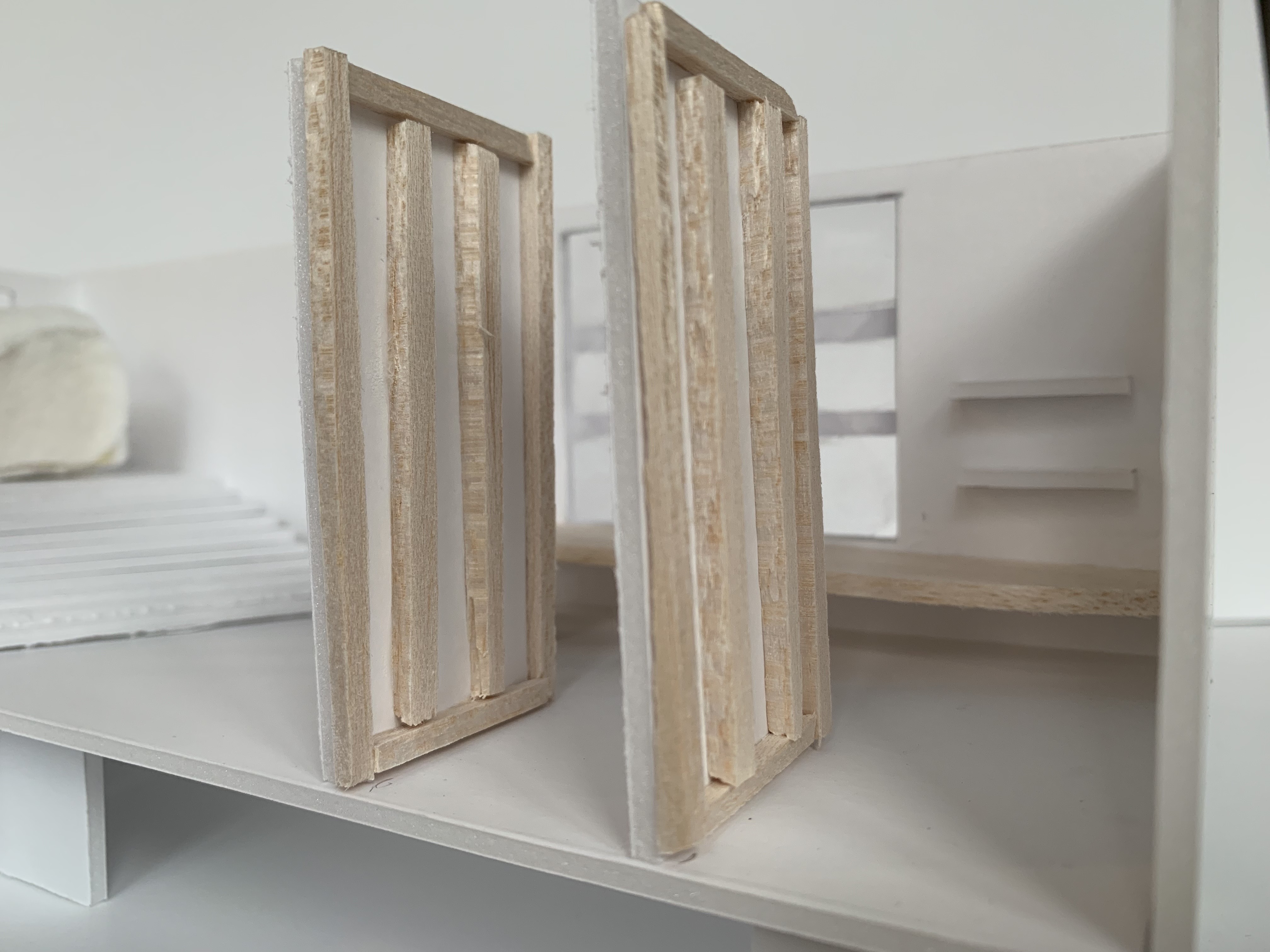
I decided to gather lots of materials as I was uncertain to how I wanted my models to look nor what materials would work together well, so I wanted to have as many options to play with as possible. First we were asked to create four hand sized models, spending only five minutes on each model.
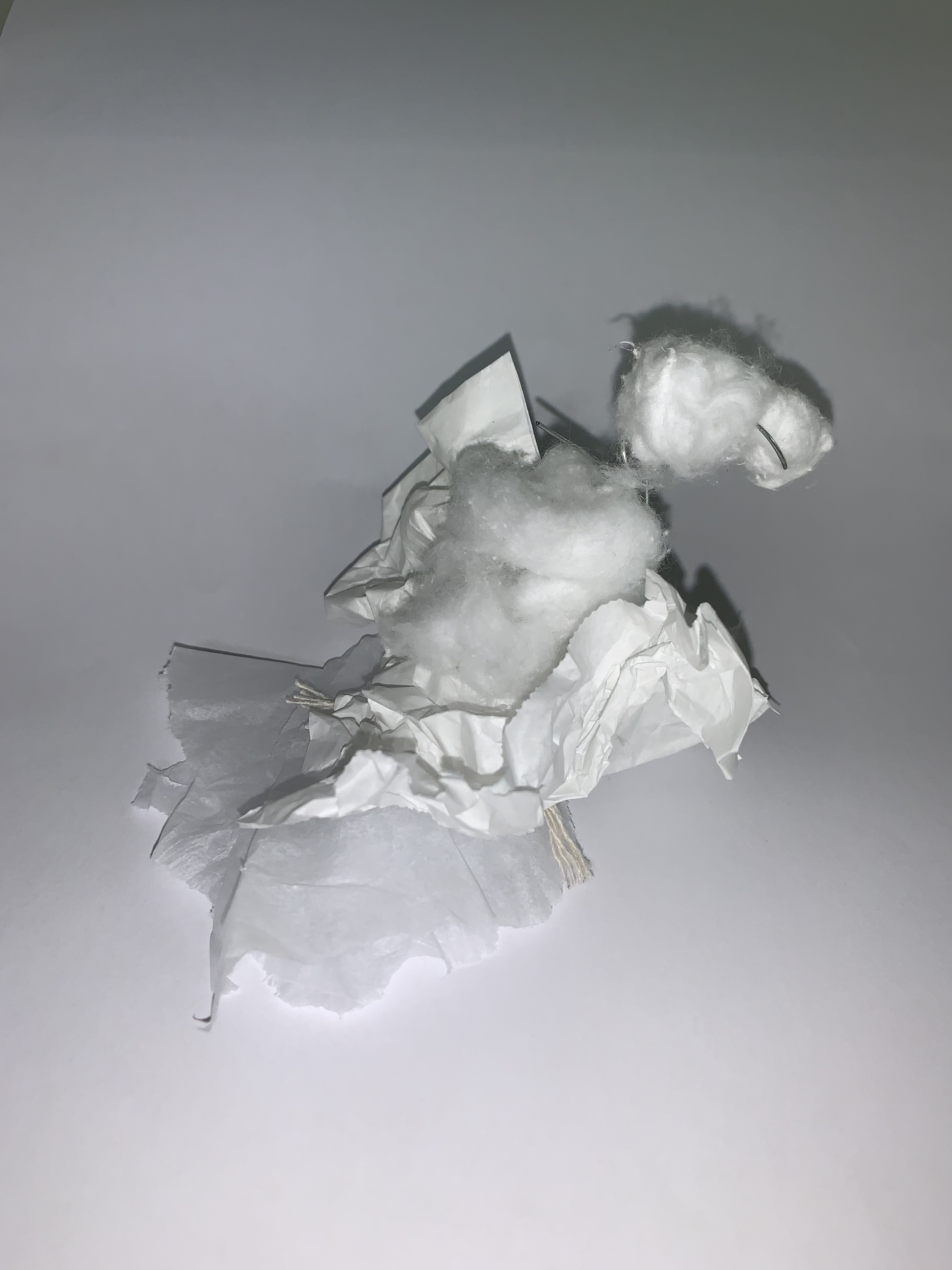
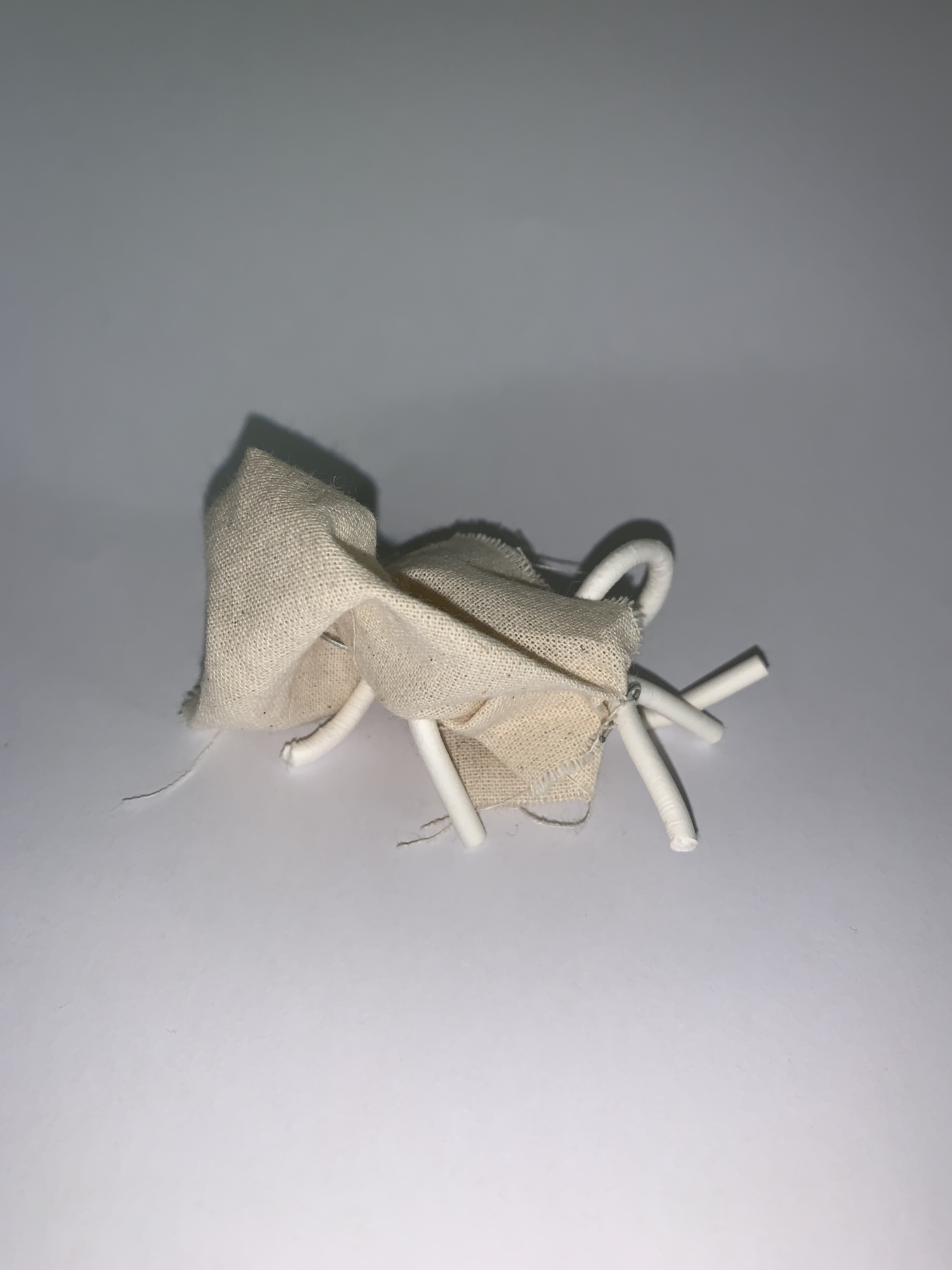
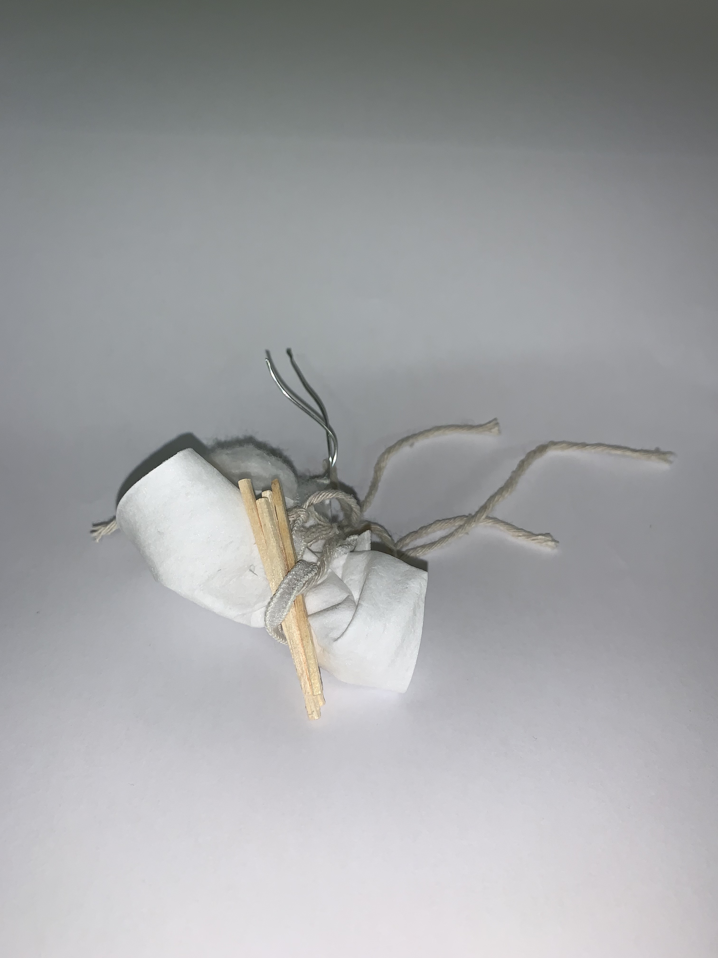
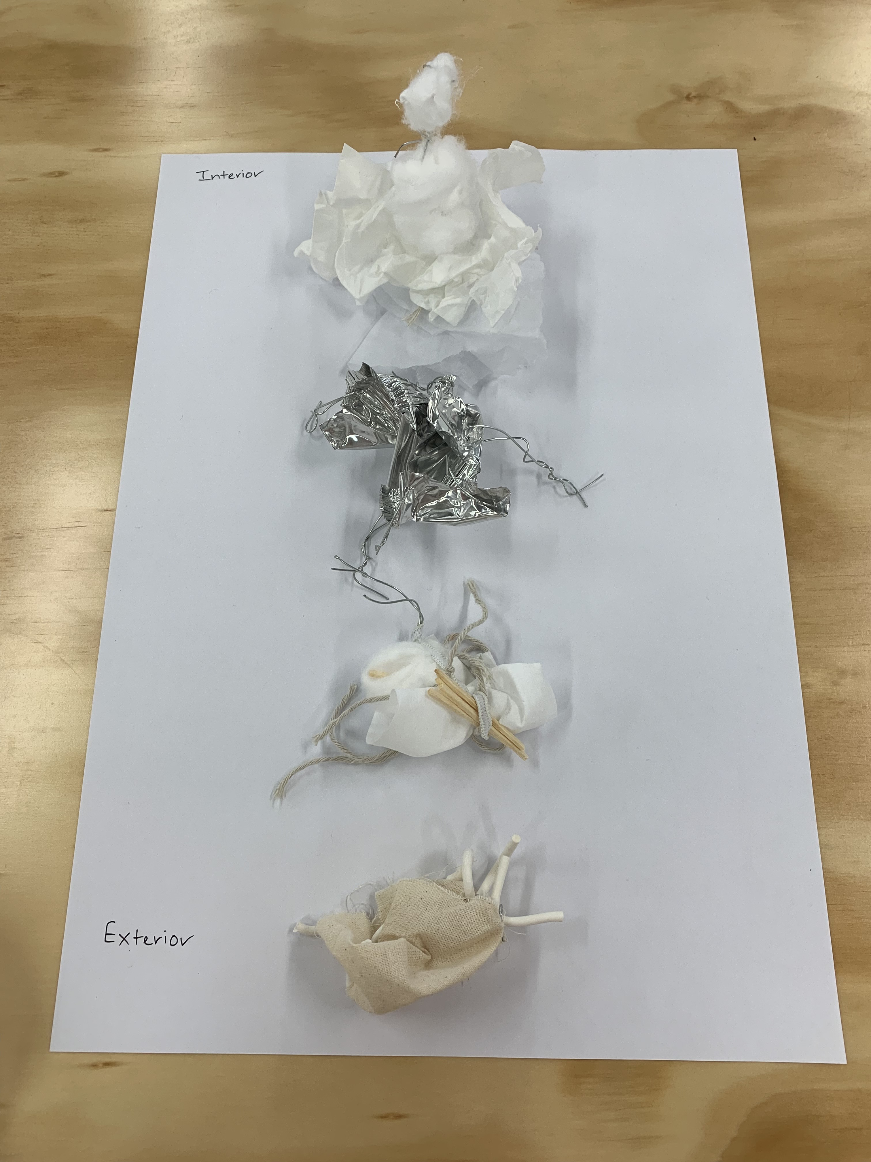
My approach to making the models was to spontaneously combine materials thinking mainly on movement and line. Once we had made the models we were asked to place them on a vertical axis ranging from the model that is most interior to the model that is most exterior and all in between. Once placed on the axis we then created three more models. I took the same approach instead playing with contrasting materials and seeing how they would combine together to create more intimate spaces within the models.
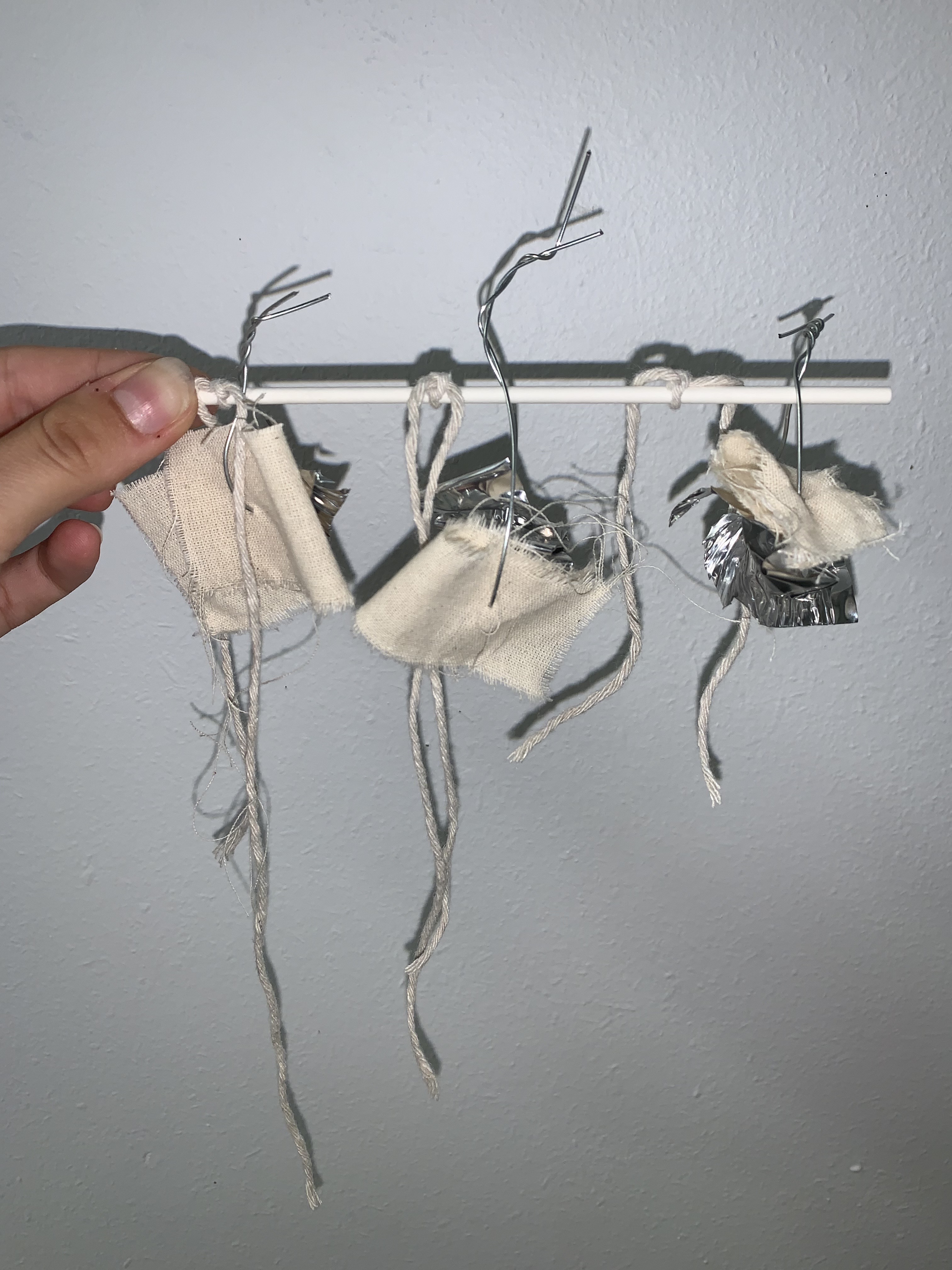
All all the hand sized models we had produced, we then had to arrange them in a vertical axis based off lightness/darkness and fluidity/solidity.
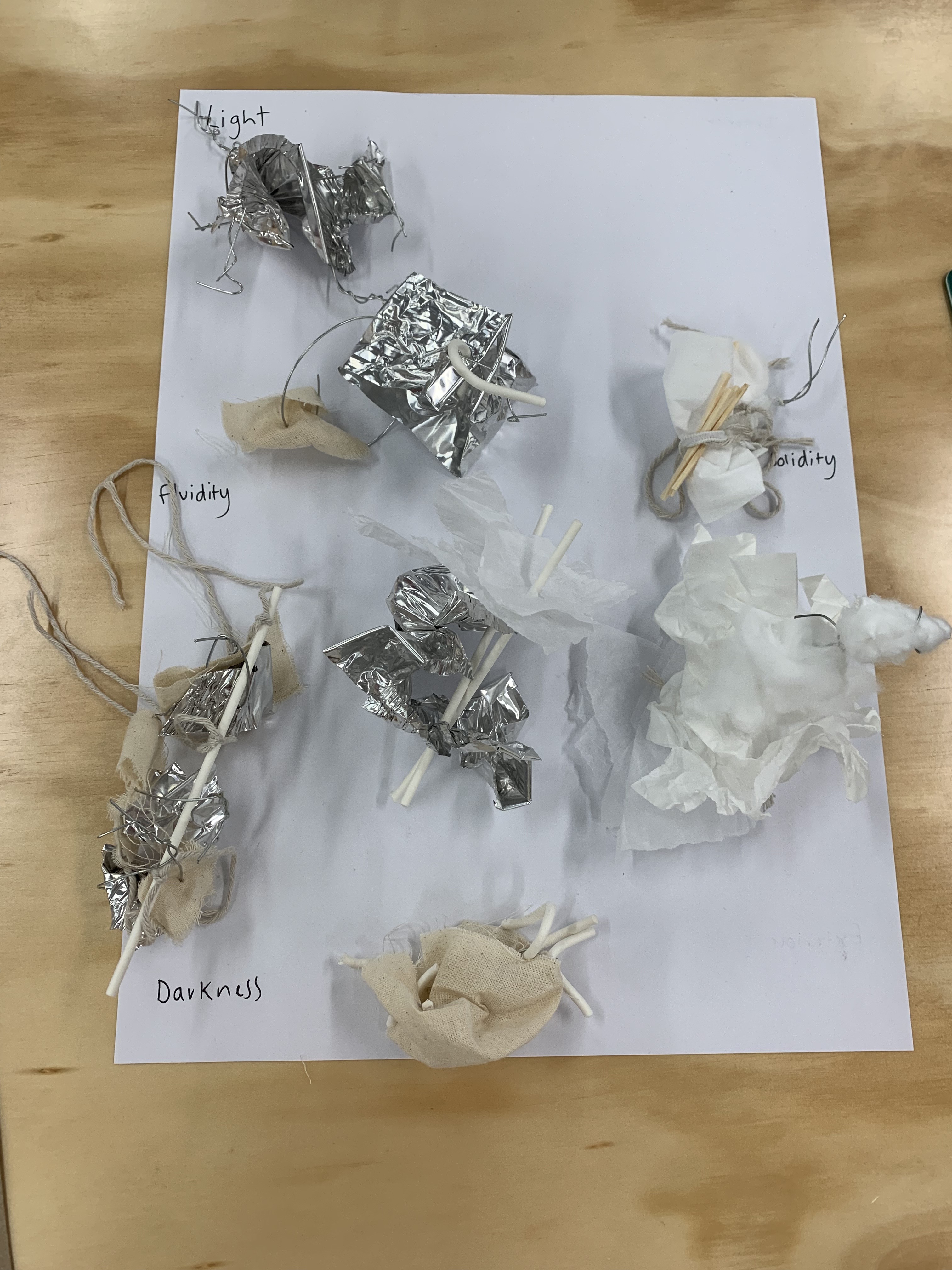
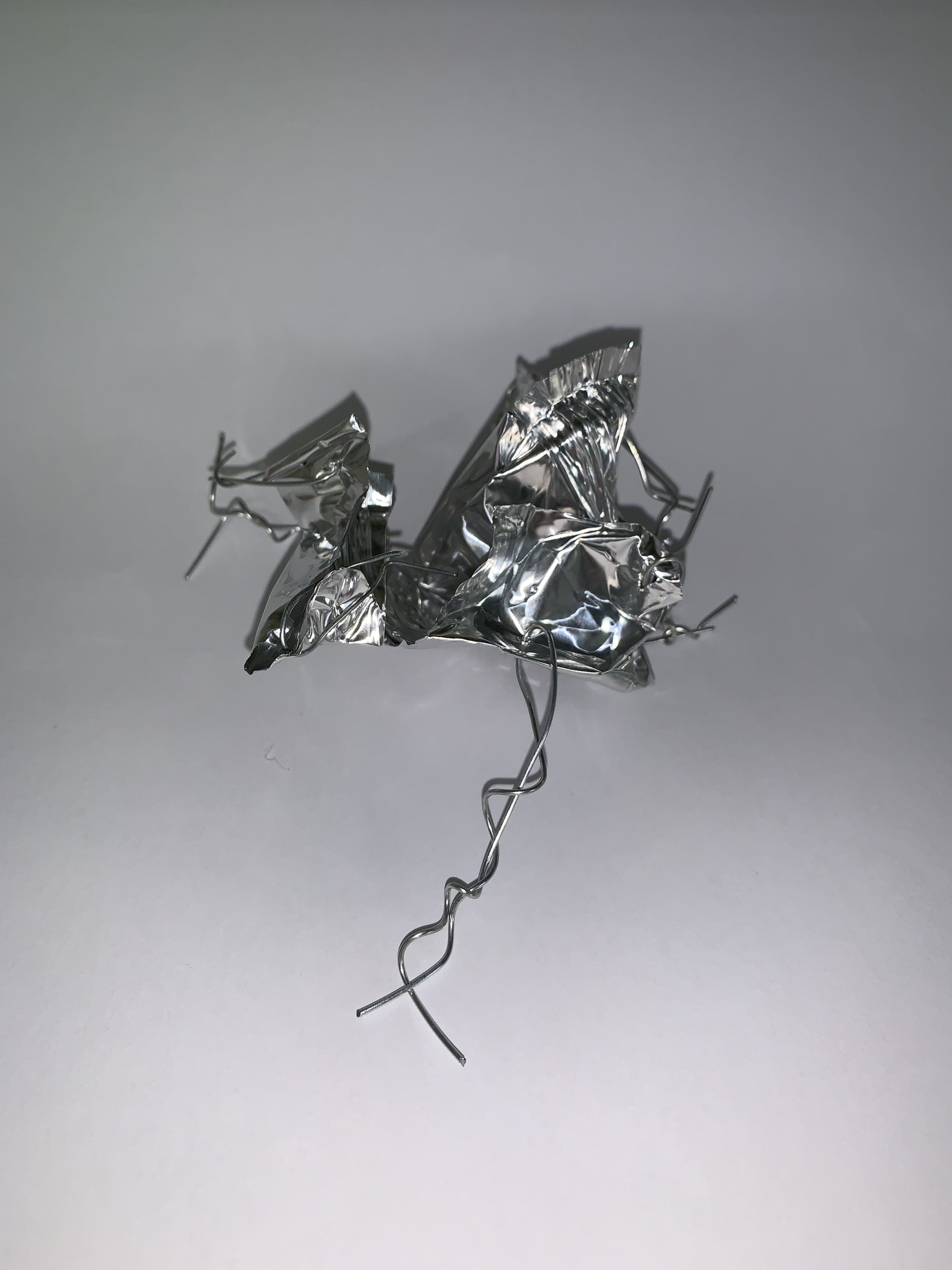
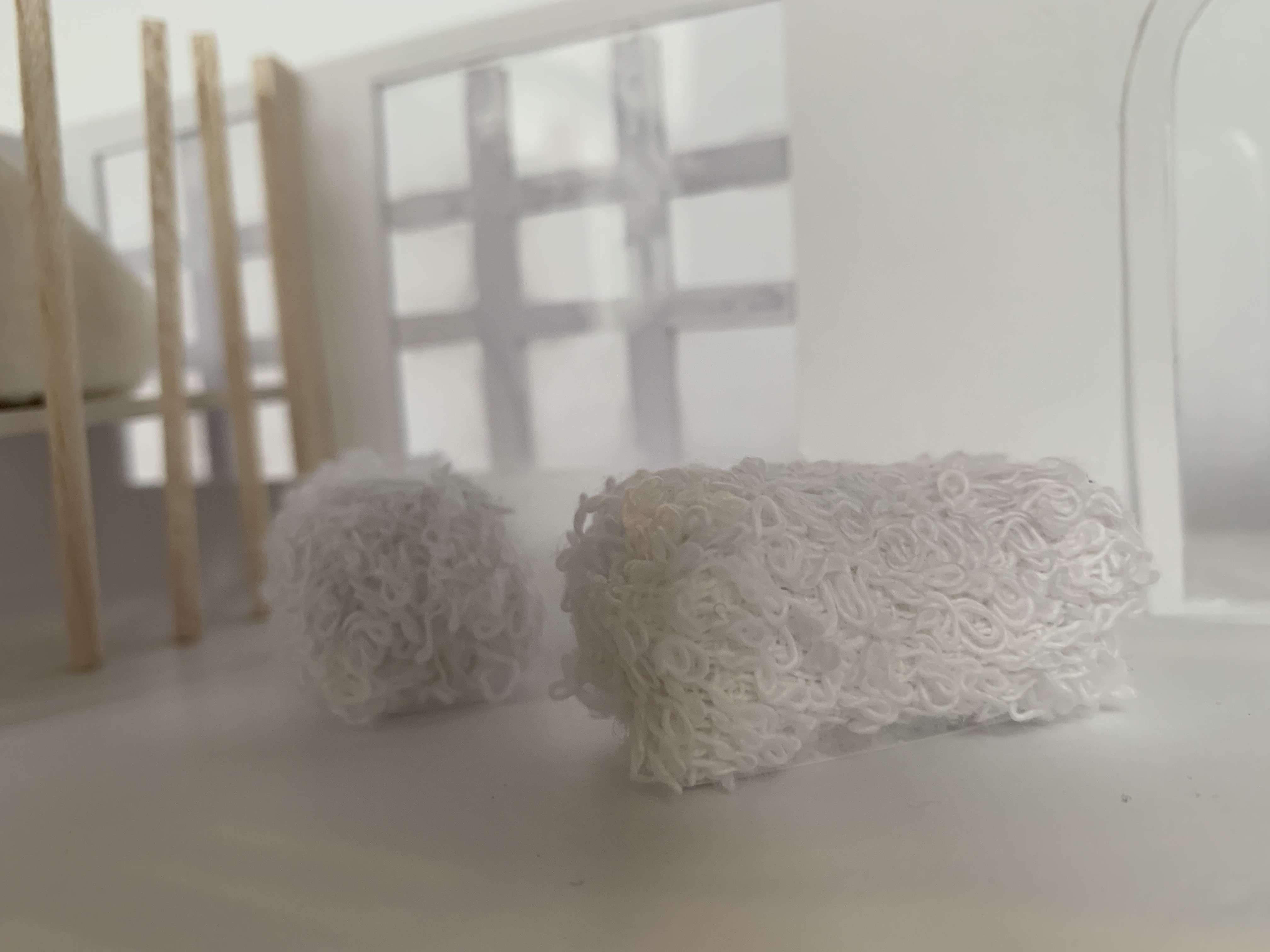
I was then asked to create another model by considering any gaps in my axis layout above where I hadn’t fully analysed or explored some of the light/dark and fluidity/solidity relationships, so I decided to create the following model to explore the relationship between dark/fluid by manipulating the foil into an organic shape, marking creases into the foil to show the movement of line and shadow.
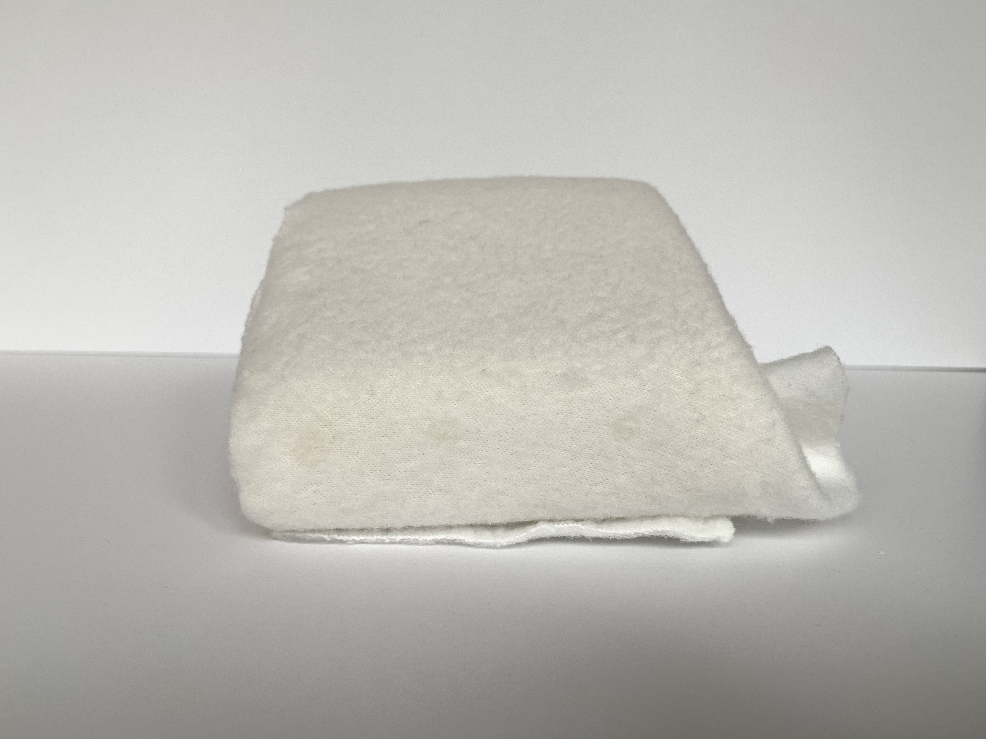
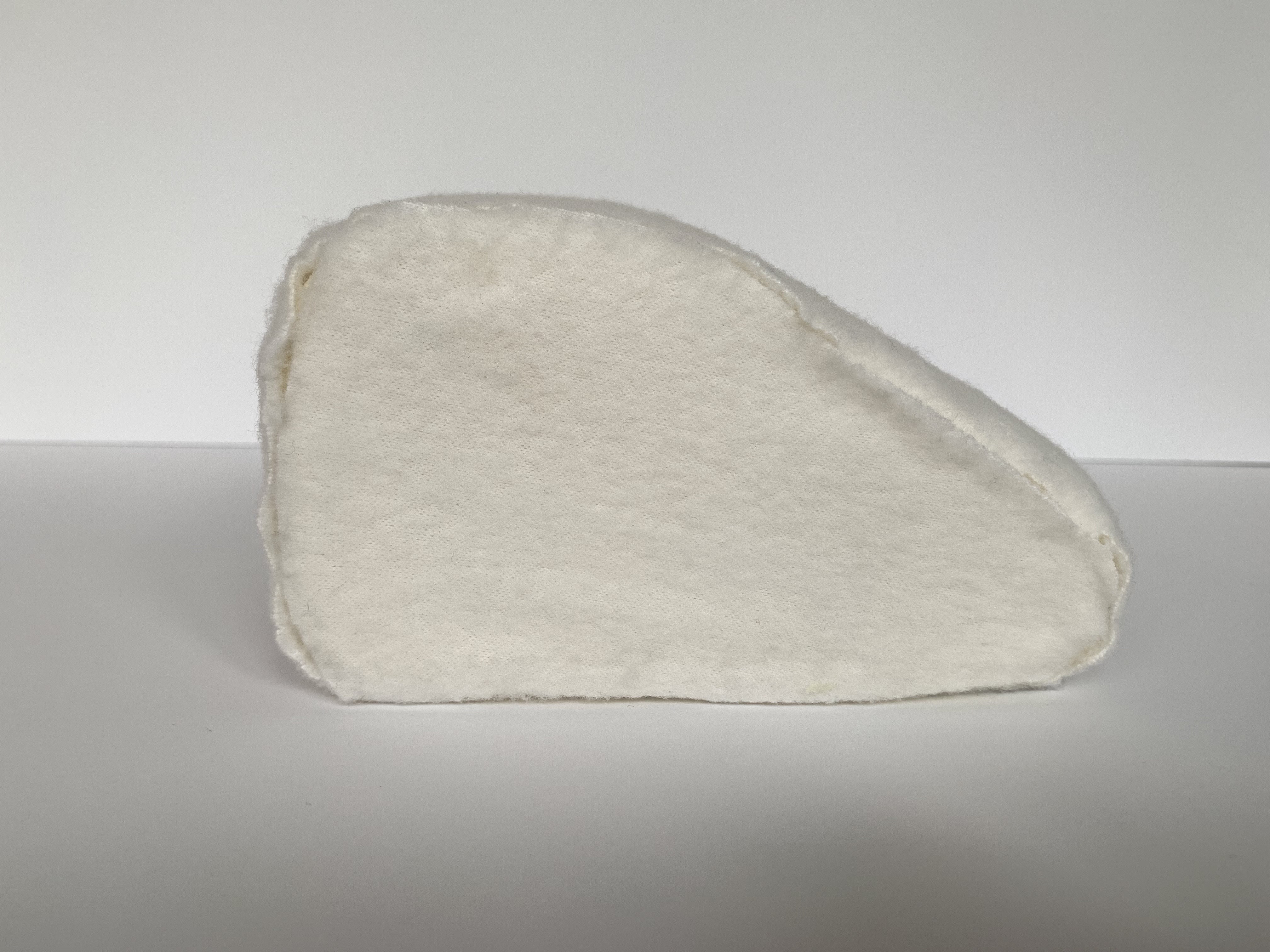
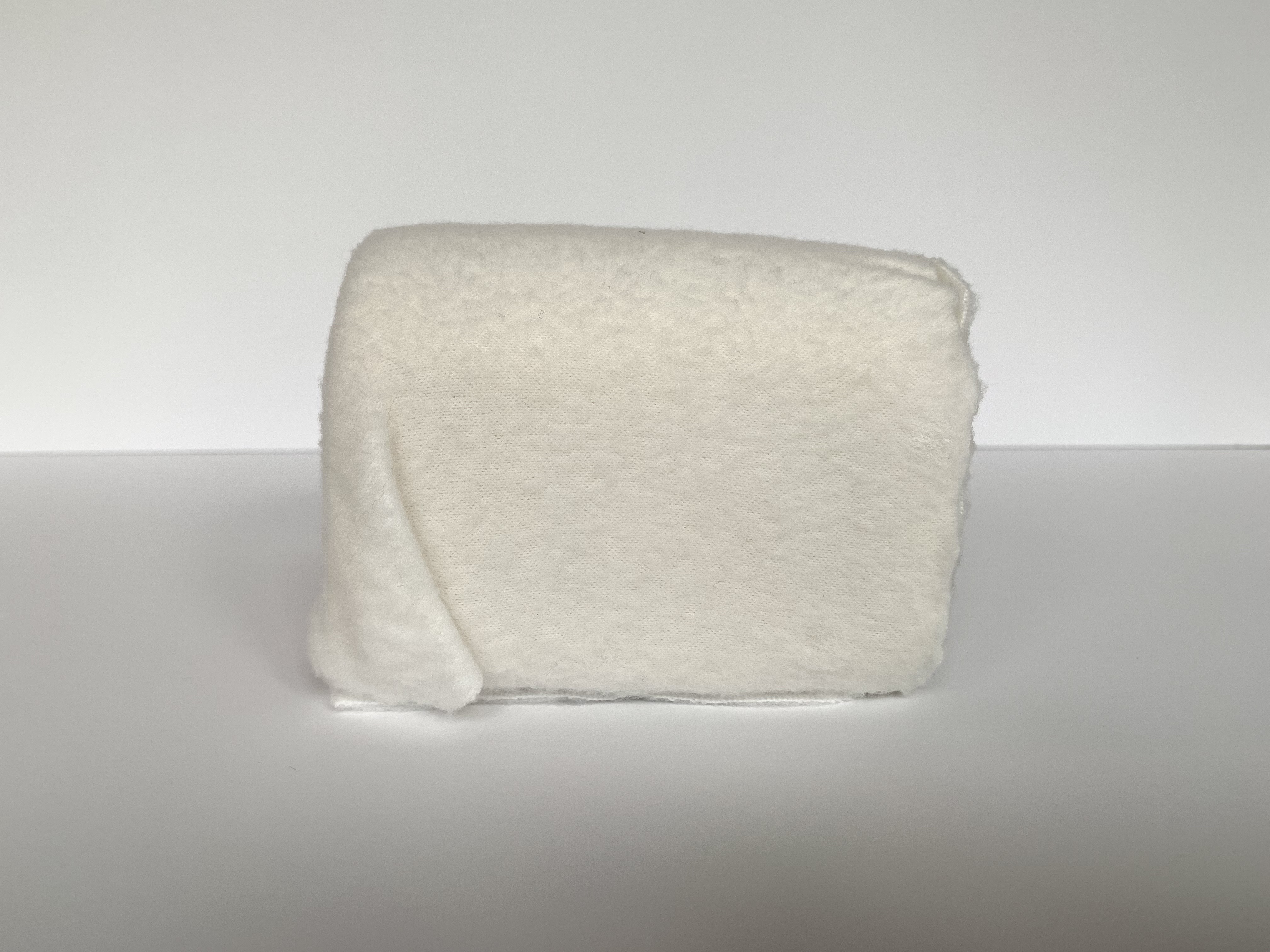
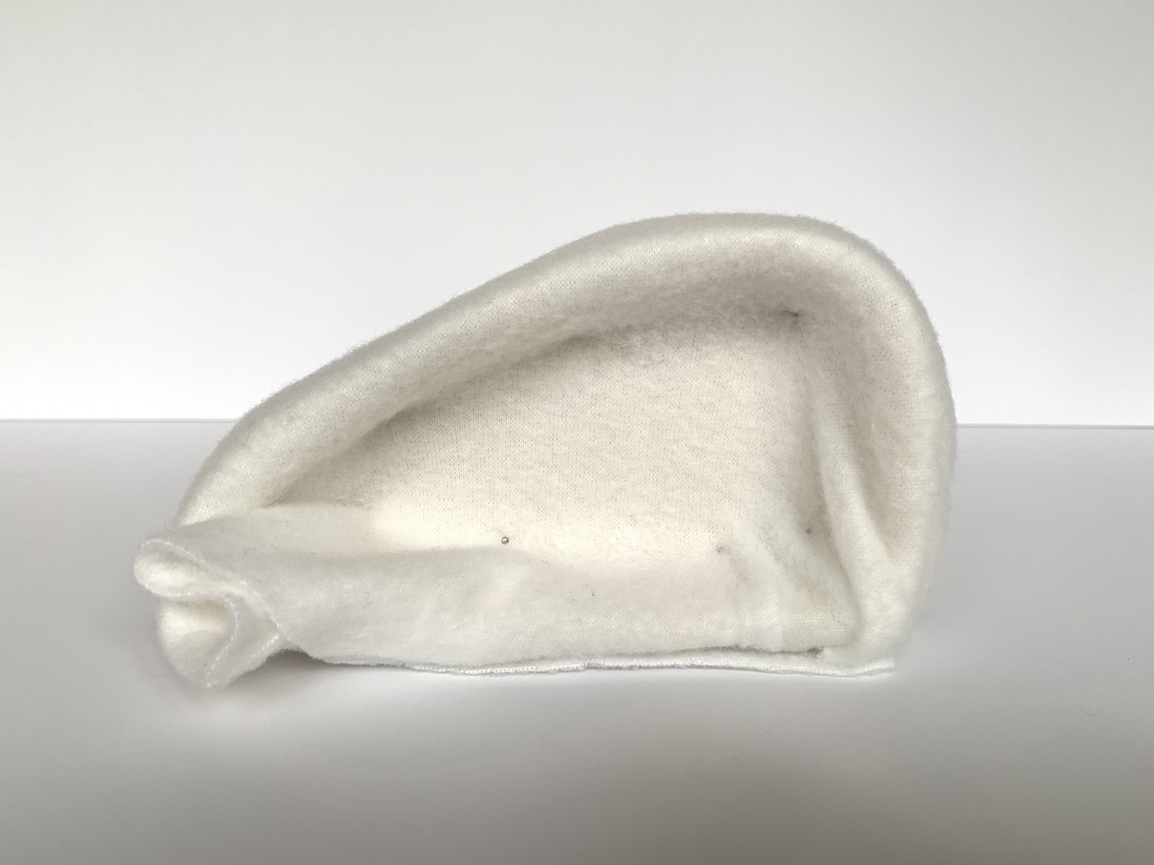
Model Making
05. 03. 19
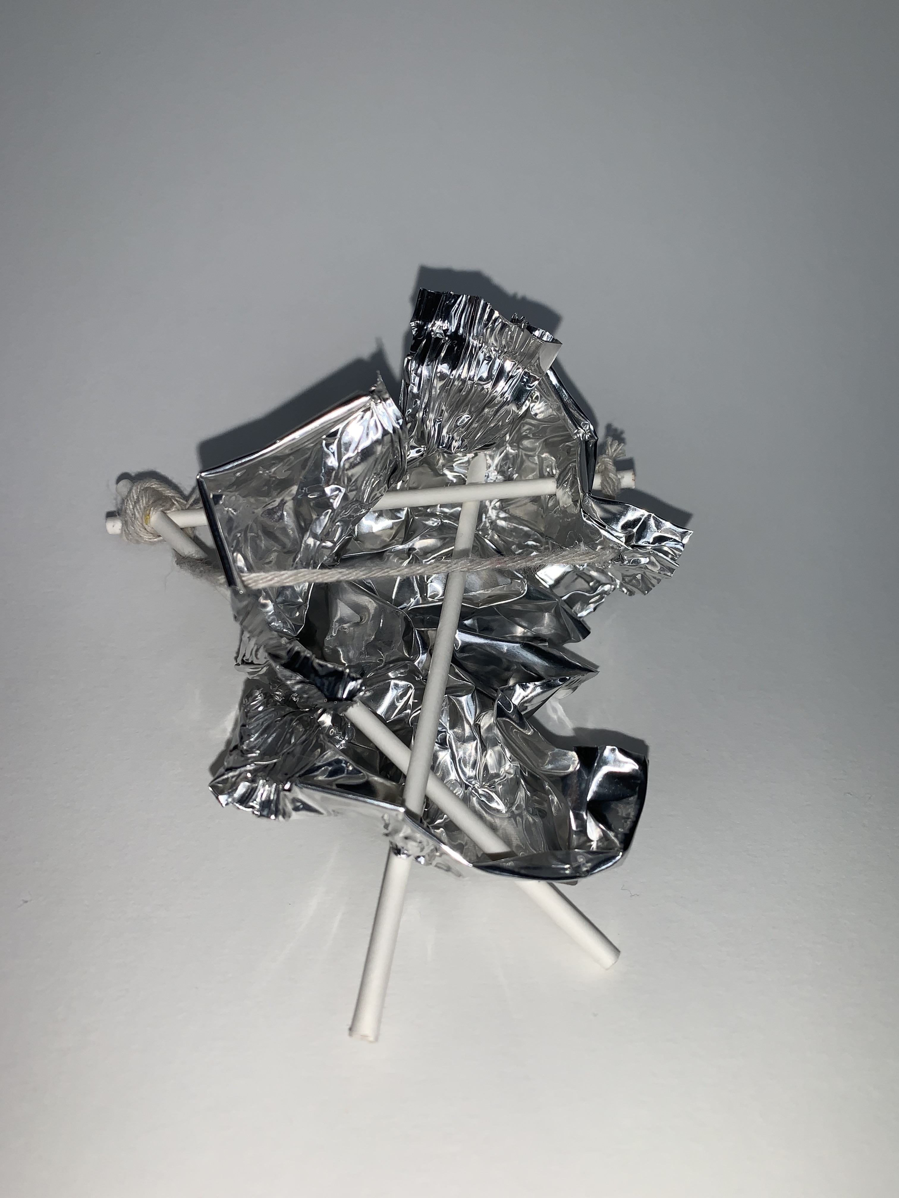
After the last workshop I went home and created a larger scaled models that reflected and related to my A2 drawing as well as combining and extending my favourite elements of my hand sized models.
This was the first large model I created and the materials that I used were the same as my original hand sized concept models. To create this model I used foil, cake pop sticks, wire, cloth, string and tissue paper. I crafted this model by manipulating the foil into a compressed yet bendable form, cutting holes to thread the cake pop sticks through. I then stacked tissue onto one of the sticks while wrapping a wire band around the model to connect the foil to the tissue. While making this model I wanted to continue exploring the threshold relationships of light/dark and fluidity/solidity from my previous models, however reflect more to my A2 drawing and the movement of the mind and body behind the sleep/wake states. I choose to use the foil and with it create an enclosed interior space representing the beginnings of the sleep state where the mind and body is still busy, dark and hectically thinking from the days events. The tissue paper represents the light, airy dream state where the body is shutting down, however the tissue paper did allow me to play on the idea of movement and stillness as a sudden draft of air made it move, showing how the mind, even in the sleep state doesn’t stop moving/thinking. The wire band surrounding and connecting the foil and tissue creates the sense of a cycle and emphasises the movement of transitioning from the sleep/wake state as it constantly goes round and round everyday.
Design Workshop 4
06. 03. 19
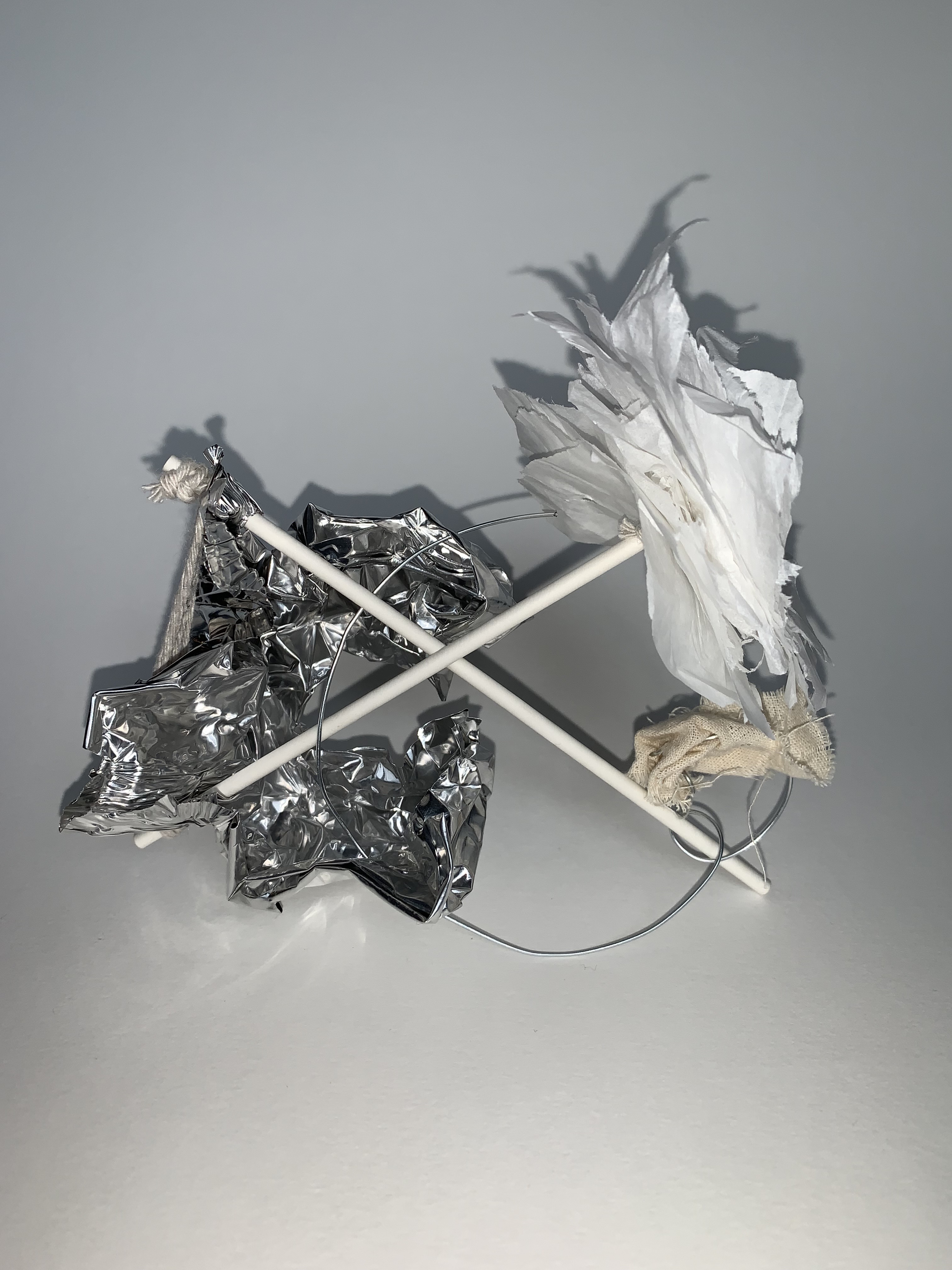
Today in class we were asked to bring in our larger model we had created at home to get some feedback from other students. The feedback I received about my model was overall really positive as they liked my concept and how my choice of materials represented it well. However they thought that the model had a lot of materials which without having an explanation of the concept would make it difficult to understand my overall idea and thinking. I will take all there comments into consideration when developing my model further.
For my new model I am going to use similar materials, however less of them, to really highlight my concept without detracting by adding to many materials to the model. I am going to dig further into the idea of the relationship between the mind and body while transitioning from the sleep/wake states through exploring movement and the nature of line. By doing this I want to create organic shapes of line movement from my A2 drawing and reflect the mind and body and how the mind is always in control of the body even during the sleep/wake states.
Resolving my Final Model
09. 03. 19
Today I used my A2 drawing, hand sized models, larger model and feedback to create my final atmospheric model.
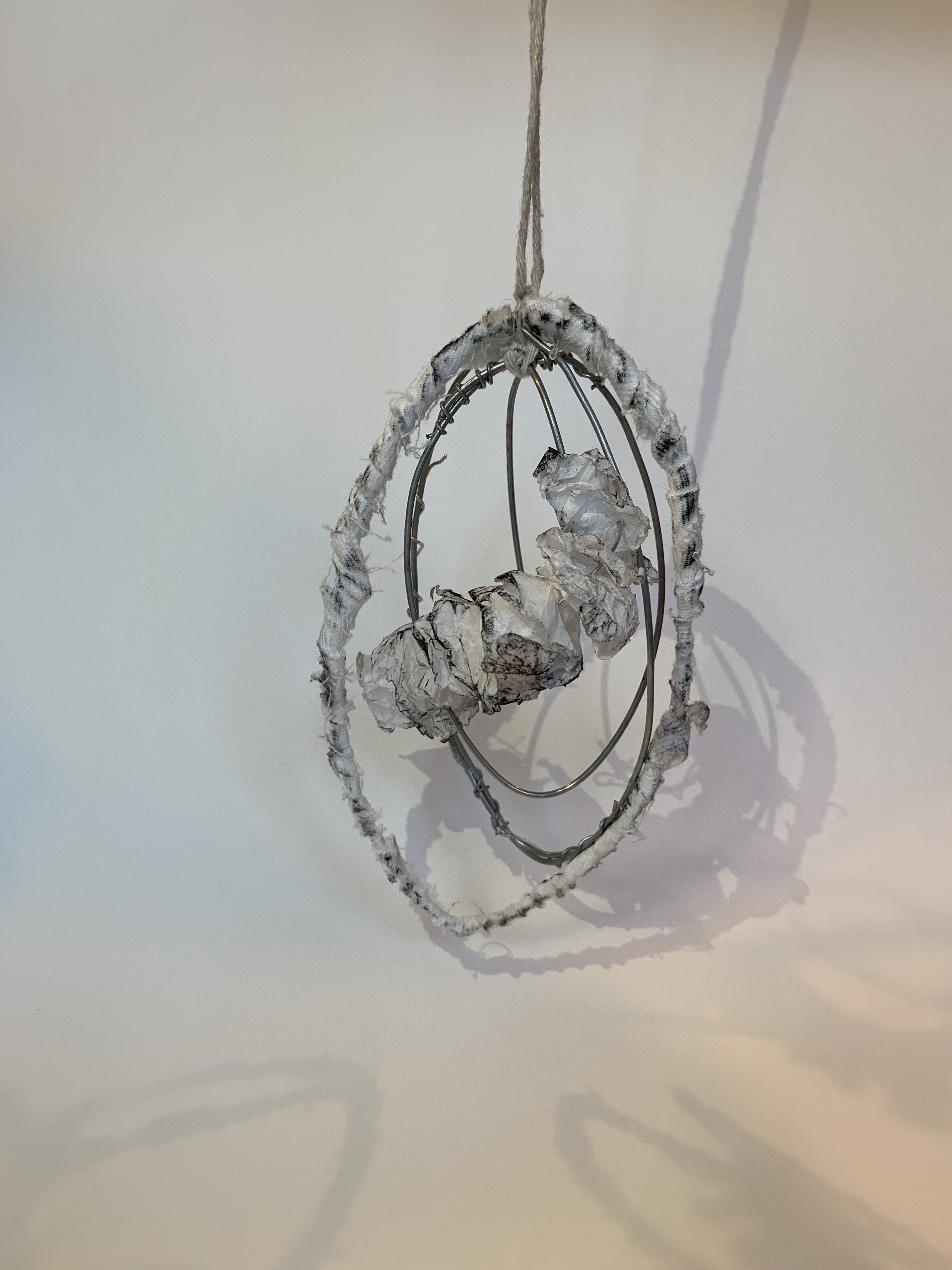
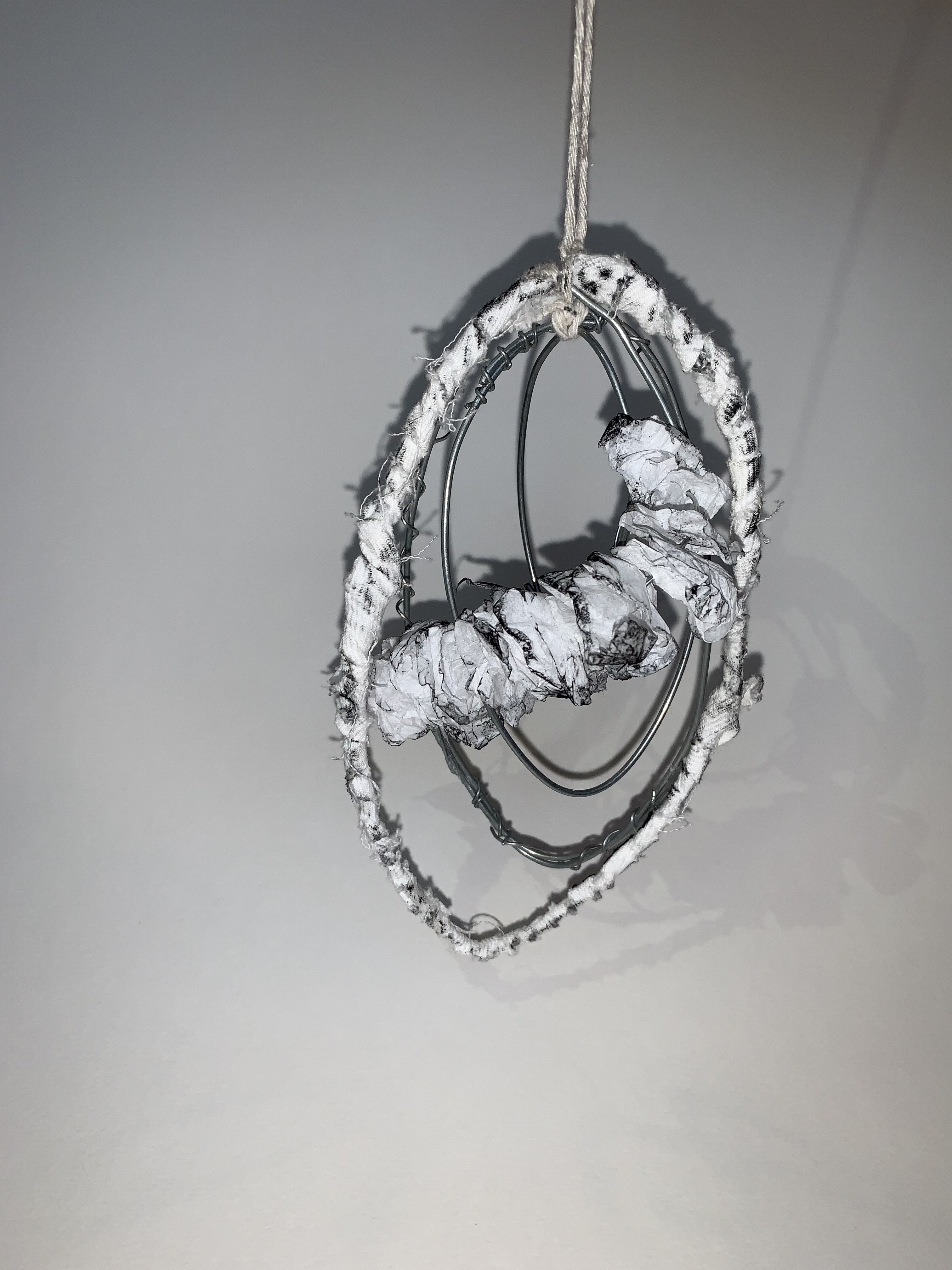
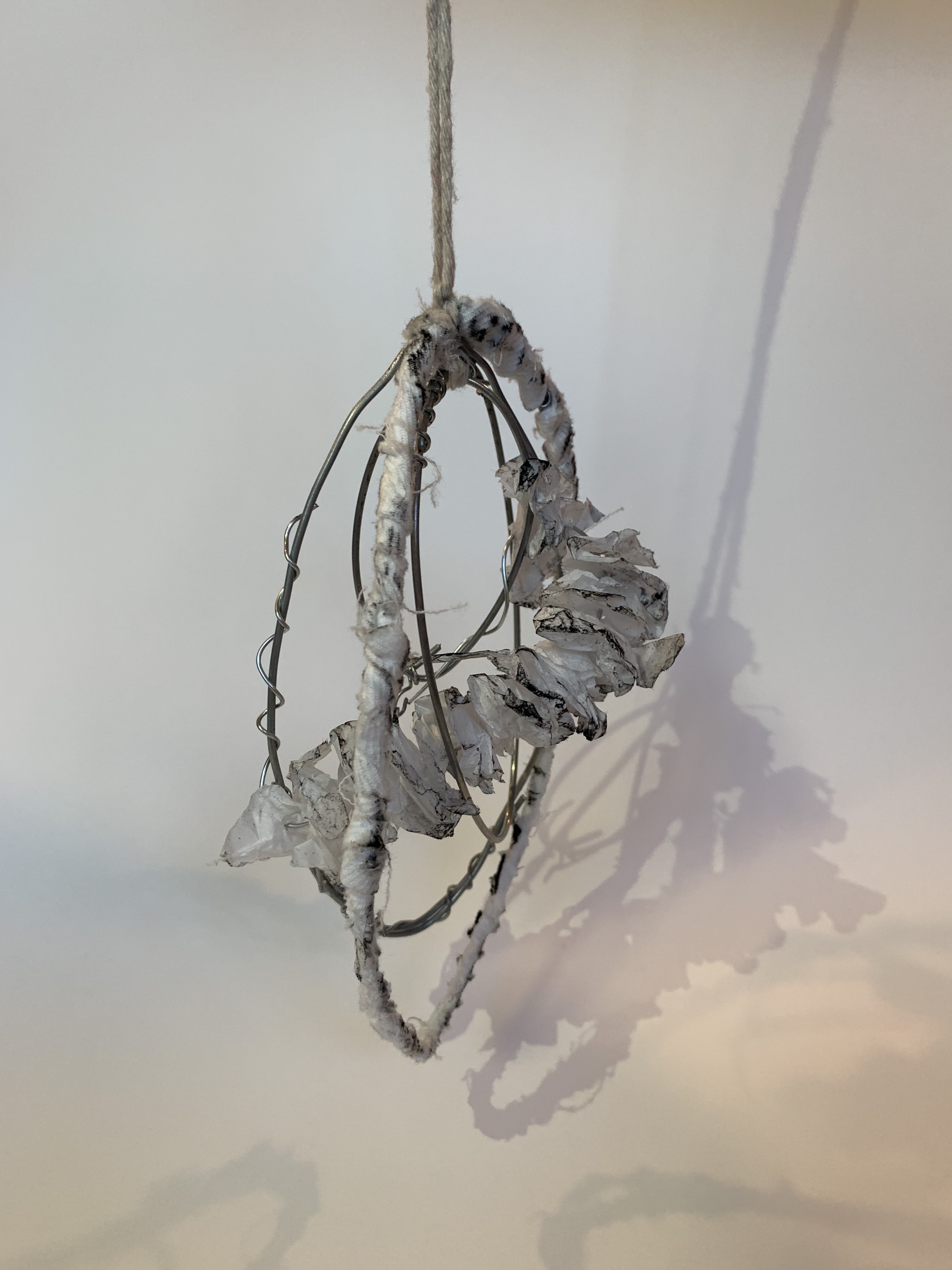
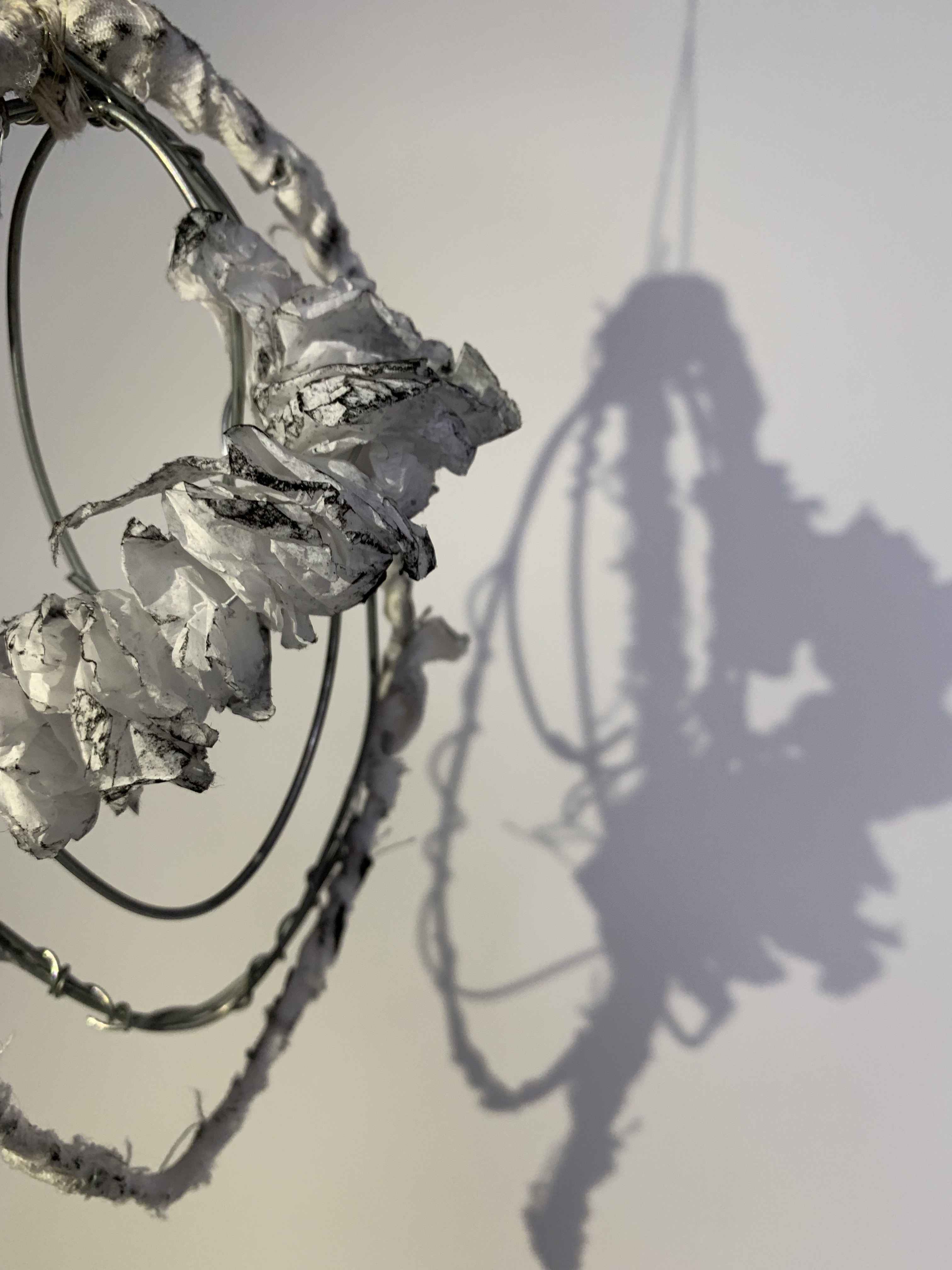
I created four ovals shapes made of bent wire all interlocked and layered together to create the sense of a 3D mind, representative to the natural shape created in my A2 drawing. I took on the feedback by creating a more minimalist model where each of the four materials used conveys and reflects the relationship between the mind and body during the sleep/wake states through line and movement. The materials I used were wire, clear string (not shown in these photos), tissue and rags. On the outside oval I decided to wrap it in rag strips to emphasise the idea of the mind and how its dominance for each persons sleep/wake states can affect their personal dream like experiences where the mind becomes unconscious, in relation to transitioning into the sleep state. I wanted to use a delicate, fragile material such as tissue paper to represent the body being coiled and almost compressed inside the mind. The tissue responds to my A2 drawing and concept as when progressing to the sleep state our body shuts down and fully lets go, whereas our unconscious mind continues to remain control, even over our body by constantly thinking and projecting images and words into our brain for example when we have dreams or nightmares in the sleep state. The charcoal I added to play on the contrasts of light and dark and to emphasise the crinkles and creases in the tissue that is made up of natural line movements.
Atmospheric Photograph
11. 03. 19
Today I started taking photos of my final atmospheric model. At first I played with the lighting to see how the shadows would cast onto the white backgrounds. I then tried to experiment with focusing closer onto different parts of the model. My first photos (shown above) I really liked the shadow contrasts my model was creating onto the white wall, however these photos were taken front on not fully showing the 3D nature of the model, so I wanted to take some more images to compare each viewpoint.
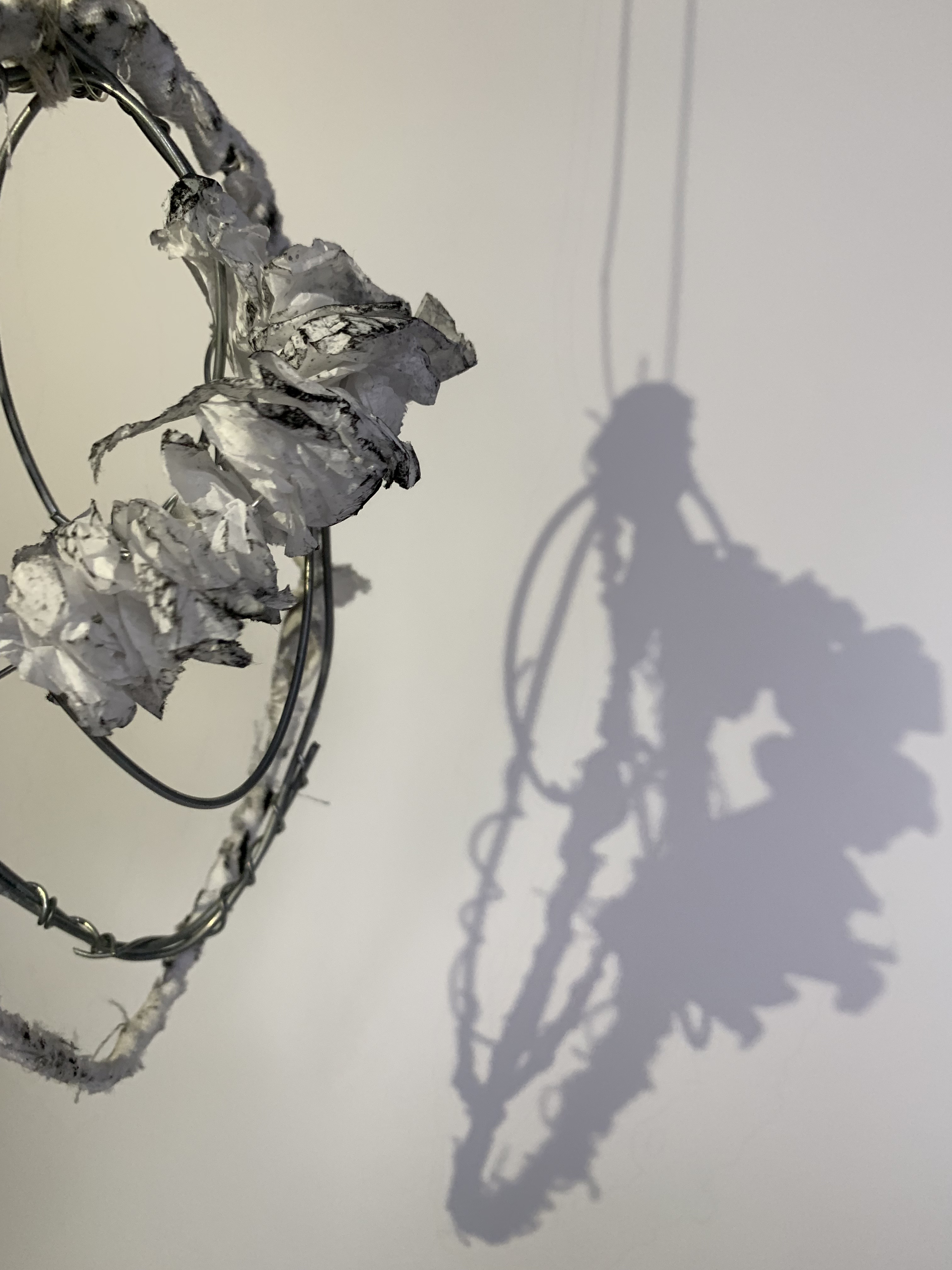
These photographs highlighted the 3D nature of the model through the use of the shadows to almost create this twin model side by side. Initially I was going to consider one of these photographs to be my final atmospheric photograph however I felt to fully connect my A2 drawing, model and ideas together I wanted to explore taking photographs much closer to the model, creating an interior space and surreal atmosphere like you are inside the model looking out as well as highlight all the different movements of line within the model and its varying quality.
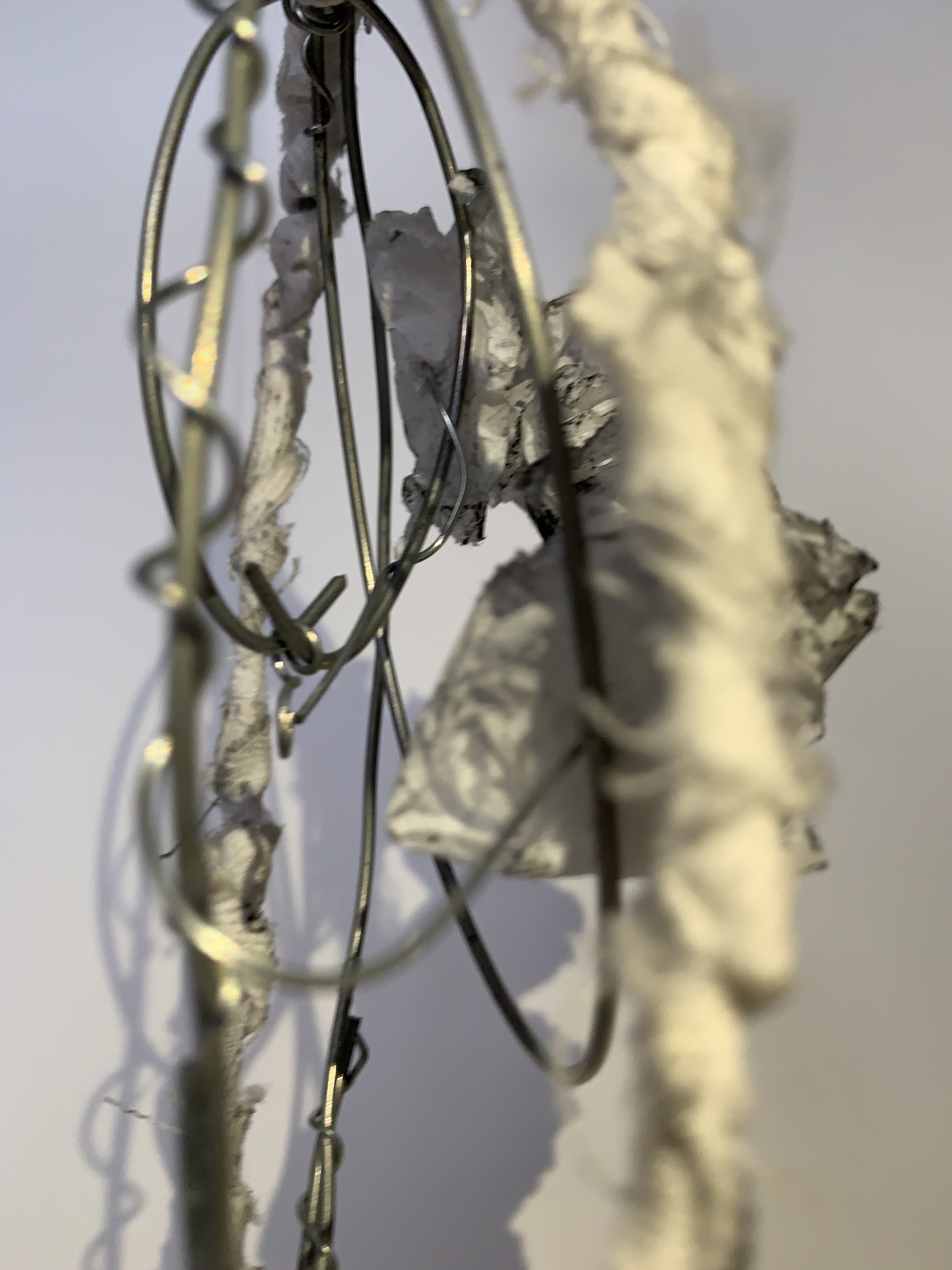
This is my final photograph that best reflects my ideas surrounding the relationship between the mind and body when progressing through the sleep/wake states as well as how line and its movement can impact this.
Presentation
13. 03. 19
Today we had to present our work of our creative thinking (made up of our A2 drawing, Concept Model, Atmospheric Image and Abstract) to the class of our tutorial groups in a critique setting. We first discussed our works to the group then had an overall discussion where others made readings into each others presentations.
I decided to use this overall layout for my presentation as I wanted my drawing and image to be off centred next to each other, with my abstract at eye level as well as having my model hanging down with clear string to give the illusion that its almost floating.
Above is my abstract that went along with my presentation. When writing I wanted to begin reflecting on my own personal experiences with sleeping and waking and what affects me when transitioning in and out of each state. In my abstract I also explained my ideas behind each piece of my presentation (drawing, model and image) and how my experiences are reflected in my ideas and therefore my works surrounding sleep and wake and its thresholds.
Project Two: SLEEP/WAKE
Design Workshop 1
18. 03. 19
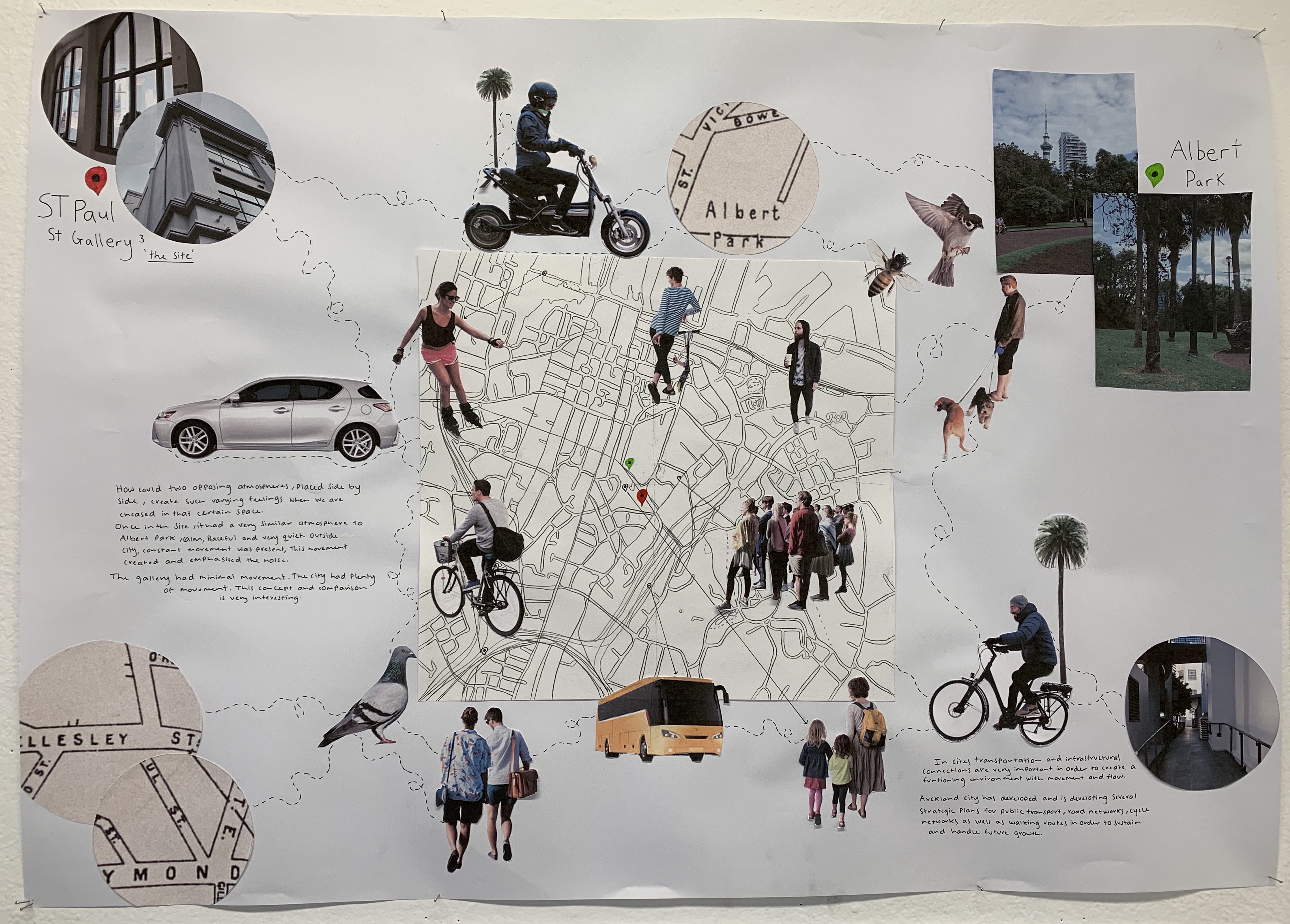
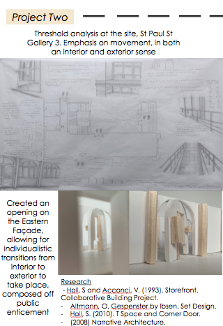
Today in class we were introduced to Part Two of our Sleep/Wake design project “SITE MAPPING: THRESHOLD Design”. In this second part of the project we will be studying a particular site as well as its constant surroundings and environment. The site chosen for us to explore further is ST PAUL Street Gallery Three on 63 Wellesley St East along through investigating and comparing to Albert Park and its settings. We have been asked to immerse ourselves into the site by analysing the ‘thresholds’ through detailed exploration between closure, opening and the condition of crossing a threshold. Our internal experiences of Project One will be “put into connection with the complex and interconnected world outside”. Ultimately this second part of the project will lead into designing a threshold which connects the interior condition of the site to the exterior condition, through our personal sleep/wake experiences and site research.
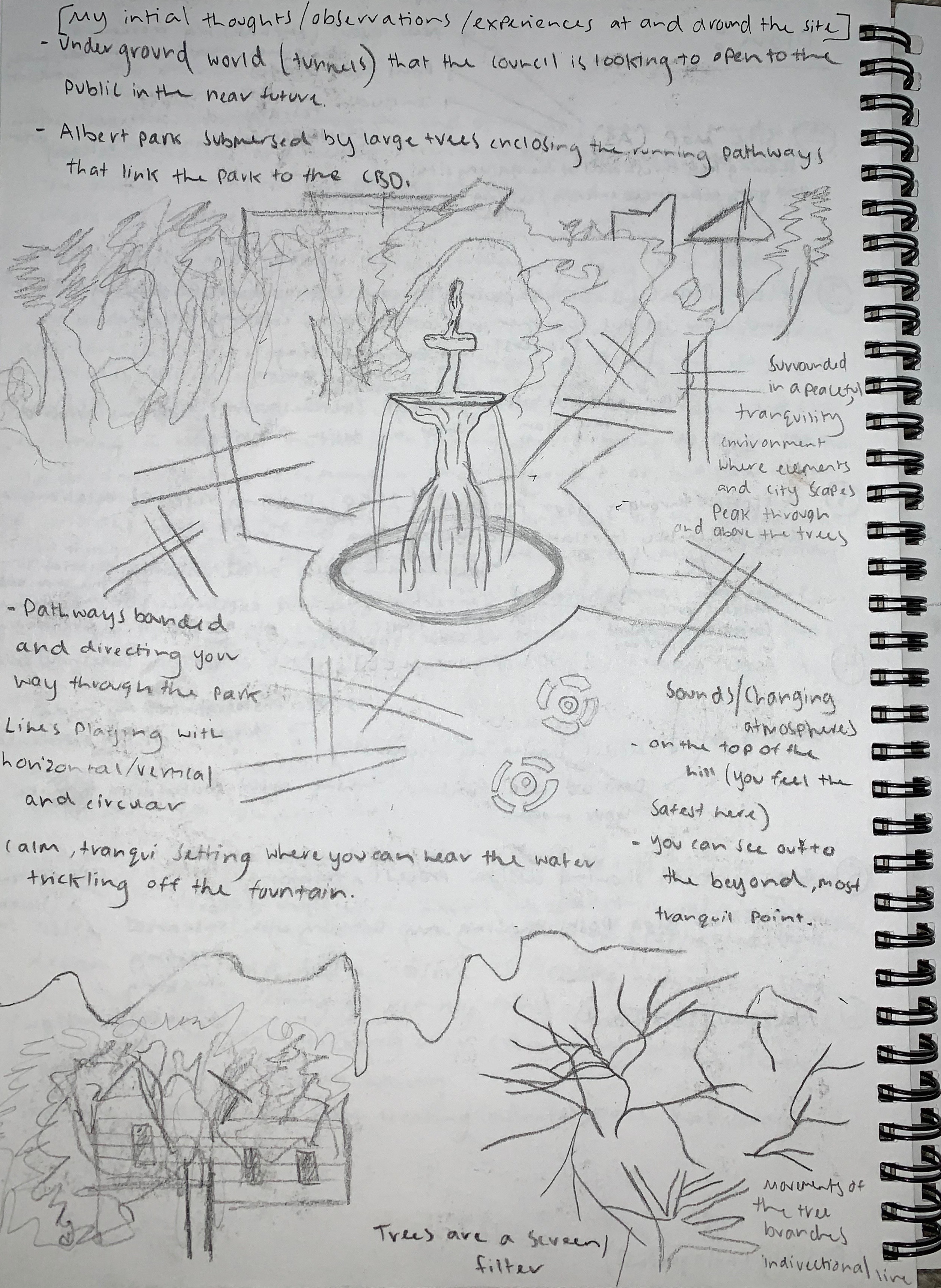
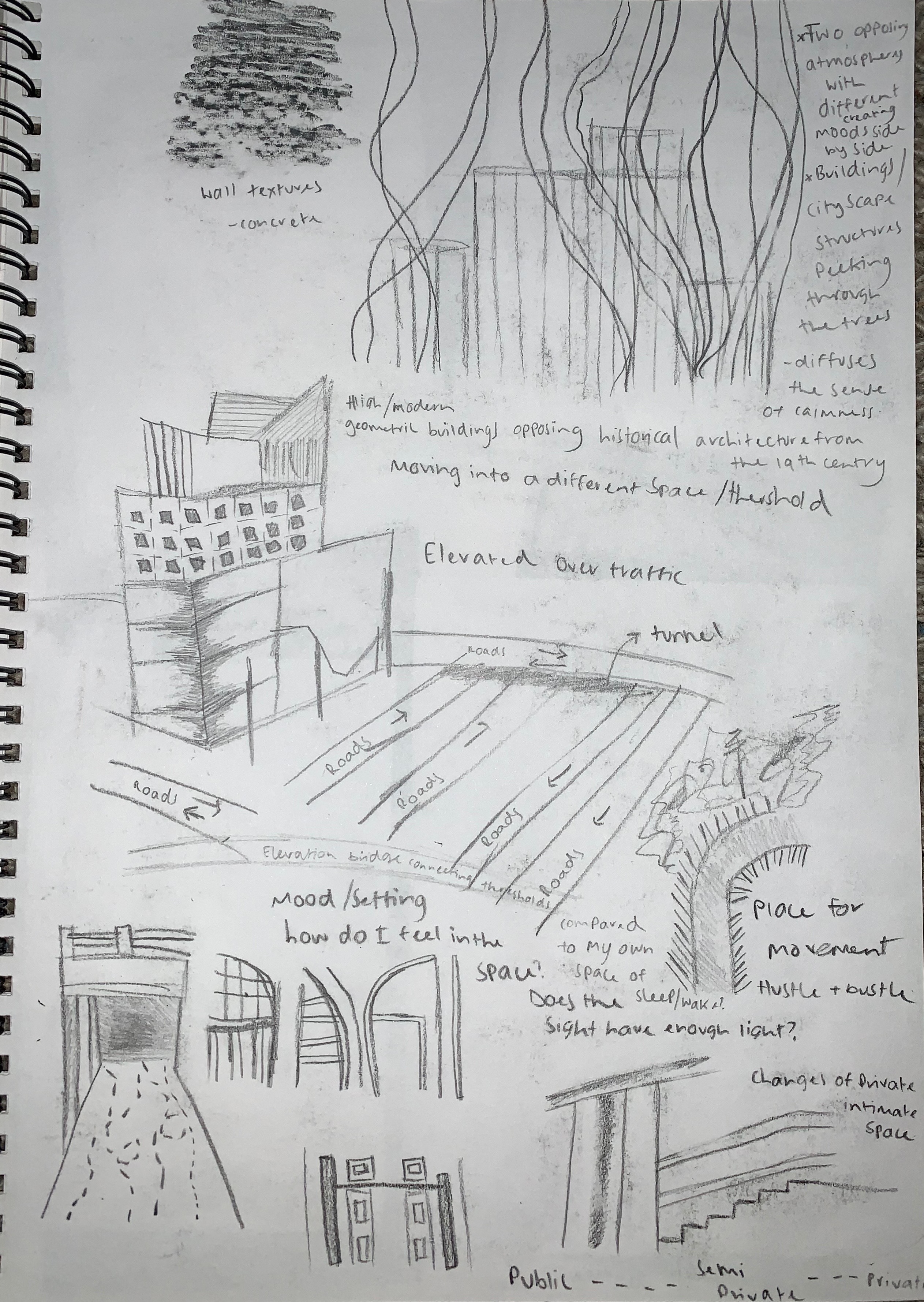
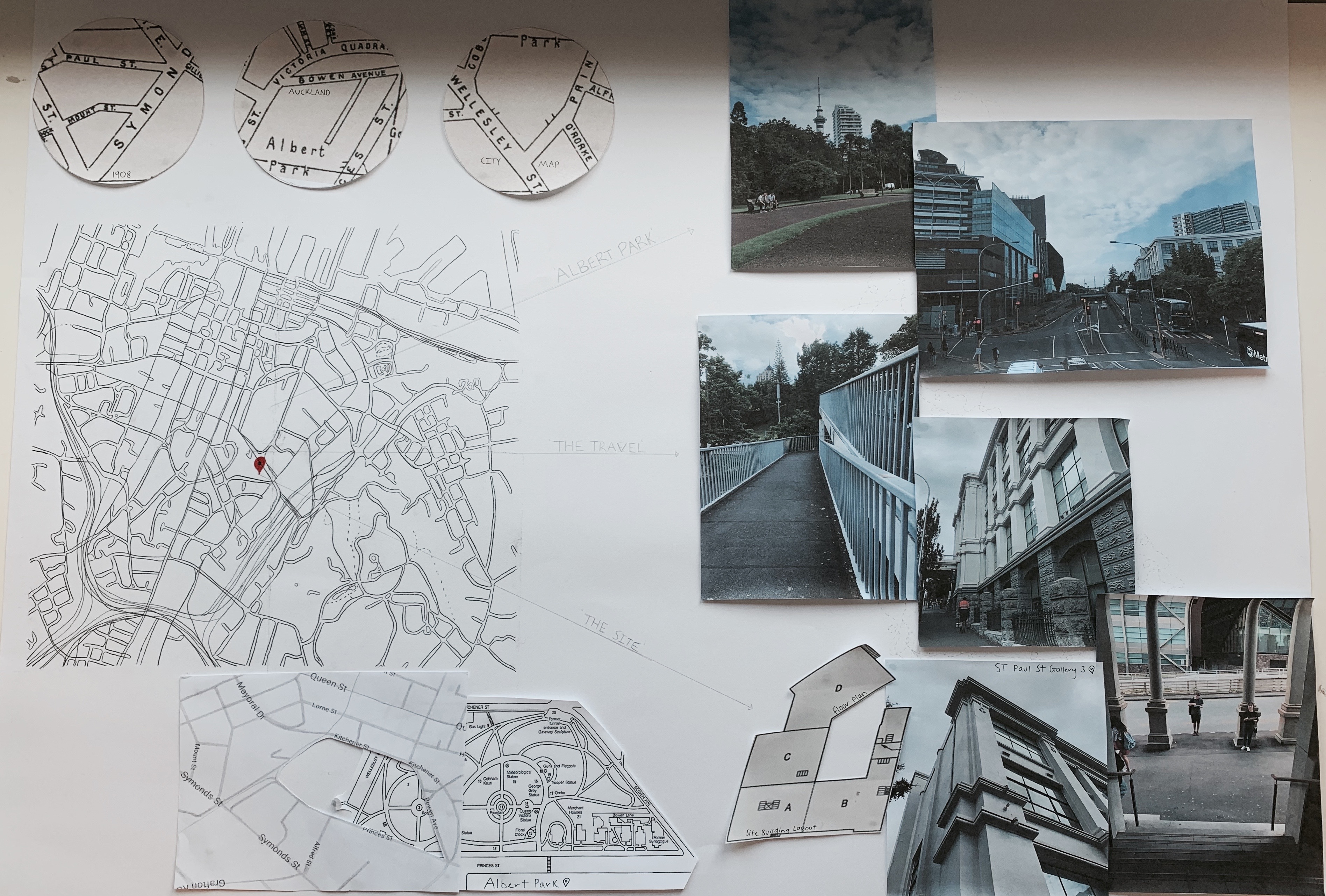
We began the studio session introduced to contexts talks surrounding our site analysis and what features and thoughts we needed to write down and explore further while visiting the site itself. Over the next part of the project we will be spending time carefully considering all details and components of the site building and its settings. We must view and research the site through its quantitative and qualitative characteristics. The quantitative features we need to investigate are through maps and measurements, being the immediate site and its wider contexts. The qualitative features we need to investigate and note are through the social, cultural, sensorial and emotional contexts of the site. Once briefed we then went on a walk from the university through to Albert Park and then back up to the site. While first visiting and walking around the site and its surroundings I drew some sketches and bullet notes of my initial thoughts/observations and experiences of the site. The images below are those initial words and sketches.
While initially visiting the site I decided to take lots of photographs in order to reference and keep on memory, specific aspects of the site and its setting. Below are only a series of photographs of the exteriors that I took while we visited the site for the first time.
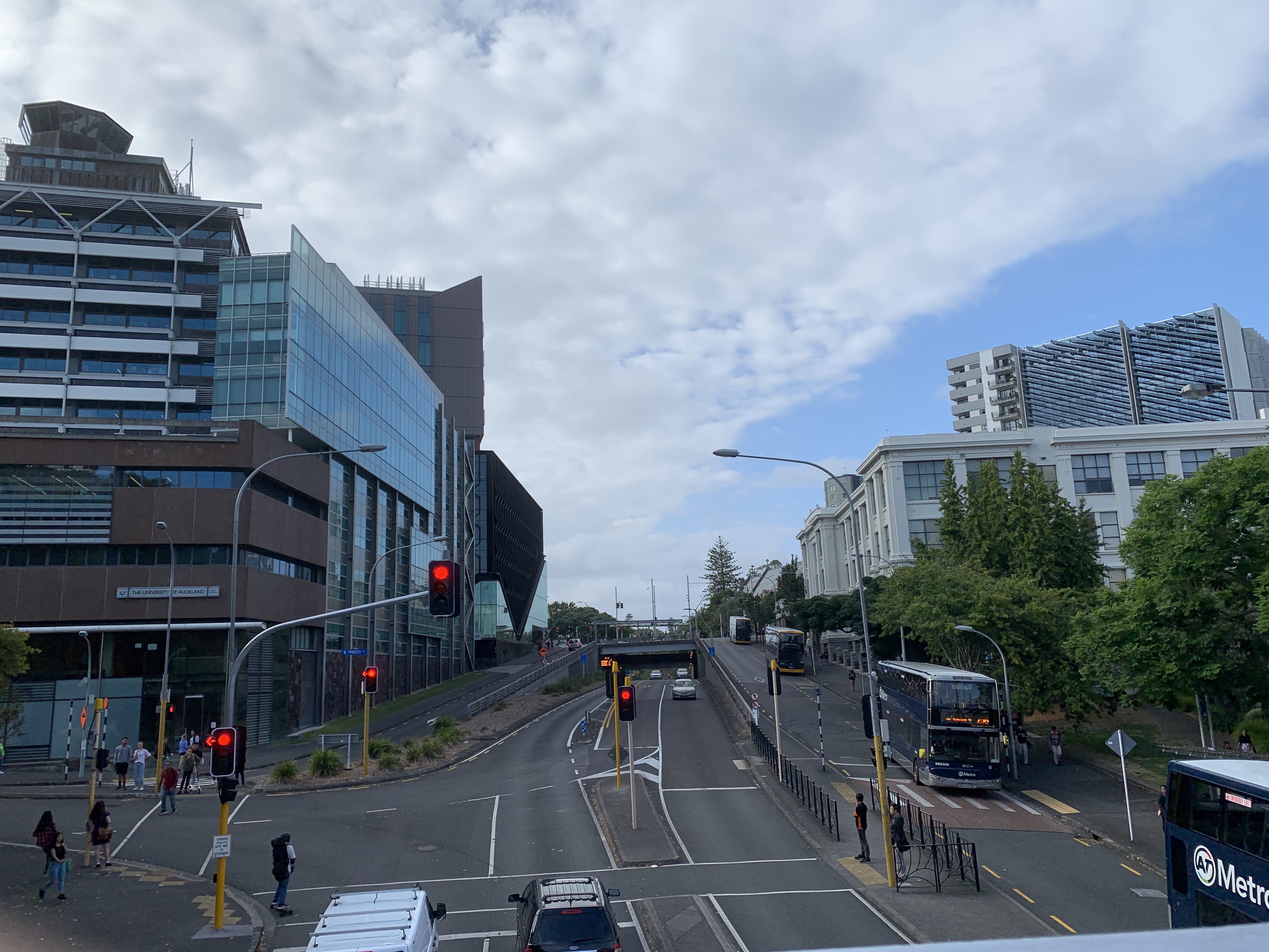
The site from the walkway bridge 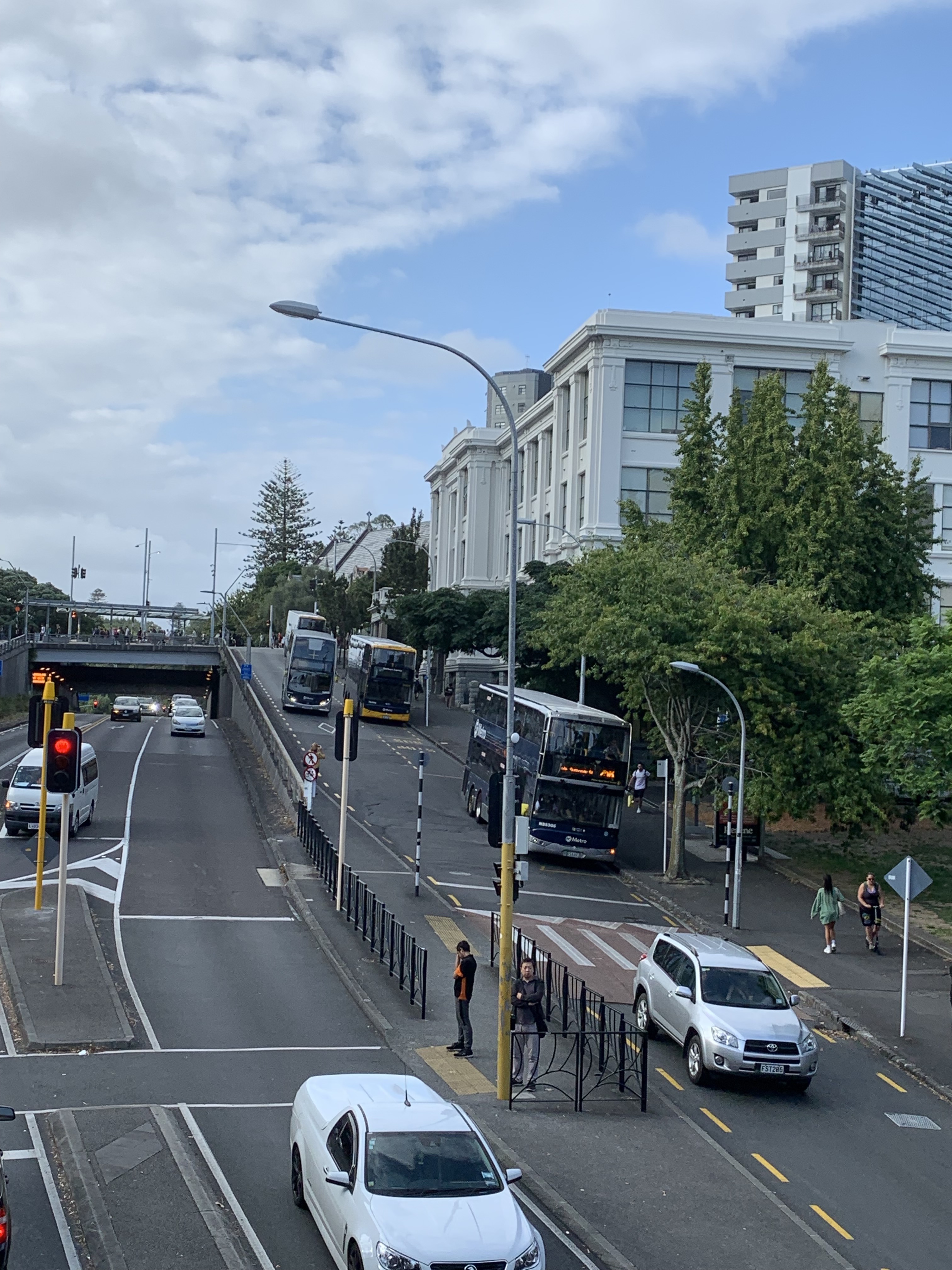
Site from walkway bridge 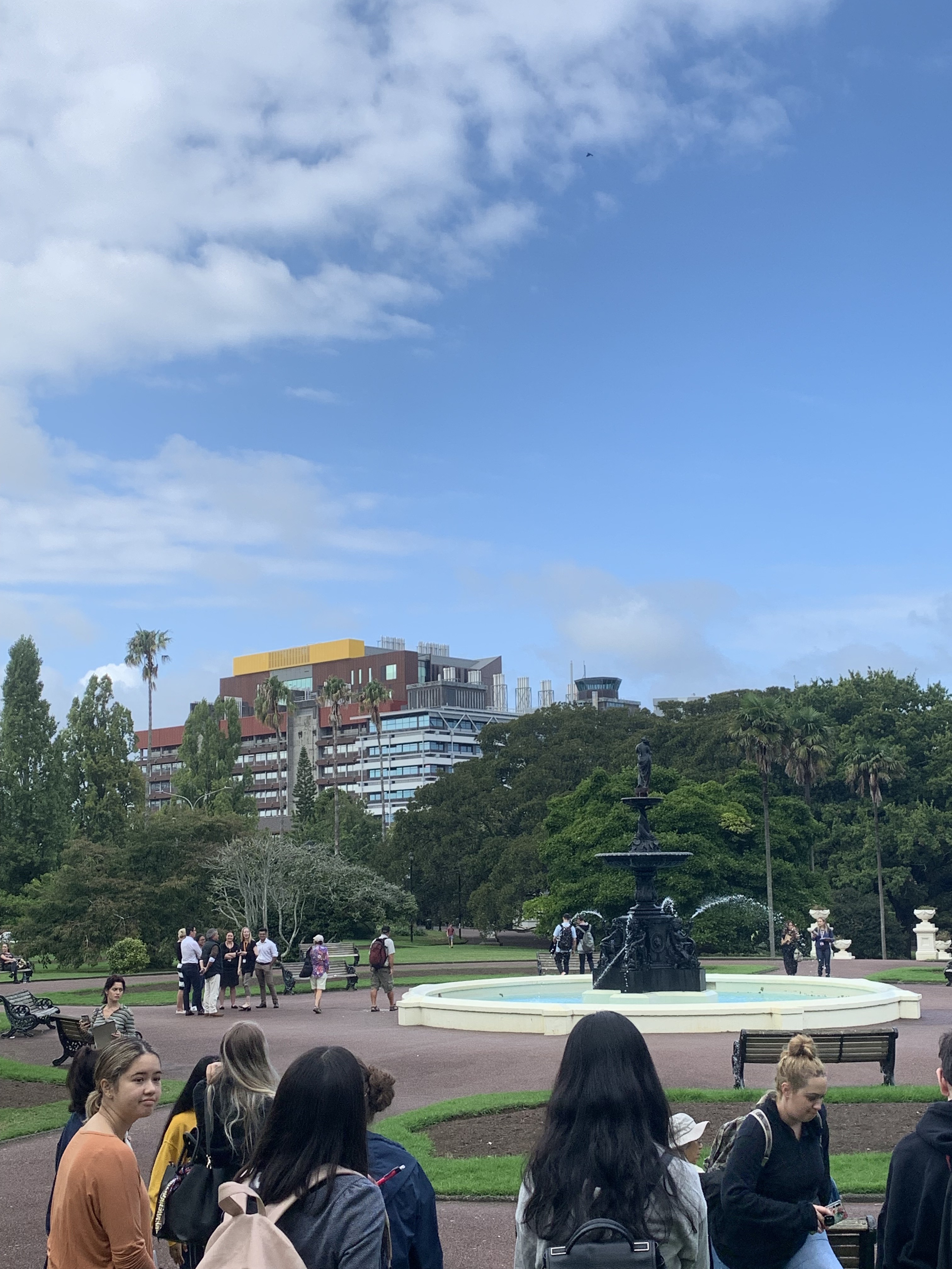
Fountain at Albert Park 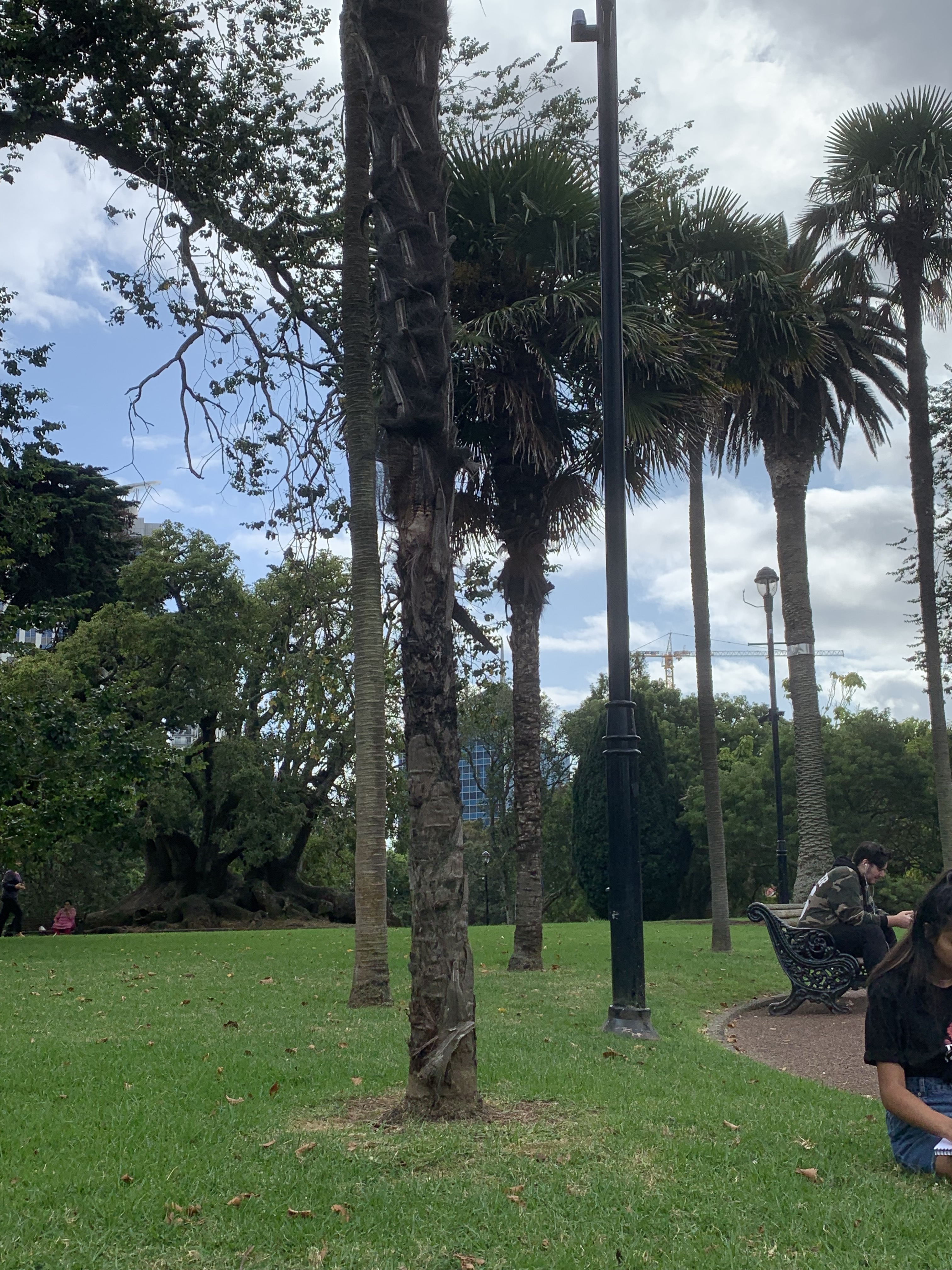
Albert Park 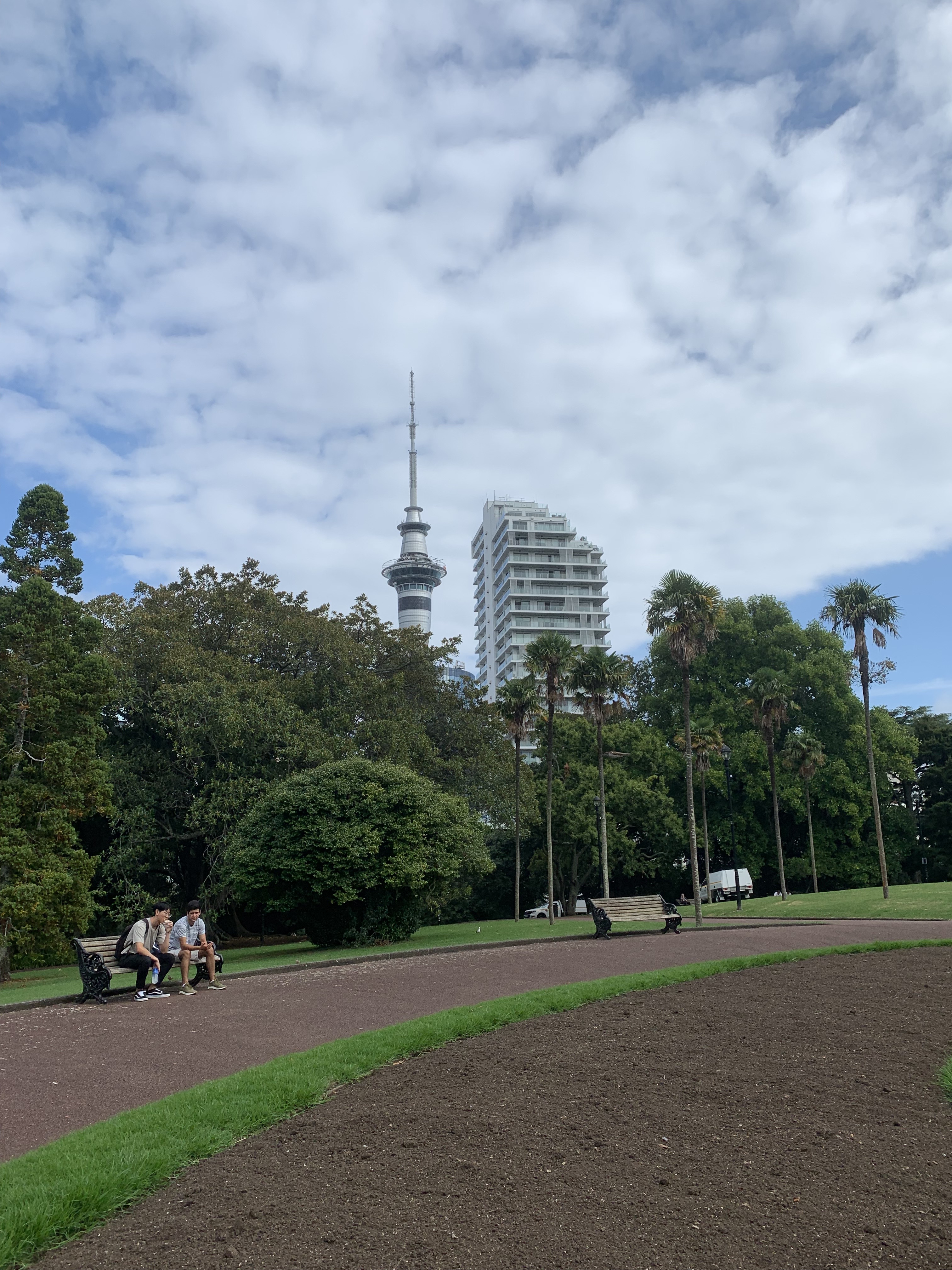
Albert Park 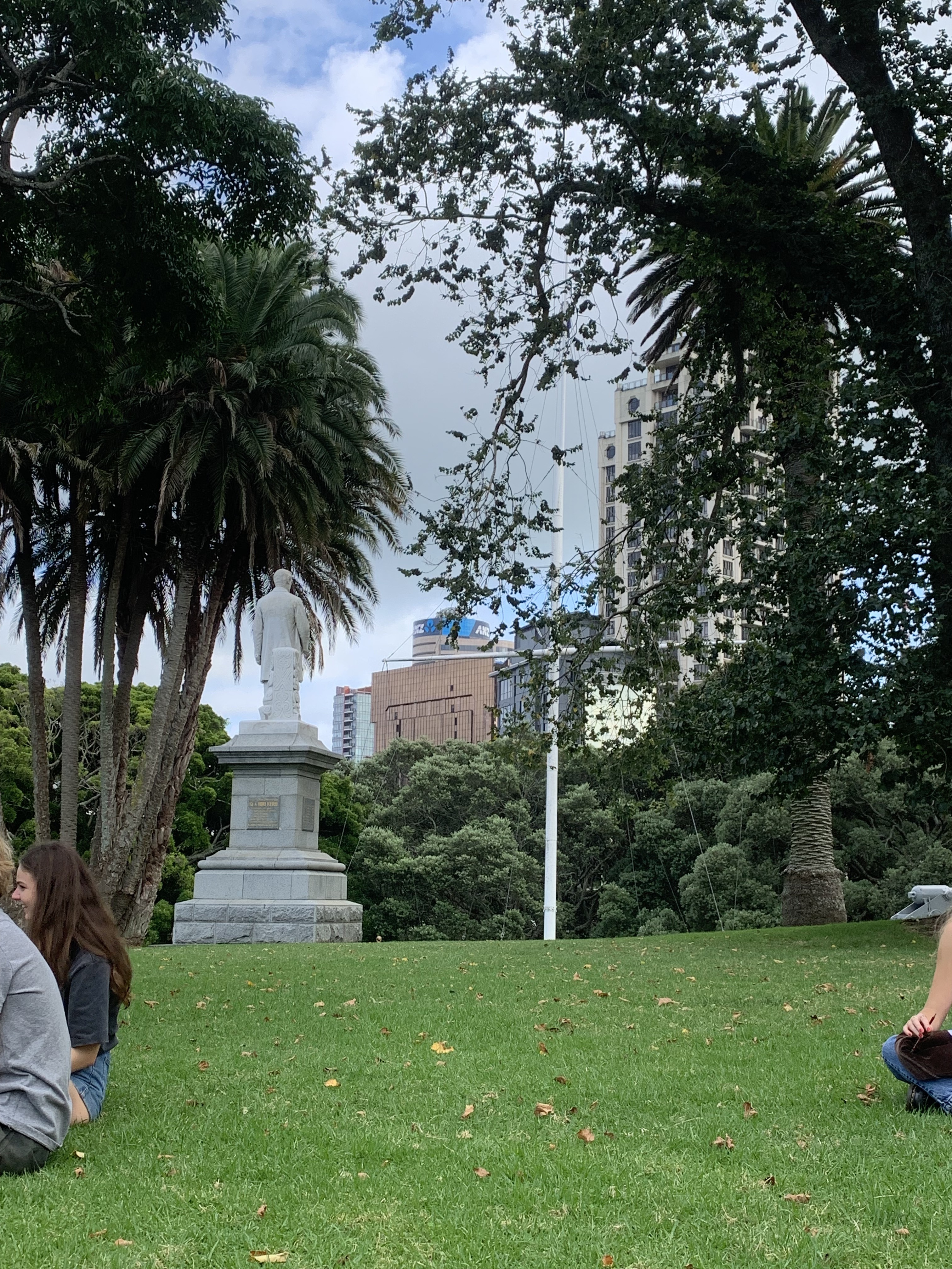
Albert Park 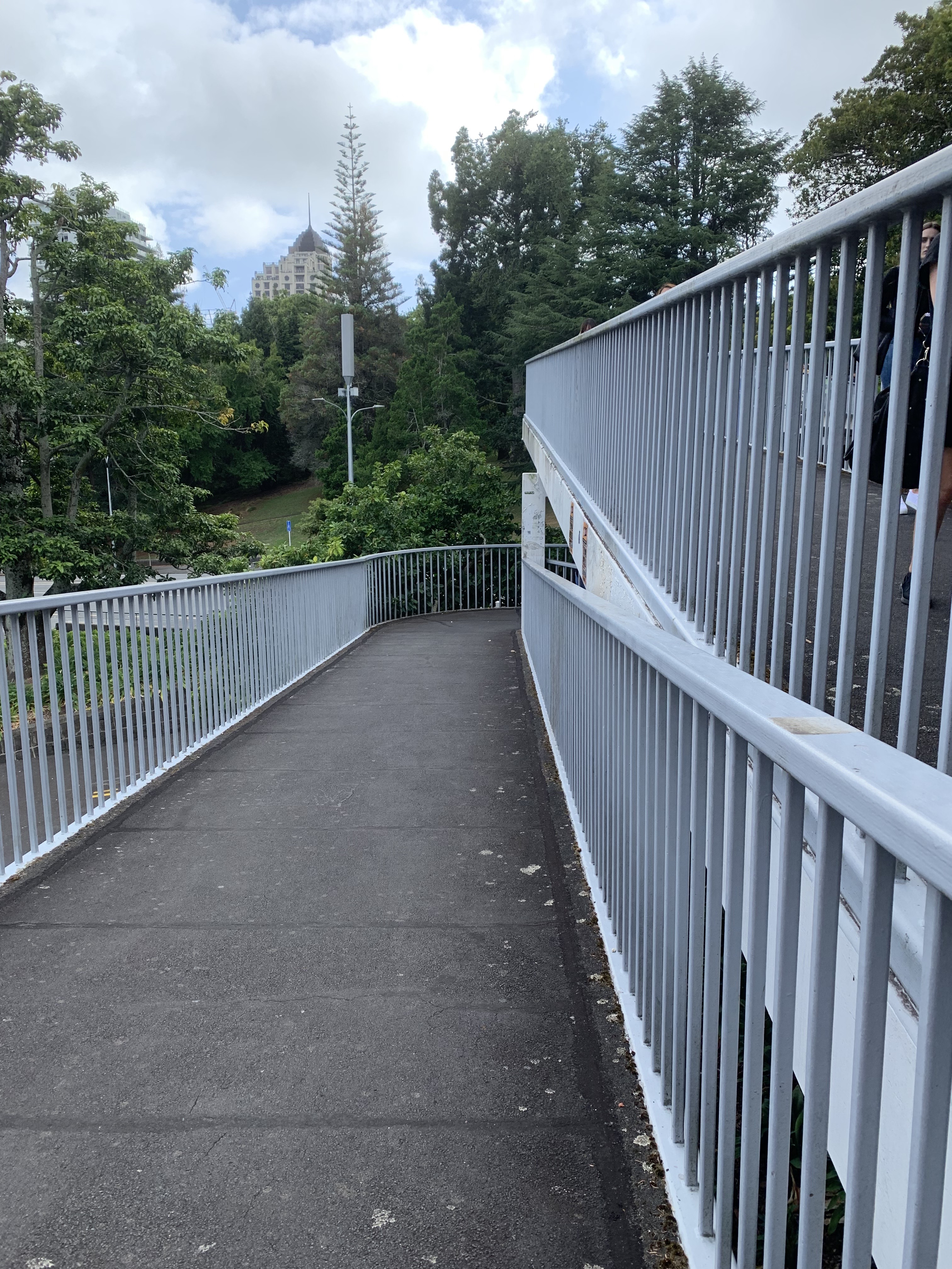
Walkway connecting Albert Park and the Site 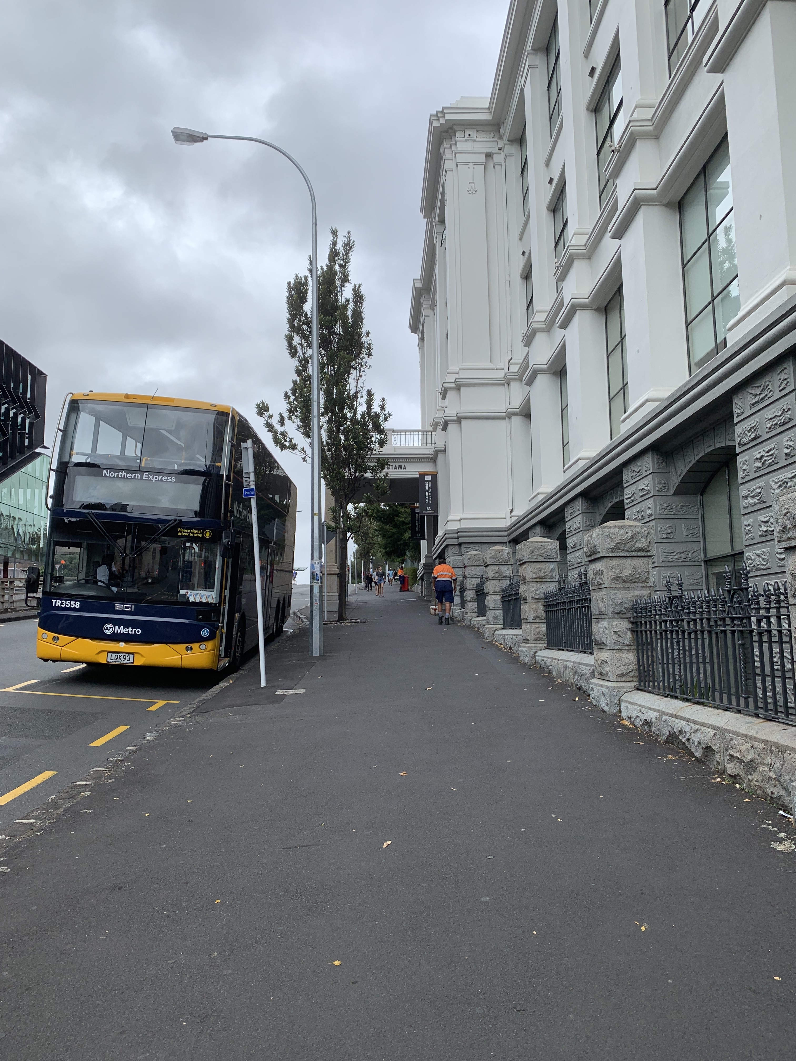
Walkway up towards the Site 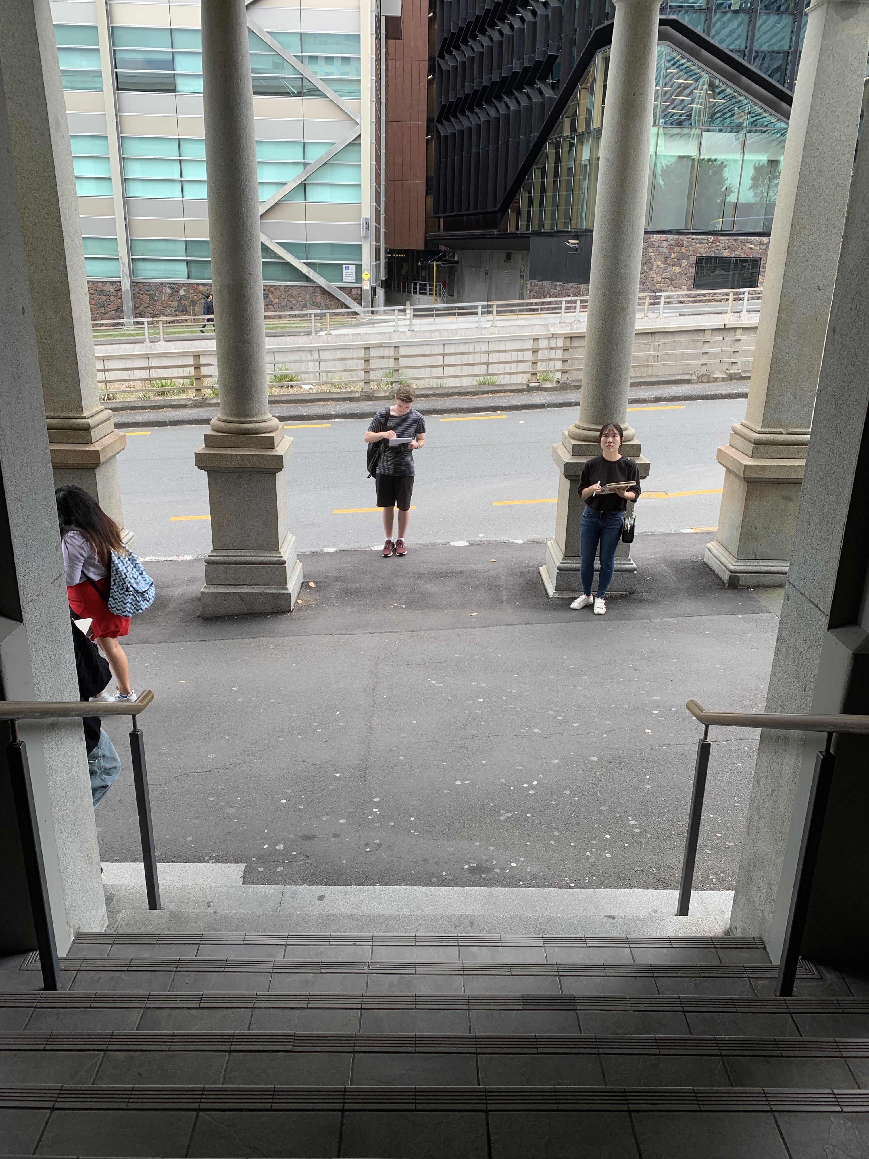
The Site looking onto the road 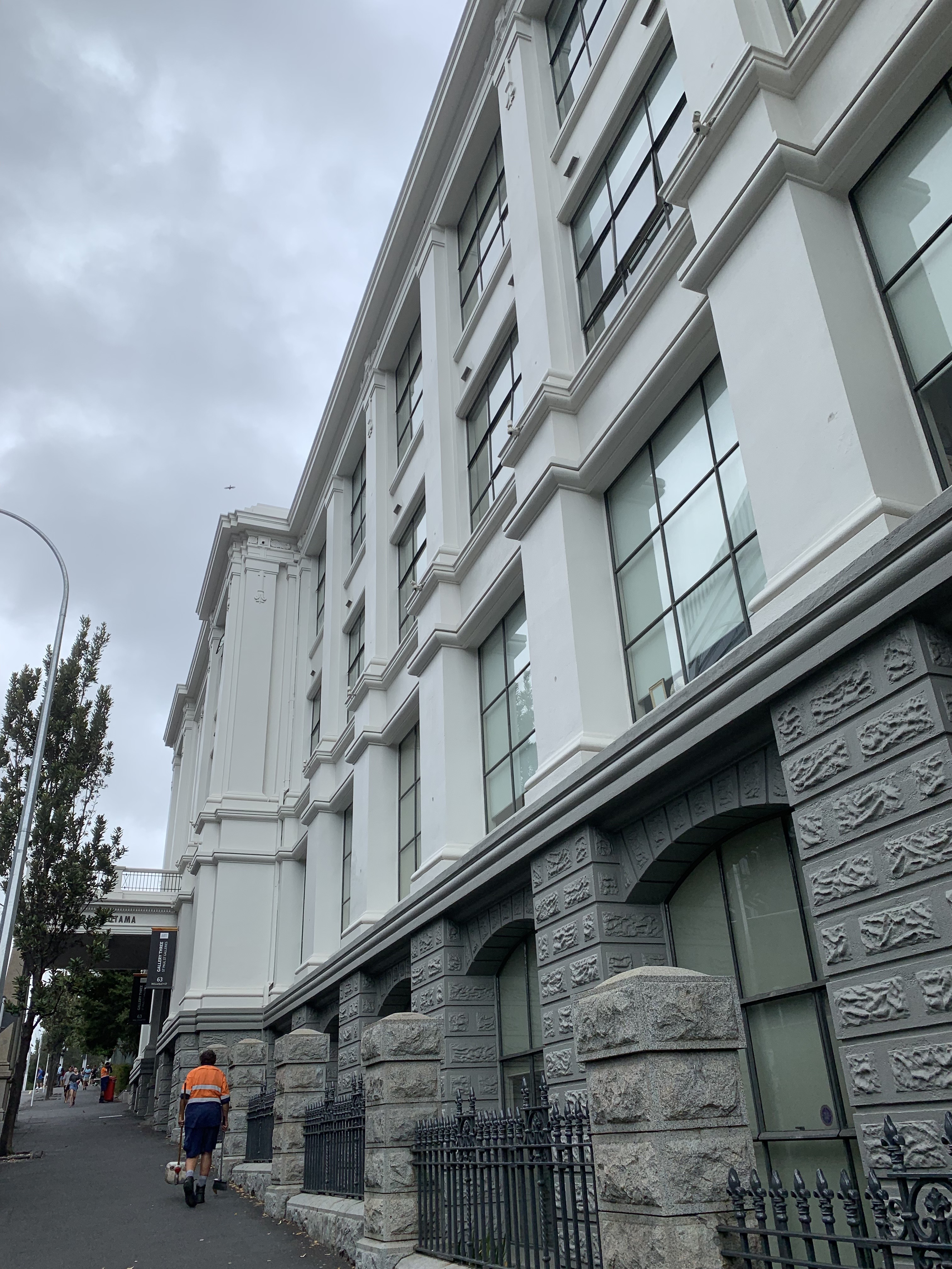
The Site 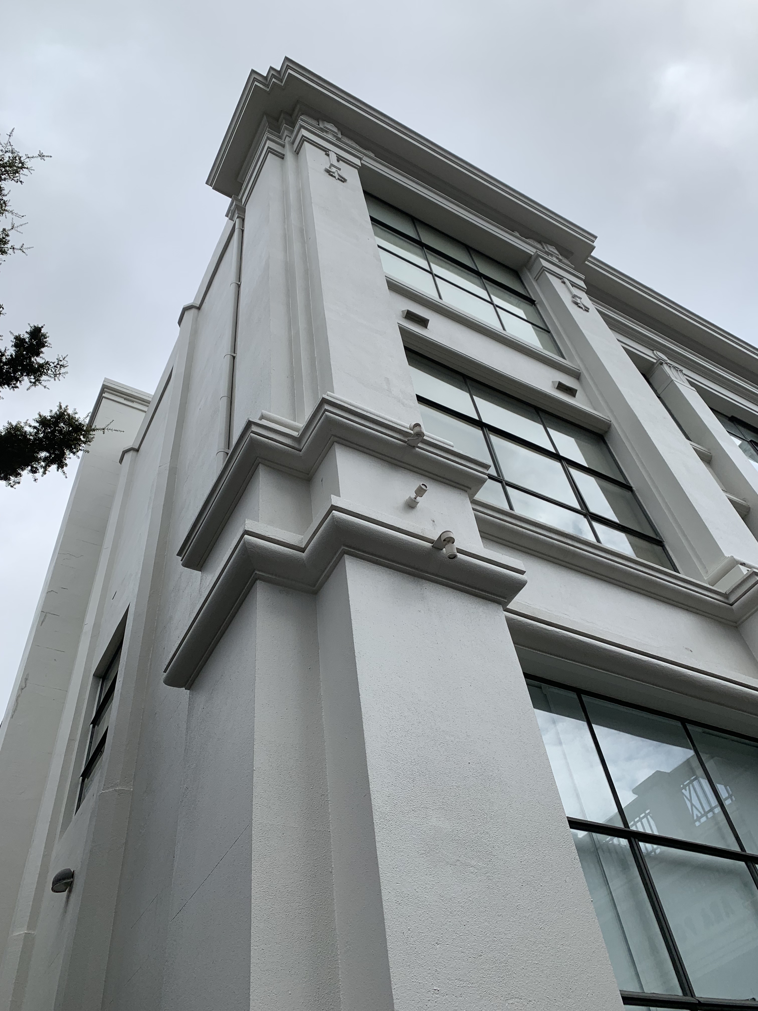
The Site 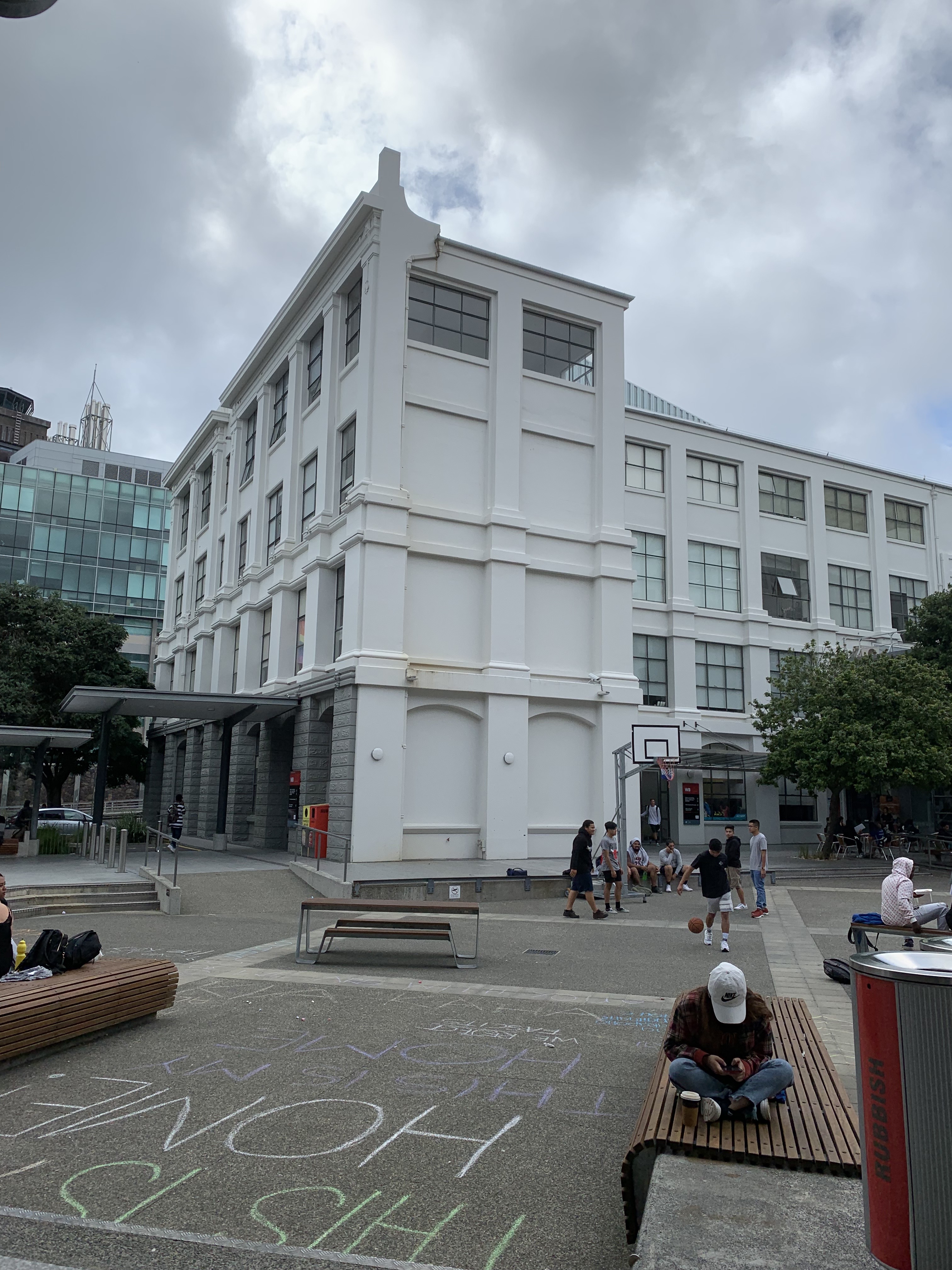
Back of the Site 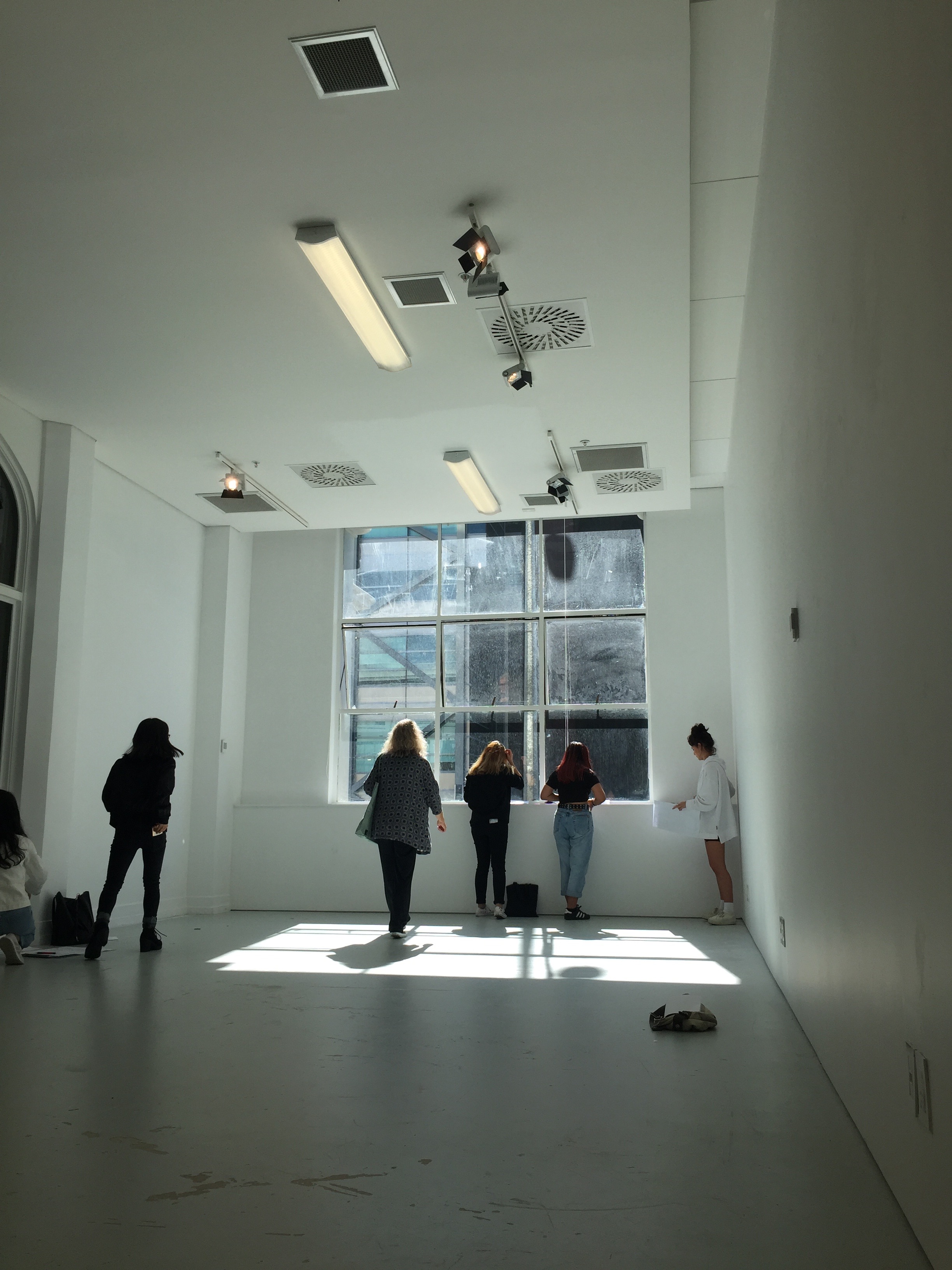
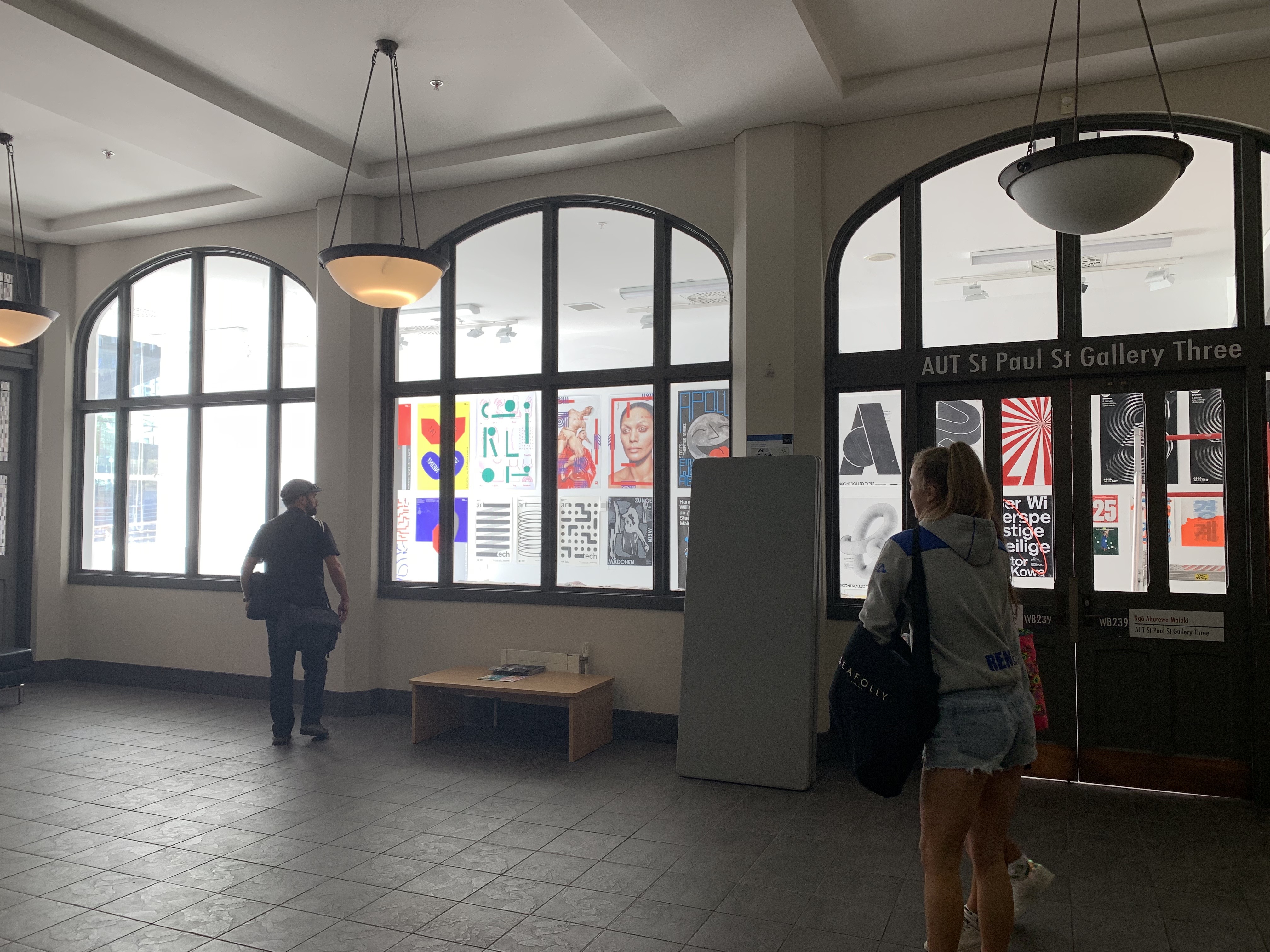
Inside the Gallery 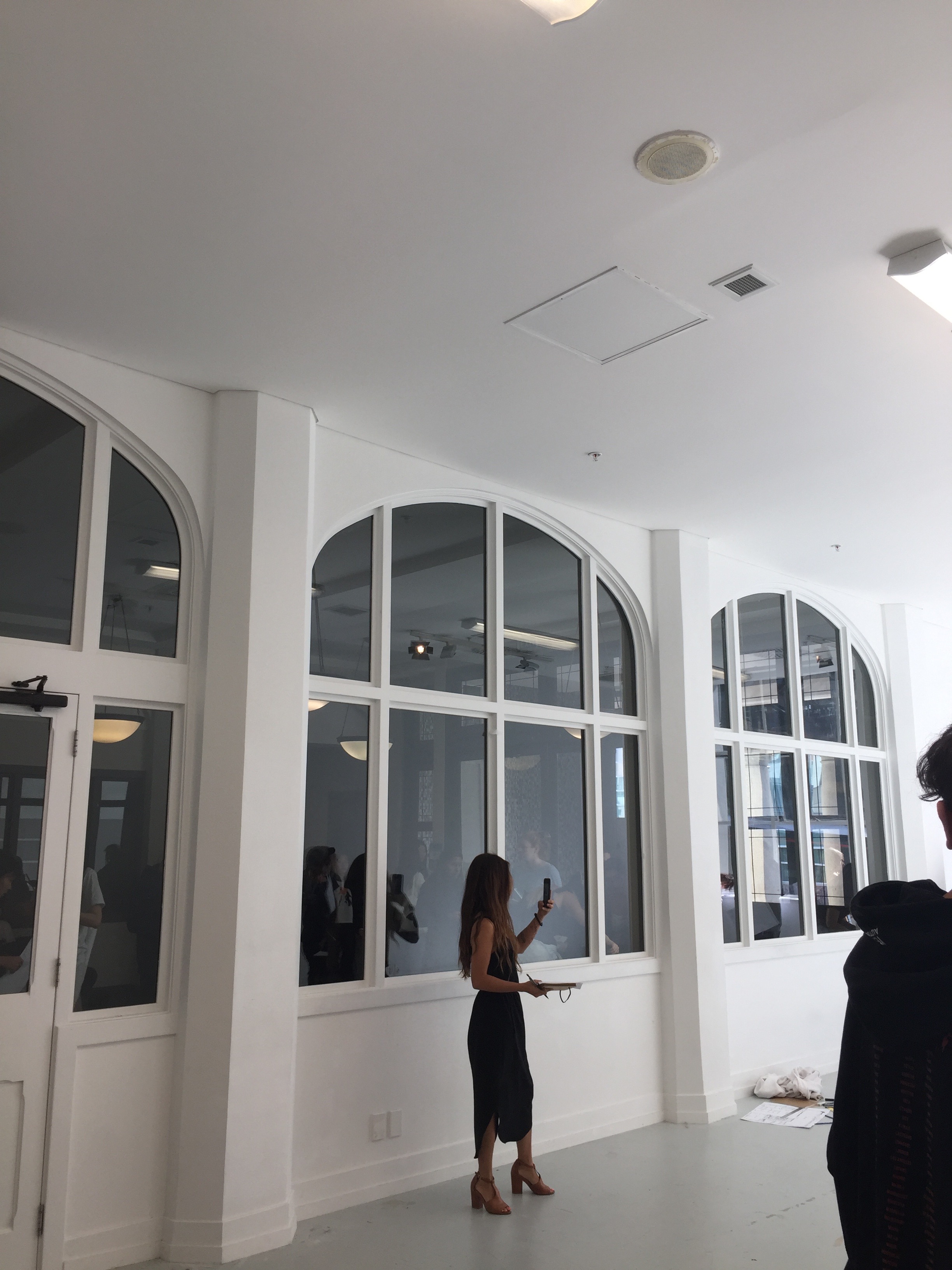
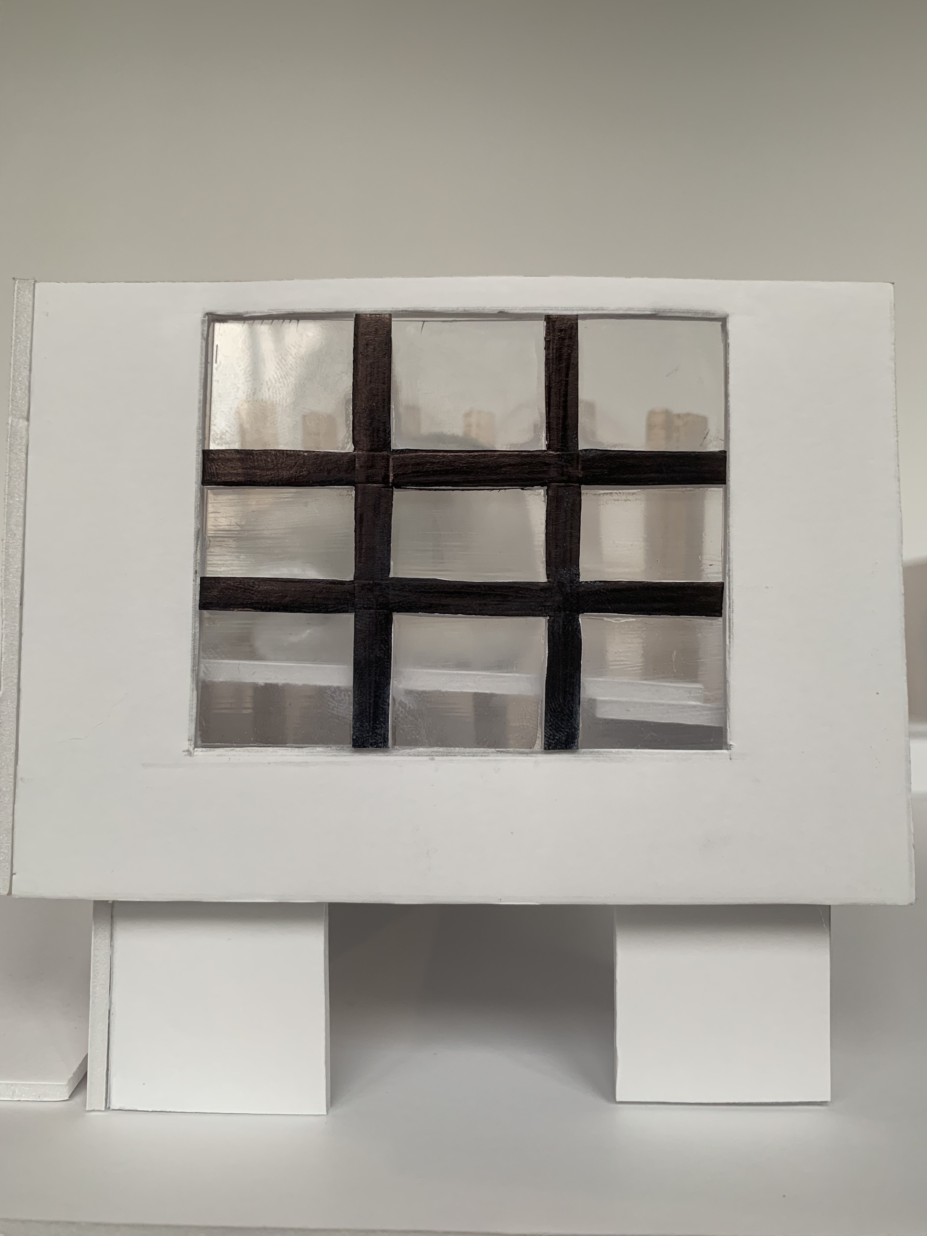
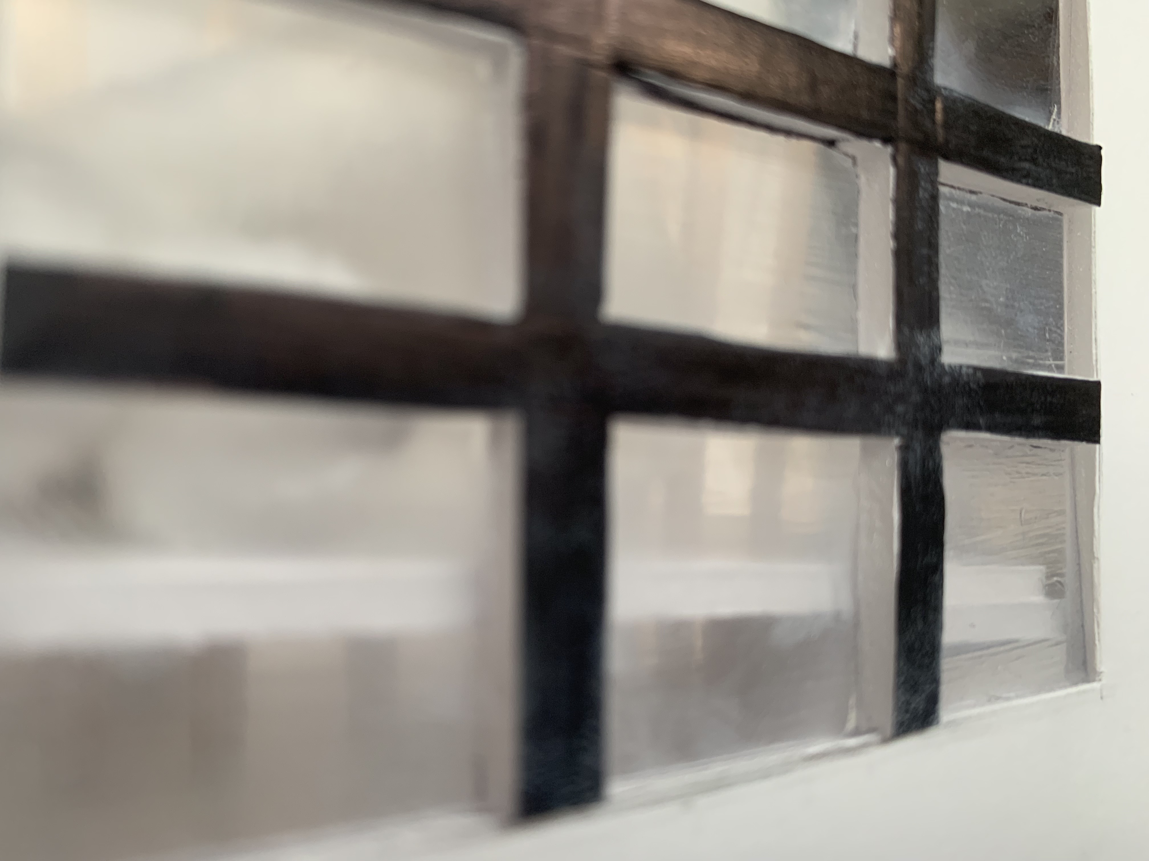
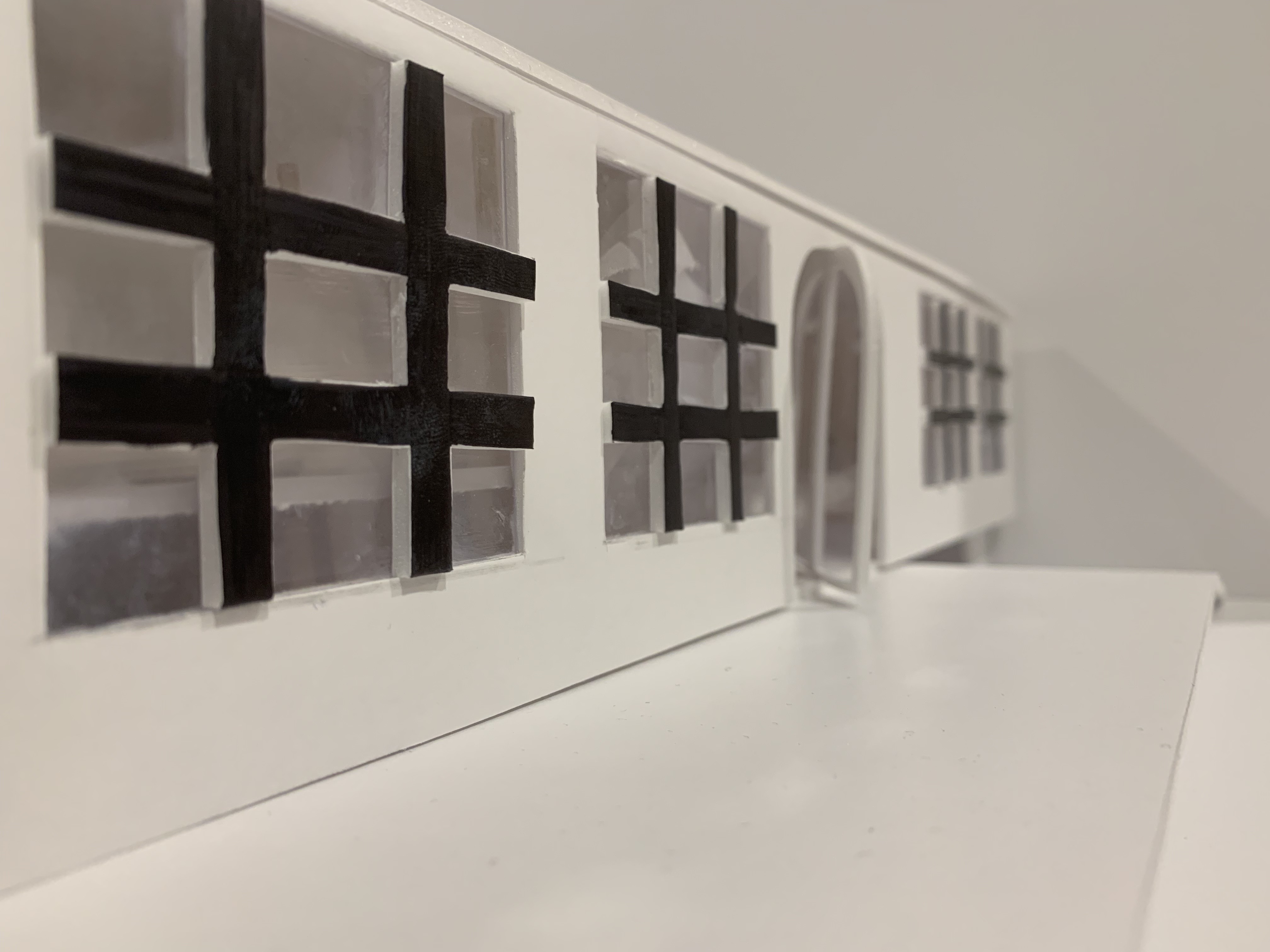
Interior Windows in Gallery 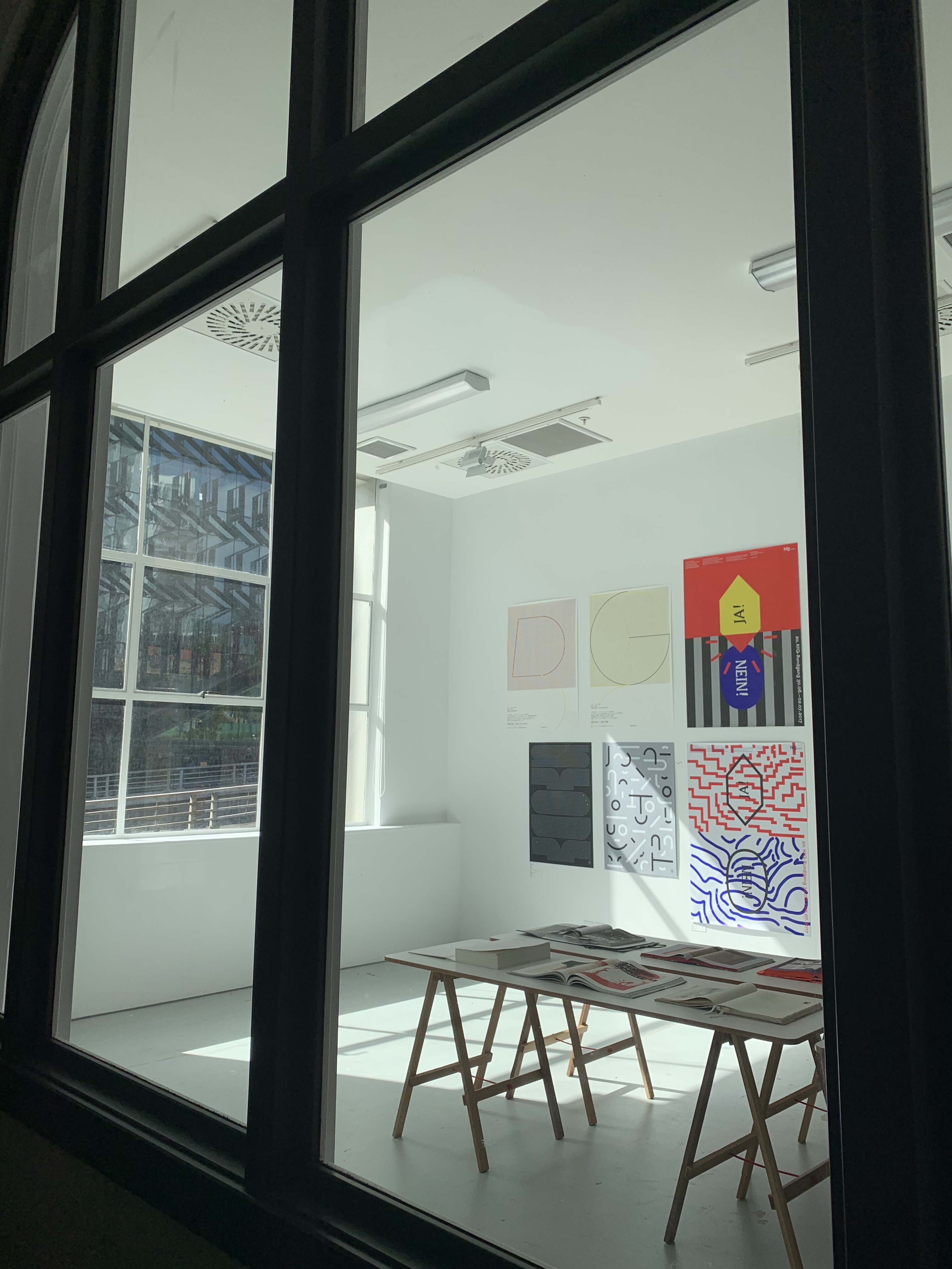
Lobby looking into Gallery 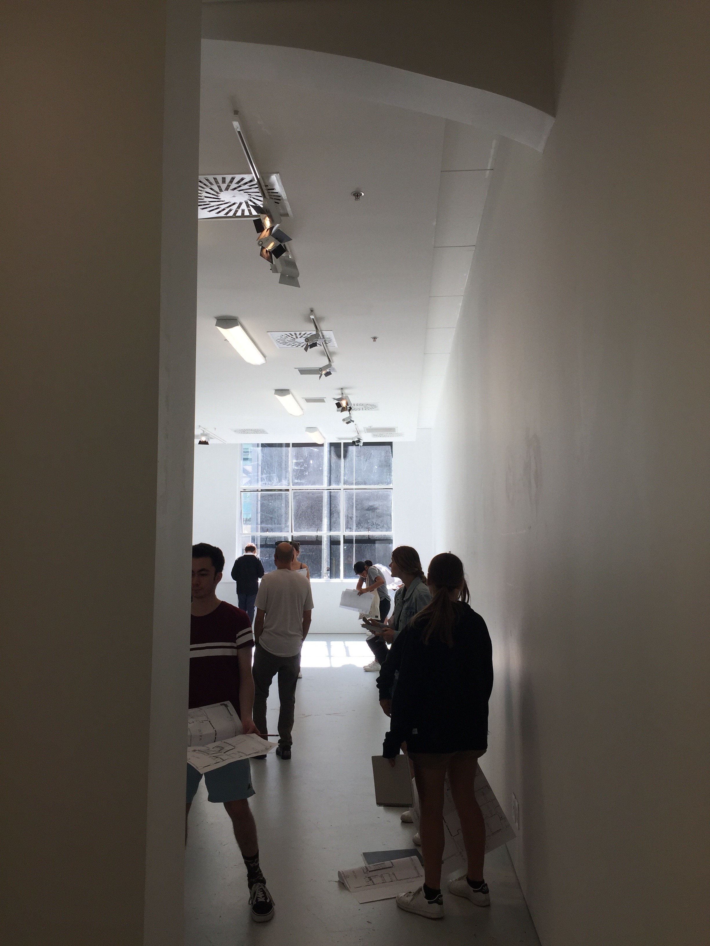
Inside the Gallery
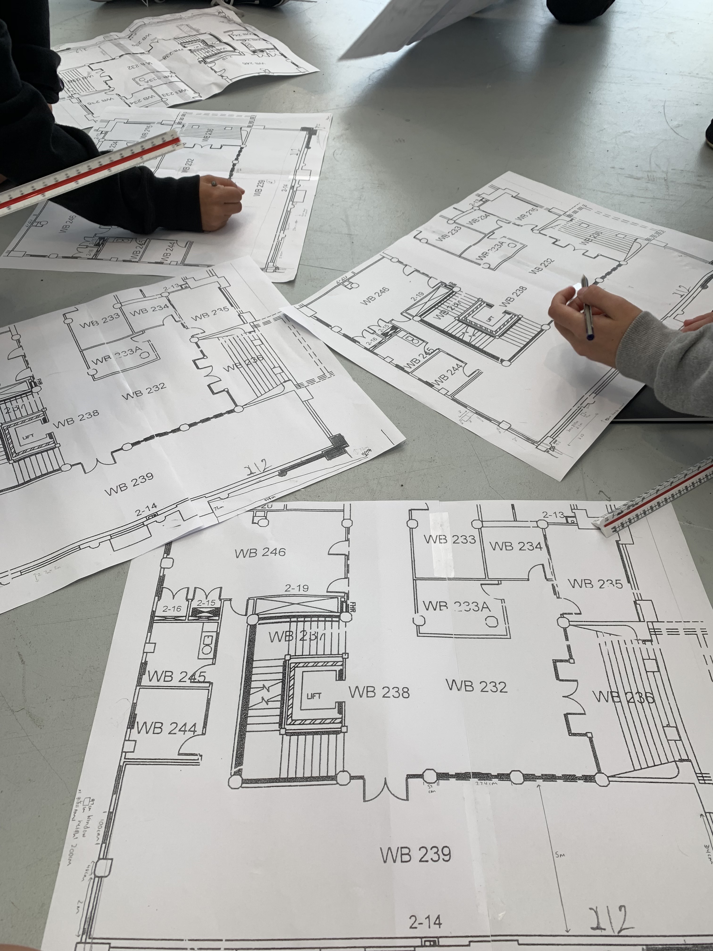
As we were first visiting the site and made it into the Gallery Three space, in groups we began measuring different features of the building in order to accurately construct our plan drawings of the building layout. We all started with the exterior measurements of the building on the rear Eastern side, intricately measuring the windows, walls and gradient slope. Eventually making our way to the back end of the building and loping around to the Western side within the entire building, only measuring the gallery space interior walls. Once we made our way inside the gallery space in our group we all divided up the sections of the space where everyone goes around in pairs or by themselves measuring different features. At the end of the session we all combined our measurements and recorded them onto our supplied plan sheet of the gallery space.
Site Analysis and Research
19. 03. 19
After being introduced and briefed into the second part of the project, I went home and started researching deeper into the sites contextual background as well as jotting down my own thoughts and experiences whilst visiting the site. I decided to focus on specific quantitative and qualitative characteristics that had a meaningful connection to part one of my project (my sleep/wake concept), as well as what particular qualities I found interesting about the site and wanted to explore deeper.
After our context talks and site visit the quantitive characteristics I chose to investigate and research further into are the Natural Ecosystems (Flora and Fauna), the surrounding Infrastructures (Infrastructural connections), Degree of Publicness and Historical contexts.
In New Zealand we have a very diverse and unique range of flora and fauna, with majority of it being native species. Over 20% of New Zealand is covered in national parks, forest areas and reserves, with these being the best places to observe the countries flora and fauna. We are constantly surrounded by flora and fauna ranging of various kinds of animals such as native birds, as well as having a large variety of plants, trees and shrubs. When New Zealand’s rainfall and sunshine hours are high, this can give the country a lush, diverse flora with 80% of it being native. Surrounding ourselves with greenery and rich landscapes helps the human body in many ways, some in which connect with the ideas surrounding sleep and wake. These qualities I found particularly interesting and I wanted to explore deeper while visiting Albert Park, a place where you are fully submersed and encircled in nature. With one of the main qualities being in nature, it soothes us and relieves our stress levels as we have evolved to be more relaxed in natural spaces. In Auckland City, where urban settings and infrastructure predominately fill the space, there are still pockets of natural settings where we are able to escape to and relax our minds.
Suttie, J. (Mar, 18, 2016). 5 Benefits of Nature On Your Brain and Body. Retrieved from https://www.naturalvitality.com/blog/5-benefits-of-nature-on-your-brain-and-body/?SID=ivvb5hojeh8t5asn2djkpcfse6
100%PureNewZealand. New Zealand Plants and Animals. Retrieved from https://www.newzealand.com/ie/feature/new-zealand-flora-and-fauna/
NewZealandTravelGuide. New Zealand Plants. Retrieved from https://www.tourleader.nz/new-zealand-travel-information/plants-new-zealand
In urban environments there is a very large population density, as commonly majority of New Zealanders live in these suburban cities. In the main urban areas of New Zealand 71.1% of the country’s entire population live in these industrial spaces. In these cities there are many ecosystems and developments which allow for this large density of people to live and function compactly together. Some of these ecosystem services include physical support for structures, cultural diversity and heritage values and crops of garden spaces. These developments are crucial to urban residents and contribute significantly to their quality of life, activities and regimes. In cities transportation and infrastructural connections are very important in order to create a functioning environment with movement and flow, as there is incredible movement happening all around you. Auckland city has developed and is developing several strategic plans for public transport, road networks, cycle networks as well as walking routes in order to sustain and handle future growth.

Proposed Auckland Cycle Network Map
Retrieved from https://at.govt.nz/media/1152355/Proposed-Auckland-Cycle-Network-map.JPG?width=780
Annual Average Traffic Volume
NZ Transport Agency. (2015). Road Infrastructure. Retrieved from https://www.mbie.govt.nz/assets/5f96bf780c/road-infrastructure.pdf
Meurk, C.D. (2013). Ecosystem Services in New Zealand. Retrieved from https://www.landcareresearch.co.nz/__data/assets/pdf_file/0006/77046/1_18_Meurk.pdf
Auckland Transport. Projects and Upgrades. Retrieved from https://at.govt.nz/cycling-walking/projects-upgrades/
Auckland Transport. Walking Routes. Retrieved from https://at.govt.nz/cycling-walking/auckland-cycle-run-walkway-maps/central-auckland-walking-routes/
Auckland Plan. Auckland’s Infrastructure. Retrieved from https://www.aucklandcouncil.govt.nz/plans-projects-policies-reports-bylaws/our-plans-strategies/auckland-plan/development-strategy/Pages/aucklands-infrastructure.aspx
By the beginning of the 20th century, Auckland was already looking towards its suburbs to deal with its expanding population. For Auckland city in the 1870s and 1880s the colonial population grew quickly with many new commercial buildings being built such as libraries, hospitals and churches. As well as developments of these modern buildings we also still hold and feature historical buildings, such as ST PAUL Street Gallery Three, the site our project is on. Albert Park originally was laid out in the 1880s commanding views over the harbour and cityscapes, whereas now the views are of modern buildings peaking through thick foliage.

Heart of the City Auckland. History and Heritage. Retrieved from https://www.hotcity.co.nz/city-centre/history-and-heritage
Word Guides. (2016). Auckland History Facts and Timeline. Retrieved from http://www.world-guides.com/australia-continent/new-zealand/north-island/auckland/auckland_history.html
Pollock, K. (11 Mar 2010). City Parks and Green Spaces. Retrieved from https://teara.govt.nz/en/photograph/20560/albert-park-auckland
The qualitative characteristics I chose to investigate and explore further into were my Initial Personal Responses to the Site, the Atmosphere, the Grounds, Outlooks and the Background Sounds.
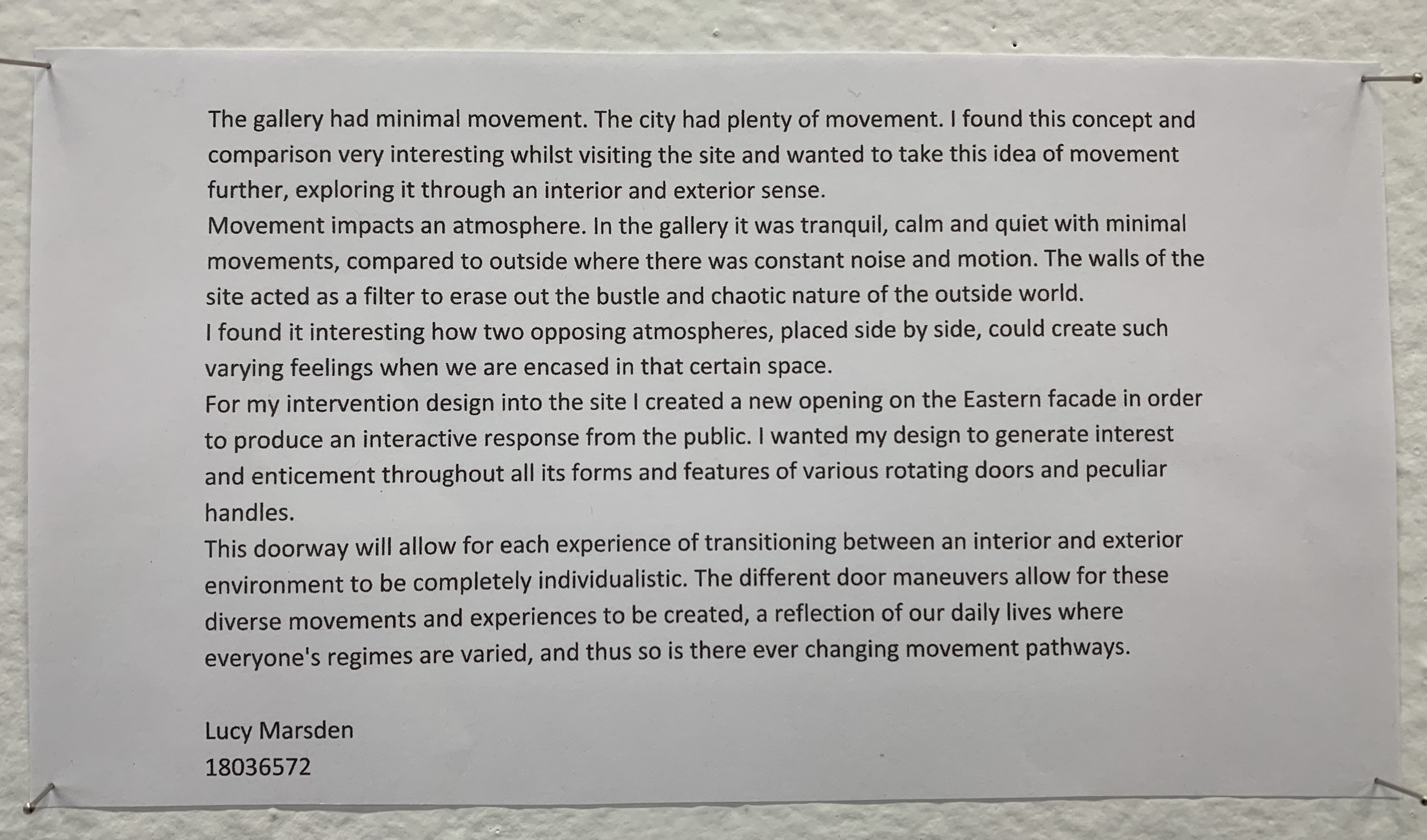
On my first visit to the site and its surroundings, I noted down my initial impressions, thoughts and feelings. The first two sketch pages above at the beginning of my part two project are the pages I drew and wrote notes on while being present at the site. At first we visited Albert Park which is down the road from the gallery site. While entering Albert Park I became submersed by large trees and greenery enclosing the space to where the park felt almost very separate from the city. It was like you are in this calm, tranquil setting where the trees filter out the bustle and chaotic nature of the outside world. The atmosphere in the park was very different compared to being out in the CBD. When your surrounded by nature you feel at ease as the space is very peaceful with your ears only filling with noises of trees swaying and the birds chirping. Very different compared to the noises you hear in the city. The main objectives and thresholds which I focused on in part one of my project was movement/stasis and fluidity/solidity. While visiting the park and site I was thinking about how these environments demonstrated these particular objectives, whether visible or not. I found it interesting how two opposing atmospheres, placed side by side, could create such varying feelings when we are encased in that certain space. Once leaving the park we headed over to the gallery site where we explored the exteriors and then interiors of the building and the space we were working with. When I considered the building in consideration with the sleep/wake states, I viewed it as holding stages of vulnerability. The outside public pathway on the Northern front of the building was a public space, a space where you feel unguarded, compared to inside the gallery where its private and you feel more enclosed and protected, very similar when transitioning from the sleep/wake states. Once in the space it had a similar atmosphere to Albert Park, calm, peaceful and very quiet. Outside in the city I noticed how much constant movement there was, and how this movement created and emphasised the noise, minimising any form of tranquility. Yet the gallery space blocked off and sheltered you from the noise and movement to where the air is still and the only thing you can hear is your breath. The gallery had minimal movement. The city had plenty of movement. I found this concept and comparison very interesting while at the site.
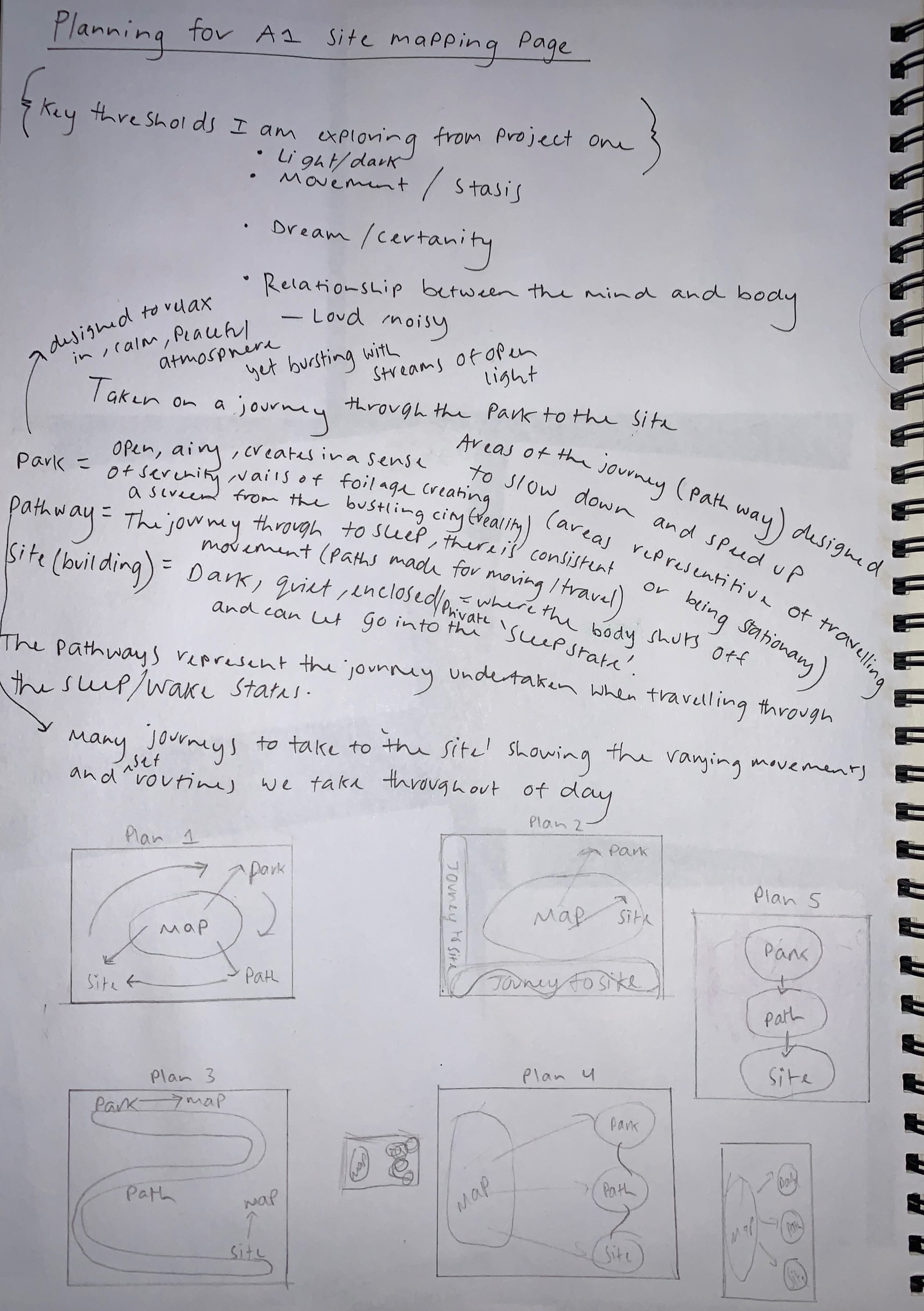
Site Mapping
20. 03. 19
Once gathering together all my research and image collecting I began writing out some planning layouts on how I wanted to arrange my findings as well as looking on Pinterest for further inspiration. I also jotted down some words and thoughts from the initial site visit.

The Secret Spot. Urban Layout. Retrieved from http://housegardenlandscape.com/landscape-architecture/rock-solid-advice-spruce-landscaping-2/ 
hbme. (2018). Autonomous Utopia. Retrieved from https://www.instagram.com/hbme/ 
Hillside House Plan and Section. Retrieved from https://i.pinimg.com/originals/16/72/73/167273c8b9ab8efe961e25d29133b2c4.jpg 
Canteen. (2019). Retrived from https://www.canva.com/learn/cartography/ 
Archisoup. An introduction to Site Analysis. Retrieved from https://www.archisoup.com/architecture-site-analysis-introduction
These particular images from Pinterest I have gathered I drew inspiration on for my Site Map. I was particular interested in each different layouts as well as the artistic qualities each image held. This gave me further ideas for how I can present my research in my own unique way that is abstract in its own form.I particularly loved from the 1st and 3rd image the layouts and how they take you on a journey through development as well as extracting specific details about what their site map/drawings are about.
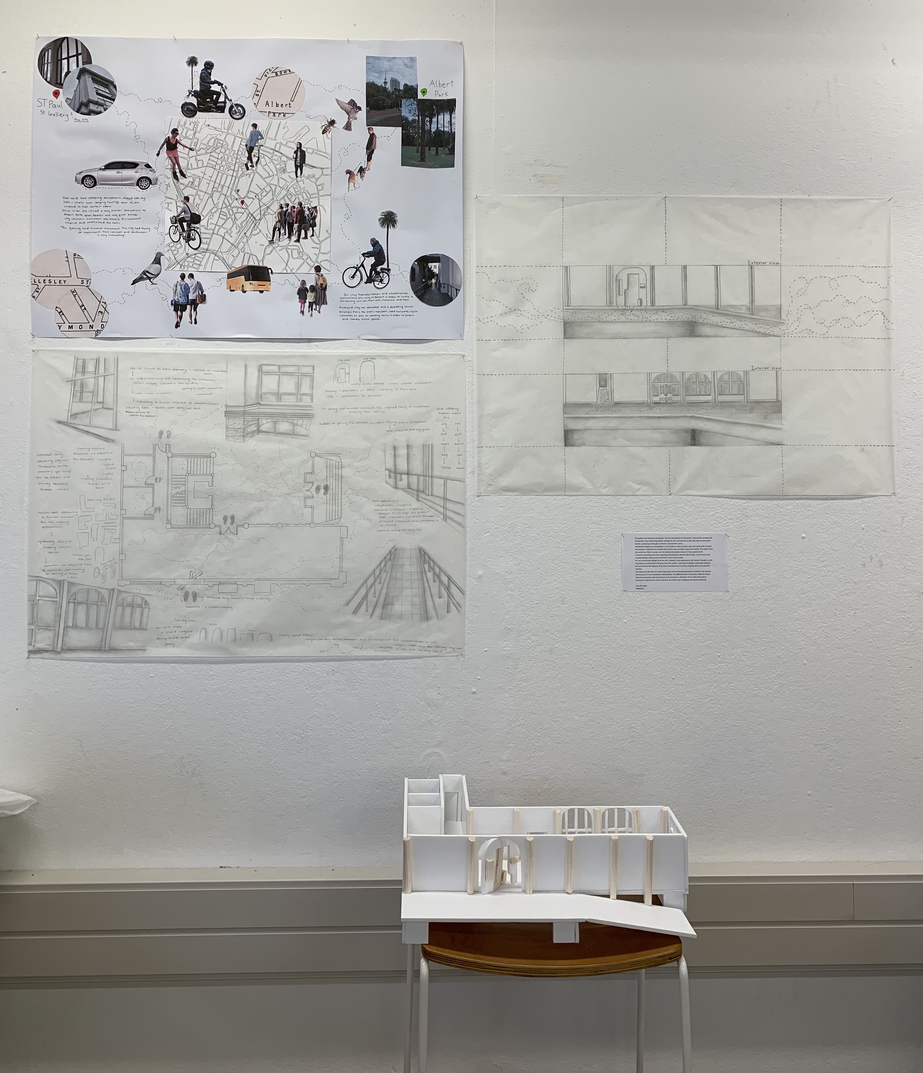
Along with this planning page, inspiration from Pinterest and my own research, I began constructing my A1 site map and drawing of the site.
Overall I wanted my site map to captivate all the research and personal experiences I had encountered while being in the space of the site. Yet I didn’t feel this particular layout justified my ideas and further intentions within this part of the project. I also wanted to try and further artistically create a site map that shows my thinking in a unique way. So I decided to continue brainstorming and searching for new ideas for how I can depict my findings.
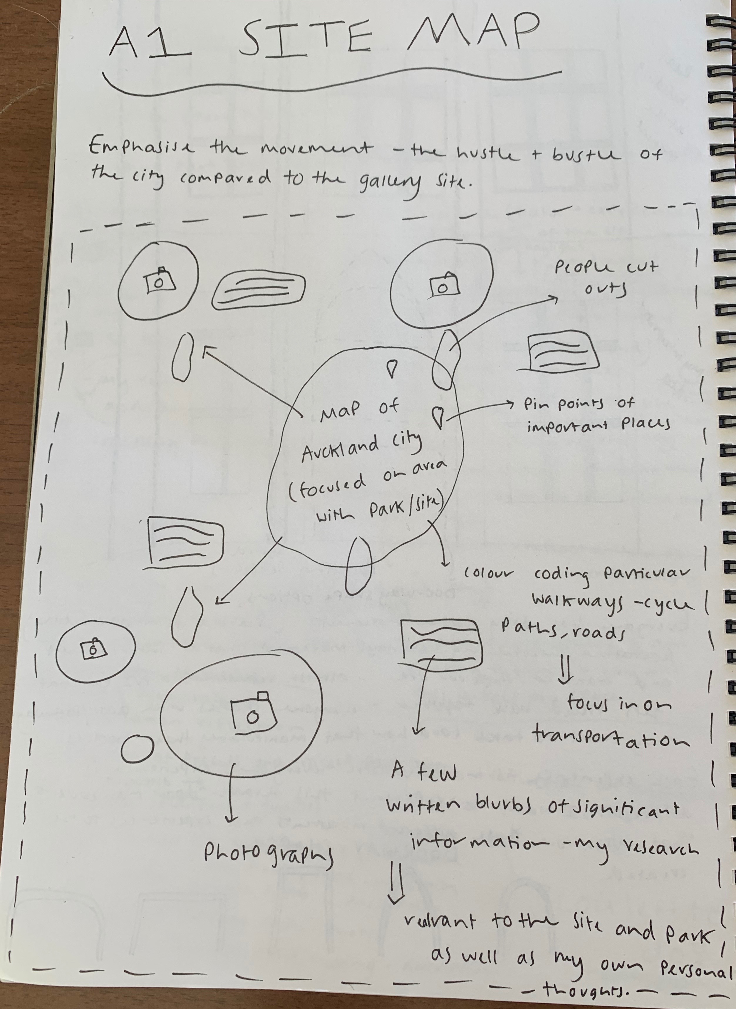
After refining my ideas and creating a new comprehensive plan, in this new A1 site map I am able to demonstrate and show the key features of the site I was interested in and researched further.
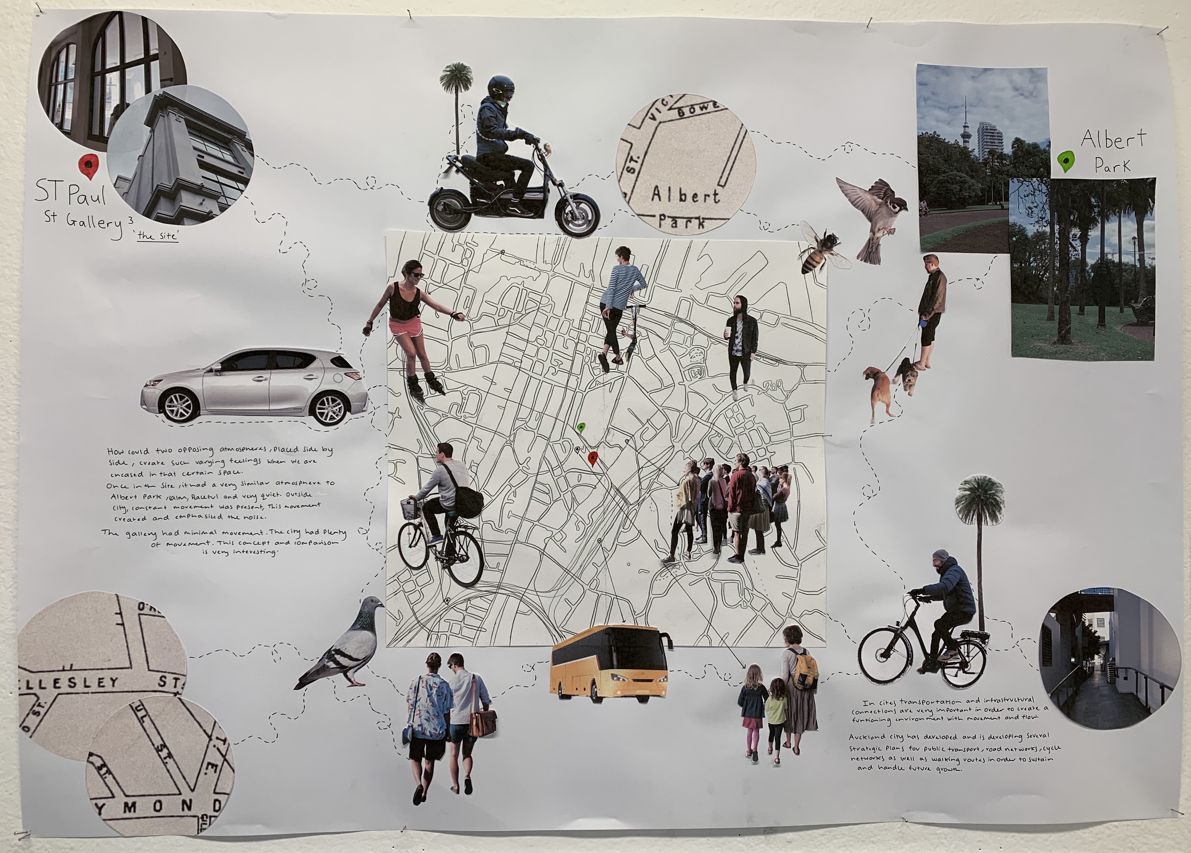
I have created this new site map, adjusting features and changing moments from my previous site map. I carried through the photographs I had taken while visiting the site as I wanted show show different features of the site and Albert Park in order to have some clear visual representation. Compared to my draft map I have added many cut outs, especially of people. I thought that by adding people into my map would show my ideas and interests in terms of what aspects I focused on at the site. While at the site and the park I focused on movement in all its forms, whether visible or not. I was interested heavily in all forms of movement whether it was through people, transport, animals, nature or simply sounds. These aspects I wanted to highlight in my map by showing how there is always constant movement all around us, and how everyone has different regimes and routines. I also wanted to add some blurb writing of my own initial impression comparing the being in the interior of the site as well as the exterior. Movement impacts an atmosphere. In the gallery it was tranquil, calm and quiet with minimal movements, compared to outside where there is constant noise and movement. The idea of movement was my main focus and I believe that this new map layout and content shows this.
Design Workshop 2
25. 03. 19
Today in class we were introduced into the action of drawing thresholds and how to do so. We were briefed on how our threshold moments that we experienced while visiting the site can be translated through drawings and sketches. One particular example that we were shown which really helped my understanding of threshold drawings was the Storefront for Art and Architecture in New York City created by architect Steven Holl and artist Vito Acconci in 1993. His drawings demonstrate a sense of atmosphere through his perspective within how he imagines and views the space – this I found particularly interesting to draw inspiration and knowledge from.


Holl, S and Acconci, V. (1993). Storefront. Collaborative Building Project. Retrieved fromhttps://architizer.com/projects/storefront-for-art-and-architecture/
Once we were introduced to this new concept of drawing thresholds, I began searching through Pinterest at some threshold moments and designs that were very interesting and fascinating to me. These images all depict movement in some shape or form which I wanted to draw inspiration from – whether its through the representation of movement and connections of people or even being able to manipulate and move fluid or solid forms such as light and architectural moments within buildings. Below are some of the images that I found to help me start to gather further understanding as to how to draw the thresholds I experienced at the site.

(2008). Narrative Architecture. Retrieved from https://aadl.wordpress.com/2008/08/12/narrative-architecture/ 
Altmann, O. “Gespenster” by Ibsen. Set Design. Retrieved from https://i.pinimg.com/originals/15/1b/49/151b49287887bf0c9171fc6332162ae9.jpg 
Altmann, O. Retrieved from https://i.pinimg.com/originals/4d/c6/fc/4dc6fc09d76bfcedc4b4ae14d4444ab7.jpg 
Holl, S. (2010). T Space. Retrieved from https://www.archdaily.com/82147/t-space-steven-holl-architects/ 
Holl, S. Corner Door. Retrieved from http://afasiaarchzine.com/
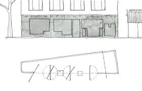
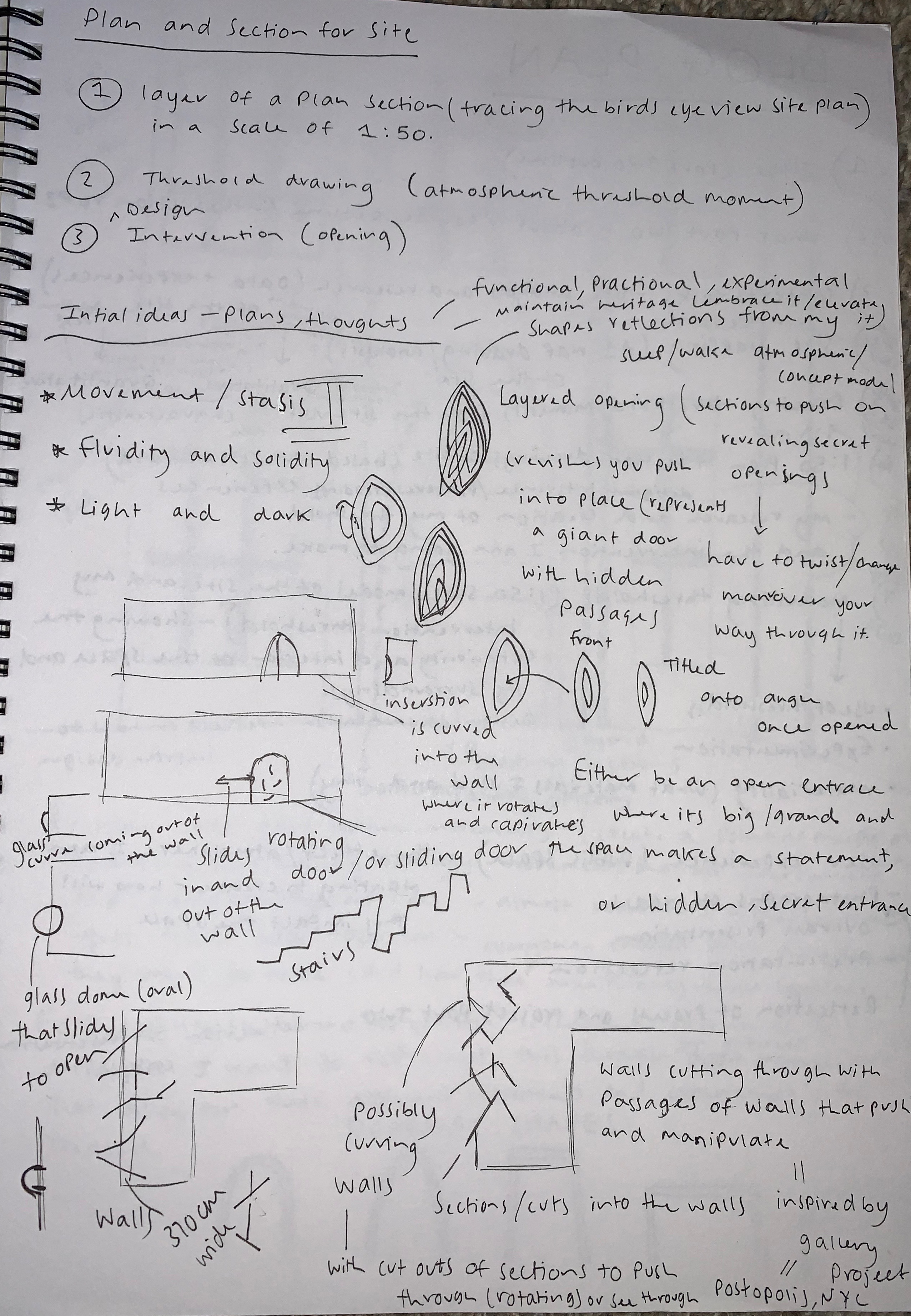
After browsing through Pinterest, I began creating my A2 Plan and Section Drawing of the site (with a scale of 1:50). I started by tracing the overview plan of the gallery space, referring to both my taken measurements from when I visited the site, as well as the already drawn up handout. While drawing the plan of the site, I also started drawing and writing little notes around the edges which strongly resonated with the site, my research and my own individual experiences. By doing this I wanted to work in the present with my ideas and research leading to further thinking and designs for my threshold intervention. All my previous contextual research on the site through its quantitative and qualitative characteristics and recording of my experiences and threshold moments through sketches and words, I was able to combine all my resources onto my plan and section layouts in order to clarify, and comprehensively show my design process.
Further Research
26. 03. 19
The following day after the studio session I decided to head back to the site in order to collect some more intricate measurements of the building and space, as well as have another opportunity to experience and create threshold moments and ideas or my upcoming intervention. I noted down many more measurements for which I could add to my plan layout in order to scale it as accurately as possible. As well as the measurements I also captured lots more photographs to help with my documentation and for future reference for when drawing and reflecting back on the site and its settings.
Main Entrance to Gallery 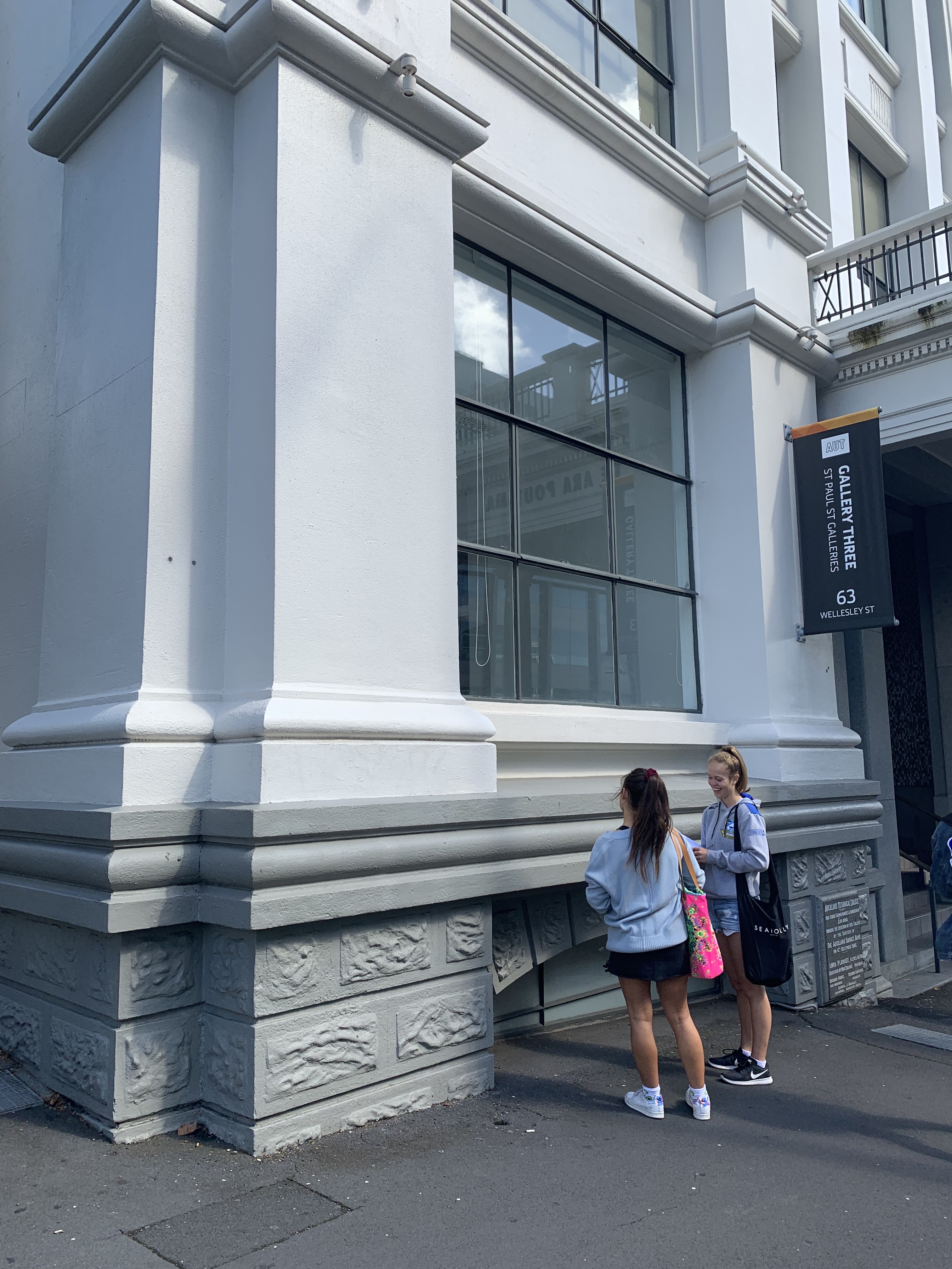
Exterior corner of Building 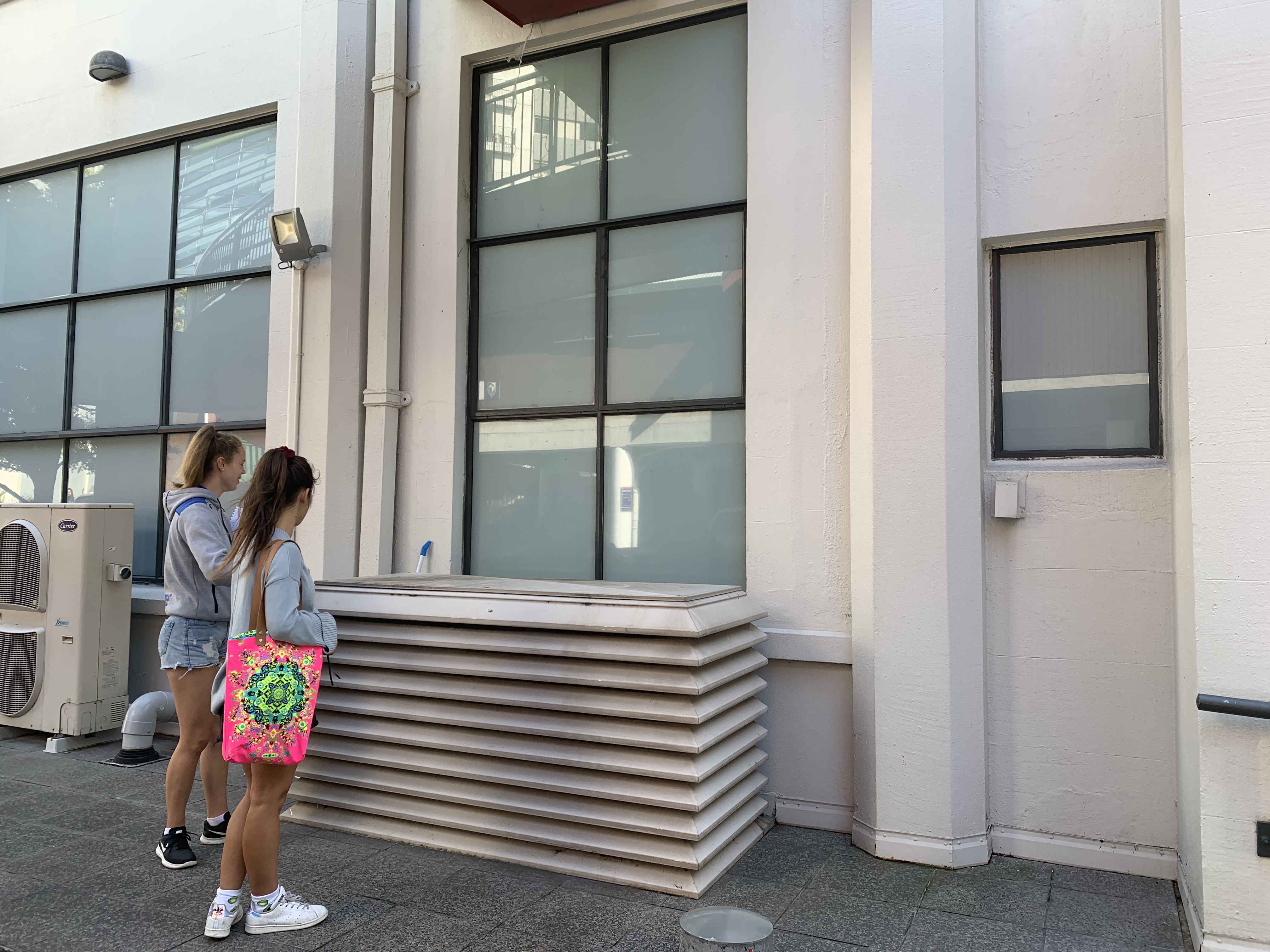
Eastern side of Building 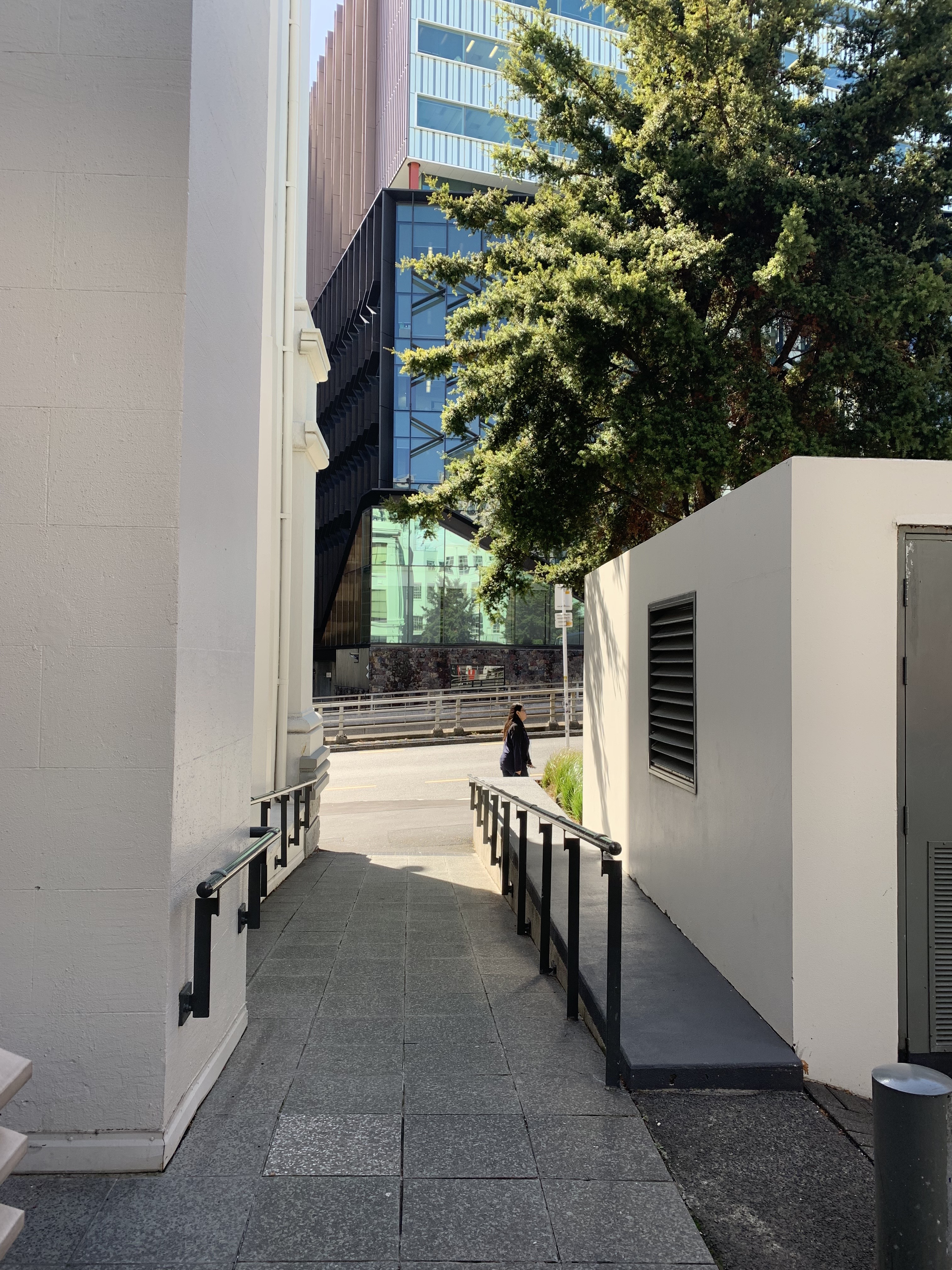
Slope connecting path to Eastern side of Building 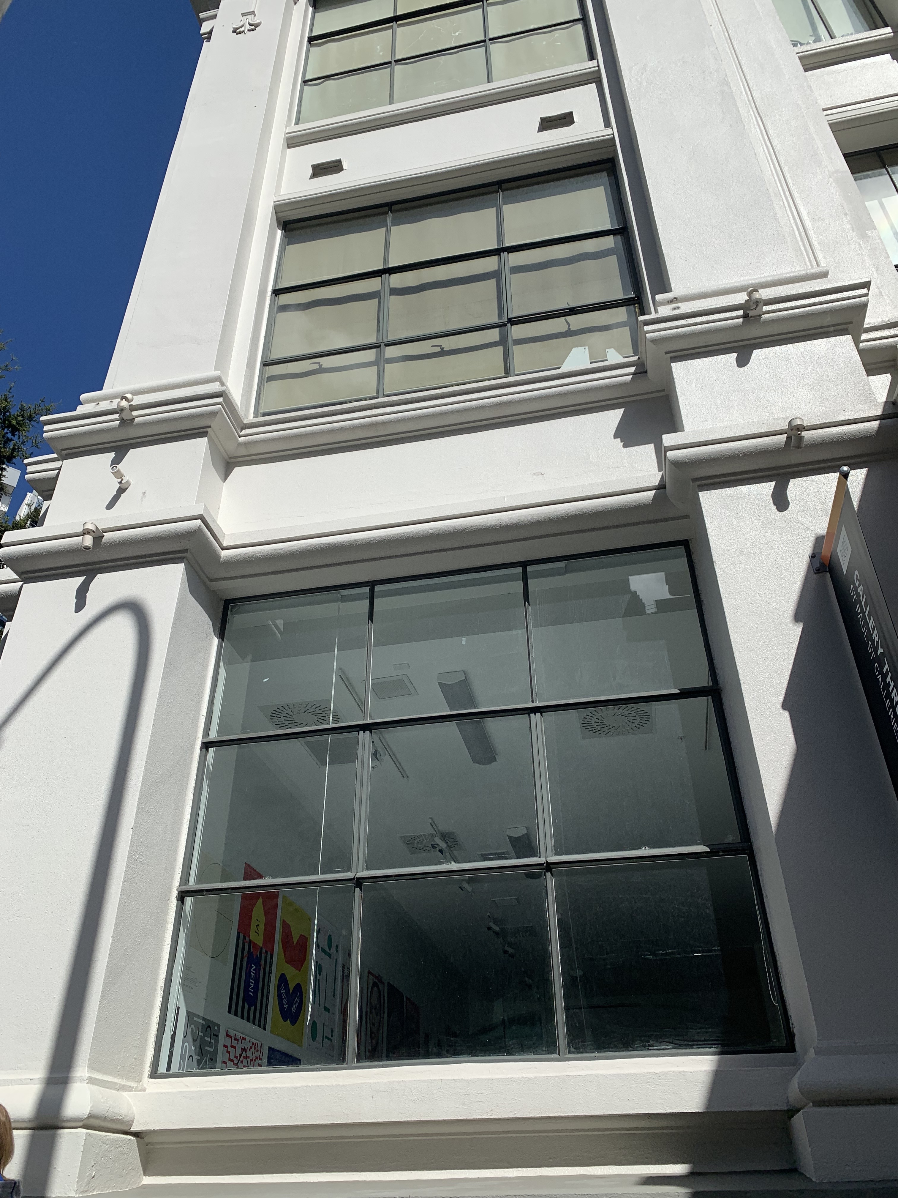
Front view of Building (Gallery side) 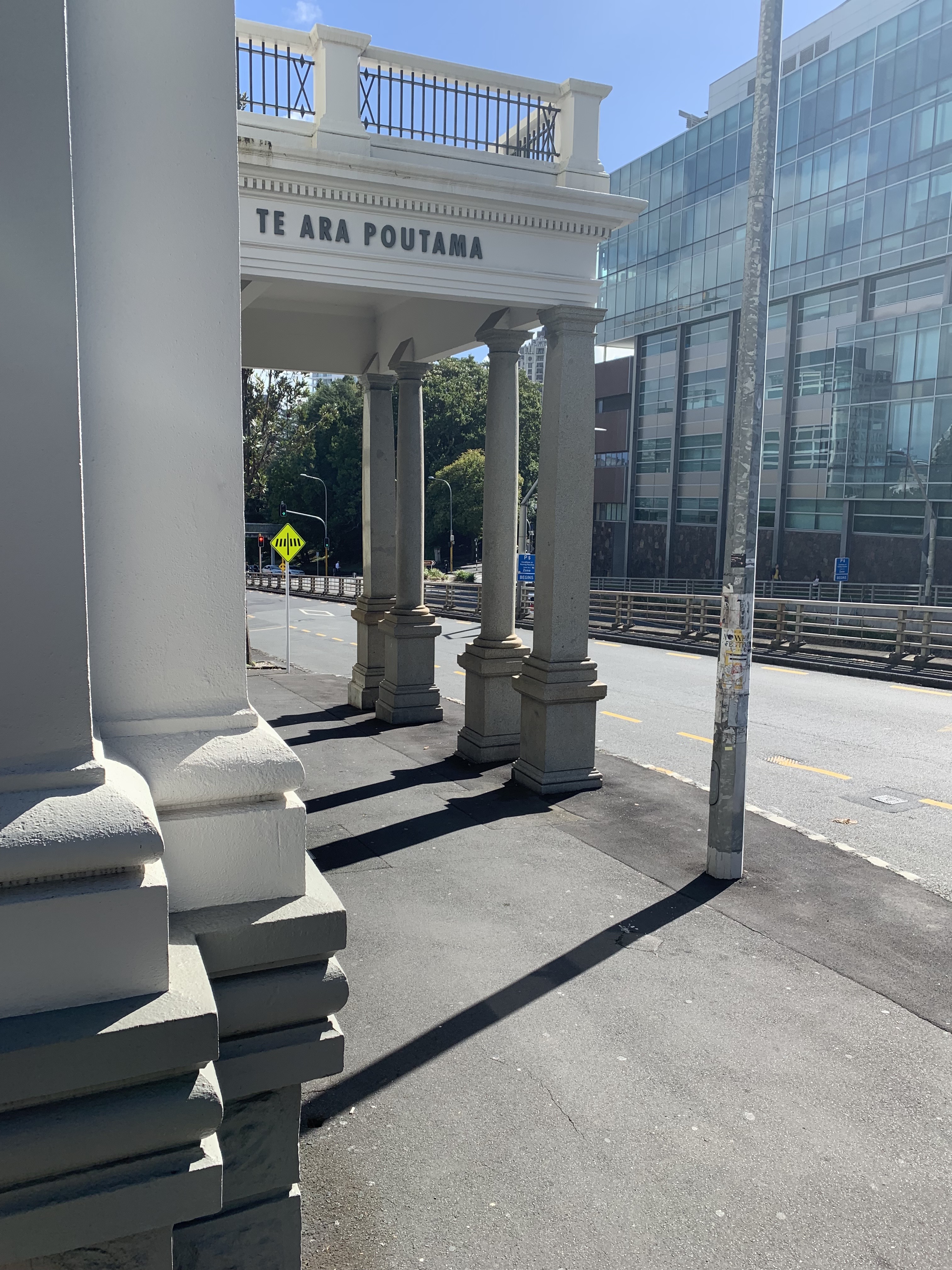
Front facade of Building 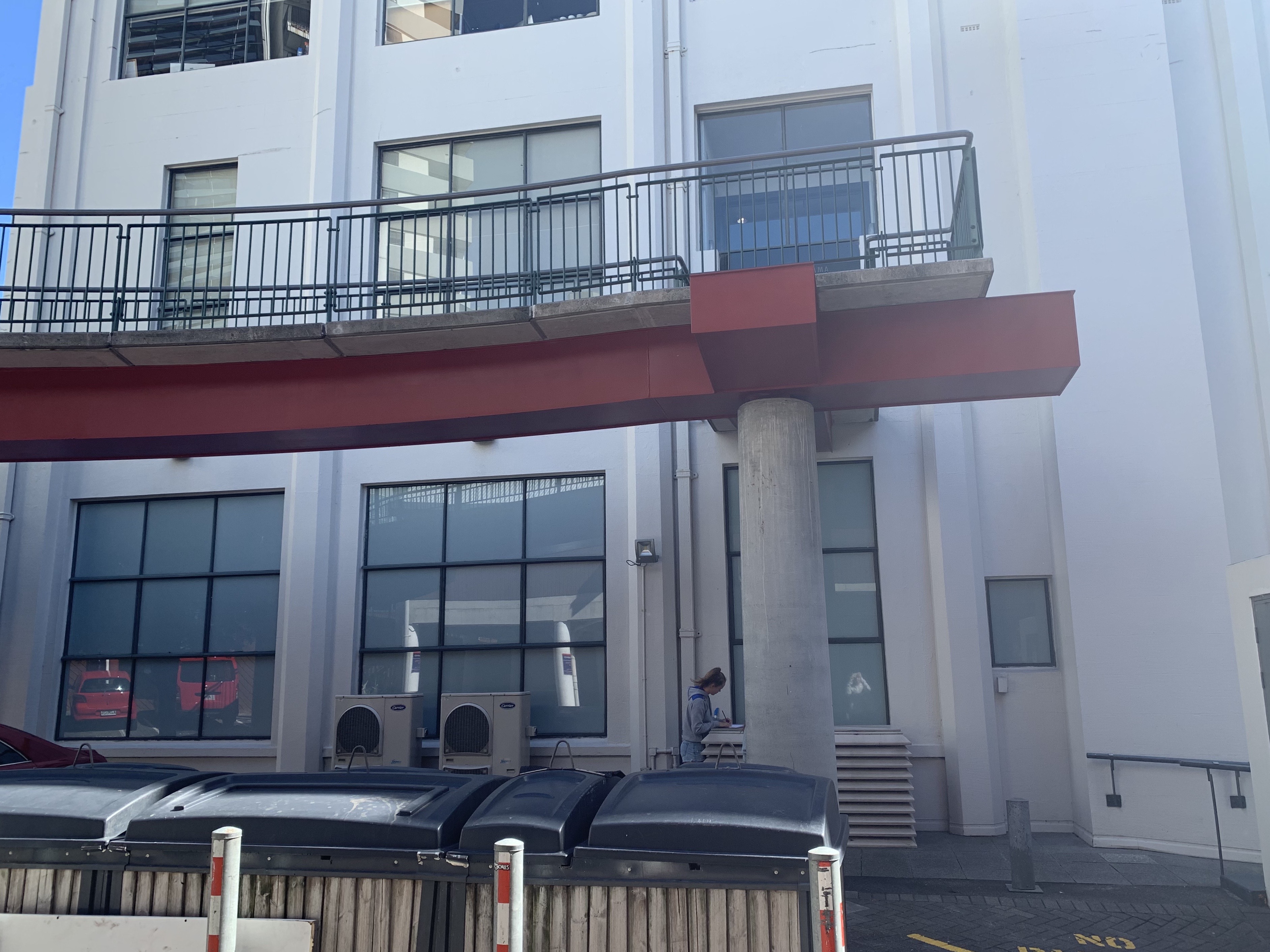
Eastern side of Building
1:50 Plan and Section Drawings of the Site
27. 03. 19
Some of the following sketches and notes are placed around my plan and section drawings in order to show my design process and to help clarify my thinking and key features of the site I wanted to explore further. Once I had gathered all my key information I was able to create threshold drawings and write notes which were helping my design process to ultimately unfold features of the site that I found interesting and communicate my notion of the site in relation to my sleep/wake concept. My plan and section drawings are based off my research, inspiration and influences from other designers work, Pinterest and my own individualistic experience at the site.
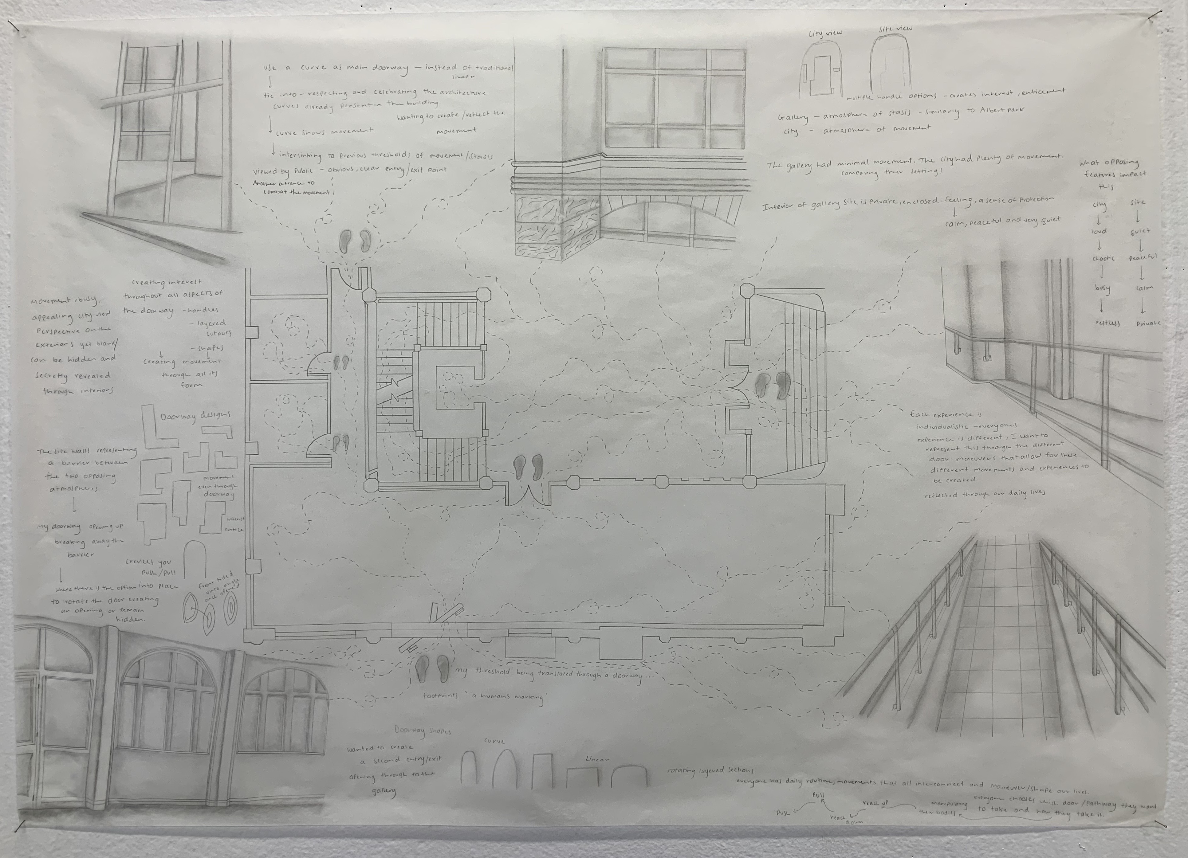
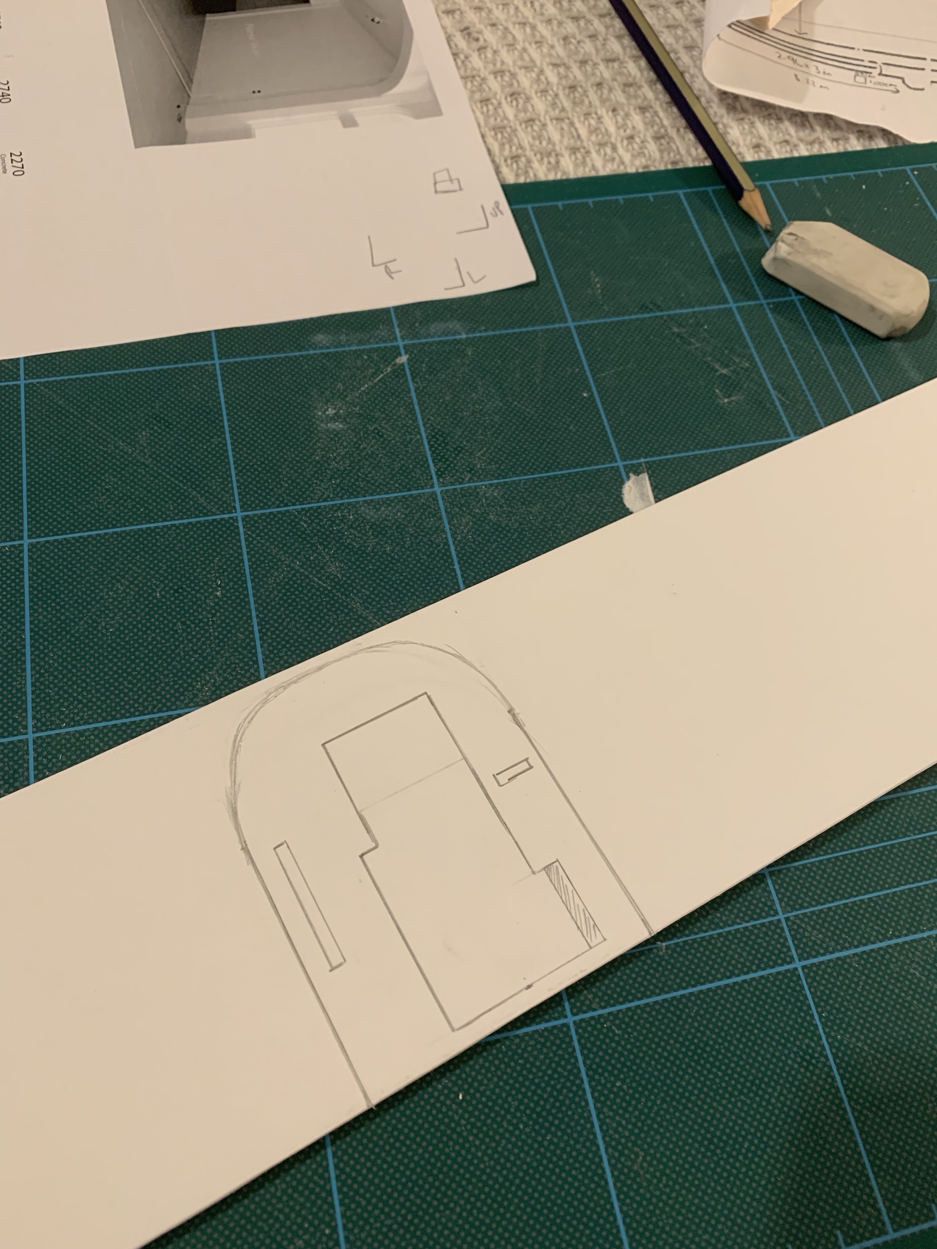
For my plan drawing I wanted to highlight important architectural features of the site as the main structures to emphasise and show the components of the building I was working with whilst designing my intervention doorway. Essentially this plan drawing was to show my design thinking and process for my threshold intervention while exploring and understanding the site and its environments (adding onto the knowledge from my visits to the site as well as own research). I did this by writing lots of notes of my own thoughts in relation to the site and my threshold design as well as drawing mini diagrams and drawings of my thinking.
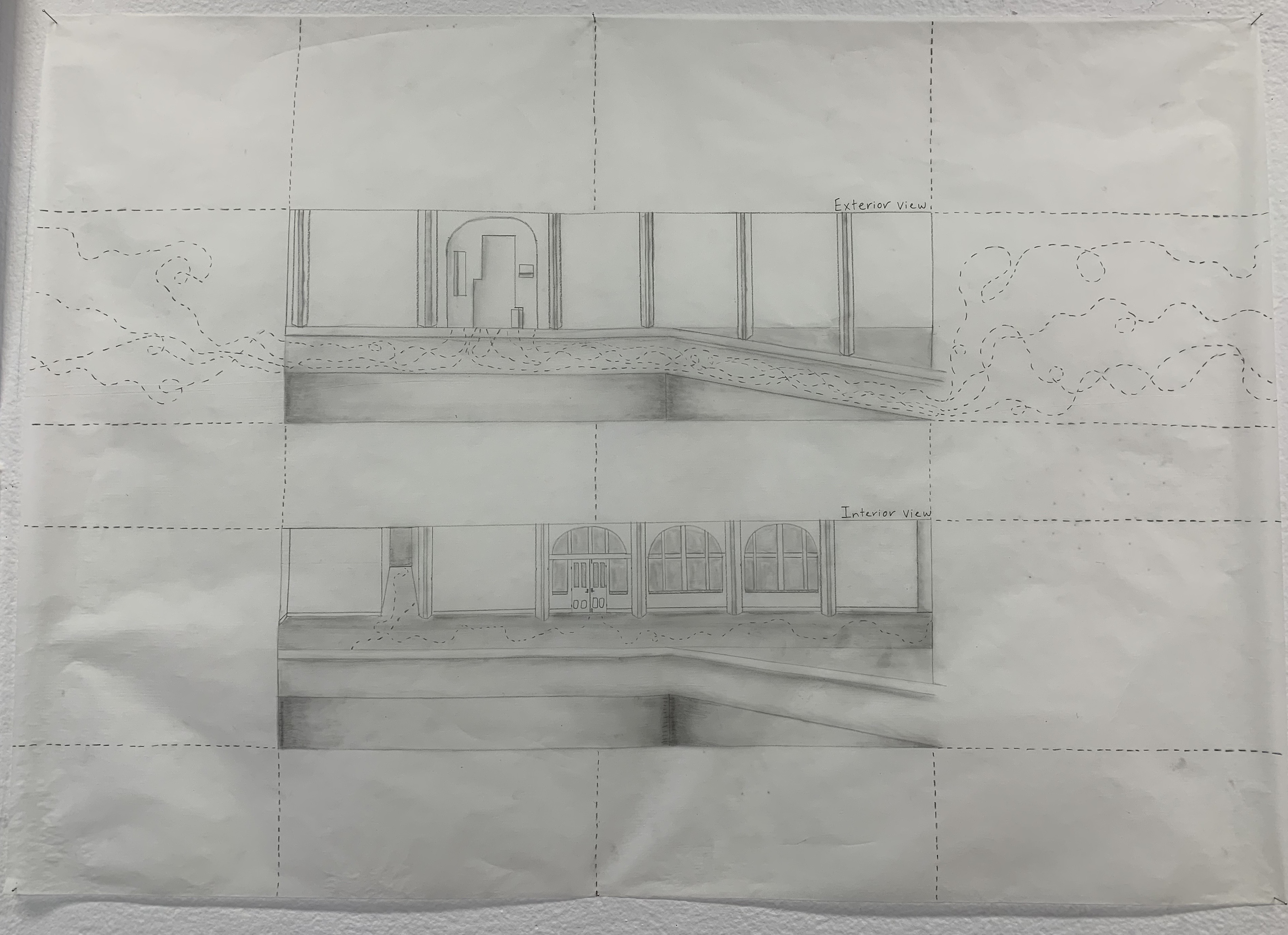
For my section drawing I decided to draw the interior and exterior section views as these two components are an important part to my investigate comparisons of movement. By drawing both the interior and the exterior I wanted to show how movement is different and impacts both these spaces differently. I showed this through the tracking pattern representing the outside public space filled with endless movement, compared to the interiors of the site where there is very minimal movement, and therefore very minimal tracking pattern.
Design Workshop 3
01. 04. 19
Today in class we started off the studio session by reviewing our plan and section drawings in our table groups. We were asked to, within our groups present and explain our plan and section drawings and our ideas to each other. This was slightly difficult as for this part of the project I hadn’t verbally expressed my ideas and well as them still being in the process of developing. This was also really helpful as we also gave each other feedback and further ideas surrounding their concept which was a great way to reflect on how individually we can improve our design. Once each of us presented, as a group together we all chose someones plan and section drawing to present to a larger group of the class. We had to really focus on their work in order to clearly grasp their ideas and present them back to the class. Sharing our ideas with each other was a very beneficial tool to help each of us with our own projects and share knowledge.
After presenting in groups we began a context talk on the next step of our project two, model making. We were briefed and showed through previous examples of models and what particular materials others used when constructing. The model making section of this part of the project was to produce a 1:50 model of the gallery site and our threshold intervention design. Our intervention design, which we add into the gallery site shown through our model, based off our plan and section drawings, will show both the interiority and exteriority of the site and the impact of my design within the public space. While thinking about my model there were lots of elements I had to consider and think about for how I wanted it to visually look and show my intervention. Before starting my model I had to think about materiality and my use of materials, experimentation and different designs, functionality and most importantly construction. Below are sketch pages of my initial intervention designs for where I am developing my thinking.
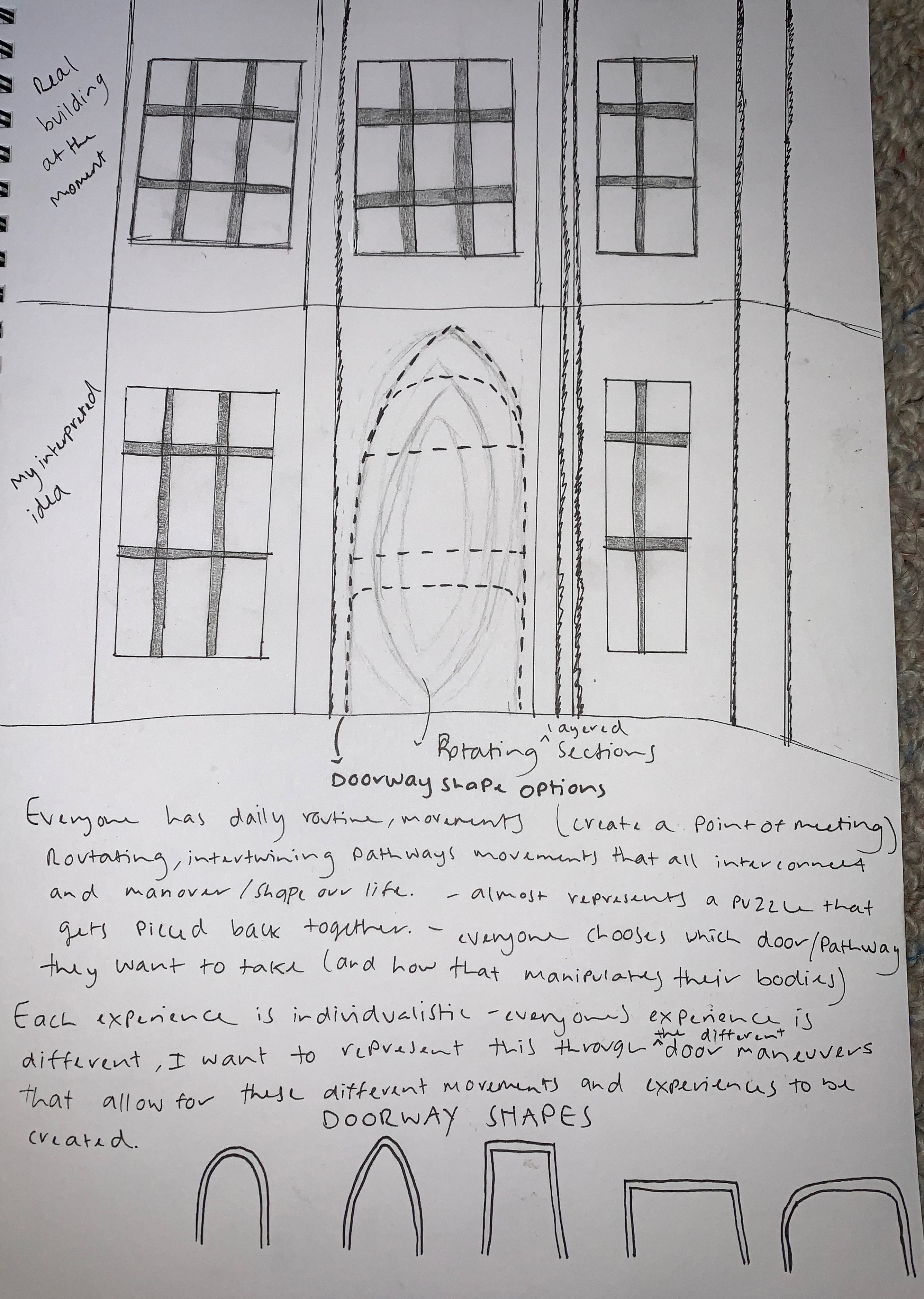
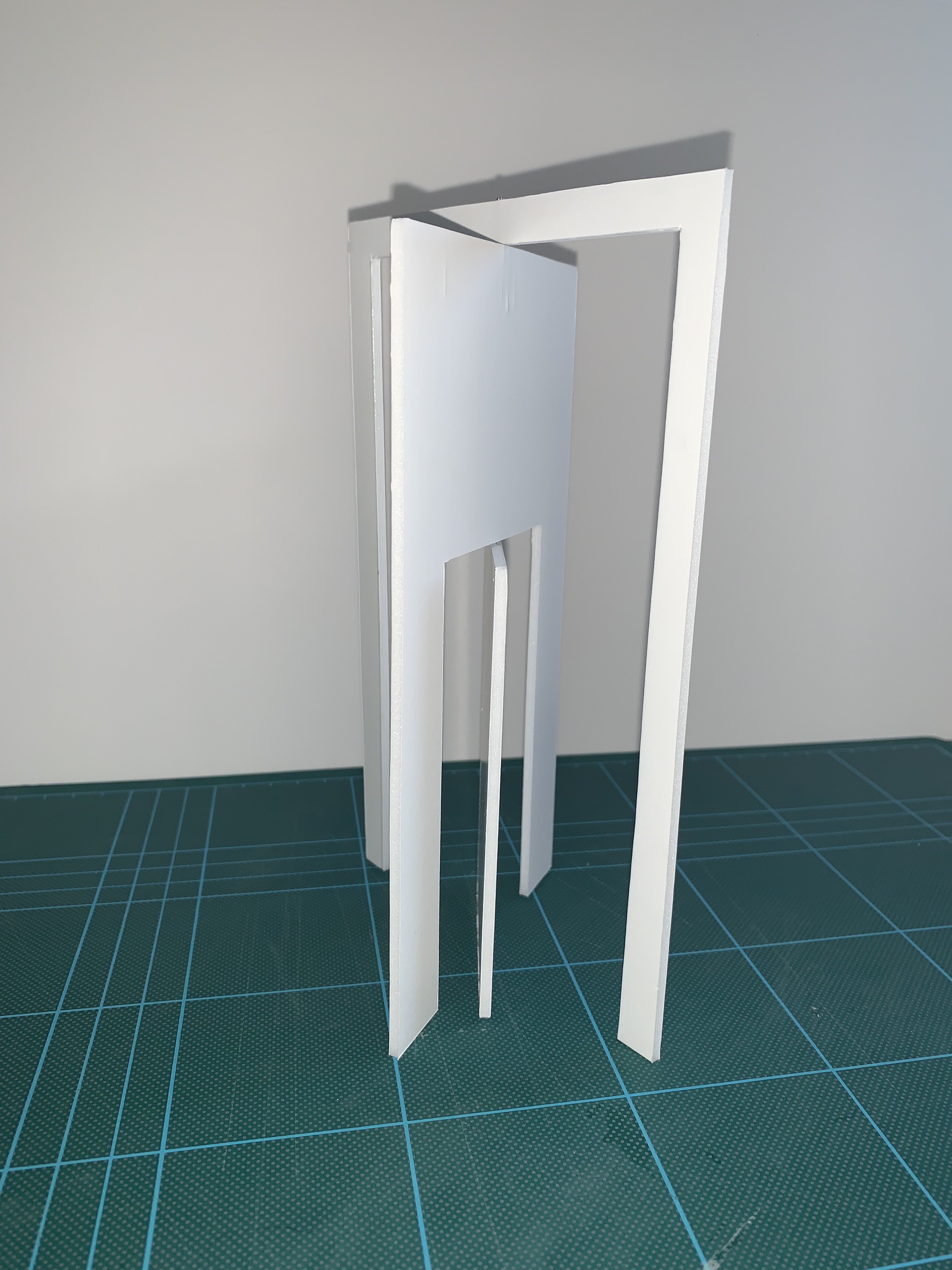
As I wanted my intervention into the site to be a new opening on the eastern facade which creates an interactive reaction from the public. I wanted my design to entice the public to be intrigued in what lies behind the opening and how you step through and transition from the exterior to the interior gallery space. My model needed to demonstrate the function of my intervention in order to show its action within the site space and its outer affects. Before beginning the construction of my model I experimented with how I was going to create my threshold design where it is able to perform the true functions as if it were in the gallery space. I experimented with a range of possible shapes for my doorway, looking at which one performed the best function and was practical. Below are images of my experimental model making.
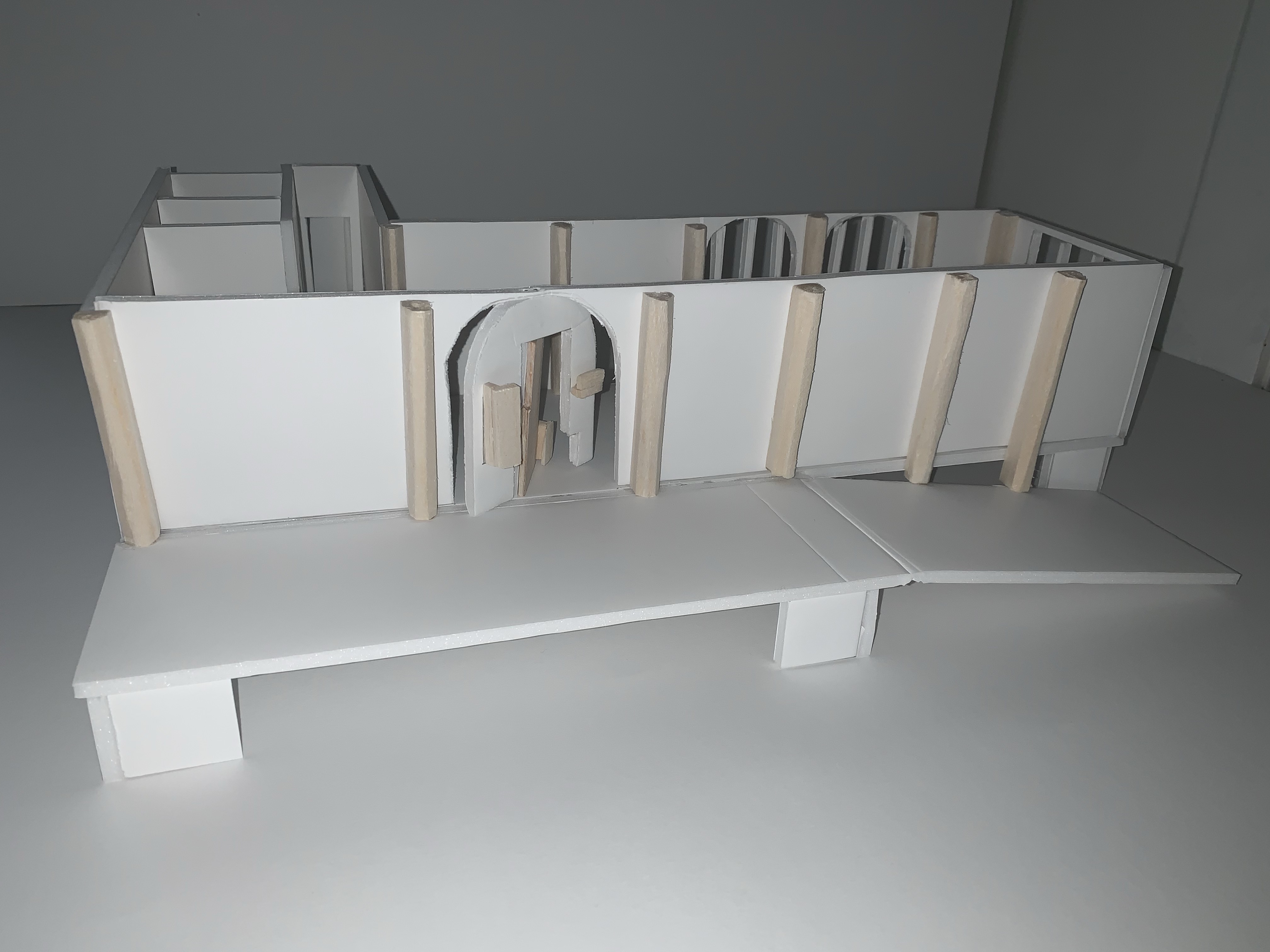
I then began thinking about materiality. What materials did I want to use to create my model? And what would they represent if my model was to be in real public space? What materials would impact my design, the public space of the site, and particularly the building itself? The use of materials, the ones I imagine my design to be as well as the ones used to construct my model would be very important. After doing some research and hunting on what materials are viable and useful for model making I decided to create my model out of foam board. This material works really well for model making as it is easy to cut and shape, yet is still sturdy and will create a strong structure.
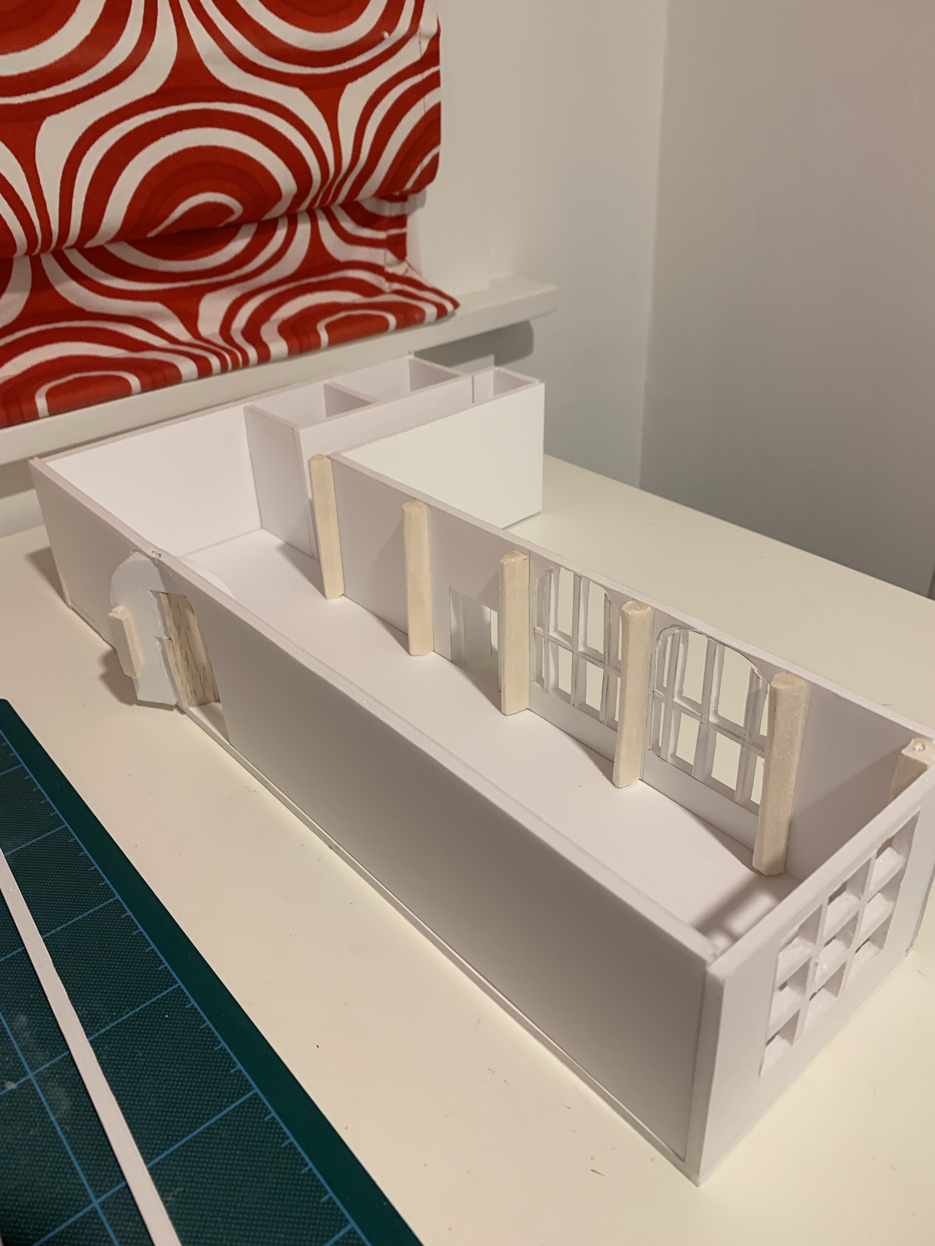
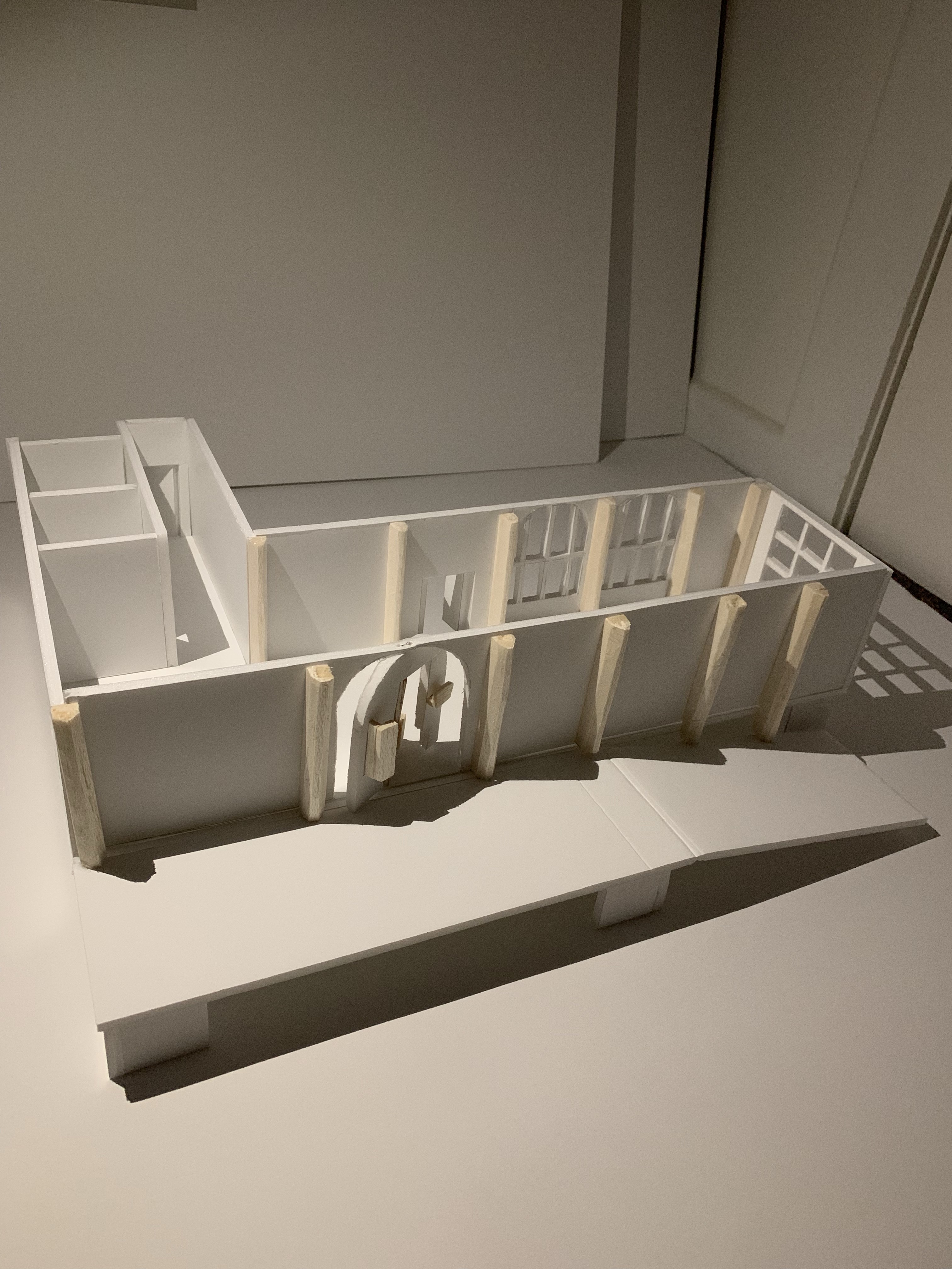
Below is the beginning of my model making process. I started by using the 1:50 scaled measurements I had taken from visiting the site (the same as the measurements on my plan drawing) and cutting out the foam board into their precise shapes.
Once I had measured and cut out the shapes I needed, I started sticking together each piece slowly making adjustments accordingly.
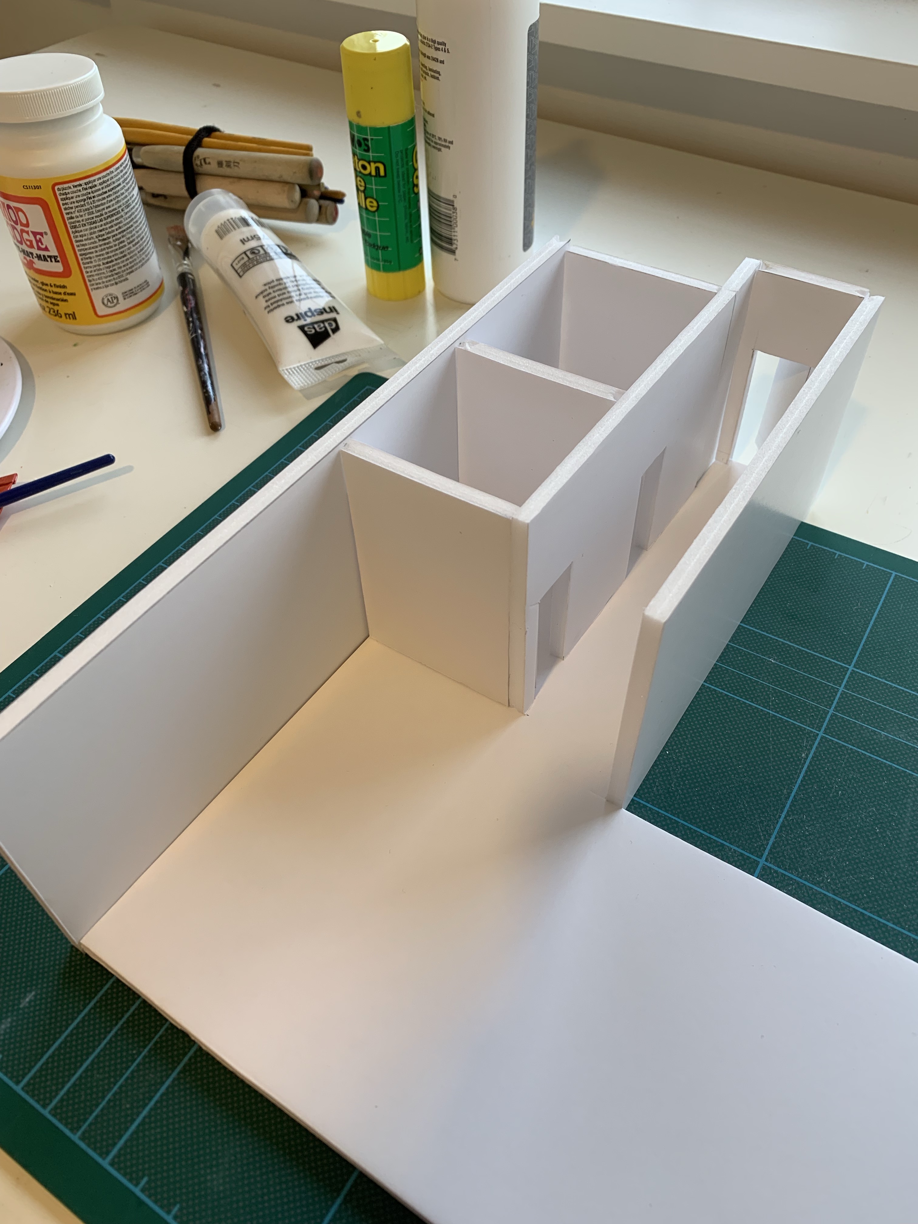
On a couple of the larger walls, which I left to glue on last, I started cutting out some intricate details of the windows and walls. Once cut I carefully glued each piece together.
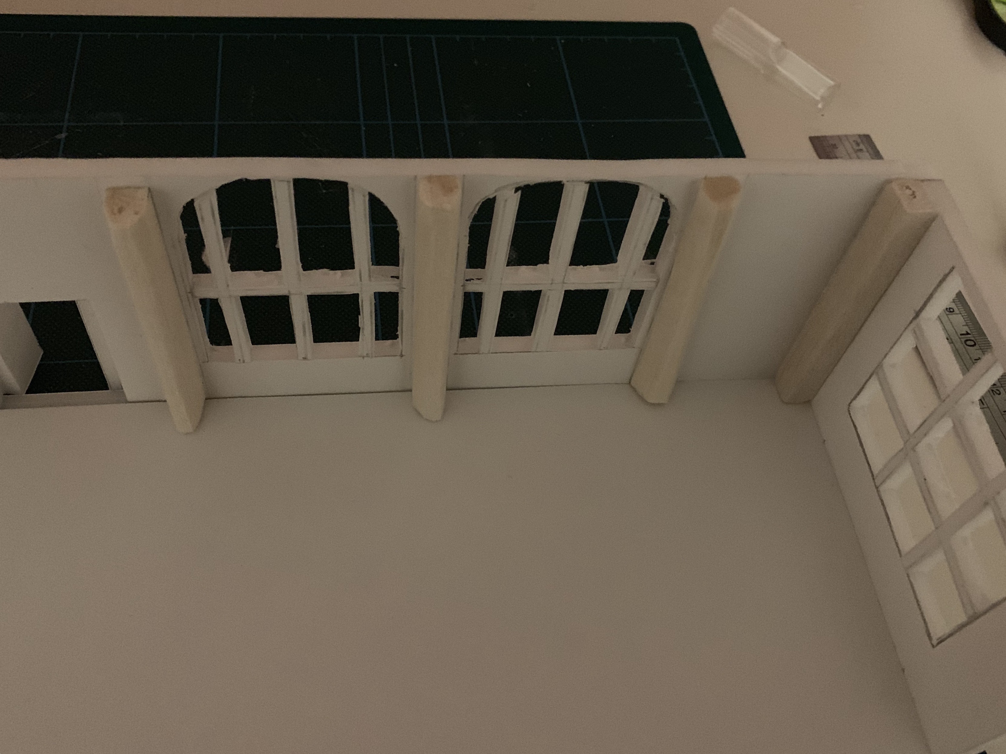
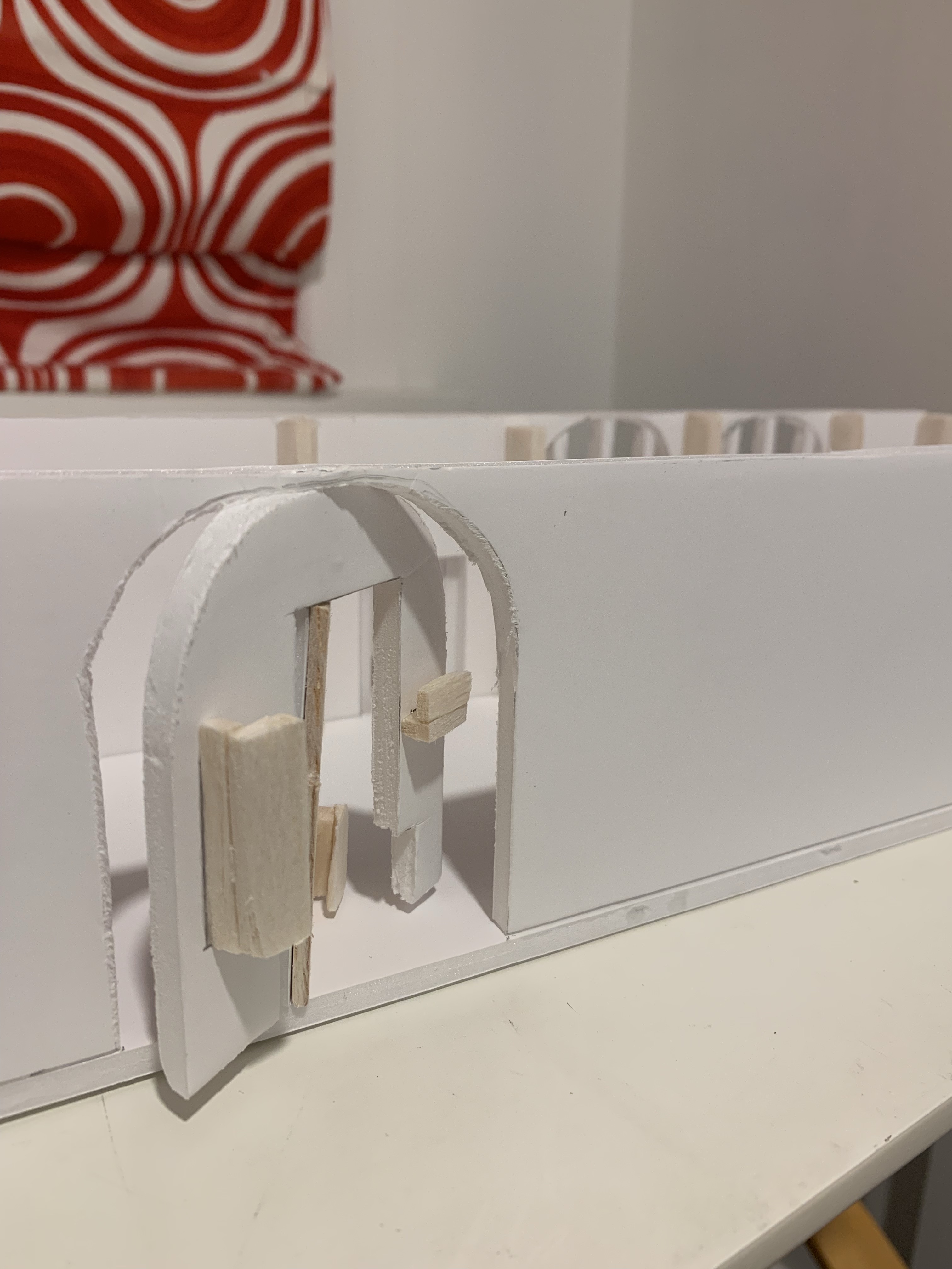
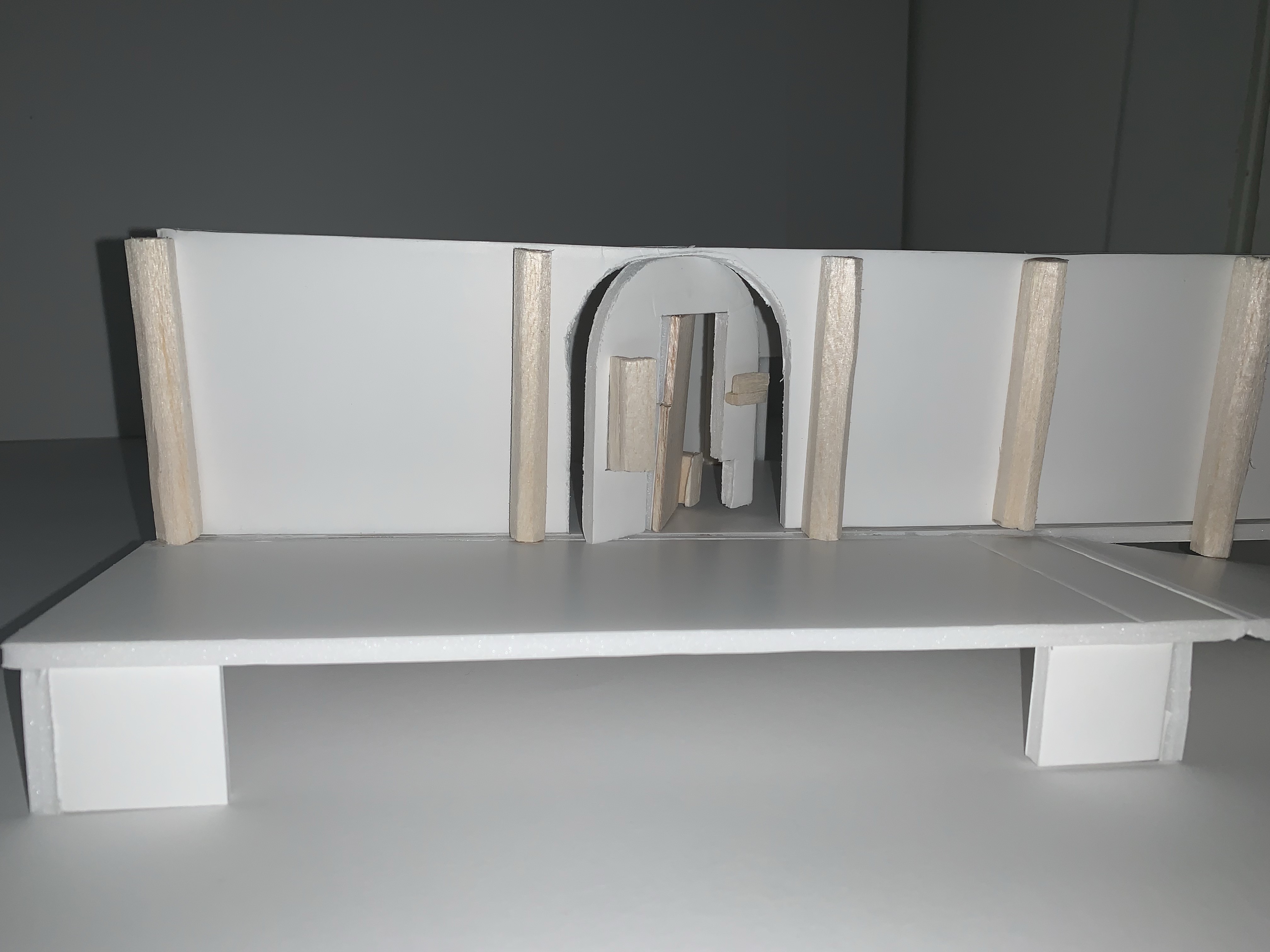
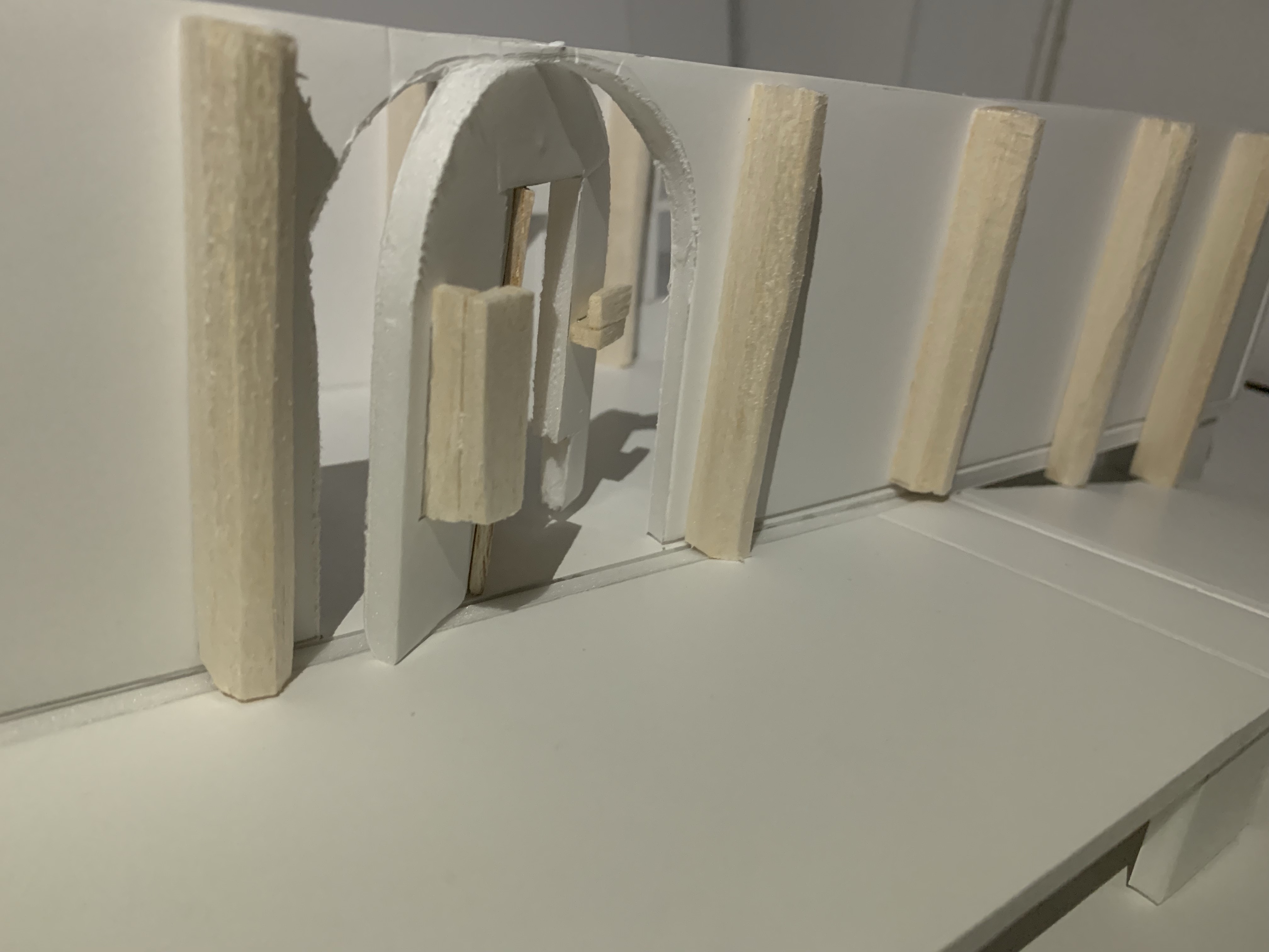
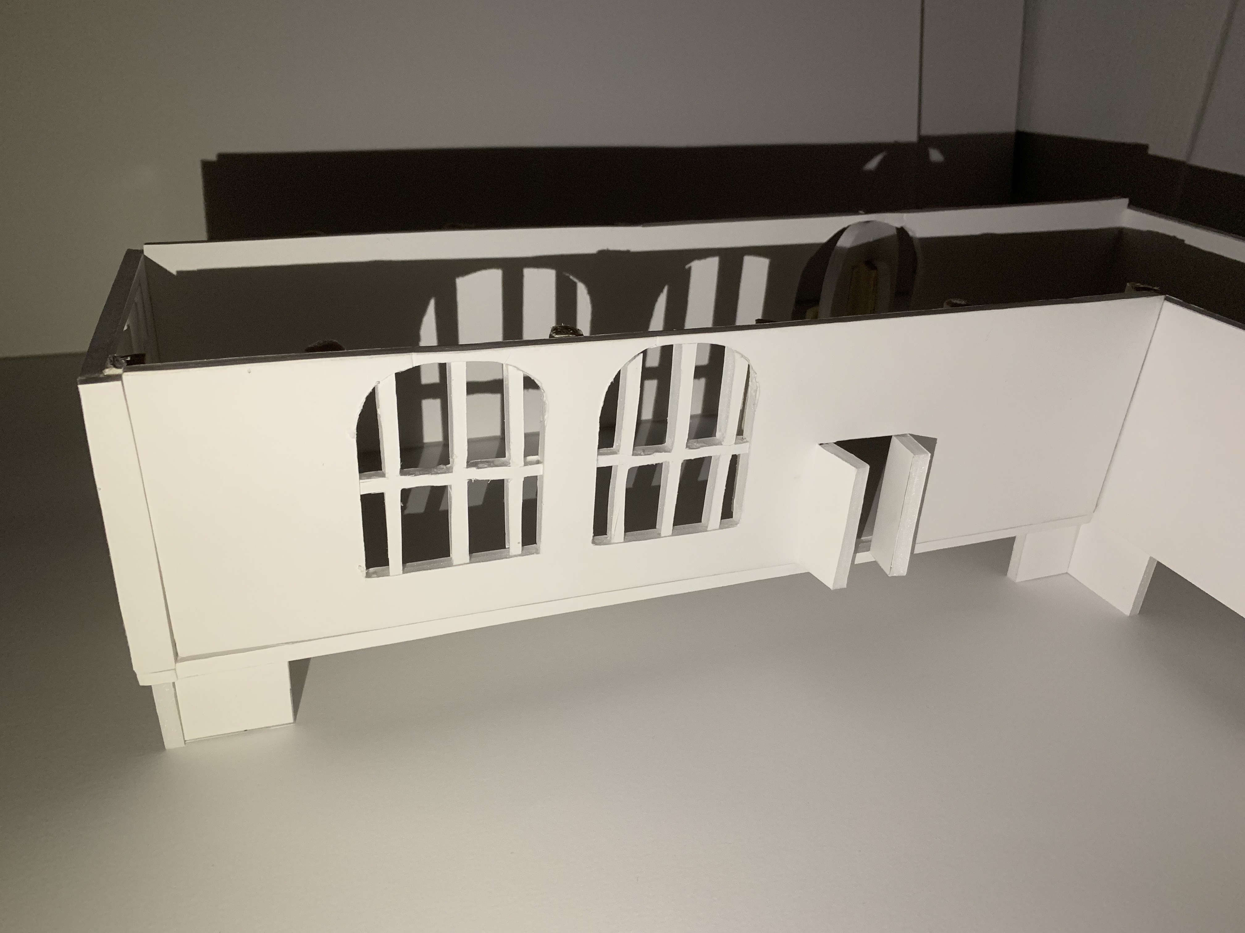
The final wall left to do was the eastern wall, the wall my intervention is on. I traced my doorway and its shapes and then began cutting out and sticking together the different sections.
Once the last wall was glued on the gallery space was coming together where I had created a closed space modelling the site, with my added doorway.
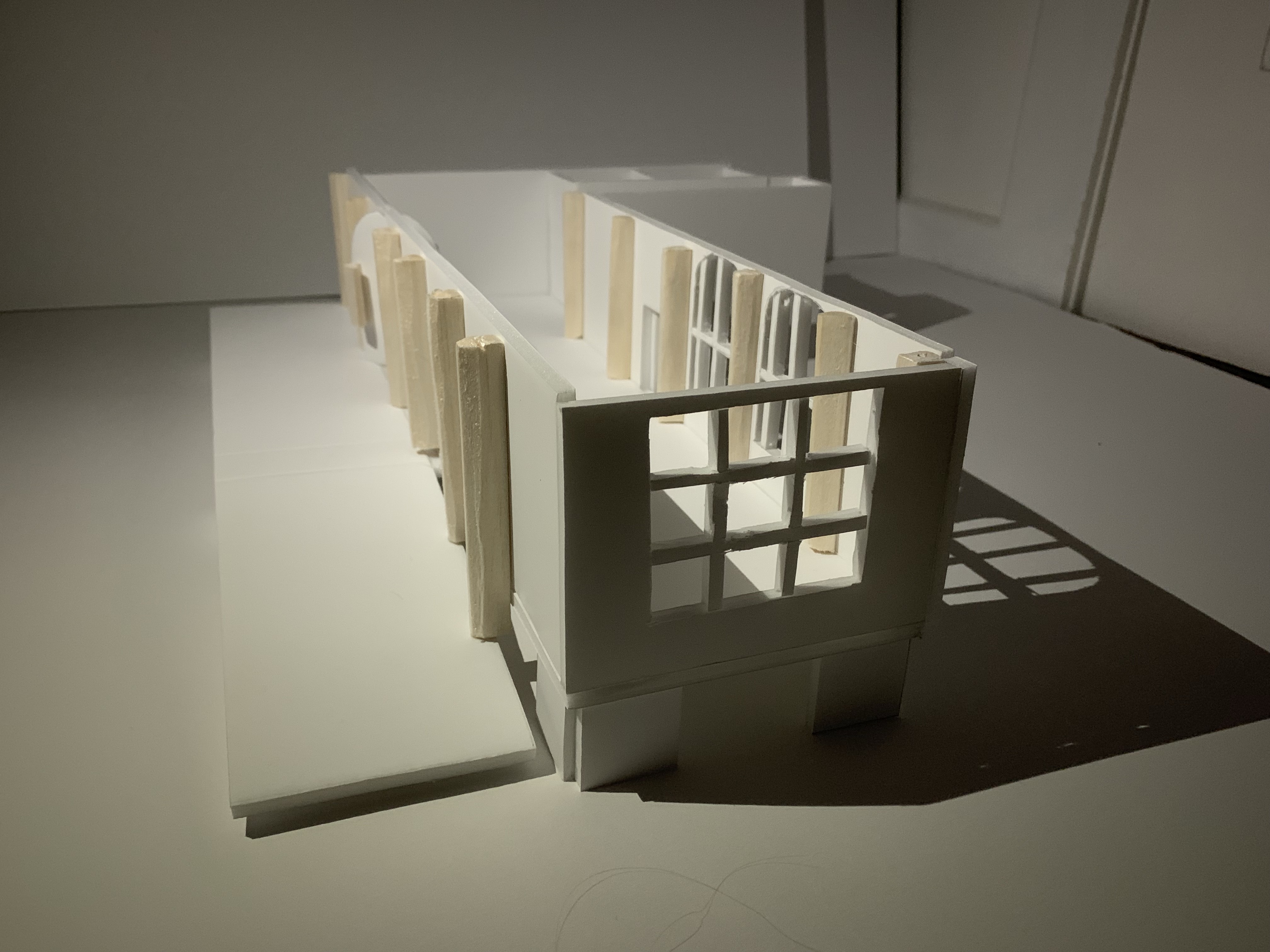
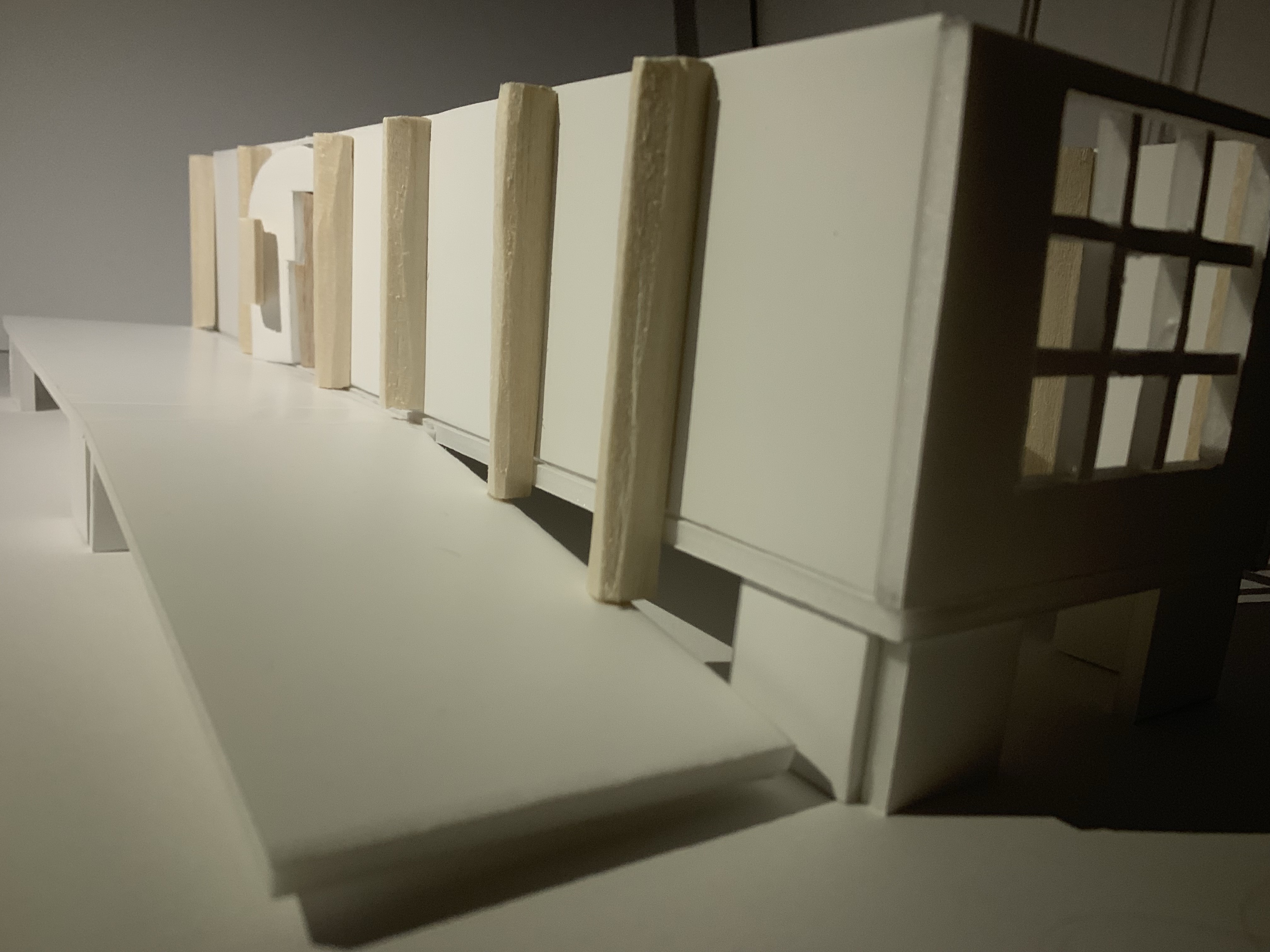
For the final part of my model I wanted to add some of the exterior elements to show the effect of a main pathway to my intervention.

For my model I have created the gallery site in a 3D sense, with the addition of my threshold intervention. I have created a rotating doorway that entices you into the gallery space. Handles in all different directions where you enter and exit the site whatever way you wish, there are multiple options, just like peoples actions and movements everyday. I wanted to reflect how movement impacts an atmosphere through my doorway, where on the exterior side there are many handles and entry points – to be quite chaotic, yet on the interior side the doorway is hidden where you have to explore to find it. I also wanted movement to be created through the body when entering the site as I created a doorway where you reach up high, down low manoeuvring and manipulating your body. To add to the interest in the doorway I wanted to use contrasting materials of the outer doorway being made out of a thin layer of concrete, a solid material, yet still moveable with some forceful effect and the inner doorway and handles to be made out of timber, a much lighter material. I chose to do this as I wanted to explore and think about whether which atmosphere you are coming from heading in or out of the site would impact the doorway and material you choose, and therefore affecting your bodies movements.
Modelling Thresholds
03. 04. 19
Once I had completed my model I decided to take some close up, atmospheric photographs of my model to show how my design would look in the public space. I also took these photos to help imagine how my threshold design would look in the eye of a person, to be viewed in a real life setting.
Presentation
29. 04. 19
Today in class we presented all of our work from Part Two in a critique setting. Our presentations were composed of a Site Map, Floor Plan Drawing, Section Drawing as well as our scaled 1:50 model. We all went around the studio presenting our works followed up with some feedback and comments. Below is a photograph of my presentation.
I also decided to create an abstract to go along with my presentation in order to create some clear, concise points as well as practice reflecting on my overall ideas surrounding project two.
For my abstract I wanted to describe my initial thoughts and impressions and how this eventually evolved and developed through my drawings and model. After we each had presented our work we all got some really helpful critical feedback and reviews of further ideas and transitions our projects could make and how we can expand on our findings. Particularly for my presentation my feedback was specifically on my threshold plan and section drawings and how my drawing quality could be represented and developed through my intervention more. My drawings have a very soft, delicate notion whereas my original intervention was very solid and more rigid to connect with the existing building. Whereas my feedback was to expand and draw from these delicate qualities in my drawings to be more playful, bold and fluid with my intervention – This could possibly be through materiality choosing a fluid, gentle fabric or even through looking deeper into this repetitive tracking pattern present in my drawings to create a woven stitching effect.
Project Three: SLEEP/WAKE
Design Workshop 1
01. 05. 19
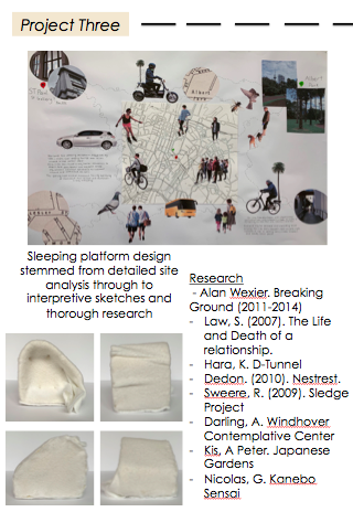
Today in class we were introduced to Part Three of our Sleep/Wake design project “TWO STRANGERS”. In this third and final part of the overall project we will be developing our concept designs and discoveries from Parts One and Two into an ‘unconventional accommodation for two strangers’. Using ST PAUL Street Gallery Three as our site space, we are to design temporary accommodation for two strangers, a place that explores and uncovers the thresholds between sleep, wake and interior, exterior in a whole new light. As well as creating spaces to transition from the sleep/wake state (sleeping platforms), we are to also design areas for socialising, washing, cooking, working and even a bathroom, liveable and functional spaces. The inner connections between these shared spaces and how they are to be translated and inhabited are crucial to the overall design experience and layout. Each detail, surface, fabrication, materials, fittings, structures and atmosphere is to be carefully considered, emphasised and applied with great precision. As well as this we must also consider the overall aesthetics and interior qualities throughout the space, such as colour, texture, furnishing and lighting, in order to reinforce and ‘advance the experiential narrative’.
We began the studio session introduced to contexts talks surrounding initial designs and considerations for how we could compose our spatial layout as well as beginning thoughts for possible sleeping platforms. To start getting ideas flowing we were shown different works and interpretations surrounding ideas for sleeping arrangements/areas for transitioning between sleeping and waking. One particular work that stood out to me and intrigued my first design thoughts for this part of the project was a work by Alan Wexier titled Breaking Ground (2011-2014).
This piece of work in particular highlighted the significance of being either physically, mentally or emotionally removed or distant from someone. There is a clear distinction between what we imagine as two people where they are composed within the same space, yet are separated and secluded to their own area. I love the way that their is this clear distance, yet I find it interesting how Wexier has detached and disconnected these two ‘people’ but still allows access to reconnect and come together, their separation is impermanent. These particular elements of being distinctly separated in a temporary state, a area that can be interpreted and inhabited in many possible ways is how I wish to convey and design my accommodation space.
Once we were introduced and shown various artist design examples we began considering our own design arrangements and sleeping platform. We began drawing initial ideas and sketches for our sleeping platform, making various, quick designs. At this point my mind was flooding with different ideas for different aspects within the overall site layout. At this point I wrote down various ideas, thoughts and feelings I had in regards to this new concept of introducing two strangers into the space. I wanted to make the sleeping platform the main feature of the space, and therefore process and filter the rest of my design around it. Below is my initial drawings and ideas page.
While creating these sketches, as well as letting my first thoughts and ideas come forward I was also considering aspects from my previous Part One and Two projects and how I could further explore and expand on those ideas in my design. Once we had translated our initial ideas onto paper we then created a quick mini cardboard model of one of the various compositions and design ideas for sleeping platforms. My model consisted of various horizontal and vertical platforms joined together, which ultimately didn’t turn out exactly as I had envisioned as it was difficult for the model to stay together and be structurally sound. However this was a good way for me to consider this design idea and how it could be rethought and designed to work within a functioning space.
A1 Site Map Review
02. 05. 19
After yesterdays studio session I decided to revisit my site map, in order to start to fully construct and compose my design ideas and decisions. From Part Two of the project, particularly looking into my site map analysis, I wanted to create, extract and expand on ideas in which I had uncovered and discussed within Part Two to bring into Part Three. Referencing to my site map and the emphasise created on the sites tranquil, serene and composed space in relation to the energetic nature of the outside world, I wanted to further expand and explore these ideas.
By retaining and revisiting the ideas and features demonstrated within my site map, this will allow me to fully clarify, create and throughly design the interiors within the gallery site. I will continue to explore the original ideas of my site map by further developing this discussion around the nature of movements both inside and outside the site, as well as how these movements impact our relationship within a certain space/environment.
Design Workshop 2
06. 05. 19
Today we started off the studio session by reviewing and discussing each of our sleeping platform design prototype models and initial drawings. In our table groups we began by presenting and explaining our original ideas and sketches to each other, followed by our platform model. It was really good to express and try describe to each other what we are envisioning to create, as well as get some advice and outside ideas and opinions. This particularly helped my design process and allowed me to gain more confidence in where I wanted my design ideas to travel. Once we had presented our model and sketches to each other we joined together with three other table groups, where each table chose one design to show the overall group. Getting to view and understand others work was really helpful for my design as it sparked new ideas and design creatives in which I could apply throughout my own accommodation space. Viewing these other examples really emphasised to how we each interpret the site and design in our own individualistic way.
For my design, when it came to presenting and showing my ideas and drawings within the table group, I struggled to fully compose my idea into one clear, precise concept. I had so many different design ideas in my head of various platform compositions that I could explore further. I explained all my ideas to the group in order to get their design judgements on which of my ideas had the most potential to develop and evidently demonstrate my ideas. At this point in the project, from the first studio session as well as thinking over the weekend I had two main ideas for possible sleeping platforms, with both ideas allowing the two strangers to encroach on the space however they chose. One design idea was a sleeping platform referenced to a puzzle like composition. This idea sparked from my threshold design in Part Two as the rotation movements within my ‘entrance and exit point’ I wanted to consider exploring further. This platform would be composed of various platforms that could be rotated, moved and flipped into different layouts in which the two strangers would occupy. The second design idea still continued to explore this ‘movement’ idea but not in a physical sense. This idea would consist of a more enclosed ‘pod’ shaped sleeping environment where each stranger would have their own distinct space to transition from the sleep/wake states.
While considering which idea I wanted to develop onwards with I had to start considering the overall layout of the site and all its amenities. I needed to start considering the full picture in order to confine and develop further on my sleeping platform design. I have to now consider all the other elements that will make up this accommodation space. How did I want my two strangers to interact? How did I want them to feel in the space? In order to do this I needed to fully imagine the experience I wanted to create whilst in the site. Even down to its finest aesthetic details, as every component impacts the complete, sensory atmosphere and experience. I began writing down all my thoughts on various experiences in which I could create within the site. I did this as I needed to release and write out all my internal thoughts so that I could start gathering which ideas to explore further.

Materiality and Detail
After all of the group presentations and discussions we had a materiality and detail context talk, as we now began to add another element onto our design considerations – Materials. The overall materiality, detail, construction and craft that is to be implemented into our designs is extremely important. We were briefed on all the different components we need to consider whilst figuring out the aesthetic and sensory details within our designs. This could be the surfaces, depths, colour, touch, sound, scent and even temperature. The space between each and every element needs to be deliberate and thought out. The surface structure amongst our designs can have a massive impact on not only the appearance of a space but most importantly the atmosphere, sensory qualities and ones experience within that environment. Some of the main materials in which we are to consider, compose of timber, metals, stone, plastics, glass, textiles and ceramics. These materials and the relationships between them through joints, fixings, hardware, connections and the space between these elements will have a massive impact on our accommodation design, therefore making it crucial that our material choices are done thoroughly.
After this design workshop and materiality and details talk I decided to start researching into various materials in order to differentiate which ones I wanted to incorporate into my design. In my design I knew I wanted to create a calm, sensory space that fully expressed the impressions and experiences the site originally created. I want my space to completely contrast against the outside world and the experiences we foresee in ‘that’ kind of an environment. In order to do this I knew I wanted to use natural materials such as timber throughout my design. As well as these natural materials I also wanted to incorporate fabrics and textiles into my accommodation space as I believe this will exemplify the calming, peaceful qualities I’m wishing to create.
Research
07. 05. 19
In order to fully understand the atmospheric conditions I was wishing to create as well as how to essentially create them I began doing some self research. Particularly I found a blog post from House Beautiful, an interiors creative company in the UK which explains how natural materials can create a calm, energising home. “Our home is our sanctuary; a personalised living space where we eat, sleep, make memories, spend most of our time and disconnect with the outside world”. Heath expresses how using natural materials gives us wellbeing benefits and improves our human connection to nature. She states how there have been several studies done which prove spaces that are based on Biophilic Design principles have wide-ranging psychological and physical benefits, from improving sleep to reducing stress levels. She also expresses how there are key factors which demonstrate how the use of natural materials within a space can positively impact our wellbeing. According to research from the Wood Window Alliance it is said that 49% of people believe that having natural materials in their homes makes them discernibly happier than artificial materials. It is also said that we are to embrace the love of Lagom, a Swedish way of living more. It revolves around declutter and taking only what you need, a way of living which sustains an organised, tidy, minimal environment to create a clear, cleansed mind.
Heath, O. (13 Aug 2017). 3 Key Ways how Natural Materials can create a Calm, Energising Home. House Beautiful. Retrieved from https://www.housebeautiful.com/uk/decorate/a2207/using-natural-materials-calm-home/
Watts states how most of the world is urban, and it is continuing to increasingly become more urban and industrialised. There are more and more cars, noise, pollution and even stress compacted into our lives. Especially in a busy city it is very hard to sustain or find a sense of calmness and tranquility in our everyday lives. In order to predict the tranquility of an environment, they have developed a Tranquility Rating Prediction Tool. The tool measures two main factors, the level of man made noise, most commonly traffic as well as the percentage of natural and contextual features in view. This includes elements of view of natural objects such as greenery as well as if a place has view of historic or religious buildings. Greenery allows for a screening affect against buildings in a busy street. In order to boost the tranquility within an area you have to reduce as much man made noise as possible. Allow for the natural sounds to be received and the unnatural sounds to be retracted. As well as this increasing the percentage of natural features or views of these features can create a strong sense of calmness as it detracts against man made structures.
Watts, G. (18 Aug 2017). How tranquil spaces can help people feel calm and relaxed in cities. The Conversation. Retrieved from https://theconversation.com/how-tranquil-spaces-can-help-people-feel-calm-and-relaxed-in-cities-82358
“Under most circumstances, entire buildings, sections within, and individual rooms are designed specifically for how they are intended to be used — generally speaking, how it all fits together. More uncommon are spaces with a primary purpose based on experience or observation. That is to say, an architectural construct that is not designed for efficiency or use, but more ephemeral, atmospheric qualities.” It is said that spaces in which create these qualities are able to allow an environment of solitude and reflection. “Effectively, spaces constructed for meditation are secluded to create a truly intimate atmosphere inside”. Aura, character, feeling, tone, and quality are essential elements into composing a harmonious, calm, sensual and relaxing experience for the mind, body and soul.
Golenda, G. Architecture, Body and Mind. Architizer. Retrieved from https://architizer.com/blog/inspiration/collections/meditation-pavilions/
Design Workshop 3
08. 05. 19
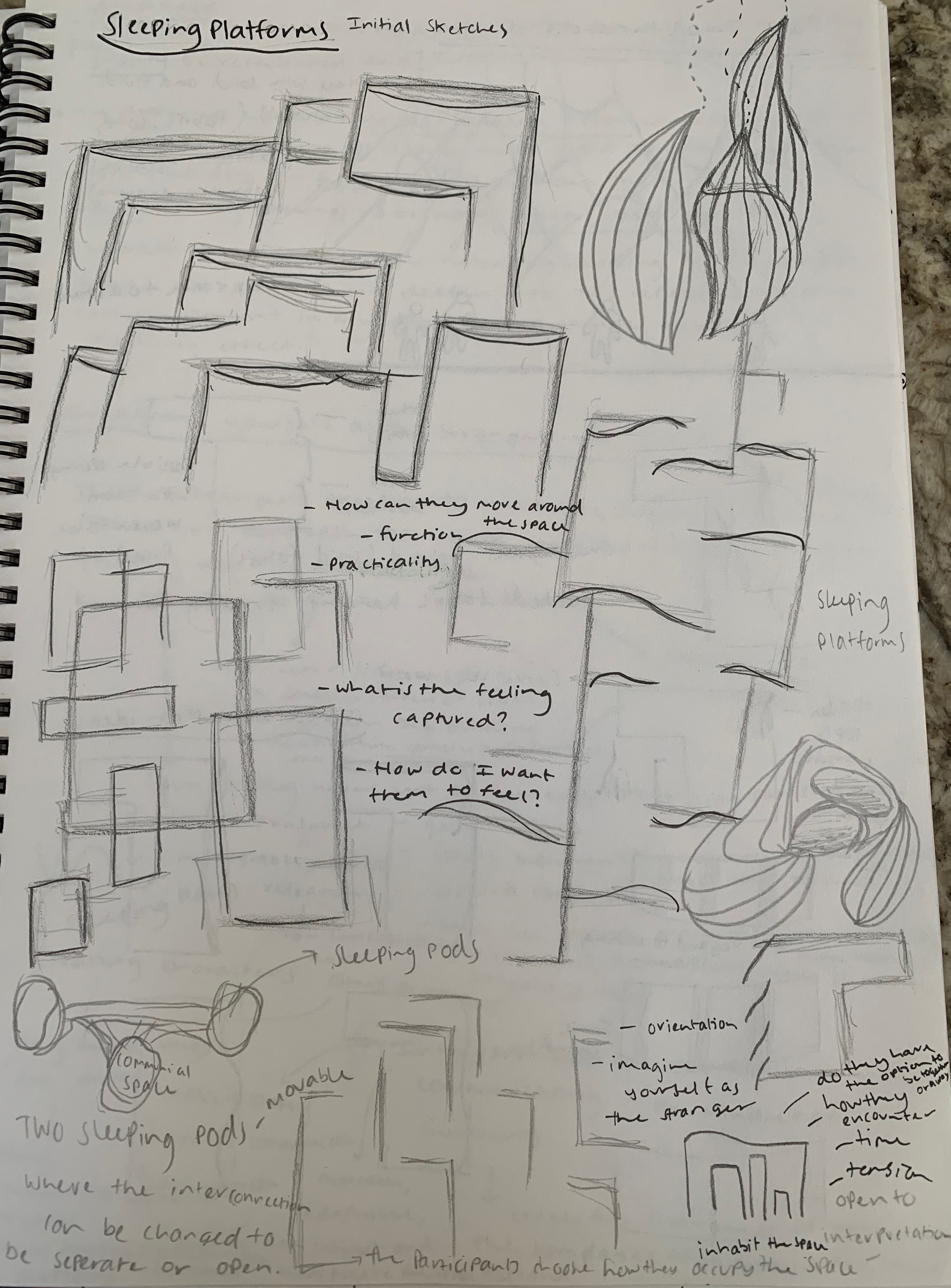
Today in the studio session we began making and crafting our scaled 1:20 sleeping platform models. Over the last few days we had all gathered, collected and researched into different materials and designs in which we could apply within our own accommodation space. I have throughly researched into different artists and their specific works in order to create and spark further designs within my ‘movement and tranquil design’. From this research from both designers and my own sensory and materiality research I decided to expand on my second design idea of the ‘sleeping pods’ for my sleeping platforms. Below is from my workbook where I am sketching and planning our various compositions and arrangements for my sleeping platform.
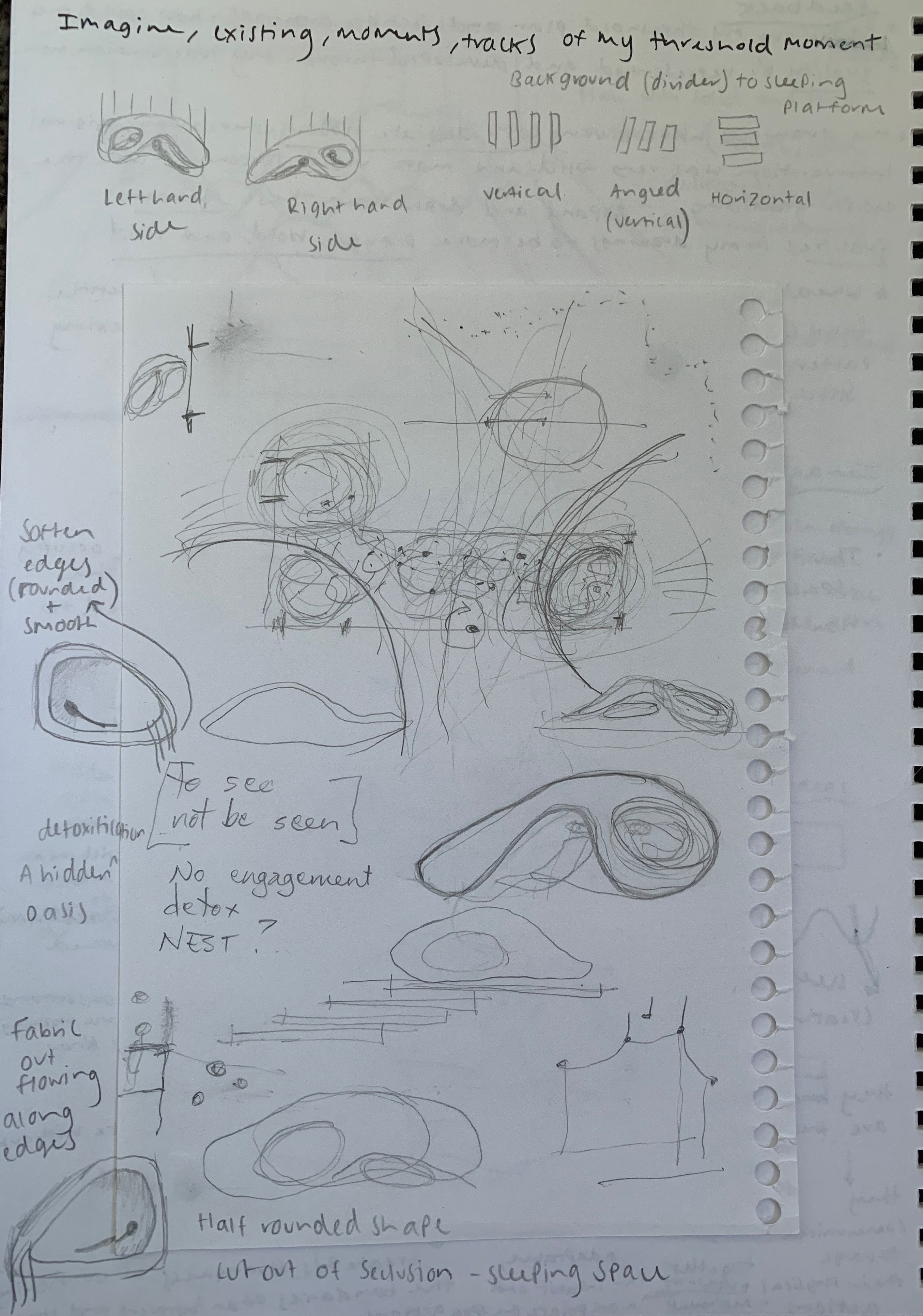
While creating these designs I was heavily influenced by the works and installations of other designers. All these designers reflected elements in which I was attracted too and very interested in composing within my own sleeping platform design. These elements included arrangement, shape design, materiality and even atmospheric qualities.

I was initially drawn to this work through the artists use of materiality. The way she has outlined forms through fabric that has been folded, wrinkled and compressed to create almost delicate, and hazy forms. The compacted and creased fabric really creates enticement and interest, as it makes you want to look more closely at the significant details. This usage of fabric I really want to incorporate into my design by overlaying a soft, comfortable fabric in a similar manner in order to create this calming yet inviting effect. The creased fabric allows the environment to look more ‘lived in’ and therefore allowing you to feel more contented than compared to crisp, flat sheets.

Within this work scale is perceptively emphasised. Hara is referring to scale in a way which achieves an equilibrium between human and dog. When looking at this work first glance I was instantly captivated by this platform effect in which Hara was able to create at such a small scale. He has created this enclosed space in which leads and travels the eye and body upwards. There is a distinct separation between ground and height. This elevation of a platform really intrigued my design idea as it lead me to consider uplifting and elevating my sleeping pods onto their own platformed space above the ground. I believe this would further exemplify my ideas surround a ‘calm and tranquil’ environment in which you would be able to feel safe and secluded within your own secure space.

Dedon. (2010). Nestrest. Retrieved from https://www.dedon.de/en/Product-Finder/furniture/nestrest 
Dedon. (2010). Nestrest. Retrieved from https://www.dedon.de/en/Product-Finder/furniture/nestrest
The product description of this designed piece of furniture states that “Like a nest scaled for humans, this hanging lounger provides an enveloping place to relax or read – a breezy, secluded retreat”. I was initially captured by this innovative, organic structure which portrays a strong sense of protection through its shape design. Dedon has created a nest depicted shape which allows for complete separation from outside movements allowing the body and mind its own space to breath, relax while feeling safe and secure. Its inviting nature of feeling enclosed due to the soft, comfortable fabric materials which lie inside, they have created a luxurious interior through decorative finishings. This more encased and confined shape sparked many design ideas with how I could replicate this ‘nest’ hue within my sleeping platforms.

Sweere, R. (2009) 
Sledge Project 
Retrieved from https://robsweere.com/2012/01/27/sledge-project/
These two commissioned designs by Sweere, constructed of wooden and insulated materials can accommodate up to six people. These small, confined spaces have been fully equipped and designed to allow people to sleep, cook and rest, all while surrounded by a striking environment. When researching further into this design I was fully captivated by how these such small spaces allow for many people to conduct all these everyday activities. Sweere has create these spaces to be completely inhabitable and controlled by the participants who are placed within that environment. This concept of inhabitability, even when constricted to such a tiny space, I found very interesting and immediately knew I wanted the two strangers whom are staying in my accommodation space to be able to inhabit and use the space however they chose most comfortable and calming for them. As well as this Sweere’s shape designs of curvature finishes and rounded edges I knew I wanted to play with in my own designs in order to create a softer appearance.
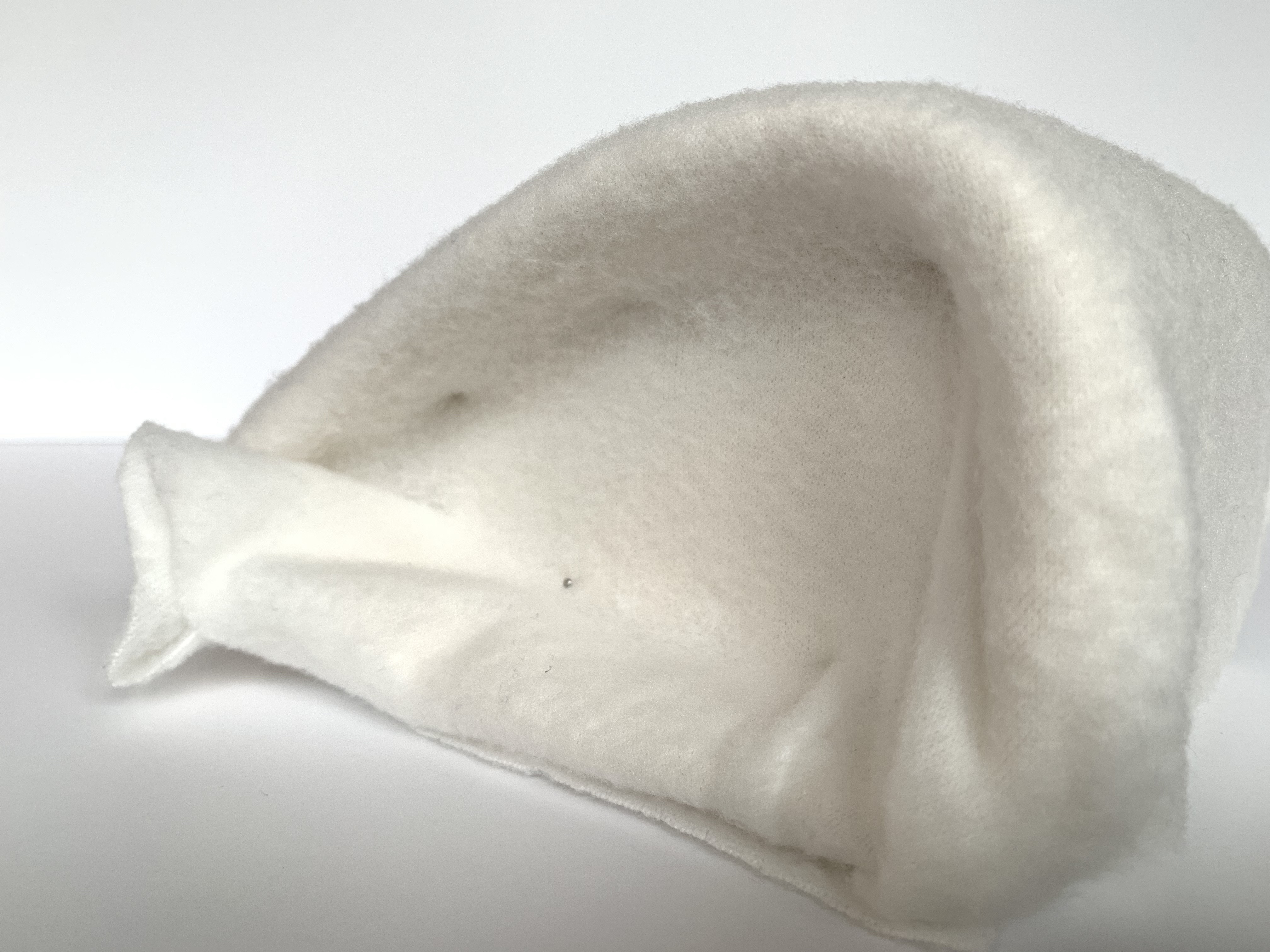
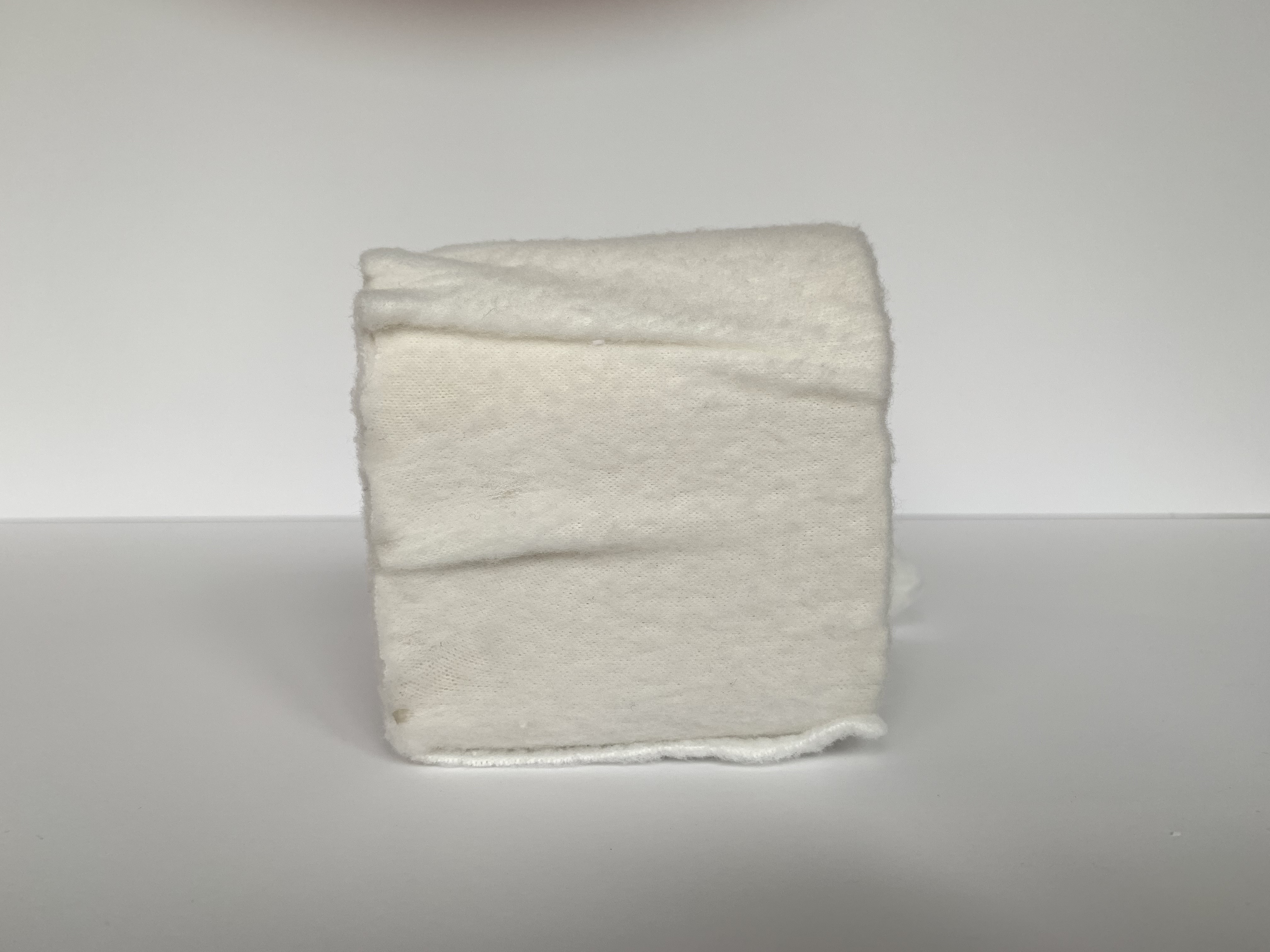
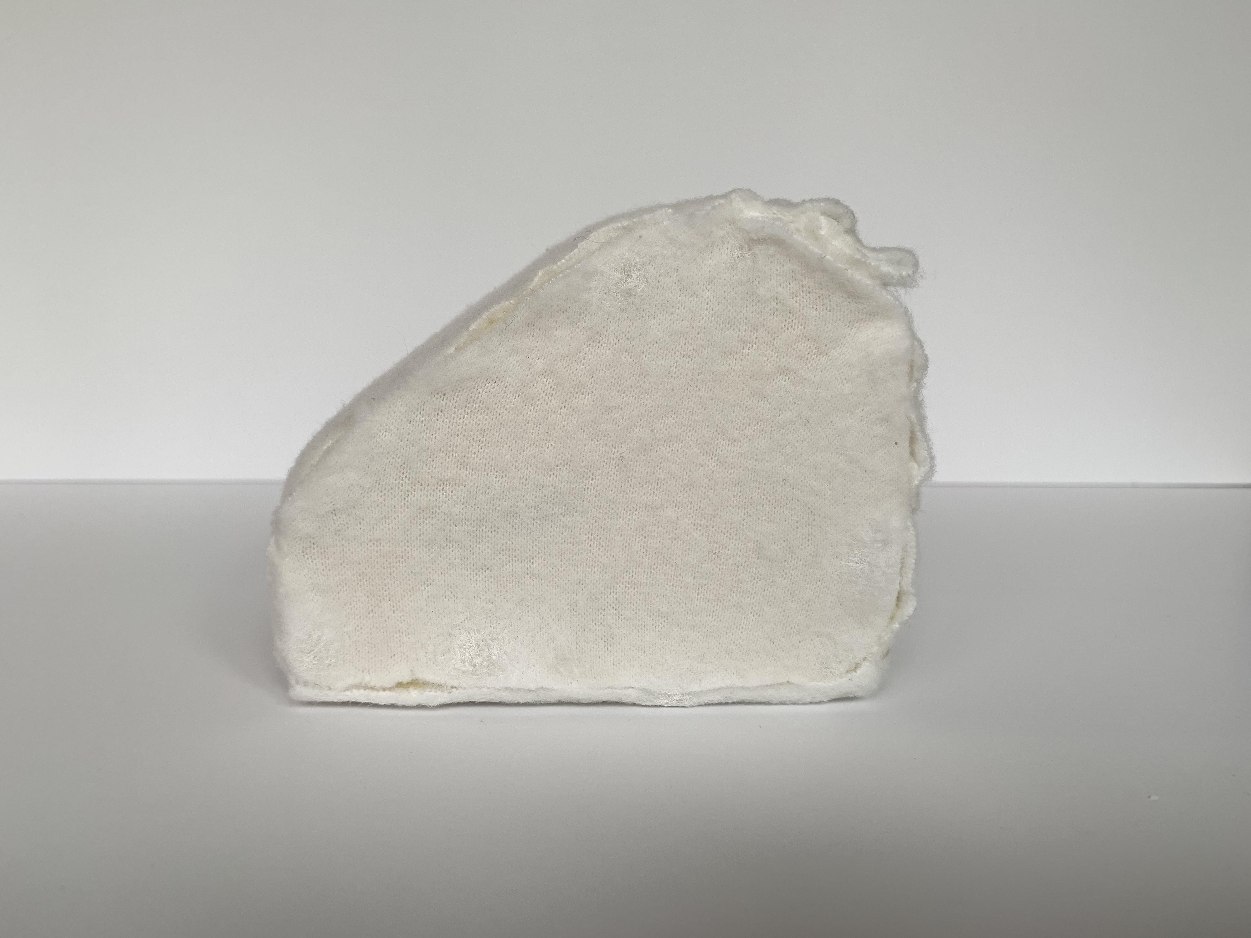
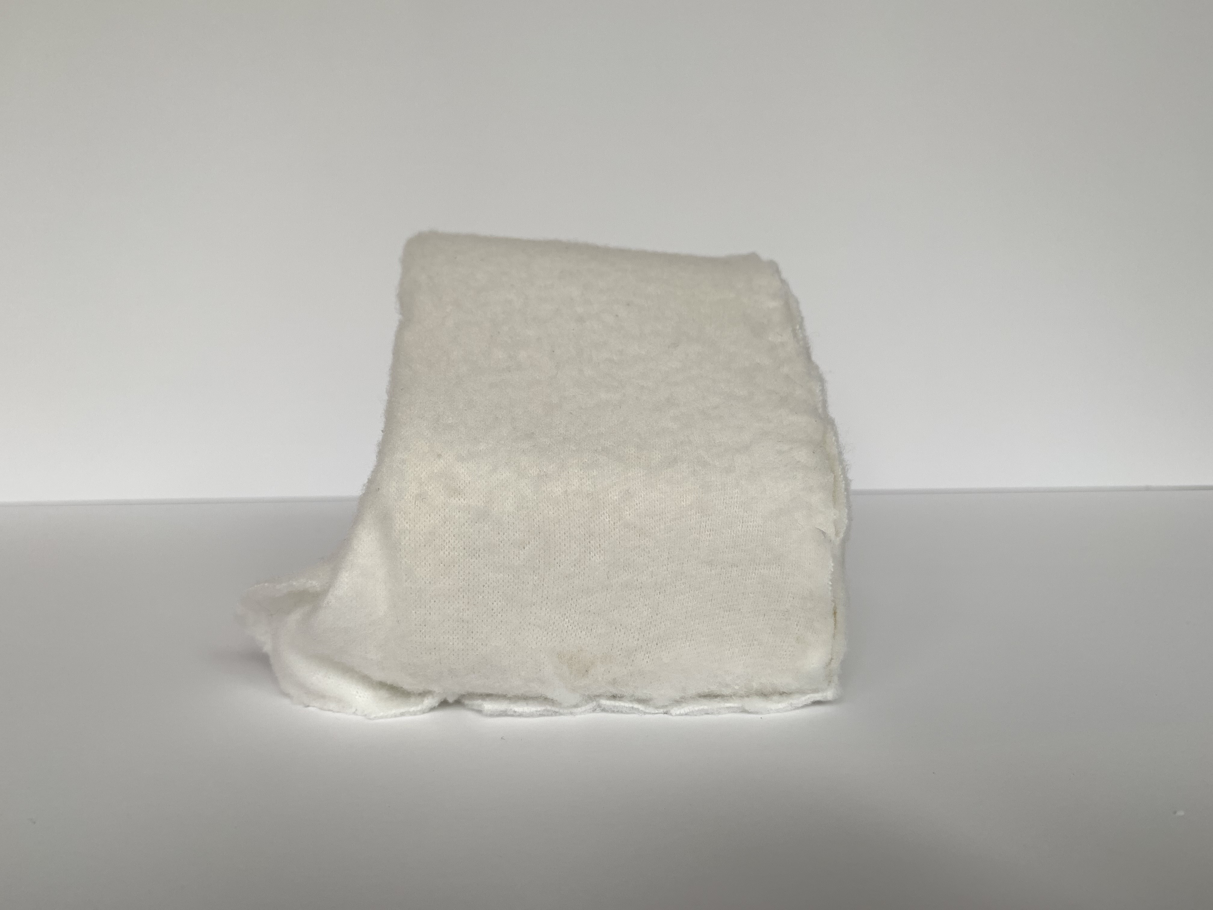
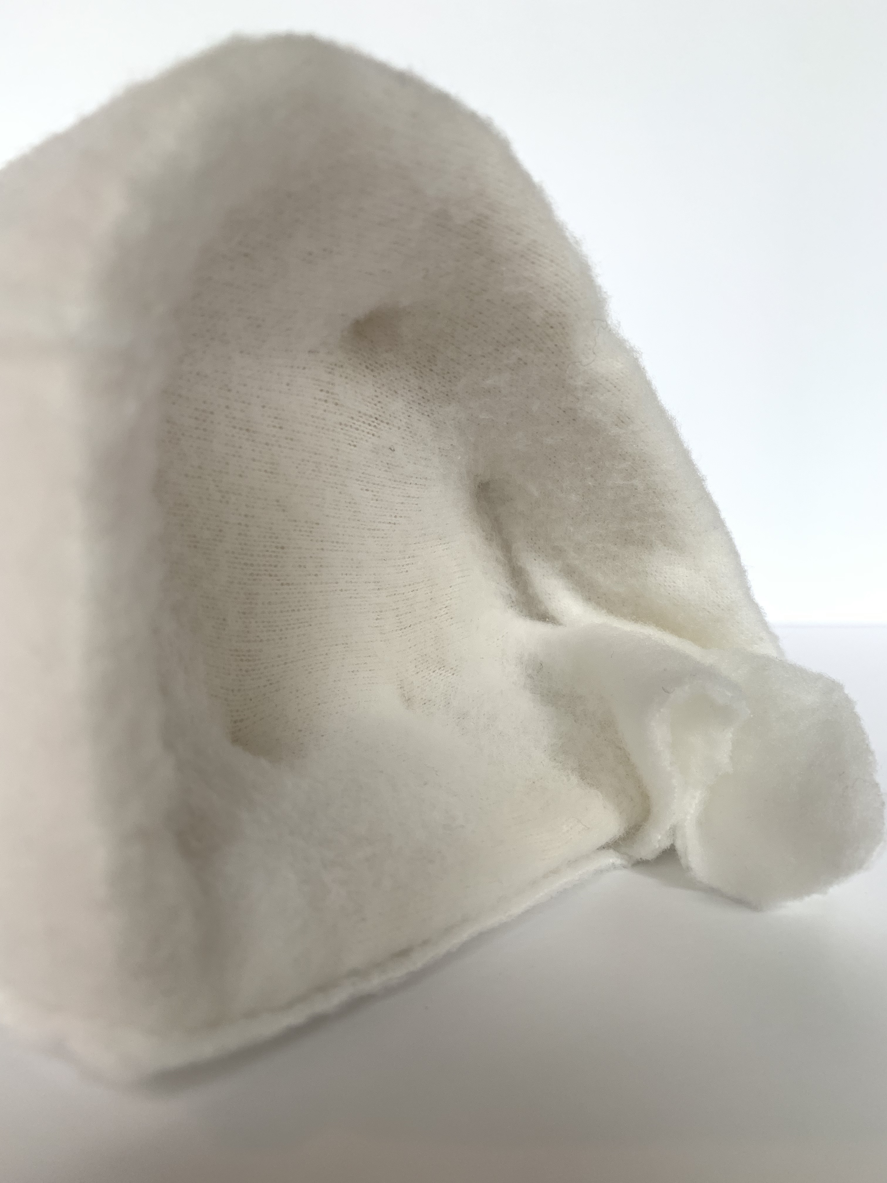
From all this research I was able to start constructing my sleeping platforms (sleeping pods). I collected and sourced all my required materials for which I would need in order to make my models. The materials I gathered were a various array of fabrics with different textures, foam, stuffing for extra cushioning, pins, adhesive such as glue as well as all the tools needed to shape and sculpt my design. I wanted to have various fabrics on option in order to gather which one would work best for my design idea.
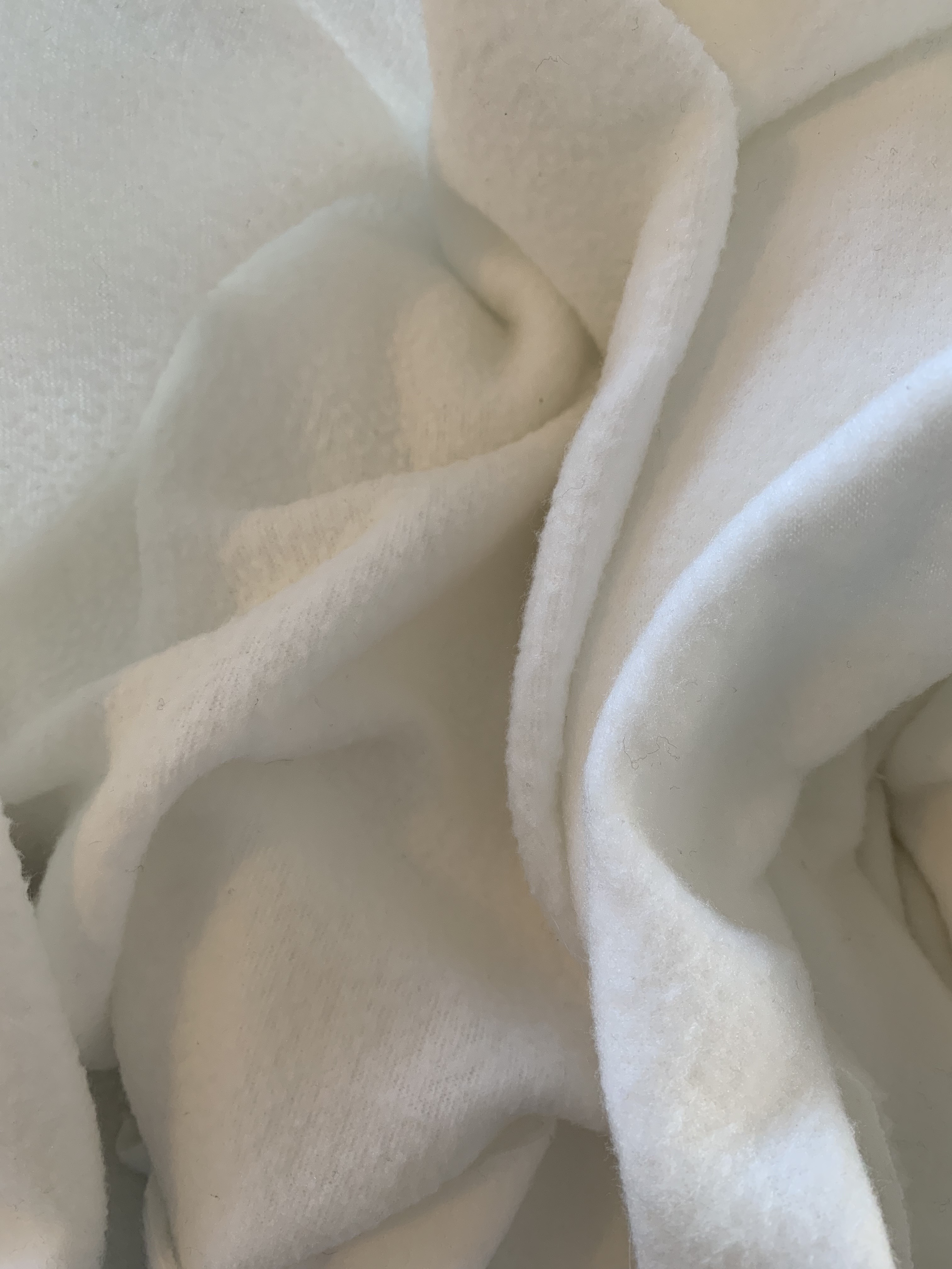
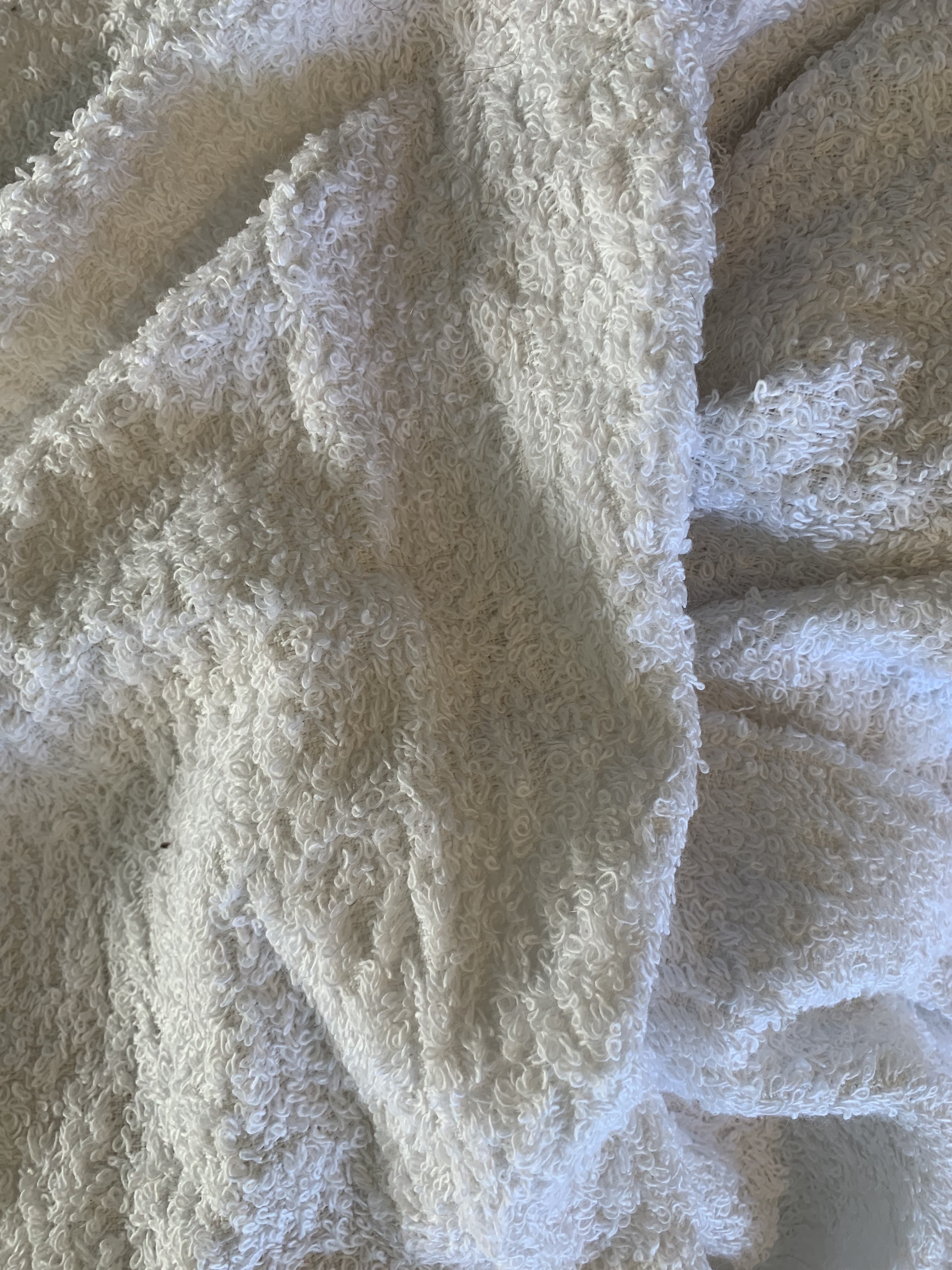
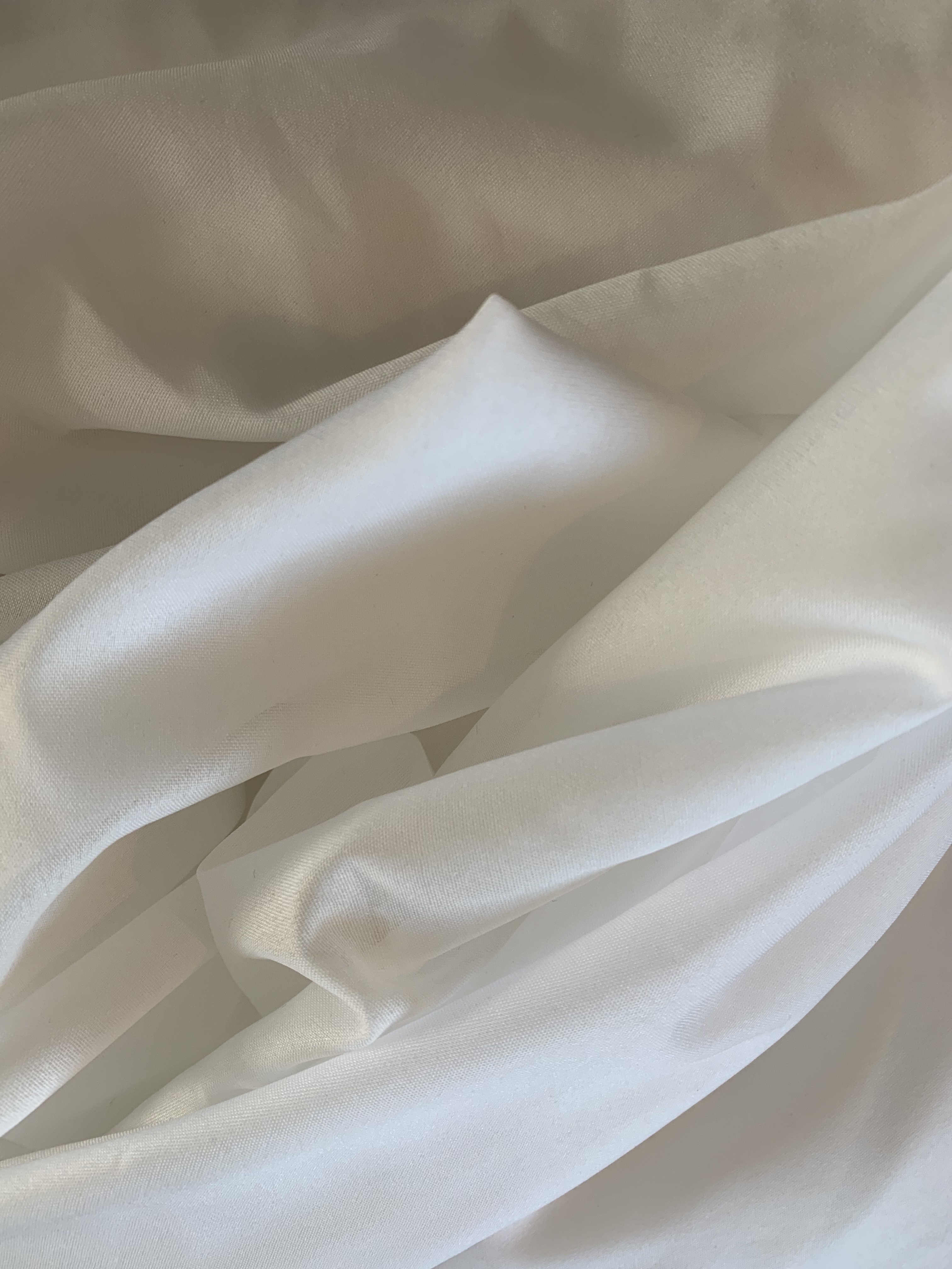
Above were the selection of fabrics I had to choose from for my sleeping platform. For my final design I decided on the softest fabric choice (far left photo) as I believed in order to create this cosy, enclosed and comfortable space that allows the participant to feel fully at ease and relax I needed an inviting, delicate fabric to do so.
I began creating my 1:20 detailed sleeping platform model. I used various cutting tools to shape and outline the beginnings of my model. I needed to carve back the foam in order to make the curvature details I was wishing to create within my design. Once I have cut and shaped the outline of my sleeping platform I then added stuffing along the bottom surface of the platform for extra cushioning and comfort whilst sleeping. I then had to covered the foam with my chosen fabric. I laid the fabric overtop allowing excess fabric to gather. This created a cosy feel, soften the edges as well as made the platform look much more inviting to curl up and sleep in. Once the fabric was secured onto the foam and placed accordingly I pinned within each side of the interior of the platform to ensure the fabric was secure on the foam. After all of this I then trimmed the fabric to the perfect length and cleaned up the edges, finalising my sleeping platform. Whilst making the sleeping platform model to a 1:20 scale, I essentially created two versions of the same design. I did this because I wanted to test out the various shape and size of the sleeping platform and how it would look to this scale. The images below are of my practice 1:20 sleeping model where I am experimenting with the shape and size of the platform.
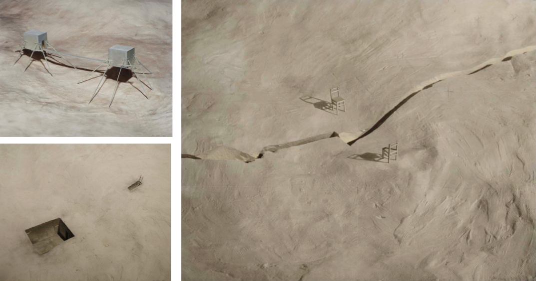
The following images are of my final 1:20 scaled sleeping platform model in which two of these (one sleeping pod for each participant) will be placed at either end of the site on an elevated raised platform design.

Design Workshop 4
13. 05. 19
Today at the beginning of the studio lesson we all brought in our 1:20 sleeping platform models to share, show and explain to our table groups. This was just a small group discussion around our models and what our plans and design ideas for the rest of the site entail. I got really positive feedback on my sleeping platform but the group was really curious as to how I was going to put my platform into the site. They were asking me lots of in depth, specific questions surrounding the arrangement and view of the platform within the entire space. Some of the questions were what do you want the person lying down in the platform to see? What is their view of sight? Do you want the platforms to be obvious within the space or more mysterious and hidden? How close together are you going to place your platforms? These questions were really helpful as it allowed me to now start to consider the overall design aspect of the site. I hadn’t fully decided on some of these design decisions so talking about it within our table groups and getting their opinions and ideas against mine was very beneficial.
Modelling Space
The next part of the studio session we had a context talk surrounding how to model the space and design the further interiors of the site. We are to fill up and arrange the layout of the site, along with the composition of our sleeping platforms design an accommodation space for two strangers. This is to include areas for socialising, washing, cooking, working and even a bathroom, liveable and functional spaces. I decided to start drawing and planning out possible spatial designs for my accommodation space. I initially knew of key aspects I wanted to include in the space in order to make it inhabitable and adaptable yet I wasn’t fully sure of the arrangement and layout position of each piece.
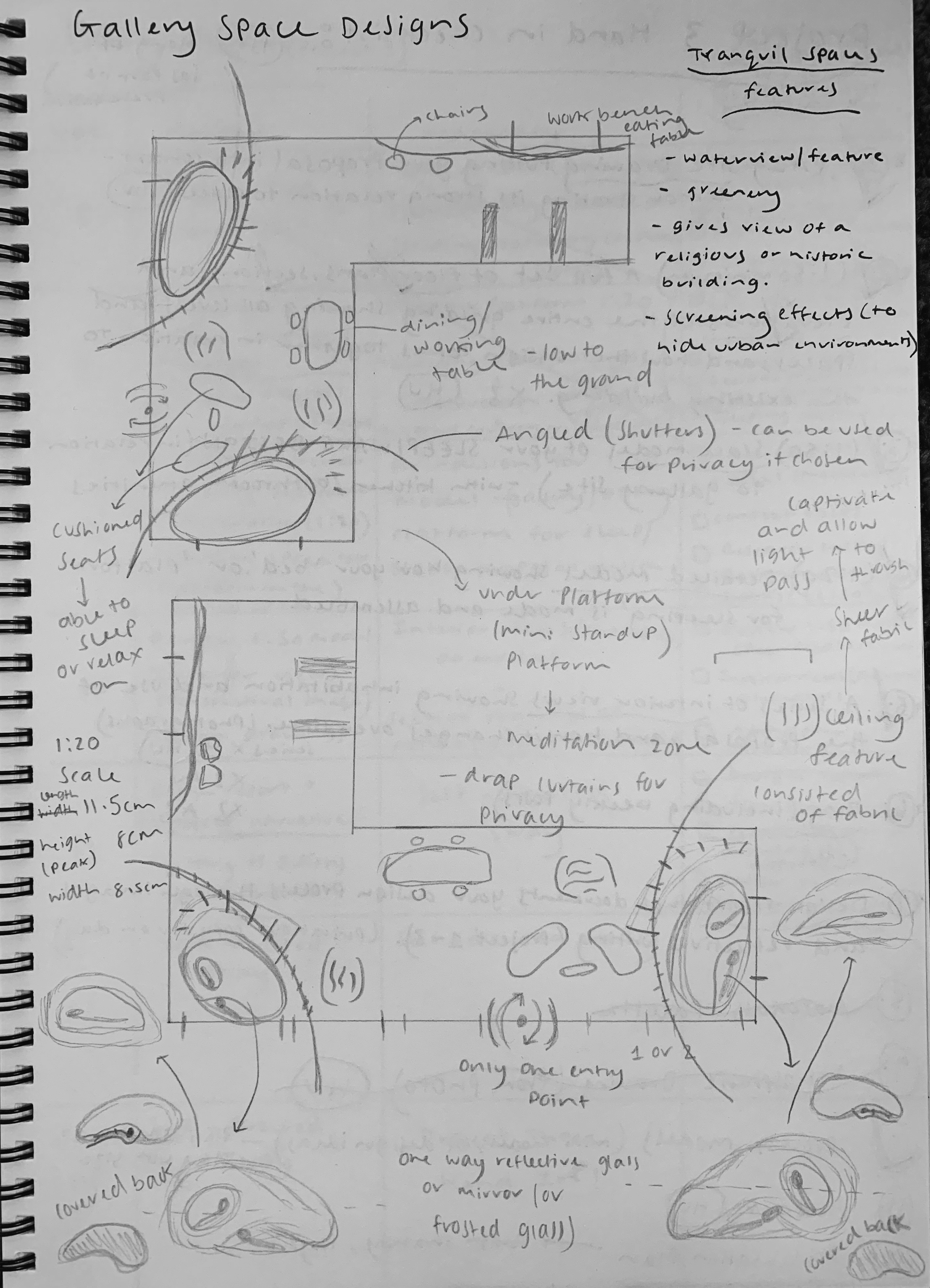
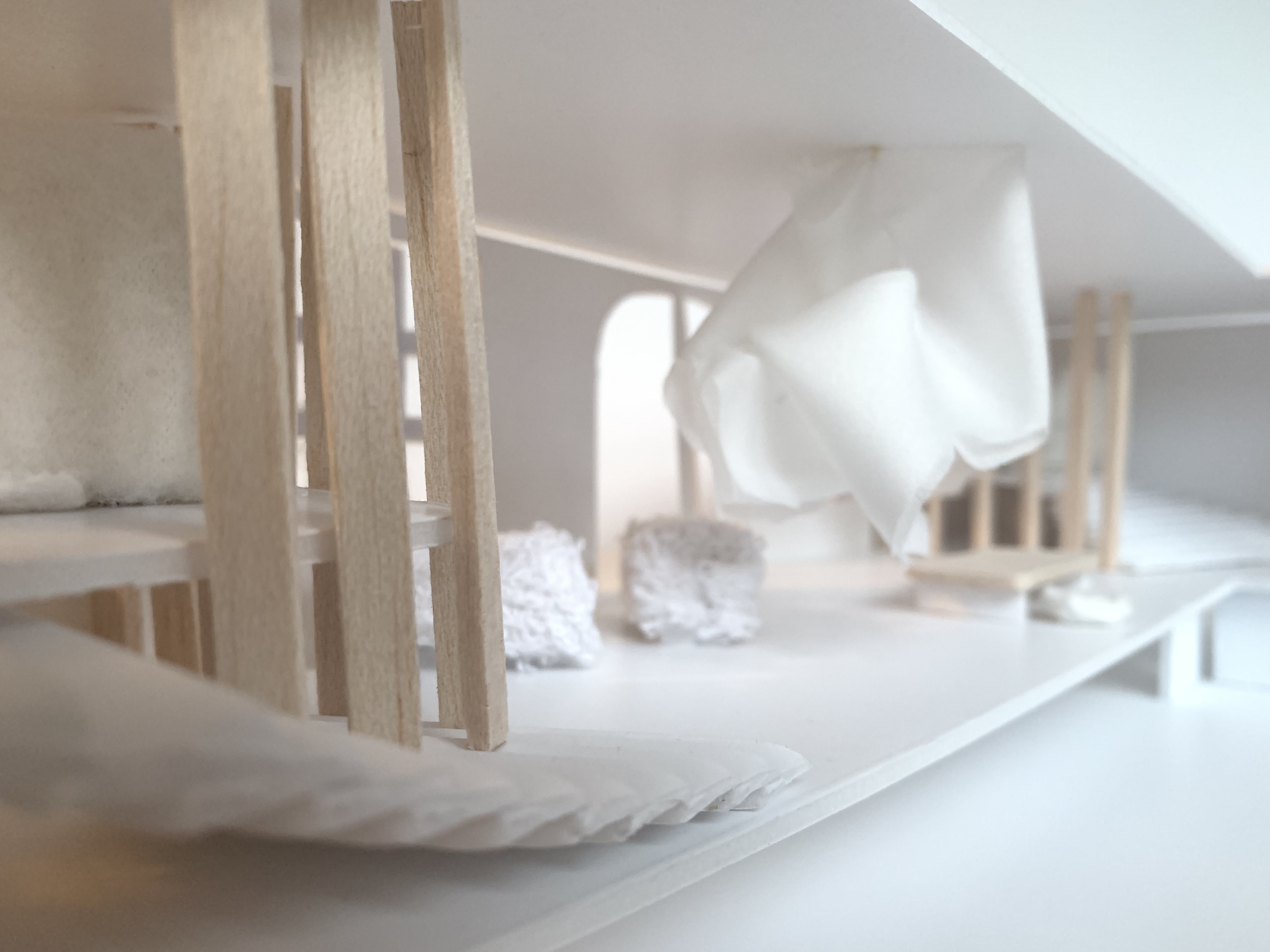
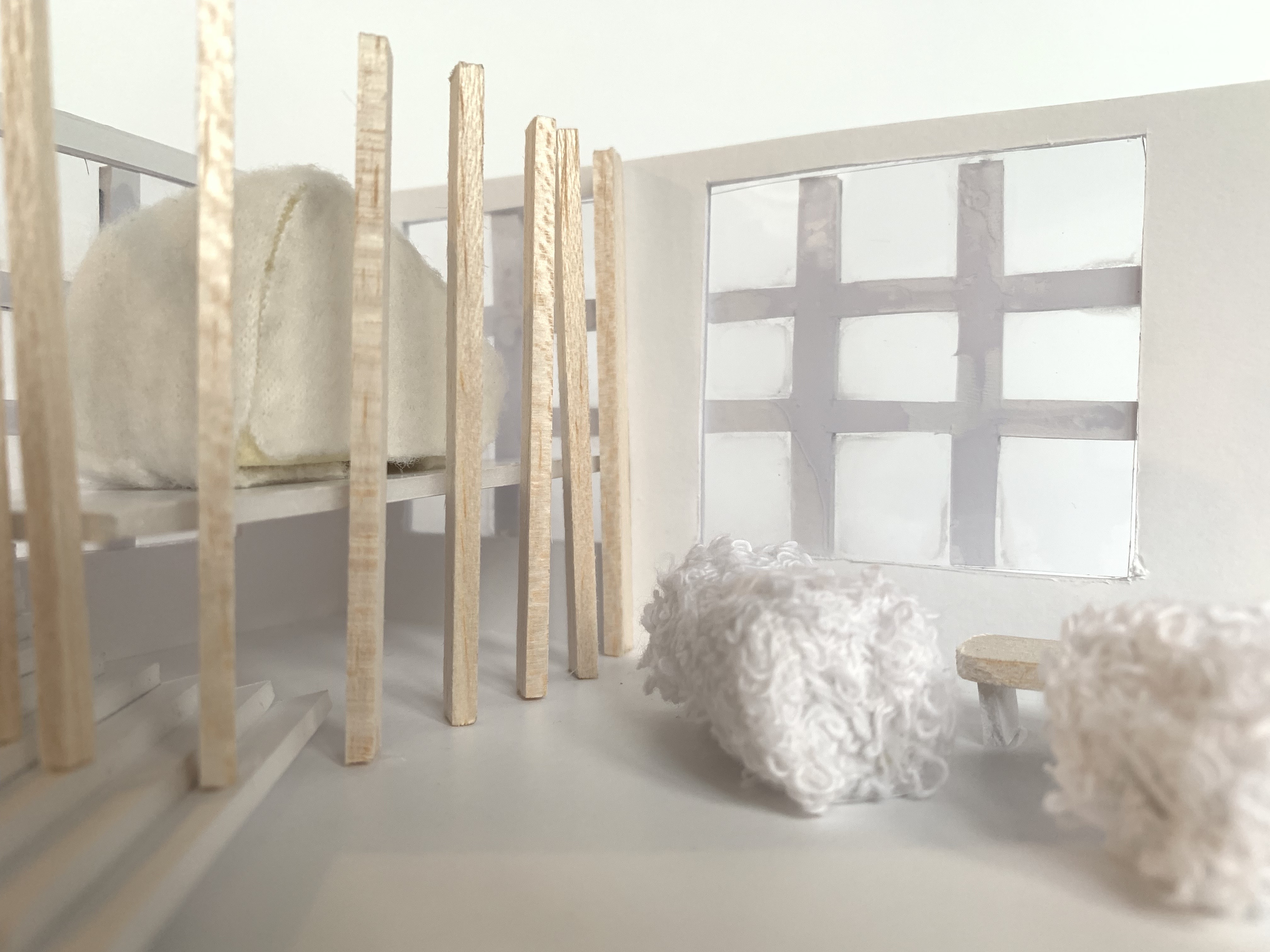
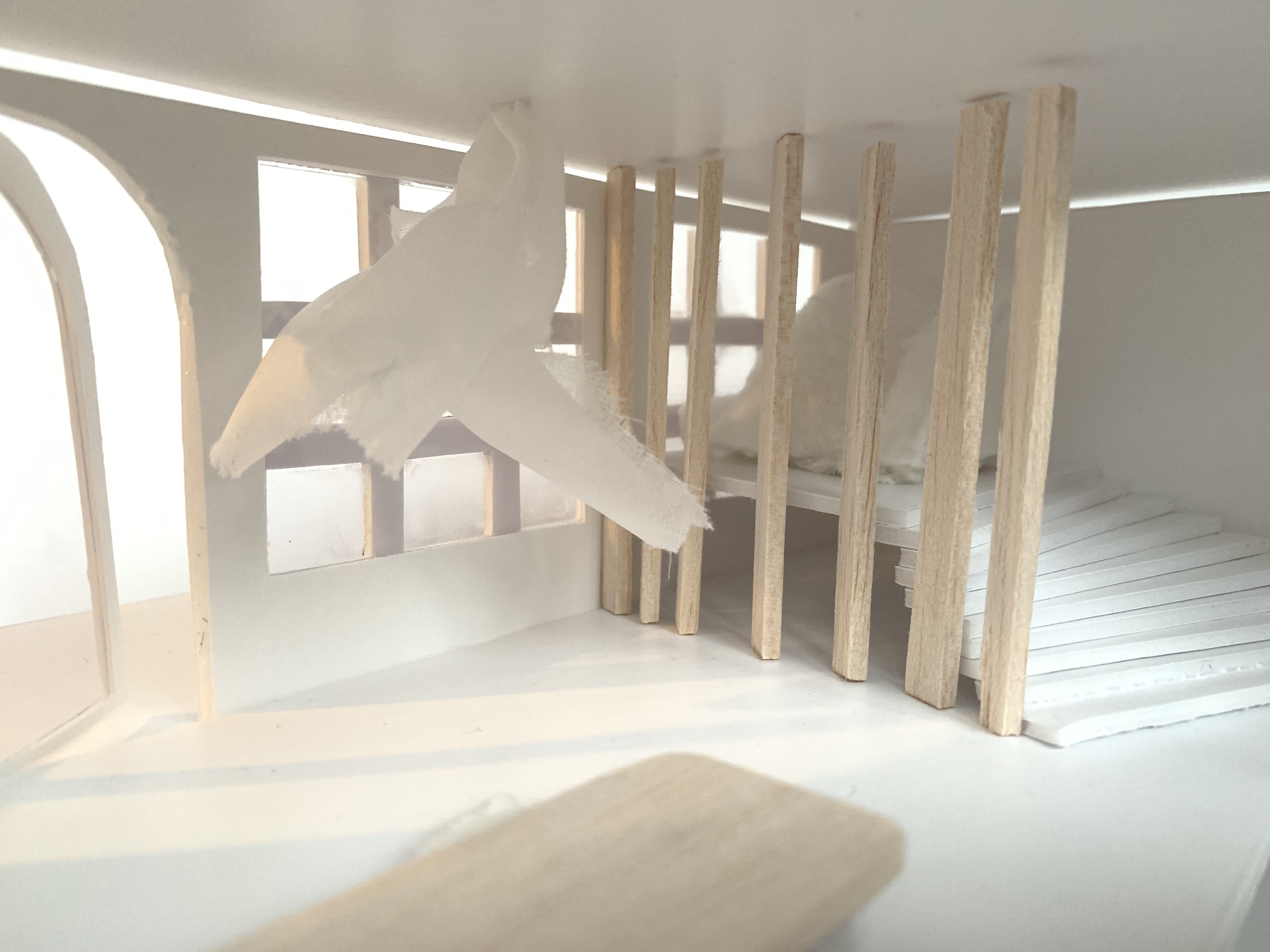
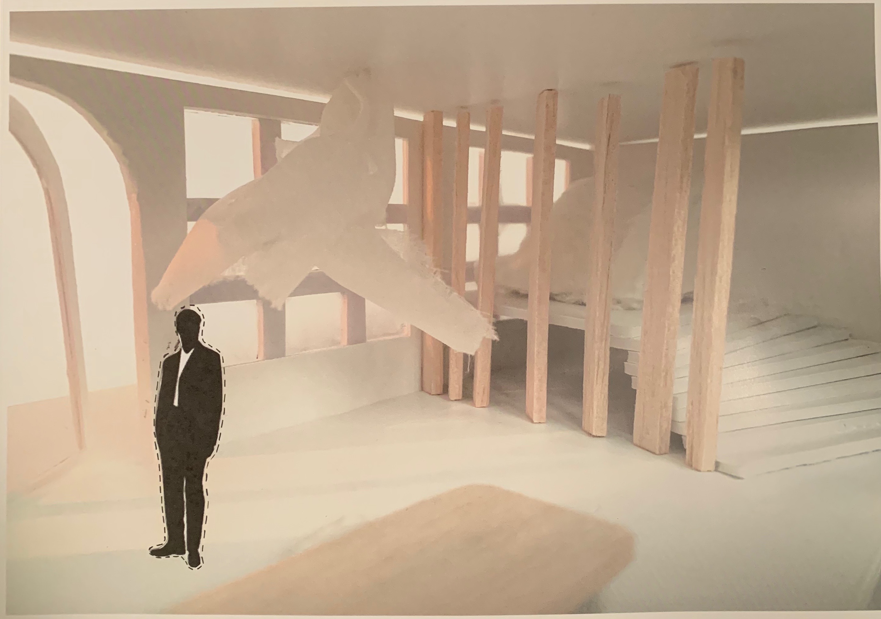
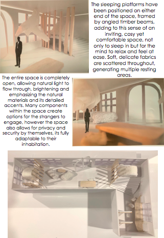
I decided to add in various table arrangements such as a low surfaced table where the participant has to sit on large comfy cushions on the ground, two large cushioned chair loungers, a long workbench with stools as well as two divider walls and two feature fabric hangings. I believe that all these additions will allow to create an inviting, calming environment that allow for the two strangers to completely detox, relax, healing both their mind and bodies from the ongoing chaos and stress of the outside world. The positioning of my sleeping platforms majorly influenced my overall design layout. I decided to position each sleeping pod on either end of the site, with both openings facing outwards towards the window, allowing full possible natural lighting as well as enjoying the satisfying nature of watching the outside world tick over in its normal routine. I have separated each sleeping pod as I wanted the two strangers to feel at full ease in their own distinct area as well as have the option to communicate and connect throughout the rest of the site – the space is fully theirs to inhabit. Angled timber beams run along the perimeter of each sleeping platform in order to allow the natural light to pass through yet also creating the private, secure environment in which the sleeping platform is to create. Throughout this entire design I wanted to keep the interior decorative palette very simplistic and minimal with features and accents of timber in order to warm up the space and create this calming atmosphere filled with soft, delicate qualities of enriching materialistic elements.
Design Workshop 5
15. 05. 19
Before creating the layout design of my accommodation site I did some research on different architectural and installations designs in which gave me inspiration on different features I was wishing to install into the space.

This particular design was very fascinating to me as I loved the impact the panelled timber beams had on the overall aesthetic of the building. This building was designed as a spiritual retreat to promote and inspire quiet reflection and provide refuge from the intensity of day-to-day ongoings. This particular idea I found very similar to the atmospheric and experimental qualities my space is being designed to create and therefore I looked in its use of wood surfaces to conduct these effects. Its ultimate aim was to portray an environment exposing and heightening the visitors sensory experience acoustically, tactilely and visually, which I believe are all really important qualities to allow someone to feel calm, relaxed, grounded and intrigued within a space.
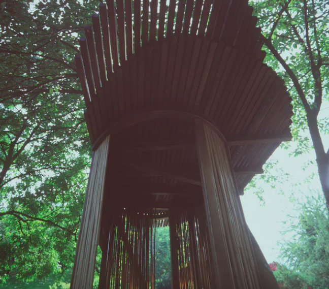
Retrieved from https://architizer.com/blog/inspiration/collections/meditation-pavilions/
I was very intrigued with the composition and structure created with the timber beams. Kis has created a structure which is made up of a frameless, curved glass wall that winds between wooden posts. Kis has fully considered his environmental surroundings and respected the lands in which he is working with. He has designed his space very purposefully and impact fully all while carefully working with the Japanese Gardens in which this site fits. I love this design as it exemplifies very similar qualities to which my whole design idea is steaming from, an ephemeral and tranquil space for solitude and reflection.

Nicolas, G. Kanebo Sensai. Retrieved from https://www.dezeen.com/2010/02/09/kanebo-sensai-select-spa-by-gwenael-nicolas/ 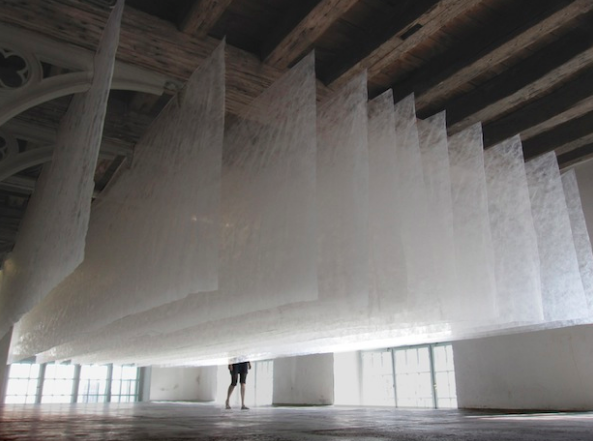
SpaceOperaForm. Retrieved from https://www.fastcompany.com/1561097/huge-dryer-sheets-static-clingmagical-installation-art
Both these art installations explore a very similar aesthetic. The way each designer has created this use of fabric hanging from the ceiling is very memorising and enticing. Both artists have used silk, sheer panels of fabric layered upon each other. The use of this fabric is to remove the outside world layer by layer to transform the mind and body. “The lighting wall created with layers of interlaced strings of fabric, as the eye loses focus, space vanishes and the mind is liberated”. The way the fabric reacts as we travel through it is very captivating. These qualities inspired how I could create a fabric installation piece hanging from the ceiling, all within the spatial design of my accommodation space.

Mason Studio. 
Interactive installation. 
Retrived from http://www.lemayonline.com/fr/collective/nuages-lumineux-une-installation-interactive
This art installation piece designed by Mason Studio has used fabric in a very innovative and unique way. Each gathered piece of puffed fabric almost resembles a cloud. This instantly connected me to a calm place as cloud watching is a well known activity to create calmness within ones wellbeing. The layering and soft, delicate nature the fabric heavily inspired ideas as to how I could create my fabric installation piece.
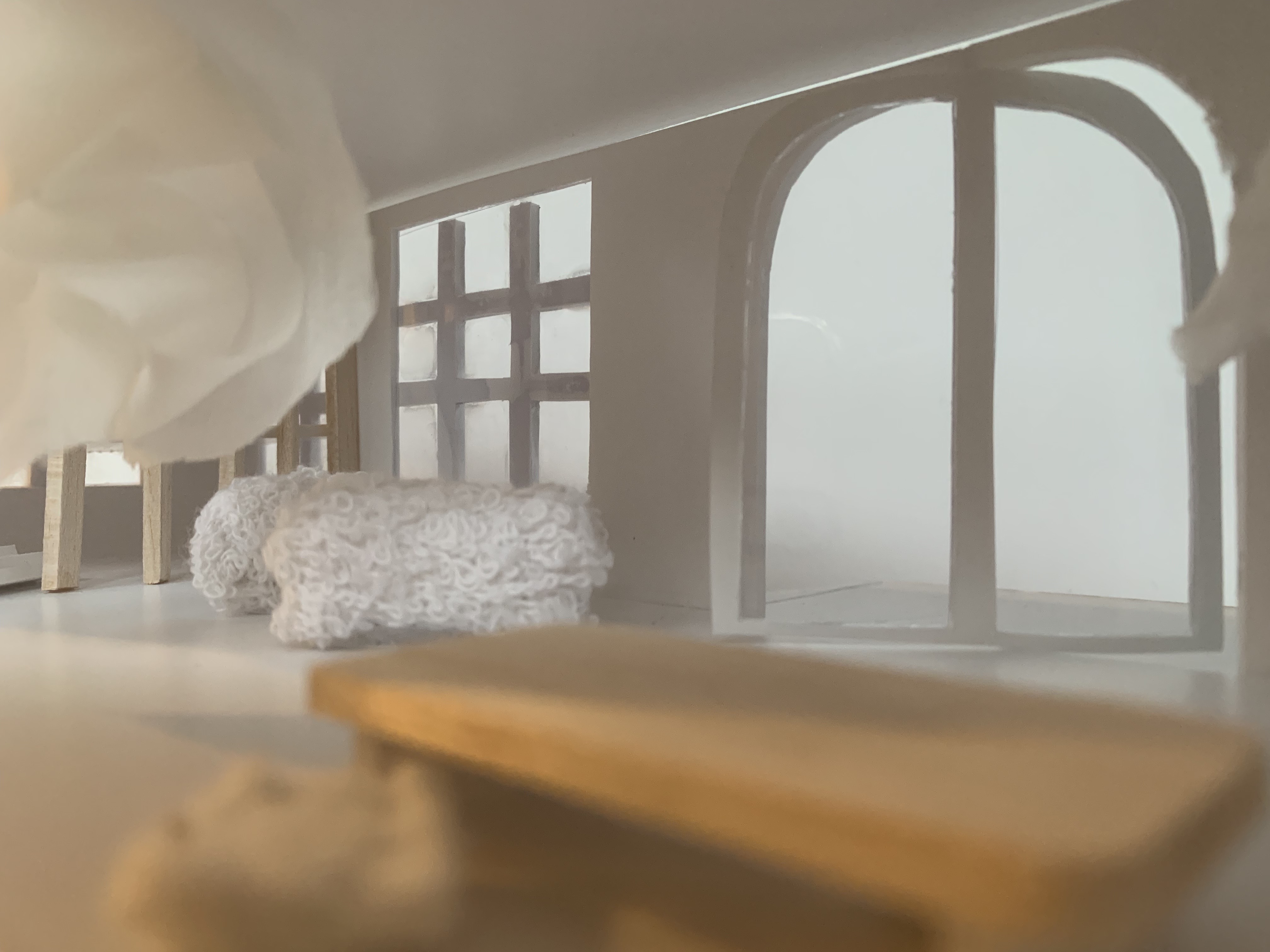
Once I had reflected all my research, drawings and design ideas I was able to start constructing my 1:50 scaled model. Following the exact same steps from Part Two I decided to recreate my 1:50 gallery site model as I wanted to try and improve on my craftsmanship and detailing from my previous model. Once I had created the base format to my accommodation space I then began creating miniature furniture and interior decorative features to fill the entire site. These additional elements really brought the space to life as it started to become a functional, liveable environment as well as let off tranquil atmospheric qualities. I used both timber and fabrics to create interest and give depth into the space, as well as portray and more ‘lived in’ quality. Below are various images of my 1:50 scaled model of my accommodation space.
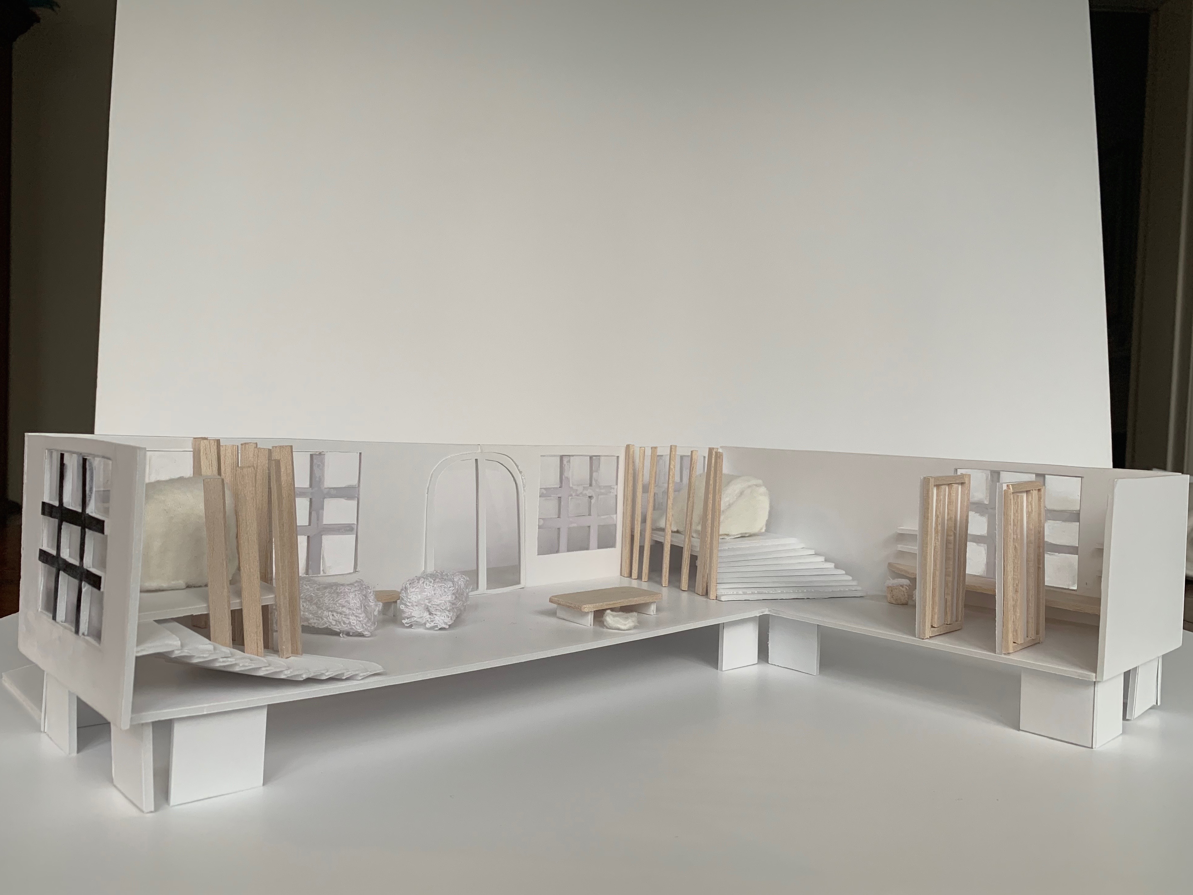
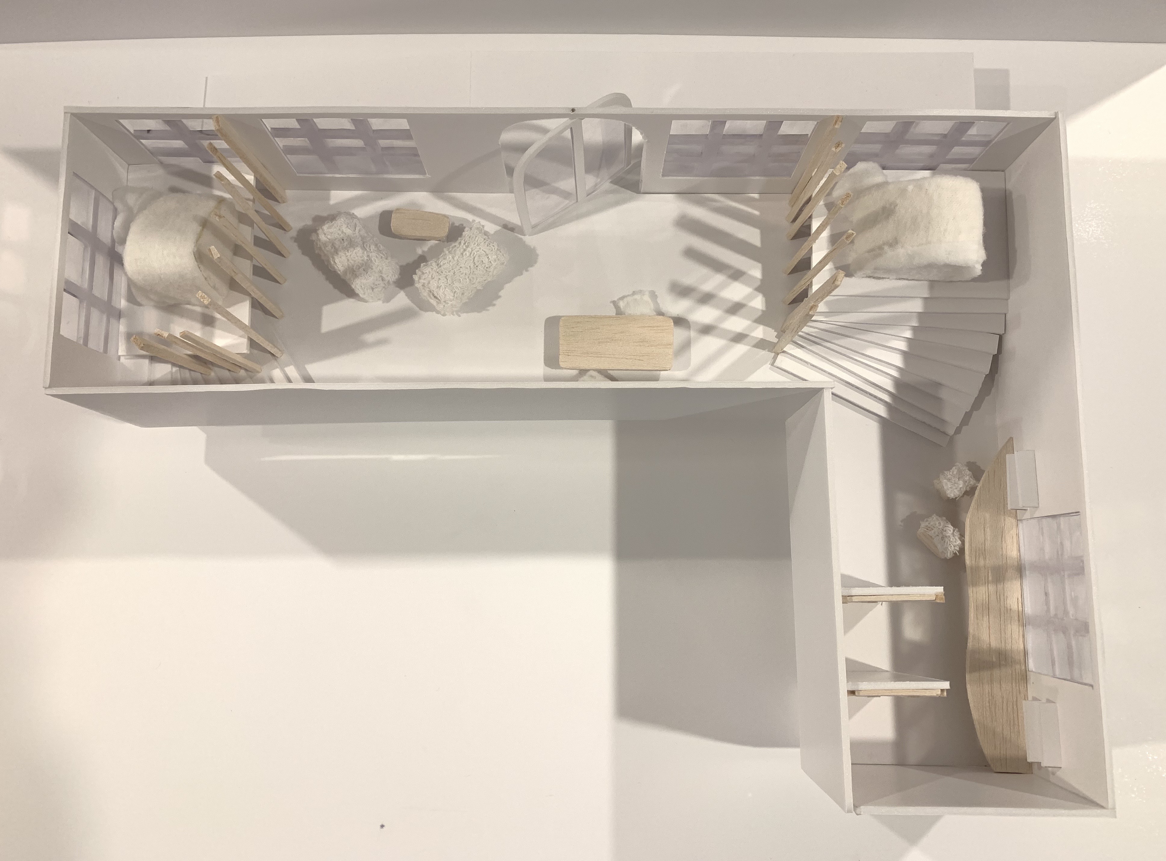
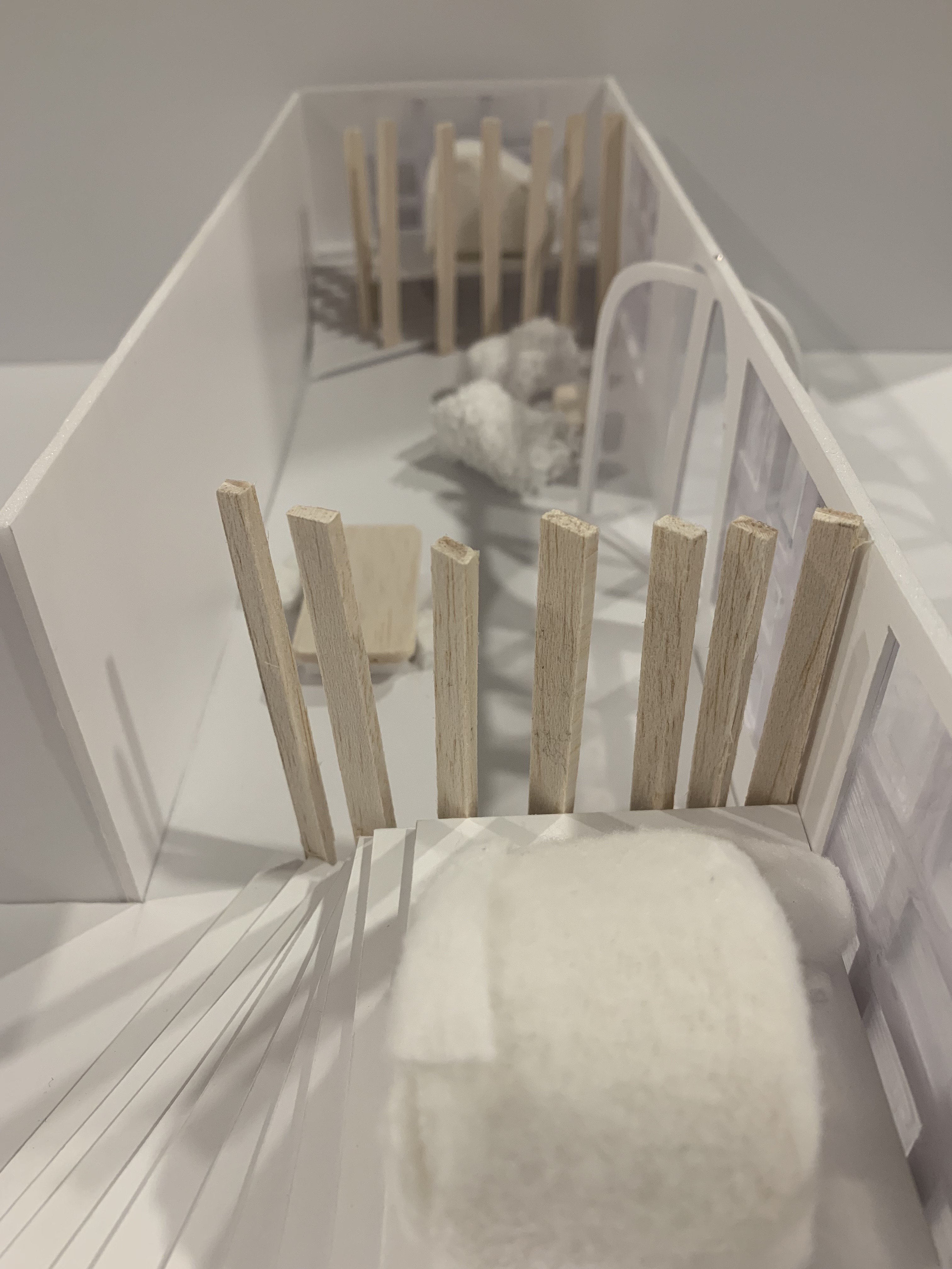
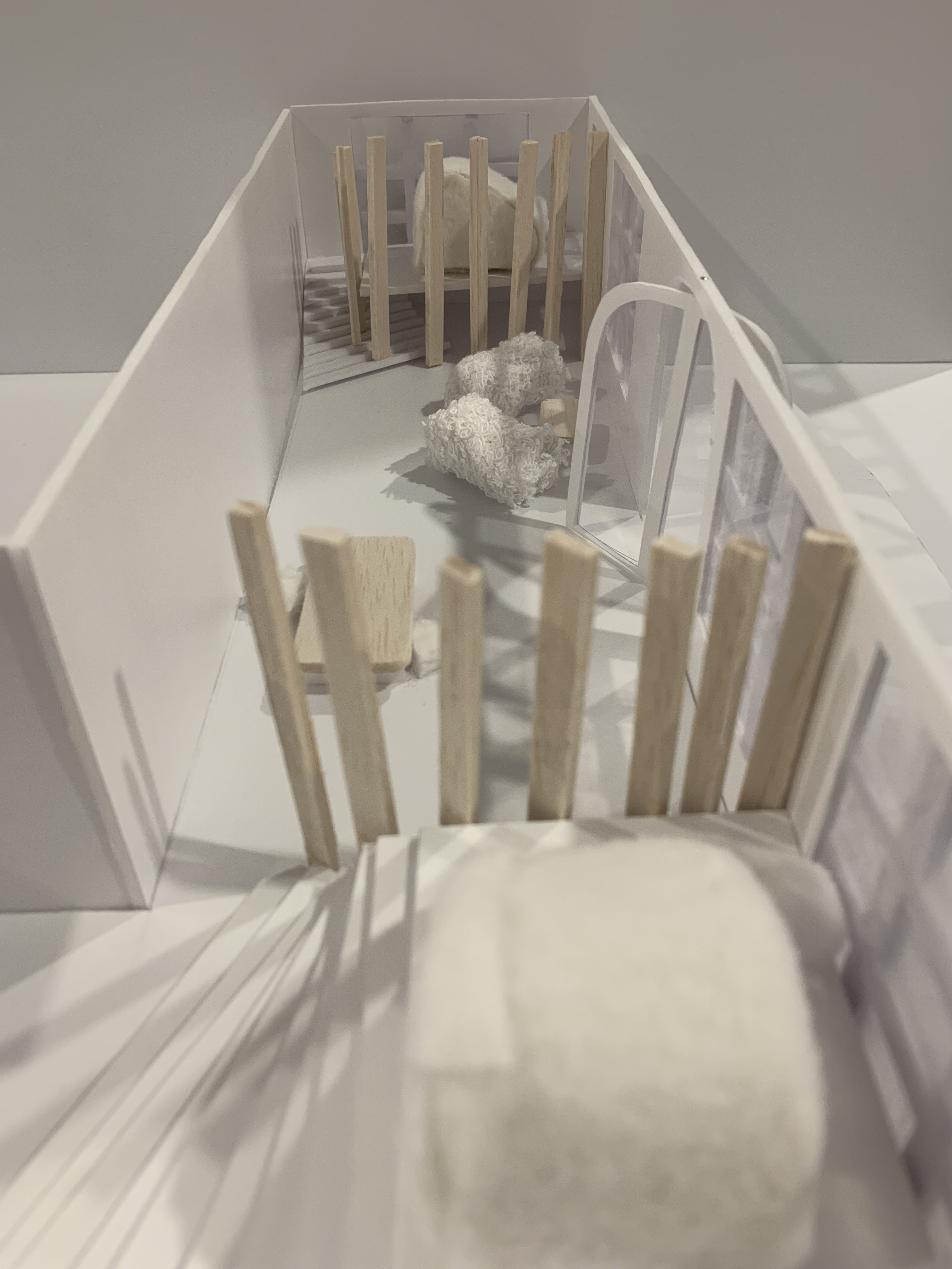
These shots emphasise and display the materiality used throughout my design as well as interior design details I incorporated into the space.
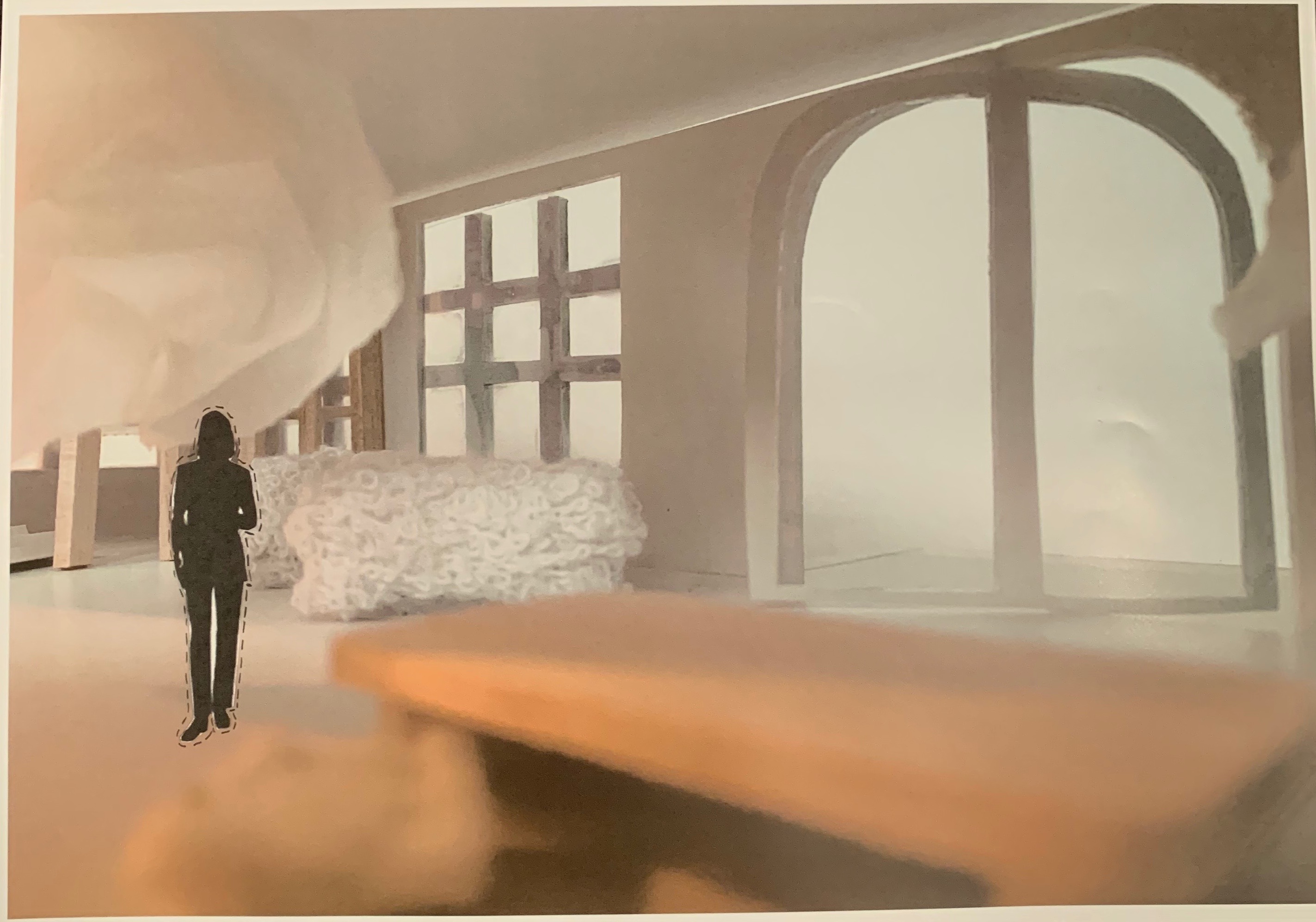
In order to create an exact 1:50 model of what my design invision is, down to the finest details I created frosted glass windows along the wooden bench wall, as well as against the two windows in which the sleeping platforms are placed. In order to do this I used plexi plate and mod podge glue to create this effect. I did this as I wanted the participant to feel full privacy and security without hesitation of being watched or looked at. Even though I wanted to create this effect I decided to leave the top panels clear glass as I still wanted them to experience the serenity of being able to lay down and look at the ever moving clouds, an utter sense of calmness in which I did not want to remove. Below are images depicting this.
Design Workshop 6
Interior Views of Models (Atmospheric Images)
20. 05. 19
Once I had finalised all the details of my 1:50 model I began taking atmospheric photographs in order to capture the true essence of my accommodation space and bring the model to life. I played around with various lighting and ultimately decided I wanted bright and white photographs to show the amount of natural light that would come into the space through the Eastern Facade and all the new windows I have added.
I then decided for my final atmospheric images to added a couple characters into the space to show to real scale as well as portray the space being inhabited by ‘two strangers’.
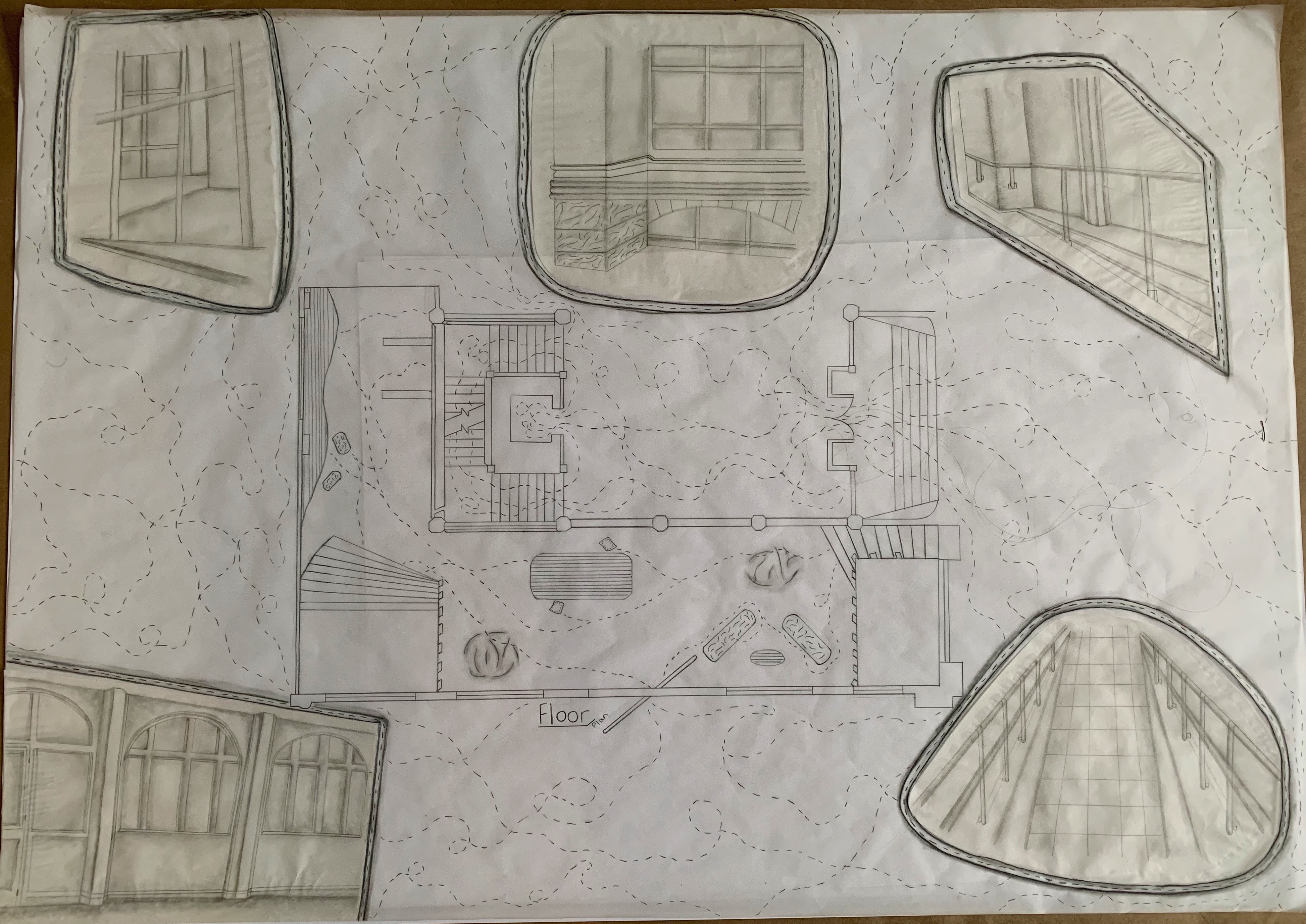
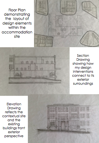
Floor Plans, Section Drawings and Elevations
22. 05. 19
After the creation of both my 1:20 sleeping platform model and 1:50 accommodation model I drew up three differential drawings of my designs to demonstrate their relation to the rest of the existing building. For my floor plan I’ve drawn a birds eye view overlooking all the components and elements of my design, from my sleeping platform down to the added decorative furniture elements. Around the perimeter I’ve also added the trekking pattern, continuous from my Part Two project which represents the chaotic movements and hustle and bustle lifestyle of the outside world, the rapid, fast pace lifestyle we all commonly live.
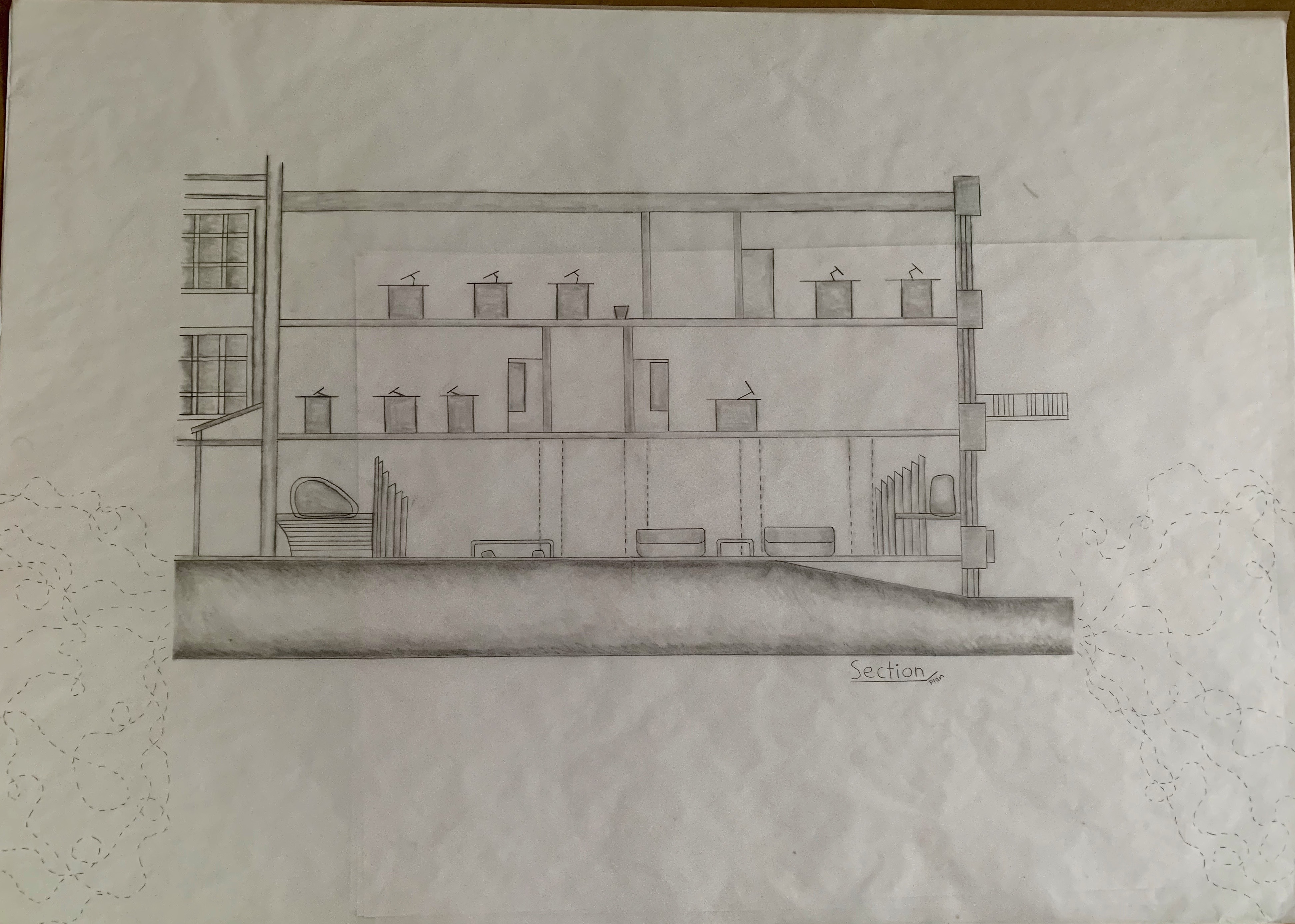
For my section drawing I have shown the above levels of the existing building in which my accommodation lies within. This drawing is a sidewards view from the Eastern facade looking into the building. This drawing demonstrates my accommodation space in relation to the building and its other levels, in order to give a contextual viewpoint. I have also continued the trekking pattern into the outer perimeters of this drawing too, all with the same meaning.
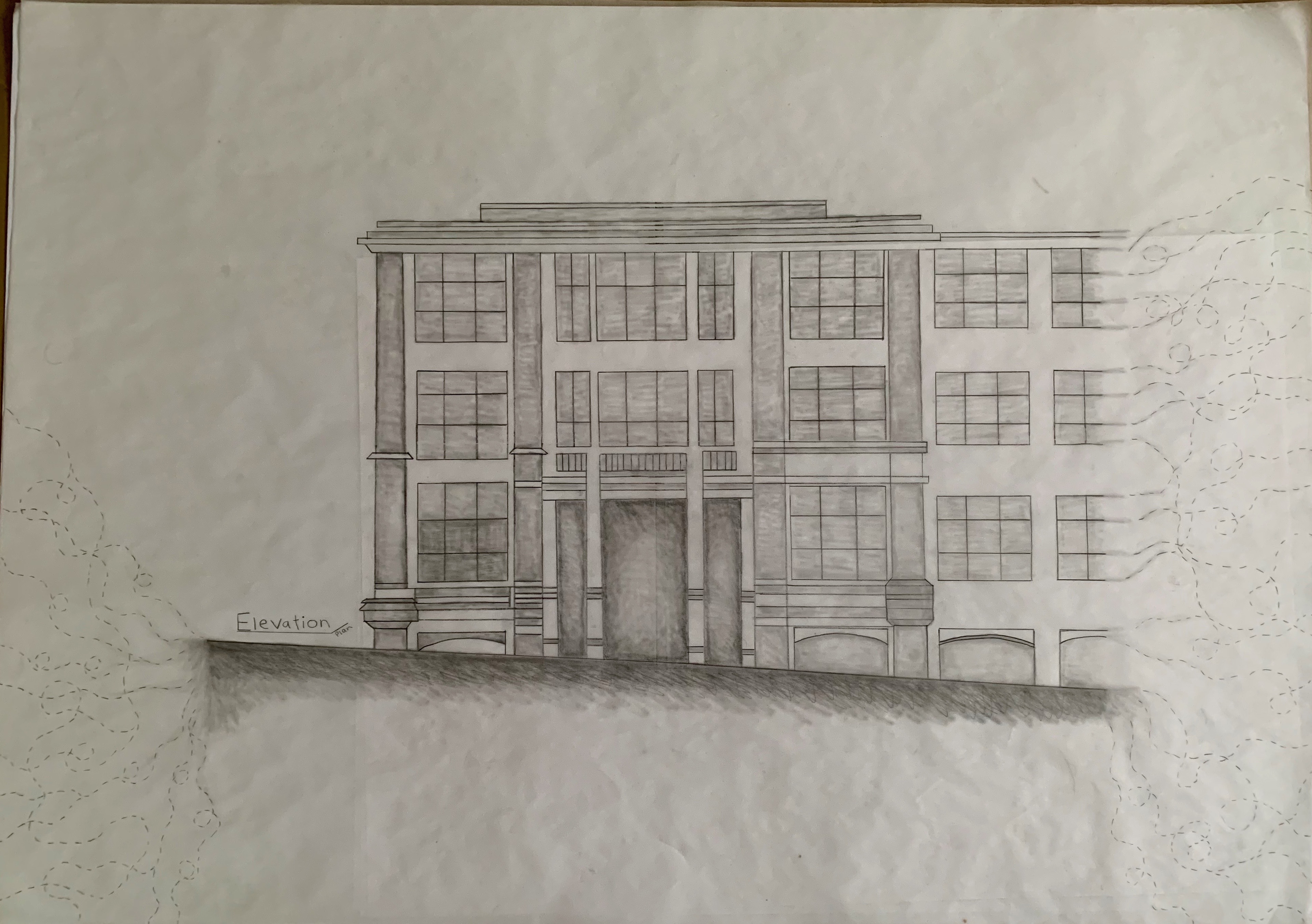
For my elevation drawing I have shown the front on view of the existing building, particularly where my accommodation space lies within the entire building. I have created a detailed drawing of the front perspective of the existing building to give contextual insight into the exterior of my accommodation site. As well as both my other drawings I have also included the trekking pattern as I wanted to connect all my drawings together, represented through the same ideas of movement.
Design Workshop 7
27. 05. 19
Project Narrative and Presentation Planning and Strategies
After I had completed various design communications for my project I began constructing my project narrative as to the story of my characters, idea and designs. As well as creating this project narrative I also distinguished a presentation strategy and possible layout ideas as to how I could format my work.
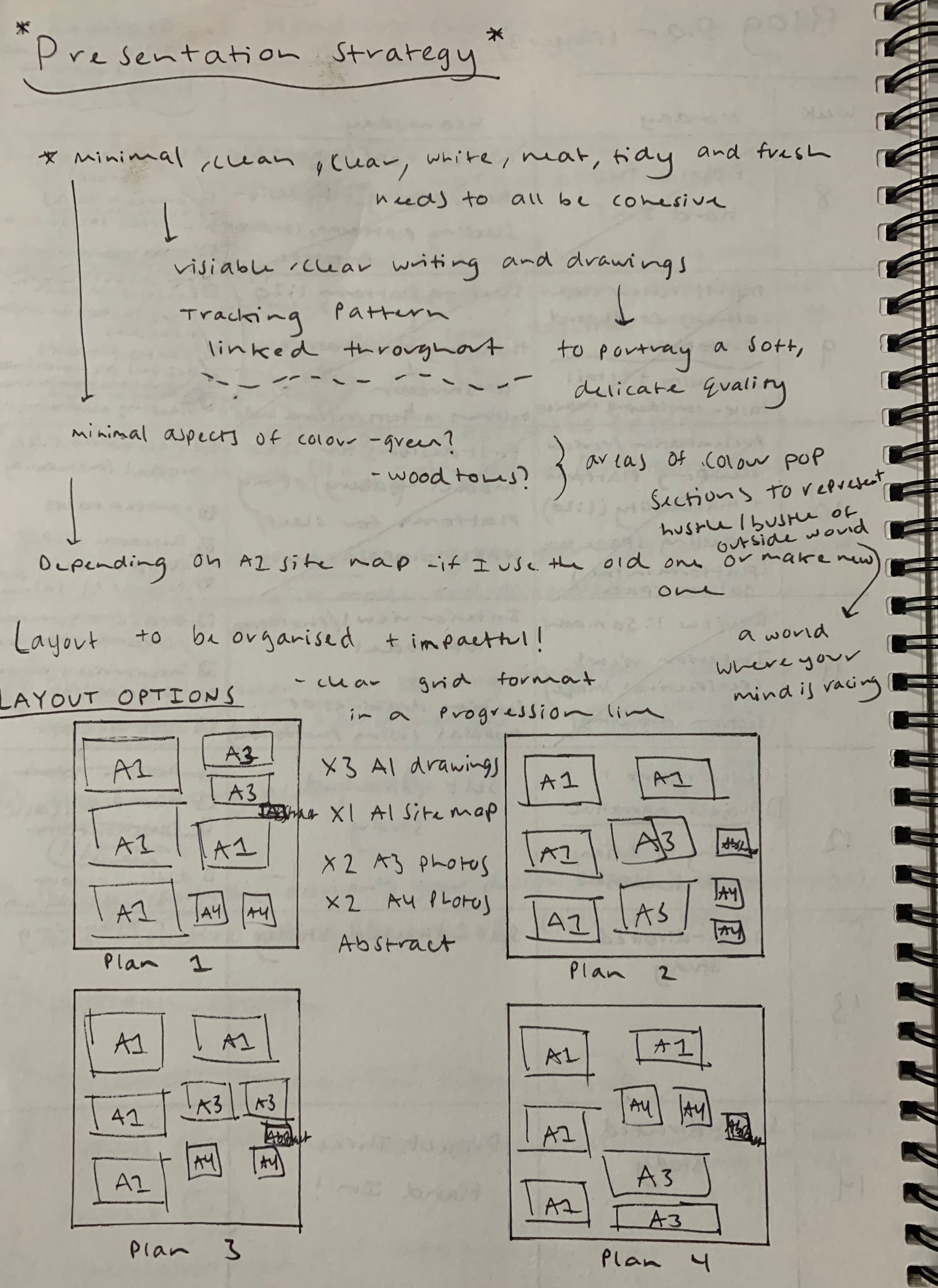
From planning out different ideas for layout options I decided to use Plan four as my presentation configuration as I believe it will clearly travel through my design idea and make the concept easier to visually understand.
PROJECT NARRATIVE
Concept: What is it?
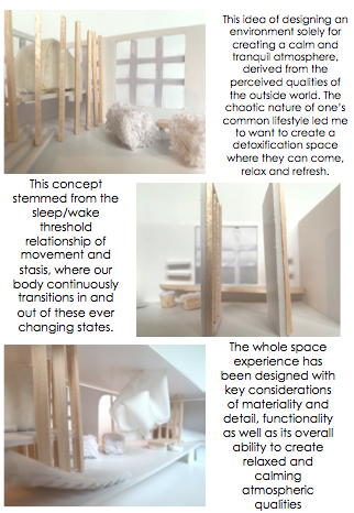
I have designed temporary accommodation for two strangers. These strangers live very active, busy lifestyles. They are hectically moving from one thing to the next, where their mind and body can never fully rest. The environments in which they surround themselves can heighten these tense feelings and pressures. They are the ones who need a mind and body detoxification cleanse, a hidden oasis in which they can detach from the chaotic outside world and fully relax in a calm, tranquil environment.
Angle: What does it do?
The design of this accommodation provides refuge from the intensity of their day to day ongoings. It has been designed as a space of tranquility, where the two strangers are confined to exploring a sense of relaxation and wellbeing.
Object: Discuss examples from the Projects Design that clearly supports the claims made in your concept and angle statements.
They are able to inhabit and adapt to this space however they chose. Situated in a new environment with a complete stranger is very confronting and strangely intimate, so keeping mind their comfortability levels around engaging with each other was very important to the spatial arrangement of interior details. Homely and cosy cushioned chairs, couches, pillows create an inviting, calming space allowing the two strangers to completely detox, relax, healing both their mind and bodies from the ongoing chaos and stress of the outside world. Each sleeping platform is separated on either end of the site, with both openings facing outwards towards the window. This is because in order for each stranger to feel secure, safe and at complete ease they needed their own distinct area as well as have the option to communicate and connect throughout the rest of the site. Angled timber beams run along the perimeter of each sleeping platform in order to allow the natural light to pass through yet also creating the private, secure environment in which the sleeping platform is to create. Throughout this entire design the interior decorative palette very simplistic features of comfortable fabrics and accents of timber in order to warm up the space and create this calming atmosphere filled with soft, delicate qualities of enriching materialistic elements.
Design Report
Below is my Design Report which summaries and reflects over all three Sleep/Wake Projects, Part One, Part Two and Part Three.


Final Presentation
12. 06. 19
Today in studio we presented all of our work from Part Three in a critique setting. My presentation was composed of a Site Map, Floor Plan, Section Drawing, Elevation Drawing, x 2 A3 Atmospheric Photographs, x2 A4 Atmospheric Photographs, 1:50 Scaled Model of my accommodation space, 1:20 Scaled Model of my sleeping platform, Design Report and an Abstract. Once we each presented our work it was then followed up with some comments. Below is a photo of my presentation board and models.
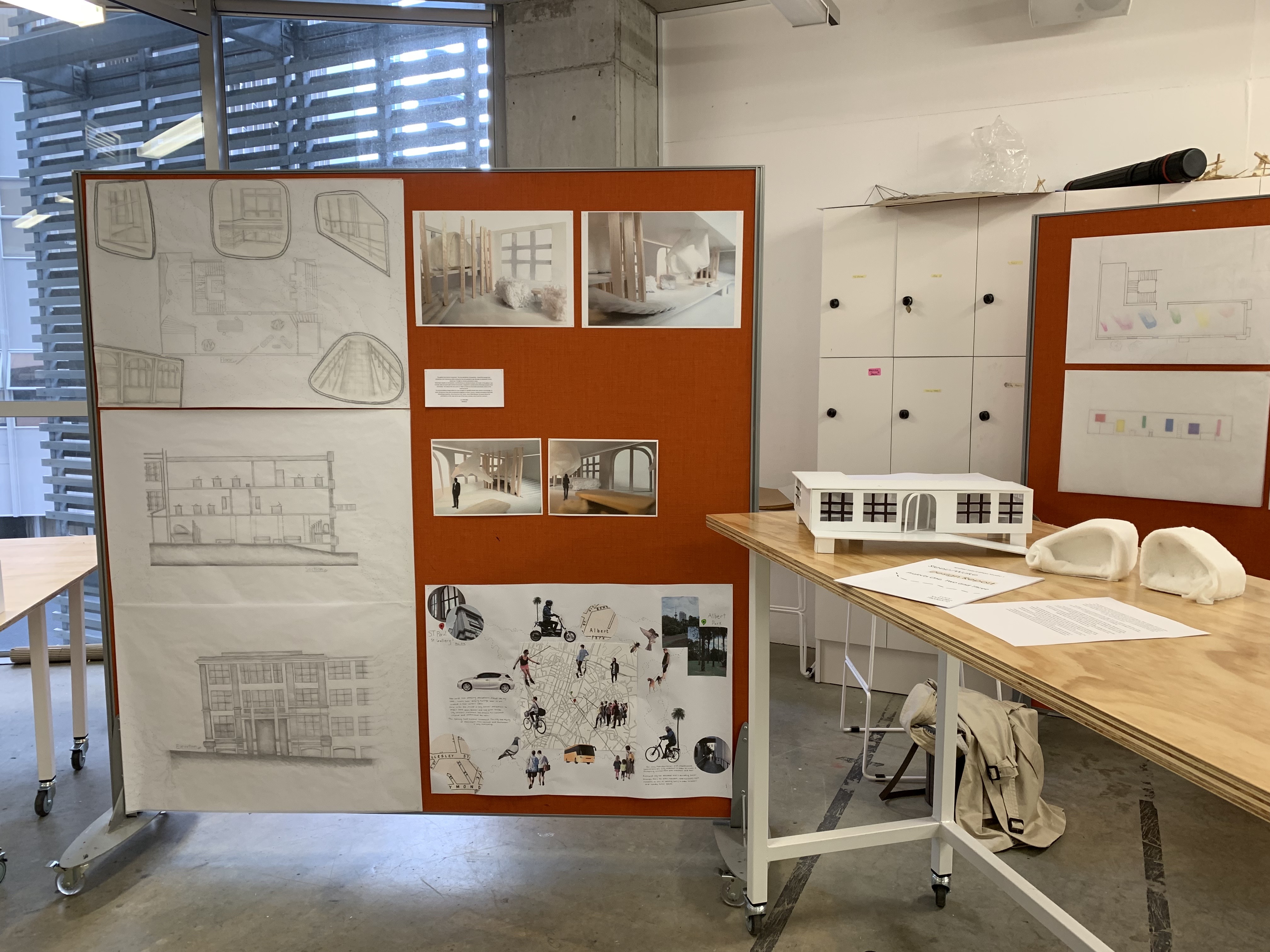
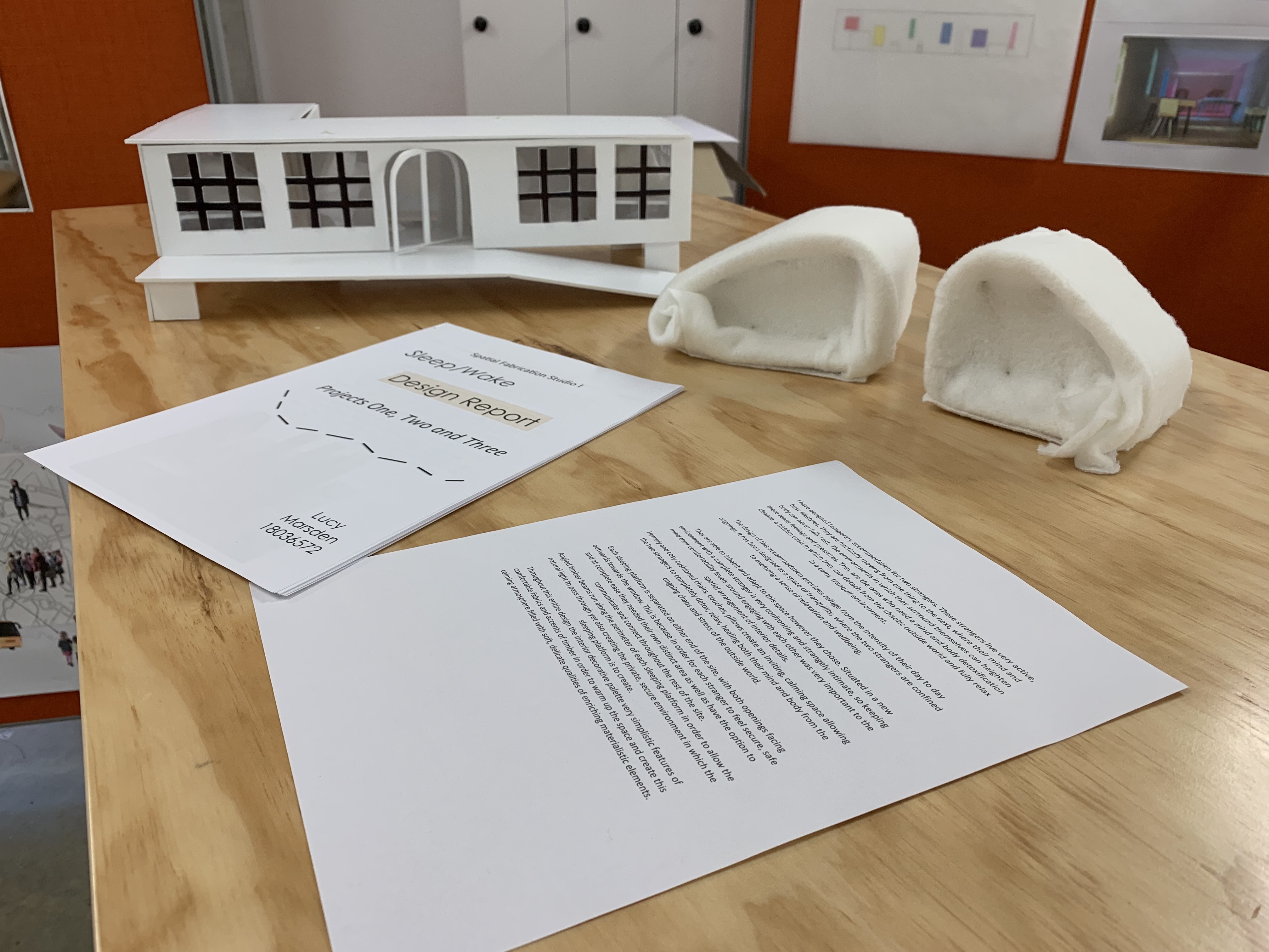
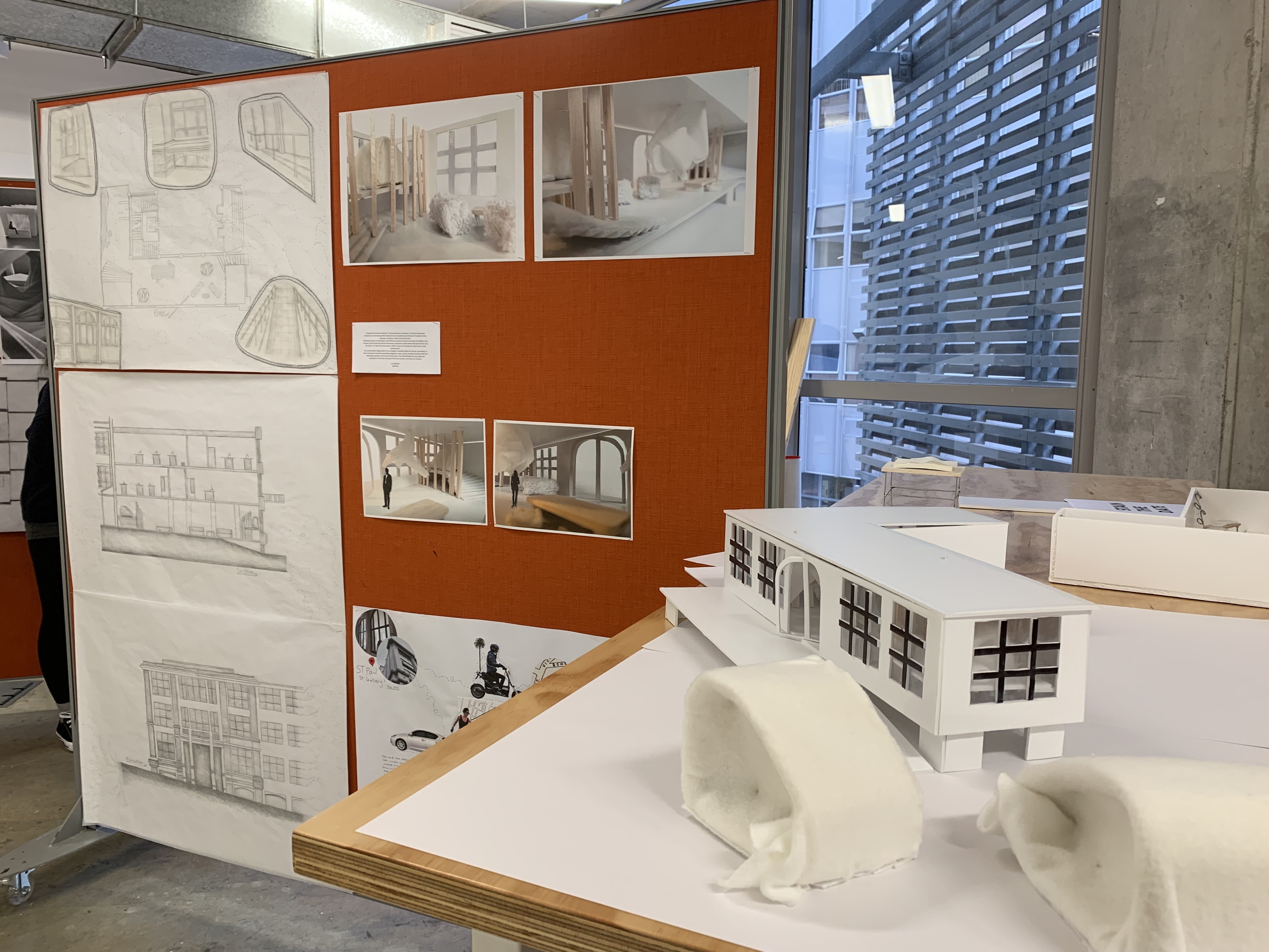
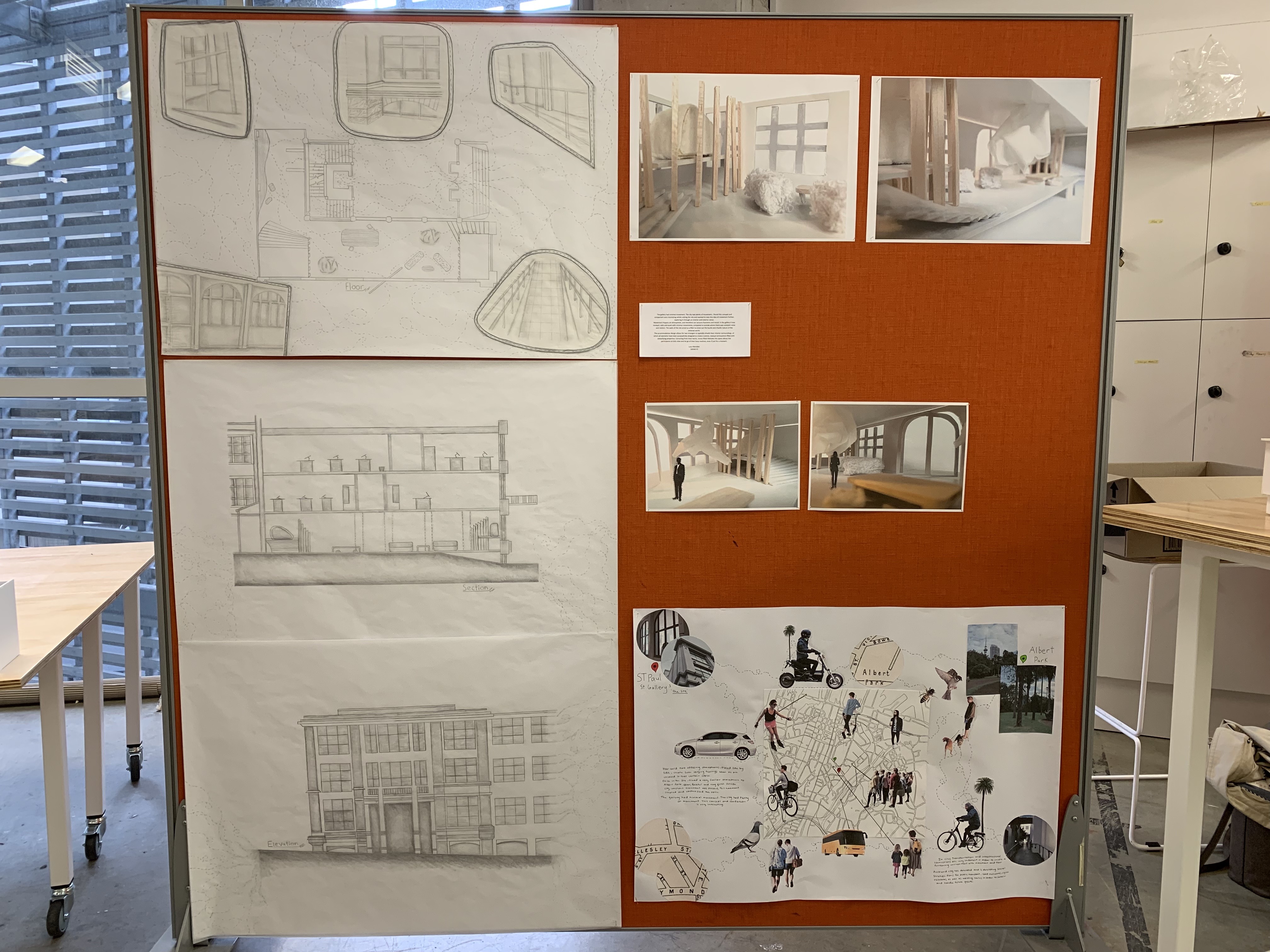
I also decided to create an abstract to go along with my presentation in order to create some clear, concise points as well as practice reflecting on my overall ideas surrounding the final part to this Sleep/Wake project.
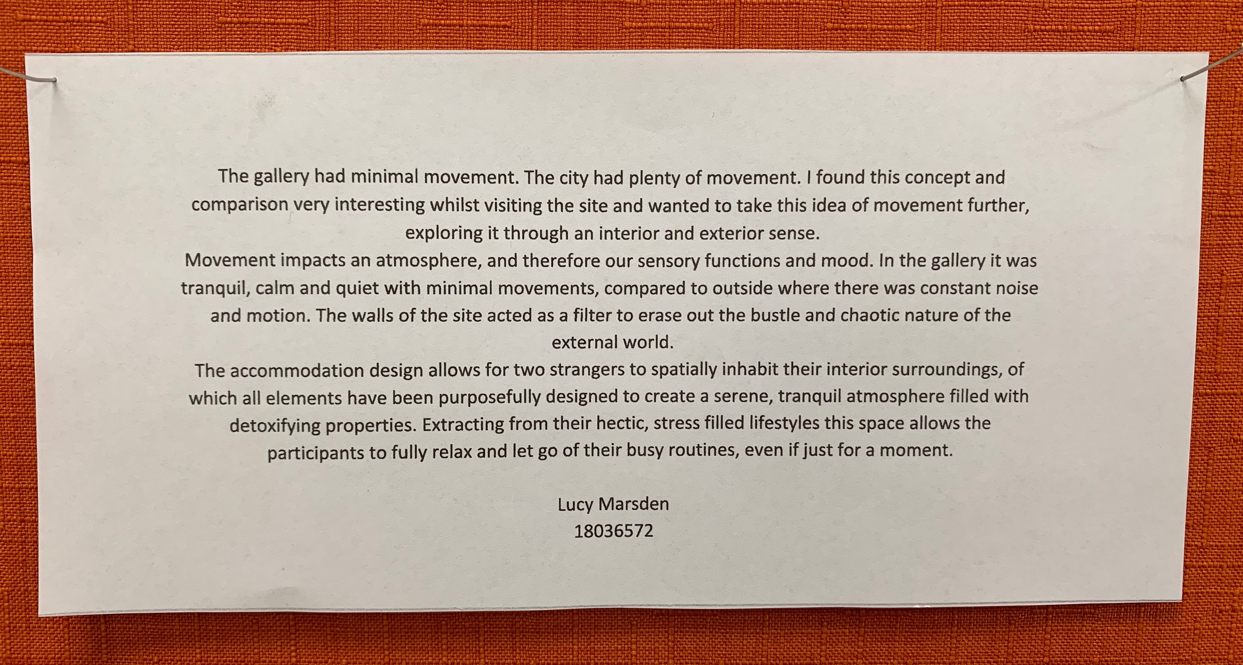
For my abstract I wanted to describe and link to my initial thoughts and impressions from the site gallery in Part Two, as well as show how this evolved and developed into my design practices and ideas through models and drawings. After we each had presented our work we all has some really interesting discussions and comments surrounding our ideas and hypothetically if this Sleep/Wake project was to continue how could we even further extend our ideas. Particularly for my presentation the comments discussed for a continuing ‘future project’ was surrounding materiality. How could the use of the soft, delicate fabrics, timber accents and the heritage building all start to weave together where they begin to intertwine with each other? For this entire Sleep/Wake Project, overall I am very happy with the design outcomes for all three Parts. This design project has really deepened my spatial thinking and conceptual ideas, taught me new skills surrounding drawing and model making as well as opened my eyes to all the different elements in which space possesses and how to express this.

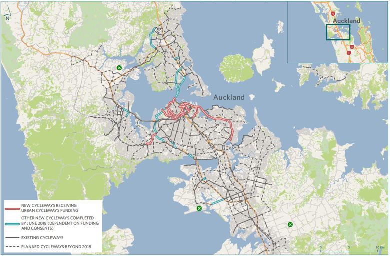